Behind the Scenes: Launching the Stuart’s Plumbing Rebrand
Stuart's Plumbing reached out to our branding company to handle their rebrand, with a focus on creating an identity that would translate well to their fleet of vehicles.
The plumbing business was successful. Now, their goal was to update their brand image to better align with their position in the market as a residential plumbing company. Our client knew that by adjusting their brand image, they would be better equipped to attract more of their ideal clients.
Project Kickoff
The first step in the branding project was to create a client brief. We sent a list of questions to our client to obtain details about their vision for the project.
The information provided in the client brief would provide us with a clear picture of the client's expectations, challenges, and opportunities. Upon review of the brief, we coordinated a meeting to have any remaining questions answered, and then it was time to get down to business.
We started with an internal meeting. Here, we gathered our branding project managers, logo designers, website copywriters, and brand strategists to review the goals of the project.
For the Stuart’s Plumbing project, our branding experts knew that one of the client's biggest goals was to use the new logo design on their plumbing company trucks. We kept that in mind as we crafted our brand strategy and moved into logo design.
Design Direction
Together, our logo design experts determined that we wanted to employ a logo color palette consisting of varying blue hues, due to their association with water, honesty, and professionalism. Our branding professionals reference color psychology to determine what we want to convey through color for a brand. Color selection is just one of the ways we use graphic design to direct the perceptions that people form about companies, and so we shy away from personal preferences and reference the science behind color instead.
Additionally, we knew that we would develop a strong brand icon to accompany the logo design. In the end, we wanted to be able to create a pattern out of the icon to be used throughout the brand support, especially including the plumbing truck design.
We started with sketching, and then sat down to look over the logo sketches and narrow the concepts down to our best ideas. We decided that the typographic logo format paired with the full name of the business was a strong concept. We also knew we wanted to incorporate pipes and water into the final logo design, so we thought the concepts with references to those things were also worthy of developing.

With our sketches in place, we got to work bringing the logo design options to life digitally.
Logo Design
Our logo development process includes the presentation of three logo options. So, we set to work creating the logo designs that we would walk through with the client.
In the digital development phase, our branding experts combine both brand strategy and graphic design fundamentals into a logo design that will serve the business well for the next 10 years or so. Read up on some of our logo design tips to dive deeper into our process for logo design.
For Stuart's Plumbing, the first logo design was created from letters that fit together like pipes, portraying a strong, industrial aesthetic.
The second logo design was a more straightforward typographic option accompanied by a logo icon created from two bent pipes.

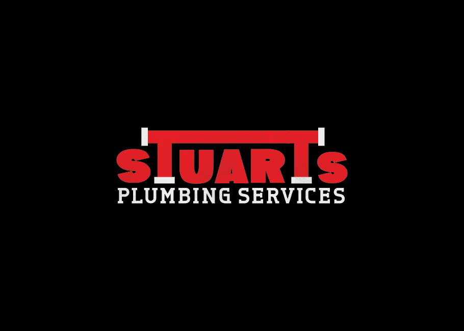
The final logo design we presented incorporated a bold font that featured a spigot as the letter "t" within the Stuart's name.
Upon presentation of the three logo design options, the client selected the third logo design. This was the most playful design, and bold font aligned with what he envisioned for his business.
The additional logo designs that were not selected by our client can be seen in our portfolio sample for the Stuart's Plumbing branding project.
The final logo included a graphic as part of the letter “t.” This logo icon wouldn't work as a standalone icon to represent the business, as it was shaped from the letter T and not an S. So, we created a secondary brand icon that could stand by itself to represent the logo. This secondary icon consisted of the S and P from the full logo, separated by a blue water droplet.
To finalize the logo design, our graphic designers created a complete set of logo files and logo guidelines to share with our client.
We provided all of the major logo file types, including JPEG, PNG, EPS, and PDF. These files were provided to the client in full color, black, and white, along with color codes in PMS, CMYK, RGB, and hex codes.
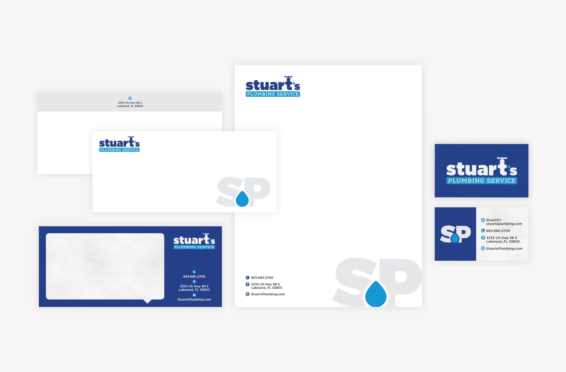
Stationery Design
We then moved into stationery design. We started with the creation of a business card design featuring the Stuart's Plumbing logo design atop a solid blue background on the front. The reverse showcased the water droplet brand icon in a color block on the right side of the card, while the pertinent contact information took up the left side of the business card design.
We proposed two paper types with two different print finishes for the business cards. This allowed us to print an impactful, sturdy business card for the owner and a more economical business card for the rest of the team. For the owner's business card, we selected a 32pt uncoated paper with painted edges. And for the employee business cards, we used a more standard, but still luxurious 16pt silk stock.

We then typeset the business cards and worked to coordinate printing with our professional business card print vendors.
Additionally, to complete the stationery suite design, we created a letterhead, notecard, business envelope, as well as a custom-designed thank you card.
Website Design
For this project, we worked with the third party website development firm that already handled the hosting of the Stuart's Plumbing website.
Our role was to create the website design for a couple of the key pages, which would set the tone for user interface and user experience. The client's existing website management firm would then implement the design into the website, and would continue to host and maintain the website.
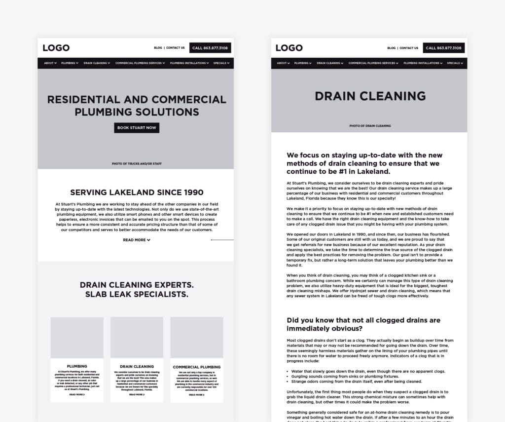
We started by creating a website wireframe that mapped out the site and determined the user journey through and between the website pages.
The wireframe process allowed us to really focus on ensuring that the client's primary goals for his website would be achieved by gently, but intentionally nudging users to key calls to action. The goal was to highlight the Drain Cleaning service throughout the website, and to prompt users to contact Stuart's Plumbing for a quote.
Our approach to website wireframes focuses on the user experience. We want every visitor to your website to understand what your company does and why you matter within three seconds of landing on your website. The facts show that users bounce in three seconds or less, so we've got to be pretty relentless about ensuring that we're clear about what you're offering immediately upon page load.
To combat high bounce rates, we organized the top sections of the website to communicate two things: who the company is, and what the company does.
Next, we worked down the website homepage, organizing pertinent information for the user. Our goal was for every scroll to tell the user the next thing they needed to know. Sounds intuitive, but it takes a lot of strategic thinking to walk your user through your website. Calls to action are really important here, nudging the user to contact the company for services or to take the next step in buying into whatever it is that you're offering.
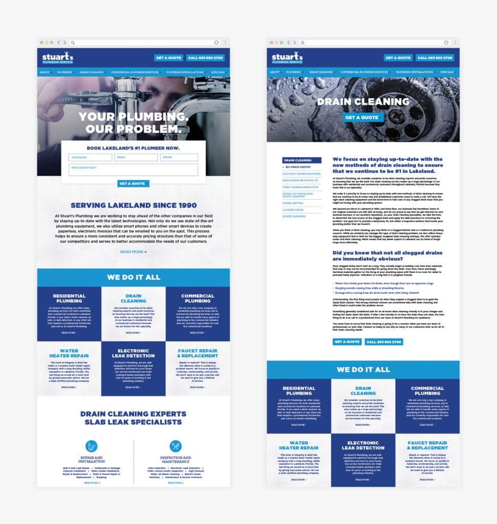
With the website wireframe in place, we moved into website design. Our website design focused on aligning the interface with the new brand direction, while simplifying the user journey and driving users toward key calls to action.
Additionally, we sought to portray a crisp and clean aesthetic, while also making it clear that the company focused on residential plumbing services, as opposed to commercial clients. So, the goal was to create a website that was super-slick but also welcoming to homeowners.
On the Stuart’s Plumbing website, our website copywriter created a headline that would tout the fact that our Stuart's is the solution to the user’s plumbing problem. The next section reinforced Stuart's professional experience and continued to sell the user on why Stuart's Plumbing is Lakeland’s go-to plumbing company. The rest of the website wireframe walks through the services offered and how to schedule them.
To make our calls-to-action stand out, we employed bold brand colors and large type to grab the attention of the user. On-brand fonts and color-blocking provided visual division between the sections of content. Imagery that was aligned with the brand direction, coupled with subtle textures displayed a squeaky clean vibe and would immediately connect the user with the service.
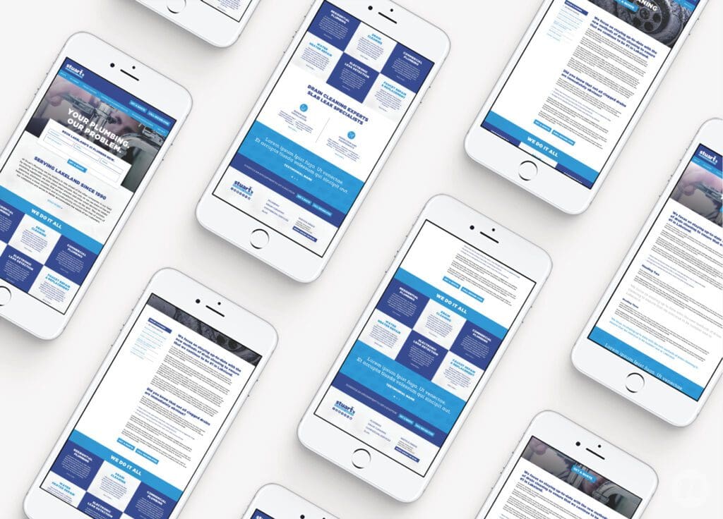
Meticulous attention to every detail of the website design would turn the website into a powerful element of brand support.
Once approved by the client, our website designers create assets for our website developer to use, including all images, copy, fonts, colors and more that will be needed to bring the site design to life.
Our developers then build and code the entire website from the ground up on the WordPress platform. We pay keen attention to SEO best practices, ensuring that the website is developed using clean code, page structure, and more.

However, there was a plot twist as this project started to wrap up. Our client wasn't able to approve the final design, based on the fact that he was hoping to see some other color brought into the design. We were unable to come to an agreement about how to solve the issue, as we were committed to maintaining the integrity of the brand.
Ultimately, he decided not to move forward with our branding company for the website design portion of the project. We were disappointed that we wouldn't be able to see our website design on his www, but there were no hard feelings. As a branding company, it's our job to keep the brand intact and protected from personal preference. This works best when our clients trust the branding company they hired, but when it doesn't work out that way, sometimes it's best to part ways, and that's ok.
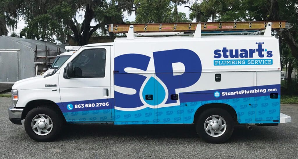
Vehicle Design
The final phase of this branding project and the catalyst for starting the rebrand in the first place was the graphic design of a fleet of plumbing company trucks.
To design the vehicle wraps, we first confirmed with the client the exact make and model of the vehicle we would be designing. We also requested straight-on photos of all sides of the vehicle to reference during our design phase.
The graphic design experts at Nice Branding Agency worked to ensure that each and every vehicle view would be a rolling extension of the brand.
For Stuart's Plumbing, we implemented a custom pattern created from the SP logo icon. The pattern was offset by a strip of blue used to house the company's contact information. The large SP brand icon was set in the center of the design, and the full logo took its place at the top-right corner of the vehicle.
Once the vehicle design was approved, our team coordinated with the printer and installer throughout the entire process to ensure that the vehicle wrap installation mirrored exactly what we designed.
At the end of the project, we provided all print-ready business card design files, stationery design files, and logo files to the client for their future use, equipping them to continue to grow their new brand.
Contact Our Branding Company
If you feel like your current branding is going down the drain, and you're ready for a new, squeaky clean look, contact our branding company today.