3 Crucial Logo Design Tips You Don’t Want to Miss
Looking for logo design tips?
We’ve put together a list of three key elements that a logo must posses in order to be considered “good,” “well done,” or “‘strong.”
Obviously, if you’re not graphically inclined, it’s probably best to leave the logo development to a graphic designer.
Even more, you might consider looking specifically for a branding expert to develop your logo, because your logo is such a crucial element of your overall brand image.
Not every graphic designer or user of the design programs is necessarily qualified to create a logo for your business.
There’s so much to consider and so much more on the line.
If today’s the day you need to make a wise decision, read no further, and call the logo design experts at Nice Branding Agency at 615-905-9936.
If you’re feeling brave, need to make sure the branding company you hired is doing it right, or you’re just curious overall, read on, my friend.
 Notice the arrow between the E and the X.
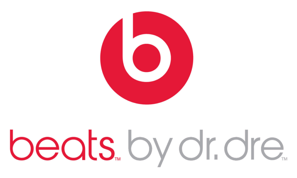 Notice here how the b in the icon is the same shape as headphones on an ear.
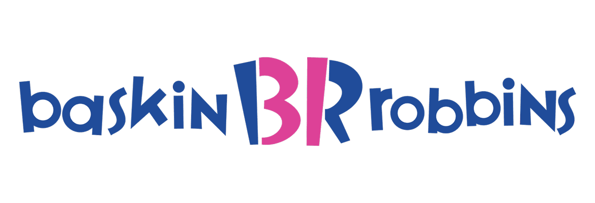 Notice the hidden 31 in the BR icon.
It’s gotta be unique and it needs to point your brand in the direction it needs to go for success.
The font choice and overall design aesthetic plays a huge part in what your business is saying to your customers or potential clients.
Playful logos are going to say fun. Sophisticated logos are going to say expensive. Trendy logos are going to say innovation. The list goes on and on.
Make sure the positioning of your logo is correct or you might go down the wrong road fast.
The logo has to carry forth something more than just a “good” design.
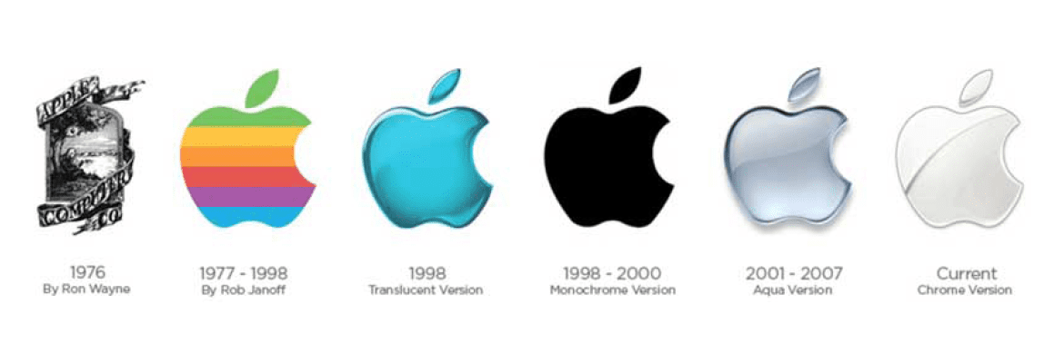
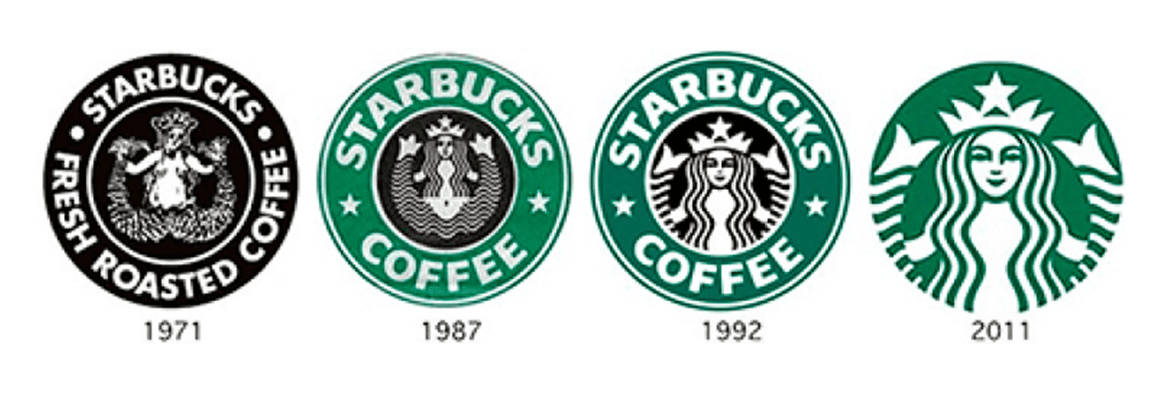 It took two of these three companies years to nail down the art of simplicity. Multiple rebrands each offered a bit more simplicity until ultimately solving the puzzle and skyrocketing their brand awareness.
Just remember, it must be simple, but it also must be distinctive, to the extreme.
Simplicity is not only key in the design of your logo, but it’s also a key factor in the decoration of your logo.
No embossed logos. No drop shadows. No beveling. Gradients only sometimes.
Simple logos are often easily recognized, incredibly memorable, and the most effective in conveying the requirements of the client.
— Jeff Fisher
Sometimes it should be so simple that you may feel slighted as a paying client; however, remember the art of simplicity is not something all designers posses.
Logo Design Tips: Your logo must be versatile.
A big word with a lot of meaning. Your logo must be versatile in size. It’s got to be able to scale down to the size of a quarter or up to the size of a billboard and still be recognizable, clear, and readable. Keep it simple with no intricate details. Keep font sizes and element sizes fairly consistent. Use well-crafted, classic fonts. Respect the grid. Your logo must be versatile in color. This baby has got to be effective in black, white, and in color. If your logo only works when displayed with all of its colors in all of their glory, it’s a no go. Your logo must be versatile in layout. Your brand mark is going to need to fit this space, that space, and probably a bunch of spaces in between. You should have multiple setups of your logo. Vertical, horizontal, just the icon, just the logo type, with the slogan, without the slogan … you get the picture. If it only works in one layout setup, you gotta keep workin’ it.Logo Design Tips: Your logo must align.
This is another big one with multiple things to think about. Let’s just start by saying that strategy is big here. There’s gotta be something behind your logo. The concept or meaning behind your logo should ideally align with your core purpose, offerings, or values of your business. It’s can’t just be a slick stock icon paired with a sans serif font, boxed in and reversed out. Your logo has to be distinctive and suggestive of the goods and/or services you’re putting out there, or the result of using those goods and services. Keep in mind that this doesn’t mean it has to say what you do through a direct icon. For example, a restaurant logo does not have to have a burger in it. A logo doesn’t need to say what a company does. Restaurant logos don’t need to show food, dentist logos don’t need to show teeth, furniture store logos don’t need to show furniture. Just because it’s relevant, doesn’t mean you can’t do better. The Mercedes logo isn’t a car. The Virgin Atlantic logo isn’t an airplane. The Apple logo isn’t a computer. Etc. — David Airey Well-designed logos oftentimes include an element of surprise. Notice the arrow between the E and the X.
 Notice here how the b in the icon is the same shape as headphones on an ear.
 Notice the hidden 31 in the BR icon.
It’s gotta be unique and it needs to point your brand in the direction it needs to go for success.
The font choice and overall design aesthetic plays a huge part in what your business is saying to your customers or potential clients.
Playful logos are going to say fun. Sophisticated logos are going to say expensive. Trendy logos are going to say innovation. The list goes on and on.
Make sure the positioning of your logo is correct or you might go down the wrong road fast.
The logo has to carry forth something more than just a “good” design.
Logo Design Tips: Your logo must be simple.
Yes. Can you believe that? Simple is best. Think of Apple. Think of Nike. Think of Starbucks.
 It took two of these three companies years to nail down the art of simplicity. Multiple rebrands each offered a bit more simplicity until ultimately solving the puzzle and skyrocketing their brand awareness.
Just remember, it must be simple, but it also must be distinctive, to the extreme.
Simplicity is not only key in the design of your logo, but it’s also a key factor in the decoration of your logo.
No embossed logos. No drop shadows. No beveling. Gradients only sometimes.
Simple logos are often easily recognized, incredibly memorable, and the most effective in conveying the requirements of the client.
— Jeff Fisher
Sometimes it should be so simple that you may feel slighted as a paying client; however, remember the art of simplicity is not something all designers posses.


