Global Grab

corporate branding franklin tennesee

Global GRAB is a perimeter security company based out of Franklin, Tennessee. When they first approached us, they had a clear need for corporate brand development, including Foundational Branding (or brand positioning) and a new website. However, as the branding project progressed, we saw more needs to update their brand and support their ongoing marketing needs. This included refining their logo and updating their marketing materials.

We have continued our relationship with Global GRAB and currently direct and fulfill all of their marketing needs. It’s important to note that our work for this client does not encompass any of our off-the-shelf packages, but it does align with key services our agency provides.

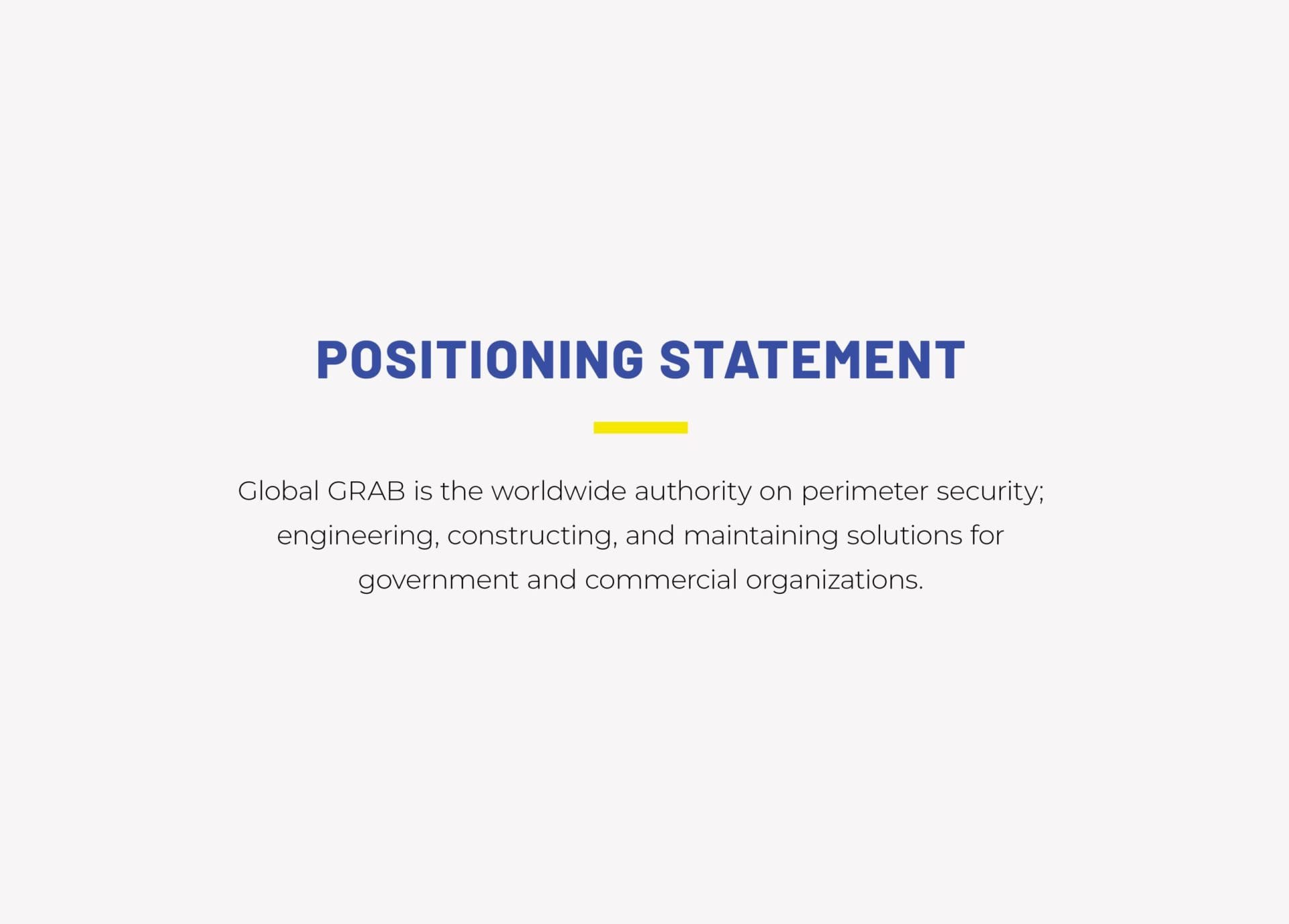
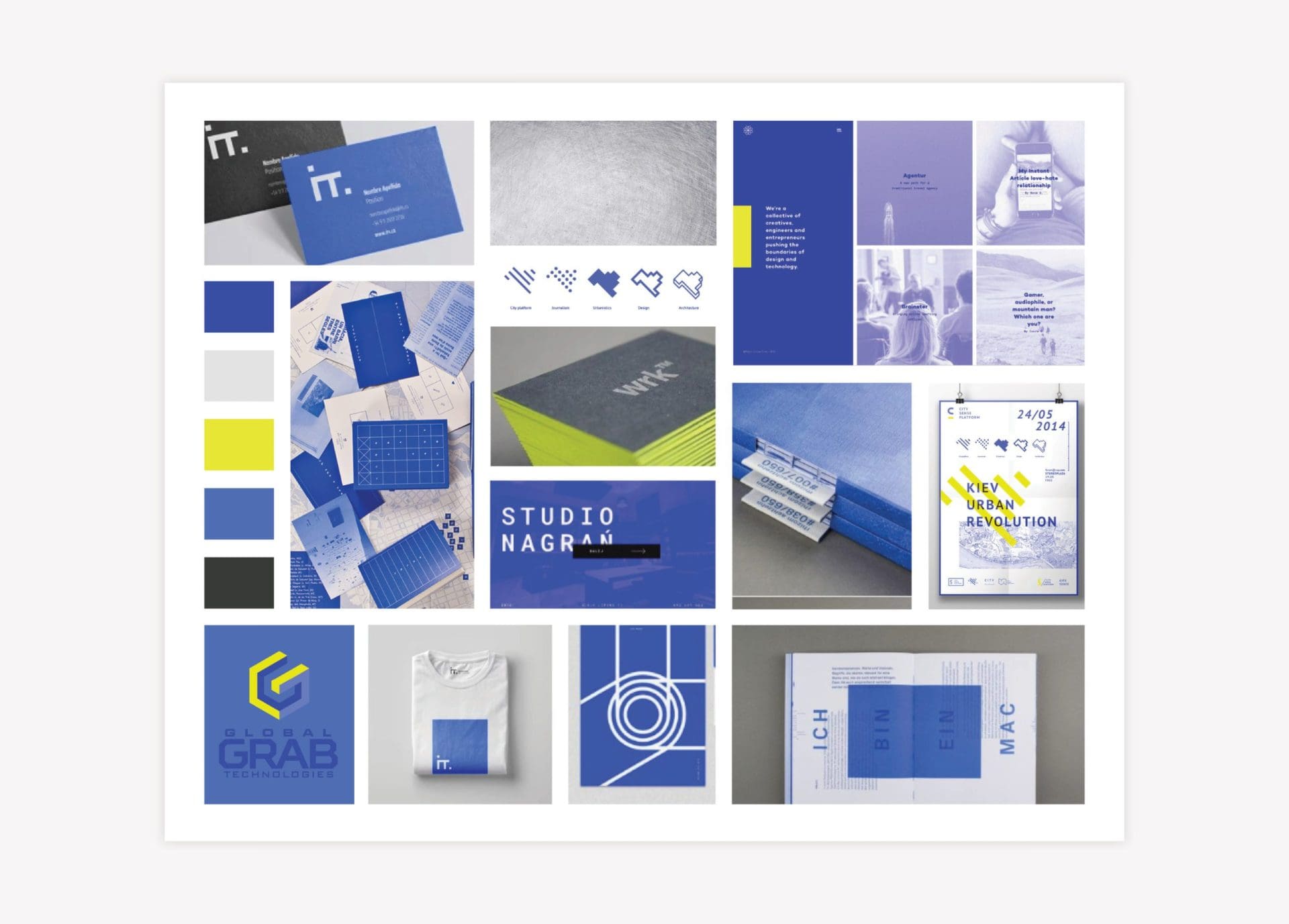
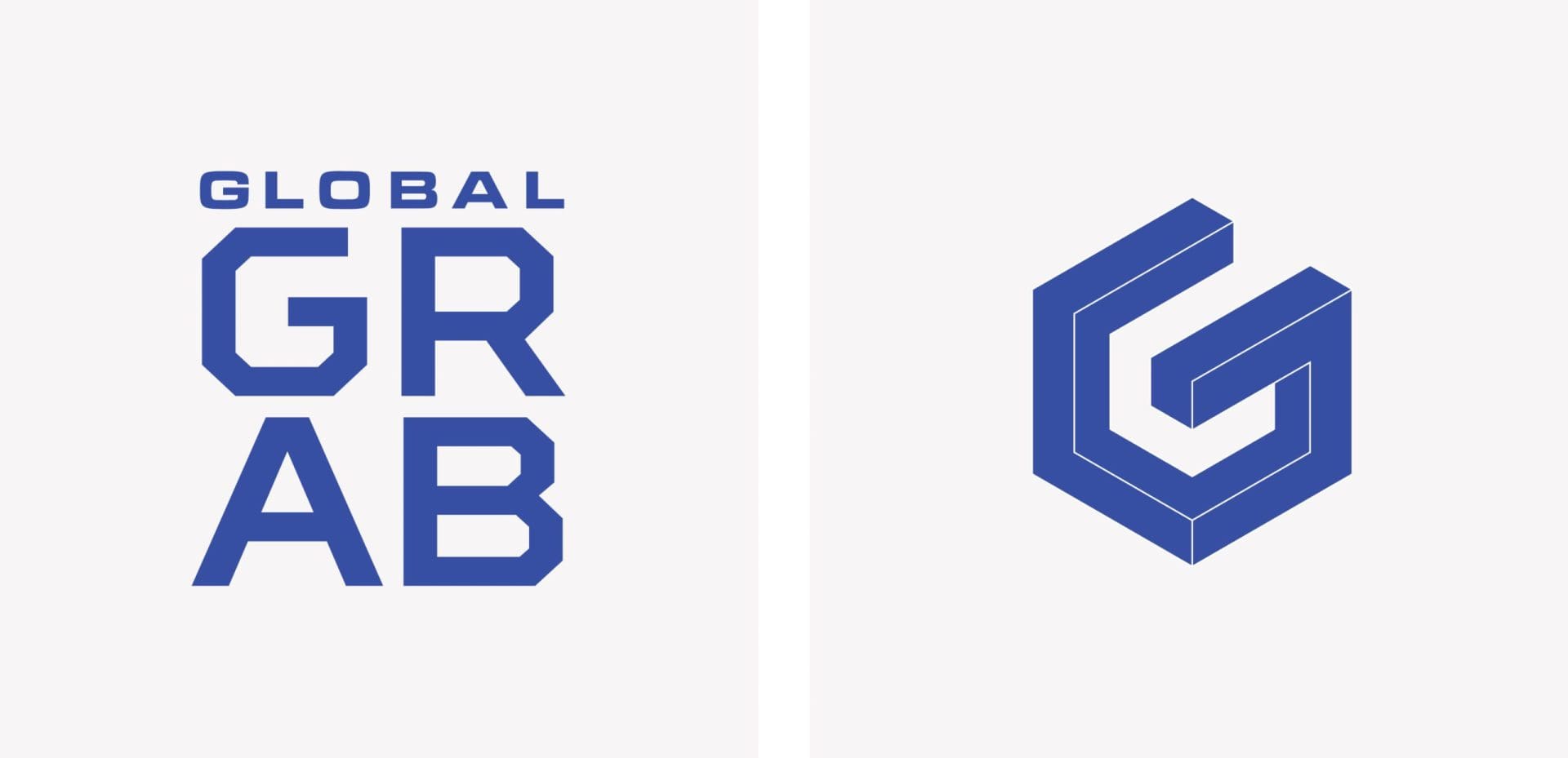
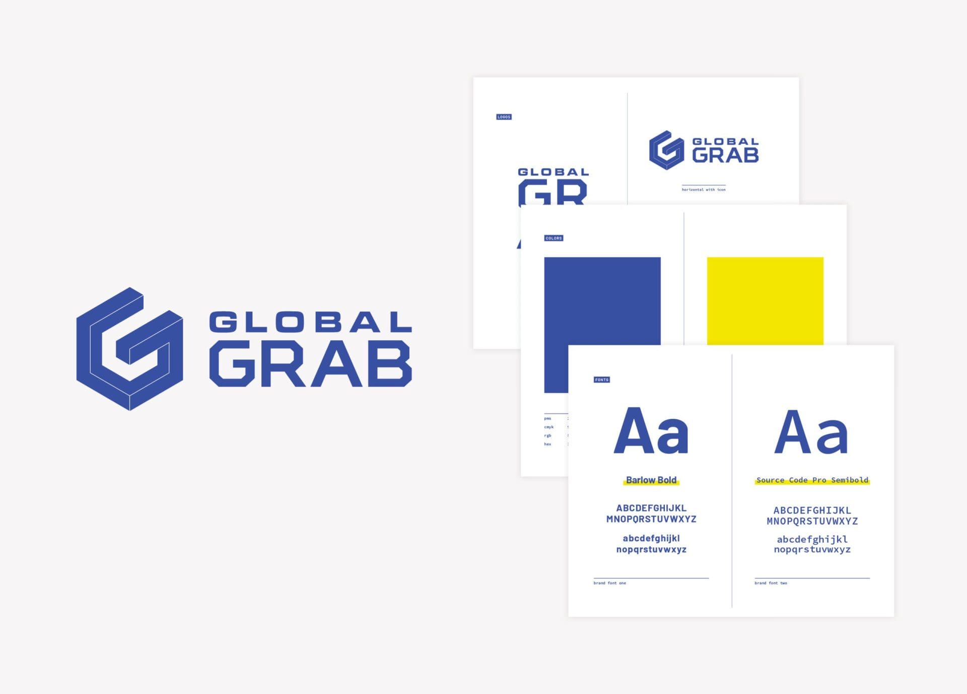
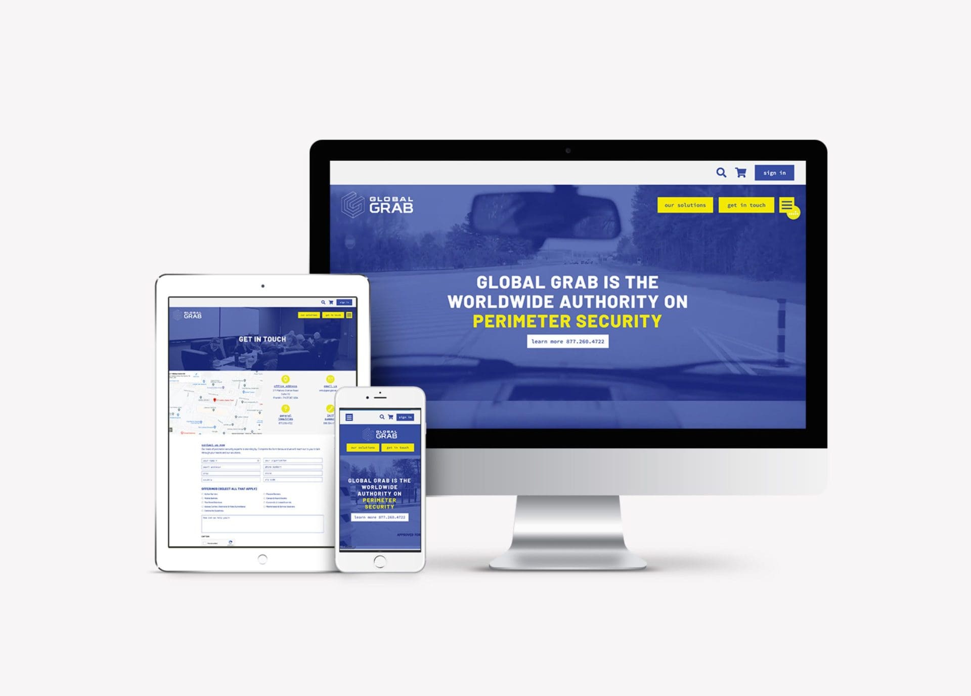
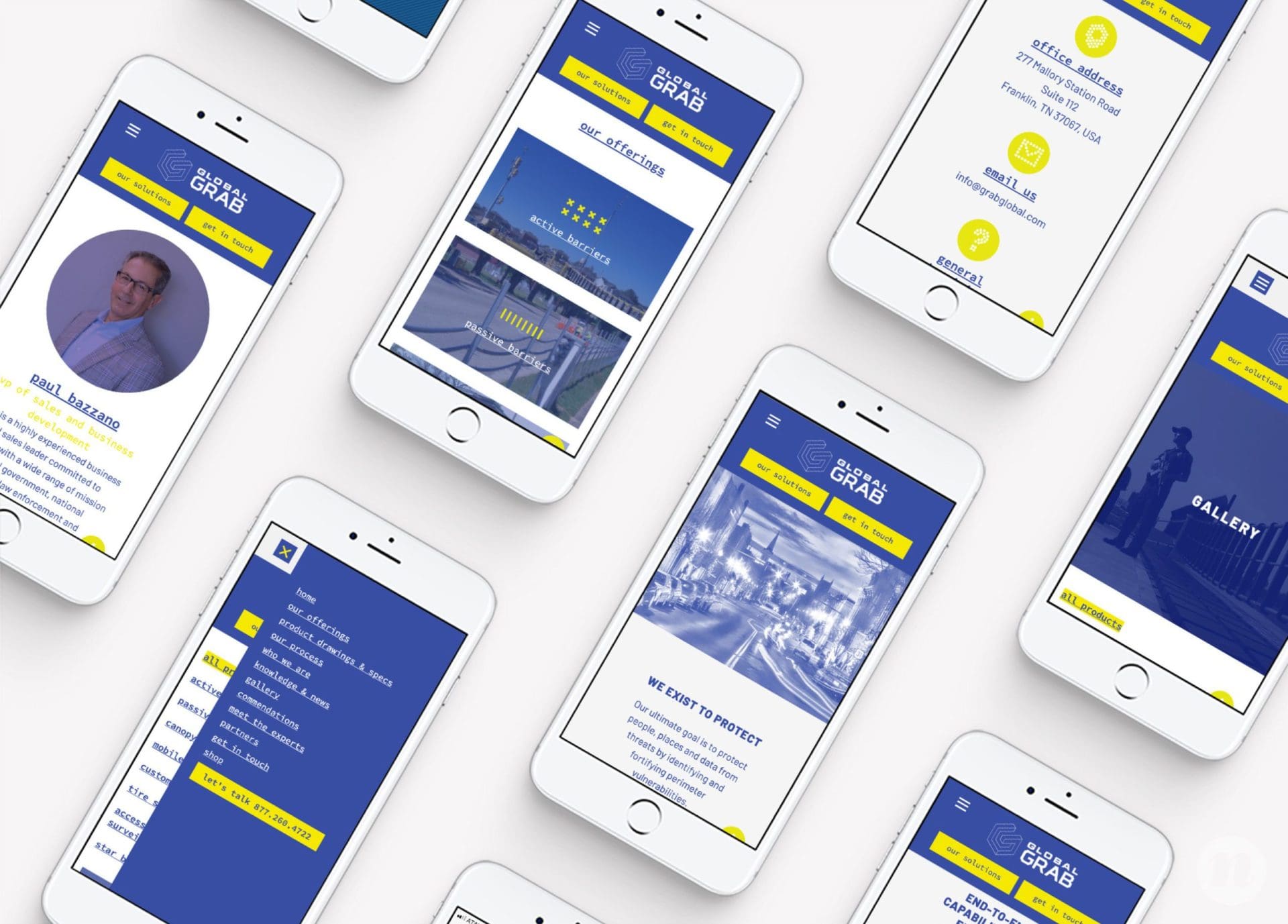
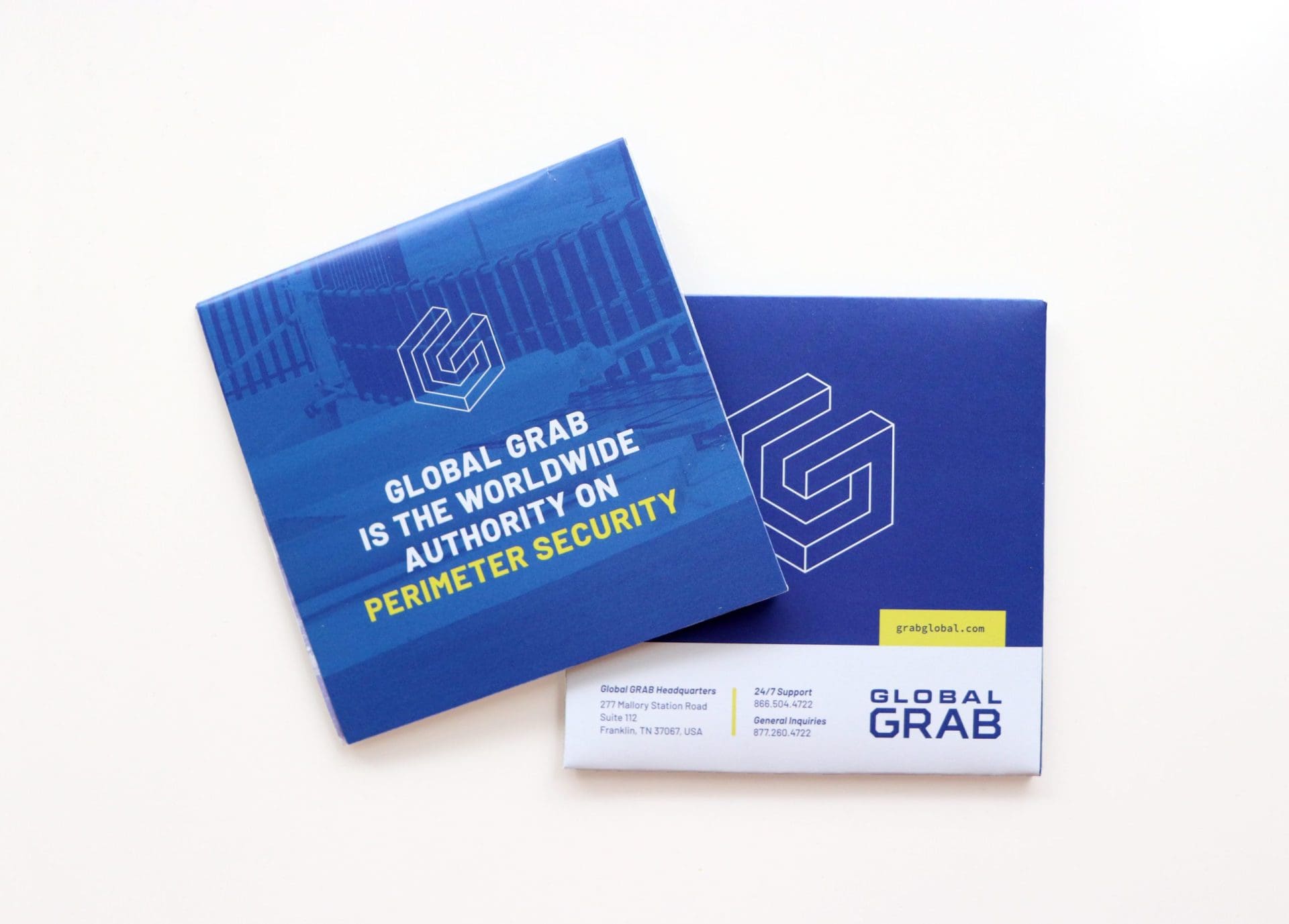
To begin, our team jumped into discovering the key attributes that set Global GRAB apart. From there, we defined a visual direction that allowed us to execute a new website and marketing collateral.

Corporate Brand Development: Project Kickoff

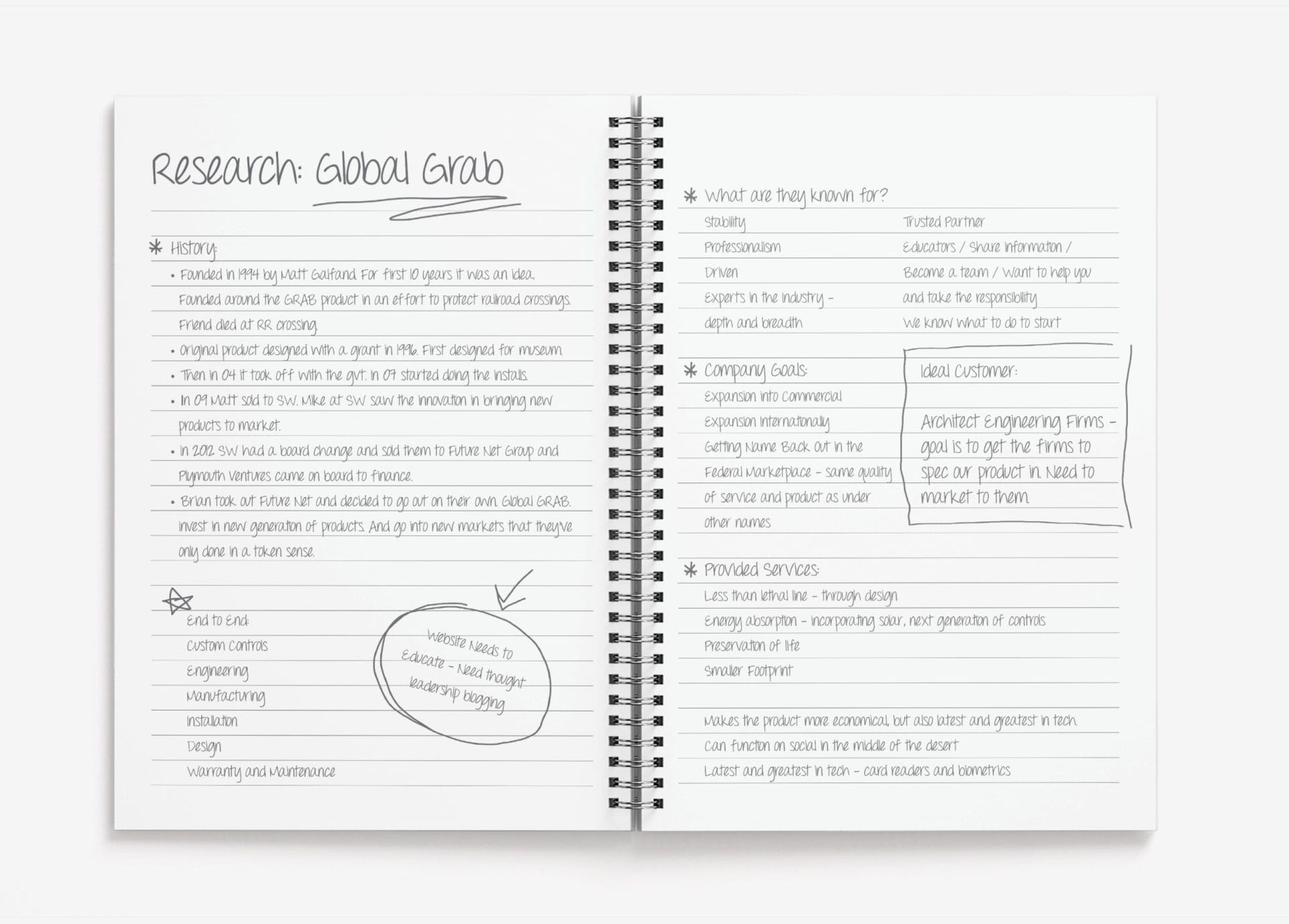
We started corporate brand development project with our Foundational Branding discovery session. This is where we met with about eight of their key team members and dug into everything we could about Global GRAB and their brand history.

We learned that they had been bought and sold many times and had various names throughout the years. Their past reputation hadn’t been so great within the industry, and they were working hard to turn that around. A rebrand and new website were important in their overall goal of rebuilding and redirecting the company.

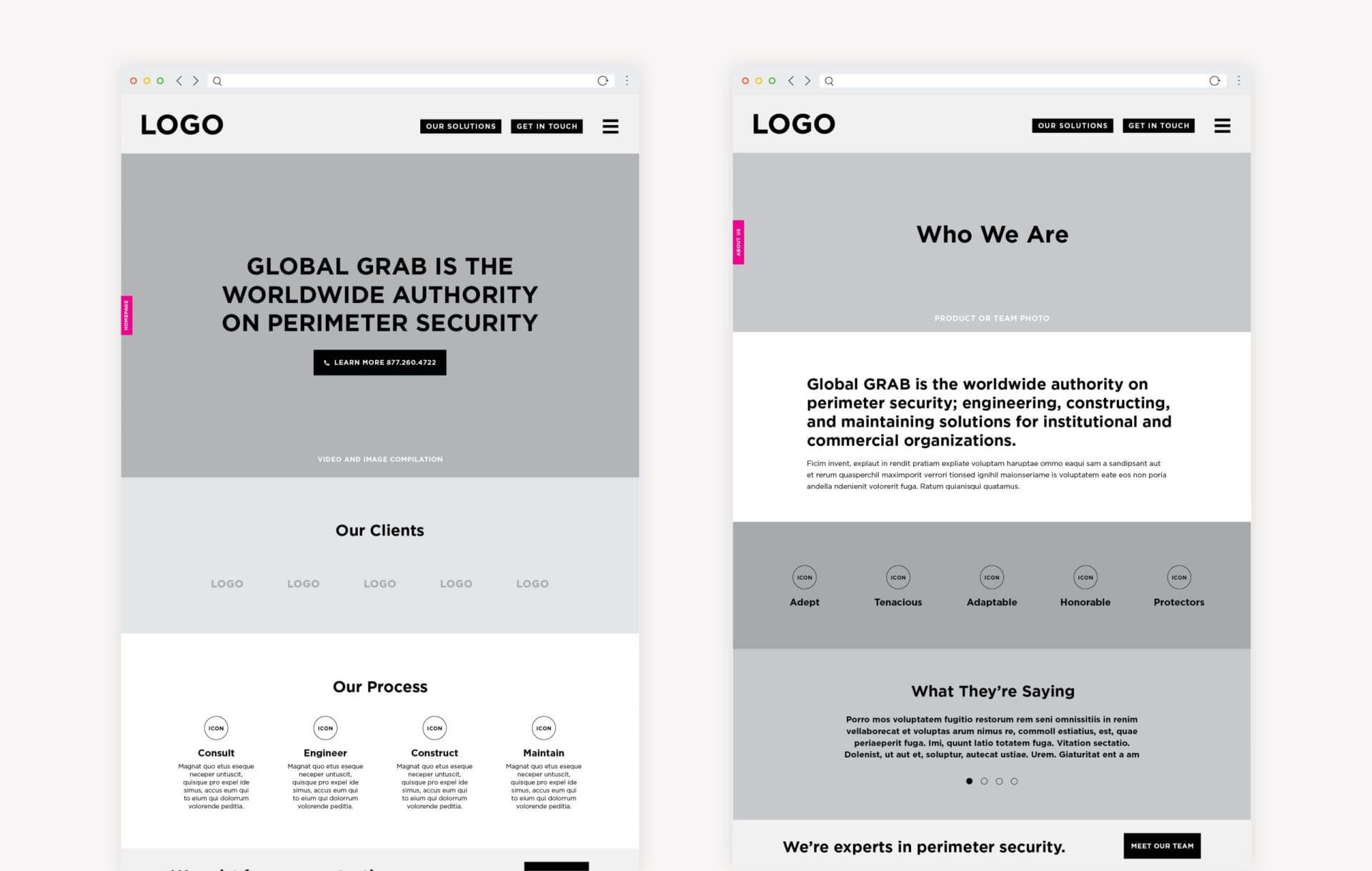
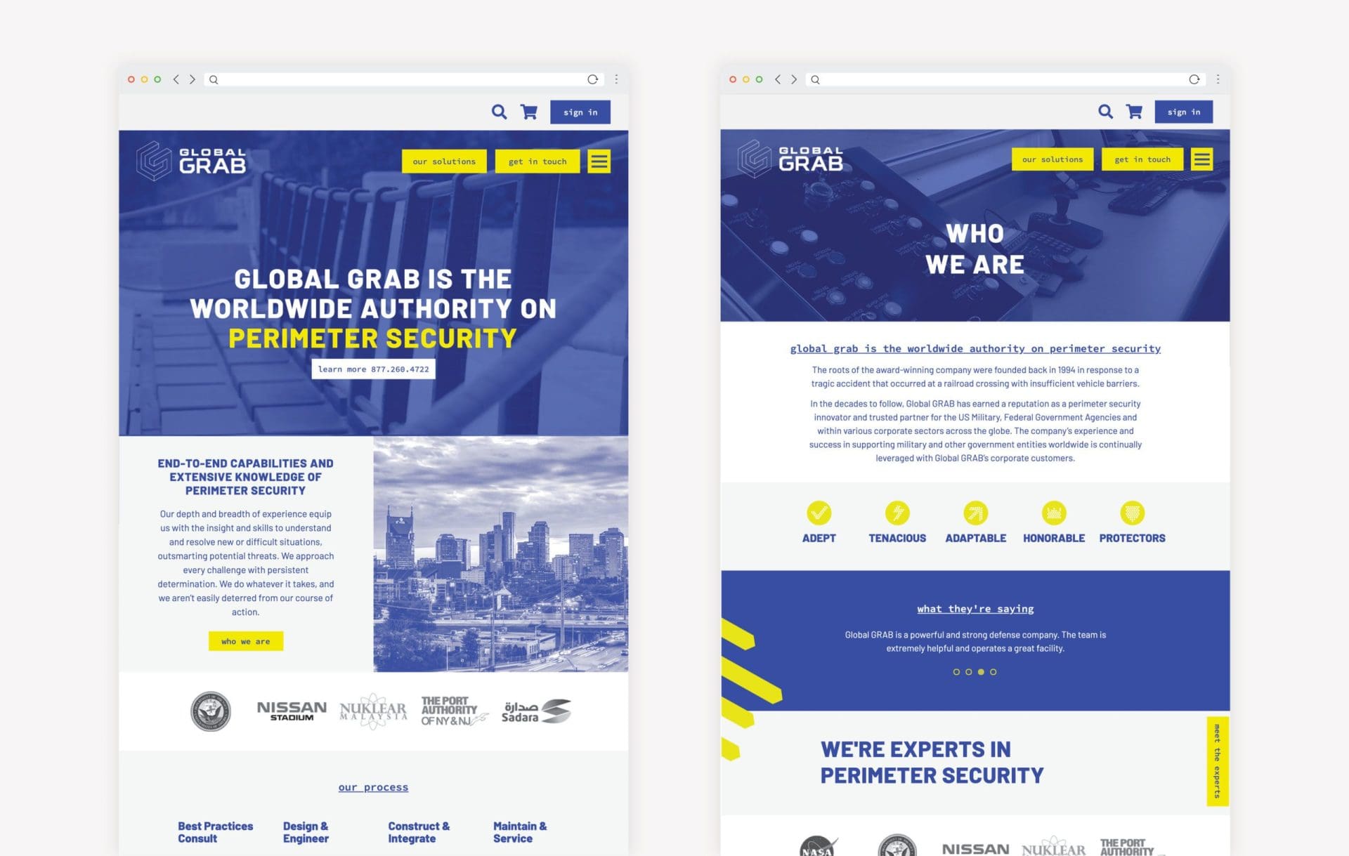
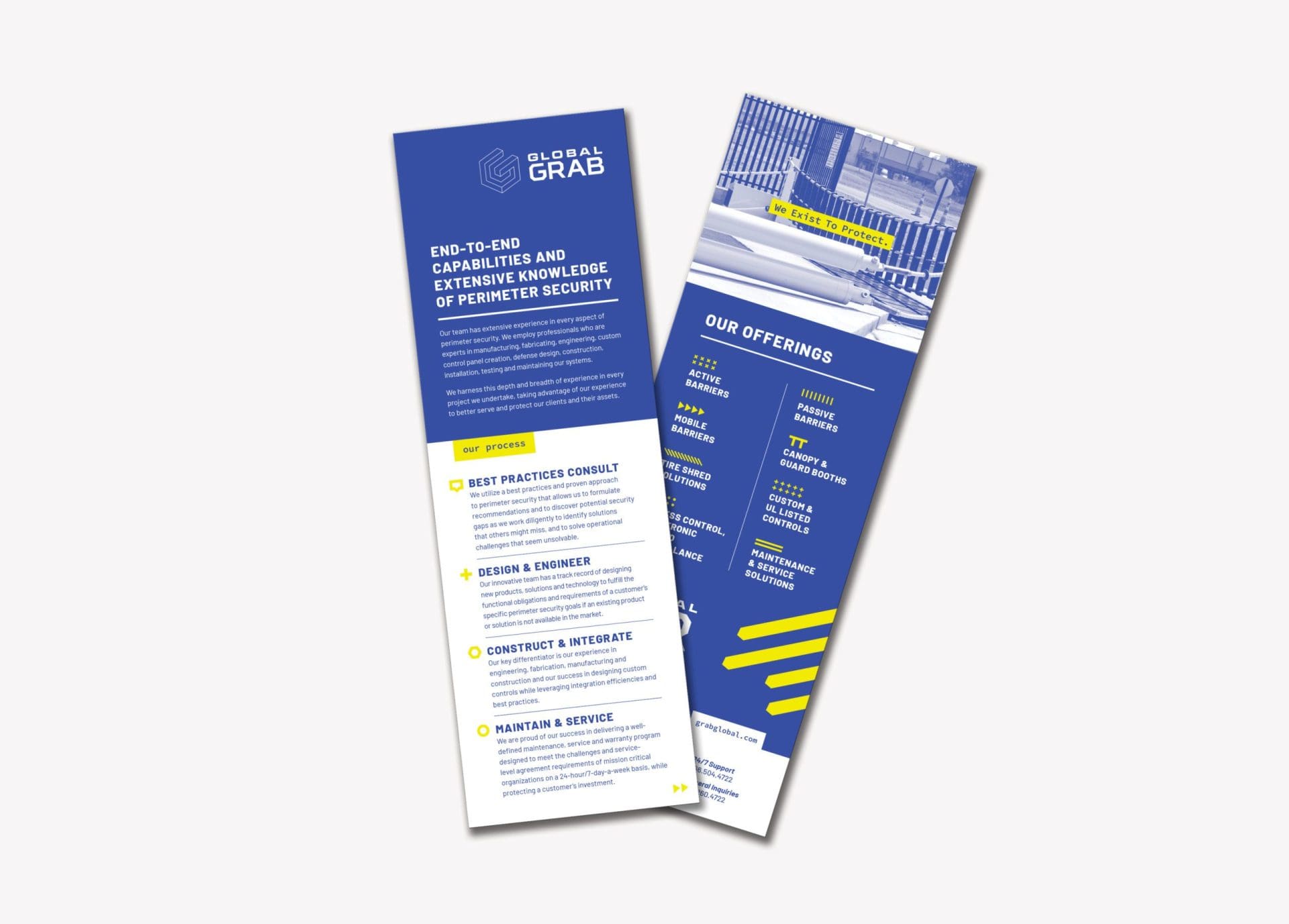
During our discovery session, we also learned that there were two sides of their business that held equal weight: end-to-end perimeter solutions and perimeter security products.

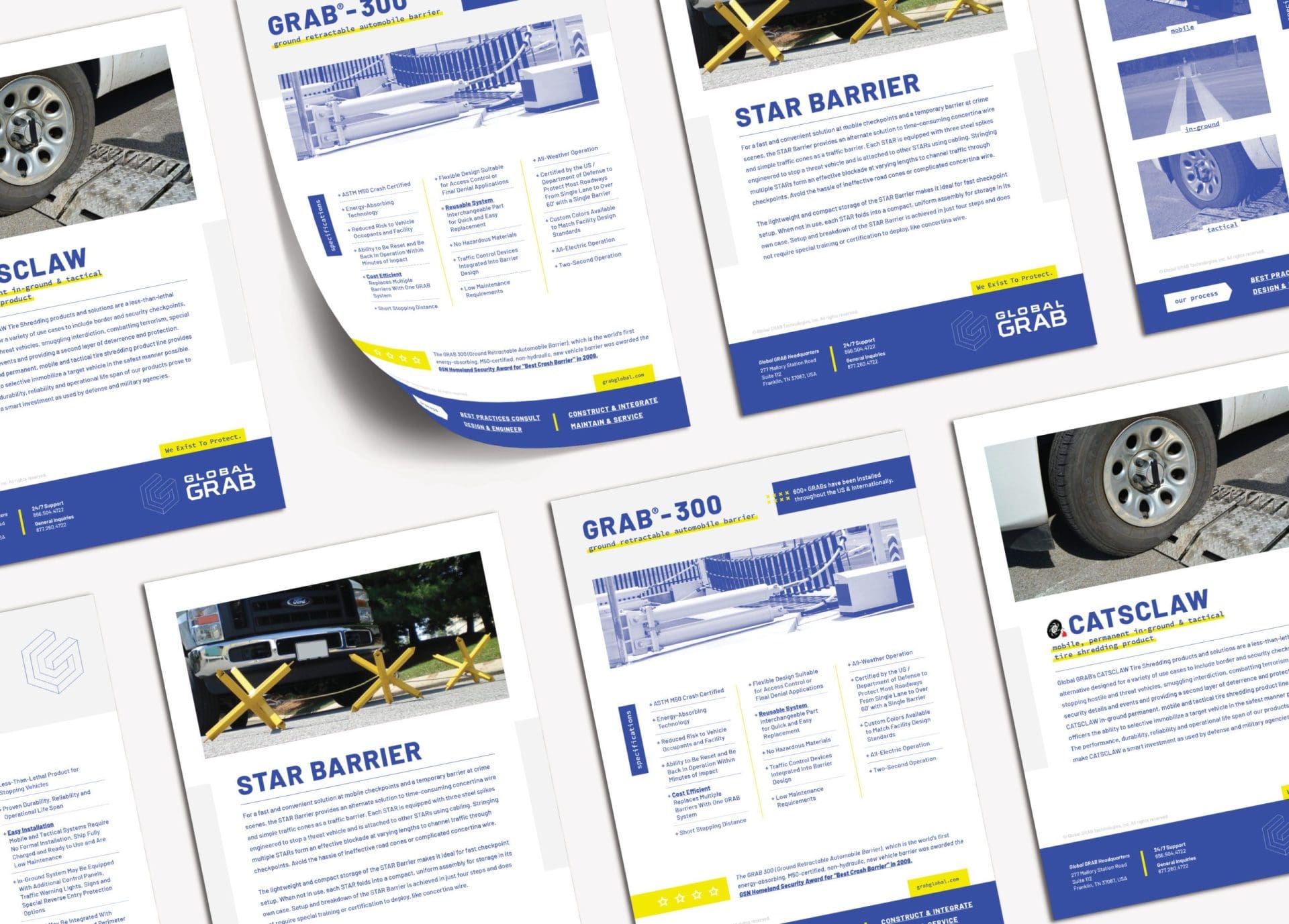
Their perimeter solutions process involves sitting down to talk with a company, finding out the need, and putting together a custom solution. They also offer perimeter security products such as fencing and wedges. Notably, they have two less-than-lethal active barrier products they’ve designed and patented called the GRAB-300 and GRAB-400.

It became clear that they needed to lead with both the perimeter solutions process and the perimeter security products because both were advantageous to their business model.

corporate company branding nashville

Positioning Statement

After we met with the key players at Global GRAB, we took all that we had learned from the session and crafted a brand positioning statement. The positioning statement serves as a cornerstone to any brand we develop. It is a one-liner that clearly defines what the company does, who they serve, and the value they provide.

We created the positioning statement: “Global GRAB is the worldwide authority on perimeter security; engineering, constructing, and maintaining solutions for federal and commercial organizations.”

It’s straightforward about what Global GRAB does and establishes them as a leader in the industry. We used this statement to guide all of the design, copy, and strategy moving forward.

corporate brand positioning statement

Descriptive Paragraph

The descriptive paragraph is an extension of the positioning statement. We used it to further expand on who Global GRAB is and what they offer. This paragraph can then be used on their website and marketing collateral.

corporate brand development agency

Brand Attributes

Brand attributes are a set of words that define who the company is and serve as a compass for brand direction. You can think of them not only as personality traits for a brand but also attributes that the company’s team members should reflect. This way, the company will become known for these key characteristics.

After talking with the team at Global GRAB, there were a few characteristics that stood out to us. First, many members of the team had military backing and had a strong urge to protect. They held true to their word and stayed committed to any challenge they faced. Another key characteristic was that they didn’t take a “one-size-fits-all” approach.

We took these descriptors and narrowed them down to key terms to describe Global GRAB. We chose the following words: adept, tenacious, adaptable, honorable protectors.

corporate brand attributes

Visual Direction

Using the brand attributes we defined, our team got to work on creating three different visual directions to show our client. Each of the options showcased the strengths of Global GRAB in different ways. Through color choice, design elements, and imagery, we were able to communicate the core of who they are.

Since they had a brand already in place, we also provided an option that complemented that brand. We were able to show how each of these design directions would translate to their website, promotional material, and marketing collateral.

The first option we presented for visual direction featured a modern blue color that conveyed a sense of depth, trust, loyalty, sincerity, wisdom, confidence, stability, and intelligence. We incorporated an orange accent element to bring a sense of energy to the design while also referencing caution and construction. We created custom icons and chose sans serif font to give a modern feel while communicating the boldness of the brand.

For the second visual direction, our team highlighted the intellect being leveraged for safety and protection. The bold, industrial font and design elements paralleled the protector nature of Global GRAB. We utilized pops of red to pique curiosity, interest, and parallel the powerful nature of the work performed by our client. We used concrete textures, and colors of black, gray, and white to indicate strength, power, and authority.

Finally, our third visual direction conveyed a sense of protection with an overall tone that was more dark and shadowed. The use of black demonstrated being unseen or hidden, but existing nonetheless. We incorporated yellow to represent caution and the action of stopping somebody in their tracks. To represent the adept nature of Global GRAB, we used a modern sans serif font, along with more industrial-tech and geometric design elements.

Presentation

Upon presentation, our client chose the first brand direction option but replaced the orange accent with yellow. While the blue anchor color helped establish a sense of trust and confidence, the yellow accent added an energizing element. We used this visual direction to further define Global GRAB’s new brand.

corporate brand board development

Logo Design Direction

Since Global GRAB already had a logo in place, we presented them with a refined version that would align with their chosen visual direction. Our designers fixed some structural issues with the old logo, updated the font base, and incorporated the brand’s updated color scheme. These small tweaks helped give the website and marketing materials a cohesive look.

corporate logo development
corporate brand business logo design
Global Grab - branding design

Sitemap Presentation and Website Hosting

Once our client approved the updated logo, we got to work on the website, which was a key component of the corporate brand development project. The first step was to create a sitemap. The sitemap is a key part of planning what pages will be represented on the final website and helps create the best user experience.

During this part of the process, we also discussed website hosting. We use WordPress to host the websites we work on. It’s simple to use but is a powerful platform that can handle businesses of all sizes. It also gives our team the flexibility to incorporate customized design elements that we create.

The Website Wireframe

After establishing a sitemap, we created the website wireframe. The wireframe is an important strategic piece in our website development process and helps lay the groundwork for the final site.

As we started the wireframe process, we were challenged to give equal weight to their process and products. We also wanted to show our client’s staff and culture in a new light.

Because of their past political issues within the organization, they didn’t have the best reputation in terms of getting new employees. We wanted to show that this was a new team, a good culture, and a strong company to work for and with.

We put their positioning statement in large font on their homepage. As you scroll down the page, their process and products are equal in hierarchy. We also showcased their clients and customer testimonials to build credibility and give context for the services they offer.

After we wireframed all of the pages, we walked our client through all of the pages we created. Once they gave their approval, we moved onto the design phase.

corporate website design

Corporate Brand Development: Website Design

The website design phase was straightforward since we had already established key brand elements. We took their selected visual direction and immersed that throughout the website build. We used bold colors and an intuitive interface that would lead customers through the site and seamlessly get them where they needed to be.

In addition, they were already working with the production studio Magnetic Dreams on videos to bring one of their products to life. We put one of these videos on the homepage behind the positioning statement to capture their customers’ attention right away and help them quickly identify what they do and how to connect.

corporate business branded website

Website Development

Our team spent the next weeks working hard to develop the website. We were able to bring the website design to life using clean code and responsive web development.

Once we put all of the design elements into place, we created a staging site. This staging site lets us perform internal testing to make sure everything works as it should. After we performed internal testing, we sent the staged URL to our client to test it and send it back with revisions. Then, we made revisions and did more internal testing until the website was ready to launch.

Our team spent the next weeks working hard to develop the website. We were able to bring the website design to life using clean code and responsive web development. Once we put all of the design elements into place, we created a staging site. This staging site lets us perform internal testing to make sure everything works as it should. After we performed internal testing, we sent the staged URL to our client to test it and send it back with revisions. Then, we made revisions and did more internal testing until the website was ready to launch.
Nashville graphic design agency

Website Launch

We launched the site and the Global GRAB team was excited to have a new presence, an updated look, and a firm foundation to continue to grow their business. The visual direction and copy clearly represented who they were. In addition, the overall site design gave their customers a seamless user experience as they navigated the website. The corporate brand development project was a success.

Marketing Materials

After the website launch, Global GRAB enrolled in a six month retainer with us for brand support because they had such a large number of marketing materials that needed to be updated and created. During this time we supported our client through consulting, strategy, graphic design, and copywriting.

Materials we created included a brochure, business cards, stationery package, rack card, and product sheets. We also designed a trade show set-up, attire, and promotional products for them.

We started by creating a brochure for Global GRAB. At the time, they were planning on going to a trade show and needed something that represented who they were and drew customers into the services and products they provide.

As we started to strategize, we decided that we wanted their perimeter security process and products to hold equal weight. We also included a letter from their CEO to add a level of personalization to the brochure.

Our team worked to infuse the new brand direction into all of the copy and design we created for this print collateral. We used thick cardstock paper so that it would feel sturdy and represent the protective nature of the brand.

The brochure folded in an interesting way to create more attention and intrigue. The result was a visually appealing piece that provided a summary of Global GRAB and established them as a trusted source for perimeter security solutions.

corporate brand brochure design
corporate branded brochure

We also created a rack card that showcased their process and products. Rack cards are cheaper to print than full brochures and can be a great cost-effective alternative.

The rack card we created for Global GRAB stayed on-brand with the overall visual direction they had chosen. We also utilized copy from the brochure we had already designed. Creating both the full brochure and rack card gave Global GRAB two different options to give potential customers, depending on the customer’s level of interest.

corporate brand material design

They also had existing product sheets for each of their products. However, they needed all of these redone to match their new brand and visual directions. Our team worked with Global GRAB to update each of those product sheets so they would represent the new branding and showcase their offerings. Because of our client’s market location, we also translated these product sheets to Arabic.

corporate brand material design

To further support Global GRAB’s marketing initiatives, we created a trade show booth for them. At the time, they were planning on going to a trade show and needed a new booth design that reflected their new brand.

We worked with our client to determine the types of attendees who would be there and the best way to showcase their new brand to entice potential customers to stop at their booth. Our goal was to create an eye catching design that clearly represented who Global GRAB was and the services they provided.

The final trade show booth design boldly displayed the new logo and their services offered. We placed TVs throughout the booth to showcase our clients products. In the design, we also highlighted that they were named one of the “Best 50 Companies to Watch.”

corporate tradeshow booth design agency

Business Card

We created business cards for the team members at Global GRAB to incorporate the new logo and design direction. On one side, the card displays the updated logo with the slogan “We Exist to Protect.” The other side of the card clearly displays the team member’s contact information.

corporate brand business cards

Stationary Package Development

Along with the business cards, we developed a stationary package to capture Global GRAB’s new visual direction. We used the brand’s modern blue color for the logo so it would stand out against the white paper. Pops of yellow color added an energizing and modern element to the design.

corporate stationery development

Project Closeout

Since creating a new website and marketing collateral, and completing the corporate brand development project, we have entered into an ongoing marketing agreement with Global GRAB. Under this agreement, we lead and direct their marketing efforts, fulfill them, and report on their performance. This includes assisting with their social media, digital marketing, and content marketing.

Ready for a Nice Brand?

At Nice Branding Agency, we build connective, impactful, bold brands that position businesses to conquer their market through creative ingenuity and deep strategic thinking. Our team provides positioning, foundational verbiage, visual direction, graphic design, marketing strategy, and beyond.

If you’re ready to take your brand to the next level through corporate brand development, we’d love to talk! Give us a call at 615.905.9936 or contact us here.

Be sure to follow us on LinkedIn and Instagram for inspiration and tips on branding and marketing.

are you ready to create something nice?