Restaurant Branding Project Kickoff
We kicked off the restaurant branding project by obtaining a creative brief. The brief ensures that our team has a firm understanding of the goals of the project. It also communicates key information about the target market and the competitive landscape of the restaurant’s region.
From the brief, we learned that this would be the first of many Tikka N’ Curry restaurants. We also found that the restaurant would be located in The Loop district of Chicago. It would serve professionals hurrying to grab a bite between meetings during their busy workday.
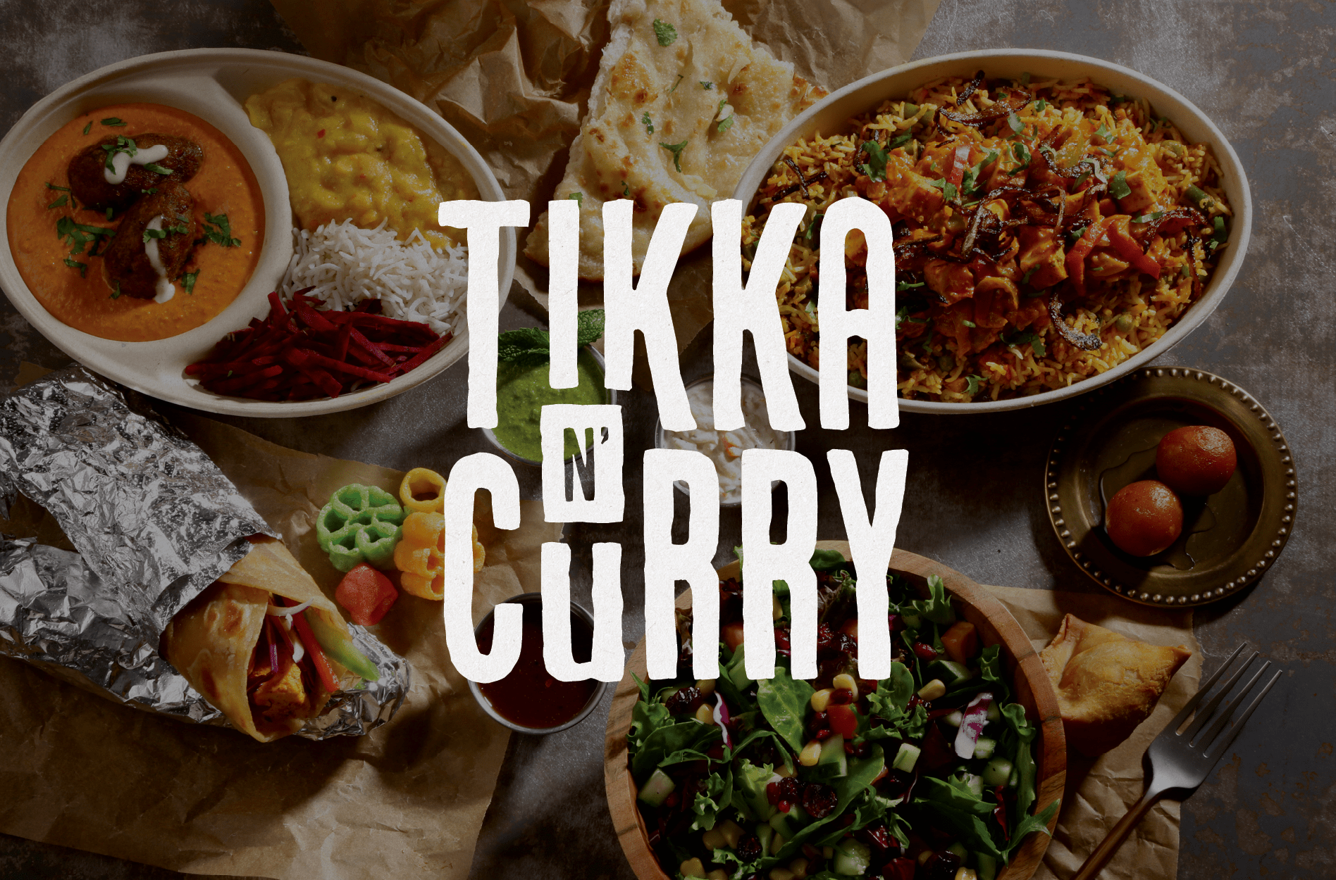
The fast-casual Indian restaurant would feature a live tava and a build-your-own bowl concept. The setup would be somewhat similar to the Chipotle customer experience. This, paired with the commitment to a modern take on savory Indian cuisine, is what would set Tikka N’ Curry apart from the other eateries in the area.
Armed with information, we created a strategy for the brand. The deliverables for the Prime Restaurant Branding Package would include one final logo design, business card design, menu design, and website design.
Logo Design Direction Brainstorm
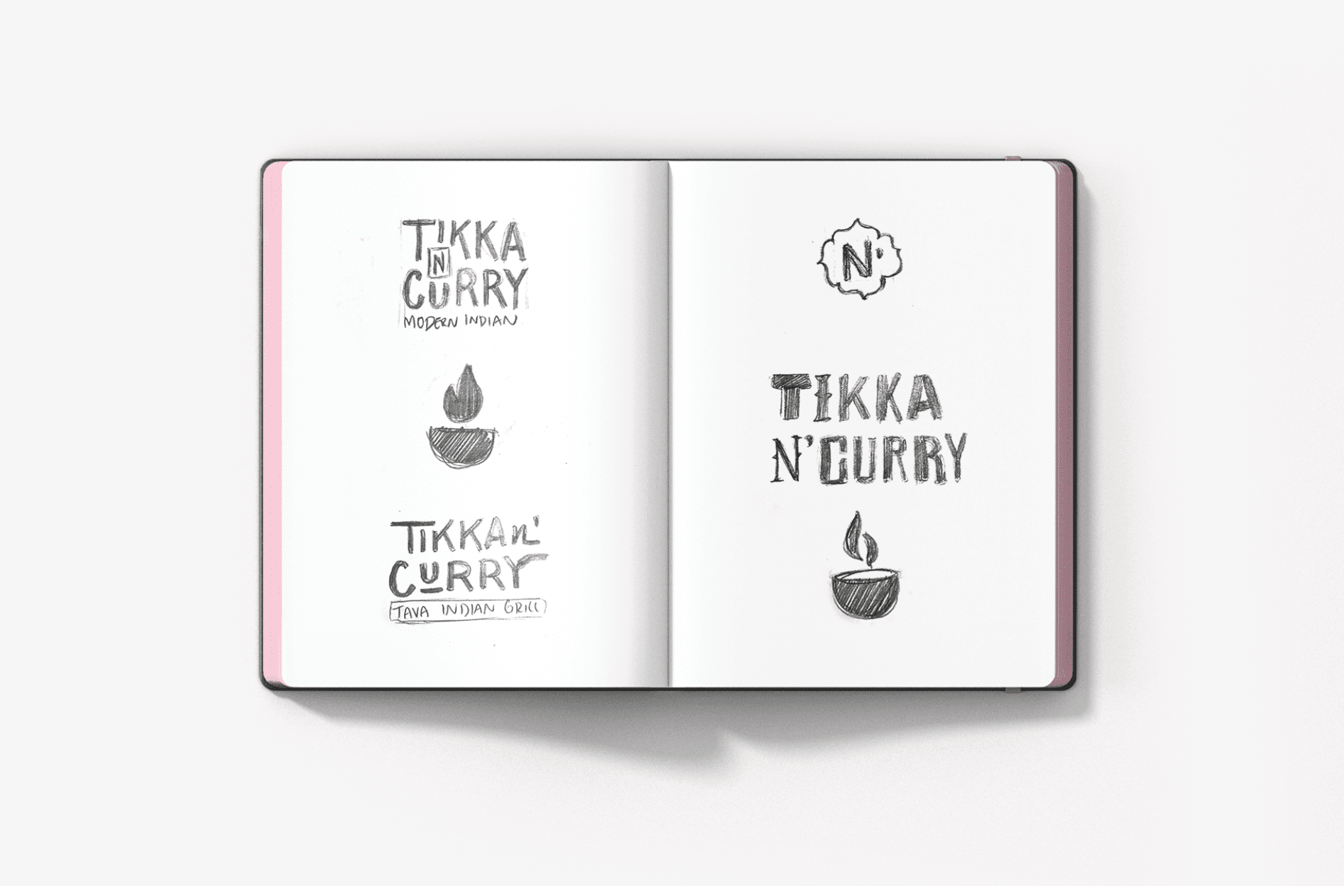
Based on the information about the concept, we created several sketches in order to determine a viable direction for the logo design.
Finalization of Conceptualization
Our Creative Director and Director of Design reviewed the options thoroughly and determine that we would move forward with the illustrative tava, the mismatched font option, and the clean and modern type option.
Restaurant Branding Package: Logo Design Options
For Tikka N’ Curry, we created restaurant logo options that incorporated the warm vibrancy of the cuisine and culture. We also worked to bring into the logo design a sense of interest that would parallel the uniqueness of the concept.
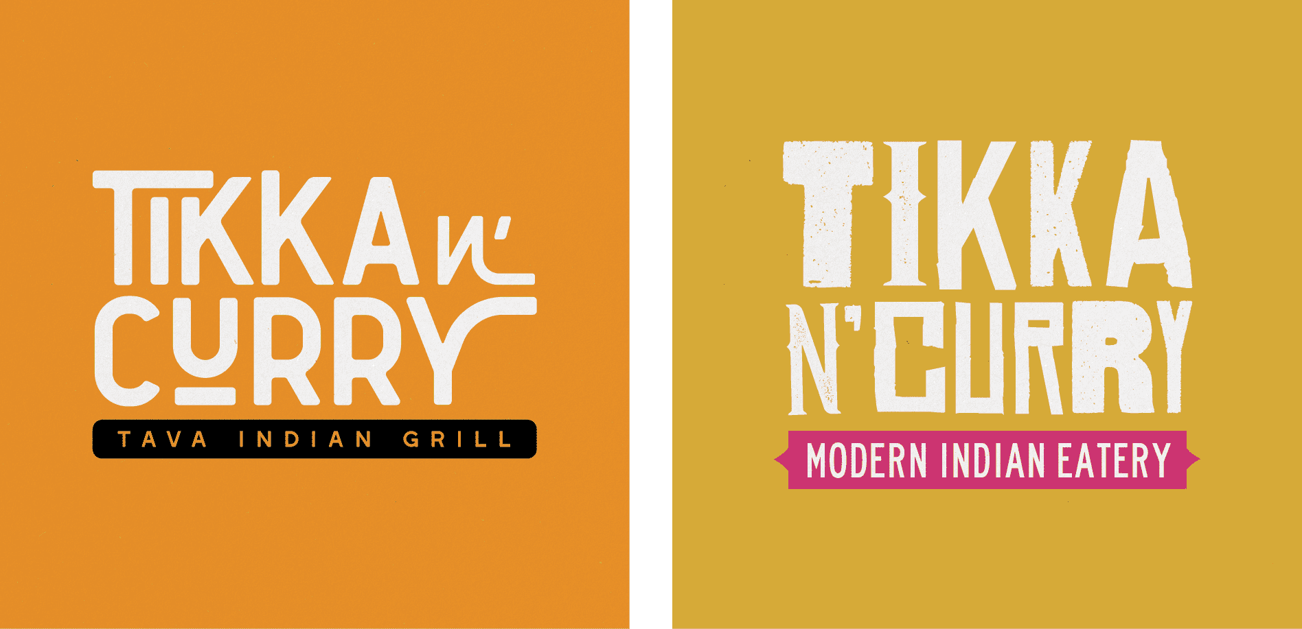
The first fast-casual logo option included a distressed font comprised of mismatched letters. The eclectic nature of the font mirrored the variety of food items available at the restaurant and provided an Indian street-food vibe. A warm yellow hue was paired with a modern pink and grounded with an off-white tone.
The second option was a modern take on an Indian restaurant logo design. This clean type-based logo elongated parts of the font to create movement that aligns with the fast-casual nature of the restaurant. A tagline was incorporated under the type to indicate the differentiator; the live tava.
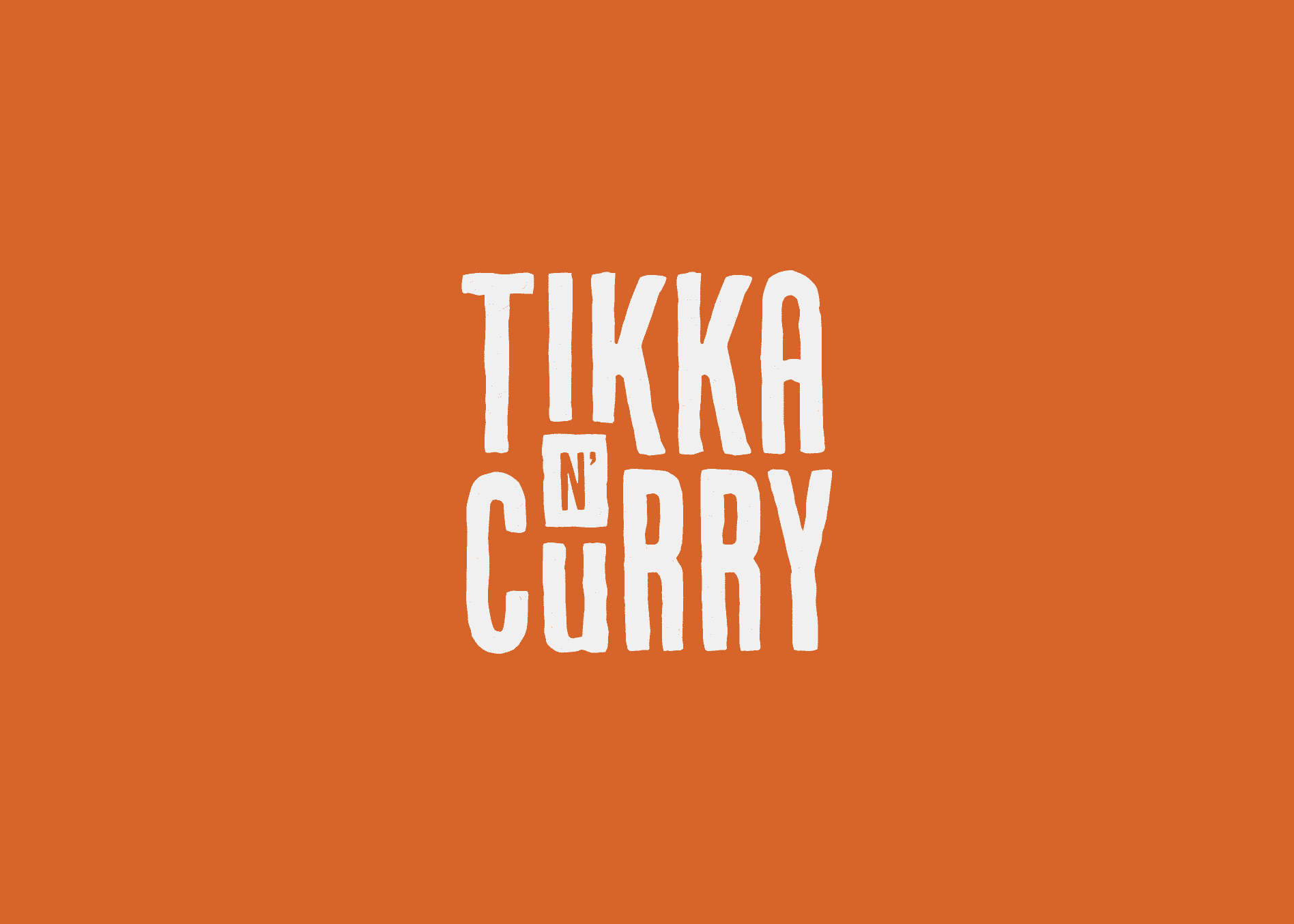
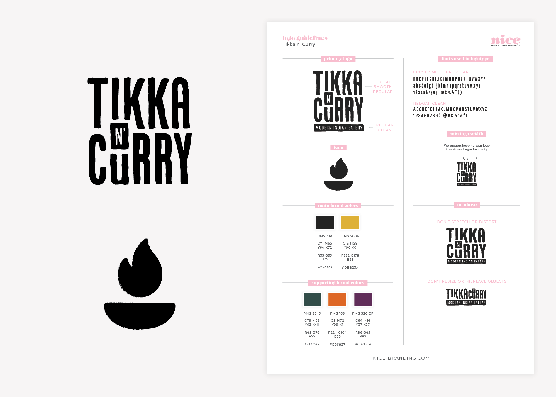
The third logo option was a typographic design, paired with a rough-edged live tava icon. We loved the typographic lockup, but we wanted to ensure that the restaurant had a social media icon and a mark that could be used in an application where the full logo wouldn’t work. This was achieved with the illustrative icon.
Logo Presentation and Selection
Upon presentation, our clients selected the third logo option. They loved the rough, hand-drawn nature of the type and icon. They also were drawn to the mark because it would afford them the opportunity to use the icon heavily on social media.
Logo Finalization
During the finalization process, our Director of Design perfected the logo design and selected exact colors in PMS, CMYK, RGB, and HEX codes.
Logo files were then created in JPEG, PNG, EPS, and PDF and shared with our client in black, white, and full color. We also provided the files for the icon. Additionally, we created logo guidelines to help the client maintain the integrity of the logo and brand. The guidelines included fonts, color codes, and logo usage recommendations.
Menu Design
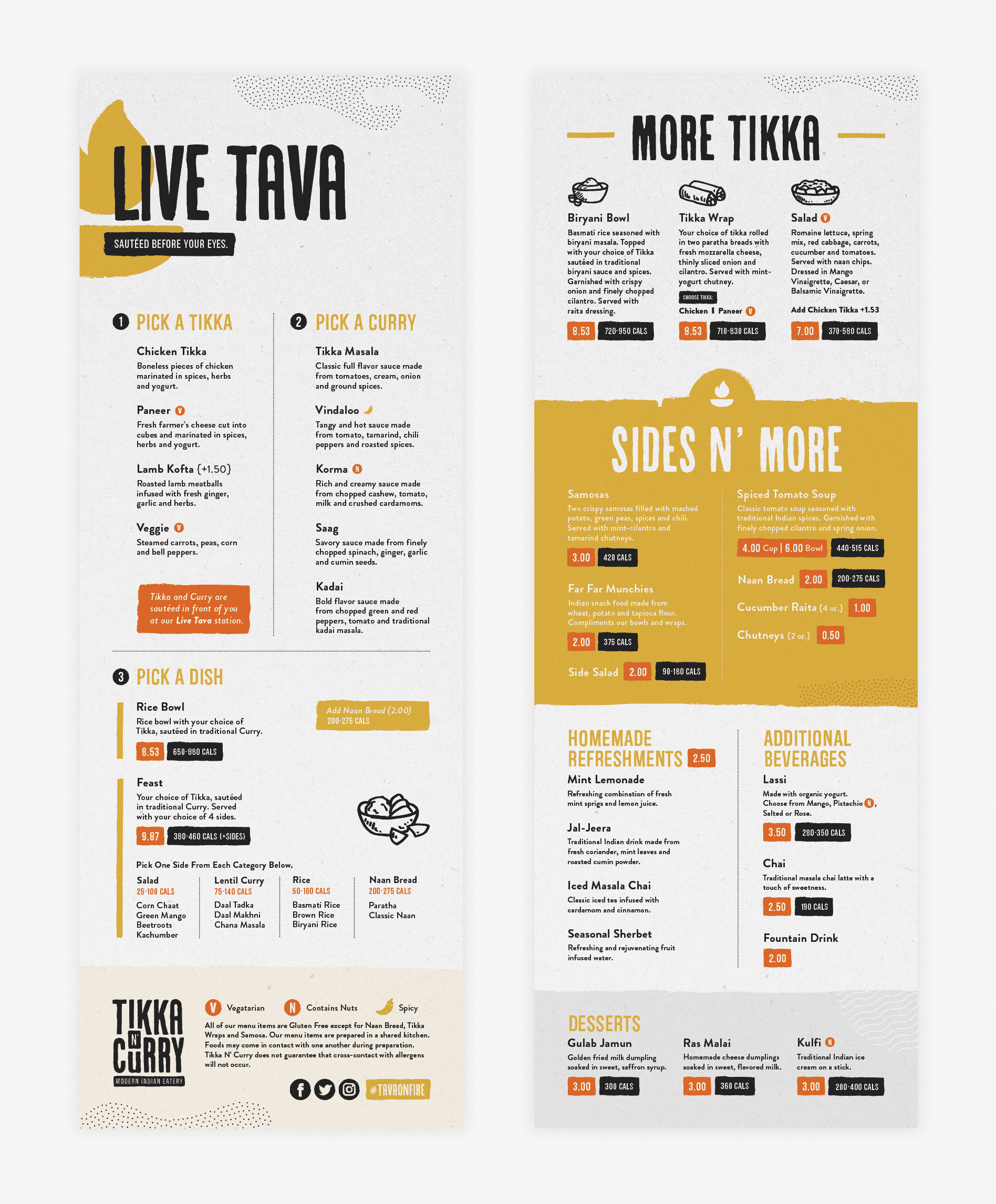
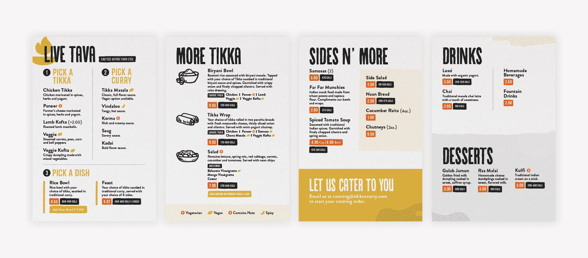
Next up in the Restaurant Branding Package, we created a restaurant menu design for Tikka N’ Curry. The dine-in menu incorporated the corresponding logo elements and color scheme. However, we also supplemented the designs with additional brand elements, including hand-drawn illustrations and graphic patterns.
Attention was drawn to the live tava differentiator and this offering claimed one entire side of the menu.
The customer experience for the live tava station was laid out in a step-by-step manner. This process-driven menu design format was implemented to guide the customer through the ordering process.
If people find it simple to compile their order, they are more likely to come back.
The flip-side of the fast-casual menu design was allocated to items available for order outside of the tava station. These included more traditional dishes that were pre-prepped to make for a quick serve.
Website Hosting and Sitemap
Before beginning the website design, we created a sitemap to ensure that we covered all bases during the creation of the website. For this project, we knew that we would be creating a single page of unique design. So, we took inventory of what information would need to be presented on the website, in order to ensure that the wireframe would be inclusive of the necessary details. We also noted where we would need to allow for external links for delivery or loyalty programs. This list of information became our website sitemap.
We also discussed hosting with our client. We offer website hosting for WordPress websites that we have built so that we can do regular maintenance, daily backups, and keep everything functioning as intended.
Restaurant Branding Package: Website Wireframe
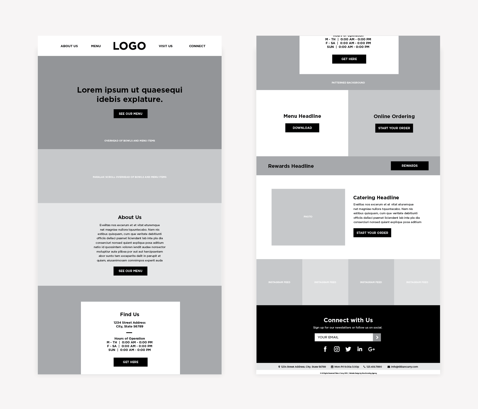
With a good grasp on what would need to be included in the website, we moved into the creation of a website wireframe. The wireframe acts as the blueprint for the website, allowing us to outline the elements on a page before implementing any design.
We took a user-first perspective and walked through the website to prioritize the client’s goals for the website: online ordering and menu views. We called for photography of food being placed against compelling headlines and restaurant verbiage to draw the user in. Clear calls-to-action followed at every scroll nudging the user to take the desired action to meet the client’s goals.
Our team presented the wireframes to the client over a virtual call, sharing our screen to walk the client through the plan for the restaurant website. We allow one round of revisions to finalize the website wireframe before moving to the website design phase.
Website Design
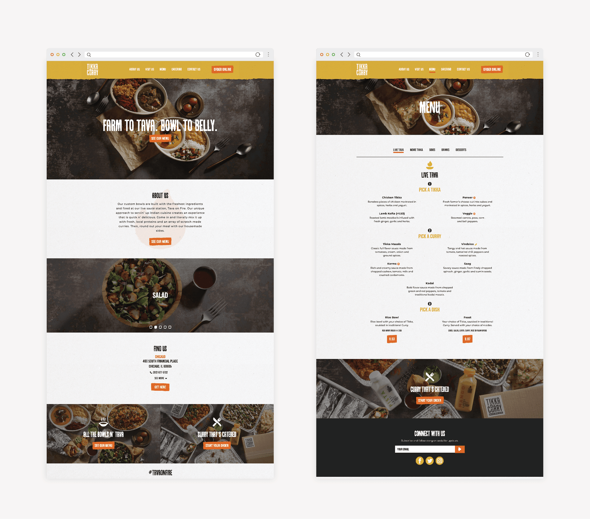
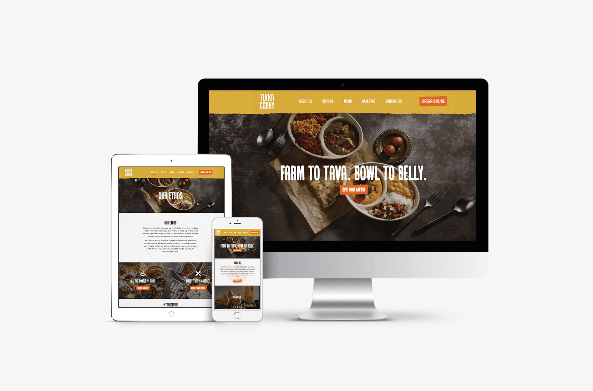
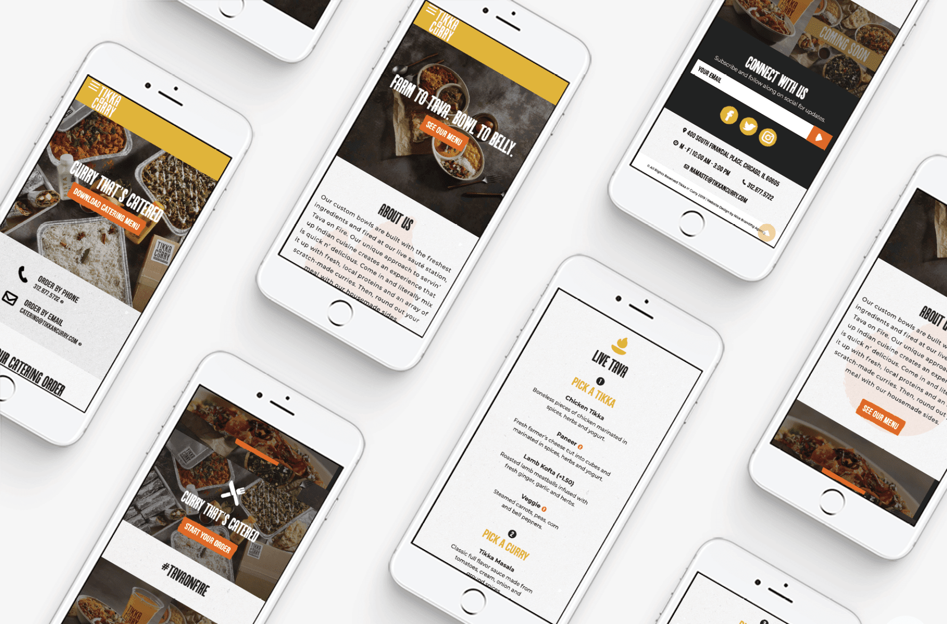
During the website design phase of the restaurant branding project, we created the visual design for the website. We implemented brand fonts and brand colors, the client’s professional food photography, and patterns and illustrations that further conveyed the brand.
The approved website design incorporated warm, vibrant colors indicative of the savory nature of the cuisine. Illustration-style fonts were incorporated to further convey the welcoming vibe of the brand. And color floods were brought in with a brushstroke effect to align with the overall visual direction.
Website Development
After the website design was finalized and approved by the client, we moved into the development stage to build out the website. This is the phase where the site becomes fully functional on a staged environment.
We choose to custom-develop our websites on WordPress in order to ensure an optimal user-experience while implementing clean code and proper heading structure.
When the site is fully built, we undergo extensive testing to ensure that every link is working correctly, content is populating properly, and any forms on the site are functioning as intended.
Once everything passes the test, we are ready for launch.
Website Launch
Typically, we launch sites we develop, but our client wanted to launch this one, so we provided all of the final website files and a backup so he could bring the site live on his own.
Prime Restaurant Branding Project Closeout
Upon approval of all of the initial proofs, our team finalized the selections by providing logo files and guidelines, icon files, print files for the menu and more.
Environmental Graphic Design
In addition to the Prime Restaurant Branding Package we created for Tikka N’ Curry, we also worked on environmental graphic design for the interior of the Indian restaurant.
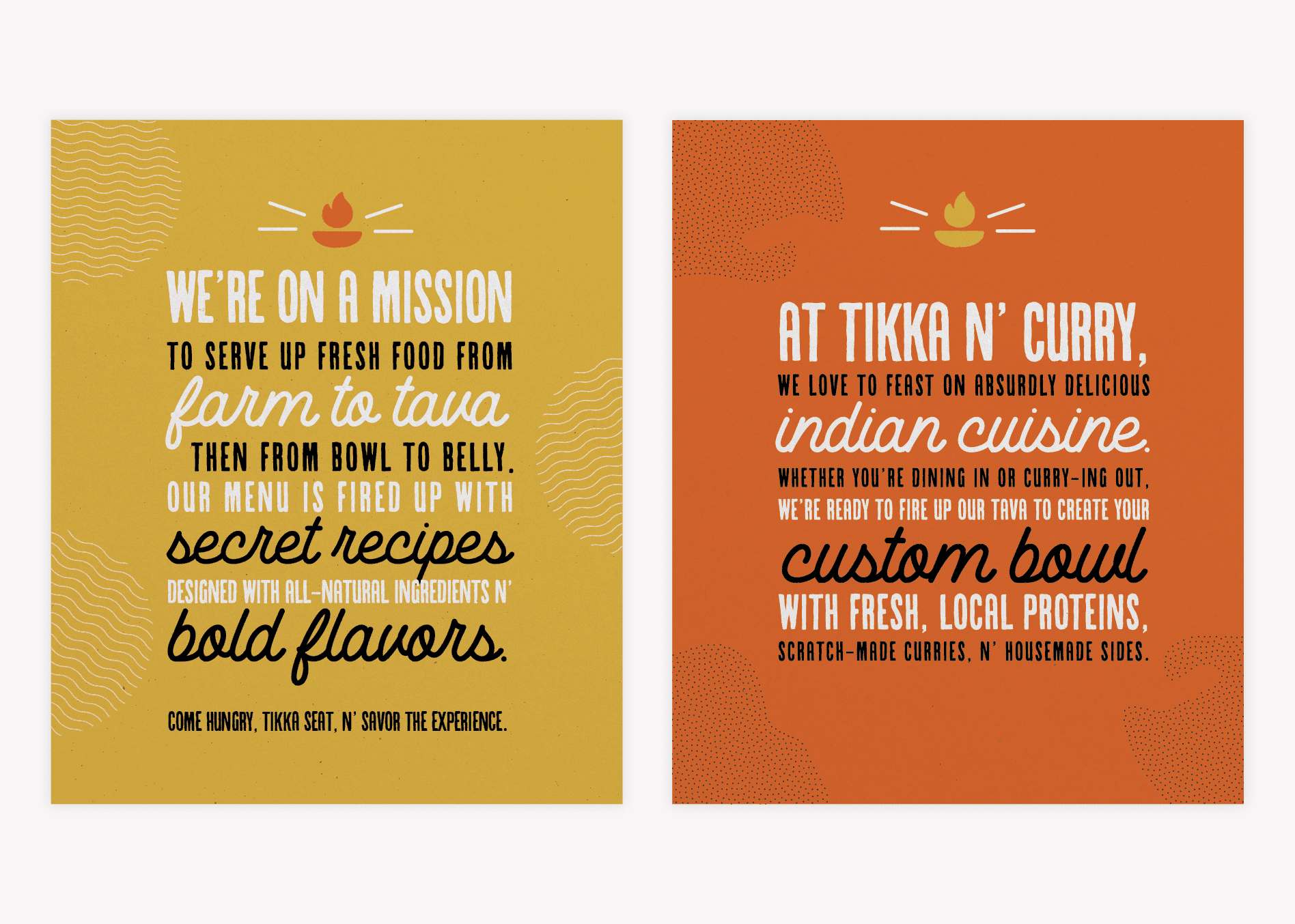
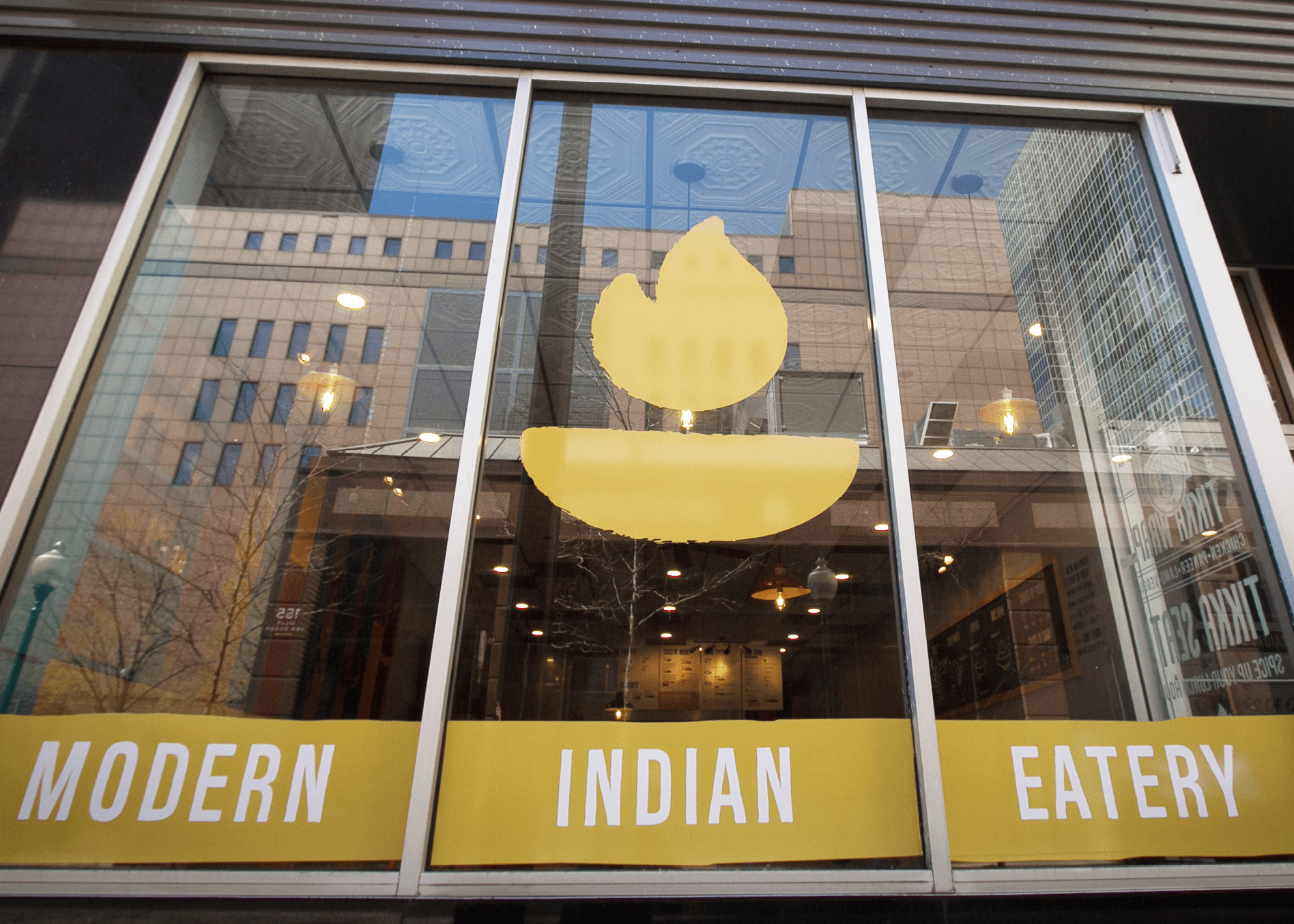
Here, we created window graphics and wall murals that would allow people to understand the Tikka N’ Curry ethos. We also created a menu board design based on the handheld menu but optimized for a menu board installation.
The branded graphics throughout the restaurant would create a cohesive and memorable experience for customers. Environmental graphic design is key in helping customers feel the brand as they walk up to and step into the restaurant.
Social Pack
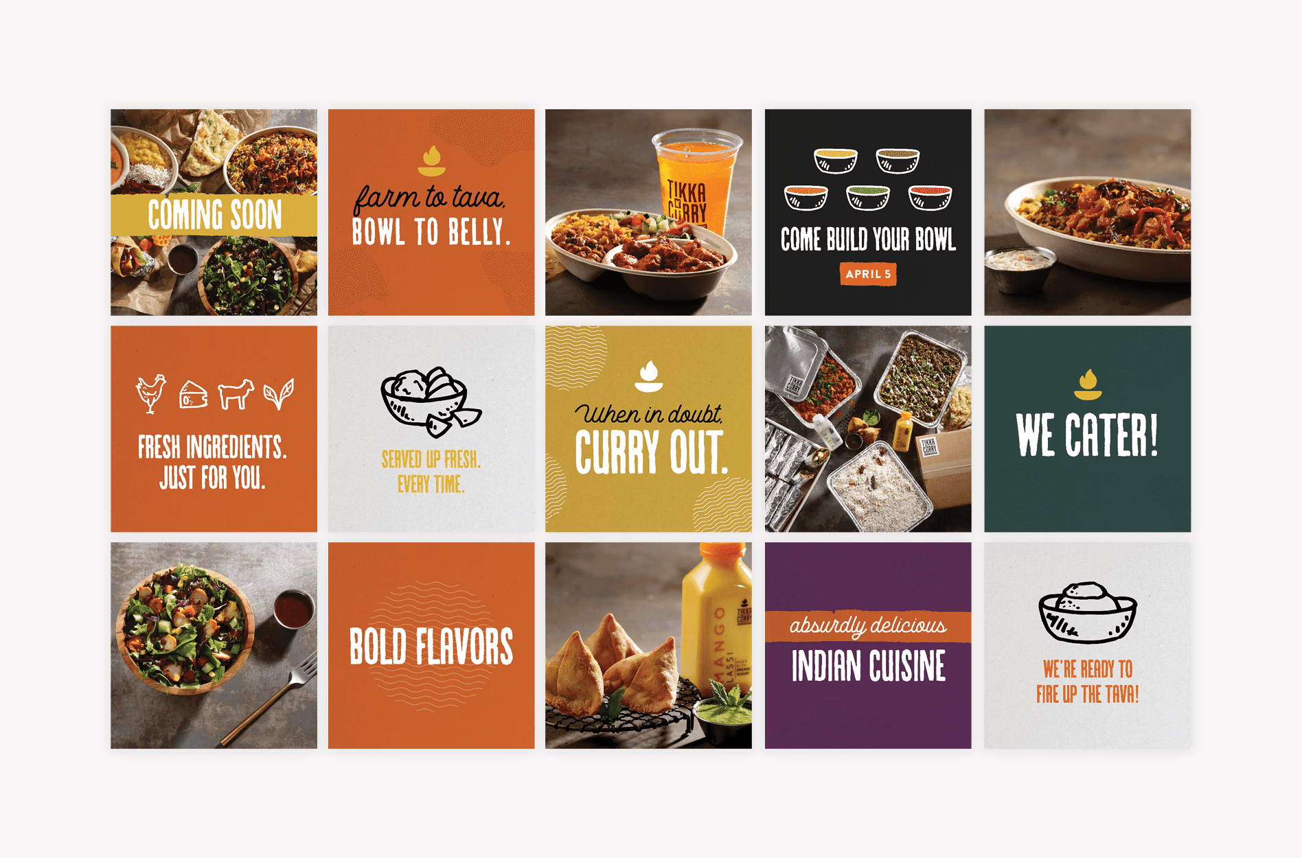
Finally, we equipped Tikka N’ Curry with a Social Pack to populate their social media pages leading up to the opening. The Social Pack includes 15 social media posts with captions and a set of 15 hashtags.
The purpose of the Social Pack was to provide the restaurant with social graphics and captions that would help keep the brand intact as their feed became flooded with influencer posts and in-the-moment captures.
The interest Tikka N’ Curry garnered as they launched their restaurant was truly astounding. People flocked to the food and connected with the brand.
With a strong start, a restaurant brand can continue to grow in followers and repeat customers, as long as they’re diligent about keeping the elements intact.
Ready for a Bold Brand?
If you’re interested in upping your restaurant branding game, or you’re ready to launch a new restaurant and need an assist with the basics, curry over to our restaurant branding page and review our restaurant branding packages. Then head over to our contact page and give us a shout.
