As I walk around downtown Franklin and drive throughout Nashville, I find myself endlessly critiquing logos and various branding pieces of different businesses. All too often I'm saddened to see so many start-up companies with slim budgets that place their corporate branding at the end of their to-do list. Unfortunately, this results in a cheap, unthoughtful, last-minute logo with little to no meaning or relevance. It's such a bad situation because a logo is something that remains with your business for a long time and defines the look of your company to so many.
I can't tell you how many of our clients have been leery to invest in their brand, but after they take the risk, they are blown away by the results and say they are happy to write the check. These people are the smart ones, folks. Take note.
Also, let's just put this on the table before going any further. If you even think to mention 99logos.com or any similar services in our presence, you're putting a quarter in the swear jar and we are confiscating your computer — effective immediately.
Creating a compelling, unique, and timeless logo at the onset of your business is both time and money well spent. It's just as important as buying the software, renting the space, or hiring the help. Invest in a professional with a branding business staffed with exceptional graphic designers, and let them do their job. Don't pay them to create a brand for your business and then micromanage them. Let them do what they are good at and you go off and do what you are good at. A good branding agency creates a mark that looks nice. A great branding agency creates a mark that has meaning that backs the history, foundation, values, practices, and services of your business. If the branding agency you choose to create your logo doesn't ask questions about who you are before they start the logo development process, you better run... and run fast, right to the door of
Nice Branding Agency. That other branding agency will probably create something simple. It'll probably have one or two colors. It won't be shiny or contain shadows or gradients. Remember, your logo needs to last 10 to 15 years, so it shouldn't be trendy or contain elements that are stylish now, or it runs the risk of be dated within a few years. Below are a few key points to ensure that your new logo design is not only attractive, but timeless.
1. Style and Design in Logo Design
The main goal of your logo is recognizability: think
McDonald's,
Starbucks, or
Publix. Of course, it will take a few years to get that type of status, but the key here is to keep it simple and concise. Normally, if you're going for an iconic status, you should have an icon that is paired with a typographic element. You'll run with this complete logo for a while, at which point you will eventually be able to display your icon without the typographic element and people will recognize it. No gradients. No shadows. No embossing. Keep it to one or two fonts and normally no more than three colors unless the circumstances call for color! Fonts — oh yeah. Let's do one serif and one sans serif if you are mixing it up. Don't go trendy. A logo needs to last, and if it's a trendy design it's not going to stand the test of time, unless you plan to repeat the logo development process in a year or two. Keep in mind, this is obviously circumstantial and sometimes these rules may not all apply.
The design of your logo needs to encompass various traits of your business in a strategic, single mark. Talk about a challenge! Here's the deal. Don't put the state of Tennessee in your logo just because you do business in Tennessee. Don't put an outline of the county you do business in within your
logo design. People will find you without that directional feature — trust us. The design must go deeper. It's gotta be given a lot of thought, but first, the company you hire to do the design must ask questions and do research. I'm guessing you don't want someone to design a mark that is supposed to represent your company for 10 years or more without knowing a good bit about you. The final design should incorporate what you do or who you are as a business in a compelling and interesting manner. A manner that probably won't be able to always be recognized by every viewer, but once explained, will be nothing short of many well deserved
ohhs and
ahhs.
The style of your logo is really so much larger than just the initial mark that is created. A logo is a
piece of your brand. Nine times out of ten, your logo will take up one-fourth, or less, of the piece that it is on. The other three-quarters should help support the brand image. This is where a good branding agency will create supporting elements that bring in those gradients, shiny elements, and shadows, and display your brand personality. Normally, this is where your logo will come alive, so keep that in mind when reviewing logo comps.
Font selection can easily make or break your new logo. Always keep in mind that the cool and edgy font that you love today may very well be the reason that you despise your logo in a few years. In addition, simplicity in font choice is important for scaling purposes. Your logo should appear clear at the size necessary to display it on a billboard or the size necessary to display it on a quarter. If you choose intricate, detailed, decorative fonts, your chances for clarity are slim to none. As stated previously, keep it to one or two fonts, and if you are using two different font faces, use a
serif and a
san serif. Just remember that the more elaborate and decorative the font, the sooner it will likely become outdated. You must also consider the various uses for your logo. If it's going on a truck or being embroidered on a shirt, a bit more simplicity may be required during the steps of logo development.
So, back to selection. Let's not choose a font that everyone else uses. Make it unique. It's quite interesting to many that big brands are having font faces developed specifically for just their brand. Go big or go home. If you're destined to be a monarch, having a custom font-face built might be something you want to think about.
Also, you gotta pay to play. If you find a font you want to use in your logo, make sure that you have the rights to use that font. Some fonts are free but some are not. Check your sources and make certain that your branding company has done their due diligence to get proper
font licensing for your brand.
First round, you may be presented with black-and-white logo options. This allows you to focus on the structure, build, and design of the logo. Once you've nailed down the design, color will be implemented. This prevents you from discarding a great logo due to the fact that it utilizes puke brown as the main color and, quite frankly, that's just not a color you're ready to embrace. When you start selecting a color palette, it is very important to understand that the colors on your logo should be incorporated into every aspect of your brand, so if you can't fathom wearing the chosen color every day of the week or painting one of the walls in your office that color, it's advised you take a different route.
You're not allowed to base your logo on your daughter's favorite color or your favorite sports team — and that's final. Choose color based on color meaning. You want the colors to evoke the feelings you want your customers to have when they view your logo. If your business is serious, choose serious colors. If it's fun, choose vibrant and bright colors. You get only a few colors, standardly two to three, so choose wisely. Those colors are gonna be with you for a while. Once again, hire a professional, with a company, not with a computer at a coffee shop. Once you find your team, listen to them. They know more about this stuff than you do.
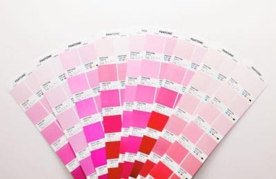
Each color that is chosen needs to have a corresponding
Pantone color, and your branding agency should provide you with the PMS build. In addition, make sure you are provided CMYK builds, RGB builds, and the web build. In addition, you should receive multiple setups of your final logo in various
file formats. This should equip you with what you need to showcase your logo initially and in the future days of success. Once you get these logo and branding details, keep them in a safe place for future reference. We suggest a gun safe if Fort Knox is unavailable.
All in all, a new business logo can be very powerful when the proper creative elements are in place, but it's easy to go astray. It's important to give your new logo the thought and attention it deserves, but it is equally important to not overthink it. Instead of using a logo that you created on a napkin at 2 a.m., find a reputable and experienced branding agency, built by excellent graphic designers, who will first listen and then create. Nice Branding Agency is the firm we recommend! This will make all the difference in the world as to how your business is perceived, ultimately creating attraction.


