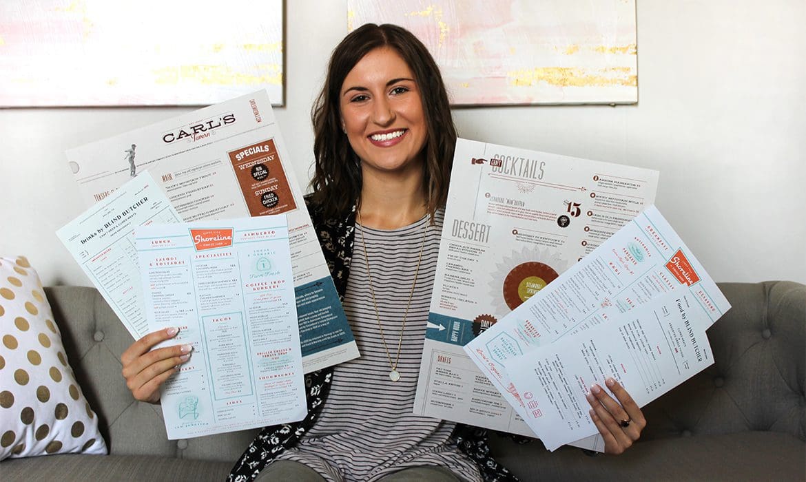
The Importance of Restaurant Menu Design
A good restaurant menu design is a key component to any restaurant. The menu should invoke your brand’s personality and promote best-selling items through design. It should be easily read and visually appealing without being too busy or hard to navigate.
Here at Nice Branding Agency, we love restaurant branding, and getting to do restaurant menu design is the icing on the cake. When we aren’t designing menus for our clients, we love spending our free time browsing through various restaurants’ menu design.
We’ve recently come across some drool-worthy restaurant menu design. Today, we’re sharing three of our favorites and why these menus speak our design language.
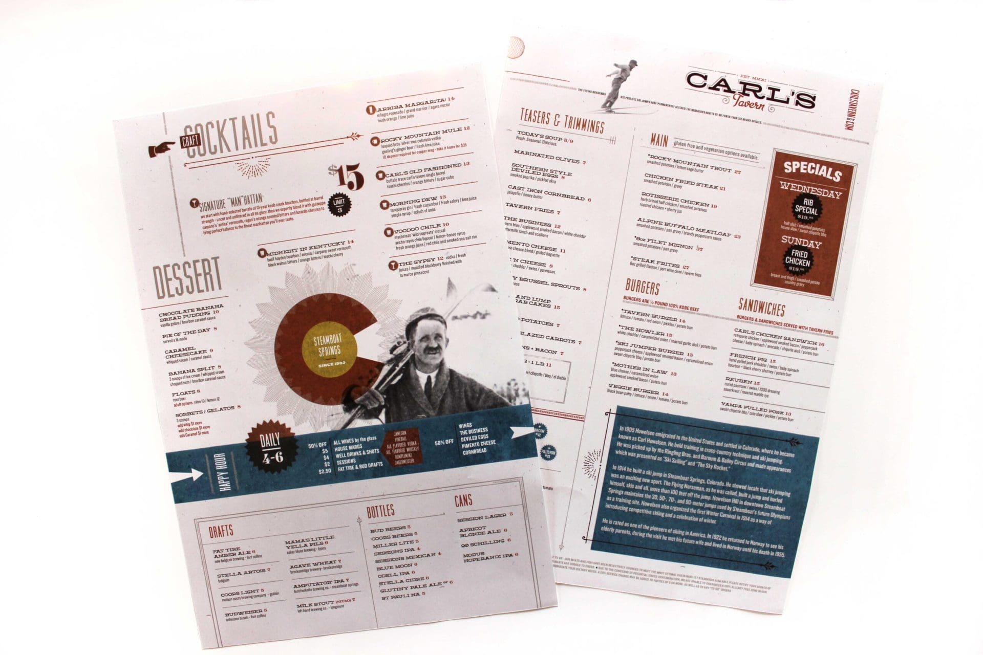 Up first is the menu from Carl’s Tavern in Steamboat Springs, Colorado. While Carl’s has many delicious options to choose from, this menu is laid out well, which makes it easy to navigate. A one-page menu is a smart way to go, not only for cost efficiency, but also so the customer doesn’t have to keep flipping pages.
Carl’s claim to fames are easy to spot since they pulled those out and put them into their own design element, as shown here in a brown box. The menu also goes in order from appetizers, to salads, mains, sides, and so on. The color palette brings in the tavern feel and allows the brand’s personality to come to life.
Our team at Nice Branding has a crush on vintage. And this restaurant menu design is filled with vintage typography and elements that give us all of the warm fuzzies.
Up first is the menu from Carl’s Tavern in Steamboat Springs, Colorado. While Carl’s has many delicious options to choose from, this menu is laid out well, which makes it easy to navigate. A one-page menu is a smart way to go, not only for cost efficiency, but also so the customer doesn’t have to keep flipping pages.
Carl’s claim to fames are easy to spot since they pulled those out and put them into their own design element, as shown here in a brown box. The menu also goes in order from appetizers, to salads, mains, sides, and so on. The color palette brings in the tavern feel and allows the brand’s personality to come to life.
Our team at Nice Branding has a crush on vintage. And this restaurant menu design is filled with vintage typography and elements that give us all of the warm fuzzies.
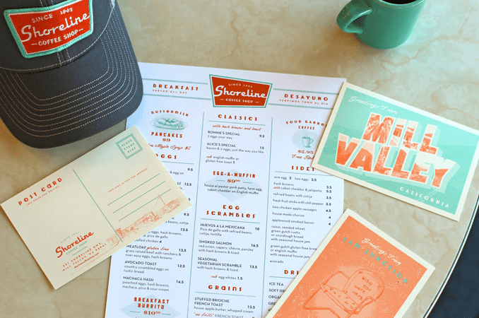 Shoreline, a retro, yet modern coffee shop comes in at number two. This menu has a complementary color scheme comprised of orange and light teal that gives it a crisp look while still bringing in a retro vibe. The fonts are well chosen. Although the headlines are not in your run-of-the-mill font, they are still easy to read and cohesive with the brand’s personality.
There are several pull-out design elements and illustrations that give the eye a break and bring attention to the important menu items. Overall, this menu is organized, easy to navigate, and easy on the eyes. A double-check plus in our book.
Shoreline, a retro, yet modern coffee shop comes in at number two. This menu has a complementary color scheme comprised of orange and light teal that gives it a crisp look while still bringing in a retro vibe. The fonts are well chosen. Although the headlines are not in your run-of-the-mill font, they are still easy to read and cohesive with the brand’s personality.
There are several pull-out design elements and illustrations that give the eye a break and bring attention to the important menu items. Overall, this menu is organized, easy to navigate, and easy on the eyes. A double-check plus in our book.
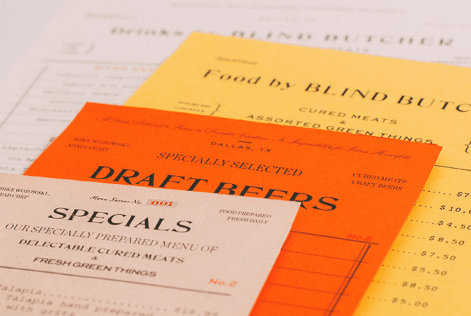 The vibrant, stacked menu from Blind Butcher comes in at number three on our list of good restaurant menu design. This is a perfect example of a menu that doesn’t necessarily need to be printed in color. Simply printing black ink on colored paper that pairs well with your branding does the trick!
This Blind Butcher example shows a well-thought-out menu that has different pages for the different components of the menu, that, when aligned, not only stack up, but the colors complement each other and together create a stand-out design. The clipboard keeps all the pieces together nicely while introducing a rustic vibe that matches the brand.
The typographical design of the menu shows a simplistic classic vintage feel, which we L.O.V.E.
As a bonus, because each piece is printed separately, it makes for easier edits without having to reprint the whole menu.
Have these examples inspired you to create a great restaurant menu design for your restaurant? If you’re ready to get cookin’ on your own menu, take a look at our restaurant branding services and contact our design agency today!
The vibrant, stacked menu from Blind Butcher comes in at number three on our list of good restaurant menu design. This is a perfect example of a menu that doesn’t necessarily need to be printed in color. Simply printing black ink on colored paper that pairs well with your branding does the trick!
This Blind Butcher example shows a well-thought-out menu that has different pages for the different components of the menu, that, when aligned, not only stack up, but the colors complement each other and together create a stand-out design. The clipboard keeps all the pieces together nicely while introducing a rustic vibe that matches the brand.
The typographical design of the menu shows a simplistic classic vintage feel, which we L.O.V.E.
As a bonus, because each piece is printed separately, it makes for easier edits without having to reprint the whole menu.
Have these examples inspired you to create a great restaurant menu design for your restaurant? If you’re ready to get cookin’ on your own menu, take a look at our restaurant branding services and contact our design agency today!
Restaurant Menu Design No. 1: Carl's Tavern
Up first is the menu from Carl’s Tavern in Steamboat Springs, Colorado. While Carl’s has many delicious options to choose from, this menu is laid out well, which makes it easy to navigate. A one-page menu is a smart way to go, not only for cost efficiency, but also so the customer doesn’t have to keep flipping pages.
Carl’s claim to fames are easy to spot since they pulled those out and put them into their own design element, as shown here in a brown box. The menu also goes in order from appetizers, to salads, mains, sides, and so on. The color palette brings in the tavern feel and allows the brand’s personality to come to life.
Our team at Nice Branding has a crush on vintage. And this restaurant menu design is filled with vintage typography and elements that give us all of the warm fuzzies.
Restaurant Menu Design No. 2: Shoreline
Shoreline, a retro, yet modern coffee shop comes in at number two. This menu has a complementary color scheme comprised of orange and light teal that gives it a crisp look while still bringing in a retro vibe. The fonts are well chosen. Although the headlines are not in your run-of-the-mill font, they are still easy to read and cohesive with the brand’s personality.
There are several pull-out design elements and illustrations that give the eye a break and bring attention to the important menu items. Overall, this menu is organized, easy to navigate, and easy on the eyes. A double-check plus in our book.
Restaurant Menu Design No. 3: Blind Butcher
The vibrant, stacked menu from Blind Butcher comes in at number three on our list of good restaurant menu design. This is a perfect example of a menu that doesn’t necessarily need to be printed in color. Simply printing black ink on colored paper that pairs well with your branding does the trick!
This Blind Butcher example shows a well-thought-out menu that has different pages for the different components of the menu, that, when aligned, not only stack up, but the colors complement each other and together create a stand-out design. The clipboard keeps all the pieces together nicely while introducing a rustic vibe that matches the brand.
The typographical design of the menu shows a simplistic classic vintage feel, which we L.O.V.E.
As a bonus, because each piece is printed separately, it makes for easier edits without having to reprint the whole menu.
Have these examples inspired you to create a great restaurant menu design for your restaurant? If you’re ready to get cookin’ on your own menu, take a look at our restaurant branding services and contact our design agency today!


