Burger Restaurant Branding Review: Goody Goody
On our quest to educate our followers about the ins and outs of burger restaurant branding, all while getting some meals in along the way, our Nice Branding Florida girls hit the highway to Tampa recently.
Tampa’s food scene has exploded in recent years, and the Nice Girls are always willing to take one for the team by taking it to Tampa for lunch instead of grabbing takeout.
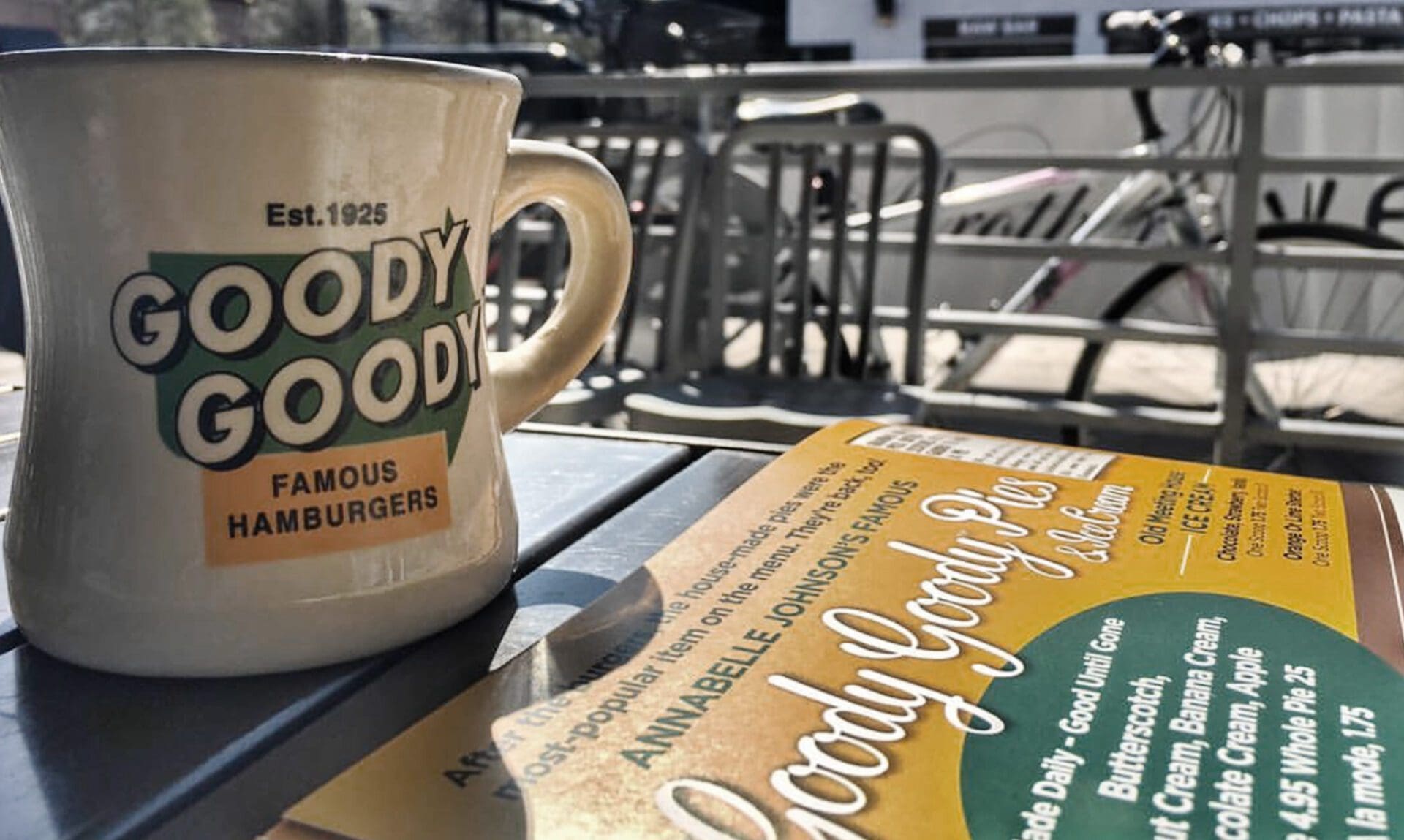
For this burger restaurant branding review excursion, we selected the burger joint, Goody Goody. Let’s start by saying that we anticipated this review to be less than stellar. From the looks of their website, the restaurant seemed a bit cheesy, and not in the extra-cheese-on-my-burger-please good way.
Nevertheless, burgers are kinda our thing, so we set out to taste test the food and analyze the burger restaurant branding.
As we arrived in Hyde Park, we realized that the location of Goody Goody is goody goody. It’s right on Swann, surrounded by Sprinkles Cupcakes, Anthropology, Pottery Barn, West Elm, and tons of other shops and restaurants.
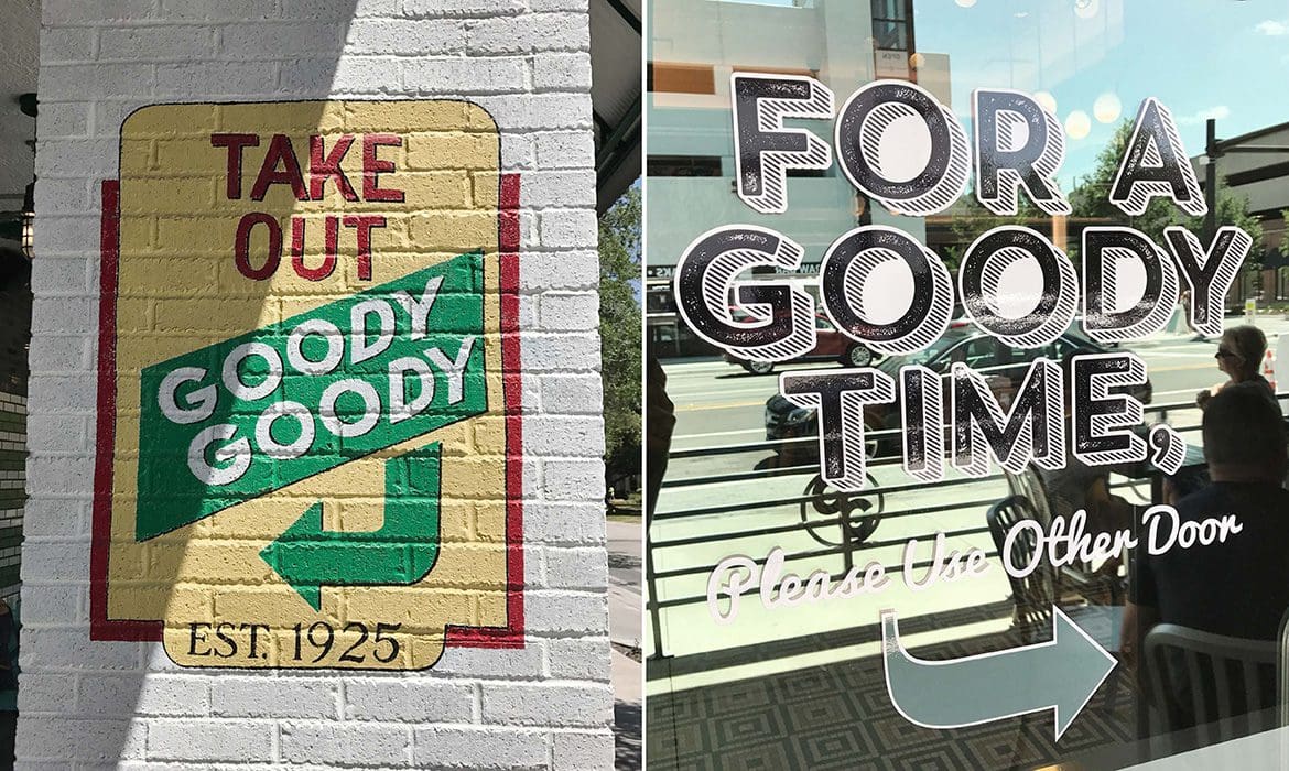
The exterior of the restaurant was also well done (pardon the pun).
As you approach the restaurant, right away you get a retro, diner, nostalgic feel, which appears to be the goal of the brand. However, you’re also struck with the sense that this spot has been recently renovated, since the vibe is undeniably cool.
The exterior restaurant sign is very visible, and the “GG” icon appears in several places on the exterior, such as on the custom metal railing and in vinyl on the front door. There is a mix of subway tile and green brick present on the outside that gives the storefront a modern feel, while the railing and tables bring in the diner element without being overtly obvious.
There were also graphics on the exterior of the building that put a playful spin on the restaurant name, and patio seating that’s perfect for outdoor dining.
 Ok, you got our attention, Goody Goody. Let’s go in.
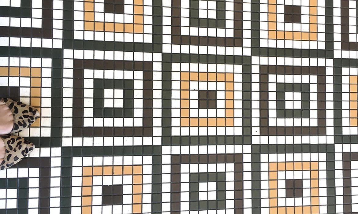
As soon as you step foot into the restaurant, you’re taken back in time. The custom floor tile is a feature for sure, and ties in the supporting brand colors. The mosaic tile is in square patterns on the floor and then runs along the underside of the bar in a more random pattern. The ceiling features distinctive white tile that resembles a vintage tin style. The variation, yet complementing design and color of all of the tile in this space, allows for cohesiveness of the brand without the monotony of subway tile from wall to wall. There are just enough colors and textures in place to hit the spot without overwhelming the senses. This is burger restaurant branding in the making …
Ok, you got our attention, Goody Goody. Let’s go in.
As soon as you step foot into the restaurant, you’re taken back in time. The custom floor tile is a feature for sure, and ties in the supporting brand colors. The mosaic tile is in square patterns on the floor and then runs along the underside of the bar in a more random pattern. The ceiling features distinctive white tile that resembles a vintage tin style. The variation, yet complementing design and color of all of the tile in this space, allows for cohesiveness of the brand without the monotony of subway tile from wall to wall. There are just enough colors and textures in place to hit the spot without overwhelming the senses. This is burger restaurant branding in the making …
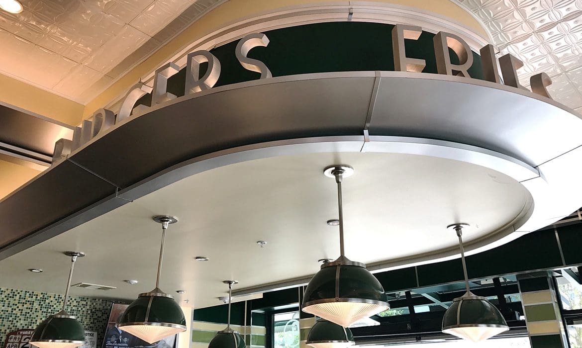
 Now, on to the bar. Or rather, the counter. THIS is the true focal point of the restaurant, and your eye is immediately drawn to this area as you enter the space. Styled like an old-school diner counter, the words “Burgers,” “Pies,” and “Shakes” line the bar installation. And just like that, within half a second of being inside the place, you know exactly what they are famous for. Plus, if you’re anything like us, you’re already trying to decide what flavor shake to order.
 There are big booths around the outer walls of the restaurant, tables in the center of the restaurant, and a few spots perfect for someone who’s dining solo. These one-seaters are vintage school desks set with a place setting to indicate that you can actually sit there. This unique setup seems to be the perfect way to get a few more seats into the space, while creating a design element that sets the restaurant apart and draws a bit of interest.
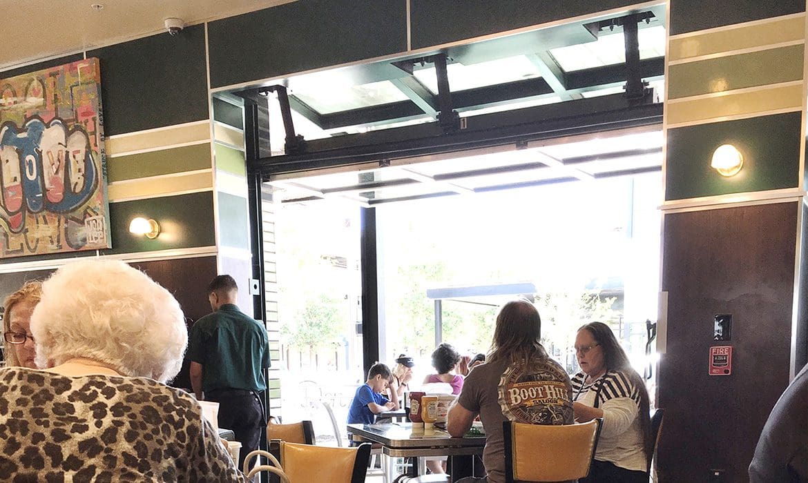
Yes, there’s a lot going on when you walk into Goody Goody. But, it’s done relatively well so nothing really seems like “too much.” Something that plays into that fact is that the restaurant is completely lined on two sides by garage-style doors that were totally open. Fans on the outside and the A/C cranking provided climate control, while the open-air aesthetic gave the restaurant a very airy and lively feel, without being too overstimulating.
There are big booths around the outer walls of the restaurant, tables in the center of the restaurant, and a few spots perfect for someone who’s dining solo. These one-seaters are vintage school desks set with a place setting to indicate that you can actually sit there. This unique setup seems to be the perfect way to get a few more seats into the space, while creating a design element that sets the restaurant apart and draws a bit of interest.
Yes, there’s a lot going on when you walk into Goody Goody. But, it’s done relatively well so nothing really seems like “too much.” Something that plays into that fact is that the restaurant is completely lined on two sides by garage-style doors that were totally open. Fans on the outside and the A/C cranking provided climate control, while the open-air aesthetic gave the restaurant a very airy and lively feel, without being too overstimulating.
 As we were gawking at all of the design elements, a hostess politely waited for us to snap our photos and talk amongst ourselves before she brought us to a tiny table tucked into the back of the restaurant.
Speaking of the hostess, she was wearing a Goody Goody branded shirt; however, we think that a tee with a catchy phrase could have brought more of the brand voice to the forefront. You already know how we feel about puns…
Now, we sit.
Come to find out, Goody Goody has been around since 1925 and is owned by renowned Florida restaurant, The Columbia. This info was communicated to us by our super-friendly server (yes, your staff’s demeanor totally plays into your burger restaurant branding experience), but the story was also told on the custom-designed placemats at our table. The mats depicted Tampa in a playful way and showed the journey of Goody Goody from 1925 to present day.
As we were gawking at all of the design elements, a hostess politely waited for us to snap our photos and talk amongst ourselves before she brought us to a tiny table tucked into the back of the restaurant.
Speaking of the hostess, she was wearing a Goody Goody branded shirt; however, we think that a tee with a catchy phrase could have brought more of the brand voice to the forefront. You already know how we feel about puns…
Now, we sit.
Come to find out, Goody Goody has been around since 1925 and is owned by renowned Florida restaurant, The Columbia. This info was communicated to us by our super-friendly server (yes, your staff’s demeanor totally plays into your burger restaurant branding experience), but the story was also told on the custom-designed placemats at our table. The mats depicted Tampa in a playful way and showed the journey of Goody Goody from 1925 to present day.
 The servers and staff dressed the part, and the staff’s attire played into the overall personality of the brand well. Even something as simple as an embroidered logo on a staff shirt can elevate the old-time feel that really seems to serve this brand well.
As we waited for our food to arrive, we scoped out the bathroom. The ladies and gents rooms are an often-overlooked but super-effective place to communicate your brand to patrons.
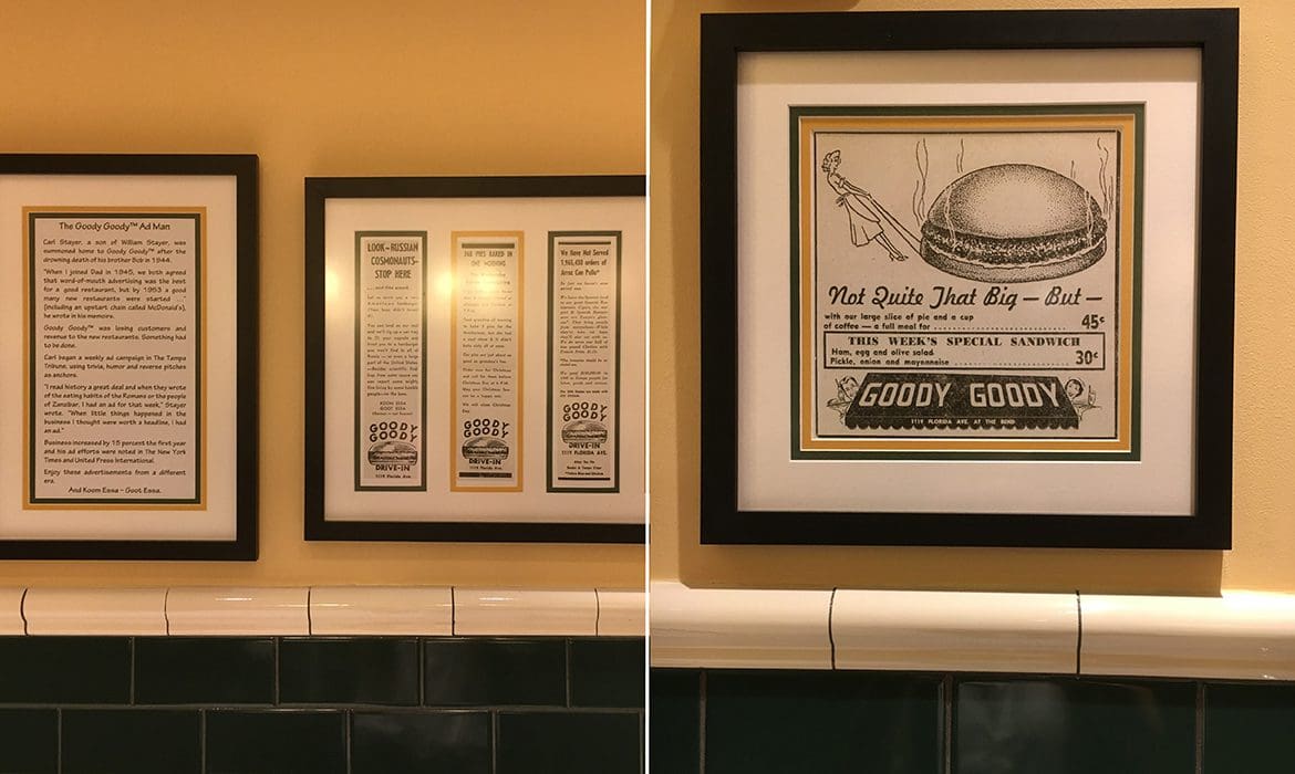
The bathroom at Goody Goody seemed to be dedicated to telling the story of the restaurant. It was decked out with black and white pictures of the original Goody Goody and super-old newspaper articles that told the story of the brand’s growth. When you see actual, printed newspaper articles about a business, doesn’t it just give you that family-owned, been-here-a-long-time feel? We loved seeing these and wished that they were brought inside of the restaurant in a bigger way. Hey, if someone didn’t have to potty, they would miss out on these goodies. Or should we say Goodys?
The servers and staff dressed the part, and the staff’s attire played into the overall personality of the brand well. Even something as simple as an embroidered logo on a staff shirt can elevate the old-time feel that really seems to serve this brand well.
As we waited for our food to arrive, we scoped out the bathroom. The ladies and gents rooms are an often-overlooked but super-effective place to communicate your brand to patrons.
The bathroom at Goody Goody seemed to be dedicated to telling the story of the restaurant. It was decked out with black and white pictures of the original Goody Goody and super-old newspaper articles that told the story of the brand’s growth. When you see actual, printed newspaper articles about a business, doesn’t it just give you that family-owned, been-here-a-long-time feel? We loved seeing these and wished that they were brought inside of the restaurant in a bigger way. Hey, if someone didn’t have to potty, they would miss out on these goodies. Or should we say Goodys?
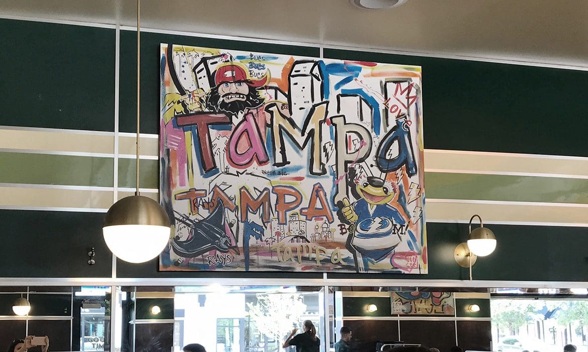
 Back at our table, we noticed that while the articles and old-time photos were not on the walls, some really strange art was taking up valuable wall space. Along the walls that weren’t occupied by the garage doors or the big bar, there were several graffiti-style paintings. It seemed like maybe they were designed to bring in a community aspect, but really they just looked out of place, and their presence took away from the retro feel of the restaurant a bit.
 Pro Tip: While tempting to put a little something personal or communal in your restaurant, you must must must adhere to your brand direction at all costs to create true burger restaurant branding magic within your restaurant. There’s typically always a way you can accomplish what you’re after while still staying on brand, so be relentless about making sure that every aspect aligns.
Ok, now we’re really hungry. Our food arrives and we’re starving, but of course we’ve got to get some #foodporn pics. So we get ready to snap away, and we notice that the baskets and table tops aren’t that great for the instagram pics. Bummer and big miss.
Pro Tip: While tempting to put a little something personal or communal in your restaurant, you must must must adhere to your brand direction at all costs to create true burger restaurant branding magic within your restaurant. There’s typically always a way you can accomplish what you’re after while still staying on brand, so be relentless about making sure that every aspect aligns.
Ok, now we’re really hungry. Our food arrives and we’re starving, but of course we’ve got to get some #foodporn pics. So we get ready to snap away, and we notice that the baskets and table tops aren’t that great for the instagram pics. Bummer and big miss.
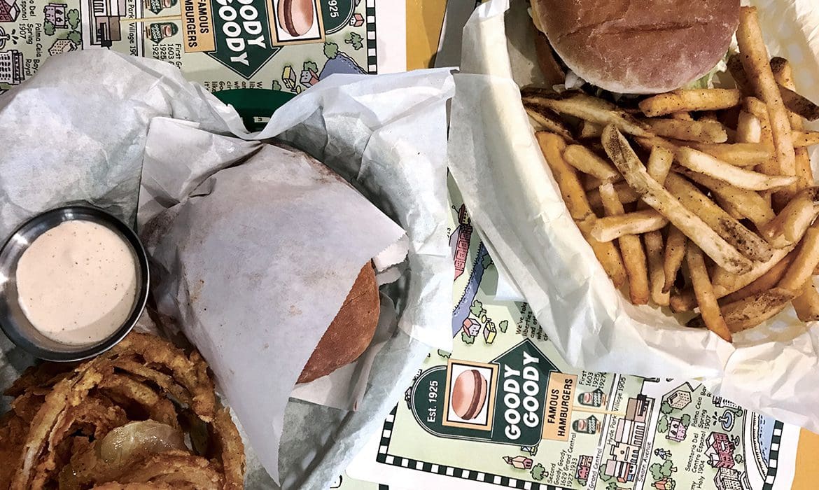 Although the green and yellow baskets technically, kinda match the brand colors (not exactly though), metal baskets or small metal trays would have been a better fit for the overall brand direction. There is already so much yellow and green being used on the tables, walls and floors, and the metal would have been a nice contrast. Plus, it seems cleaner and more sleek.
The Goody Goody logo was on the basket liner, but it was underneath all the food. One thing we would have recommended is that the liner be more simple, and the burger paper feature a catchy saying or the icon or logo.
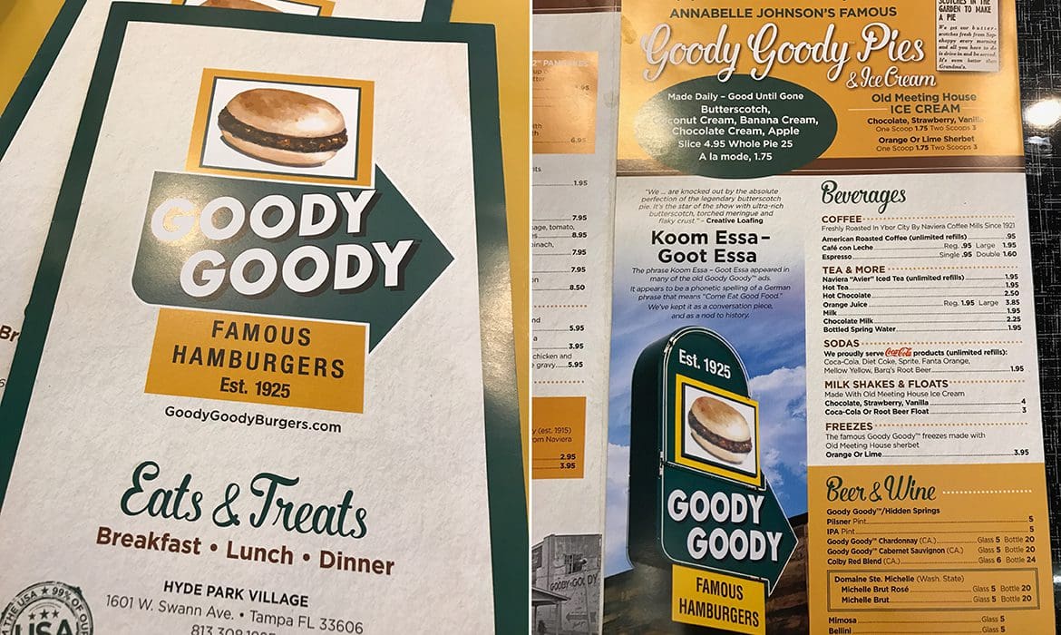
We also felt like there were opportunities missed on the napkin holders and menu. The use of the typography seen in other areas of the restaurant could have been brought into the menu to update the design immensely, while still keeping the nostalgia intact. Basically, it seemed like tons of dough was dropped on the interior, but the menus were just so-so.
Although the green and yellow baskets technically, kinda match the brand colors (not exactly though), metal baskets or small metal trays would have been a better fit for the overall brand direction. There is already so much yellow and green being used on the tables, walls and floors, and the metal would have been a nice contrast. Plus, it seems cleaner and more sleek.
The Goody Goody logo was on the basket liner, but it was underneath all the food. One thing we would have recommended is that the liner be more simple, and the burger paper feature a catchy saying or the icon or logo.
We also felt like there were opportunities missed on the napkin holders and menu. The use of the typography seen in other areas of the restaurant could have been brought into the menu to update the design immensely, while still keeping the nostalgia intact. Basically, it seemed like tons of dough was dropped on the interior, but the menus were just so-so.
 Overall, our adventure to the big city was a success, and we were able to review a really cool restaurant. While there was room for improvement in weaving the burger restaurant branding through the menu, tabletop items, and walls in a more connective manner, Goody Goody seemed to stay true to their roots as an updated diner.
 If you’re a restaurateur who is reading this and it’s resonating with you, give us a shout. We would love to help you create that branding magic in your own restaurant space.
We also reviewed The Grilled Cheeserie in Nashville — read it here if you’re still not convinced we are the best choice when it comes to restaurant branding.
If you’re a restaurateur who is reading this and it’s resonating with you, give us a shout. We would love to help you create that branding magic in your own restaurant space.
We also reviewed The Grilled Cheeserie in Nashville — read it here if you’re still not convinced we are the best choice when it comes to restaurant branding.
Ok, you got our attention, Goody Goody. Let’s go in.
As soon as you step foot into the restaurant, you’re taken back in time. The custom floor tile is a feature for sure, and ties in the supporting brand colors. The mosaic tile is in square patterns on the floor and then runs along the underside of the bar in a more random pattern. The ceiling features distinctive white tile that resembles a vintage tin style. The variation, yet complementing design and color of all of the tile in this space, allows for cohesiveness of the brand without the monotony of subway tile from wall to wall. There are just enough colors and textures in place to hit the spot without overwhelming the senses. This is burger restaurant branding in the making …
Now, on to the bar. Or rather, the counter. THIS is the true focal point of the restaurant, and your eye is immediately drawn to this area as you enter the space. Styled like an old-school diner counter, the words “Burgers,” “Pies,” and “Shakes” line the bar installation. And just like that, within half a second of being inside the place, you know exactly what they are famous for. Plus, if you’re anything like us, you’re already trying to decide what flavor shake to order.
There are big booths around the outer walls of the restaurant, tables in the center of the restaurant, and a few spots perfect for someone who’s dining solo. These one-seaters are vintage school desks set with a place setting to indicate that you can actually sit there. This unique setup seems to be the perfect way to get a few more seats into the space, while creating a design element that sets the restaurant apart and draws a bit of interest.
Yes, there’s a lot going on when you walk into Goody Goody. But, it’s done relatively well so nothing really seems like “too much.” Something that plays into that fact is that the restaurant is completely lined on two sides by garage-style doors that were totally open. Fans on the outside and the A/C cranking provided climate control, while the open-air aesthetic gave the restaurant a very airy and lively feel, without being too overstimulating.
As we were gawking at all of the design elements, a hostess politely waited for us to snap our photos and talk amongst ourselves before she brought us to a tiny table tucked into the back of the restaurant.
Speaking of the hostess, she was wearing a Goody Goody branded shirt; however, we think that a tee with a catchy phrase could have brought more of the brand voice to the forefront. You already know how we feel about puns…
Now, we sit.
Come to find out, Goody Goody has been around since 1925 and is owned by renowned Florida restaurant, The Columbia. This info was communicated to us by our super-friendly server (yes, your staff’s demeanor totally plays into your burger restaurant branding experience), but the story was also told on the custom-designed placemats at our table. The mats depicted Tampa in a playful way and showed the journey of Goody Goody from 1925 to present day.
The servers and staff dressed the part, and the staff’s attire played into the overall personality of the brand well. Even something as simple as an embroidered logo on a staff shirt can elevate the old-time feel that really seems to serve this brand well.
As we waited for our food to arrive, we scoped out the bathroom. The ladies and gents rooms are an often-overlooked but super-effective place to communicate your brand to patrons.
The bathroom at Goody Goody seemed to be dedicated to telling the story of the restaurant. It was decked out with black and white pictures of the original Goody Goody and super-old newspaper articles that told the story of the brand’s growth. When you see actual, printed newspaper articles about a business, doesn’t it just give you that family-owned, been-here-a-long-time feel? We loved seeing these and wished that they were brought inside of the restaurant in a bigger way. Hey, if someone didn’t have to potty, they would miss out on these goodies. Or should we say Goodys?
Back at our table, we noticed that while the articles and old-time photos were not on the walls, some really strange art was taking up valuable wall space. Along the walls that weren’t occupied by the garage doors or the big bar, there were several graffiti-style paintings. It seemed like maybe they were designed to bring in a community aspect, but really they just looked out of place, and their presence took away from the retro feel of the restaurant a bit.
Pro Tip: While tempting to put a little something personal or communal in your restaurant, you must must must adhere to your brand direction at all costs to create true burger restaurant branding magic within your restaurant. There’s typically always a way you can accomplish what you’re after while still staying on brand, so be relentless about making sure that every aspect aligns.
Ok, now we’re really hungry. Our food arrives and we’re starving, but of course we’ve got to get some #foodporn pics. So we get ready to snap away, and we notice that the baskets and table tops aren’t that great for the instagram pics. Bummer and big miss.
Although the green and yellow baskets technically, kinda match the brand colors (not exactly though), metal baskets or small metal trays would have been a better fit for the overall brand direction. There is already so much yellow and green being used on the tables, walls and floors, and the metal would have been a nice contrast. Plus, it seems cleaner and more sleek.
The Goody Goody logo was on the basket liner, but it was underneath all the food. One thing we would have recommended is that the liner be more simple, and the burger paper feature a catchy saying or the icon or logo.
We also felt like there were opportunities missed on the napkin holders and menu. The use of the typography seen in other areas of the restaurant could have been brought into the menu to update the design immensely, while still keeping the nostalgia intact. Basically, it seemed like tons of dough was dropped on the interior, but the menus were just so-so.
Overall, our adventure to the big city was a success, and we were able to review a really cool restaurant. While there was room for improvement in weaving the burger restaurant branding through the menu, tabletop items, and walls in a more connective manner, Goody Goody seemed to stay true to their roots as an updated diner.
If you’re a restaurateur who is reading this and it’s resonating with you, give us a shout. We would love to help you create that branding magic in your own restaurant space.
We also reviewed The Grilled Cheeserie in Nashville — read it here if you’re still not convinced we are the best choice when it comes to restaurant branding.


