Kerning, Leading and Tracking
Nice Branding Agency is a graphic design firm with offices in Nashville, TN and Lakeland, FL. This blog breaks down the importance of spacing with a specific look at kerning, leading, and tracking.
Have you ever looked at something and thought to yourself, that just doesn’t look good? And by “something,” we’re referring to marketing collateral, packaging, outdoor advertising, magazine ads, etc.
We’ve all been there. We’ve seen a business card or brochure that just looks a little off, or we’ve gotten a direct mailer that just seems kind of wonky. Near our graphic design firm in Nashville, we’ve even seen some big ol’ billboards that seem like something is just not right. Hey, maybe that’s their tactic for catching your eye?!
Sometimes you can’t quite put your finger on it, and sometimes it’s as plain as day that the piece is just too dang hard to read.
Typography is the art of arranging letters and words so that they are appealing to the eye, easy to read, and evoke a certain emotion based on the style and arrangement of the letters.
It’s typography that either draws the elements of a design piece together or really leaves you squinting your eyes and scratching your head.
Now that you’re reading this blog post, you won’t be able to escape bad type. You’ll notice it everywhere, we promise. You’ll start critiquing ads and picking apart packaging design. You will probably even start to notice the type on product labels. Sorry! But also, you’re welcome.
There’s nothing we hate more at our graphic design firm in Nashville than a poorly kerned word, and maybe we can expose the injustice that’s being done to type, one blog reader at a time. Hey, we can have a little hope, right?
Let’s jump right into it. Basic typographic design skills boil down to include a mastery of kerning, leading (rhymes with bedding), and spacing.
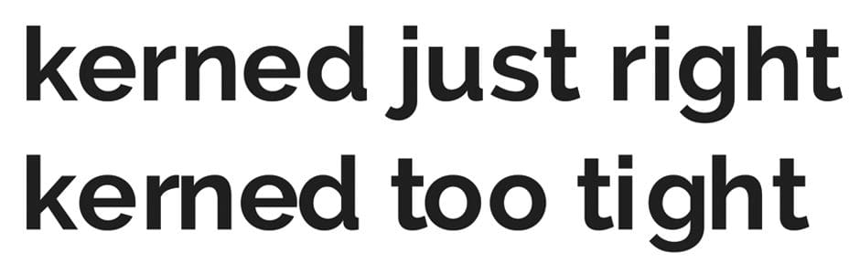 Kerning refers to adjusting the spacing between the letters of a word, separately. This one seems simple, but handled improperly, kerning can impact the legibility of a word. With letters spaced too closely together, the word can become indecipherable. And if they’re too far apart, the word becomes too difficult to read. It’s kind of a Goldilocks situation.
Letters should be proportionally spaced, and designers must take into account the stylistic needs of certain fonts. There’s no easy button for this one. Kerning a font precisely requires a sharp eye, patience, and determination.
Not all fonts are created equal. When fonts come off the keyboard, after being typed, the spacing between x and y maybe not be the same spacing as what is between a and b. Attention must be given to this spacing, especially when the font size is large, for example, as it is when used as a headline.
We aren’t suggesting that you start tackling your own graphic design after simply reading this post, but if you’re already a designer, here are a few quick tips we found on how to kill it at kerning.
Kerning refers to adjusting the spacing between the letters of a word, separately. This one seems simple, but handled improperly, kerning can impact the legibility of a word. With letters spaced too closely together, the word can become indecipherable. And if they’re too far apart, the word becomes too difficult to read. It’s kind of a Goldilocks situation.
Letters should be proportionally spaced, and designers must take into account the stylistic needs of certain fonts. There’s no easy button for this one. Kerning a font precisely requires a sharp eye, patience, and determination.
Not all fonts are created equal. When fonts come off the keyboard, after being typed, the spacing between x and y maybe not be the same spacing as what is between a and b. Attention must be given to this spacing, especially when the font size is large, for example, as it is when used as a headline.
We aren’t suggesting that you start tackling your own graphic design after simply reading this post, but if you’re already a designer, here are a few quick tips we found on how to kill it at kerning.
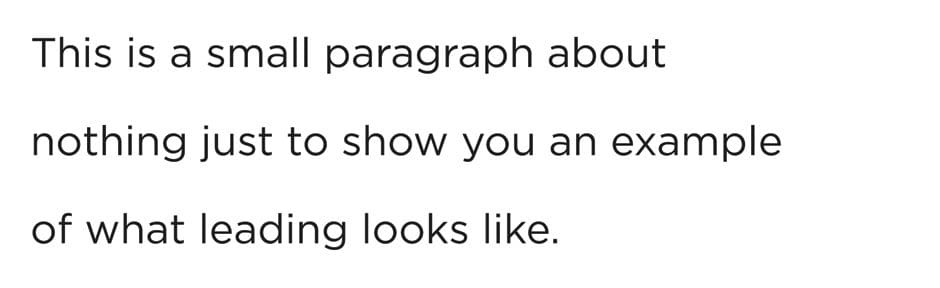
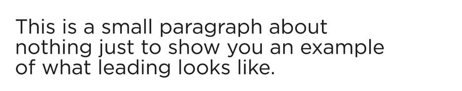
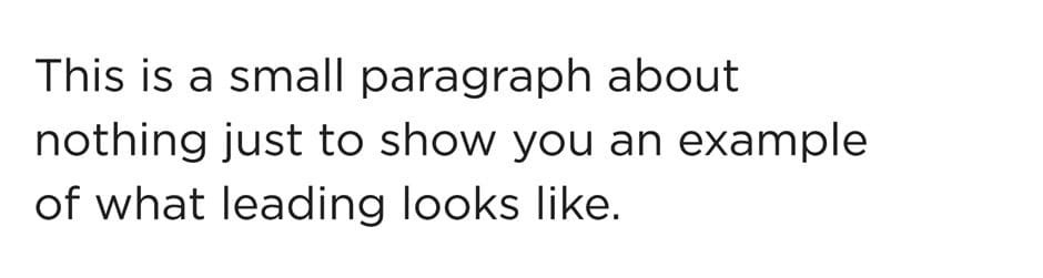 Also a spacing technique, leading determines how text is spaced vertically when there are several lines of copy. You may know this as “double spacing” in Word, but in the design world, this is much more precise.
Leading is measured by setting a baseline for where the letters of one line will sit. A designer then takes into account descenders (like lowercase j or g) and ascenders (like lowercase d or b), and then sets leading, or spacing between the lines, to accommodate the font size.
Generally, leading at 20 percent of the font size is standard, but once again, there’s no standard to design. We are asked weekly to create templates so that they can be updated by our clients in-house. Although we understand the value to this, there’s just no dollar amount that can be placed on a good designer. Once you start paying attention, you’ll really start to notice how leading will either guide you through copy effortlessly, or cause you to stumble through the written word.
Also a spacing technique, leading determines how text is spaced vertically when there are several lines of copy. You may know this as “double spacing” in Word, but in the design world, this is much more precise.
Leading is measured by setting a baseline for where the letters of one line will sit. A designer then takes into account descenders (like lowercase j or g) and ascenders (like lowercase d or b), and then sets leading, or spacing between the lines, to accommodate the font size.
Generally, leading at 20 percent of the font size is standard, but once again, there’s no standard to design. We are asked weekly to create templates so that they can be updated by our clients in-house. Although we understand the value to this, there’s just no dollar amount that can be placed on a good designer. Once you start paying attention, you’ll really start to notice how leading will either guide you through copy effortlessly, or cause you to stumble through the written word.
 Just when you thought you had a handle on spacing in the design world, we’re going to throw one more concept at you straight from our graphic design firm in Nashville. Tracking is the adjustment of the spacing between letters throughout an entire word.
I hear you, you’re probably saying to yourself, ok so tracking is another term for kerning. Well, no it’s not.
Once you’ve kerned the crap out of the each letter relationship in your word, you can adjust the tracking to set the same amount of space between each letter throughout the entire word. Does that make sense?
Often times designers will increase leading drastically to create big spaces between each letter in a word, but they are all evenly spaced. You’ve probably seen this before and not even realized it. Can we say conversation starter?
Now that you know, you can critique design with the rest of us! Just kidding, but seriously, if you’re a designer or your commissioning one to create something for you, paying attention to these typographic design skills is like going back to basics. We often see designers throwing everything and the kitchen sink at their design, all while overlooking the most basic fundamentals.
Wondering how well we can walk the talk? Contact our graphic design firm in Nashville, aka Nice Branding Agency, today to get started on a design project, and let us put your money where our mouth is!
Just when you thought you had a handle on spacing in the design world, we’re going to throw one more concept at you straight from our graphic design firm in Nashville. Tracking is the adjustment of the spacing between letters throughout an entire word.
I hear you, you’re probably saying to yourself, ok so tracking is another term for kerning. Well, no it’s not.
Once you’ve kerned the crap out of the each letter relationship in your word, you can adjust the tracking to set the same amount of space between each letter throughout the entire word. Does that make sense?
Often times designers will increase leading drastically to create big spaces between each letter in a word, but they are all evenly spaced. You’ve probably seen this before and not even realized it. Can we say conversation starter?
Now that you know, you can critique design with the rest of us! Just kidding, but seriously, if you’re a designer or your commissioning one to create something for you, paying attention to these typographic design skills is like going back to basics. We often see designers throwing everything and the kitchen sink at their design, all while overlooking the most basic fundamentals.
Wondering how well we can walk the talk? Contact our graphic design firm in Nashville, aka Nice Branding Agency, today to get started on a design project, and let us put your money where our mouth is!
Graphic Design Firm Talks Kerning
Kerning refers to adjusting the spacing between the letters of a word, separately. This one seems simple, but handled improperly, kerning can impact the legibility of a word. With letters spaced too closely together, the word can become indecipherable. And if they’re too far apart, the word becomes too difficult to read. It’s kind of a Goldilocks situation.
Letters should be proportionally spaced, and designers must take into account the stylistic needs of certain fonts. There’s no easy button for this one. Kerning a font precisely requires a sharp eye, patience, and determination.
Not all fonts are created equal. When fonts come off the keyboard, after being typed, the spacing between x and y maybe not be the same spacing as what is between a and b. Attention must be given to this spacing, especially when the font size is large, for example, as it is when used as a headline.
We aren’t suggesting that you start tackling your own graphic design after simply reading this post, but if you’re already a designer, here are a few quick tips we found on how to kill it at kerning.
Graphic Design Firm Talks Leading
Increased Leading
Not Enough Leading
Nice Leading
Also a spacing technique, leading determines how text is spaced vertically when there are several lines of copy. You may know this as “double spacing” in Word, but in the design world, this is much more precise.
Leading is measured by setting a baseline for where the letters of one line will sit. A designer then takes into account descenders (like lowercase j or g) and ascenders (like lowercase d or b), and then sets leading, or spacing between the lines, to accommodate the font size.
Generally, leading at 20 percent of the font size is standard, but once again, there’s no standard to design. We are asked weekly to create templates so that they can be updated by our clients in-house. Although we understand the value to this, there’s just no dollar amount that can be placed on a good designer. Once you start paying attention, you’ll really start to notice how leading will either guide you through copy effortlessly, or cause you to stumble through the written word.


