
Restaurant Branding Review: Grilled Cheeserie, Nashville, Tennessee
Let’s set this story straight. This is a restaurant branding review which is an opinion piece on restaurant branding. It’s simply the analytical thoughts of a creative director with a passion for restaurant branding.
I haven't taken into account project budgets, client demands, or project history when preparing these thoughts. All that to say, none of this is written to shed a negative light on either the restaurant being reviewed or any of those who took part in bringing the restaurant to life. It's a deep dive into how the brand has been woven into the environment of the restaurant.
Any restaurant that opens it’s doors to diners has accomplished a feat that deserves applauding and for conquering that feat, I give a standing ovation. My reviews are not meant to bring any harm to the restaurant, but instead to explore how the overall brand was woven throughout the space and into each customer touchpoint and to point out opportunities that the restaurant might not have considered, so that future restauranteurs have a basis for impeccable branding.
So, without further adieu…Here are my thoughts on The Grilled Cheeserie.
 The pattern initially throws me off because this is a grilled cheese sandwich shop, not a pasta shop. I get that they put macaroni on ONE of their sandwiches, but that noodle is a strong element carried throughout the environment, and it is not even the same noodle shape that came on my sandwich. Details baby.
Who knows here though. Maybe there's something deeper that I'm missing.
I would have suggested that with this noodle being a prominent brand element, the restaurant should have invested in an illustrator to make a macaroni icon that was 100% their own, and a true representation of the only noodle I’ve ever been served between two pieces of bread — because that is unique and a point to build a brand connection upon.
Looking up to the facade of the restaurant, there’s some black and white vertical striping on the building. This is great thinking because it’s carried over from their truck; however, this could've been taken one step further. The stripes would have looked extremely attractive as an awning over the window or lining the whole exterior space of the building.
I personally think the black and white awning over the window would have given a strong nod to the window of the food truck that so well established their name.
The pattern initially throws me off because this is a grilled cheese sandwich shop, not a pasta shop. I get that they put macaroni on ONE of their sandwiches, but that noodle is a strong element carried throughout the environment, and it is not even the same noodle shape that came on my sandwich. Details baby.
Who knows here though. Maybe there's something deeper that I'm missing.
I would have suggested that with this noodle being a prominent brand element, the restaurant should have invested in an illustrator to make a macaroni icon that was 100% their own, and a true representation of the only noodle I’ve ever been served between two pieces of bread — because that is unique and a point to build a brand connection upon.
Looking up to the facade of the restaurant, there’s some black and white vertical striping on the building. This is great thinking because it’s carried over from their truck; however, this could've been taken one step further. The stripes would have looked extremely attractive as an awning over the window or lining the whole exterior space of the building.
I personally think the black and white awning over the window would have given a strong nod to the window of the food truck that so well established their name.
 And yes they did get the custom neon sign right, but that icon graphic making up the neon sign is lacking some luster. My best guess is that it is something that was carried over from the food truck brand or something the owner had an affection for that couldn’t be torn away.
But, you’ve broken my heart here. This could have been way freakin’ cool.
The other thing that is already flooding social feeds is the Milkshake Bar in all it’s glory. A-Triple plus, plus, plus for this area.
And yes they did get the custom neon sign right, but that icon graphic making up the neon sign is lacking some luster. My best guess is that it is something that was carried over from the food truck brand or something the owner had an affection for that couldn’t be torn away.
But, you’ve broken my heart here. This could have been way freakin’ cool.
The other thing that is already flooding social feeds is the Milkshake Bar in all it’s glory. A-Triple plus, plus, plus for this area.
 It’s lined with vintage hexagon tiles placed in vertical lines in black and white. Definitely gives the old school diner feeling with the stools made of metal powder coated white and wood, along with the vintage style lighted sign.
This, folks, is how you use the power of the selfie for shameless, free marketing.
Retail was big. There’s a fairly large retail wall structure to the left immediately as you walk in. Overall, I loved the homemade feeling of the retail display but there was nothing on there that I just had to have.
Personally, I get it. You’re waiting in line and you might want to pick up a cap that says Grilled Cheeserie because that’s what’s trending on the pinterest fashion boards right now… right? No, I don’t get it — I lied.
It’s lined with vintage hexagon tiles placed in vertical lines in black and white. Definitely gives the old school diner feeling with the stools made of metal powder coated white and wood, along with the vintage style lighted sign.
This, folks, is how you use the power of the selfie for shameless, free marketing.
Retail was big. There’s a fairly large retail wall structure to the left immediately as you walk in. Overall, I loved the homemade feeling of the retail display but there was nothing on there that I just had to have.
Personally, I get it. You’re waiting in line and you might want to pick up a cap that says Grilled Cheeserie because that’s what’s trending on the pinterest fashion boards right now… right? No, I don’t get it — I lied.
 Where are the grilled cheese options — I’m hungry!
My suggestion. If you’re going to sell retail at your restaurant, make me first fall in love with your food and then I’ll possibly pick up a hat to show my brand ambassador’ness’.
Give me something cool that has a design to it that supports your brand, and then put your logo on it as a supporting element. Create something cool and eye-catching, that just so happens to have your logo on it somewhere discreet. The goal is to get people asking, "Where'd you get that hat?"
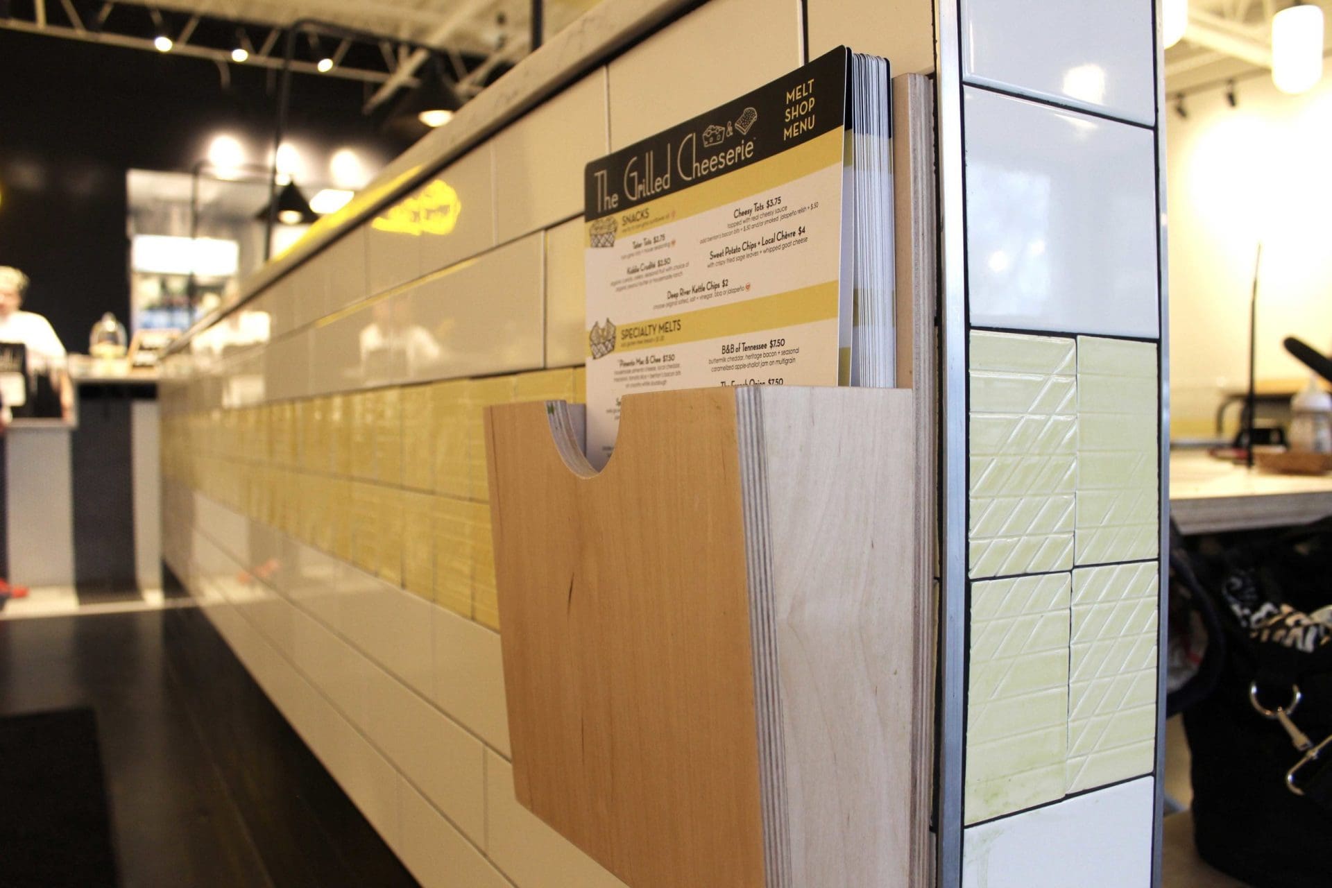
There’s a small wooden menu holder opposite the retail space, like real small, serving as home to a handheld menu. Paper choice, nothing better. However, the layout and composition could have been much more compelling. There's an opportunity in menu design to drive the diner in a certain direction, and while informative, the menu design wasn't as enticing as we would have liked. More details on the overall menu design below.
Where are the grilled cheese options — I’m hungry!
My suggestion. If you’re going to sell retail at your restaurant, make me first fall in love with your food and then I’ll possibly pick up a hat to show my brand ambassador’ness’.
Give me something cool that has a design to it that supports your brand, and then put your logo on it as a supporting element. Create something cool and eye-catching, that just so happens to have your logo on it somewhere discreet. The goal is to get people asking, "Where'd you get that hat?"
There’s a small wooden menu holder opposite the retail space, like real small, serving as home to a handheld menu. Paper choice, nothing better. However, the layout and composition could have been much more compelling. There's an opportunity in menu design to drive the diner in a certain direction, and while informative, the menu design wasn't as enticing as we would have liked. More details on the overall menu design below.
 Here’s my honest opinion after digesting this whole entry area.
The first huge thing I see when I walk in is Milkshakes, which while pretty, is not really the main event. Then I notice this oversized retail area trying to sell me things that tout a brand name or icon that I don’t yet love. Then, if I look really hard, I might find their food options which is what I originally came to the place for.
I really recommend that our restaurant clients focus in on what makes them unique, and avoid the temptation to throw any and everything at their environmental design. Here I say... show a little respect to the grilled cheese! It’s what made you who you are today and I can’t even find the creative options you worked so hard to invent as I look around your space.
I will note that there’s a little bit of wall space to the right of the retail display. This is prime real estate for an oversized menu board and would be a great way to make grilled cheese the focus.
Kudos to the kitchen area. It is, to the naked eye, pretty freakin’ cool. It’s got some square kiosks, hip aprons, stainless steel open shelving storage, and the Milkshake Bar. If nothing else, a picture of this makes the social viewers think this place is the next big thing in Nash-Vegas.
I think that the font usage in the brand and environmental design is derailing the cohesiveness of the brand a bit. While you're welcome to mix fonts, there's a method to the madness and I do not think there’s enough consistency in place here. An inappropriate mix of fonts within your brand and environment can create in viewers a feeling that something is just "off," so font choice is not to be overlooked.
Seems like the rules here were to use some sort of a sans serif font. Certain signs screamed trendy, round, nostalgic and geometric sans serifs. Other alluded to old school diners, but yet others looked stretched and distorted.
A little bit of love in the font world would have probably helped unify the brand and the space a bit more.
Here’s my honest opinion after digesting this whole entry area.
The first huge thing I see when I walk in is Milkshakes, which while pretty, is not really the main event. Then I notice this oversized retail area trying to sell me things that tout a brand name or icon that I don’t yet love. Then, if I look really hard, I might find their food options which is what I originally came to the place for.
I really recommend that our restaurant clients focus in on what makes them unique, and avoid the temptation to throw any and everything at their environmental design. Here I say... show a little respect to the grilled cheese! It’s what made you who you are today and I can’t even find the creative options you worked so hard to invent as I look around your space.
I will note that there’s a little bit of wall space to the right of the retail display. This is prime real estate for an oversized menu board and would be a great way to make grilled cheese the focus.
Kudos to the kitchen area. It is, to the naked eye, pretty freakin’ cool. It’s got some square kiosks, hip aprons, stainless steel open shelving storage, and the Milkshake Bar. If nothing else, a picture of this makes the social viewers think this place is the next big thing in Nash-Vegas.
I think that the font usage in the brand and environmental design is derailing the cohesiveness of the brand a bit. While you're welcome to mix fonts, there's a method to the madness and I do not think there’s enough consistency in place here. An inappropriate mix of fonts within your brand and environment can create in viewers a feeling that something is just "off," so font choice is not to be overlooked.
Seems like the rules here were to use some sort of a sans serif font. Certain signs screamed trendy, round, nostalgic and geometric sans serifs. Other alluded to old school diners, but yet others looked stretched and distorted.
A little bit of love in the font world would have probably helped unify the brand and the space a bit more.
 I saw this again in the illustrative styles the restaurant was using. Just really not all coming from the same perspective or style. I think a big difference could have been made had a little bit more attention been shown to consistency within illustration.
Subway tile with dark grout was found in places. Subway tile with white grout was found in places. I especially liked the detail in the yellow runner tile displayed amongst the white tile in various spaces. This took me back to the old school, vintage feeling that I truly think the restaurant is after.
The seating choices were for everyone. White and light wood modern picnic tables were found, which I think serves as a nod to the seating you may find in a food truck park, which carries forth the beginnings of the brand. Black diner style metal chairs paired with marble top tables were found. And just the coolest little window bar seating, as previously described. So date night, study sesh, or playdate — all bases were all covered.
I saw this again in the illustrative styles the restaurant was using. Just really not all coming from the same perspective or style. I think a big difference could have been made had a little bit more attention been shown to consistency within illustration.
Subway tile with dark grout was found in places. Subway tile with white grout was found in places. I especially liked the detail in the yellow runner tile displayed amongst the white tile in various spaces. This took me back to the old school, vintage feeling that I truly think the restaurant is after.
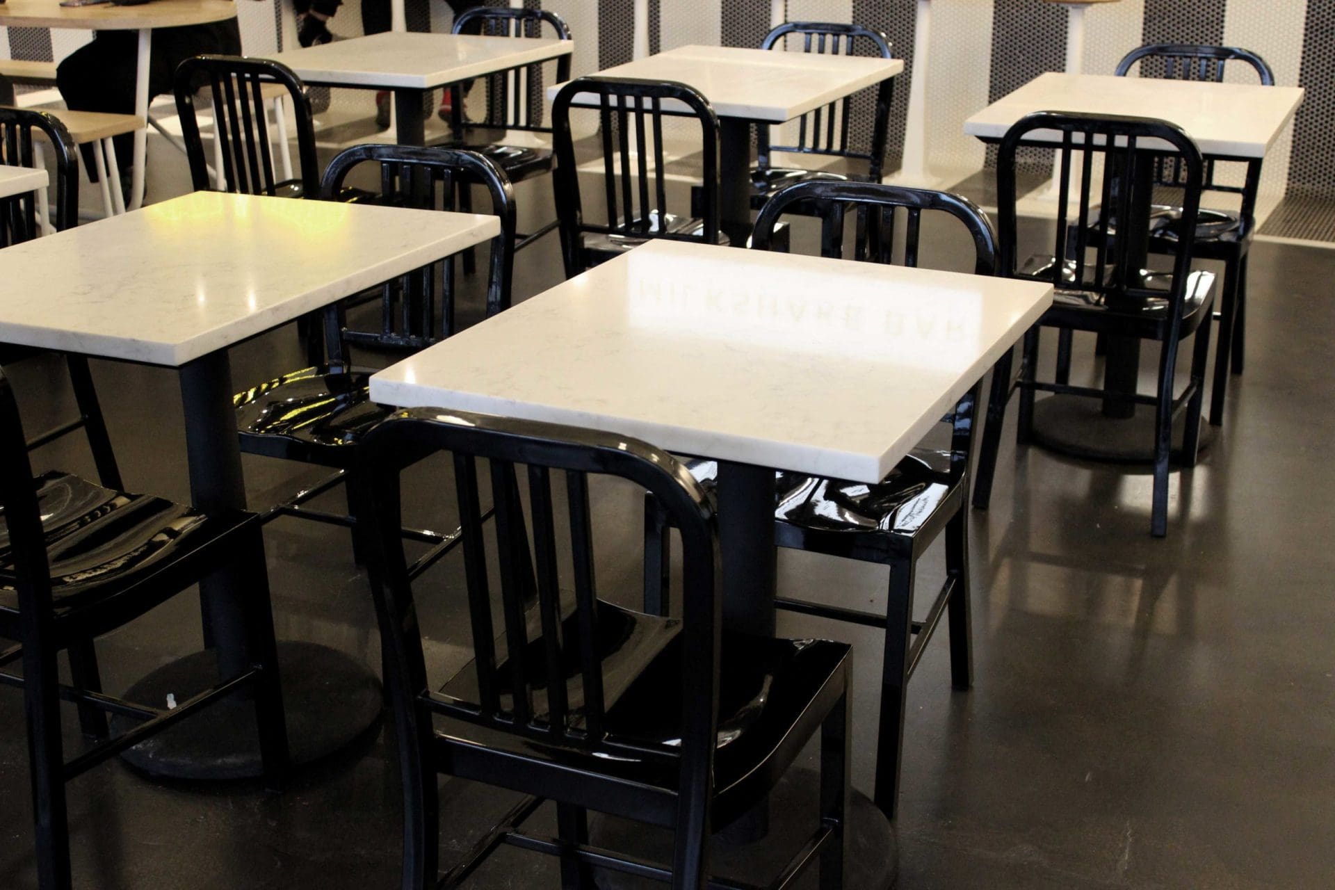
The seating choices were for everyone. White and light wood modern picnic tables were found, which I think serves as a nod to the seating you may find in a food truck park, which carries forth the beginnings of the brand. Black diner style metal chairs paired with marble top tables were found. And just the coolest little window bar seating, as previously described. So date night, study sesh, or playdate — all bases were all covered.
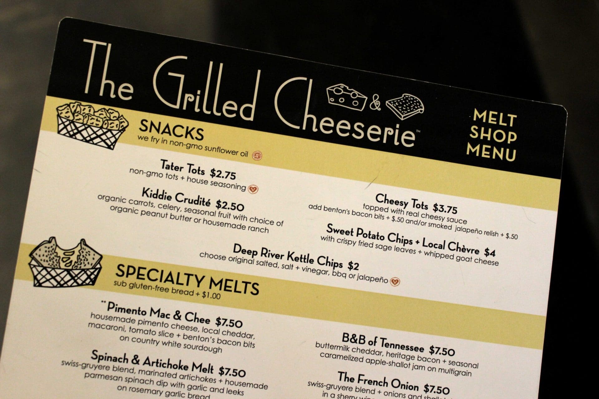
 The menu design was printed on a very thick, durable, paper. That was nice. Overall, it definitely presents their offerings in a clean, easy to read layout. Social was present and brand colors were there.
Is there room for improvement? Yes — always. The overall composition and layout was lacking luster. Basic design… nothing outstanding here. Additionally there was nothing that connected to me. Some cheeky sayings or even some historical pointers to the truck could have met me where I was.
Once again, as noted above, this was the only place I saw their food offerings and I think a menu board would do this place wonders.
As I ordered, the staff was great. Very helpful. Very charming. Everything you want from a Grilled Cheeserie aficionado.
I was given an order number to sit on my table with the vertical striping mentioned previously. I consider this to be a missed opportunity for customer connection.
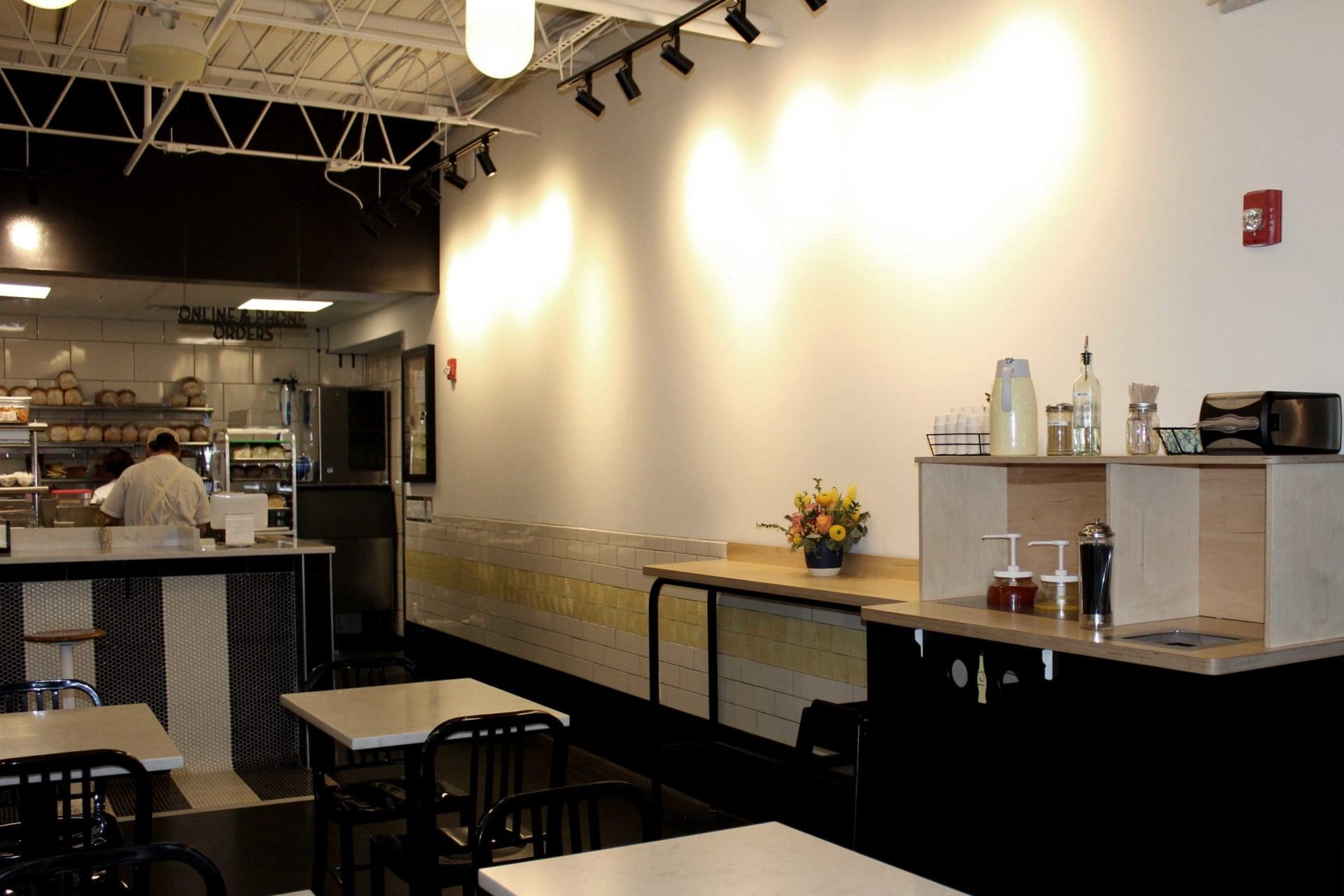
The wall to the right of the Milkshake Bar was forgotten I think. Pretty stark. Blank — but lit, so I’m guessing there’s something coming!
Next, there was an area with condiments, trash, water, etc. You know the necessities.
The menu design was printed on a very thick, durable, paper. That was nice. Overall, it definitely presents their offerings in a clean, easy to read layout. Social was present and brand colors were there.
Is there room for improvement? Yes — always. The overall composition and layout was lacking luster. Basic design… nothing outstanding here. Additionally there was nothing that connected to me. Some cheeky sayings or even some historical pointers to the truck could have met me where I was.
Once again, as noted above, this was the only place I saw their food offerings and I think a menu board would do this place wonders.
As I ordered, the staff was great. Very helpful. Very charming. Everything you want from a Grilled Cheeserie aficionado.
I was given an order number to sit on my table with the vertical striping mentioned previously. I consider this to be a missed opportunity for customer connection.
The wall to the right of the Milkshake Bar was forgotten I think. Pretty stark. Blank — but lit, so I’m guessing there’s something coming!
Next, there was an area with condiments, trash, water, etc. You know the necessities.
 Napkin holders were splattered around the restaurant with custom inserts containing the logo, icon and the city name; but these were very new-school napkin holders. I would have preferred to see some old school, silver shiny vintage napkin holders! It's such a simple touch, but would make a big difference in the overall feel of the experience.
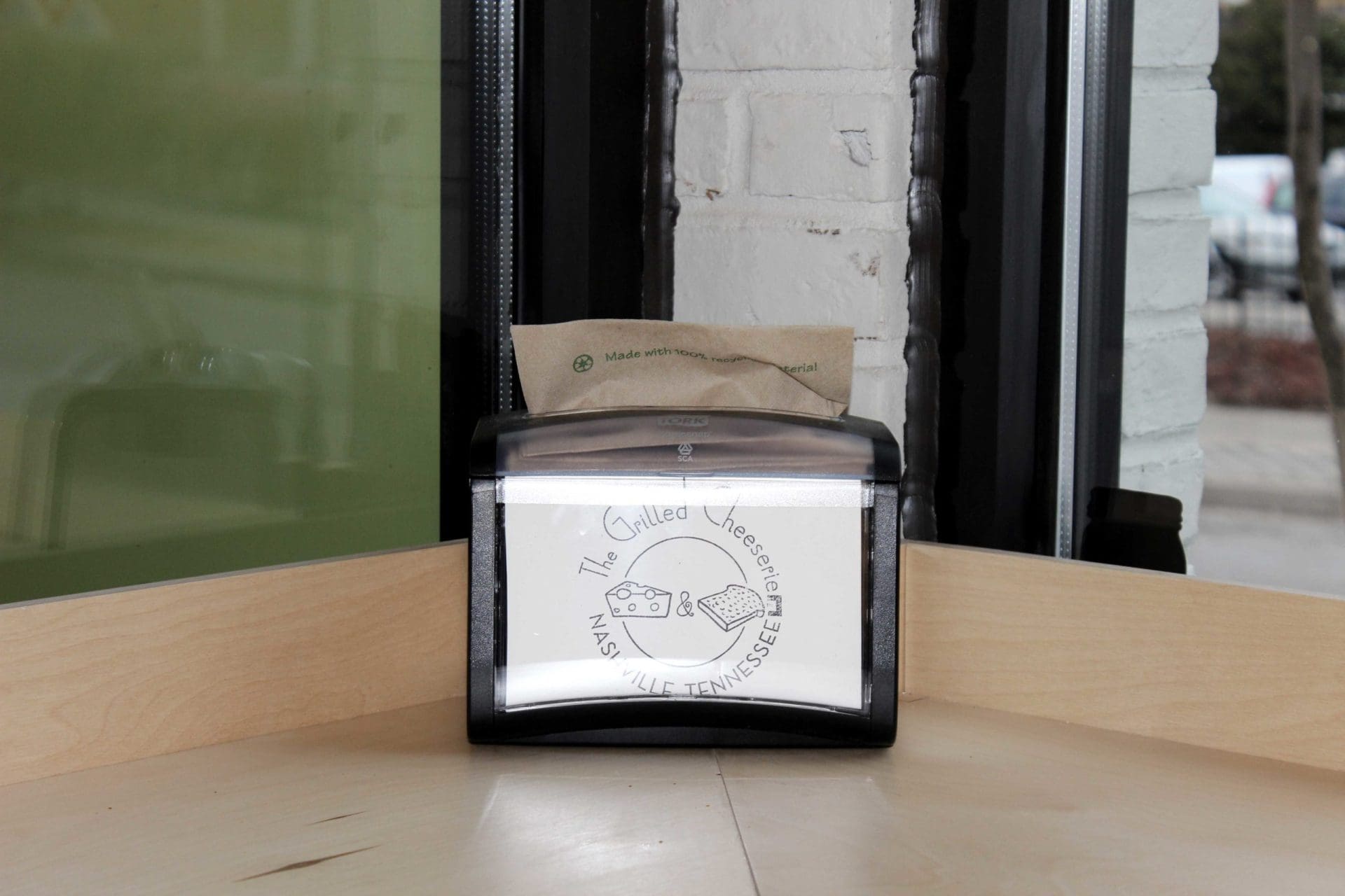 Table top decorations were very petite vases, with that little noodle on them, and a cute little flower. So score because you found vases with that little noodle, but again, that little noodle…
Overall throughout the space, with the exception of the cash/milkshake wall, the space was just too black and white. I get that’s what the brand may have been going for, but a pop of color here or there really never hurt any restaurant.
The lighting throughout the space had a lot of variation in style, but color remained black and/or white. Some pops of yellow in the lighting would have unified the yellow runner tile in a very nice, yet subtle manner.
Food presentation was great. Little baskets. Branded tray liners. Craft tot holders. Clear branded cups. All great stuff.
Table top decorations were very petite vases, with that little noodle on them, and a cute little flower. So score because you found vases with that little noodle, but again, that little noodle…
Overall throughout the space, with the exception of the cash/milkshake wall, the space was just too black and white. I get that’s what the brand may have been going for, but a pop of color here or there really never hurt any restaurant.
The lighting throughout the space had a lot of variation in style, but color remained black and/or white. Some pops of yellow in the lighting would have unified the yellow runner tile in a very nice, yet subtle manner.
Food presentation was great. Little baskets. Branded tray liners. Craft tot holders. Clear branded cups. All great stuff.
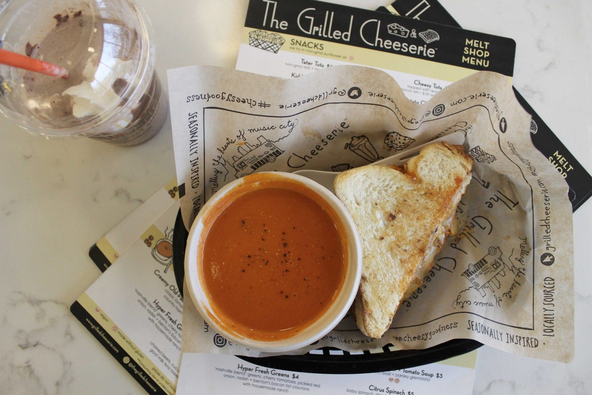 Here again, I think little metal silver baskets would have stepped up the cool factor for me and unfortunately I’m still not crazy about that slice of cheese and slice of bread which I saw again on the cup and the tray liner — but they did carry that element through to multiple customer touchpoints, so good good goodness.
The directional signage found throughout the restaurant wasn't great. Different styles. Different fonts. No consistency. That’s a-ok, but this could have brought a little improvement to the consistency issue that I’ve already harped on.
Last note, big miss in the bathrooms. Bathrooms in restaurant are visited often. A little love in here can go a long long way. I don’t think there was anything on the doors, on the walls, stalls, etc. Just more black and white. Come on… let’s get creative. Who cut the cheese, right???
The attire was on point — after all you can’t open a restaurant these days without trucker hats and cool aprons, so 5 stars for that.
Here again, I think little metal silver baskets would have stepped up the cool factor for me and unfortunately I’m still not crazy about that slice of cheese and slice of bread which I saw again on the cup and the tray liner — but they did carry that element through to multiple customer touchpoints, so good good goodness.
The directional signage found throughout the restaurant wasn't great. Different styles. Different fonts. No consistency. That’s a-ok, but this could have brought a little improvement to the consistency issue that I’ve already harped on.
Last note, big miss in the bathrooms. Bathrooms in restaurant are visited often. A little love in here can go a long long way. I don’t think there was anything on the doors, on the walls, stalls, etc. Just more black and white. Come on… let’s get creative. Who cut the cheese, right???
The attire was on point — after all you can’t open a restaurant these days without trucker hats and cool aprons, so 5 stars for that.
Restaurant Branding Review: The Grilled Cheeserie
The Grilled Cheeserie was born into the food service world as a food truck. Over time, it appears to have come into its teenage years as a brick and mortar restaurant in the popular neighborhood of Hillsboro Village in Nashville, Tennessee. As with babies, new restaurants are super cute and coveted when they’re young and fresh, but I’m always curious to see if a new spot’s popularity will withstand the awkward teenage years.Restaurant Branding Review: The Exterior
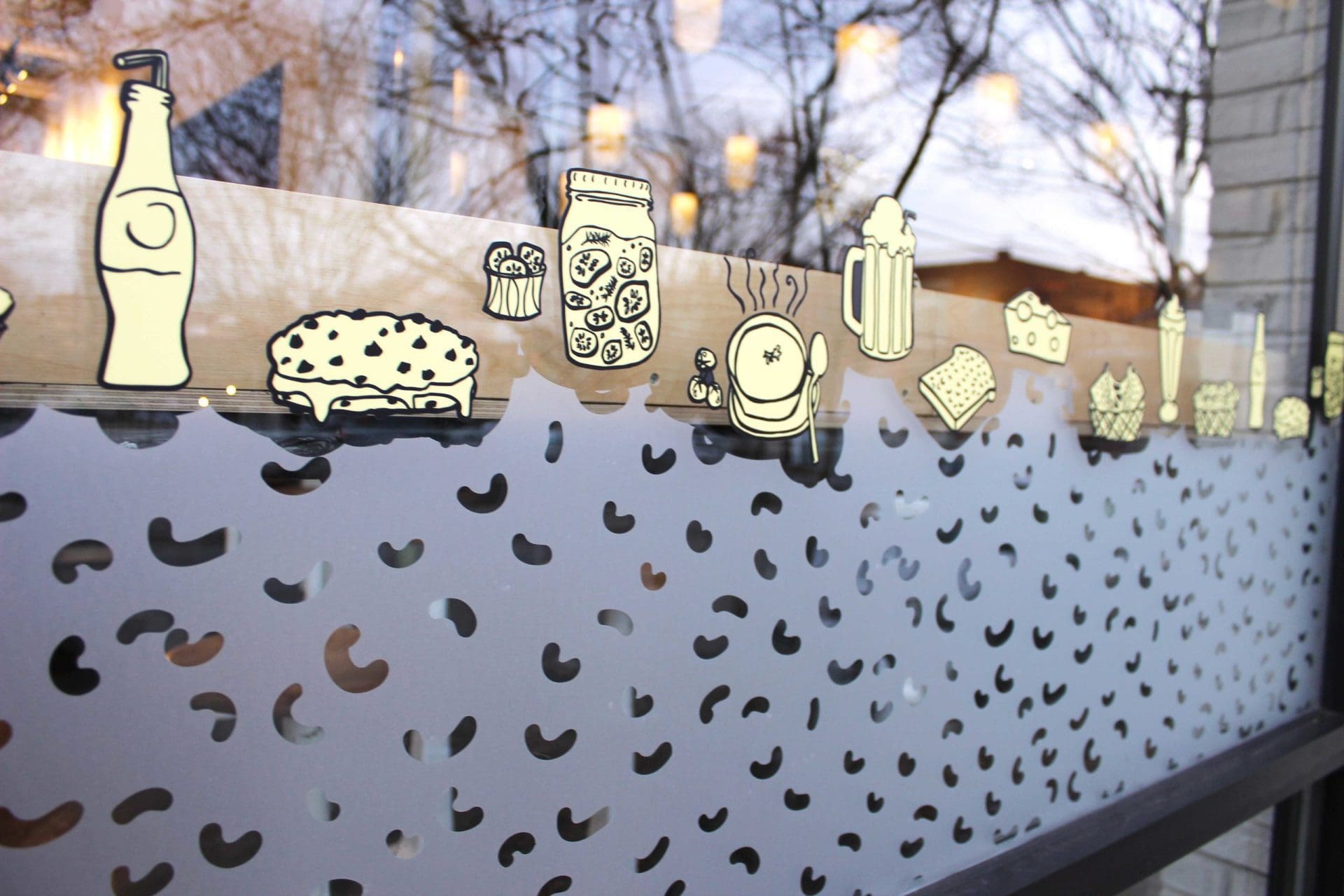
Starting with the storefront, the exterior of The Grilled Cheeserie left me wanting more. There were elements of excitement though, specifically the floor-to-ceiling window with a bar height seating area. Bar height table in front of window wins — always. The window gives the restaurant a real big city feel with a bar height table running the length of it and wrapping the adjoining walls. This is definitely a great place to sit, enjoy and observe. Most likely to become a very coveted seating area within the space. Along the bottom of the window, there’s a pattern of what appears to be macaroni in white vinyl, along with some descriptive menu item words in a sans serif, half diner, half century/gotham style font (more on font usage later). Additionally, this space boasts of product images with a kiddy, illustrative, hand-drawn style.
The pattern initially throws me off because this is a grilled cheese sandwich shop, not a pasta shop. I get that they put macaroni on ONE of their sandwiches, but that noodle is a strong element carried throughout the environment, and it is not even the same noodle shape that came on my sandwich. Details baby.
Who knows here though. Maybe there's something deeper that I'm missing.
I would have suggested that with this noodle being a prominent brand element, the restaurant should have invested in an illustrator to make a macaroni icon that was 100% their own, and a true representation of the only noodle I’ve ever been served between two pieces of bread — because that is unique and a point to build a brand connection upon.
Looking up to the facade of the restaurant, there’s some black and white vertical striping on the building. This is great thinking because it’s carried over from their truck; however, this could've been taken one step further. The stripes would have looked extremely attractive as an awning over the window or lining the whole exterior space of the building.
I personally think the black and white awning over the window would have given a strong nod to the window of the food truck that so well established their name.
Restaurant Branding Review: The Interior
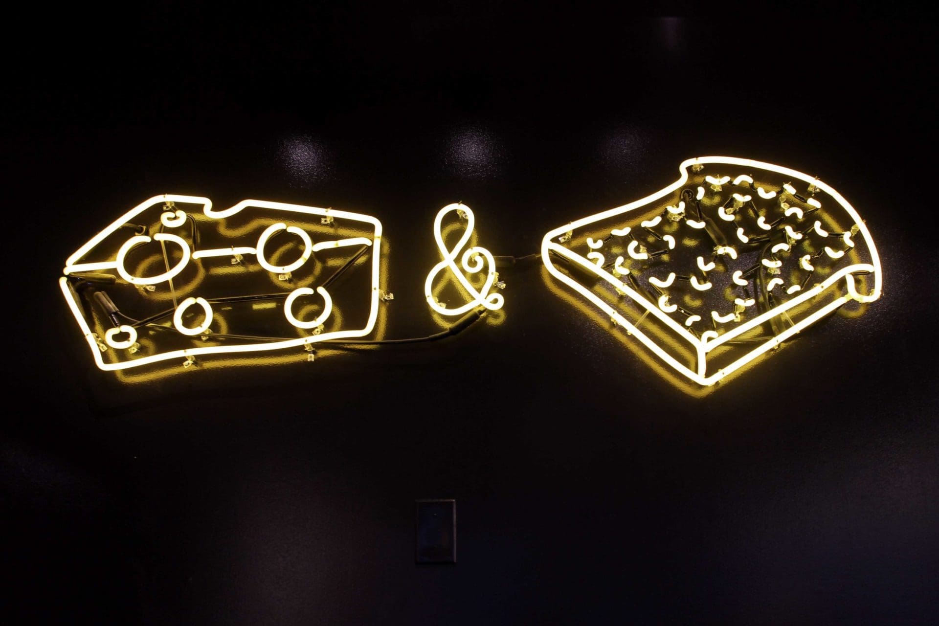
Let’s start by saying there were a lot of elements that were way cool and way on-trend. If you open a restaurant in Nashville right now and don’t have a custom neon sign, well it doesn’t take a branding expert to know that you missed the mark, right? The Grilled Cheeserie has a custom yellow neon sign, mounted on a black wall, as one of the focal points when you walk in, behind the register.
And yes they did get the custom neon sign right, but that icon graphic making up the neon sign is lacking some luster. My best guess is that it is something that was carried over from the food truck brand or something the owner had an affection for that couldn’t be torn away.
But, you’ve broken my heart here. This could have been way freakin’ cool.
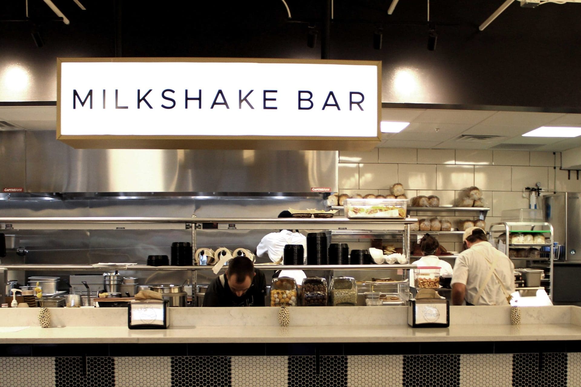
The other thing that is already flooding social feeds is the Milkshake Bar in all it’s glory. A-Triple plus, plus, plus for this area.
It’s lined with vintage hexagon tiles placed in vertical lines in black and white. Definitely gives the old school diner feeling with the stools made of metal powder coated white and wood, along with the vintage style lighted sign.
This, folks, is how you use the power of the selfie for shameless, free marketing.
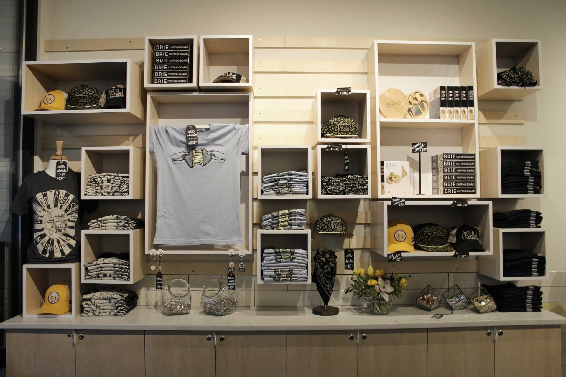
Retail was big. There’s a fairly large retail wall structure to the left immediately as you walk in. Overall, I loved the homemade feeling of the retail display but there was nothing on there that I just had to have.
Personally, I get it. You’re waiting in line and you might want to pick up a cap that says Grilled Cheeserie because that’s what’s trending on the pinterest fashion boards right now… right? No, I don’t get it — I lied.
Where are the grilled cheese options — I’m hungry!
My suggestion. If you’re going to sell retail at your restaurant, make me first fall in love with your food and then I’ll possibly pick up a hat to show my brand ambassador’ness’.
Give me something cool that has a design to it that supports your brand, and then put your logo on it as a supporting element. Create something cool and eye-catching, that just so happens to have your logo on it somewhere discreet. The goal is to get people asking, "Where'd you get that hat?"
There’s a small wooden menu holder opposite the retail space, like real small, serving as home to a handheld menu. Paper choice, nothing better. However, the layout and composition could have been much more compelling. There's an opportunity in menu design to drive the diner in a certain direction, and while informative, the menu design wasn't as enticing as we would have liked. More details on the overall menu design below.
Here’s my honest opinion after digesting this whole entry area.
The first huge thing I see when I walk in is Milkshakes, which while pretty, is not really the main event. Then I notice this oversized retail area trying to sell me things that tout a brand name or icon that I don’t yet love. Then, if I look really hard, I might find their food options which is what I originally came to the place for.
I really recommend that our restaurant clients focus in on what makes them unique, and avoid the temptation to throw any and everything at their environmental design. Here I say... show a little respect to the grilled cheese! It’s what made you who you are today and I can’t even find the creative options you worked so hard to invent as I look around your space.
I will note that there’s a little bit of wall space to the right of the retail display. This is prime real estate for an oversized menu board and would be a great way to make grilled cheese the focus.
Kudos to the kitchen area. It is, to the naked eye, pretty freakin’ cool. It’s got some square kiosks, hip aprons, stainless steel open shelving storage, and the Milkshake Bar. If nothing else, a picture of this makes the social viewers think this place is the next big thing in Nash-Vegas.
I think that the font usage in the brand and environmental design is derailing the cohesiveness of the brand a bit. While you're welcome to mix fonts, there's a method to the madness and I do not think there’s enough consistency in place here. An inappropriate mix of fonts within your brand and environment can create in viewers a feeling that something is just "off," so font choice is not to be overlooked.
Seems like the rules here were to use some sort of a sans serif font. Certain signs screamed trendy, round, nostalgic and geometric sans serifs. Other alluded to old school diners, but yet others looked stretched and distorted.
A little bit of love in the font world would have probably helped unify the brand and the space a bit more.
I saw this again in the illustrative styles the restaurant was using. Just really not all coming from the same perspective or style. I think a big difference could have been made had a little bit more attention been shown to consistency within illustration.
Subway tile with dark grout was found in places. Subway tile with white grout was found in places. I especially liked the detail in the yellow runner tile displayed amongst the white tile in various spaces. This took me back to the old school, vintage feeling that I truly think the restaurant is after.
The seating choices were for everyone. White and light wood modern picnic tables were found, which I think serves as a nod to the seating you may find in a food truck park, which carries forth the beginnings of the brand. Black diner style metal chairs paired with marble top tables were found. And just the coolest little window bar seating, as previously described. So date night, study sesh, or playdate — all bases were all covered.
The menu design was printed on a very thick, durable, paper. That was nice. Overall, it definitely presents their offerings in a clean, easy to read layout. Social was present and brand colors were there.
Is there room for improvement? Yes — always. The overall composition and layout was lacking luster. Basic design… nothing outstanding here. Additionally there was nothing that connected to me. Some cheeky sayings or even some historical pointers to the truck could have met me where I was.
Once again, as noted above, this was the only place I saw their food offerings and I think a menu board would do this place wonders.
As I ordered, the staff was great. Very helpful. Very charming. Everything you want from a Grilled Cheeserie aficionado.
I was given an order number to sit on my table with the vertical striping mentioned previously. I consider this to be a missed opportunity for customer connection.
The wall to the right of the Milkshake Bar was forgotten I think. Pretty stark. Blank — but lit, so I’m guessing there’s something coming!
Next, there was an area with condiments, trash, water, etc. You know the necessities.
Napkin holders were splattered around the restaurant with custom inserts containing the logo, icon and the city name; but these were very new-school napkin holders. I would have preferred to see some old school, silver shiny vintage napkin holders! It's such a simple touch, but would make a big difference in the overall feel of the experience.
Table top decorations were very petite vases, with that little noodle on them, and a cute little flower. So score because you found vases with that little noodle, but again, that little noodle…
Overall throughout the space, with the exception of the cash/milkshake wall, the space was just too black and white. I get that’s what the brand may have been going for, but a pop of color here or there really never hurt any restaurant.
The lighting throughout the space had a lot of variation in style, but color remained black and/or white. Some pops of yellow in the lighting would have unified the yellow runner tile in a very nice, yet subtle manner.
Food presentation was great. Little baskets. Branded tray liners. Craft tot holders. Clear branded cups. All great stuff.
Here again, I think little metal silver baskets would have stepped up the cool factor for me and unfortunately I’m still not crazy about that slice of cheese and slice of bread which I saw again on the cup and the tray liner — but they did carry that element through to multiple customer touchpoints, so good good goodness.
The directional signage found throughout the restaurant wasn't great. Different styles. Different fonts. No consistency. That’s a-ok, but this could have brought a little improvement to the consistency issue that I’ve already harped on.
Last note, big miss in the bathrooms. Bathrooms in restaurant are visited often. A little love in here can go a long long way. I don’t think there was anything on the doors, on the walls, stalls, etc. Just more black and white. Come on… let’s get creative. Who cut the cheese, right???
The attire was on point — after all you can’t open a restaurant these days without trucker hats and cool aprons, so 5 stars for that.


