Mr. Wong’s Chicken and Rice

asian restaurant branding package design

We worked with Original Chicken N Rice on a restaurant branding project that equipped the restaurant with a bold brand.

The owners reached out to us with a need to rebrand the restaurant in a manner that would resonate with their existing customers, while also appealing to new ones. Their goal was not necessarily to bring in more business (although that never hurts, right?!) but to align the brand and brand support with a narrative that would resonate better. Additionally, changes to the business structure were impending, so a new brand was 100% necessary.

Our restaurant branding agency worked on a restaurant rebrand project to create a bold new brand for Original Chicken-N-Rice.

The owners wanted a restaurant rebrand that would connect with existing customers and attract new ones. Their goal was to align the restaurant brand and brand support with a narrative that would have a bigger impact. Changes to the business structure were also impending, so a new brand was necessary.

Project Kickoff

First, we took a trip to Dallas to meet our clients, learn about the restaurant and their customers. We learned that the target market was mostly working-class families and blue-collar workers. Many customers also spoke Spanish.

The restaurant’s differentiators were pretty clear. They were a family-owned restaurant that served large portions at reasonable prices.

The menu featured fan favorites, like tempura-battered chicken tenders, Hawaiian-style wings, fried and white rice, and a variety of sauces, sides, and drinks.

The restaurant was founded by an immigrant named Mr. Wong. When he arrived in this country, he was amazed by fast food concepts and their ability to serve good food at affordable prices. He started cooking out of the back of a convenience store before opening the first Original Chicken-N-Rice concept with his business partners.

Mr. Wong retired after years of success and turned over restaurant operations to his children, our clients.

Our clients relied on us to create a bold new restaurant brand that would keep them current as they expanded within the fast-casual market.


Brand Direction

We took what we learned and combined it with our own market research, then started creating narratives and visual direction options for the brand. We wanted to reposition the restaurant from an inexpensive place to grab food to a family-run r

estaurant that served fresh, heaping portions at great prices.

Our goal was to create visuals that more closely aligned with the branding that was dominating the QSR market.

We created three options for visual direction. Each brand board could be used as a vessel for telling the story we sought to weave into the brand. The boards also served as a way for our clients to determine the direction of the brand.

The winning brand board retained a color palette similar to the existing Original Chicken and Rice brand; but, it featured updated tones and a more modern approach.

We incorporated natural elements—concrete, metal, natural wood tones—along with modern illustrations to bring in the chicken concept.

There are modern, clean fonts and a warmer yellow than the typical hue. We included an orangey-red color as well. These colors update and refresh the tones and existing colors while nodding to the original brand.

The graphics are big and clean, as shown in the NY image and the Y image. The interior graphics would be uncomplicated, but illustrations would be more minimal.

The brand features industrial furniture and fixtures with pops of color. Finishes would stay natural in materials and tones.

Black and yellow would be the primary brand colors. Red would appear in the employee attire, menu, food photography, and graphics.

Fixtures and restaurant materials, like trays, would be stainless.

Upon presentation, the client approved this board and it became the foundation for the restaurant rebrand.

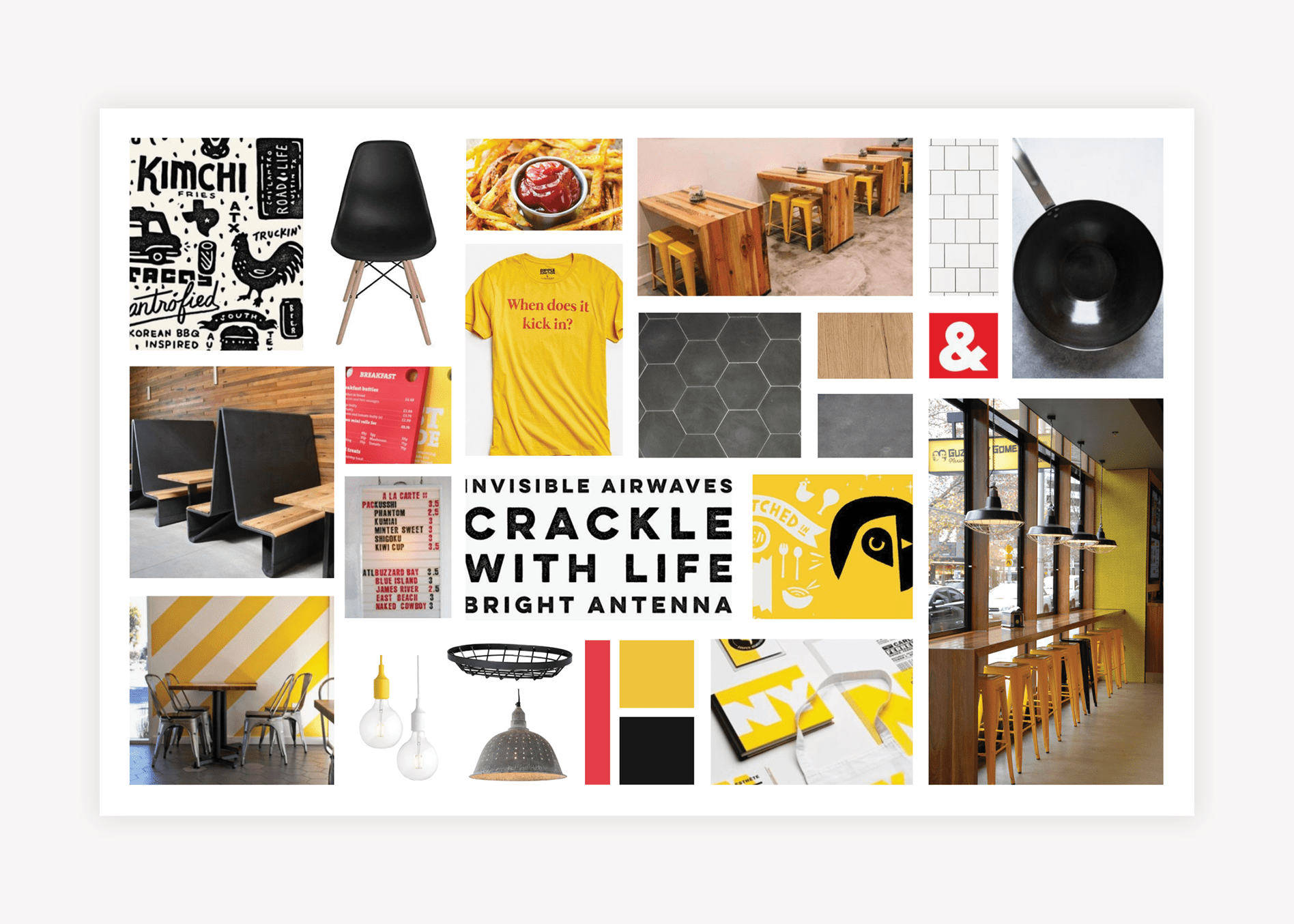
asian restaurant brand board design

Name Development

In order to distinguish the restaurant from similar local concepts, we began with naming. Within that process, we work to identify the restaurant’s differentiators and how to connect with customers.

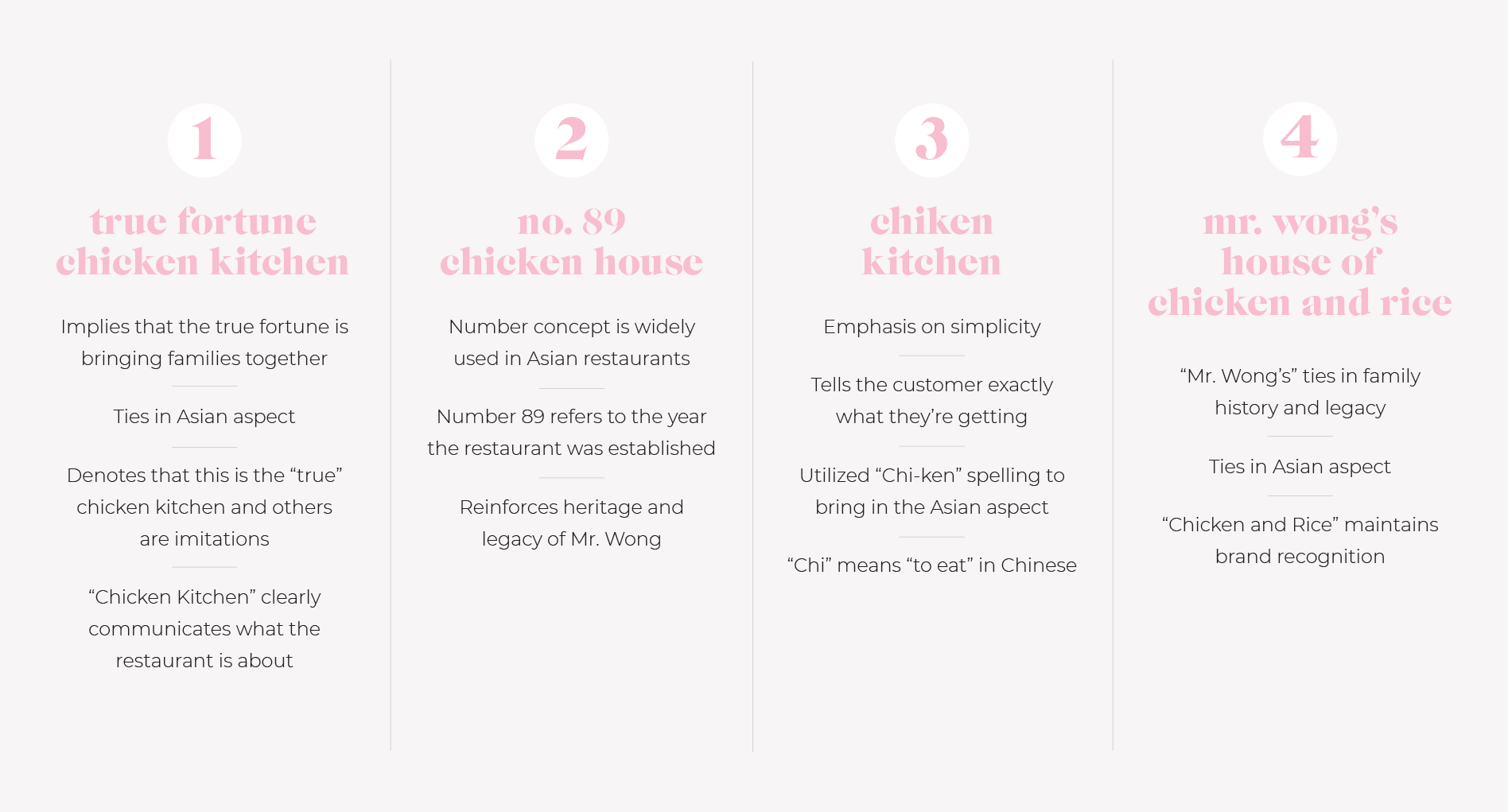
We delivered several name options, including True Fortune Chicken Kitchen, No. 89 Chicken House, and Chiken Kitchen.

restaurant name development

True Fortune Kitchen relates to Mr. Wong’s legacy and the idea that true fortune is bringing families together. The name also denotes that the restaurant is the “true” or most authentic chicken kitchen. The term “fortune” is a respectful nod to Asian cuisine and tradition. Chicken Kitchen tells the community exactly what the restaurant is about. Adding Chicken & Rice in place of Chicken Kitchen for a short period of time would allow customers to retain their awareness of the brand.
Finally, we presented No. 89 Chicken House, or Number 89. The number concept is widely used in Asian restaurants, and the 89 refers to the year the restaurant was established. It reinforces the heritage and legacy of Mr. Wong, while still being catchy. The number 89 would appear throughout the branding and you could keep “chicken + rice” for a while to allow the community to become accustomed to the name.

The name Chiken Kitchen plays on the simplicity of the brand board with a name that tells you exactly what the restaurant is—a chicken kitchen. We’ve chosen the spelling “chi-ken” to bring in the Asian heritage. Chi in Chinese means “to eat.”

We also informally presented Mr. Wong’s House of Chicken and Rice, which could be shortened to Mr. Wong’s or Mr. Wong’s House of Chicken over time.

The story behind a business name may not be obvious to every customer. But, it serves as a jumping-off point for a compelling narrative. The name and story will be supported by visual and written brand support. Once it’s used throughout the website, social media, restaurant materials, attire, interior, and more, all pieces will echo the brand.

The name and story shouldn’t confuse the customer, but all underlying meanings may not register with everyone. For example, in “Chiken Kitchen,” not everyone will know that Chi is “eat” in Chinese, but the meaning could come through with the help of brand support.

Just as the name Wendy’s doesn’t convey Dave Thomas’ story, over time, Wendy became known universally as his daughter. Similarly, not everyone knows Panera means breadbasket, but that’s OK.

Ultimately, our client went with the name Mr. Wong’s Chicken and Rice. It pays homage to the restaurant’s founder, while clearly stating its offerings: chicken and rice.

Food Photography

Using the brand direction as a guide, our branding experts began planning for food photography. The goal is to enhance brand image, attract customers, and showcase offerings throughout brand and marketing materials.

We proposed a shot list of menu items for approval. We then coordinated details with our client and the kitchen manager regarding the manner in which the food would need to be prepared for the photoshoot.

We created a visual direction for the shoot that aligned with the menu items and the brand direction. All shot setups were planned to ensure efficient use of time and resulting images that we could use for brand support.

We also created a prop list and procured all props and backgrounds necessary for the shoot. We then had all items packaged and shipped to Dallas.

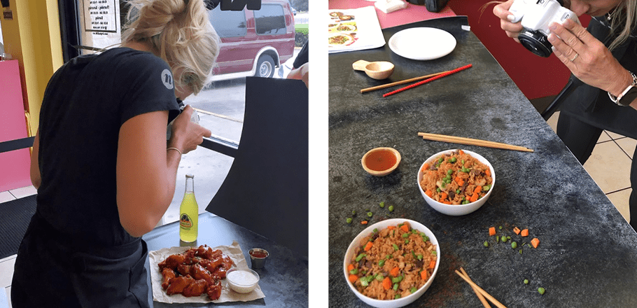
Finally, we flew to Dallas for the day. We arrived at the restaurant and spoke with our client and the kitchen manager, who had prepped all the ingredients in advance. We set up at a table against the window, where we would have ample natural light. We then created 10 staged environments in which we could photograph the food.

food photography design agency

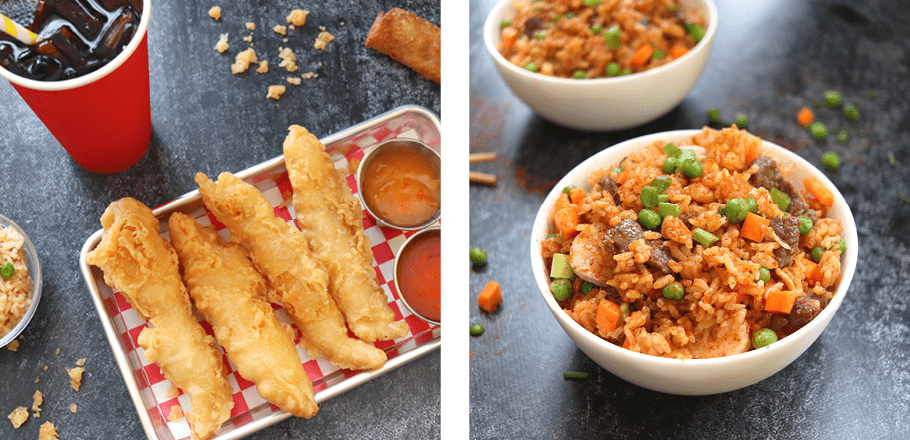
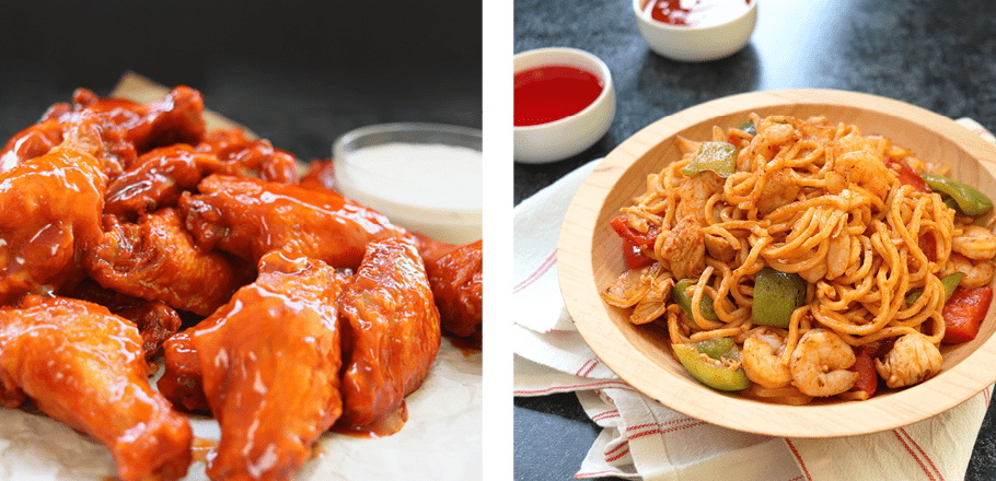
We returned to our offices and selected the best images. These were sent to the client for final selection, and the winning food photos were edited.

Final food photographs were provided to the client, and our team was able to utilize them in the development of brand support.

food photography company
food photographer

Logo Brainstorm

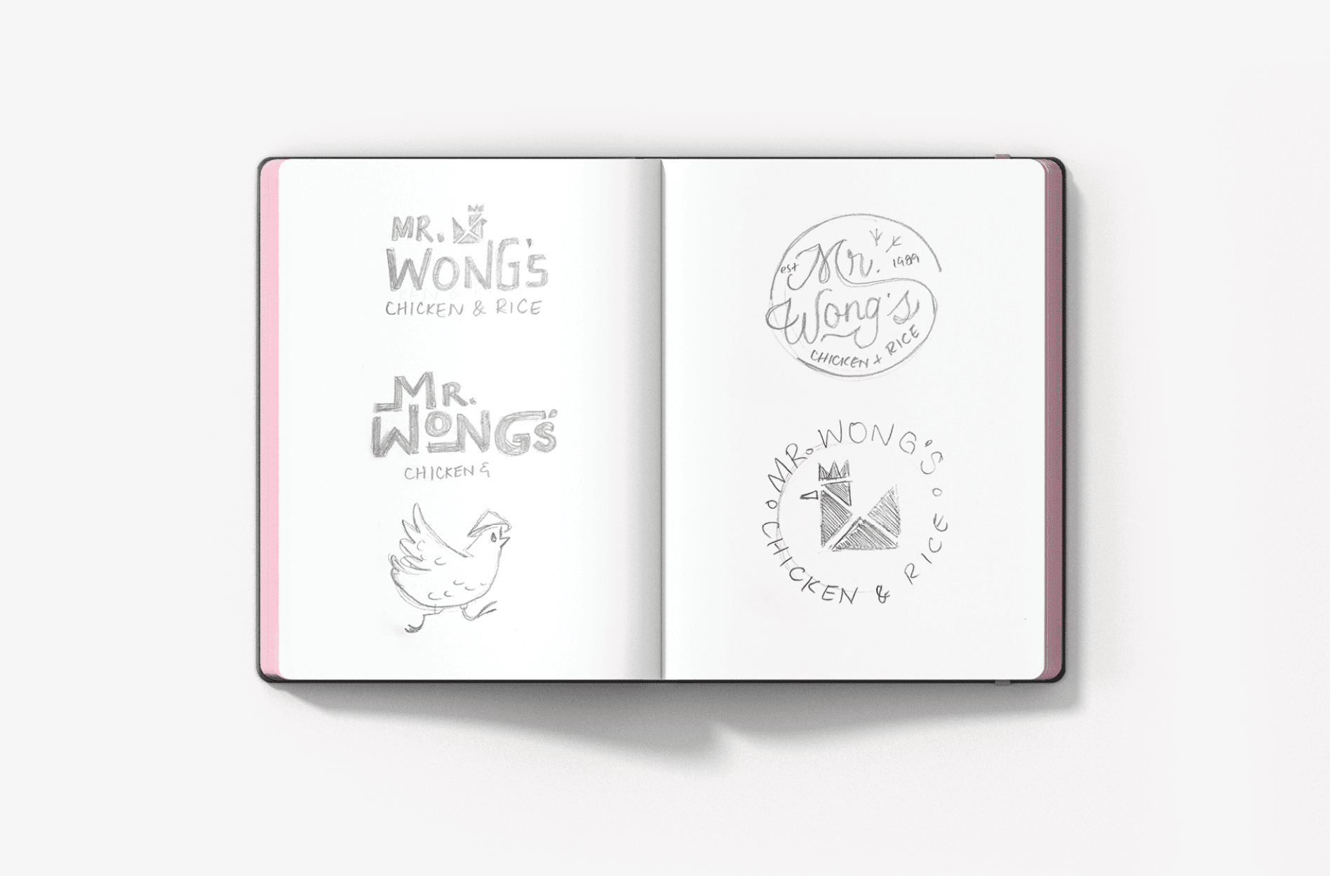
Our logo design team had to develop concepts for the logo that would align with the brand direction. They sketched out designs that encompassed a chicken icon. They also included typographical options that would bring in a chicken footprint pattern.

restaurant logo sketch design

Finalization of Conceptualization

Ultimately, our Creative Director and Director of Design determined that the rebrand concepts including the chicken icon and the typographical round logo would serve the brand well.

Logo Design

Our logo design team used the concepts to create three new restaurant logo options, with one variation to create a fourth option.

Logo Options

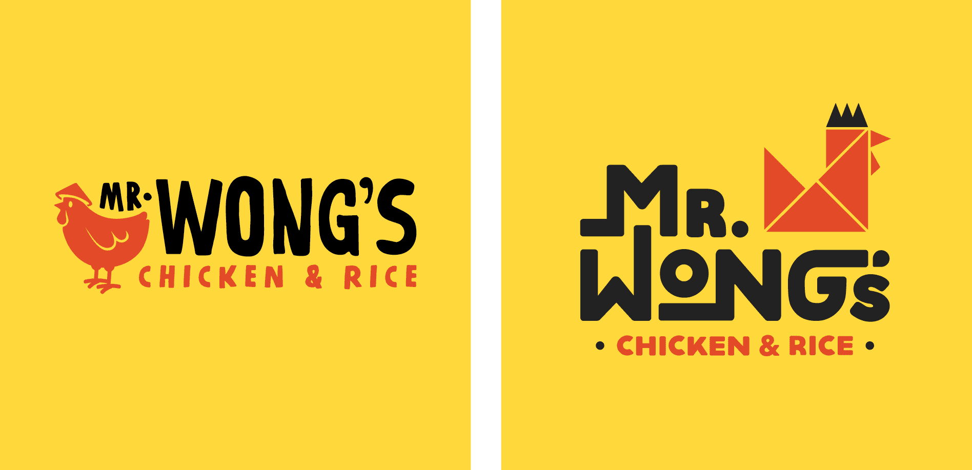
The first option had a modern, but unique type, with a custom-illustrated running chicken. The movement in the type mirrored the movement of the chicken to represent the restaurant’s fast service. “Mr. Wong’s” took primary placement, while the tag “chicken & rice” was featured below. We offered a stacked and horizontal version of the new logo, plus options for the icon. The colors were warm yellow, bold red, and a grounding black.

chicken restaurant logo designs

The second logo option introduced a new typeset. The restaurant name was featured in a round setup, like a diner-style logo. A casual script font was used to show movement and quality, and the name was encapsulated by the established date and tag. A chicken footprint pattern, which would serve as a primary brand element, was incorporated in the logo design.

asian chicken logo design

The chicken from the first option reappears in the third logo. But, this time, he’s stationary. We used a more handwritten-style font to align with the casual nature of the business in all caps for boldness.

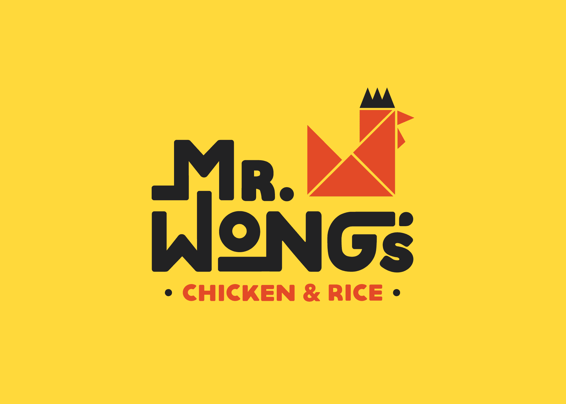
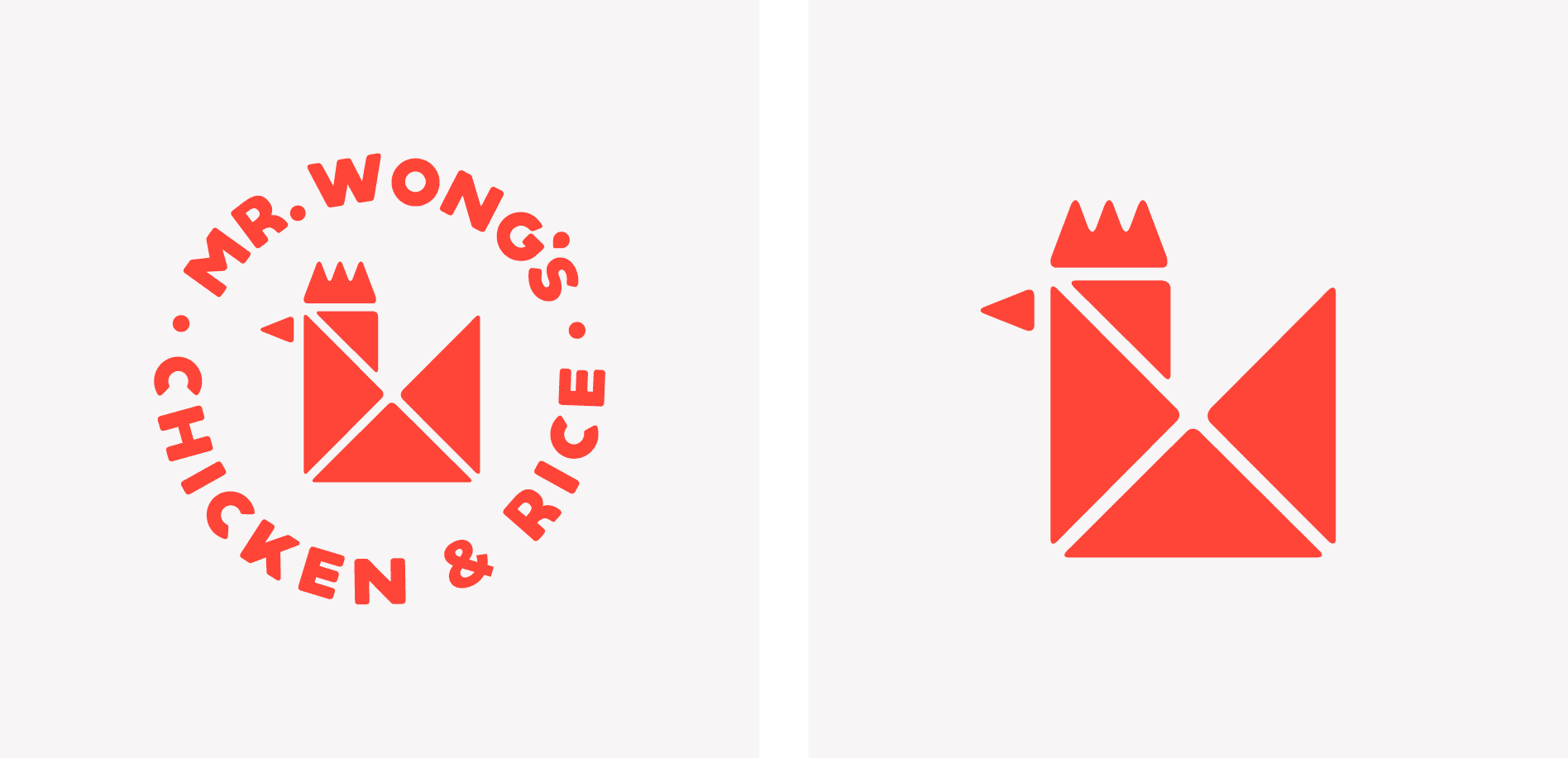
The final chicken logo option utilized the same type as the first; but, it featured a custom origami-style rooster icon that nodded to the Asian culture.

chicken logo development

Presentation and Selection

Ultimately, our clients selected the final logo option. They felt that the origami-style chicken icon and clean lines within the bold icon would be a good representation of the brand.

Logo Finalization

chinese restaurant logo development
chicken food logo graphic design
chicken restaurant logo graphic design

While the icon was a hit, our clients requested to see a change in the logotype. They worried that the extended lines would be hard to read. We revised the type and presented it to the client.

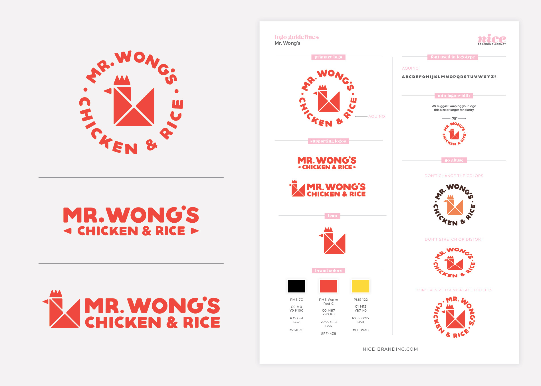
Upon approval, we finalized the logo and selected the exact color codes. The color codes were provided on our logo guidelines sheet in PMS. CMYK, RGB, and hex tones. We also prepared a complete set of logo files in PDF, EPS, PNG, and JPG.

asian restaurant logo guidelines

Sitemap Presentation

The restaurant website came next. We began by pulling a sitemap of the existing website so we could plan for required pages. We then had to determine if we needed to increase or reduce the number of pages, based on the content and goals for the new website.

Website Hosting

We also talked to our client about website hosting. We use the best WordPress website host available to ensure fast load times and daily backups, along with monthly maintenance. We also want to make the website live on launch day. Our client decided to have their marketing agency host the website, so we would plan to package up the files and provide them prior to launch.

Environmental Branding

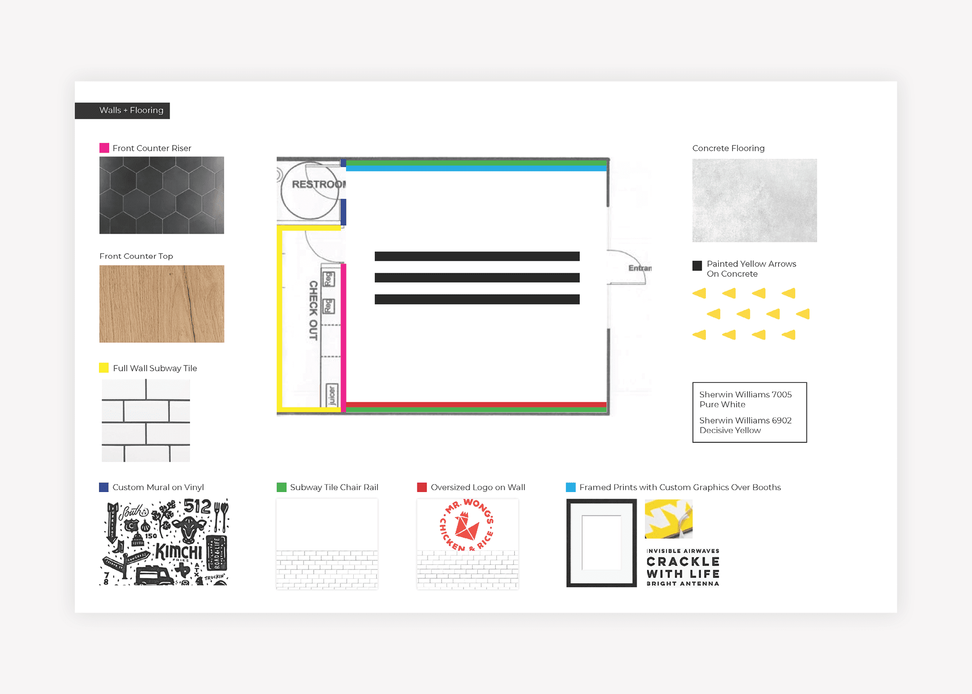
A big, but often overlooked part of restaurant branding is weaving the brand and narrative through customer touchpoints or Environmental Branding.

Our team has perfected the process of implementing a brand throughout the physical space of a restaurant in order to deepen the connection with the customer.

Mr. Wong's Chicken and Rice - restaurant branding interior

Here’s how we do it:

We start by finding opportunities in the customer journey that have the power to impact the customer. Then, we weave the brand through each touchpoint using graphic and interior design techniques.

Our environmental branding package includes a visual presentation of ideas and strategies to brand your restaurant’s interior. It doesn’t include architectural drawings, construction planning, construction drawings, or specifications, but instead outlines finishes, fixtures, and design features for the interior.

Our team gives a presentation, and upon approval, we translate all ideas to the architecture or construction team to implement into final construction drawings. Then, we act as a consultant through the final build, including a midway construction meeting if applicable.

asian restaurant interior brand design
asian restaurant environmental branding

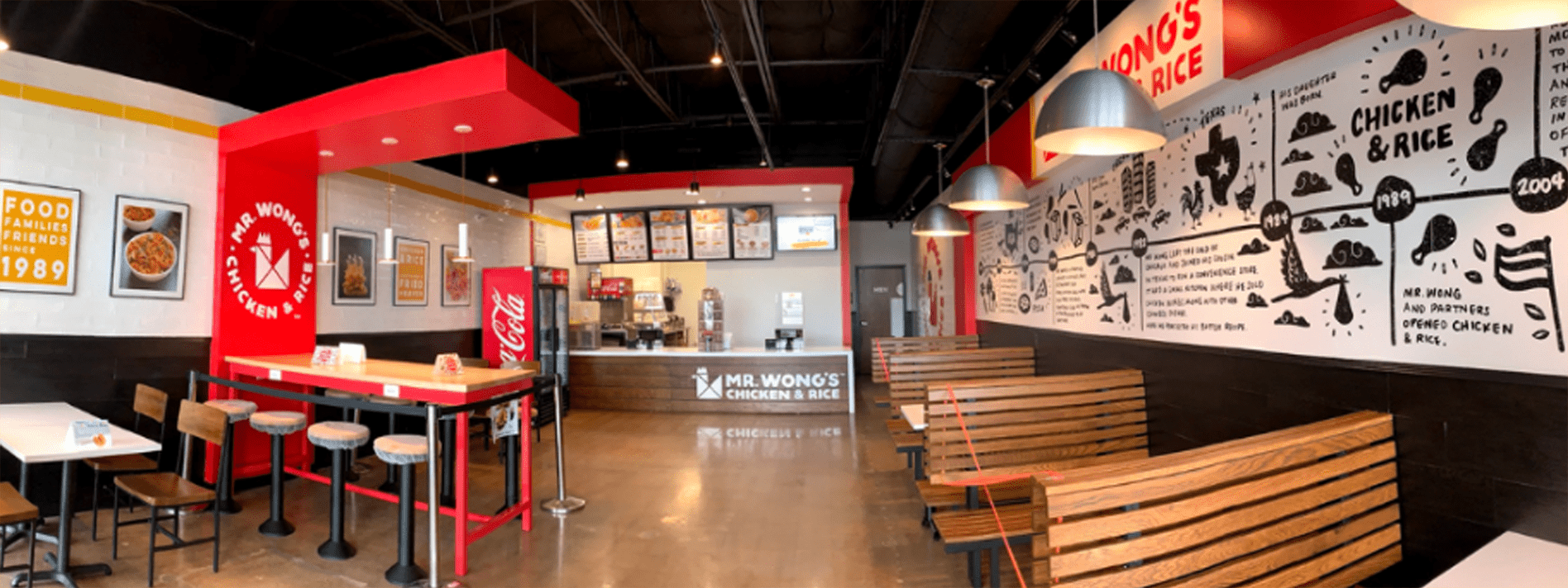
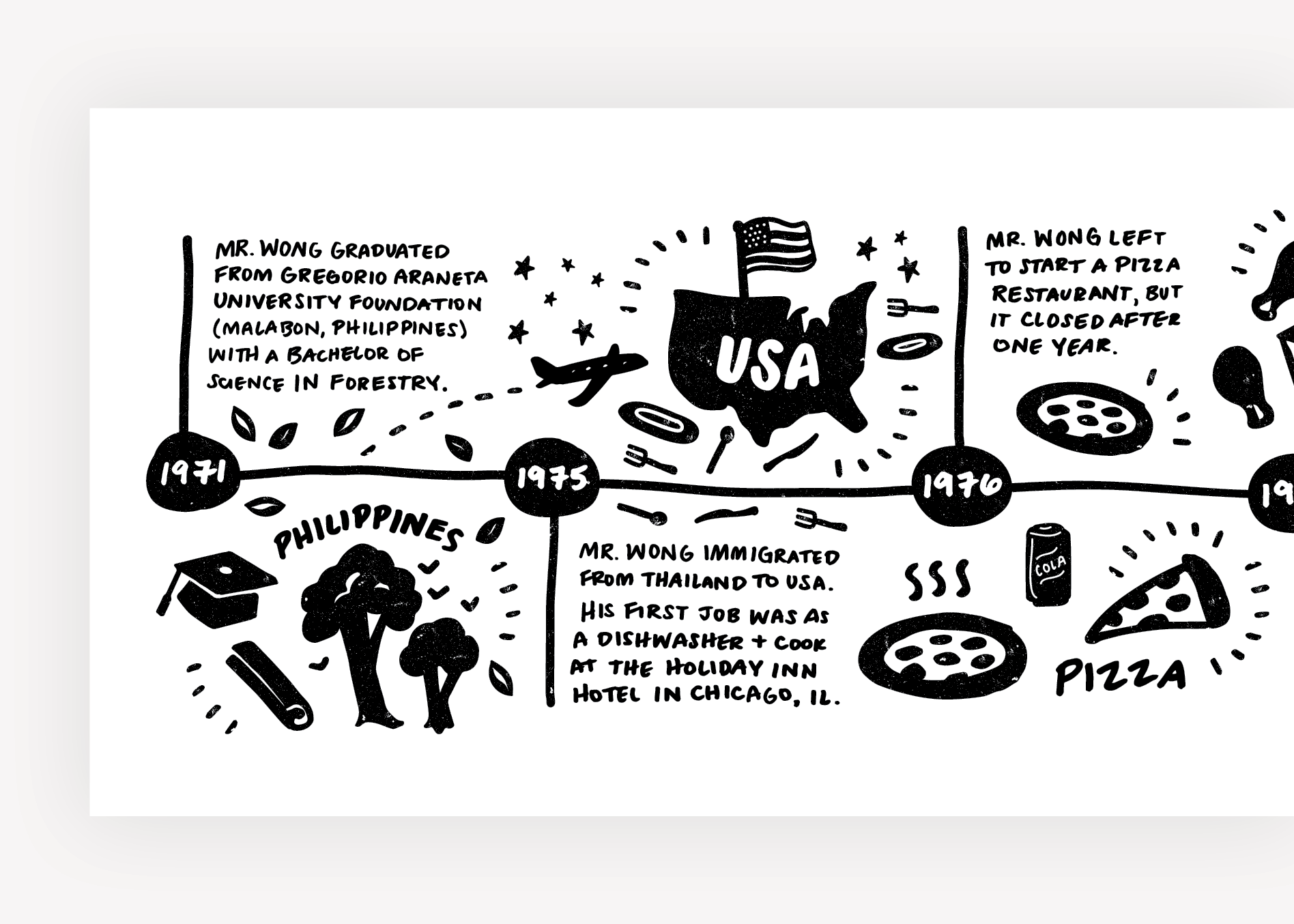
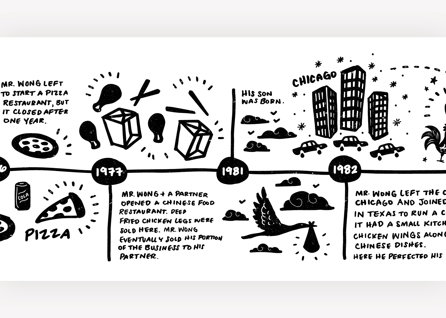
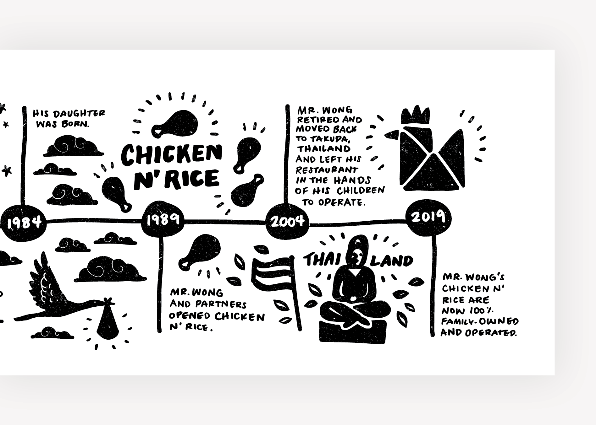
We wanted to bring the story of Mr. Wong’s Chicken & Rice into the walls so that customers could see the importance of family for the business. Since many families frequent the restaurant, we knew that this would be particularly meaningful.

One wall featured an illustrated timeline of Mr. Wong’s story and how his influence shaped the restaurant.

asian restaurant mural graphic design
asian restaurant mural illustrations
chicken restaurant mural illustrations
chicken wall graphic design

We reserved the other wall for large food images from our photoshoot.

During our time in Dallas, we sat inside the restaurant and observed customer behavior. We noted three main customer groups. The first was the takeout person or family, who ordered ahead or ordered at the register and took food to go. The second was the lone diner, who watched TV as they ate. The third customer group was families, that would order and eat in, talking over the food.

Using our observations as a guide, we created a seating plan that included booth seating for families, and counter seats and hightops for singletons or people waiting for takeout. The middle section was left open for the line.

Below the wall art was decorative subway tile, which would be easy to wipe down. The floors would be polished concrete and the lighting would be a mix of industrial-style pendants and flush-mount fixtures that would introduce black, stainless, and yellow into the design.

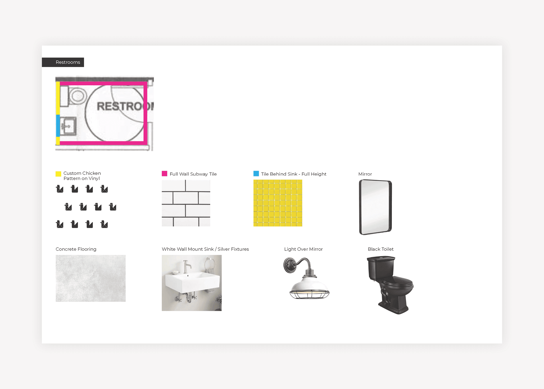
The bathroom was a key touchpoint, as it was a super-small space, but it opened directly into the dining room. We proposed a black toilet and a pedestal sink with metal legs and a white basin. Square yellow tiles would extend floor to ceiling above the toilet, and custom wallpaper would cover the space on either side of the tile. The wallpaper would be white, with a pattern created from the brand icon printed in black.

Trash receptacles and the interior doors to the restrooms and back office would be black.

Menu + Menu Board Design

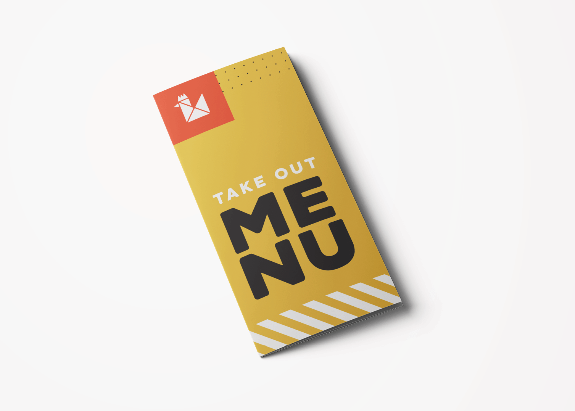
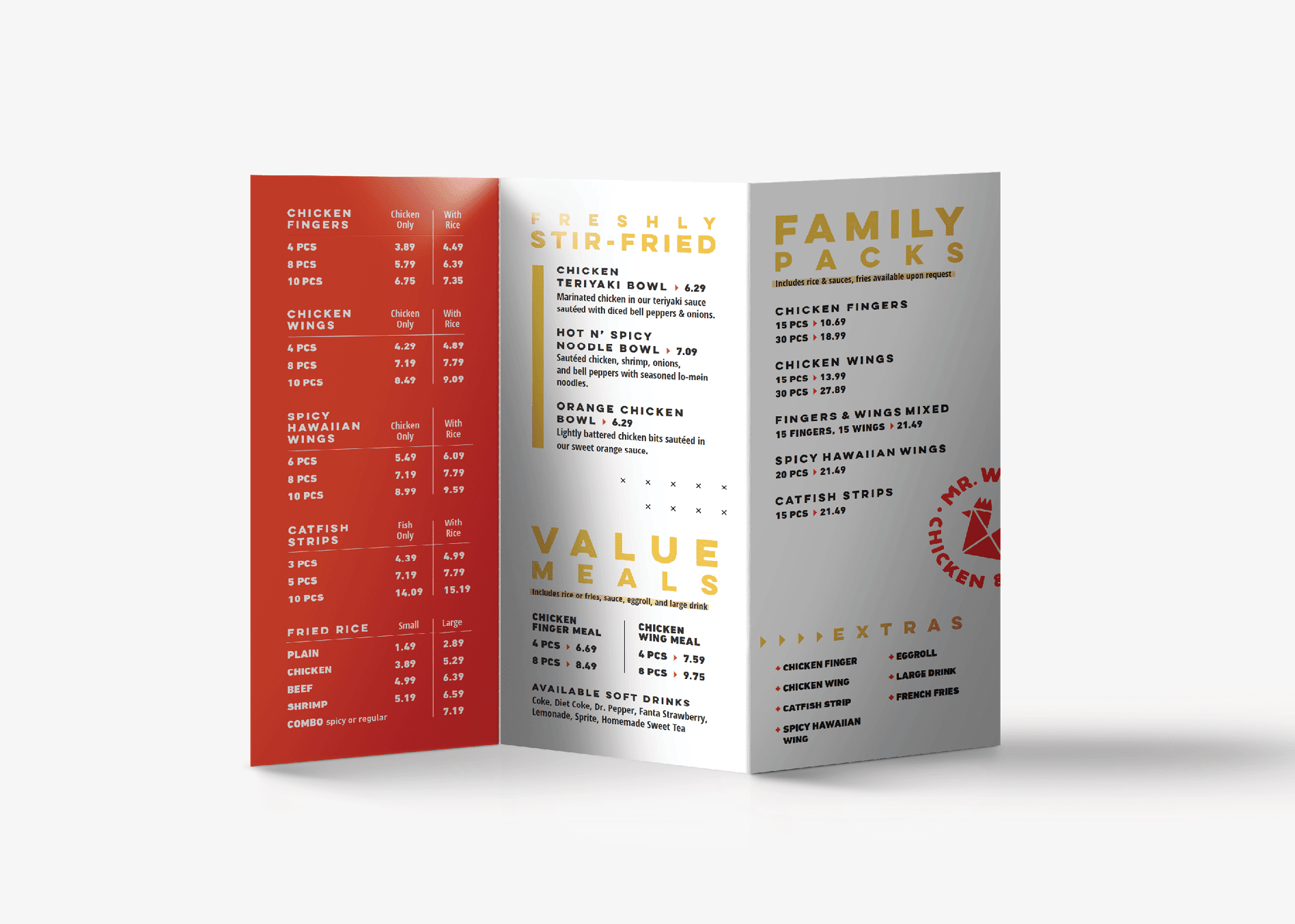
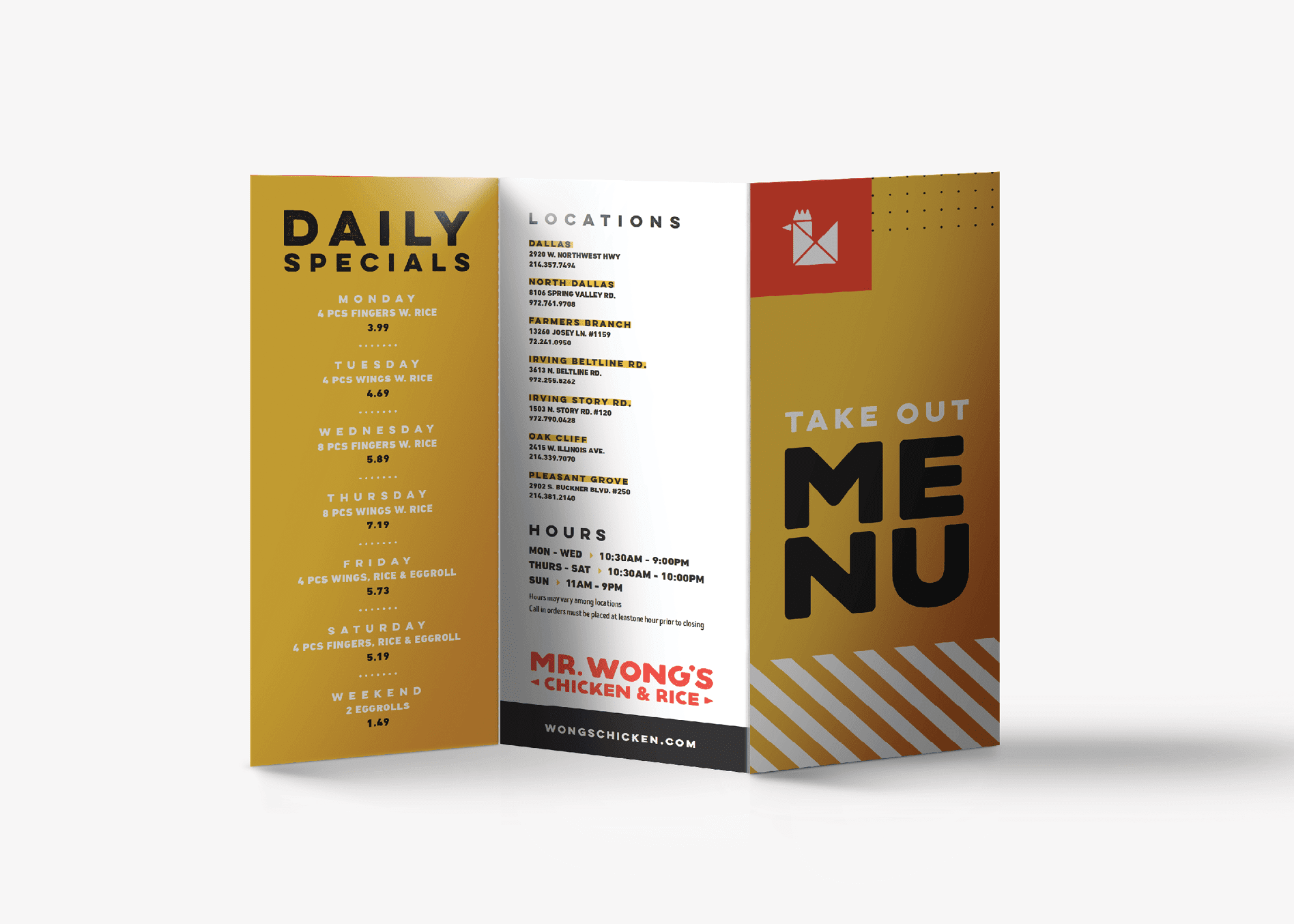
For the dine-in / take out menu, we created a trifold measuring 11 inches tall by 8.5 inches wide when laid flat. The trifold allowed us to create a small finished size that would be easy to read inside the restaurant or take on the road.

We wanted the cover design to instantly connect the customer with the brand and show off the stunning food photography. The back included a list of locations. The inside front flap highlighted the specials.

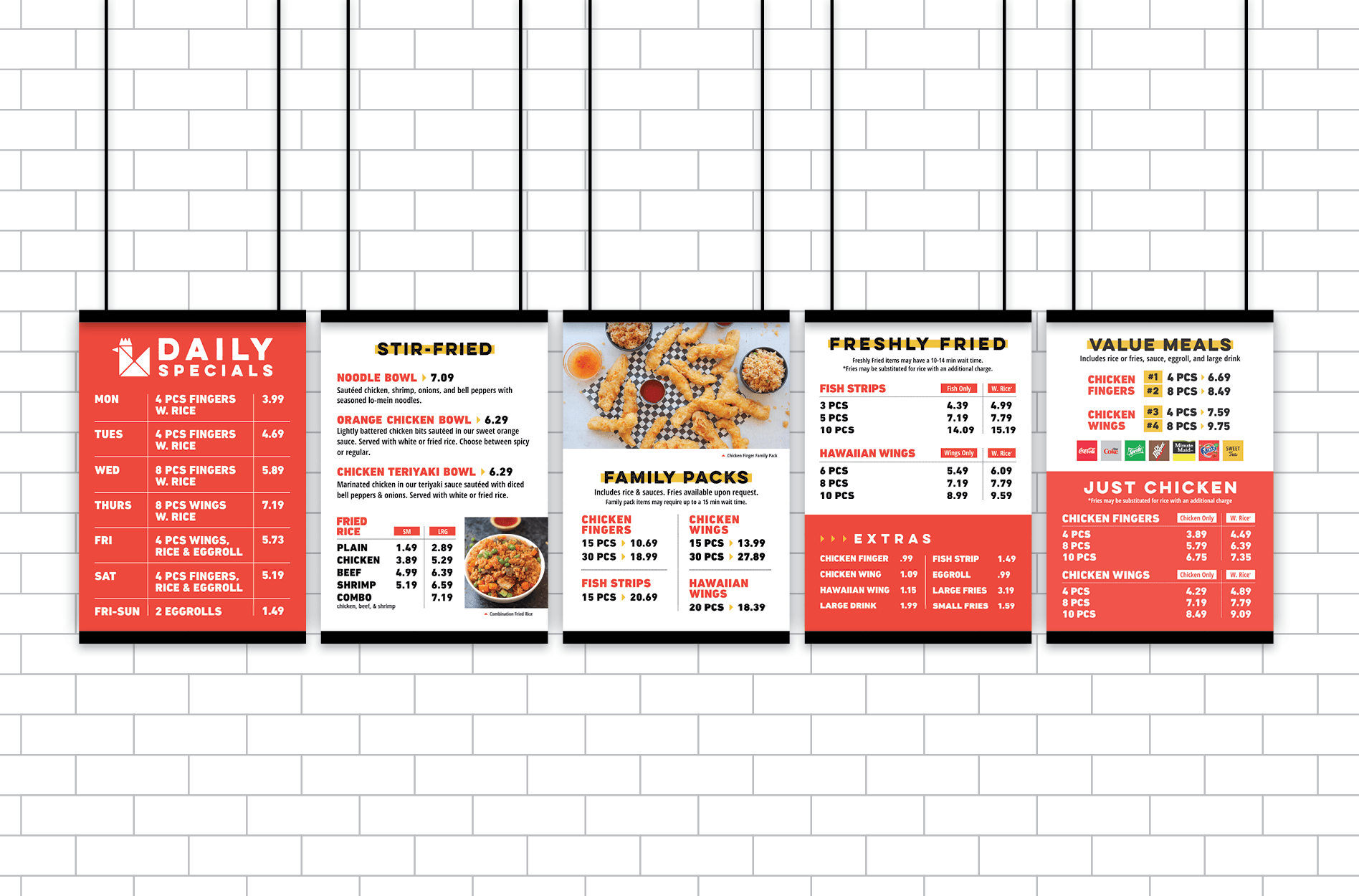
The inside of the menu was split into sections for the main menu meals, fresh stir-fried bowls, family packs, and value bowls. Color blocking was implemented to draw the customer’s eye across the different sections of the menu and to separate the content in a manner that made it easier to read. Imagery further connects people with the food.

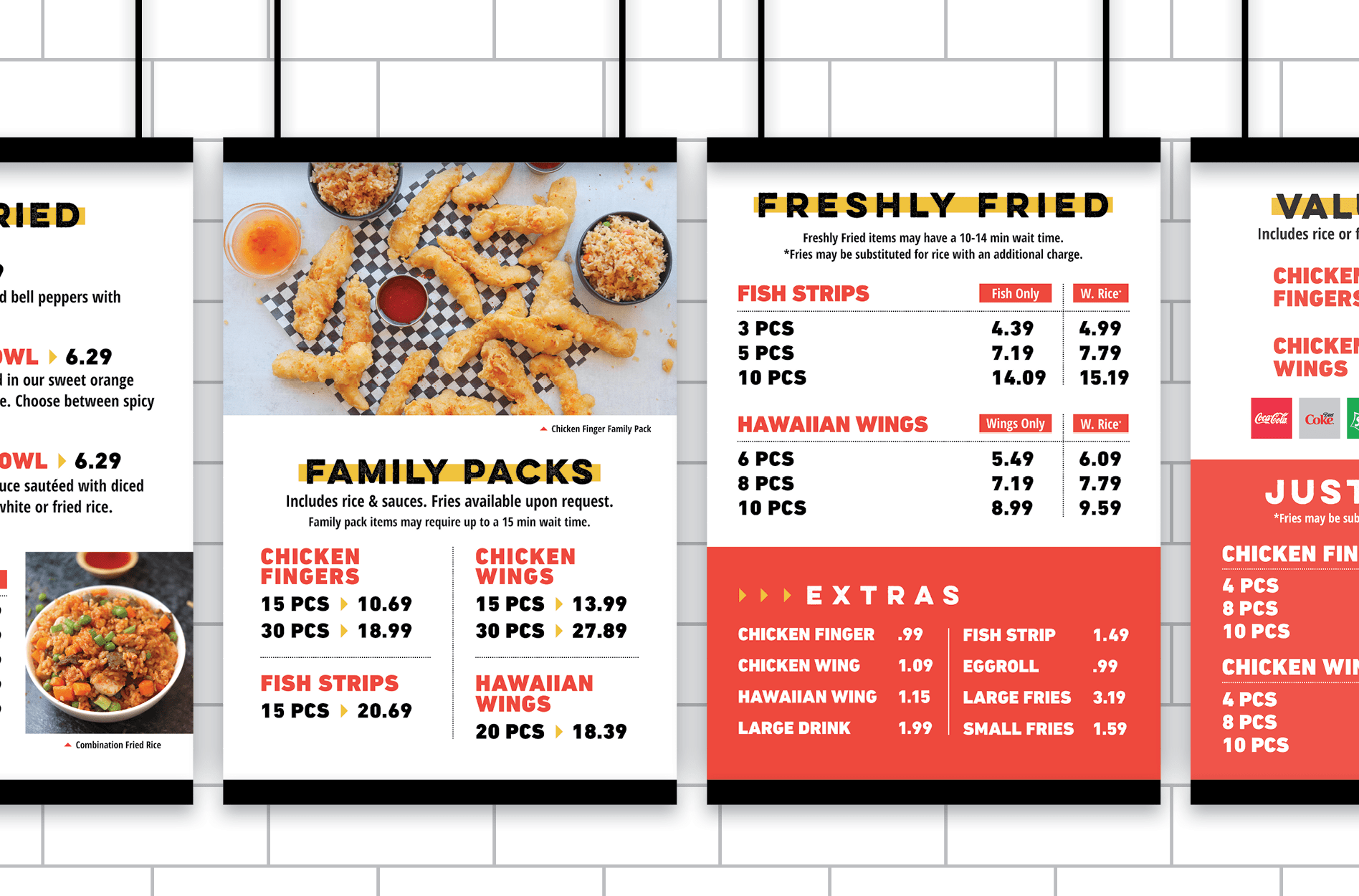
The menu board design consisted of five panels that aligned with the environmental branding and the look and feel of the takeout menu design, but with simple, easy-to-read text and ample negative space. We wanted customers to be able to read the boards from a distance.

asian restaurant menu graphic design
restaurant to go menu design
restaurant takeout menu design
restaurant menu board graphic design
chicken menu boards design

Business Card

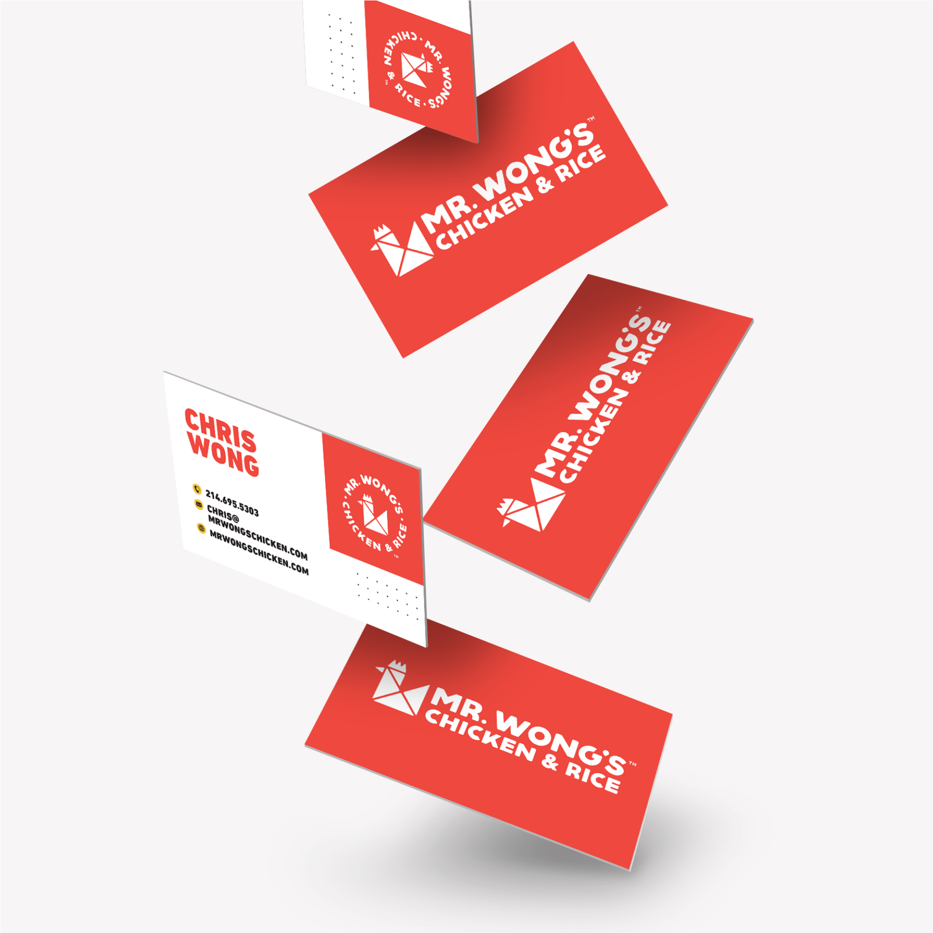
We designed a set of business cards that would put the restaurant rebrand in the spotlight. They featured the new logo and basic contact information, while also putting the brand colors and fonts on display. The new logo icon was included to draw interest and keep the card memorable.

restaurant business card graphic design

Stationery Package

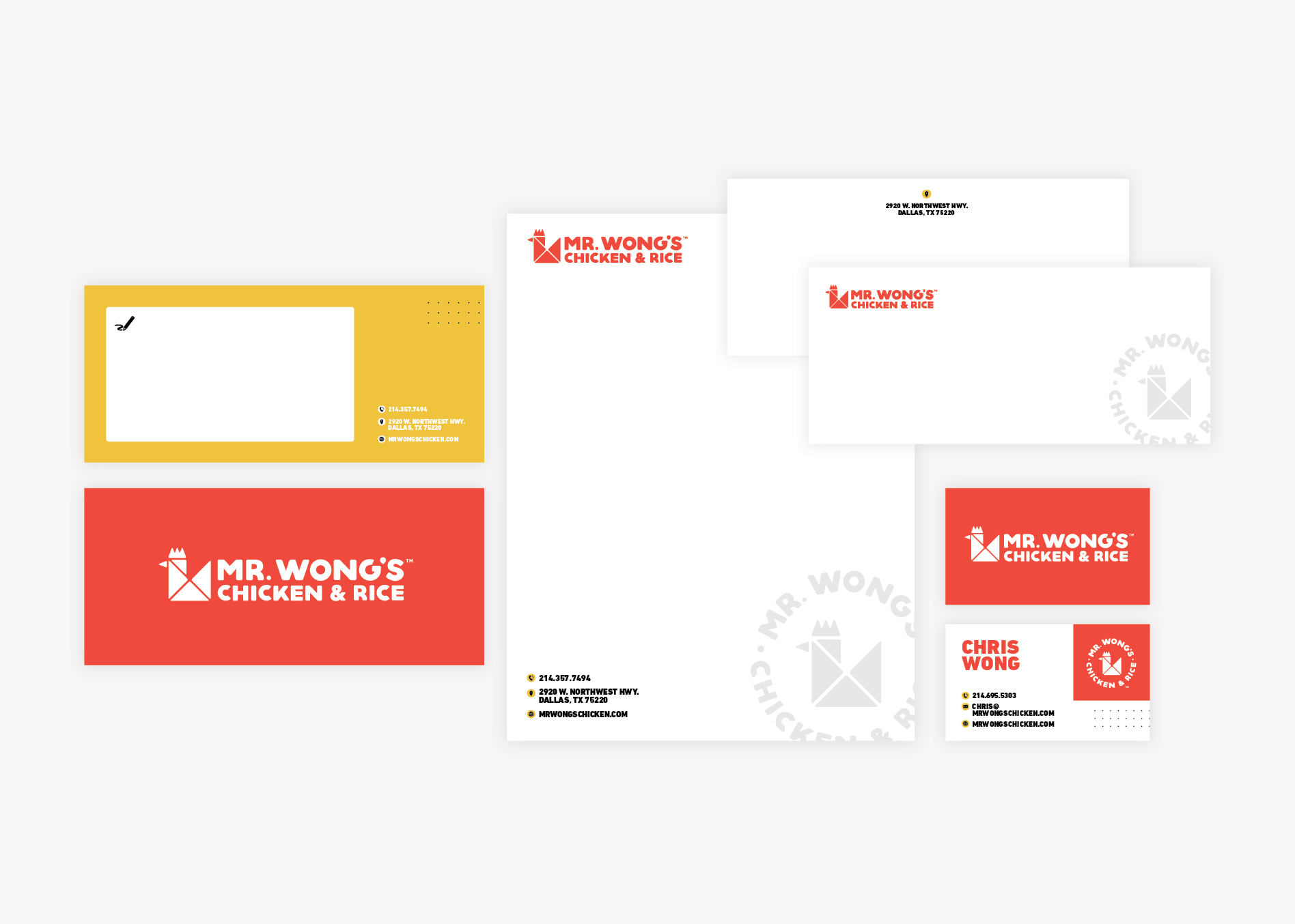
We also created a stationery package to align with the business card. It included a letterhead (both print and digital), as well as an envelope design, and a notecard. Our team provided final files to our client, but also equipped them with print prices, should they desire to order from our vendors.

restaurant stationery package design

Website Wireframe

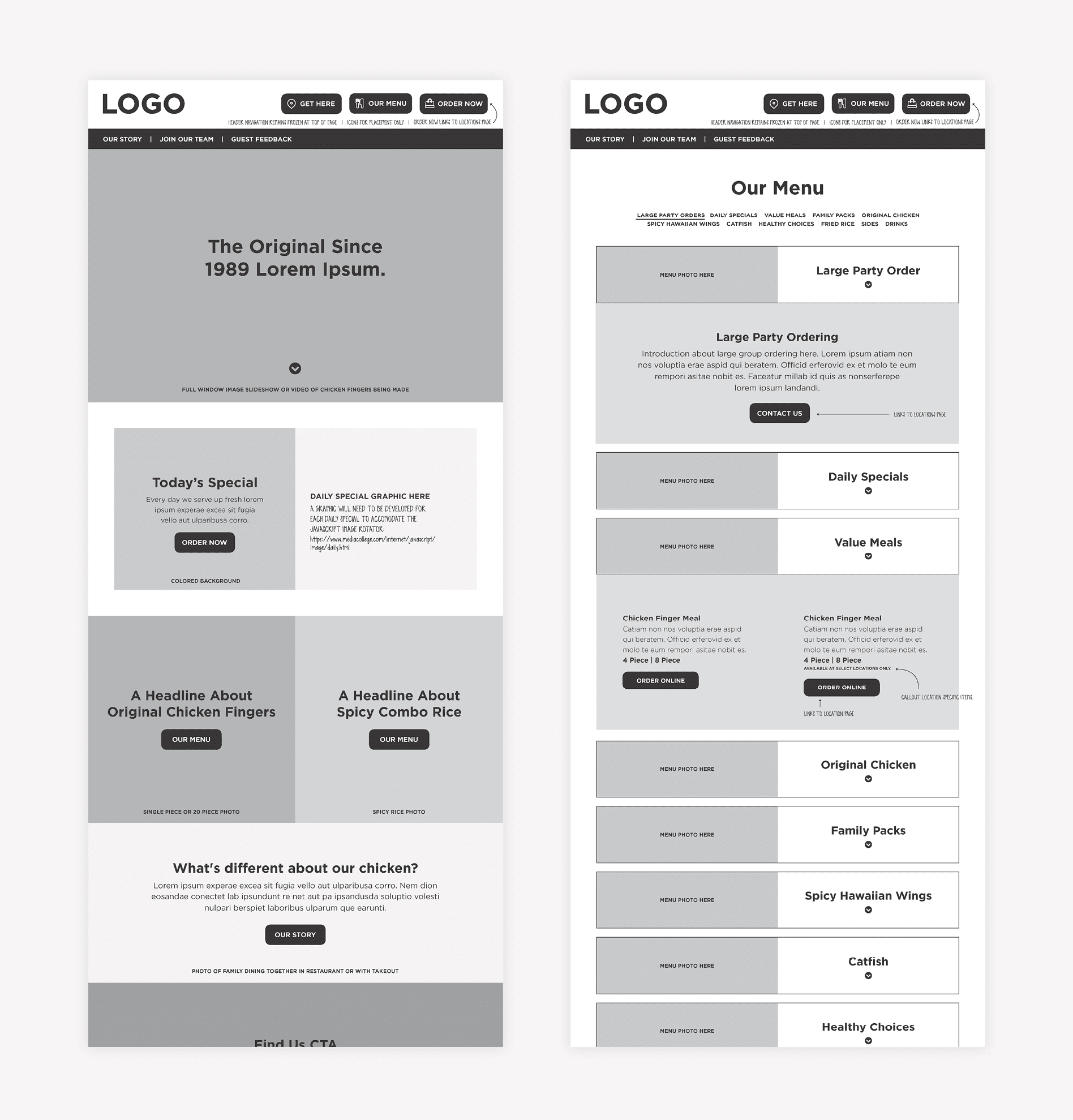
Website wireframing is where all of the strategy work is done. It’s when we determine the goal for users who land on the website, and how we are going to get them there.

During this phase, we learned that our clients’ ultimate goal for site visitors was to look at the menu or find the nearest location.

They also had a rewards club and an extensive system for garnering reviews.

We worked through the wireframe, giving special attention to the locations page and the menu. We also created several contact forms within the website to collect reviews, customer messages, and reward information. Lastly, there were job applications within the website that would need to be distinct for the front of the house and back of house applicants.

The website would be translated in English and Spanish, so we addressed the translation functionality as well.

We created on-brand headlines, subheads, and calls-to-action. This content would aid our client in reviewing the wireframe and navigating through the PDF to determine how the user would journey through the site.

We presented the wireframe to the client and made a round of revisions before finalizing and moving into website design.


restaurant wireframe graphic design

Website Design

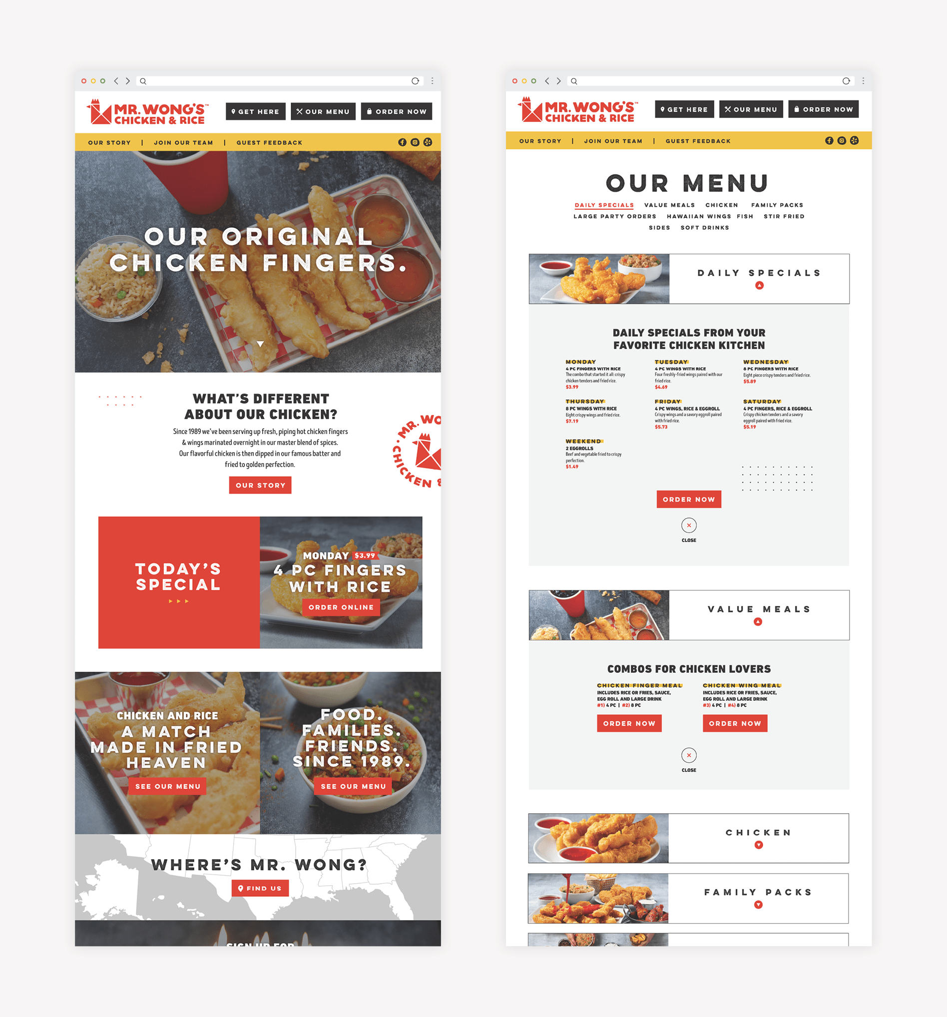
During the web design phase, we implemented brand colors, fonts, copy, and food photography to bring the wireframe to life.

The design put food photos on par with compelling content that told the story of Mr. Wong’s and what you could expect from the restaurant.

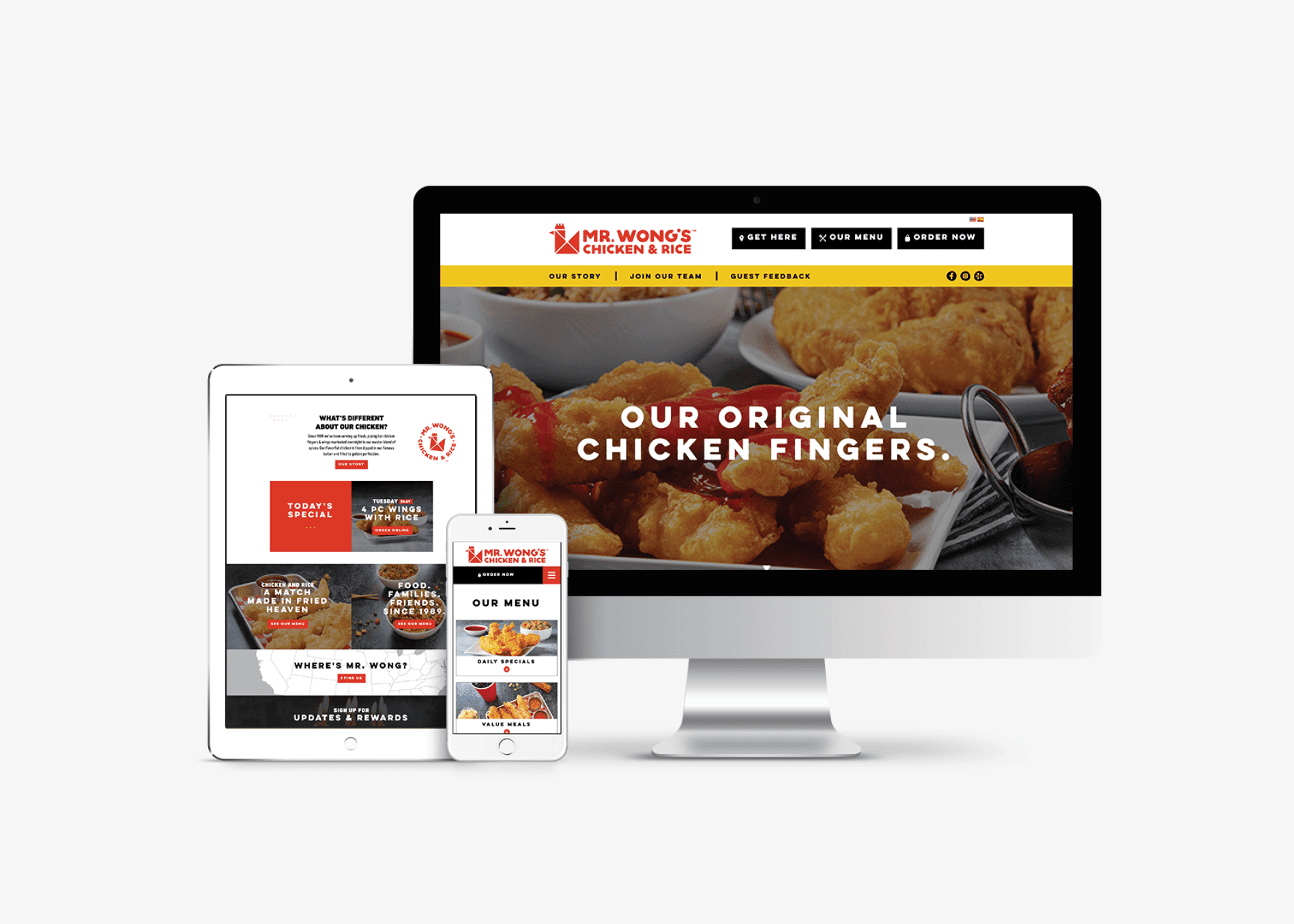
restaurant responsive web design

Website Development

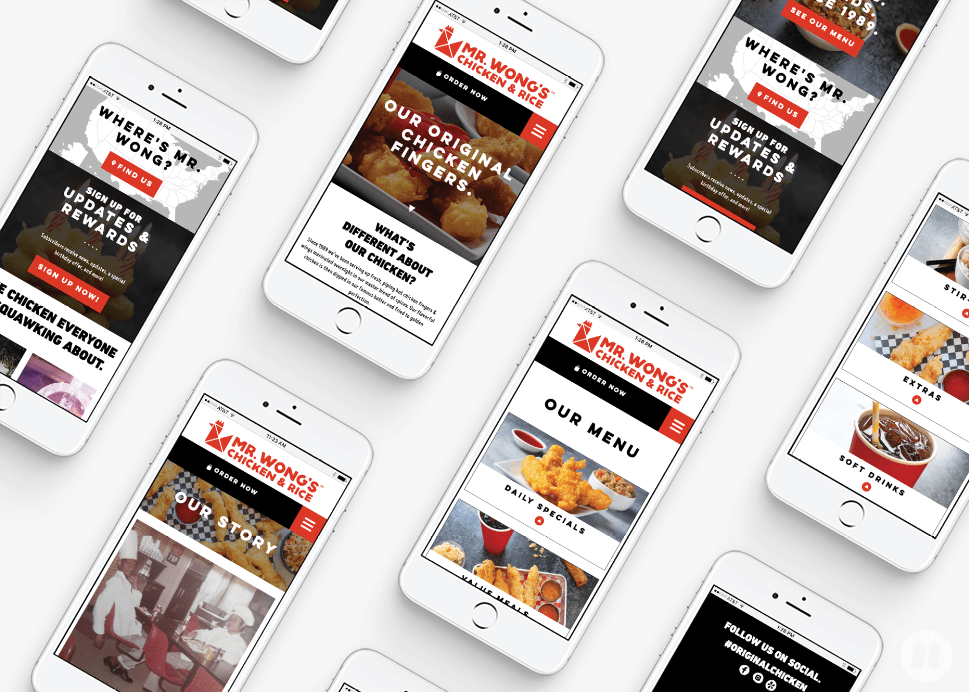
We took a mobile-first approach to developing the website, since over half of traffic would be mobile. We used WordPress, which is our content management system of choice. WordPress provides flexibility in design and the opportunity for clients to make updates easily.

We also implemented a translation feature that allowed the website to be translated from English and Spanish and back with a click.

Finally, the website underwent ADA accessibility auditing and remediation to ensure compliance with accessibility requirements.

restaurant web design
restaurant mobile web design

Website Launch

When the new website was complete, our team put it through a pre-launch closeout process, which includes the testing of all buttons, forms, and pages on mobile and desktop to ensure proper functionality and appearance.

We then packaged the site files and the ADA audit and passed it over to our client’s ongoing marketing agency for migration.

Project Closeout

This rebrand project allowed us to exercise our strategic and creative minds. We created a bold brand that would allow the restaurant to leverage its legacy, but we also worked through the strategic implementation of the brand’s story through several mediums.

Ready for a bold brand? Give us a call.

are you ready to create something nice?