Industrial Branding Project Showcase: Mielke
Nice Branding Agency was approached by industrial contractors, MW Mielke Mechanical to engage in an industrial branding project to overhaul their brand. Additionally, the scope of work included the task of bringing their core values to the forefront through both visuals and voice.
Business Branding Project Kickoff
We kicked off the industrial branding project with a discovery session and tour of the fabrication facilities in Medina, Ohio. We met with a handful of key leaders from the different divisions of the company while on-site. During the visit, we learned about the history of the company and why it was founded.
Additionally, we talked through what services they’d offered in the past and what they offer now, as well as what marketing efforts had been successful for them and what wasn’t working. We really wanted to gain an understanding of what made the company different and how they were better than the competition.
As our Creative Director, Amy Dennis states,
“In our foundational branding work, we ask a lot about company goals, as well as past and future marketing, in an effort to not only build a brand for the company, but to build a brand that supports the future marketing for the company.”
We distilled the company's offerings down to three divisions: mechanical, constructors, and service.
The need for divisions is common among trade businesses. We regularly encounter construction or trade businesses searching for a branding agency to rebrand. And we find that part of the difficulty is communicating their several service lines to all customers. Often, strategy surrounding the hierarchy of services and how each service fits into the overall brand is a highly valuable endeavor to embark on before design and marketing efforts get underway.
As you’ll see in the coming paragraphs, this strategy surrounding organizational structure resulted in a big win for this industrial branding project.
Business Naming
Name development wasn’t part of the project scope. However, we felt it important to explore the meaning behind the name, MW Mielke Mechanical. We found that there wasn’t a ton of depth to the name. In fact, we felt that the name was a hindrance to the growth of the business and also formed a disconnect that interrupted customers ability to connect with the brand.
First, the inclusion of “mechanical” in the name automatically alienated two of the key service lines: constructors and service.
Additionally, utilizing the initials MW at the front of the name wasn’t all that easy to remember and diluted the power of the name.
During the industrial branding project, we recommended that the firm pare the business name down to just Mielke. The new name would allow them to promote all key services lines equally. It would also equip the company to add and change service lines as needed. Finally, the revised would also make for a name that would be strong enough to form the foundation for a bold brand.
Logo Design Direction Brainstorm
Based on the shortened name, we got to work creating the concepts that would inform the logo design process. We worked up some sketches, and ultimately decided to create logo designs that would convey strength.
Finalization of Logo Conceptualization
Our Creative Director and Director of design reviewed the logo concepts against the research we'd done, and what we had learned from our client during discovery. We decided to move forward with the undulating pipe concept, the typographical logo that portrayed industrial piping, and the logo contrived from the mountain icon.
Industrial Branding: Logo Design Options
We officially started the industrial branding project off with the creation of a new logo. Our clients agreed to shorten the name. So, we set off to create a logo system for Mielke that would allow them to communicate all of their main service lines.
Our goal was not just to create a single logo design. Rather, we sought to develop a logo system that would equip the brand to quickly convey the different divisions to customers and the team.
So, we returned to our office after the discovery session and worked on the organization of Mielke’s service offerings. This strategic hierarchy and the development of the divisions lent itself very well to what we internally refer to as Mielke mountain.
This was the first logo option that we presented to our clients during the industrial branding project. The logo icon is comprised of three bold slanted lines that make up the letter M. The resulting shape is also indicative of a mountain, to convey power and strength.
Finally, three colors were implemented into the M shape. Each of the colors represents a division of the company. The divisions included mechanical, constructors, and service. And all three are present in the main logo. To further develop this concept, three additional versions of the logo were created, each utilizing a single division color.
For example, the Mielke logo with only blue lines could be used for communication regarding the mechanical division. The orange version could be used for constructors and the yellow option for service.
The second logo design option also took on an industrial, bold look. This option wouldn’t have an icon but instead the icon would be the entire logo.
As a typographic logo design, this version would rely on further brand support to create the brand system to convey information about company divisions.
Finally, the third logo option presented implemented a winding pipe formed into the letter M. This icon indicated Mielke’s ability to complete a project from end to end, and it also was indicative of the piping used by the mechanical division and the steel used by the constructors division.
Presentation and Selection
Our client selected the first logo design presented, and Mielke mountain became the basis for brand support.
The before and after of this logo design project is truly astounding. The new mark possessed meaning that the public could grasp, and it provided a system that encompassed all of the company's divisions. The old logo was simply a mark that represented the company's name, and nothing more.
Additionally, the new logo brings a boldness to the brand through the icon itself. The new icon introduces a memorable mark that's easily recognized in application where the complete logo isn't appropriate.
Logo Revisions
There were no revisions to the selected logo, as the client was pleased with how the logo would represent their firm moving forward.
Logo Finalization
We finalized the logo and selected exact color codes in CMYK, PMS, RGB and hex codes. Then, we provided a complete set of logo files to our client that included an all white version, and all black version and a full color version of the logo design. The logo files included a PDF, EPS, JPG, and PNG, as well as a logo guidelines sheet to help keep the brand intact.
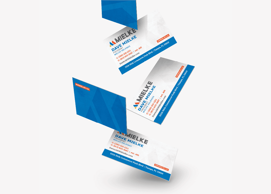
Business Card
We created a business card design that would align with the selected logo and equip the Mielke team with a printed price to represent the brand. The business card design included a flood of blue with that featured the logo icon. On the reverse, contact information was displayed in a simplistic, yet eye-catching manner. The brand color for each of the divisions was incorporated, and the logo took its rightful position at the top right corner.
Industrial Branding Stationery Package Development
Based on the chosen business card design, we created a corporate stationery package that would allow the Mielke team to correspond with vendors and clients in a professional manner. The stationery package included a business card design, letterhead, envelope design, and a messaging card.

Website Sitemap Presentation
As we moved into the user experience website strategy phase of the industrial branding project, we started by creating a sitemap for the website. The sitemap indicated what pages we would need to include in the wireframe, and a basic hierarchy for those pages.
This was one of the most challenging aspects about the website design project for Mielke. The client’s desire was to have one website for each of the main service lines, all falling under the main domain: www.mielke.com.
We determined that we would implement a structure that would unite the divisions under one website. However, we would include entry points throughout the website for the user to access additional information about each division. Then, within that division, the user could navigate to pages specific to that service including: about, services, contact, projects.
This would allow the sales team to utilize links that led directly to the individual division information. For example, a salesperson could send a link to the Mechanical section of the website to a prospect. This would get the prospect precisely the information and contact details they needed without the risk of confusion that might come with simply sending the person to the homepage.
Additionally, this strategy allowed easy cross-promotion between their main divisions. If someone came looking for service, they could quickly and easily comprehend the full-service offerings of Mielke.
Website Hosting
Additionally, we introduced our client to our website hosting package. Our hosting package includes daily backups and monthly website updates. Sorting out the hosting early in the website design and development process allows us to map out a plan for launch. If we host the website for our client, we will take it live on their domain. However, if they choose to utilize another host, we'll simply send them their website files to launch on another hosting platform.
The Website Wireframe
Even after the website sitemap was created, there was much to work through in terms of website content organization. This was all done through an extensive website wireframe process. Our wireframe process instills organization and structure not only to the website, but in turn throughout the company overall. It allows us to work through key services and prioritize content in a manner that ends up becoming the basis for marketing strategy and organizational structure for years to come.
When we start a website wireframe, the first question we ask is: what is the goal for the user on the website?
For Mielke, there were a couple of different goals. The first one was for potential customers to request a quote. Equally important, the next goal was for existing customers to request service. These calls-to-action were placed at the top-right corner of the website. Contact us was right below the main calls-to-action in the top right section of the website.
The main navigation in the header menu was then set to include links to the following parent pages: about, capabilities, leadership, safety and blog. Again, within each of the divisions, there was a separate menu that included that same information, but just about the division itself.
The blog provided another opportunity to segment information about each division while providing a unified front for the brand. The blog navigation divided the content into division-specific posts for mechanical, constructors, and service. This way, our client could create thought leadership blog posts under these three sectors to show a deeper knowledge within each division.
Overall on the website, the first thing we wanted to do is get people where they needed to go. Then, we wanted to show the expanse of work. Large carousel images of big projects Mielke had worked on took center-stage on the homepage. The images would certainly capture the attention of users as they landed on the website. However, they would also serve to convey that Mielke is not just mechanical. They are also experts in constructing and service.
In scrolling down the homepage, we quickly noted industries served. This quick association of types of clients allows the user to determine right away whether Mielke can provide the solution they need. It also conveys the breadth of knowledge and experience the firm holds. Industry affiliations and client features came next to further fortify the idea that you can trust Mielke with your project.
Finally, we wanted to showcase the Mielke team. The team-aspect of the business was noted to be extremely important to the owners and a key differentiator for the brand. We positioned the team as knowledgeable and experienced and ultimately, completely committed to safety.

Website Design
Upon presentation of the website wireframe to our client, we received a resounding approval to move forward. So, from here, we started working on the website design phase. We wanted to create a user interface that highlighted key brand elements and served as an extension of the brand. Copy was finessed and revised from the existing website. This allowed us to convey a more cohesive message. Brand colors were implemented to separate yet unify the company divisions.
Additionally, we implemented large, high-quality images of projects that were supplied by our client. These images were placed prominently on the homepage and throughout page headers. There was also significant work required to implement project photos on the project pages. Images had to be allocated to projects for each of the divisions.

The website design was presented to our client and approved for development.
Website Development
We custom develop websites for our clients. Wordpress is the platform we choose for that because of the flexibility it allows our clients. We have greater control over the user experience and user interface, and this is key in building a brand. Additionally, our custom website builds allow us to ensure clean code and fast page load speeds, among other SEO friendly tactics.


When the website was developed and reviewed by our team, we provided our client with a staged link for review.
Website Launch
Upon review, our client informed us that they would not continue the industrial branding project at that time. They were unhappy with the work we had provided up to that point and had decided to move their business to another firm.
We now see that the logo and website is live on their domain. However, it’s not the website we developed. It does very closely mirror the design we created; however, the final product is not ours.
Industrial Branding Project Closeout
You may be wondering why we’re showing you this industrial branding project, even though the outcome wasn’t necessarily in our favor.
We understand that there are many factors that may lead to a project being deterred from its intended course. Our team of account managers and creative directors works hard to ensure that expectations are exceeded and project scopes are carried out to completion. But, there are outside factors that come into play at times. And we get that.
However, we are proud of the business brand that was created by our team, and we see that the client is also super-proud of what’s been developed for them, as they are utilizing the work.
So, we didn’t get to take our website live and continue the relationship with this particular client. However, we will happily add this bold brand to our portfolio of business branding work because of the strategic thinking that brought this brand to life.
Ready to build a bold brand?
If you’re in need of a bold brand, give us a holler. We’d love to work with you.
Follow Nice Branding Agency on instagram to keep up with all of our business branding projects.


