Full Steam Logo Project Showcase
Our coffee shop logo design process is tried and true and our clients come to rely on Nice Branding Agency for creating custom brand marks that will set them apart. We were retained by a hotel group with locations nationally to create a logo for a coffee shop within one of their hotels.
So, all aboard! Grab a cup of coffee and settle in for a quick read on how we created the logo for Full Steam Coffee Shop.
Coffee Shop Logo Design Process
The first step in any logo process, and we assume this is the same for any branding firm, is to obtain all of the pertinent information about the business and the goals for the project from the client. As we onboard new logo development clients, we start by sending the client a creative questionnaire and have them type in the answers to our questions.
From there, the design lead on the project reviews the questionnaire to assure that no further information is needed before our team assembles for our first strategy session. Before we go any further, we clarify any questions we have about any of the answers provided with our client.
Coffee Shop Logo Design Brainstorm
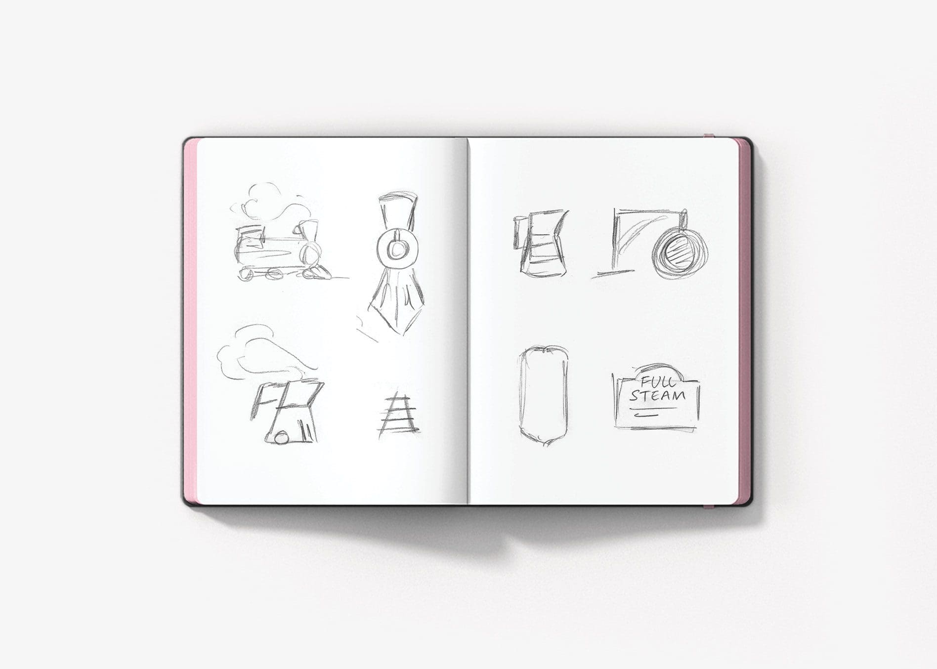
Once the imperative information is confirmed and we’re crystal clear on the project details, the design team holds a brainstorming session to pinpoint different details about the business that could come to life within the logo. We research the business’ location, competitors, company differentiators, company name and more to determine how we can weave this information into a brand mark.
Concepts to Be Digitally Developed
From here, the design lead brings all of the ideas to our Director of Design and Creative Director, and together the senior design team determines which of the options presented are viable for digital development. Designers themselves, the directors also bring additional ideas to the table at this point and convey them to the team.
Three Logo Options to Present
With the concepts sketched out, our team of graphic designers gets down and dirty creating three logo options that can be presented to our client.
For Full Steam, our hotel clients had worked with us previously to create a logo for a sister restaurant that exists within the same hotel. For the coffee shop, we wanted to create a fresh idea, but one that would align visually with the logo for the other restaurant within the space.
As a bit of background on the project, the logo was for a coffee shop called Full Steam. The hotel (and subsequently the coffee shop) serves primary business commuters -- people who were on the go. So this target, coupled with the name of the coffee shop and the fact that a major railroad rolls through town, we decided that the concepts would take the form of a train concept, while weaving in the coffee aspect of the business. We created three options for the logo design.
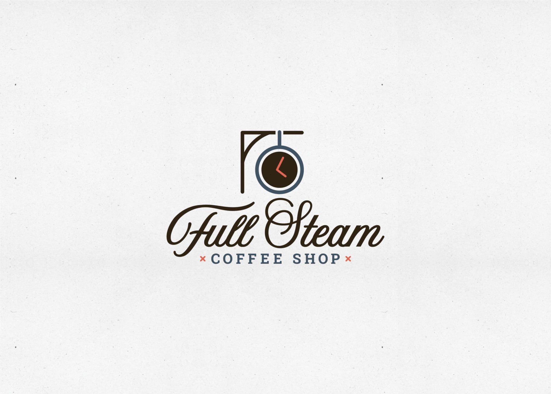
The first option was developed to include the form of a train station with an iconic large clock mounted on the wall. The clock took the shape of a coffee mug. This gave a nod to the impact that time has on a commuter’s schedule, while paying homage to the local railway.
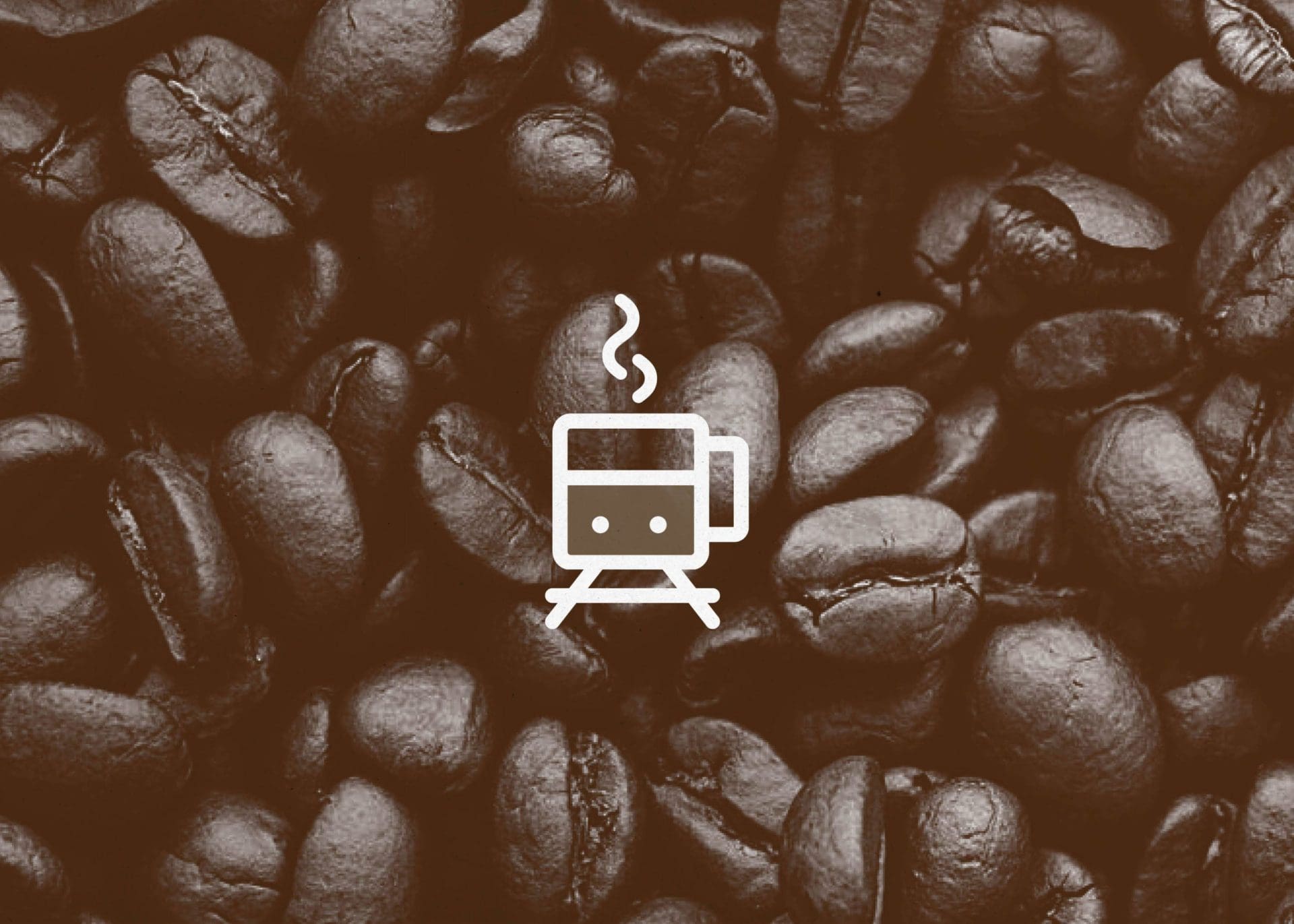
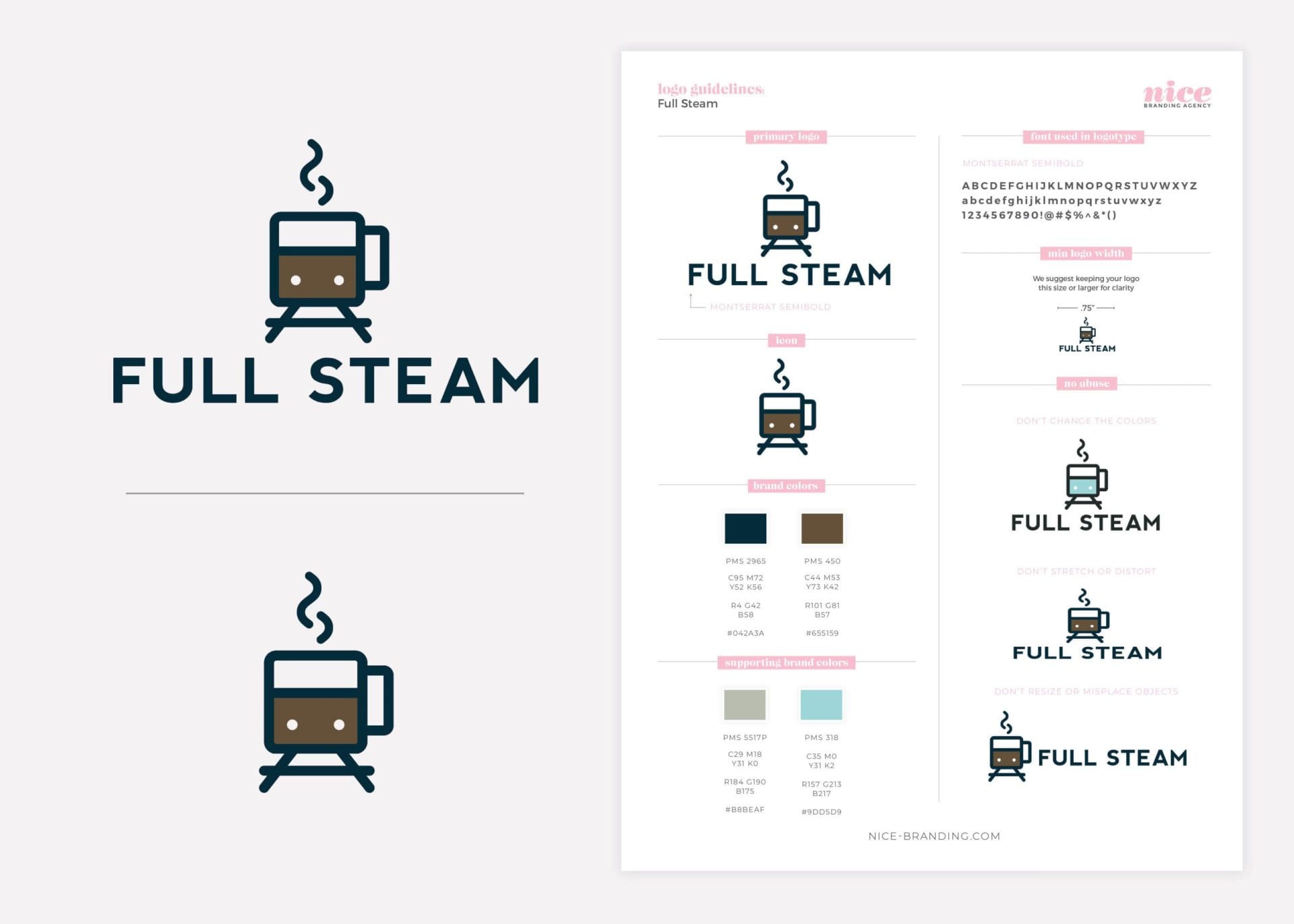
A second concept created also tied in the train idea. This logo utilized the front of a coffee mug to create a custom train icon. The icon was then paired with a modern font set that complimented the logo we’d created for the sister restaurant.
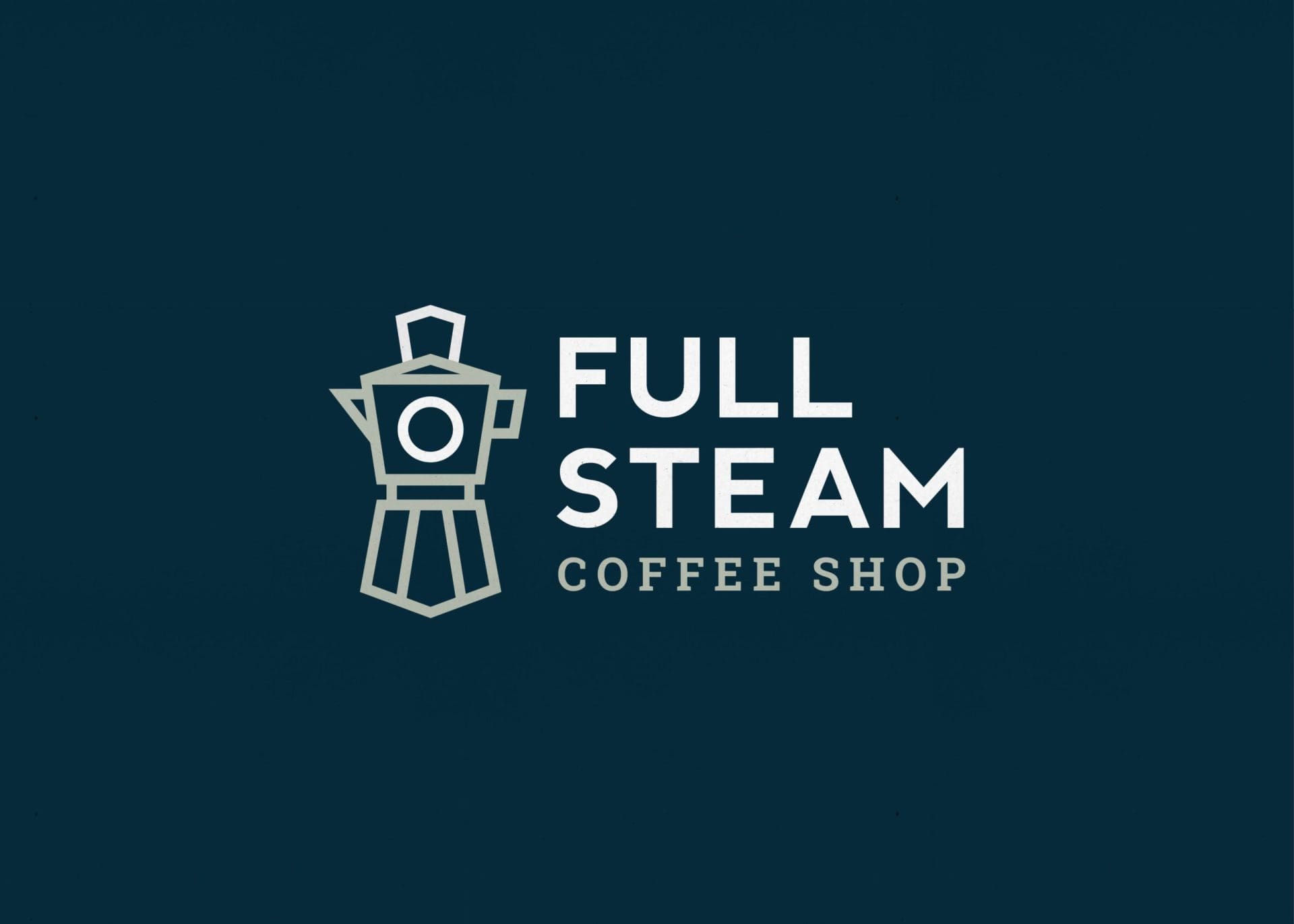
The final concept intertwined both train and coffee once again. This custom-designed icon was created from the shape of a french press, artfully developed into the outline of the front of a train. This option provided another modern take on twisting the train and coffee concept into one cohesive mark.
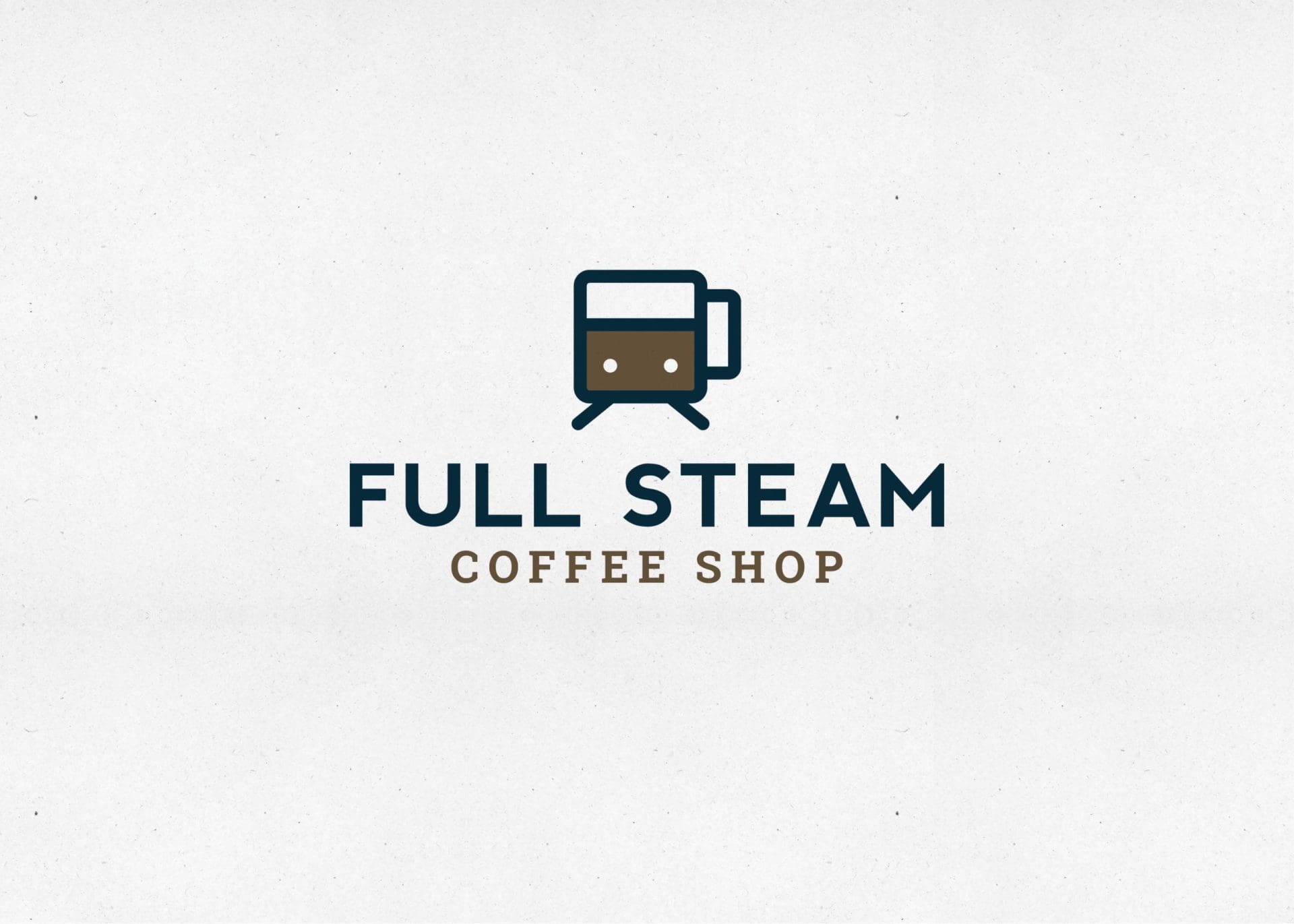
It’s important to note that all three logo icons were paired with fonts that would match the existing fonts used in the hotel as a whole. However, we also presented the options with script fonts that were more indicative of the vintage train station look.
Presentation and Selection
After the logos passed through internal review, we presented the ideas to our client and talked through the meaning behind each of the marks. There was overwhelming agreement that the most modern design of the three (the coffee cup as a train front) was the way to go.
![]()
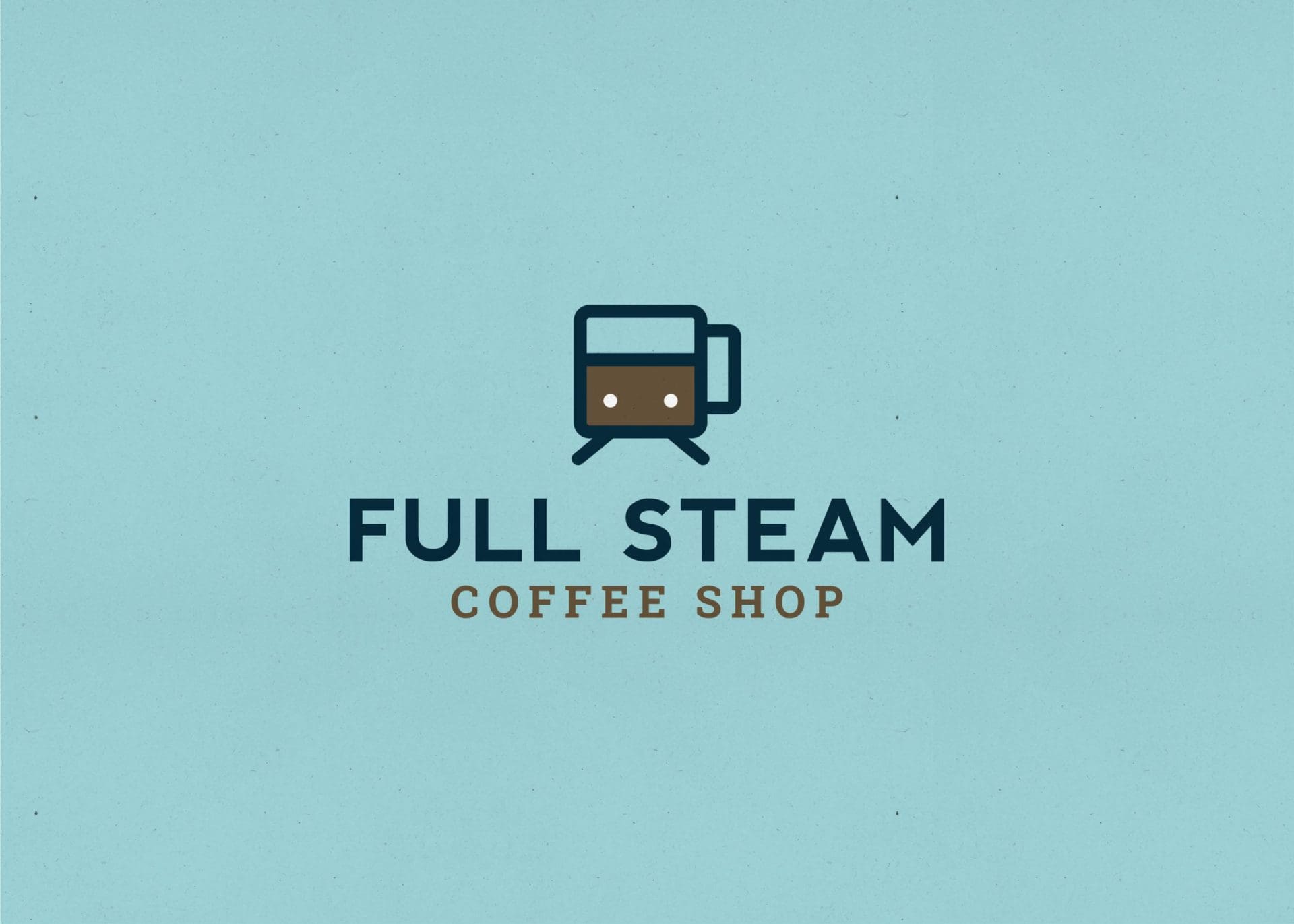
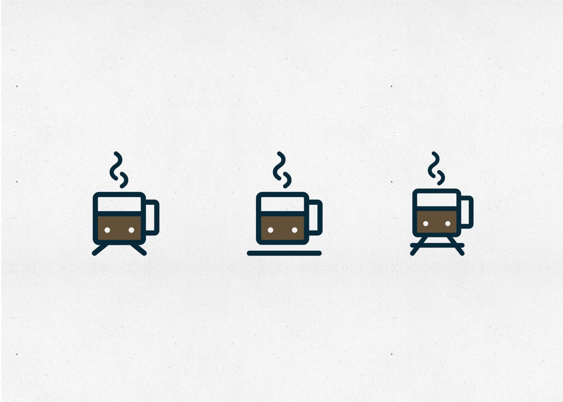
The feedback was mostly positive, however our client felt that the icon somewhat resembled a subway car instead of the train that traveled through town. They requested to see a line beneath the train car that would ground it and remove the subway car feel.
We are happy to oblige, but had concerns about the grounding line as a long-term solution to we presented two other options that would address the issue at hand.
Logo Finalization
Upon final selection, the chosen logo goes back through our Director of Design for finalization. Exact color codes are selected at this point, including PMS, CMYK, RGB and web tones.
From there, our graphic design team will create logo files in PDF, JPEG, EPS, and PNG. The logo files and a logo guidelines sheet will then be sent off to the client for safe keeping.
The only thing we love more than coffee around here is creating coffee concept logos. If you’re ready to jump on the Nice Branding Agency logo train, give us a whistle. We’re ready to depart when you are.
