
Subway Logo Refresh
In 2017, Subway will roll out a new logo across all stores and they have already featured the new look in two commercials that were aired during the 2016 Rio Summer Olympics.
The new Subway logo refresh retains the iconic arrows on the ends of the letters S and Y, but simplifies the font. With the new logo, Subway has also introduced an icon that features the S in arrows and also in the negative space.
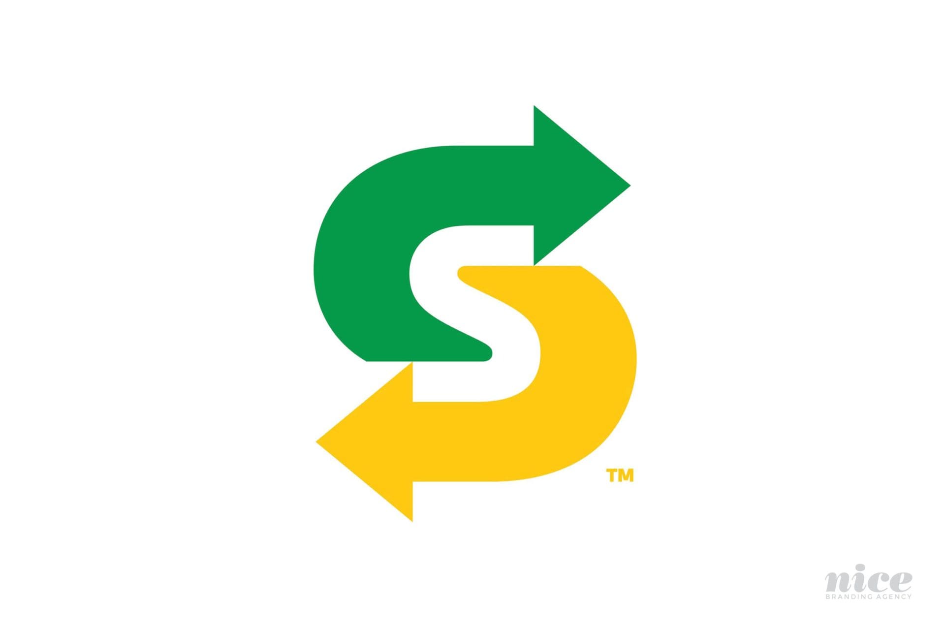
According to a press release by Subway, "The new logo stands up tall, bold and confident, capturing the essence of the brand in a fresh, contemporary look. The core colors have been optimized to live and work across all channels. And the symbol, a new asset for the brand, distills the iconic arrows into a powerful and simple mark. Capturing the essence of the brand in a smaller footprint, the arrows symbolize the choices SUBWAY® provides its guests."
Creatives and regular folk alike are sounding off about the new logo, and many aren't super-excited about the new direction (See what we did there? Arrows? New Direction?). People are saying that the refresh wasn't refreshing enough and some are even comparing the new logo to the Waste Management logo.
We think that the introduction of the icon was a smart move, but we are left wanting more from this reveal.

NOW GO GET YOUR FOOT-LONG!


