Brand Refresh Project: Milosi Landscape
As we forge ahead in our quest to give you the inside scoop on what’s going on at NBA, we’re taking you through a brand refresh that we recently completed for Milosi Landscape.
Milosi isn’t just your run-of-the-mill yard service, they are an elite landscaping company that’s uber-passionate about their crew and their clients. They put service above all and take care of their own like family.
They also do some really killer landscaping, hardscaping, outdoor lighting, outdoor kitchens, and really anything else that involves creating an outdoor oasis on the grounds of their clients’ homes. And they are exceptional at what they do. Their existing brand was not so exceptional, however. It wasn’t terrible, but it just lacked luster. It didn’t scream “elite” or “luxury,” rather it was a bit flat and needed an update.
When the key decision-makers approached us, they weren’t 100% sure that they needed a complete brand refresh. They simply wanted to update the design of a few marketing pieces with us.
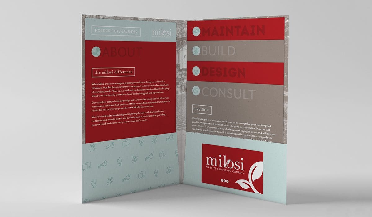
Those initial design pieces included a custom-designed brochure that was comprised of a pocket folder and tiered inserts, and a horticulture calendar. Read more about the initial project in our graphic design portfolio. As we worked through the pieces and the client saw the life we were able to breathe into their brand through design, they decided that they were ready to climb aboard the brand refresh train.
Speaking of their website, this was another project that we tackled pretty quickly after reworking the logo. Putting a nice, new logo on an old, outdated website is painful for us. And luckily our clients at Milosi agreed. To fully execute a proper brand refresh, the website needed an overhaul.
Creating a new website for our clients isn’t as simple as putting lipstick on the pig (as one of our clients to remain unnamed likes to say) and calling it a day. Instead, we strip the site down to the bare bones and start with strategy. User experience is the key to conversions (well, one of the keys), so we want to make it as seamless as possible for a user to land on your site and then make it to your inbox or phone lines or shopping cart or wherever the goal at hand may be.
Once we had an organized and structure way to display their content, we presented the wireframes to Milosi for review. Wireframes are tricky, because there are no design elements in place, it’s really just a blueprint that shows the client where on the website their content will live and how it will lay out.
In addition to addressing potential and current customers, Milosi uses their website to speak to job applicants and current employees, as well. So we made sure that the careers section of the site was created to function properly based on their internal needs.
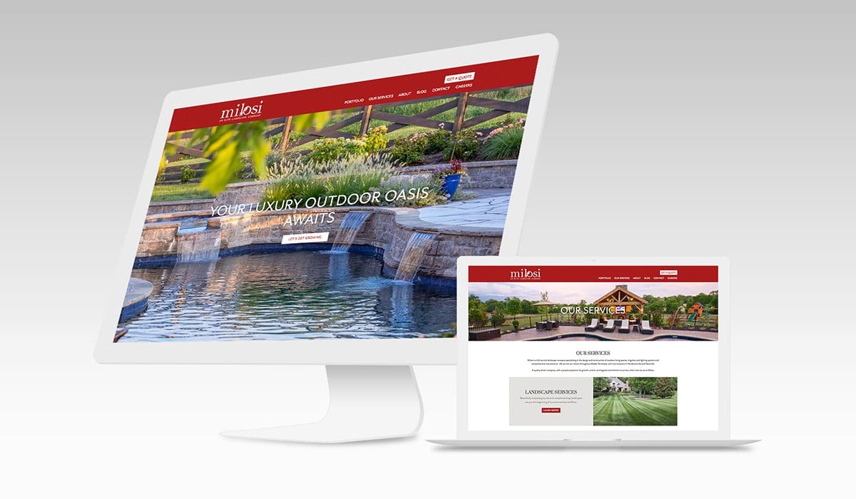
From there, we moved to design, which was where Milosi really got to see the breathtaking images of their work come to life alongside compelling copy and bold graphic design. We took into account the user journey and built in several well-placed calls to action. Our process includes creating websites that are completely responsive on mobile as well, which definitely improves the experience, as well as checks one of those pesky SEO requirements.
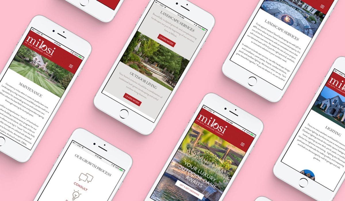 Once the design comp was approved, we staged the site for the client’s final review before the go live date. At this point, since the client has been in the loop all along the way, there generally aren’t many revisions needed. Our four-step process is such that we gain approval at each stage, which keeps the project on track and ensures that expectations are met each and every time we build a site.
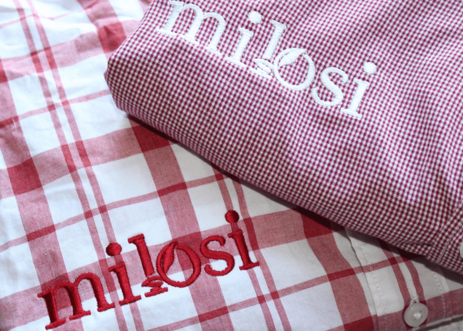
 Promo products were created that aligned with the attention to detail and service that the Milosi crew provides, and an array of apparel was designed that ranged from visors to vests and button downs to berets (just kidding — no berets, but the alliteration was nice there, right?
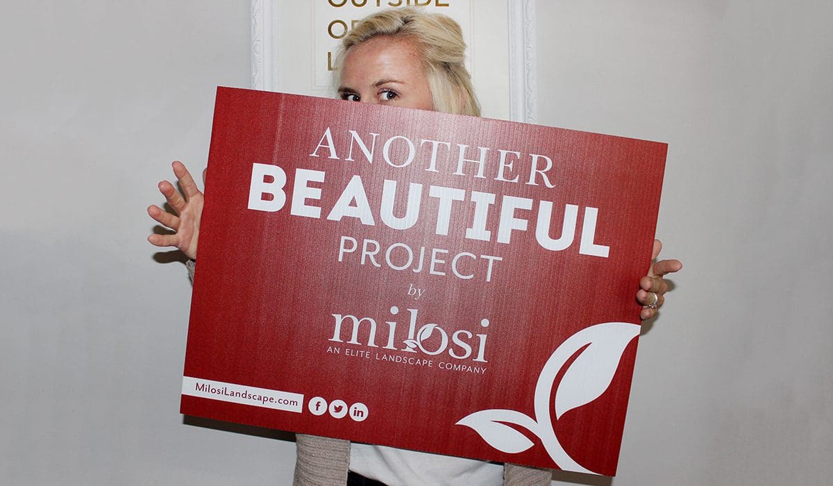
 Signs, signs, and more signs. Milosi has yard signs and fence signs, big signs and small signs. And all of their signage needed to be updated with the new brand. We also created a custom paver imprint that featured the iconic Milosi leaf, and an irrigation sign and a title block.
 In the end, what started with a simple brochure design (simple is relative here — a pocket folder and inserts isn’t exactly a walk in the park) turned into a complete brand refresh for a company that really does deserve it.
If you're brand is in need of a breath of fresh air, and you would like Nice Branding Agency to guide you through the process, please, by all means, give us a call today.

NEW LOGO: BRAND REFRESH
Like many of our well-established clients, Milosi was hesitant to make changes to their logo. We totally get it. You’ve worked super hard to build brand awareness, and you really feel like if you change your logo too much, people won’t recognize you. We understand the concern, but please know that your logo is not the end all be all, and every brand deserves a refresh during its lifetime. I mean, even companies like Apple, Starbucks, FedEx, Subway, Aldi, and more change their logos. And we all know that the change worked out fine for those guys. Back to Milosi. We assessed their existing brand mark and determined that the font usage wasn’t aesthetically appealing, and the leaf icon was outdated, not unique and not intertwined with the logo as a whole. Rather than scrapping the entire logo and creating something totally new, we worked with the logo to bring it up to par. We included a new, but similar font and worked the leaf into the name in such a way that it seemed to appear almost organically. That same leaf became an icon that could be used throughout the branding. Need a visual?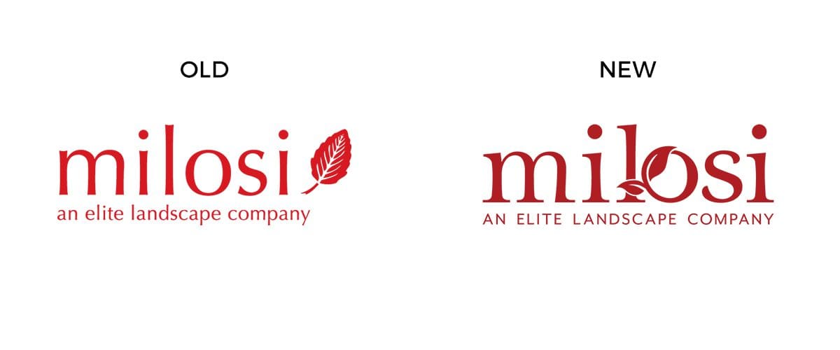 WEBSITE DESIGN + BUILD: BRAND REFRESH
Speaking of their website, this was another project that we tackled pretty quickly after reworking the logo. Putting a nice, new logo on an old, outdated website is painful for us. And luckily our clients at Milosi agreed. To fully execute a proper brand refresh, the website needed an overhaul.
Creating a new website for our clients isn’t as simple as putting lipstick on the pig (as one of our clients to remain unnamed likes to say) and calling it a day. Instead, we strip the site down to the bare bones and start with strategy. User experience is the key to conversions (well, one of the keys), so we want to make it as seamless as possible for a user to land on your site and then make it to your inbox or phone lines or shopping cart or wherever the goal at hand may be.
Once we had an organized and structure way to display their content, we presented the wireframes to Milosi for review. Wireframes are tricky, because there are no design elements in place, it’s really just a blueprint that shows the client where on the website their content will live and how it will lay out.
In addition to addressing potential and current customers, Milosi uses their website to speak to job applicants and current employees, as well. So we made sure that the careers section of the site was created to function properly based on their internal needs.
From there, we moved to design, which was where Milosi really got to see the breathtaking images of their work come to life alongside compelling copy and bold graphic design. We took into account the user journey and built in several well-placed calls to action. Our process includes creating websites that are completely responsive on mobile as well, which definitely improves the experience, as well as checks one of those pesky SEO requirements.
 Once the design comp was approved, we staged the site for the client’s final review before the go live date. At this point, since the client has been in the loop all along the way, there generally aren’t many revisions needed. Our four-step process is such that we gain approval at each stage, which keeps the project on track and ensures that expectations are met each and every time we build a site.

STATIONARY: BRAND REFRESH
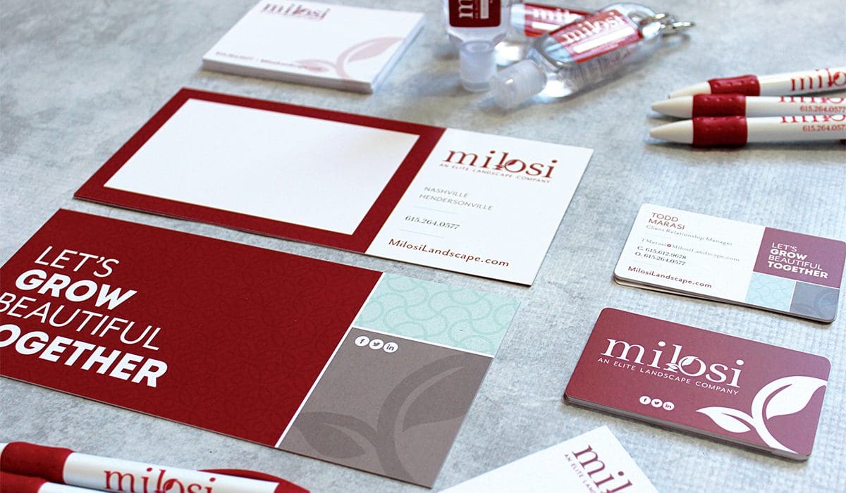
Typically, the next step in a brand refresh is to address the paper goods. We started with the stationary and created a fresh, new business card that showcases the brand well and stands out from the masses of cards that are fighting to stay out of the trash can. The Milosi card highlights the soul of the brand with the tagline, “Let’s Grow Beautiful Together,” and seeks to invite the recipient to work alongside the Milosi team to beautify their property. It’s printed on silk, which gives it a luxurious feel and a fighting chance to make an impact.
MATCHY MATCHY: BRAND REFRESH
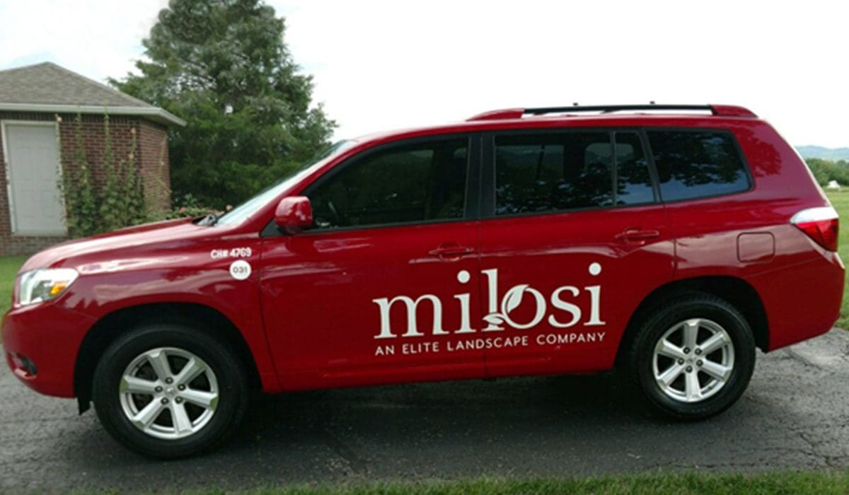
After we worked through the big branding pieces, it was time to deploy the new look, feel, and message out across all existing customer and crew touchpoints. The interesting, and sometimes tricky, thing about a brand refresh is timing. You have some pieces out there floating around with the old branding and some that have been updated. To be honest, it can start to get a little hodge podge. And that might be ok, but usually, it’s not. When working with a branding agency on a brand refresh, timing is important. Once the new brand has been determined, we think it’s best to get to work updating the design of the existing materials to match the new look. This takes time. And money. But in the end, you emerge with a refreshed appearance that might make customers take another look. That said, if budget is tight, you can certainly refresh your logo and then work through your other materials bit by bit. There are no hard and fast rules, and you’ve got to do what works for you. For Milosi, we worked fast and furious to bring everything up to par. Another big part of the brand refresh was the design of their fleet of vehicles. As we like to say, vehicles are moving advertisements, so they really do have to be on point. We worked hand in hand with the folks at Milosi to determine the precise shade of red for their fleet, and then created graphics for their vehicles that would speak volumes about the brand while cruising down the road. Promo products were created that aligned with the attention to detail and service that the Milosi crew provides, and an array of apparel was designed that ranged from visors to vests and button downs to berets (just kidding — no berets, but the alliteration was nice there, right?
 Signs, signs, and more signs. Milosi has yard signs and fence signs, big signs and small signs. And all of their signage needed to be updated with the new brand. We also created a custom paver imprint that featured the iconic Milosi leaf, and an irrigation sign and a title block.
 In the end, what started with a simple brochure design (simple is relative here — a pocket folder and inserts isn’t exactly a walk in the park) turned into a complete brand refresh for a company that really does deserve it.
If you're brand is in need of a breath of fresh air, and you would like Nice Branding Agency to guide you through the process, please, by all means, give us a call today.

