
Aldi Logo Refresh: A Logo Design Review
Discount supermarket chain Aldi has released a refreshed Aldi logo in an effort to align its visual appearance with the overall modernization and future-oriented perception that the chain is aiming for.
 The new Aldi logo was designed by illion. Markensocietaet: a design agency based in Selters, West Germany.
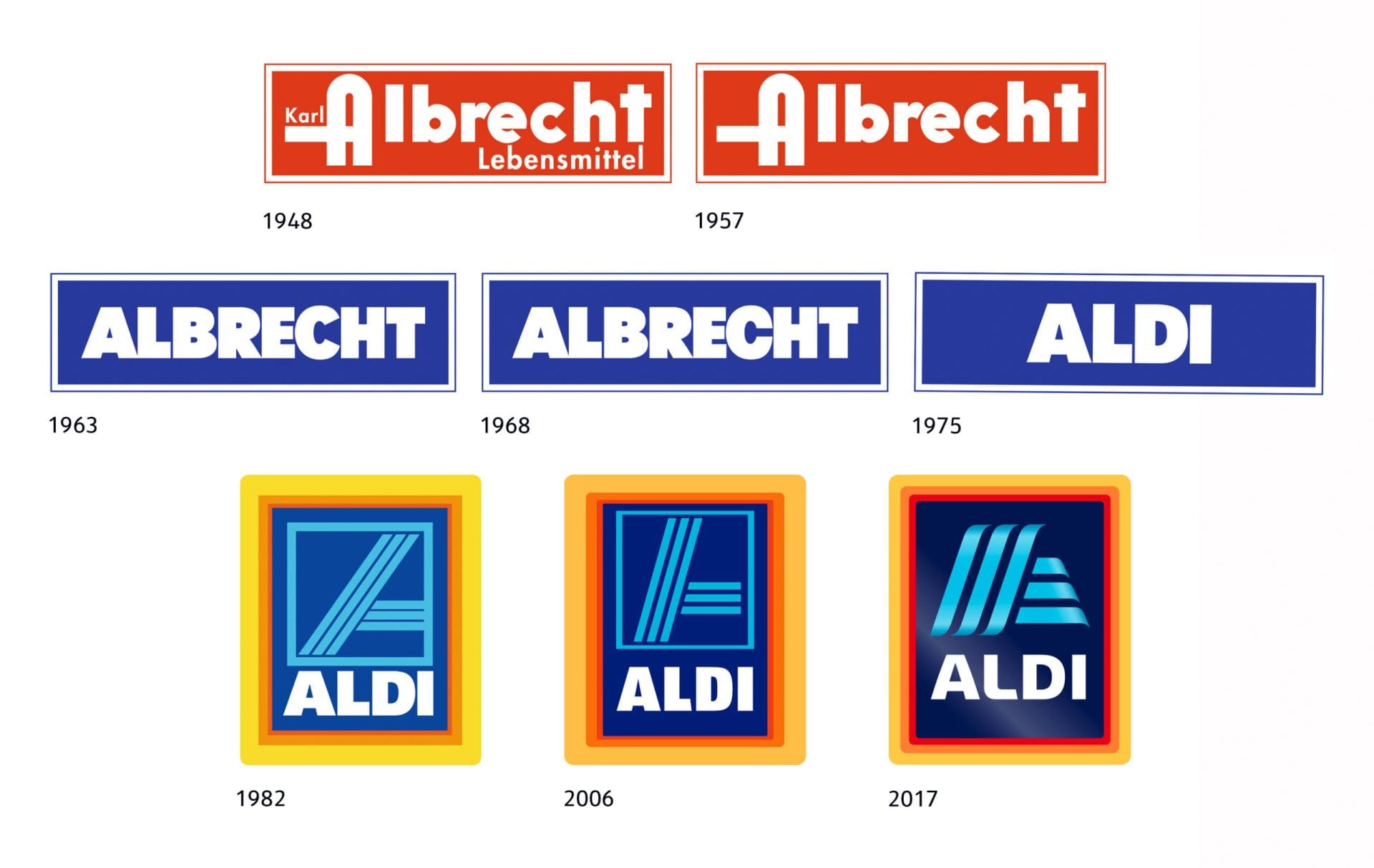
The visual evolvement of the brand has been ever changing since its first logo launch in 1982.
The first Aldi logo was introduced in 1975 as a white sans-serif logotype set against a dark blue background in a rectangular frame. Previous logos displayed the Albrecht brand name set overtop of a solid background.
The “A” icon logo with a three-lined frame was birthed in 1982 and last refreshed in 2006.
The new Aldi logo was designed by illion. Markensocietaet: a design agency based in Selters, West Germany.
The visual evolvement of the brand has been ever changing since its first logo launch in 1982.
The first Aldi logo was introduced in 1975 as a white sans-serif logotype set against a dark blue background in a rectangular frame. Previous logos displayed the Albrecht brand name set overtop of a solid background.
The “A” icon logo with a three-lined frame was birthed in 1982 and last refreshed in 2006.
 So what’s the story? What are the changes? What do they mean, and how do they align with the overall company purpose? Let’s dig in.
As stated in some of our other “review” blog posts, we want to make sure it’s fully disclosed that we are in the business of branding and graphic design. We are not here to discourage anyone or exude negativity towards any other designer or agencies; however, we do believe that by examining various rebrands, we can learn more about branding practices and branding pitfalls, and use this knowledge to improve our future work for our clients.
Unfortunately, there’s a lot of information that we aren’t privy to, such as client demands, overall goals, budgets, limitations, etc, which could potentially highly impact our review.
Nevertheless, here’s what we can see and interpret.
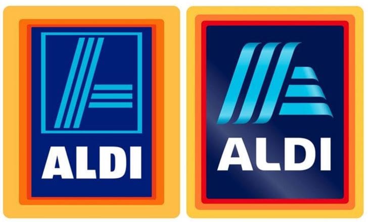
At first glance, it seems as though the red in the logo has become more prominent or more equal with the existing marigold and orange colors in the frame of the logo. The red was virtually nonexistent in the originally updated Aldi logo in 1982.
This may have been done in an effort to revive the original color in the logo for Albrecht; however, when bringing a new color to life within a logo refresh, we would like to be blown away with reasoning. Aldi should have done a better job with communicating what feeling they wanted the red to evoke as related to the brand.
In this updated version of the logo, we also notice that the frames around the edges of the logo design have been evened out to a certain extent; however, they are still looking dreadfully uneven, especially to those who hold the design grid close to their heart.
Although there seems to be some amount of rhythm going on, and these frames do show improvement on the last iteration of the logo, the overall appearance of the logo could have been modernized by eliminating these frames altogether or giving each of them an even width.
Maybe Aldi will get these frames right in 2021, or even better, maybe they will be gone? A girl can dream, right?
Can we get a high five for the elimination of the inner frame around the “A” icon? One less box is something to cheer for.
Our main concern is, why all these boxes in the first place? The only correlation that an Aldi shopper and graphic designer can make between the experience of the brand and the frames is all the boxes you see in the store that seem to be a result of the warehouse/discount type of store for which the chain is known.
We did find this in the Aldi story which may be the reasoning behind all the boxes in the logo.
“We carry the weekly must-haves and display them in their designed shipping boxes to help save time and resources to restock shelves.”
The next major change seen in the Aldi logo is the shape of the “A” icon. The corners have been rounded and overall height of the icon has decreased. There’s a ribbon-like flow to these lines with a bit of a curved edge. The three-line design is still there, but, man, do they look different now.
Here again, what’s the purpose of the three-line “A”? Is there significance here? It would be something we would love to know.
Many design critics around town, aka the world wide web, are saying that the logo refresh looks too much like an airline company. We’d have to say that the shape and slant of the lines in the “A” icon are what gives off this notion.
They are very similar to lines that indicate motion or moving forward, which does seem to align with the Aldi brand’s mantra to progress.
So what’s the story? What are the changes? What do they mean, and how do they align with the overall company purpose? Let’s dig in.
As stated in some of our other “review” blog posts, we want to make sure it’s fully disclosed that we are in the business of branding and graphic design. We are not here to discourage anyone or exude negativity towards any other designer or agencies; however, we do believe that by examining various rebrands, we can learn more about branding practices and branding pitfalls, and use this knowledge to improve our future work for our clients.
Unfortunately, there’s a lot of information that we aren’t privy to, such as client demands, overall goals, budgets, limitations, etc, which could potentially highly impact our review.
Nevertheless, here’s what we can see and interpret.
At first glance, it seems as though the red in the logo has become more prominent or more equal with the existing marigold and orange colors in the frame of the logo. The red was virtually nonexistent in the originally updated Aldi logo in 1982.
This may have been done in an effort to revive the original color in the logo for Albrecht; however, when bringing a new color to life within a logo refresh, we would like to be blown away with reasoning. Aldi should have done a better job with communicating what feeling they wanted the red to evoke as related to the brand.
In this updated version of the logo, we also notice that the frames around the edges of the logo design have been evened out to a certain extent; however, they are still looking dreadfully uneven, especially to those who hold the design grid close to their heart.
Although there seems to be some amount of rhythm going on, and these frames do show improvement on the last iteration of the logo, the overall appearance of the logo could have been modernized by eliminating these frames altogether or giving each of them an even width.
Maybe Aldi will get these frames right in 2021, or even better, maybe they will be gone? A girl can dream, right?
Can we get a high five for the elimination of the inner frame around the “A” icon? One less box is something to cheer for.
Our main concern is, why all these boxes in the first place? The only correlation that an Aldi shopper and graphic designer can make between the experience of the brand and the frames is all the boxes you see in the store that seem to be a result of the warehouse/discount type of store for which the chain is known.
We did find this in the Aldi story which may be the reasoning behind all the boxes in the logo.
“We carry the weekly must-haves and display them in their designed shipping boxes to help save time and resources to restock shelves.”
The next major change seen in the Aldi logo is the shape of the “A” icon. The corners have been rounded and overall height of the icon has decreased. There’s a ribbon-like flow to these lines with a bit of a curved edge. The three-line design is still there, but, man, do they look different now.
Here again, what’s the purpose of the three-line “A”? Is there significance here? It would be something we would love to know.
Many design critics around town, aka the world wide web, are saying that the logo refresh looks too much like an airline company. We’d have to say that the shape and slant of the lines in the “A” icon are what gives off this notion.
They are very similar to lines that indicate motion or moving forward, which does seem to align with the Aldi brand’s mantra to progress.
 Additionally, the gradient is very similar to what is shown in many airline logos.
Subtle gradients are beginning to show up more and more in logo refreshes. Could this be a new trend?
The updated gradients in the newly designed Aldi logo do give the logo a polished and modern look. There’s a very nice use of highlights on the lines that begin to provide a level of sophistication and shine.
One major problem that we see is that the icon is not centered vertically within the box or frame.
This little detail paired with the difference in frame widths do make us question the integrity of the logo design.
The darker blue background behind the logo helps the “A” icon and white type pop when compared to the previous logo. This was a positive tweak that adds to the overall sophistication of the logo.
Wait, so now it’s shining and looking sophisticated — are we still at Aldi, the discount, no-frills grocery brand?
The new typeface allows more breathing room for the internal opening of a few of the letters; however, the width of the letters are inconsistent and uneven.
The font is bolder, yet, a bit disturbing in the fact that one of the four letters appears rounded and the others do not. It doesn’t seem like a solid choice for a well-crafted font which should be a no-brainer for a worldwide brand.
Back to the un-uniformity. Back to questioning the integrity of the design.
The 1982 logo design seemed like a well-balanced design. Whatever happened in 2006 should be buried in the next box of “O’s”, and the brand should take a second go at this refresh — not based on the 2006 design.
Even the fonts used in the logos between 1963 and 1975 were better balanced and more “modern” and “evolved” than the current choice.
It boils down to this. There’s no connection. This is simply a design that was updated with misdirected thoughts. Yes, there were thoughts to change the font face, alter some shapes, update colors, thus updating the overall design; but the thought should have been more about creating a connect that correlated with the direction the brand is moving and not creating just a more modern design.
What’s the difference now? How can your redesigned logo help connect your customers to this refreshed message of futuristic grocery shopping?
Aldi touts family first through high demand, exclusive brand products tested and guaranteed, saving you time spent on your weekly grocery shopping. Aldi brings low prices to you by avoiding nonessential services like banking, pharmacies, check cashing, and carts. It all boils down to no-frills grocery shopping.
Honing in on their core purposes and offerings, or the result that their philosophy provides, could help to bring some unique features to their logo and tie their visual image to their purpose in a more compelling, connective way.
What we have seen with the Aldi logo is a different evolution than what we have seen with larger, more iconic brands. Most brands (think Apple and Starbucks) have gone from complex multicolor designs to more simplistic, one- or two-color designs. Aldi started with an extremely simple design and has now evolved into a more complex, detailed logo design.
Here again, this evolvement is misrepresentative of one of the company's core traits — simplicity.
Additionally, the gradient is very similar to what is shown in many airline logos.
Subtle gradients are beginning to show up more and more in logo refreshes. Could this be a new trend?
The updated gradients in the newly designed Aldi logo do give the logo a polished and modern look. There’s a very nice use of highlights on the lines that begin to provide a level of sophistication and shine.
One major problem that we see is that the icon is not centered vertically within the box or frame.
This little detail paired with the difference in frame widths do make us question the integrity of the logo design.
The darker blue background behind the logo helps the “A” icon and white type pop when compared to the previous logo. This was a positive tweak that adds to the overall sophistication of the logo.
Wait, so now it’s shining and looking sophisticated — are we still at Aldi, the discount, no-frills grocery brand?
The new typeface allows more breathing room for the internal opening of a few of the letters; however, the width of the letters are inconsistent and uneven.
The font is bolder, yet, a bit disturbing in the fact that one of the four letters appears rounded and the others do not. It doesn’t seem like a solid choice for a well-crafted font which should be a no-brainer for a worldwide brand.
Back to the un-uniformity. Back to questioning the integrity of the design.
The 1982 logo design seemed like a well-balanced design. Whatever happened in 2006 should be buried in the next box of “O’s”, and the brand should take a second go at this refresh — not based on the 2006 design.
Even the fonts used in the logos between 1963 and 1975 were better balanced and more “modern” and “evolved” than the current choice.
It boils down to this. There’s no connection. This is simply a design that was updated with misdirected thoughts. Yes, there were thoughts to change the font face, alter some shapes, update colors, thus updating the overall design; but the thought should have been more about creating a connect that correlated with the direction the brand is moving and not creating just a more modern design.
What’s the difference now? How can your redesigned logo help connect your customers to this refreshed message of futuristic grocery shopping?
Aldi touts family first through high demand, exclusive brand products tested and guaranteed, saving you time spent on your weekly grocery shopping. Aldi brings low prices to you by avoiding nonessential services like banking, pharmacies, check cashing, and carts. It all boils down to no-frills grocery shopping.
Honing in on their core purposes and offerings, or the result that their philosophy provides, could help to bring some unique features to their logo and tie their visual image to their purpose in a more compelling, connective way.
What we have seen with the Aldi logo is a different evolution than what we have seen with larger, more iconic brands. Most brands (think Apple and Starbucks) have gone from complex multicolor designs to more simplistic, one- or two-color designs. Aldi started with an extremely simple design and has now evolved into a more complex, detailed logo design.
Here again, this evolvement is misrepresentative of one of the company's core traits — simplicity.
 Overall yes, the logo does look updated and more futuristic, but a logo refresh for a worldwide company should go deeper than just face value. Oh, and next time, please hire an agency who knows how to use the align tools.
Additionally, the gradient is very similar to what is shown in many airline logos.
Subtle gradients are beginning to show up more and more in logo refreshes. Could this be a new trend?
The updated gradients in the newly designed Aldi logo do give the logo a polished and modern look. There’s a very nice use of highlights on the lines that begin to provide a level of sophistication and shine.
One major problem that we see is that the icon is not centered vertically within the box or frame.
This little detail paired with the difference in frame widths do make us question the integrity of the logo design.
The darker blue background behind the logo helps the “A” icon and white type pop when compared to the previous logo. This was a positive tweak that adds to the overall sophistication of the logo.
Wait, so now it’s shining and looking sophisticated — are we still at Aldi, the discount, no-frills grocery brand?
The new typeface allows more breathing room for the internal opening of a few of the letters; however, the width of the letters are inconsistent and uneven.
The font is bolder, yet, a bit disturbing in the fact that one of the four letters appears rounded and the others do not. It doesn’t seem like a solid choice for a well-crafted font which should be a no-brainer for a worldwide brand.
Back to the un-uniformity. Back to questioning the integrity of the design.
The 1982 logo design seemed like a well-balanced design. Whatever happened in 2006 should be buried in the next box of “O’s”, and the brand should take a second go at this refresh — not based on the 2006 design.
Even the fonts used in the logos between 1963 and 1975 were better balanced and more “modern” and “evolved” than the current choice.
It boils down to this. There’s no connection. This is simply a design that was updated with misdirected thoughts. Yes, there were thoughts to change the font face, alter some shapes, update colors, thus updating the overall design; but the thought should have been more about creating a connect that correlated with the direction the brand is moving and not creating just a more modern design.
What’s the difference now? How can your redesigned logo help connect your customers to this refreshed message of futuristic grocery shopping?
Aldi touts family first through high demand, exclusive brand products tested and guaranteed, saving you time spent on your weekly grocery shopping. Aldi brings low prices to you by avoiding nonessential services like banking, pharmacies, check cashing, and carts. It all boils down to no-frills grocery shopping.
Honing in on their core purposes and offerings, or the result that their philosophy provides, could help to bring some unique features to their logo and tie their visual image to their purpose in a more compelling, connective way.
What we have seen with the Aldi logo is a different evolution than what we have seen with larger, more iconic brands. Most brands (think Apple and Starbucks) have gone from complex multicolor designs to more simplistic, one- or two-color designs. Aldi started with an extremely simple design and has now evolved into a more complex, detailed logo design.
Here again, this evolvement is misrepresentative of one of the company's core traits — simplicity.
Overall yes, the logo does look updated and more futuristic, but a logo refresh for a worldwide company should go deeper than just face value. Oh, and next time, please hire an agency who knows how to use the align tools.


