
Instagram’s New Wordmark: What Its First Redesign in 10 Years Gets Right and Wrong


Instagram has changed a lot over the past decade. Stories took over our screens. Reels changed how we scroll. Content creators built full-blown businesses, and brands made it a major part of their marketing strategies. The platform has expanded far beyond the photo-sharing app it started as.
But one familiar part of the brand remained largely unchanged: its wordmark.
Until now.
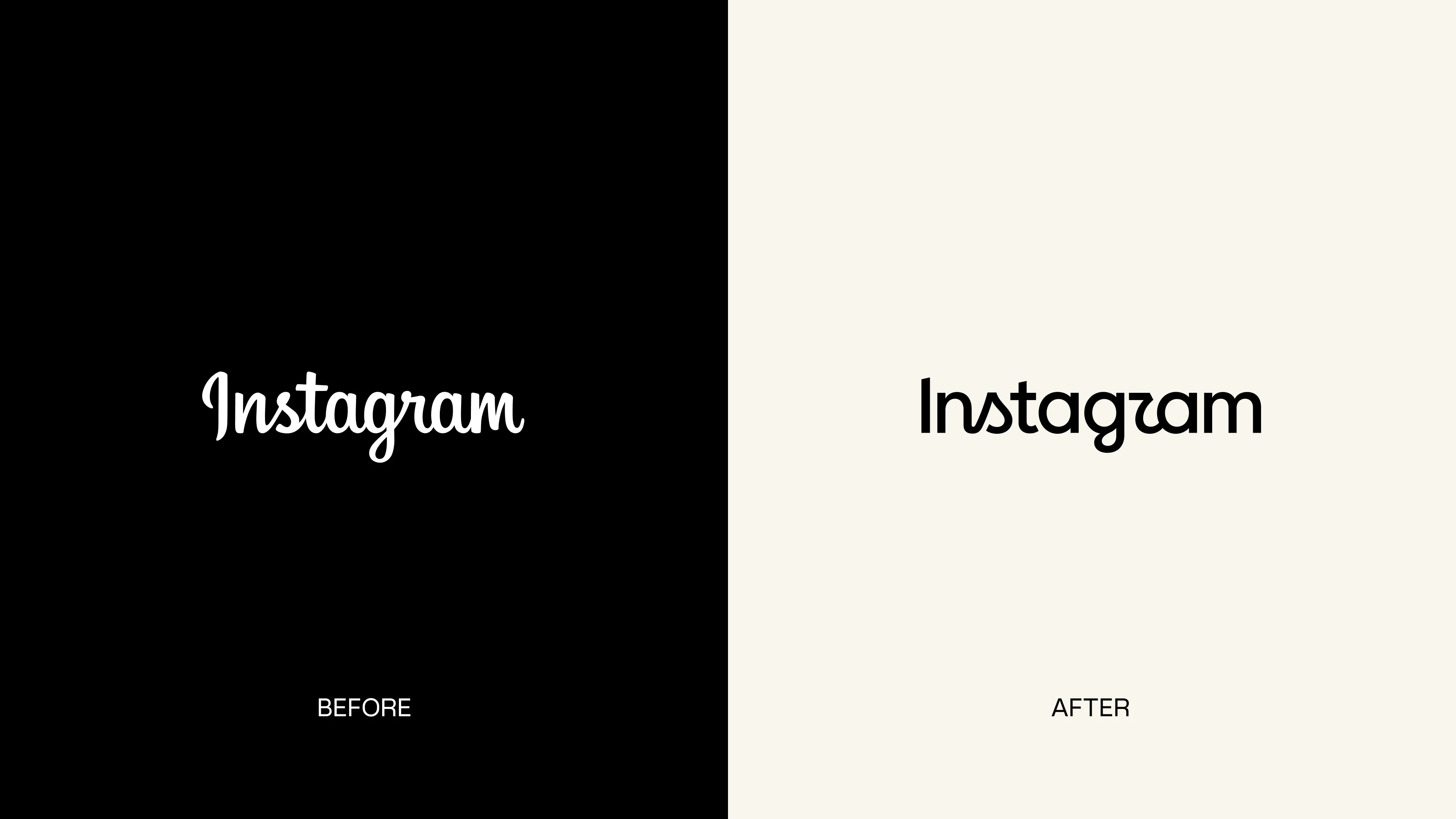
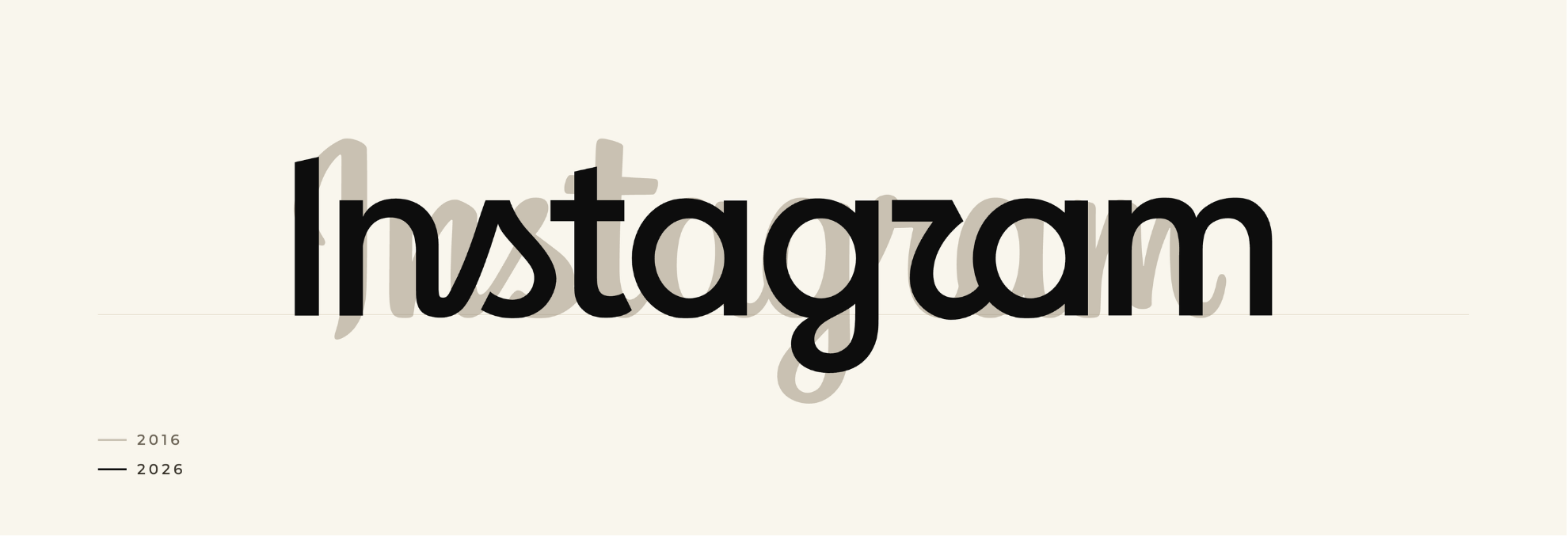
In August 2026, Instagram refreshed its wordmark for the first time in 10 years. The flowing script used since 2016 has officially been replaced with a cleaner, more structured design that still holds onto some of its handwritten personality.
And to clear up one common misconception, this isn’t a redesign of Instagram’s colorful camera icon. While you may have seen the update referred to as Instagram’s “new logo,” the change applies specifically to the written Instagram wordmark seen throughout the app and across its brand.
As you might expect when one of the world's most recognizable brands changes its look, the reactions were mixed. Some saw a more polished, modern version of a familiar wordmark. Others questioned why Instagram changed something that was already so recognizable.
But one reaction quickly took over the conversation:
"Instagzam?"
For us at Nice Branding Agency, the interesting part isn't simply whether we like the new lettering. When we look at a brand refresh like this, we're looking at whether it works. Does it protect the brand equity Instagram has already built? Does it give the identity more flexibility? Is it distinctive without sacrificing clarity?
And perhaps most importantly:
How do you modernize a brand people already know without losing what made it recognizable in the first place?
So, What Actually Changed?
Instagram worked with its internal design team, creative studio Koto, and type foundry MCKL to refresh the wordmark, which had remained largely unchanged since 2016.
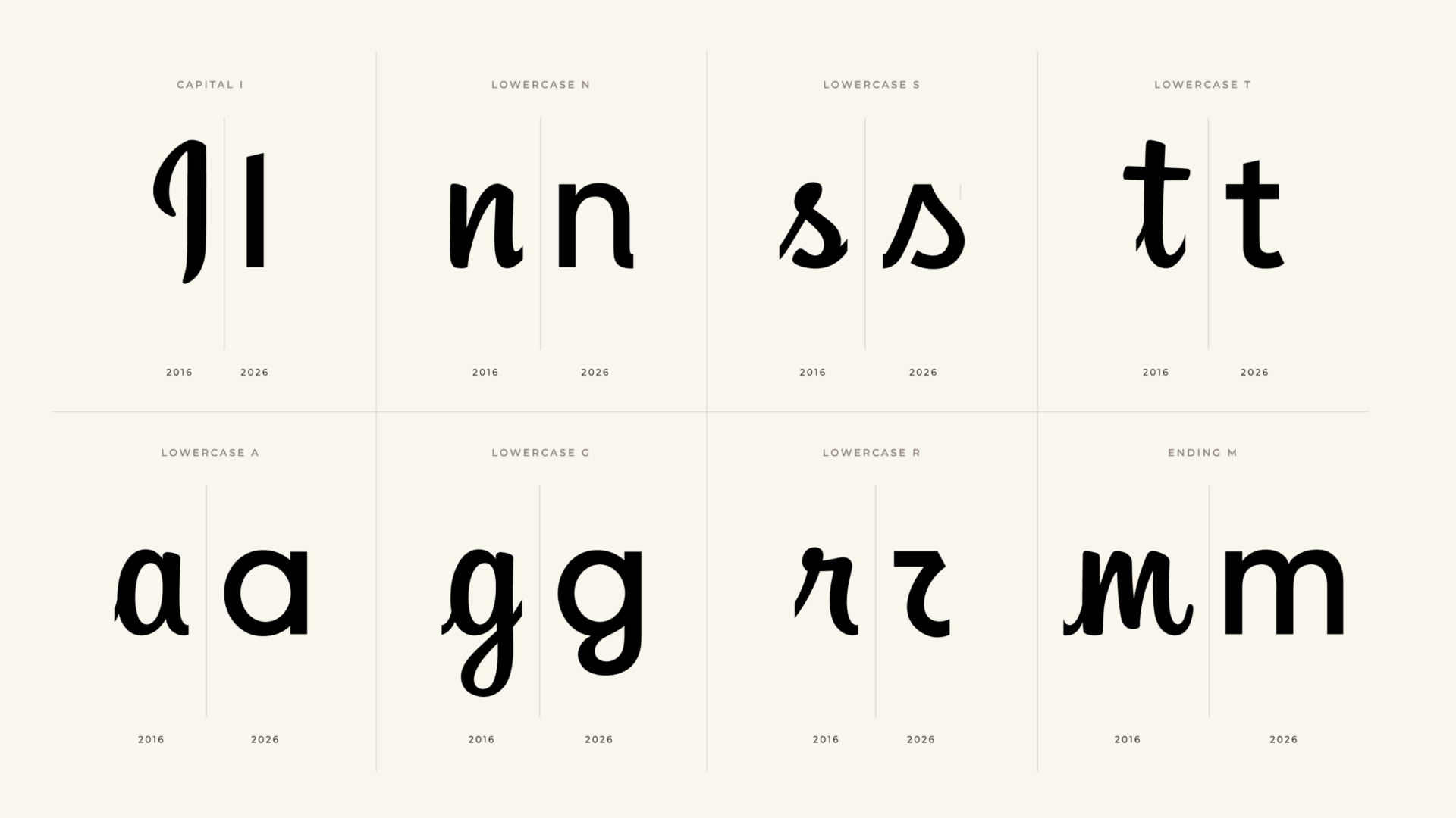
The previous version leaned heavily into a handwritten script. The new version keeps some of that personality but introduces cleaner, more upright letterforms and more separation between the characters.
At first glance, the difference is relatively subtle. That's intentional.
The design teams explored hundreds of variations, studying individual letterforms, connections, calligraphic details and handwritten characteristics to determine how much the wordmark could evolve while still feeling unmistakably like Instagram. The goal was not to abandon the existing identity. It was to preserve its recognizable qualities while creating something better suited to the brand Instagram has become.
And that is where we think the redesign gets interesting. Not every rebrand needs to blow everything up and start over.
Sometimes the smartest move is knowing what not to change.
Some rebrands are meant to completely reposition a company. Others are about evolution rather than reinvention. Instagram chose the latter.
Why Change a Wordmark Everyone Already Recognizes?
If people recognize your wordmark instantly, why touch it? It's a fair question.
Instagram did not have a brand awareness problem. Its wordmark is seen billions of times each day, according to Koto. But brands have to evolve alongside the businesses and experiences they represent.
The Instagram of 2016 is very different from Instagram today. The platform now spans Reels, Stories, creators, advertising, messaging, business tools, campaigns and an expanding family of products and experiences. That means its visual identity has more work to do than it did 10 years ago.
Koto has explained that while the previous wordmark carried significant brand equity, it had become more limited within Instagram's evolving visual system. In other words, the issue wasn't necessarily that the old wordmark looked bad. The issue was whether it could continue supporting everything the Instagram brand had become.
We see the same challenge with growing businesses. A company can have a perfectly recognizable logo and still reach a point where its branding no longer reflects its positioning, audience, services or ambitions.
That's when a refresh can make sense, but only if there is a clear strategic reason behind it. The question is whether you need to start over or simply evolve.
Ultimately, a rebrand should solve something.
What Instagram Got Right
From a branding perspective, Instagram made several decisions we really like.
1. It Protects the Brand Equity Instagram Already Built
One of the easiest ways to make a rebrand feel exciting is to make it dramatically different. That doesn't mean it's the smartest choice.
Instagram already had years of recognition built into its existing wordmark. Replacing it with something completely unrelated would have meant walking away from a lot of valuable brand equity just for the sake of looking new.
Instead, the new wordmark feels cleaner and more current, but you can still see the DNA of the original. That's often the sweet spot for an established brand.
A good rebrand should make people think, “This feels better,” not necessarily, “Wait, who is this?”
2. It Still Has Personality
We have all seen what happens when brands simplify too far. Different companies suddenly start looking suspiciously similar. Clean becomes generic. Modern becomes forgettable.
Instagram could have replaced its handwritten wordmark with a perfectly clean sans-serif typeface. Would it have been easy to read and scalable? Absolutely. Would it have felt like Instagram? Probably not.
Instead, the new wordmark intentionally keeps some of the quirky curves, connections and handwritten details that give it personality. Koto describes the process as trying to maintain the human qualities and imperfections associated with the original identity rather than designing purely for optimization.
For a platform built around creativity, self-expression and content, it makes strategic sense.
3. It Was Designed as Part of a Larger System
This may be the most important aspect of the redesign. A wordmark isn't successful because it looks good by itself. It has to work within an entire brand system.
That means alongside typography, color, photography, graphics, motion, digital interfaces, campaigns and every other place customers interact with the brand.
The new wordmark was designed with Instagram's larger visual identity in mind, including how it would function alongside its famous camera icon and throughout its broader ecosystem. According to Koto, one objective was creating a closer relationship between the two assets so they felt like part of the same visual language.
That's something we emphasize in branding work as well. A logo can be beautifully designed and still fail if it doesn't translate across the places a business actually needs to use it.
The strongest identities aren't collections of individual design elements. They feel connected.
And Then There's the “Instagzam” Problem
One part of the new wordmark sparked plenty of debate. Shortly after the redesign appeared, people began pointing out that the simplified “r” in the “gr” connection made the wordmark look, to some, like it read “Instagzam.”
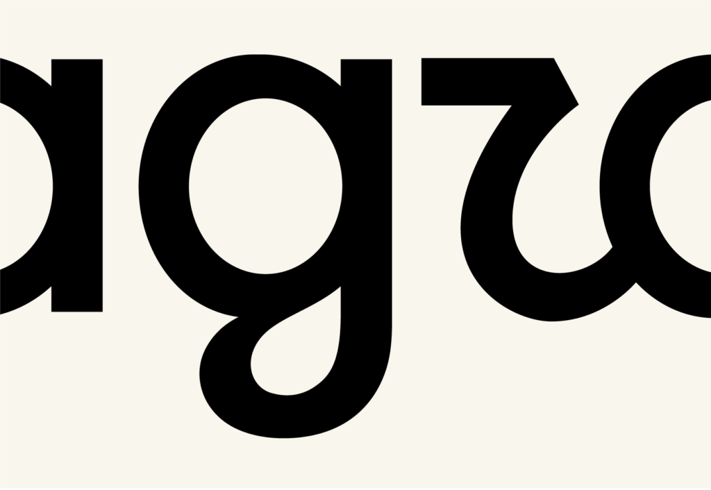
The reactions were amusing, of course. But the debate also brings up a legitimate branding question.
How far can you push distinctiveness before it starts hurting readability?
The unusual letterforms give Instagram's wordmark personality. That's valuable. But if a design choice makes the company name less immediately readable, there is a tradeoff.
Instagram has one huge advantage here: we already know what the wordmark says. When you open one of the most recognizable apps in the world and see it at the top of the screen, there isn't much mystery about which brand you're looking at.
A new or growing business doesn't necessarily have that advantage. If someone encounters your brand for the first time and can't determine what your business is called, creativity has started working against communication.
This is where we think Instagram's redesign becomes less successful. The distinctive letterforms help preserve character, but the “gr” connection pushes that idea far enough that the design itself begins competing with the name.
It's a small detail, but in branding, small details can change how an entire identity is perceived.
Why the Mixed Reactions Matter
Here's where things get particularly interesting: people weren't simply noticing Instagram's new wordmark. They were talking about it.
Designers analyzed individual letterforms. Creators proposed alternate versions. Brands began recreating their own logos in Instagram's new style. Memes spread, and AI prompts appeared showing people how to give practically any company the “new Instagram logo” treatment.
Koto described the response as the wordmark briefly becoming its own visual language. For a social platform built around people creating, remixing and sharing, that's remarkably on-brand.
That doesn't mean every controversial design decision is automatically a good one. Strong branding isn't about creating controversy for the sake of visibility. It's about building an identity distinctive enough that people recognize it, consistent enough that they trust it, and memorable enough that it stays with them.
A strong brand gives people something to recognize, remember, and talk about.
What Businesses Can Learn From Instagram’s Rebrand
Many businesses aren't working with Instagram's level of recognition, but the strategy behind this redesign offers several useful lessons for anyone thinking about refreshing their brand.
1. Have a Reason to Rebrand
A redesign should solve a problem or prepare the brand for what's next.
Before changing your visual identity, determine what is no longer working. Has your audience changed? Have your services expanded? Does your brand look disconnected from the quality of your business? Are you entering new markets?
Know what you're solving before you start designing.
2. Know What Already Has Value
A rebrand doesn't require erasing everything you've built. Existing colors, typography, symbols, shapes, messaging or other recognizable elements may already carry valuable associations with your audience.
The strongest redesign may be one that improves those assets rather than replacing them.
3. Build the Brand System, Not Just the Logo
Your logo is only one piece of your visual identity. Typography, color, photography, graphics, messaging, tone, and the way all of those elements work together ultimately shape how customers experience your company.
That's why we look at branding as a complete system. A strong identity should feel like the same company whether someone sees it on Instagram, visits your website, opens an email, walks past your storefront, or sees it on a billboard.
That consistency is what turns individual design elements into a cohesive, recognizable brand.
4. Don't Sacrifice Clarity for Creativity
Distinctive branding helps people remember you, but clarity still matters.
Instagram can survive a few “Instagzam” jokes because its name recognition is already enormous. Most growing brands don’t have that same advantage. If customers have to stop and figure out what your company is called, the design is creating friction instead of recognition.
The strongest identities find the balance: memorable enough to stand out, clear enough to understand immediately.
So, Did Instagram’s New Wordmark Work?
From a branding strategy standpoint, we think Instagram made the right decision to evolve its wordmark rather than completely reinvent it.
The brand preserved much of its existing equity while creating a wordmark designed to work within a larger, more modern system. It also maintained enough personality to keep the identity from becoming overly generic. Those are meaningful improvements.
Where we think the redesign becomes less successful is in some of the individual letterforms. The readability criticism is fair. The redesign demonstrates how quickly a distinctive detail can become distracting when people notice the design before they read the name.
But perhaps that's also what makes this redesign interesting. Instagram didn't create a perfectly neutral wordmark that quietly disappeared into the background. It created something recognizable enough to feel familiar, different enough to signal change and unusual enough to get millions of people talking about typography.
For one of the most recognizable brands in the world, that was probably the right move.
Is It Time for Your Brand to Evolve?
You don't need to wait 10 years to evaluate whether your branding still represents your business. As your company grows, your audiences change, your services expand, and your positioning evolves. Your brand should be able to grow with them without losing the recognition and trust you've already earned.
At Nice Branding Agency, we help businesses build bold, cohesive brands through strategy, positioning, visual identity, logo design and marketing, creating identities that are distinctive and built to last.
Whether your business needs a complete transformation or a thoughtful refresh, we'll help you determine what's working, what isn't, and how to create an identity designed for where your business is going next.
Contact Nice Branding Agency to talk about what's next for your brand.