Branding & Psychology: What Colors Fit Your Brand Best?
“What’s your favorite color?” It’s a common question for a reason. A person’s favorite color has been said to give insight into someone’s personality traits, motivation, and productivity level. The same can be said for your brand. The colors you choose for your brand instantly send a message to people who see it and influence how they react.
Research shows that up to 85% of consumers believe color is the biggest motivator when choosing a particular product, while 92% acknowledge visual appearance as the most persuasive marketing factor overall. But how do you choose the colors that are best for your brand? Let’s explore the ties between color and psychology.
What is Color Psychology?
Simply put, color psychology is the study of how colors impact human behavior. Swiss psychologist Carl Jung has been credited as one of the pioneers in the field through his work with art therapy and studies on how it helps people overcome trauma. Today, color psychology is used throughout business, marketing, and advertising campaigns to communicate with consumers on an emotional level.
Color Association
Color can subconsciously evoke emotion, change one’s mood, and influence decision-making. It’s a powerful tool that can help you connect with potential customers when used correctly.
Here are some of the most common traits associated with various colors:
Red: The color red attracts strong attention with its boldness and is most often used to convey strong emotions like passion, love, and anger. It’s the primary color used for a variety of recognizable brands like Target, Kellog’s, and Coca-Cola. It’s also frequently used in signage, like 50% off sales, to capture people’s attention.
Orange: Often described as an energetic color, the color orange communicates warmth and happiness. Food giants like Fanta and Dunkin Donuts use the color along with a variety of other brands like Nickelodeon, Penguin Books, and Mastercard.
Yellow: As commonly used in smiley faces, the color yellow evokes happiness, positivity, and optimism. You’ll see it used by companies like McDonald’s with their iconic yellow arches and in the Warner Brothers logo.
Green: The color green, as it’s linked with the natural environment, is said to symbolize growth, tranquility, and peace. Some recognizable brands that use the color include Starbucks, Spotify, and Sprite.
Blue: Representing the sky and sea, the color blue brings a feeling of calmness and serenity. It’s most notably used by tech giants Facebook and Twitter.
Purple: Used by a variety of brands like Yahoo and Hallmark, the color purple represents creativity and wealth.
Using Color for Your Brand
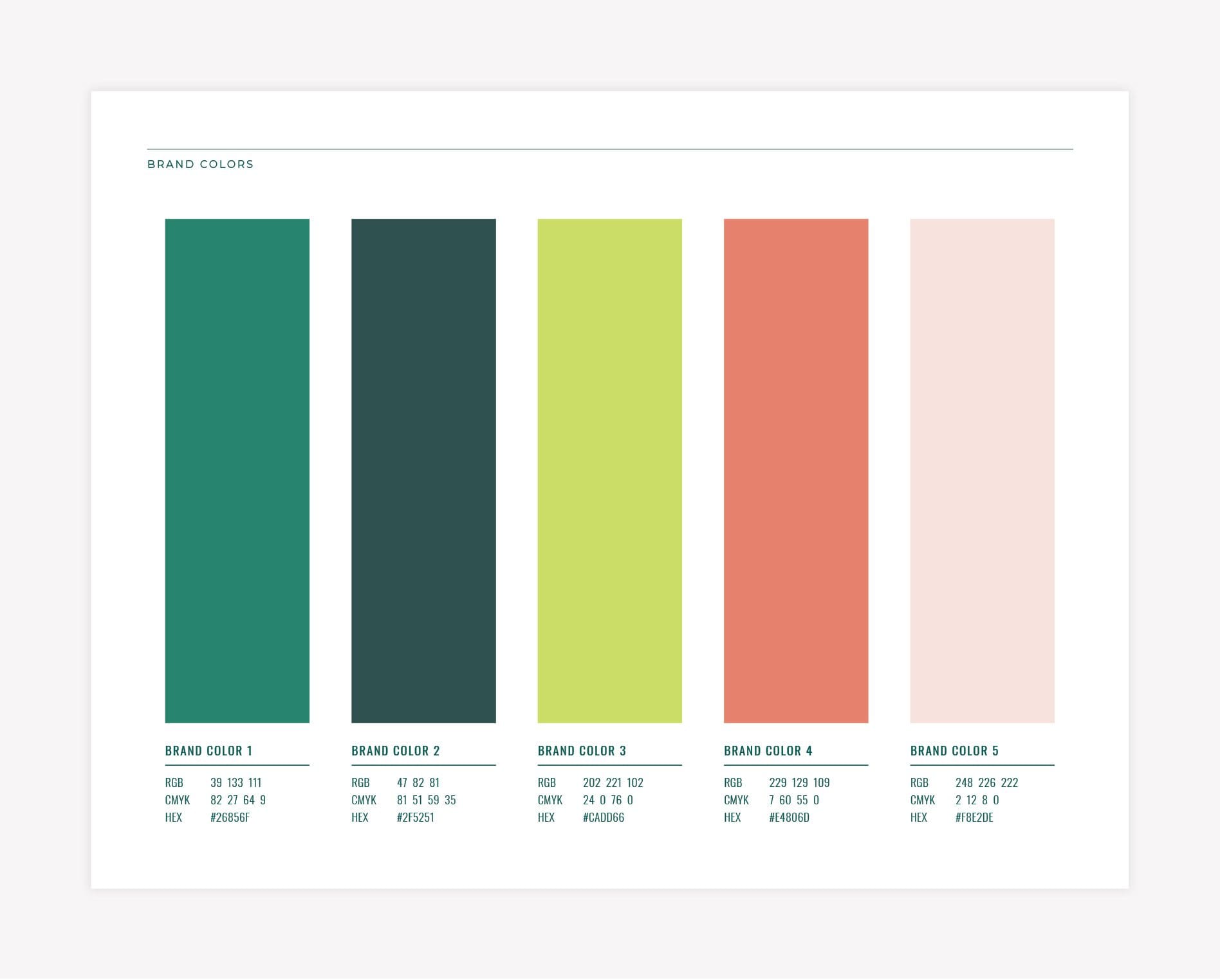
As you consider what colors to use for your brand, keep your goals and target audience in mind as the use of color will play into their decision-making. You’ll also have to think about which colors work best together in order to create something that is pleasing to the eye. When creating your color palette, you should use one to three primary colors and one to six secondary colors. This will allow you to create a variety of combinations while still maintaining a consistent brand identity.
At Nice Branding Agency, we’re all about color and we love creating bold brands through creative branding and messaging. Contact us today to learn about our services which include business logo development, visual direction, brand attributes, and more.


