CMA EDU

nashville music industry branding

Backed by the Country Music Association, CMA EDU offers college students one-of-a-kind experiences and mentoring to give them a solid foundation for a successful career in the music industry. Needless to say, our Music City-based agency couldn’t wait to create their new, show-stopping brand. From brand positioning to T-shirt design, this project showcases a variety of our branding services.

Find out how it all came together with meticulous strategy, flawless creative, compelling messaging, optimized digital, and cohesive marketing.

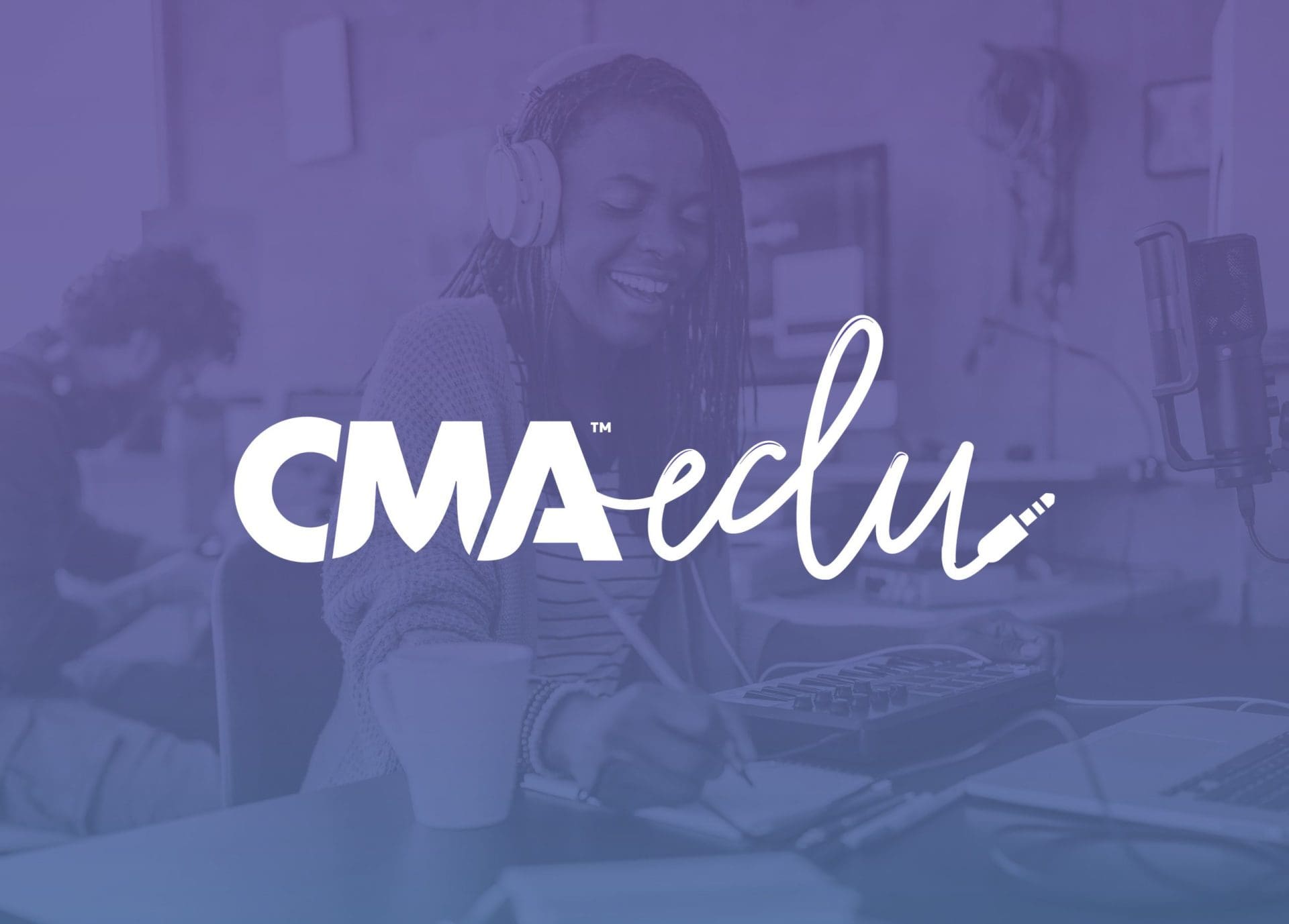
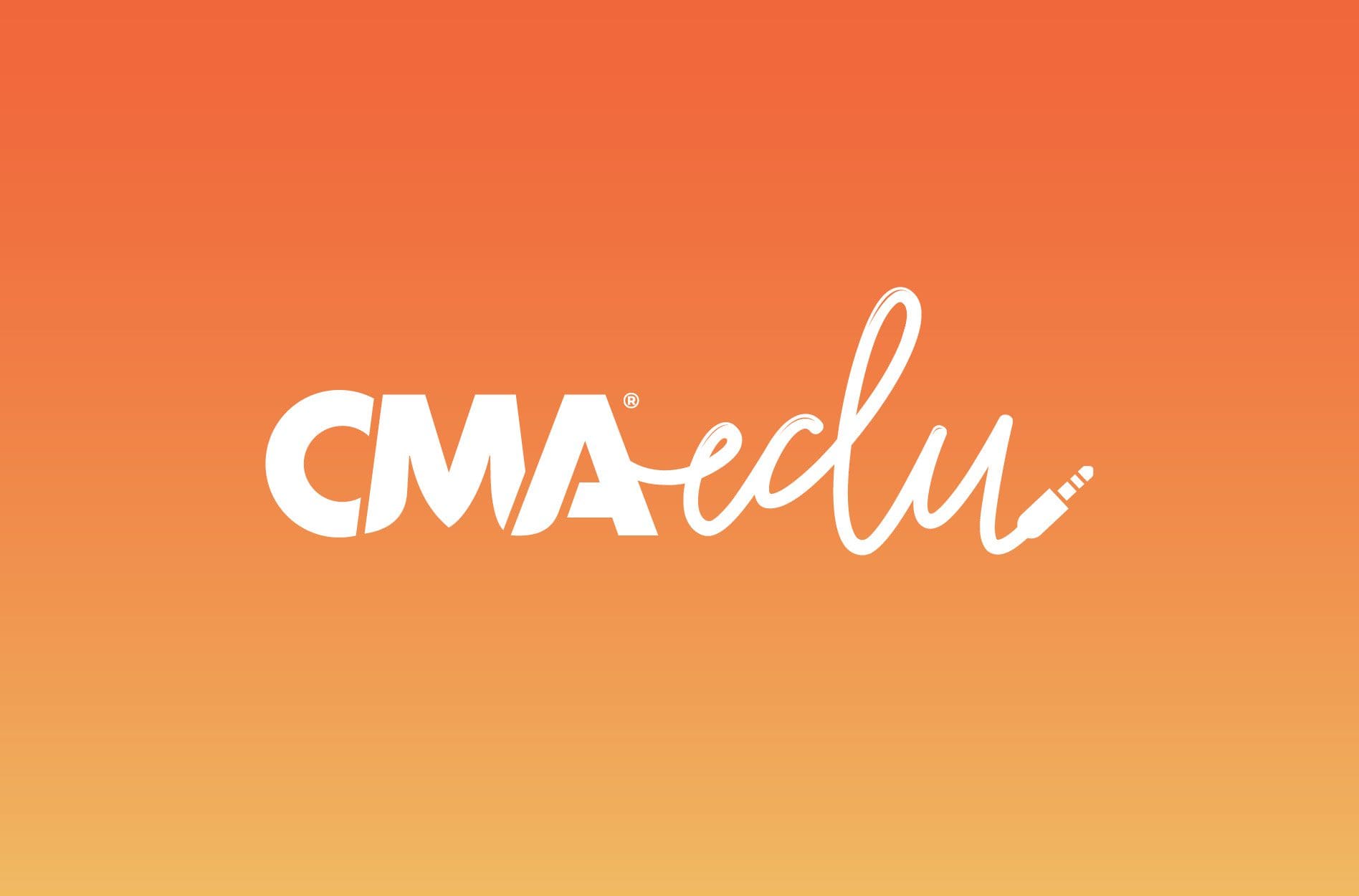
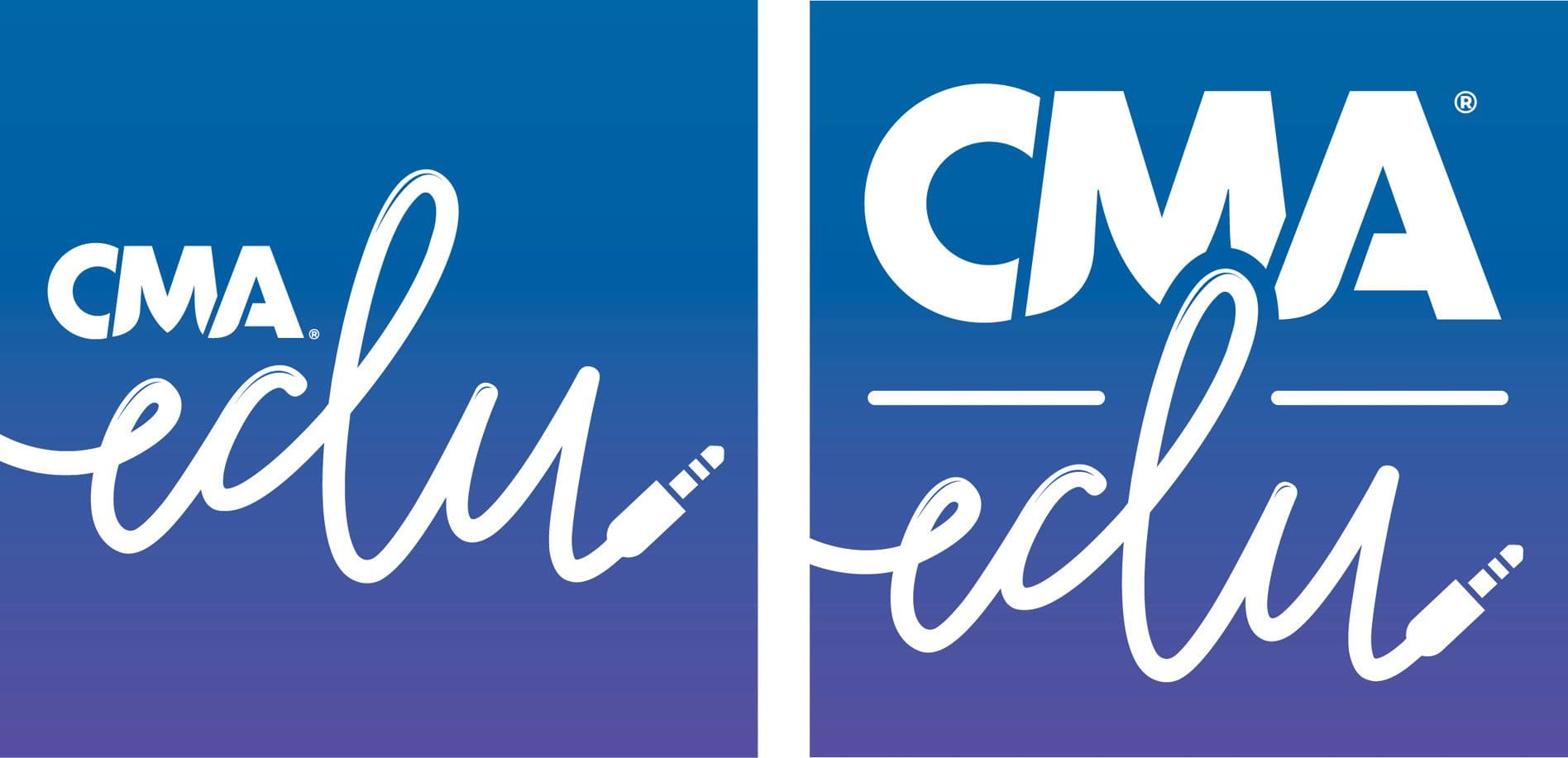
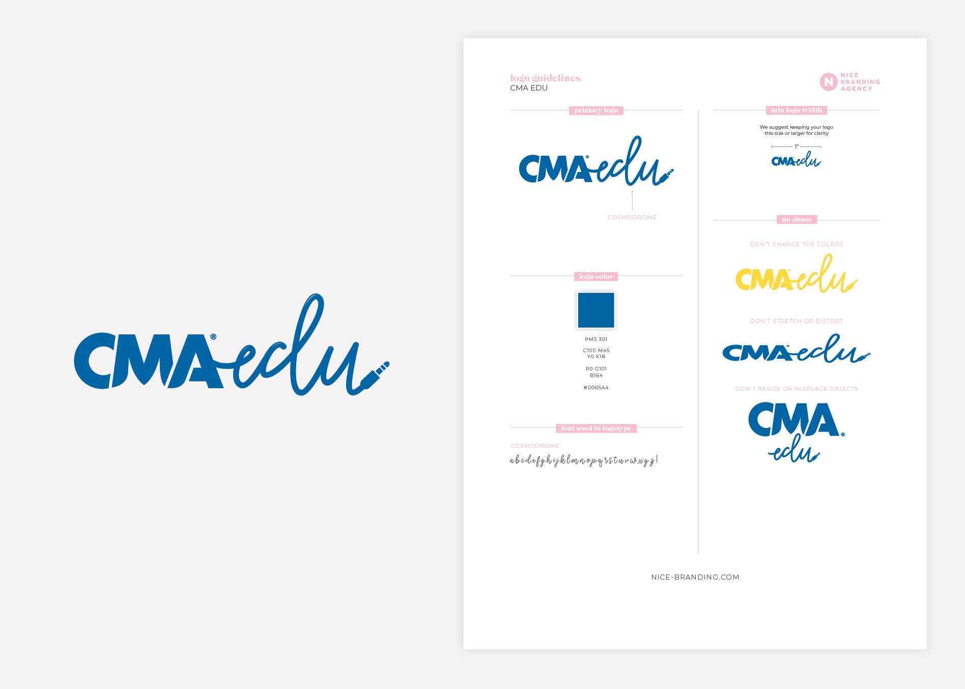
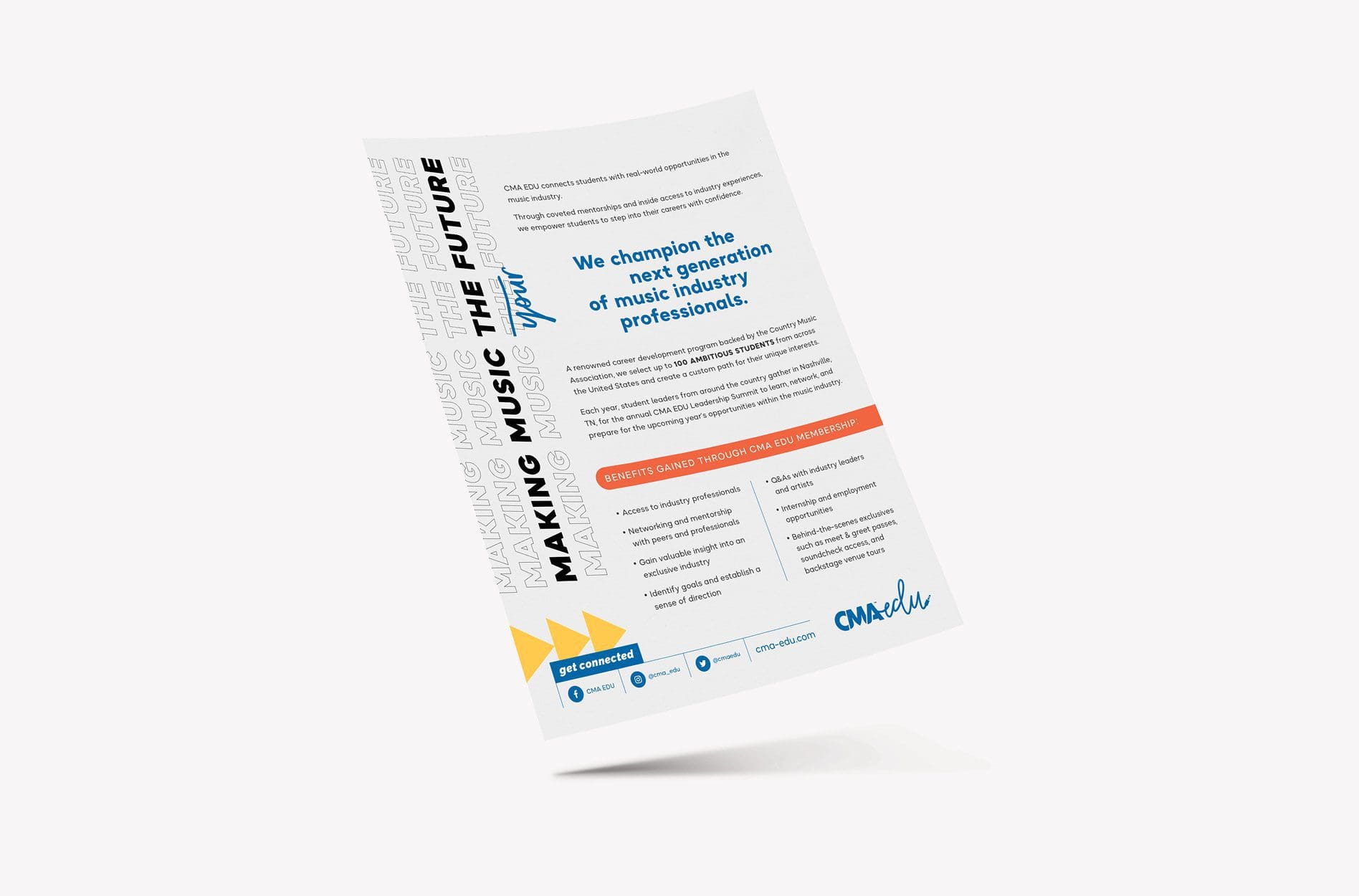
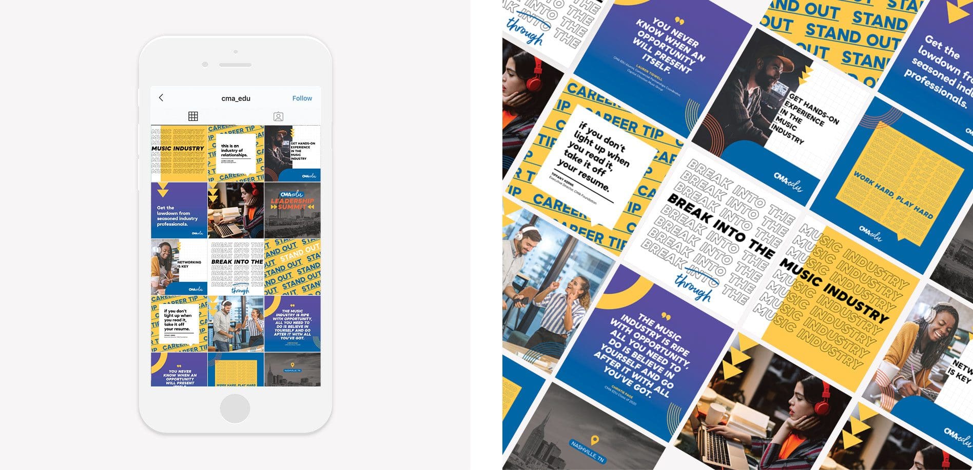
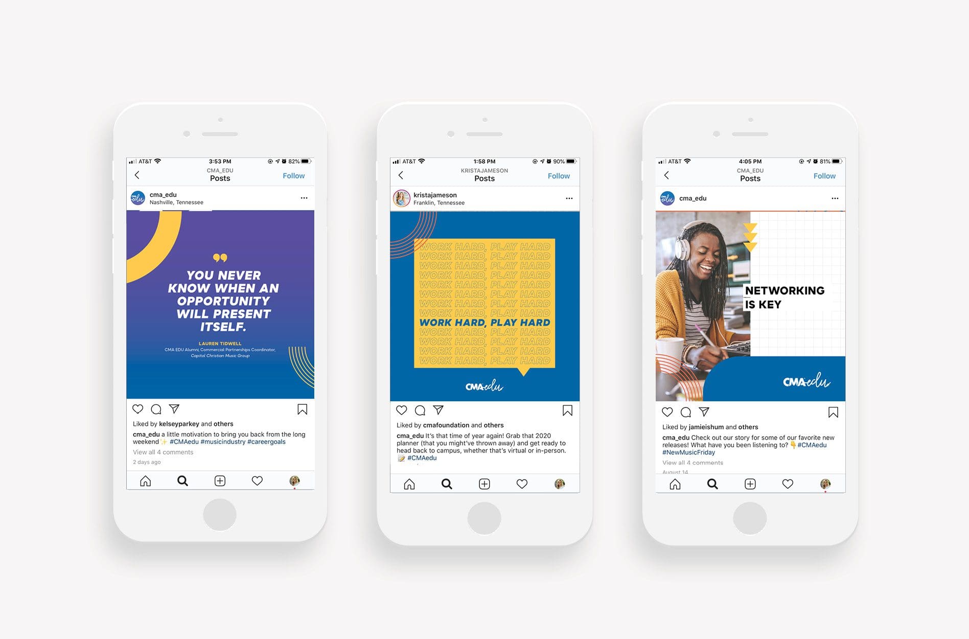
CMA EDU is a career development program for ambitious college students who have demonstrated a drive to succeed in the music industry. Backed by the Country Music Association, the program utilized our branding services to promote its coveted mentorships and real-world music industry opportunities that empower students to step into their careers with confidence.

Prior to 2020, CMA EDU membership was limited to certain participating universities. When the organization decided to open up its membership to students across the country, they needed a connective brand, which required a rebrand. And so, they came to the experts at Nice Branding Agency.

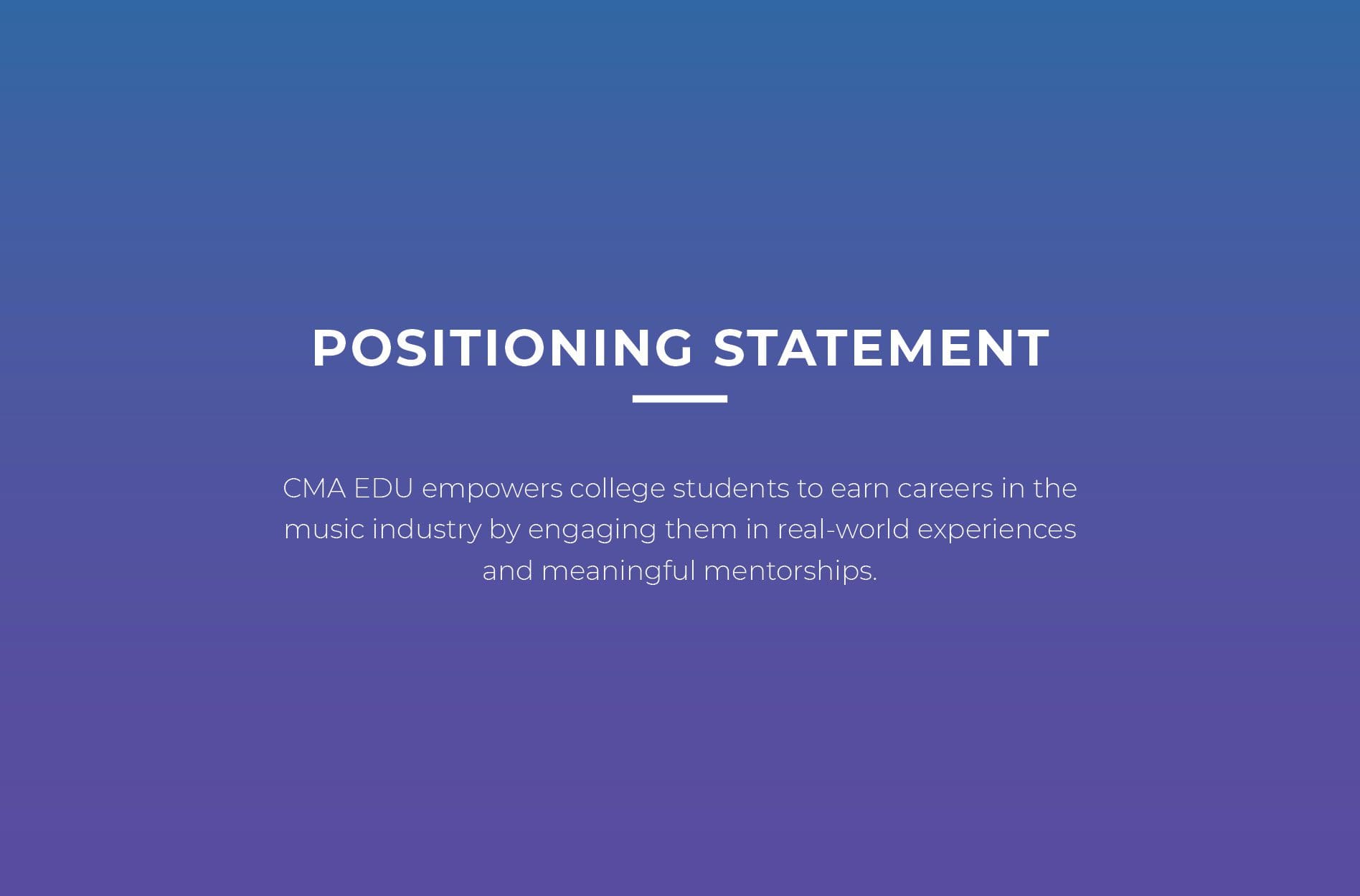
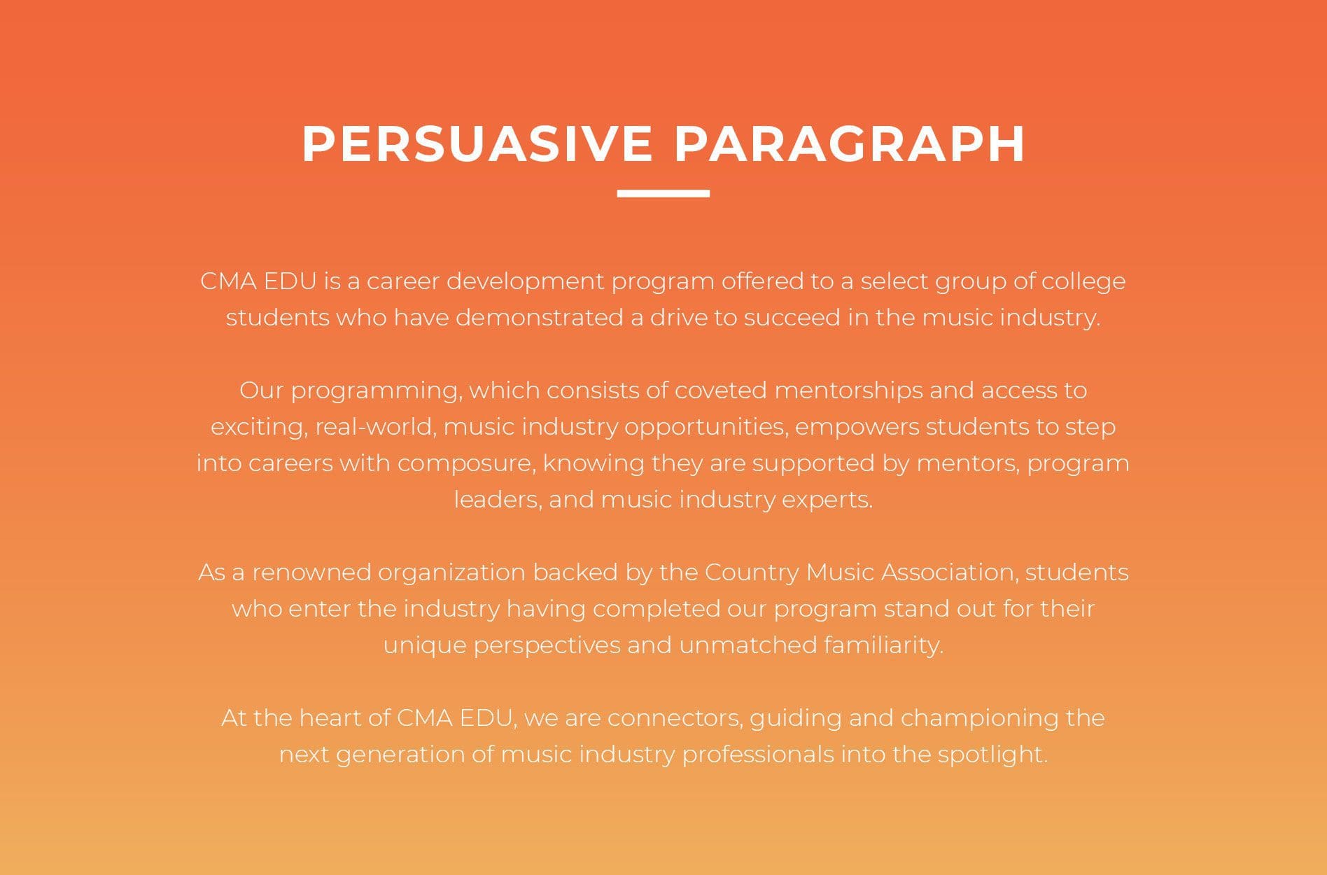
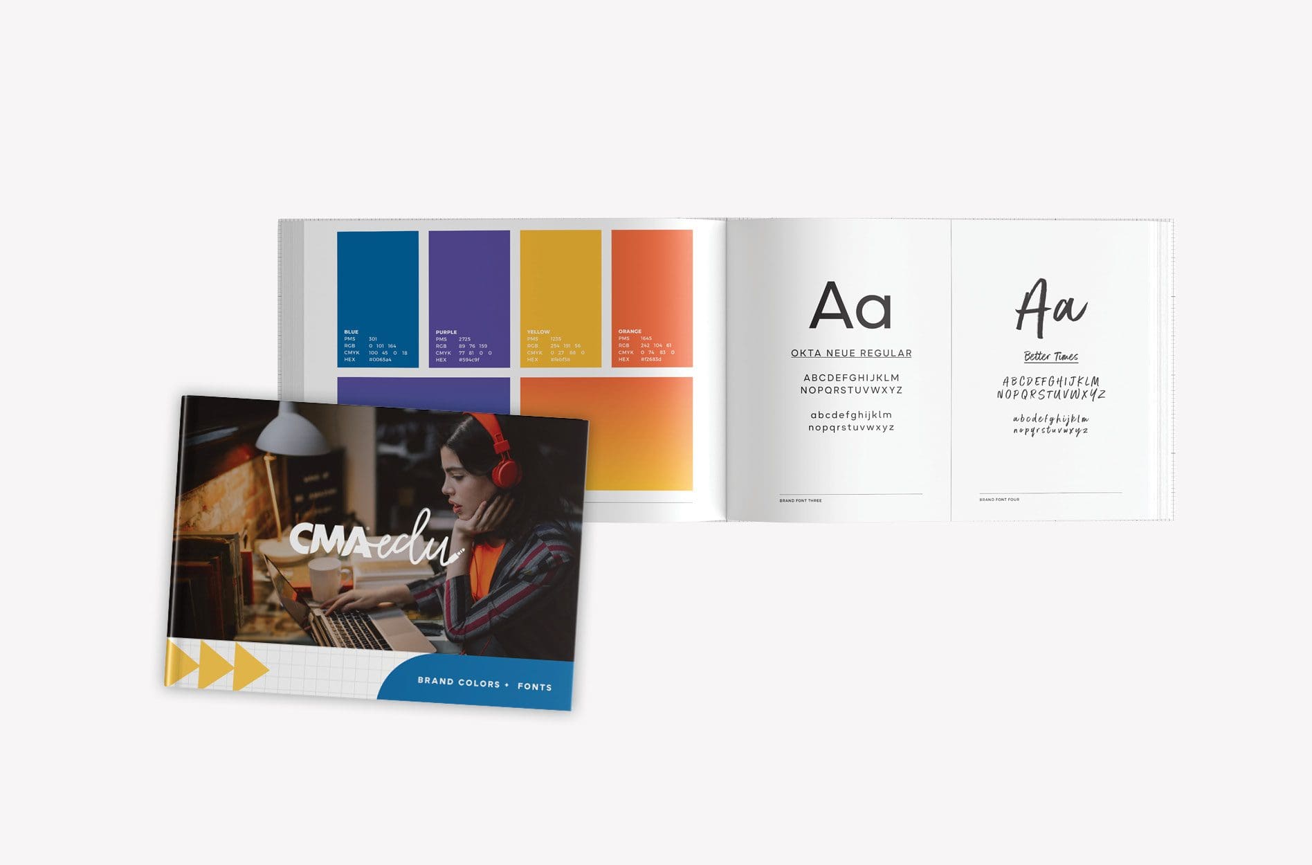
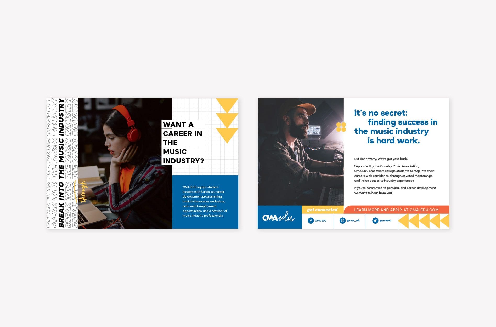
Our goal was to help define CMA EDU’s brand identity—visual direction, brand attributes, positioning statement, and persuasive paragraph—in order to help the organization better educate and connect with student leaders, mentors, and alumni. We needed to clearly communicate the program changes and emphasize the benefits of membership in a way that would appeal to the target audience.

Before we dive into the branding project, it’s important to note that our work for CMA EDU does not perfectly align with any one standard Nice Branding Agency services package. Instead, it contains many larger, impactful services that make up our packages. It serves as a great reminder that while our standard packages are a great starting point, they can be customized to suit the unique needs of your business.

Research + Discovery | Foundational Branding Services

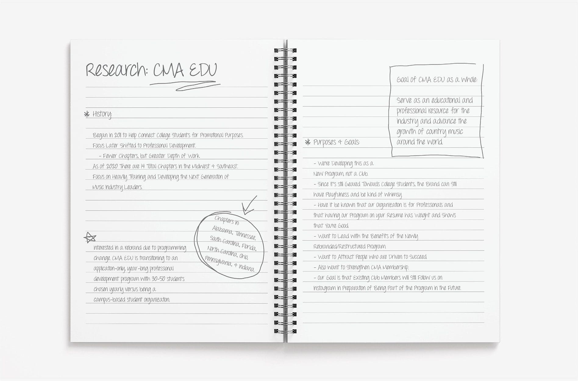
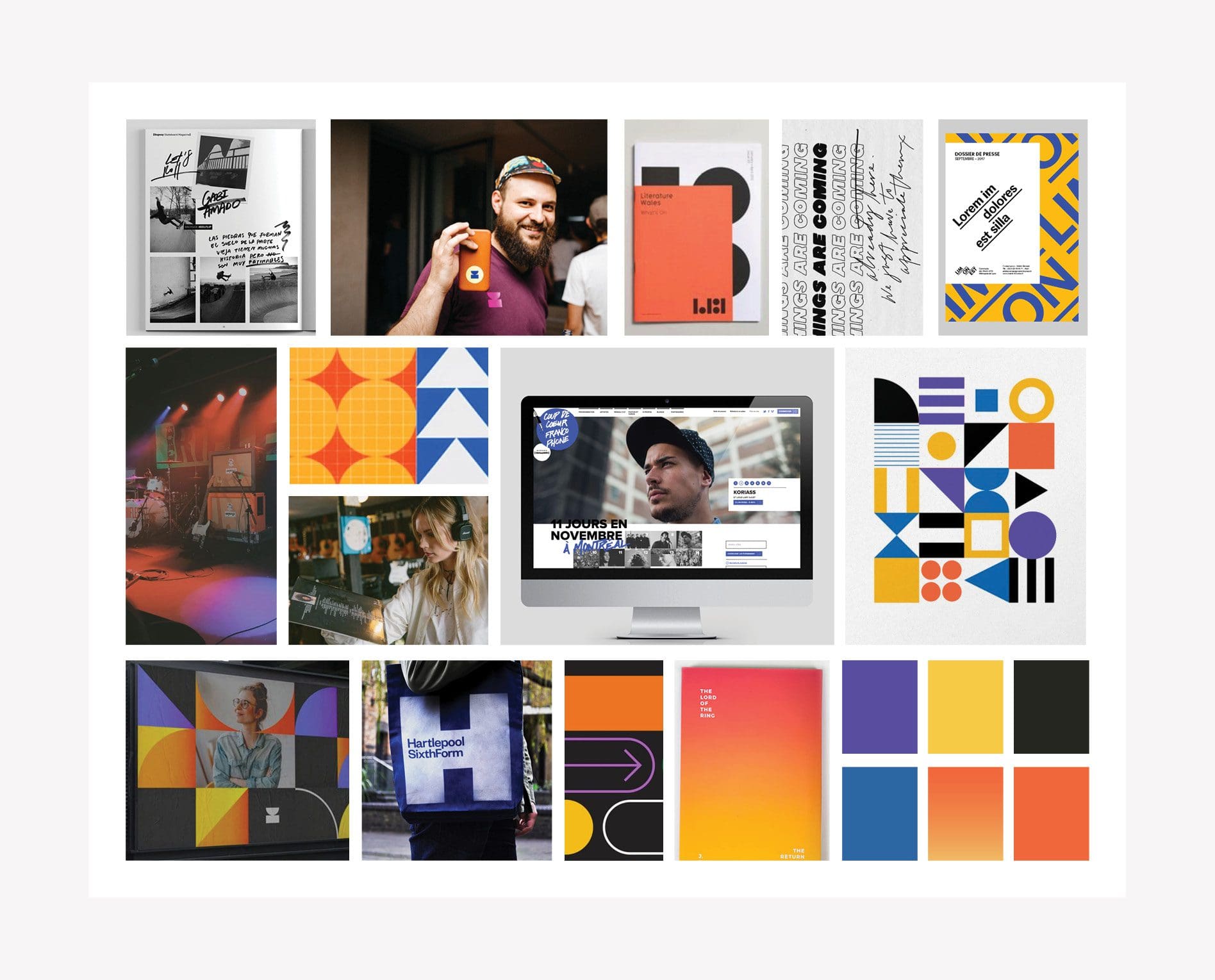
Our discovery phase is an essential part of our branding services. It’s when we learn about the organization’s goals, differentiators, and target audience.

During our initial conversations with CMA EDU, we learned all about the organization, its network of music industry connections, and the student leaders it serves. We got a better understanding of the shift in program structure, the membership expansion, and their goals for the new brand.

This information would serve as a guide for developing the key messaging and visual direction as part of our Foundational Branding process.

corporate branding

Brand Positioning Statement

brand positioning statement is your one-liner response that you have locked and loaded when someone asks, so what does your organization do. A fundamental building block of your brand, it conveys who the company is, what value it provides, and/or to whom.

The positioning statement we developed for CMA EDU is short, sweet, and describes its unique position in the market: “CMA EDU introduces college students to the music industry.” We crafted a condensed version and a full version, which can be utilized as a filter for all branding initiatives to come.

If anyone were to ask a member of the organization what CMA EDU is, they could refer back to this brand positioning statement. Over time, this consistent messaging will strengthen the brand.

nashville music branding

Persuasive Paragraph | Branding Services

The Persuasive Paragraph is our opportunity to expand upon the Positioning Statement. We use it to tell about your brand, and further convey your position and offerings in a more descriptive manner.

Within the Persuasive Paragraph for CMA EDU, we state what the organization is, what they offer, why they do it, and their position in the market.

The resulting language can be used in marketing collateral, communications, on the website, and elsewhere.

corporate marketing agency

Brand Attributes

Brand Attributes are a set of adjectives that describe the personality of the company and help to strengthen the brand. They provide clues about how a company looks, communicates, and acts. Additionally, they are a reflection of the company’s values.

For CMA EDU, the brand attributes were defined as: Educational, Reputable, Exciting, Connectors. For each attribute, we provided a condensed description and a full description. This key messaging can be used in conversations with prospective program participants, within their marketing collateral, on the website, social media, and beyond.

corporate brand attributes

Visual Direction | Branding Services

Part of our Foundational Branding services includes developing up to three brand boards to convey visual direction. Our process provides a natural way for you to have a say in the direction of your brand, and the result is a visual roadmap for the look and feel of the brand.

Each brand board is designed to bring the positioning statement, persuasive paragraph, and brand attributes to life through color, texture, and imagery. We presented three concepts for CMA EDU.

The winning board has a cool, confident energy that was more calming than the other options. Organized in a grid format that correlates with the professionalism of CMA EDU, the geometric graphics are balanced by bold colors and oversized, serif fonts that highlight the creativity and excitement of the industry.

Colorful gradients, reminiscent of stage lights, signify the perfect blend of students and mentors that make up CMA EDU. The gradients and mix of colors represent the exciting, one-of-a-kind experiences that participants enjoy.

Continuous graphic lines visually represent the connections made throughout the program, between students, mentors, and music industry leaders. The lines also allow for flexibility in the logo layout, which is representative of the various opportunities that shape and mold CMA EDU students.

The handwritten lettering reminds us that memories made in college are formative, yet fleeting, and won’t soon be forgotten.

There were similar colors in all three brand boards. The blue shade is the classic CMA blue. It is indicative of the confidence of the program. Orange evokes feelings of excitement, enthusiasm, and warmth, which align with the life-changing experiences that CMA EDU offers.

Purple and pink are uplifting and creative. They stand for the creativity and positivity of the music industry as a whole. Yellow is the color most associated with happiness; it represents the optimism of future leaders.

Green is the color of life, renewal, and energy. It is associated with growth, much like the growth that students experience in the program.

country music association branding

Logo Design Direction Brainstorm

After the client selected a visual direction, our team moved into the process of sketching a logo design that would align with the new brand. We created several sketches to determine a viable direction for the design.

We wanted the logo design to be versatile, timeless and representative of the organization’s next chapter.

music industry logo design

Finalization of Conceptualization

Our Creative Director and Art Director reviewed the options carefully and decided that we would move forward with four logo variations. Each logo design would feature elements of the brand board in order to ensure cohesion.

Logo Design Options | Branding Services

For CMA EDU, we created four logo design options that incorporated the exciting energy and creativity of the music industry. The logo needed to appeal to college students interested in working in the music industry and establish the organization as a professional, reputable organization.

While certain elements from the brand board are more prominently featured in some of the logo designs, all of the shapes and fonts align with the visual direction.

The first logo option is the most simplified. It features the letters EDU in a script, handwritten font that aligns with the brand board. The contrast font used in the CMA logo allows the EDU to stand out. This represents the way in which CMA EDU participants stand out from the crowd once they graduate from the program and enter the music industry.

The first logo would most likely be used as a one-color application but can be used in any brand color. The primary brand color would be blue.

The second logo option uses shapes to form the letters EDU. The shapes correlate to the ways that the program shapes students’ career trajectories and, ultimately, their lives. Photography can live in the D and U shapes throughout marketing materials. The CMA can live inside the E or it can also live outside the EDU.

When the CMA lives outside the shape in the second logo option, it gets pared down to the U shape, which really puts the emphasis on the student (“You”) and gives it a collegiate and reputable look.


nashville logo design agency

The third logo design option also incorporates shapes, but they’re more detailed, reflecting the patterns shown on the brand board. The shapes come together and form abstract EDU letters. The badge that CMA EDU lives in can exist with the shapes and also on its own.

The third option really brings the “connector” attribute to the forefront by using the shapes within the logo.

Finally, for option four, we wanted to create a flexible logo setup that uses the shapes and type in a creative manner that reflects the creativity of the music industry and CMA EDU itself. The shapes and letters would move around, giving flexibility to the logos, which correlates to the ways that CMA EDU shapes students’ lives.

The fourth logo design would transition well into a GIF, which could live on the website and transition automatically through the different logo setups, bringing the energetic brand to life.

corporate music logo

Logo Presentation and Selection

Upon presentation, our client reviewed the options and provided feedback. The first logo design was their favorite, but they asked that the final design incorporate a musical element.

Our team then adjusted the font to a script that incorporated a music plug. The plug not only represents music, but also serves as a nod to the industry as a whole.

Upon reviewing the revised logo, the client felt that the design really represented the organization and loved the symbolism of plugging into the music industry.

nashville music marketing
country music branding

Logo Finalization

During the finalization process, our Art Director perfected the logo design and selected exact colors in PMS, CMYK, RGB, and HEX codes.

Logo files were then created in JPEG, PNG, EPS, and PDF and shared with our client in black, white, and full color.

country music marketing agency

Branding Guidelines

Following the creation of the visual direction and logo design, we developed Brand Guidelines for CMA EDU to help the client maintain the integrity of the logo and brand. The guidelines outlined the exact brand colors (including color codes), fonts, and logo usage specifications.

These Brand Guidelines would ensure that all marketing materials and communications would align seamlessly with the brand we built. The consistency we establish through our branding services helps build trust between the company and its target audience.

music industry brand support

Leadership Logo Design

Separately, we designed a leadership logo that could be seamlessly paired with the new CMA EDU logo. We wanted to keep it simple with a brand font that would not compete with the main logo. We added the shape elements that are used throughout the brand to bring an element of energy to the typographical elements of the logo.

nashville branding agency

Brand Support: Postcard, T-Shirt, and One-Sheeter Design

We provide a variety of ongoing branding services to clients, so we were happy to add on a few support elements to further strengthen CMA EDU, including marketing collateral and custom attire design.

First, we developed a postcard to serve as the initial touchpoint introducing students to the program. The postcard featured a high-level overview of CMA EDU: who they are, what they do, and how to get involved with the program.

nashville graphic design agency

We also created a custom T-shirt design for each participant, which would be included in the box that welcomes them to the program. The T-shirt design we developed aligned with the new CMA EDU brand, but was also trendy and understated so the student would actually be inclined to wear it. The featured saying, “I’m With The Band,” was on-trend and also referenced the backstage experience that the student gets as part of the program.

band-branding

We then created a one-sheeter to showcase the new brand, including elements of the visual direction and foundational messaging. The goal was to educate prospective students on the purpose of the program and the benefits of CMA EDU membership in a clear and concise way. The client could hand out this one-sheeter at events or even mail it to prospective students if desired.

business collateral agency

Social Pack

In an effort to ensure that the newly established brand would be evident on social media, we created a Social Pack for CMA EDU. In case you’re unfamiliar, a Social Pack is a set of 15 reusable, professionally designed social posts that align with your brand identity.

The professionally designed graphics echo your visual direction and the corresponding captions are written in your brand voice with your key messaging. Investing in social media is a wise decision for any business in 2021, but especially an organization like CMA EDU that is looking to attract college students with their sights set on the music industry.

For CMA EDU’s Social Pack, there were several objectives: 1. Educate, inspire, and encourage college students interested in music industry careers to apply; 2. Attract industry mentors to participate in the program; 3. Engage alumni.

When creating the social posts, we used CMA EDU’s new visual direction and key messaging to achieve these goals. We educated people about the program, emphasized the benefits of membership, and positioned the organization as an industry thought leader.

The client was thrilled with the end result and has been utilizing the Social Pack to strengthen their brand across social media.

social media design agency
social media strategy

Need Branding Services?

Want what they’ve got? It may be time for a Nice brand. Our branding services include brand positioning, foundational verbiage, visual direction, graphic design, marketing strategy, and beyond. Let us know how we can take your brand to the next level. Call 615.905.9936 or contact us today.

Be sure to follow us on Instagram and LinkedIn for more branding project showcases and inspiration for your next rebrand.

are you ready to create something nice?