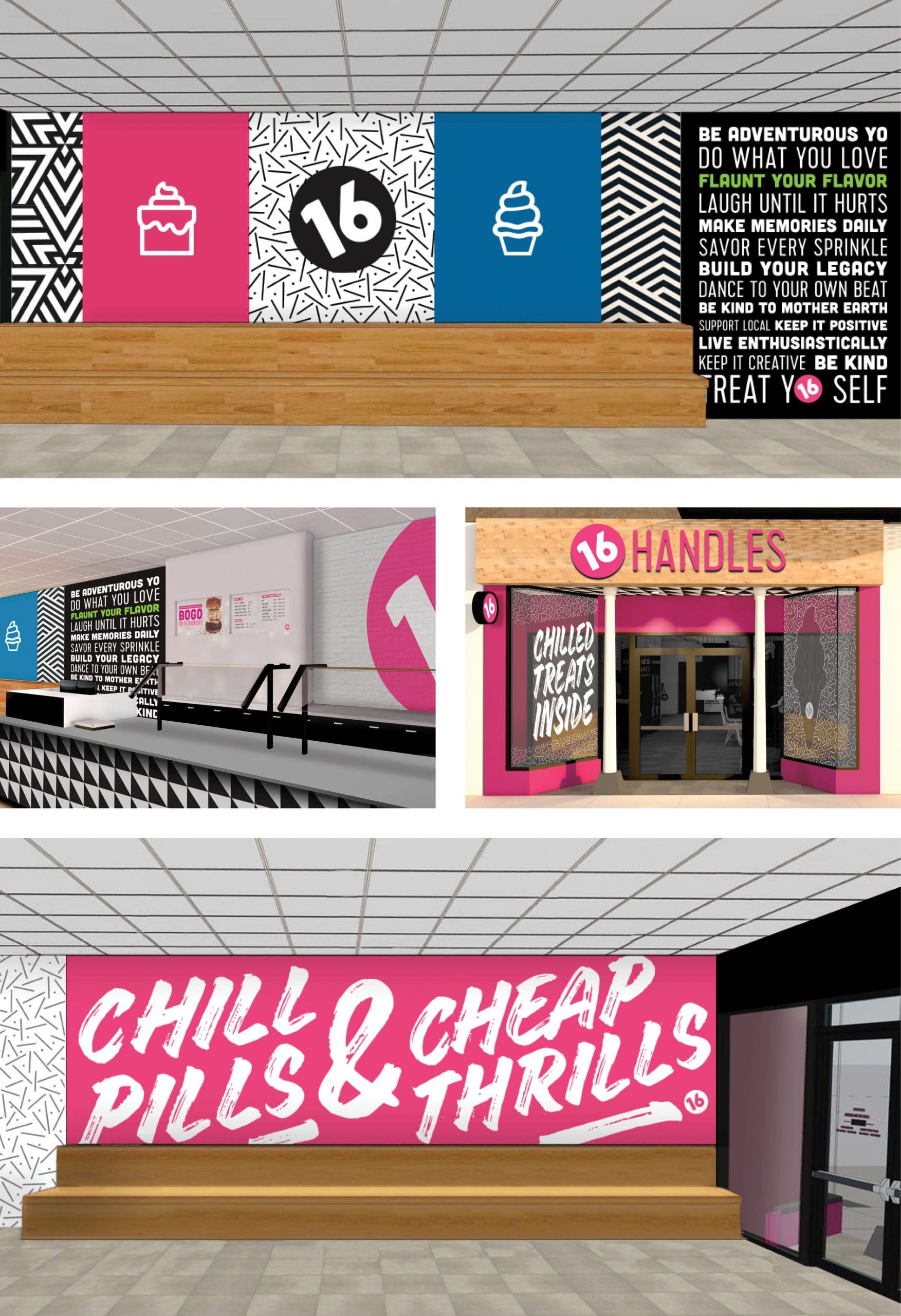
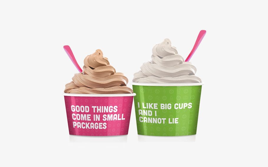
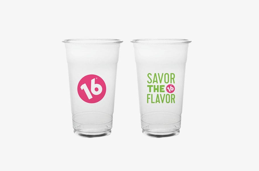
We were thrilled to complete a successful restaurant rebranding for 16 Handles, a popular New York City-based frozen yogurt franchise. We began our process by learning about founder Solomon Choi’s passion for the product and the empire that he built from scratch.
This rebrand was unique in that the logo needed to stay intact. The client wanted to keep elements of the original brand to maintain the awareness and fanbase they had grown since opening in 2008. The client also has its own internal graphic design department. We were coming aboard to elevate the brand in a way that the company could continue to carry out.
Successful Restaurant Rebranding: Discovery
We began this successful restaurant rebranding project with a discovery session. We traveled to New York City to learn about 16 Handles’ goals and mission, as well as what’s working and what isn’t, directly from the founder and his team. We talked about the brand differentiators, the quality of the product and the brand’s fun personality. Though it all, we focused on the target demographic. The team had some target personas in mind, but they were curious to find whether they were correct.
We visited a variety 16 Handles locations, during which we were able to experience the stores firsthand. Like typical customers, we engaged with the layout, menus, staff, product, and overall environment. By sitting in the stores, we could observe the customer journey and demographic. We kept an eye out for pain points in the customer experience and ways to incorporate brand communication into the space.
Brand + Consumer Insights
We decided it would be helpful to survey customers to find out what they knew and loved about the brand and what they felt was lacking. With this data, combined with our in-store observations, we were able to define the quintessential 16 Handles customer, a key ingredient to a successful restaurant rebranding. We composed a visual board and narrative that illustrated the typical 16 Handles customer a.k.a. “16 girl.” Her preferences were held up against the existing brand to identify opportunities to improve with the customer in mind.
Branding Direction: Successful Restaurant Rebranding
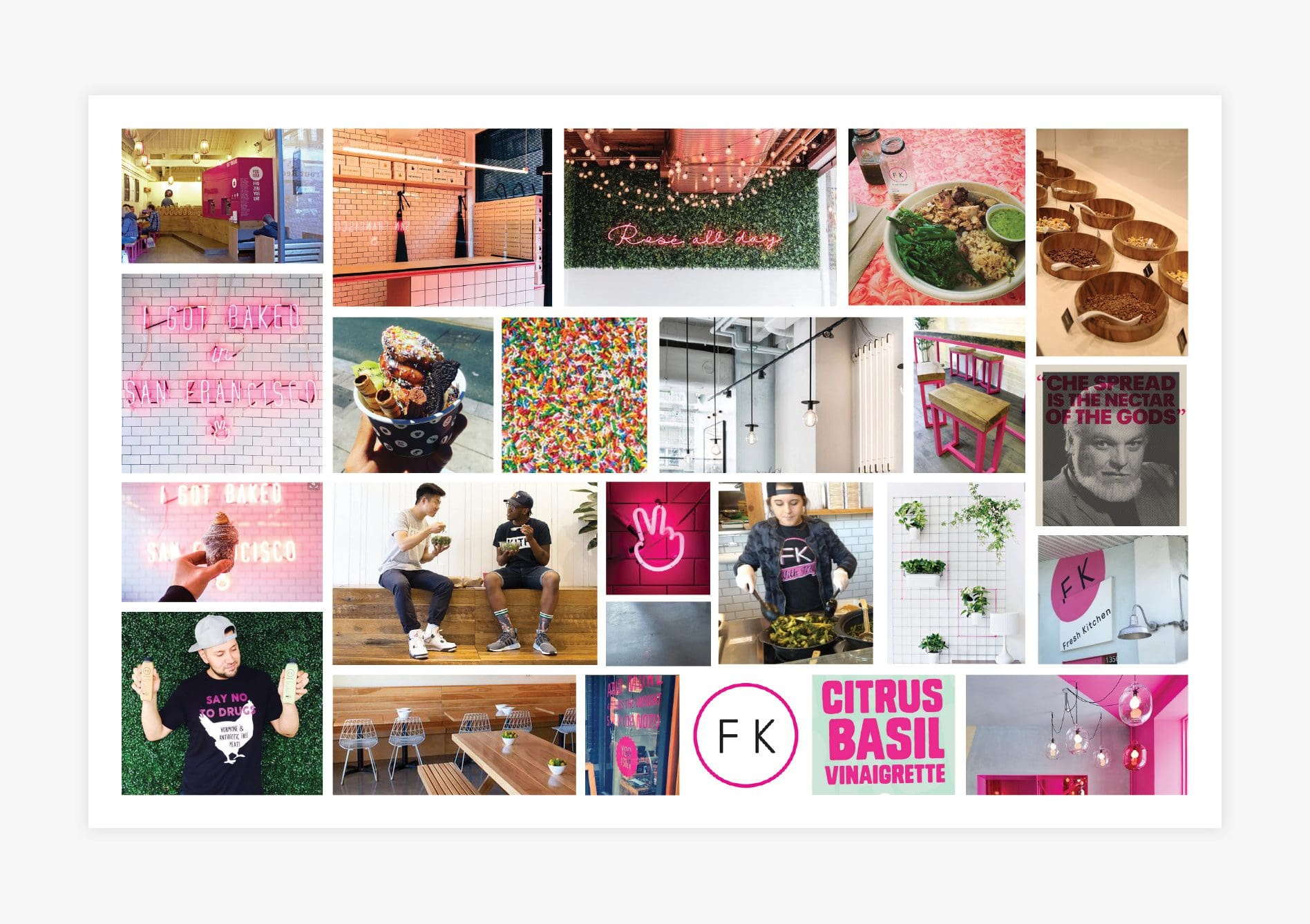
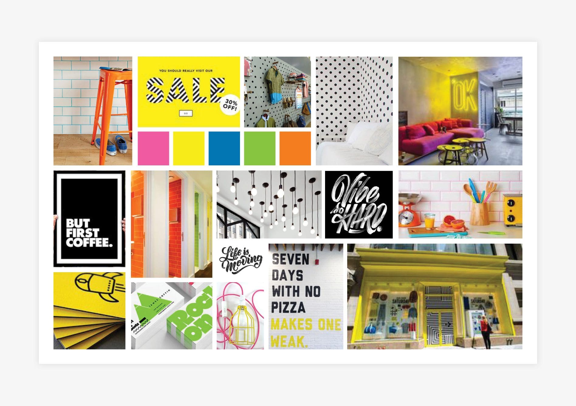
We created a visual direction for 16 Handles using the information we learned about the business and its customers. To create brand boards, we gather images, typography, text, colors, and textures. The boards are a a visual reference for what the brand can become. The client chooses one and it becomes the basis for the brand.
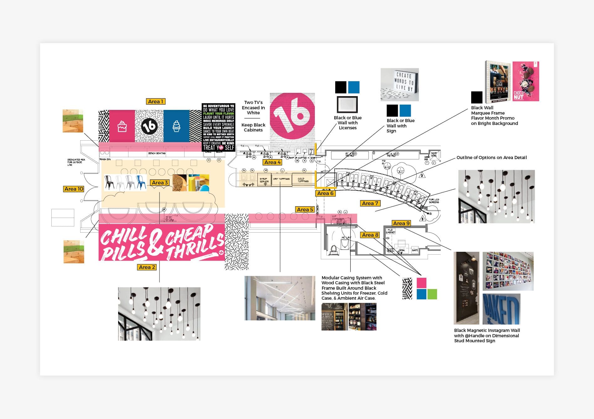
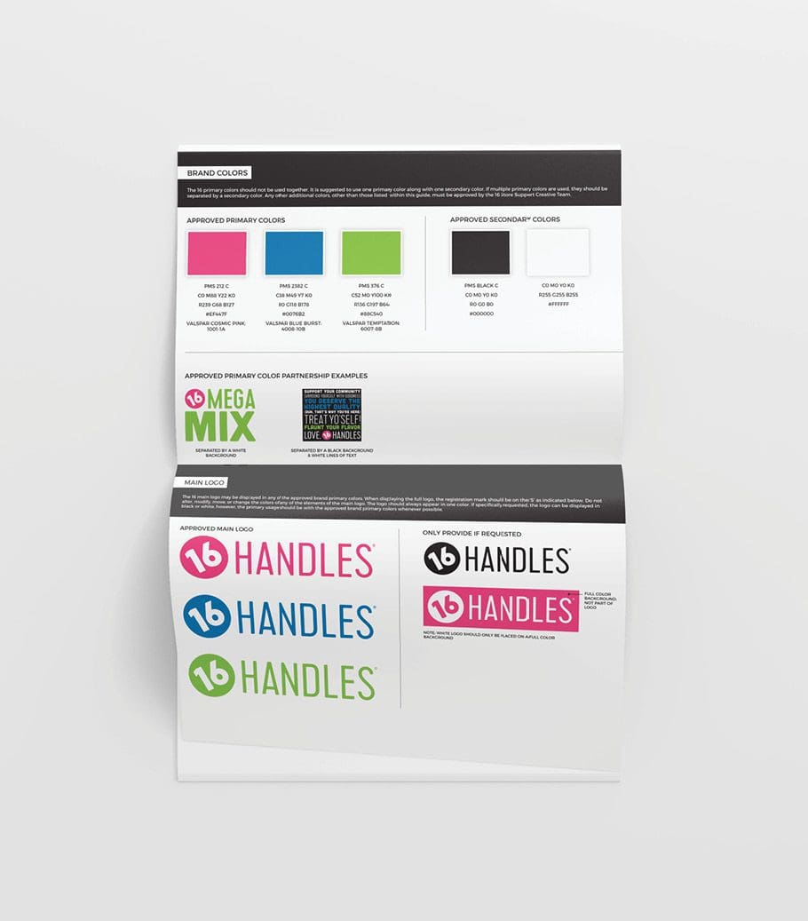
For successful restaurant rebranding project, we developed and presented three brand directions to the client. One was edgy, another was colorful and playful and one was more bold and graphic-based. Their team was initially drawn to the first board, but they were hesitant to make such a big shift away from their existing brand. Ultimately, they settled on the third option. Though the winning board featured a lot of bright yellow, our client asked that we prioritize pink and green, with small inclusions of blue, and use black as an additional color.
This color selection aligned with the existing brand, but the tones took it to a new level. The additional colors brought a level of dimension that wasn’t previously apparent.

