5 Transformative Website Redesigns with Before & After
No surprise here: a user-friendly, responsive website is critical for businesses in this century. Your website is often one of the first interactions customers will have with your business and a well designed website brings with it more credibility, increases search engine rankings, and maximizes conversions. Be honest: Is it time for a website redesign?
In 2025, strong minimalism, accessibility, and engaging design are on the forefront. Sites today must do more than be aesthetically pleasing, they must deliver thoughtful user experiences that drive business objectives and cater to various users & potential clients.
Whenever a new client begins working with us, here at Nice Branding Agency, one of the first places we go to learn about who they are, what they do, and what sets them apart from the competition, is their website.
We review what's working, what isn't, and how the site might more effectively present / represent the brand. We often discover, that there's room for improvement, and that's fine by us. We are, after all, branding experts. It's our job (and pleasure) to develop fearless brands that are expressed at each touchpoint, from marketing collateral to social media to websites and everything in between.
Make no mistake, your website can make or break your relationship with customers. Remember, first impressions are everything.
Your website should be an extension of your brand. It should reflect the brand’s visual direction, including the logo, fonts, icons, and colors. It should also incorporate your brand’s key messaging, including your persuasive paragraph, brand attributes, positioning statement, and so on. Without these elements, you’re wasting a valuable opportunity to strengthen your brand, connect with your target audience, and leave a lasting impact.
Once the brand identity is firmly established, we can begin designing and developing a website.
There are several key components to a successful website, the first and arguably the most important is that it is mobile friendly. Roughly 50 percent of Internet usage occurs on a mobile device. So, if your site isn’t responsive, you’re alienating half of your audience.
 What Makes a Website Great in 2025? Before diving into our redesign examples, here are some essentials that elevate websites in today’s digital landscape:
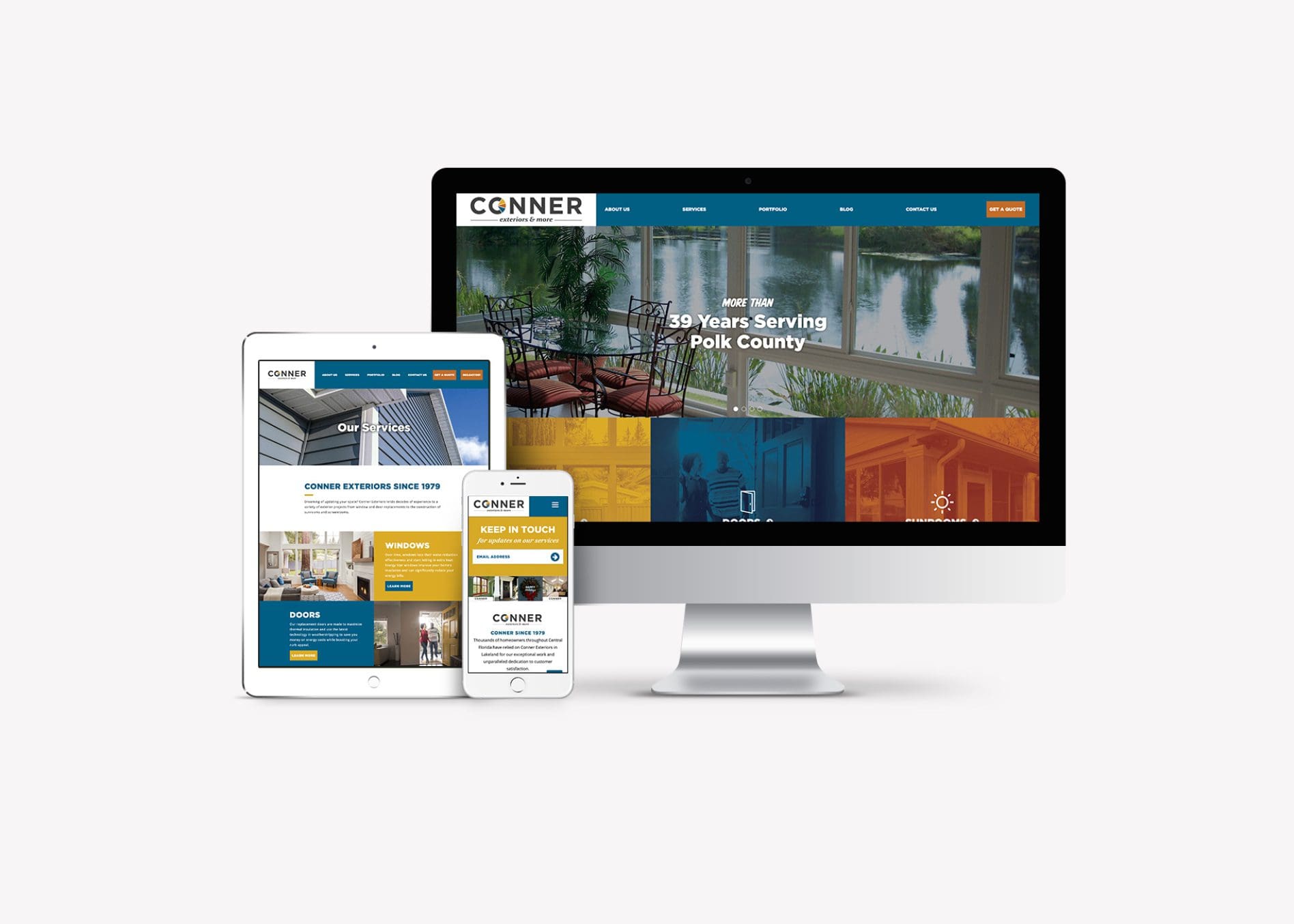
 When you landed on Conner Exteriors’ old website, it was very difficult to figure out what services the company offered because of the two-line navigation at the top of the home page and the large callouts on the right side.
The website was not mobile-friendly and it lacked cohesiveness with the new brand we had built. We knew that the company’s decades of experience was one of its most important differentiators, and that information was lost in the text-heavy content.
When you landed on Conner Exteriors’ old website, it was very difficult to figure out what services the company offered because of the two-line navigation at the top of the home page and the large callouts on the right side.
The website was not mobile-friendly and it lacked cohesiveness with the new brand we had built. We knew that the company’s decades of experience was one of its most important differentiators, and that information was lost in the text-heavy content.
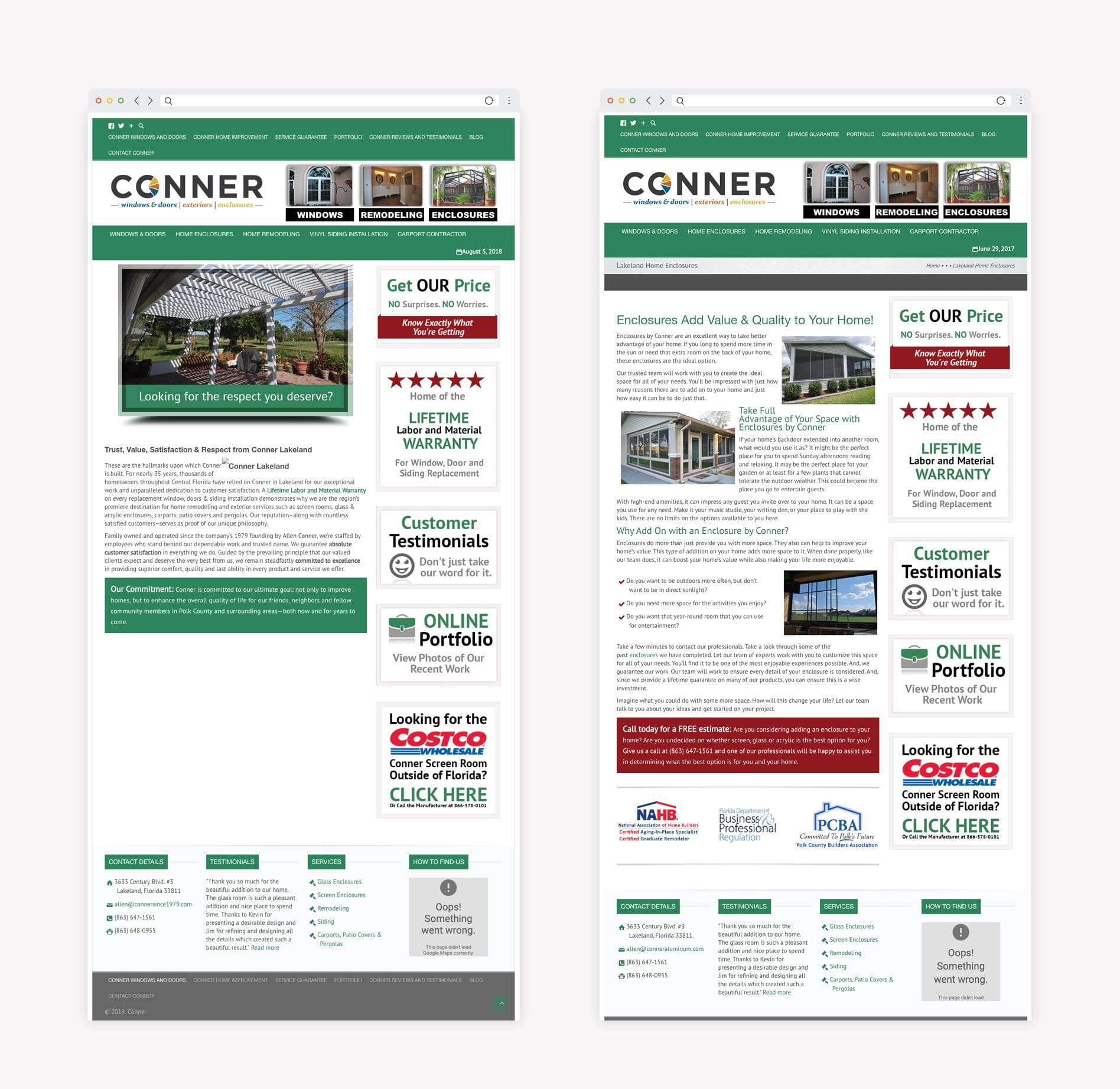 For the new home renovation website, we laid out a site map that was easy to navigate. The company’s home improvement services and experience were brought to the forefront, and we used the brand colors to visually distinguish the service buckets.
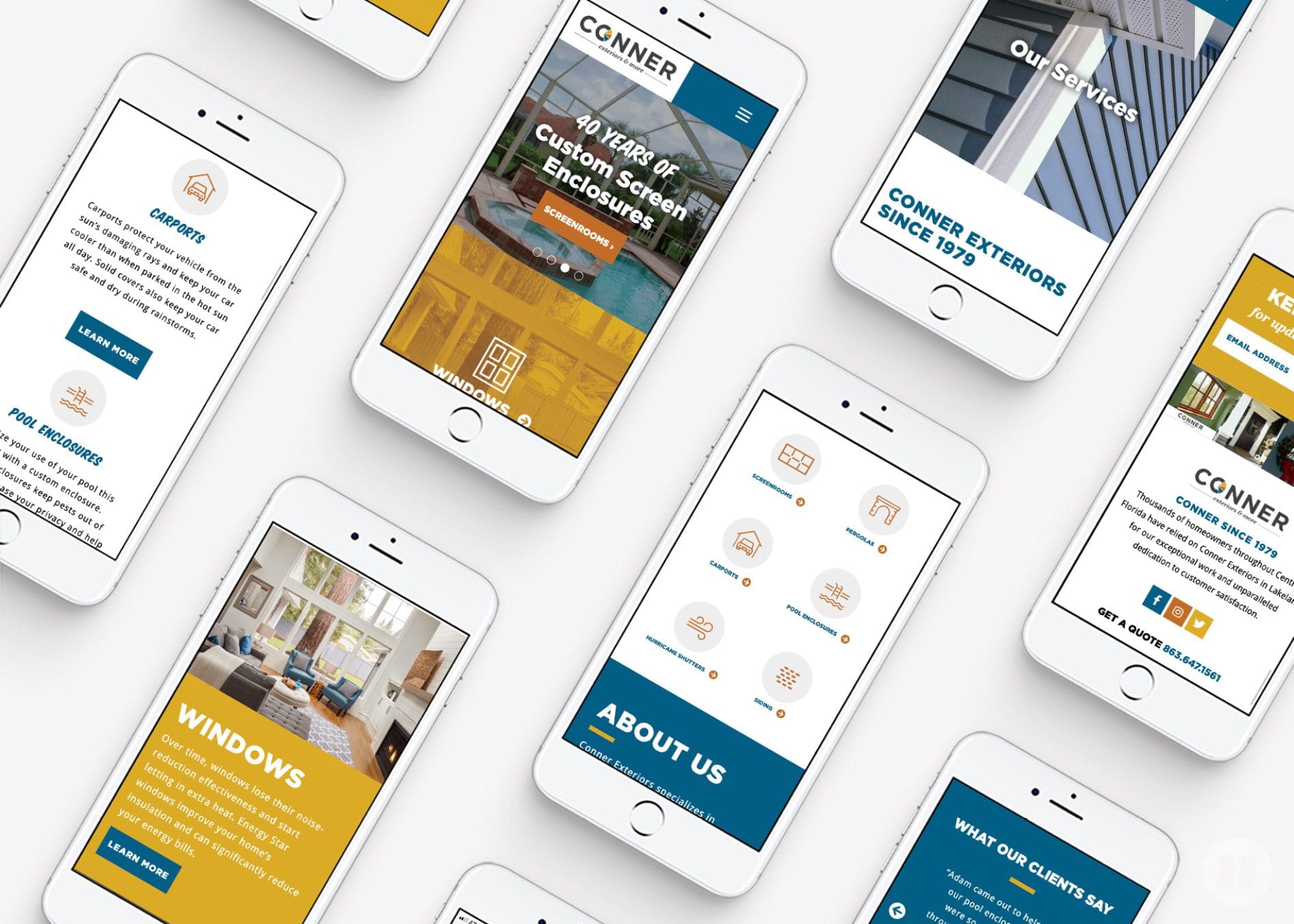
 The brand fonts and visual direction created a sense of cohesion across the new website, which also made the information easier to digest and scroll through on a mobile device. We pared down the text-heavy content to hone in on the key messaging and improve the readability on mobile.
The new website now spotlights the beautiful work that Conner Exteriors has produced over the years with large, bold images that spark inspiration, and make an impact on visitors.
The brand fonts and visual direction created a sense of cohesion across the new website, which also made the information easier to digest and scroll through on a mobile device. We pared down the text-heavy content to hone in on the key messaging and improve the readability on mobile.
The new website now spotlights the beautiful work that Conner Exteriors has produced over the years with large, bold images that spark inspiration, and make an impact on visitors.
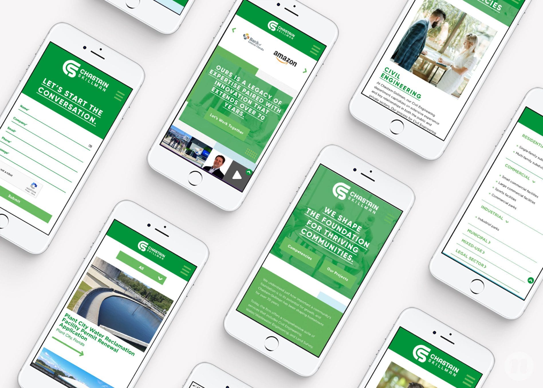
 Prior to working with Nice Branding Agency, Chastain-Skillman, a Florida-based engineering firm, had all the pieces necessary for a successful website, but it wasn’t executed well.
Outdated and lacking cohesion with the brand, the old website did not offer a positive user experience. The company wanted its new website to showcase the company in the best light.
Prior to working with Nice Branding Agency, Chastain-Skillman, a Florida-based engineering firm, had all the pieces necessary for a successful website, but it wasn’t executed well.
Outdated and lacking cohesion with the brand, the old website did not offer a positive user experience. The company wanted its new website to showcase the company in the best light.
 And so, our website design team got to work. We started by creating a site map that was easy to navigate and would create a natural flow for the user journey. At 25 pages, this Engineering Firm Website required a lot of strategy and planning.
We then pared down the content to focus on the key messaging and differentiators. We transformed the project pages from text-based to image-based, which would be easier content to consume on a mobile device, and overall, more user-friendly.
And so, our website design team got to work. We started by creating a site map that was easy to navigate and would create a natural flow for the user journey. At 25 pages, this Engineering Firm Website required a lot of strategy and planning.
We then pared down the content to focus on the key messaging and differentiators. We transformed the project pages from text-based to image-based, which would be easier content to consume on a mobile device, and overall, more user-friendly.
 Our website redesign agency utilized the brand colors, fonts, and logo throughout the beautiful new website, which improved the cohesion, readability, and navigation.
The company’s services and impressive work are now prominently displayed in a way that will motivate website visitors to act quickly and easily.
Our website redesign agency utilized the brand colors, fonts, and logo throughout the beautiful new website, which improved the cohesion, readability, and navigation.
The company’s services and impressive work are now prominently displayed in a way that will motivate website visitors to act quickly and easily.
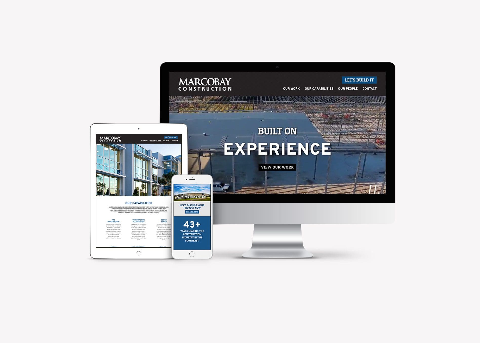
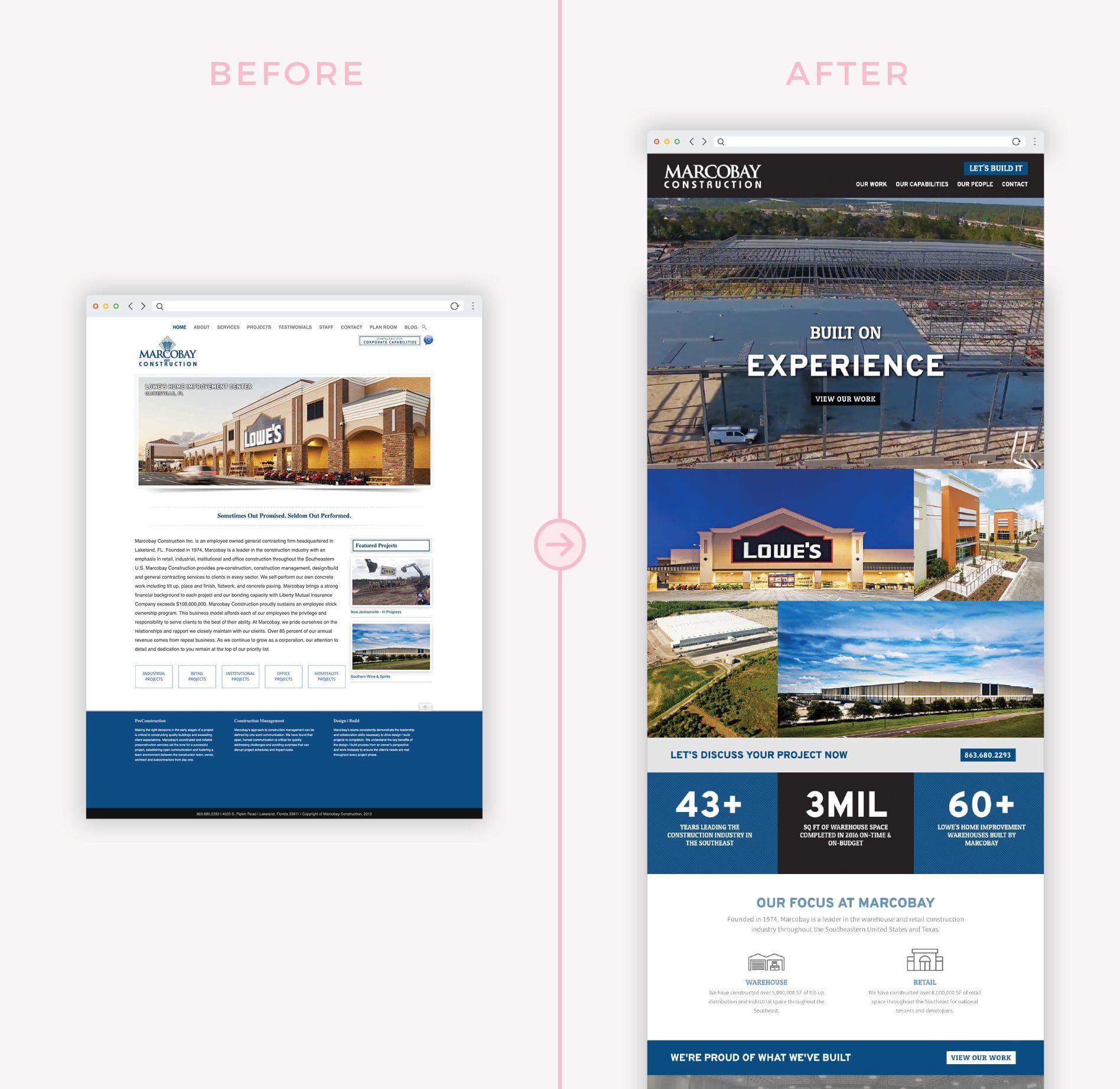 The construction industry is ever-changing, much like technology, but you’d never know it looking at Marcobay’s old construction website.
With a text-heavy homepage and small, outdated project photos, there was little motivating users to explore the website, let alone contact the company for construction services.
The construction industry is ever-changing, much like technology, but you’d never know it looking at Marcobay’s old construction website.
With a text-heavy homepage and small, outdated project photos, there was little motivating users to explore the website, let alone contact the company for construction services.
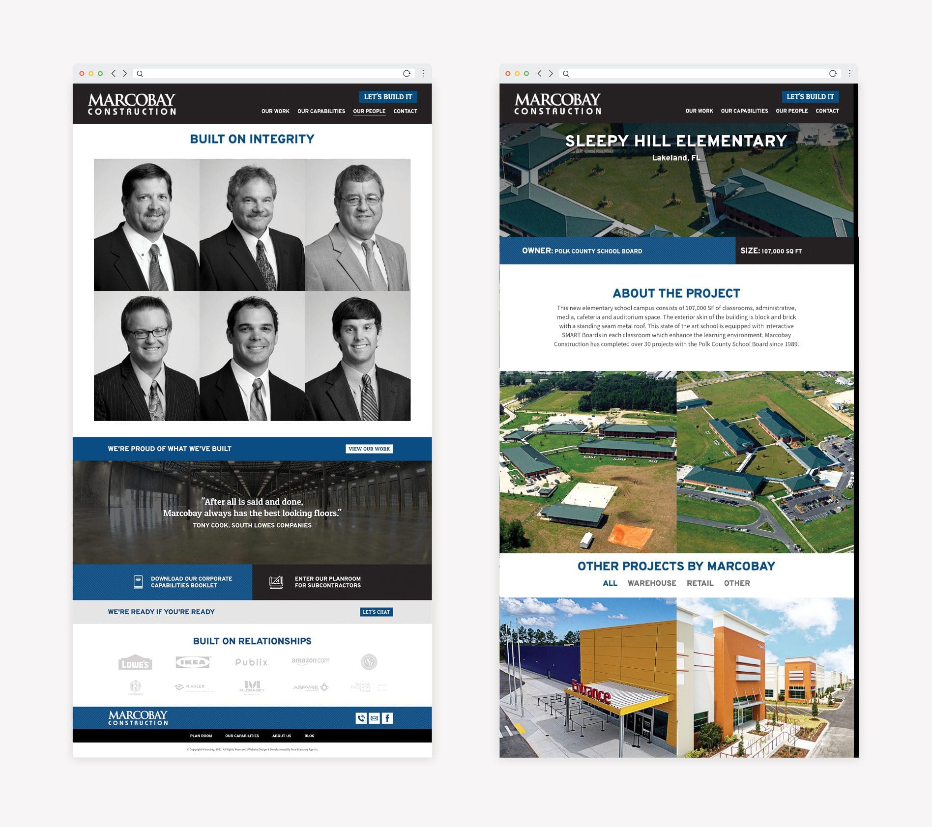
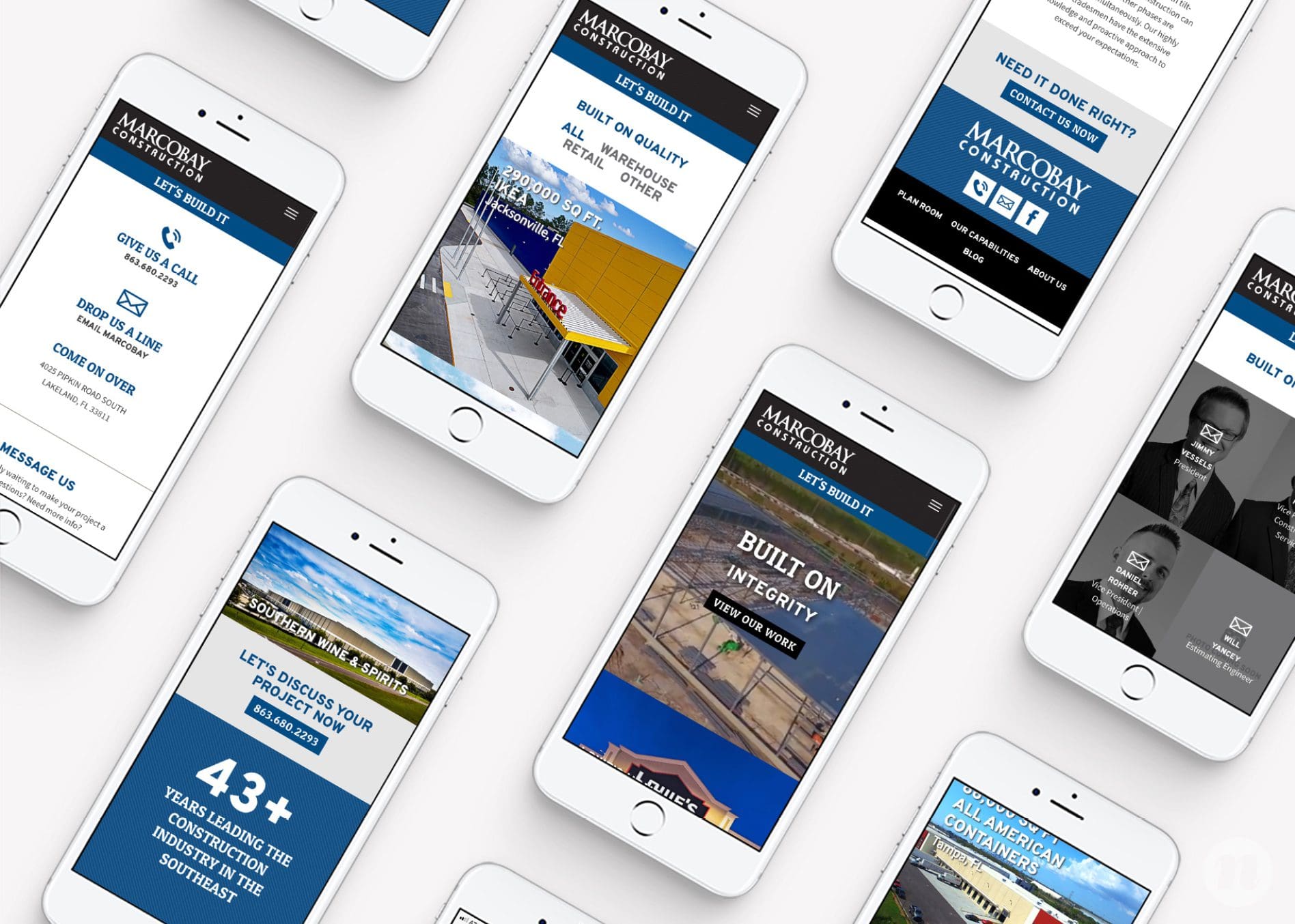
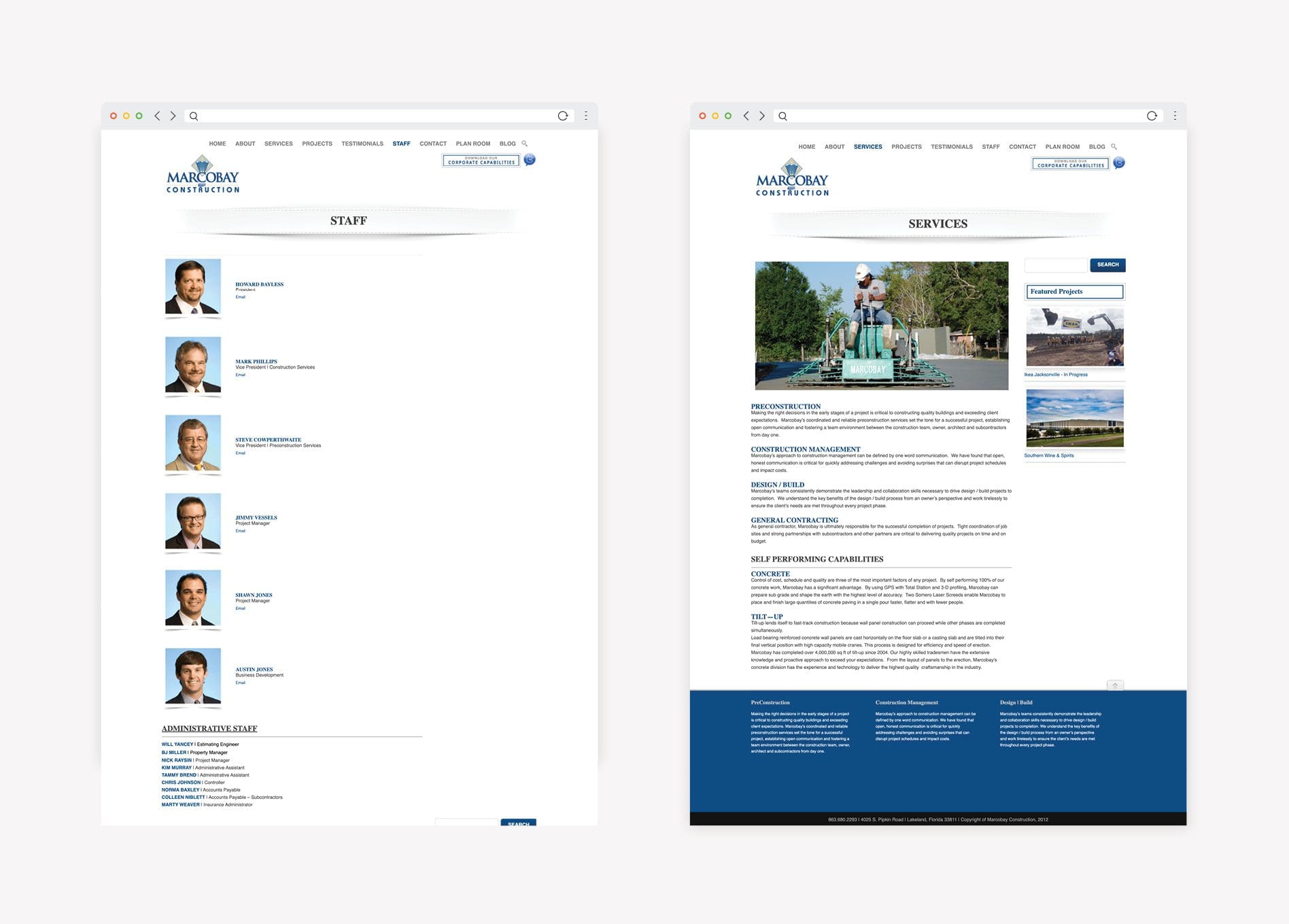 To change this trajectory, we designed a modern, responsive construction website for Marcobay that would bring the project photos to the forefront, along with larger statistics that were easy to read and emphasized Marcobay’s extensive experience.
 To visually demonstrate the value of working with Marcobay, we brought a video that showcased a completed project to the homepage. We chose this strategy because video is statistically proven to increase time spent on websites, improve user understanding of products and services, and generate leads.
Additionally, we added several prominent calls-to-action throughout the construction website and incorporated testimonials from satisfied customers that would help motivate potential customers to connect with the company.
To visually demonstrate the value of working with Marcobay, we brought a video that showcased a completed project to the homepage. We chose this strategy because video is statistically proven to increase time spent on websites, improve user understanding of products and services, and generate leads.
Additionally, we added several prominent calls-to-action throughout the construction website and incorporated testimonials from satisfied customers that would help motivate potential customers to connect with the company.
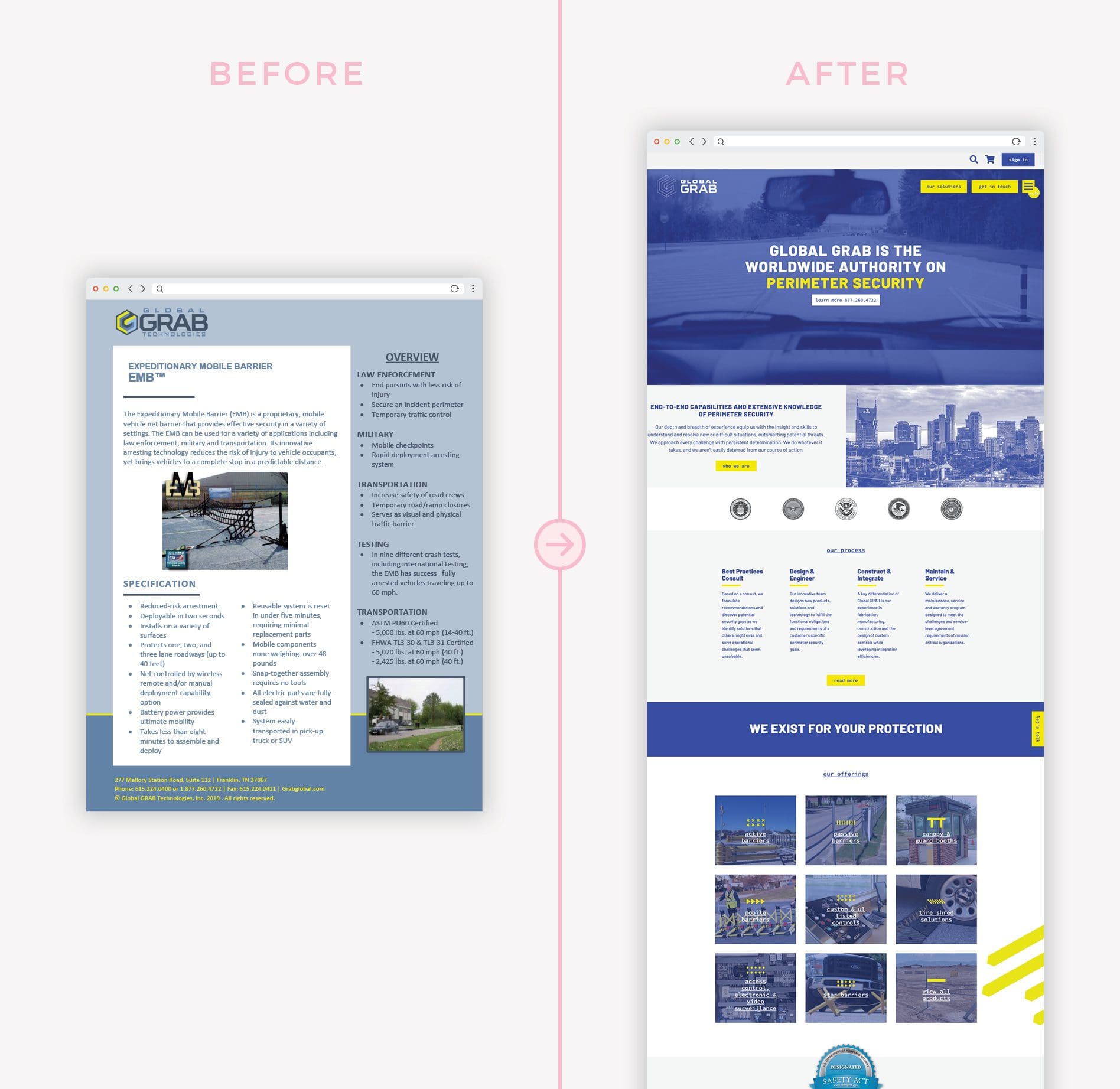 Much like our other website redesign and development projects, Global GRAB’s website needed a total overhaul.
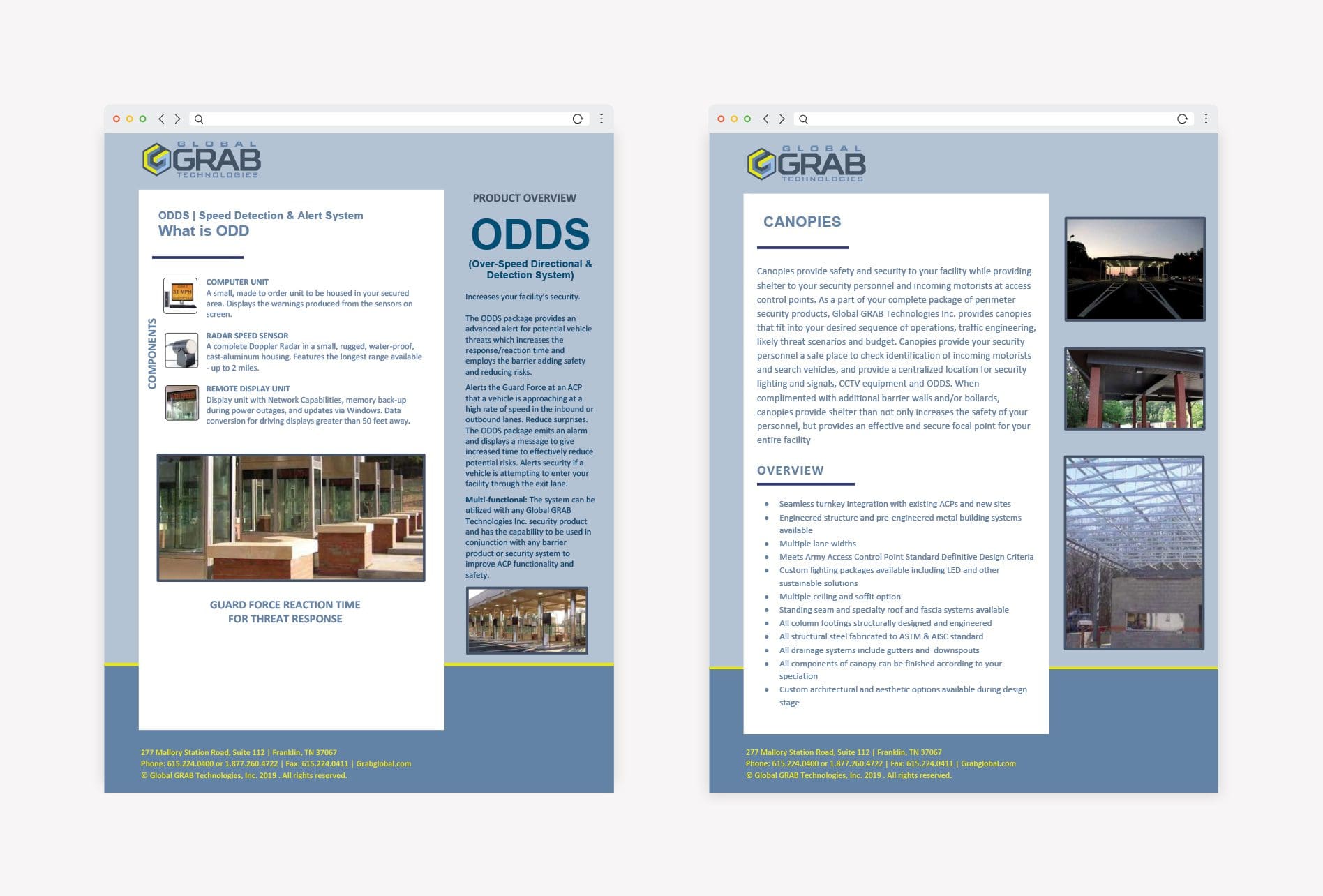
Text-heavy and outdated, the website lacked intentionality. Small images did not adequately tell the story of the company’s unique products and services, and the mobile experience was lacking.
In a nutshell, the old website was not an accurate representation of the worldwide authority on perimeter security.
Much like our other website redesign and development projects, Global GRAB’s website needed a total overhaul.
Text-heavy and outdated, the website lacked intentionality. Small images did not adequately tell the story of the company’s unique products and services, and the mobile experience was lacking.
In a nutshell, the old website was not an accurate representation of the worldwide authority on perimeter security.
 After helping Global GRAB establish a new brand identity, including clearly defined key messaging and a bold visual direction, we had the tools necessary to design and develop a proper website.
 The new perimeter security website brings the value proposition front and center. It clearly communicates who Global GRAB is, what they do, how customers benefit from their services, and what sets them apart from the competition. It features moving video on the home page, bold calls-to-action, icons to designate the different offerings, testimonials, blog articles, and more.
With the new brand colors weaved throughout the website, the user can easily flow through each page and find exactly what they are looking for.
The new perimeter security website brings the value proposition front and center. It clearly communicates who Global GRAB is, what they do, how customers benefit from their services, and what sets them apart from the competition. It features moving video on the home page, bold calls-to-action, icons to designate the different offerings, testimonials, blog articles, and more.
With the new brand colors weaved throughout the website, the user can easily flow through each page and find exactly what they are looking for.


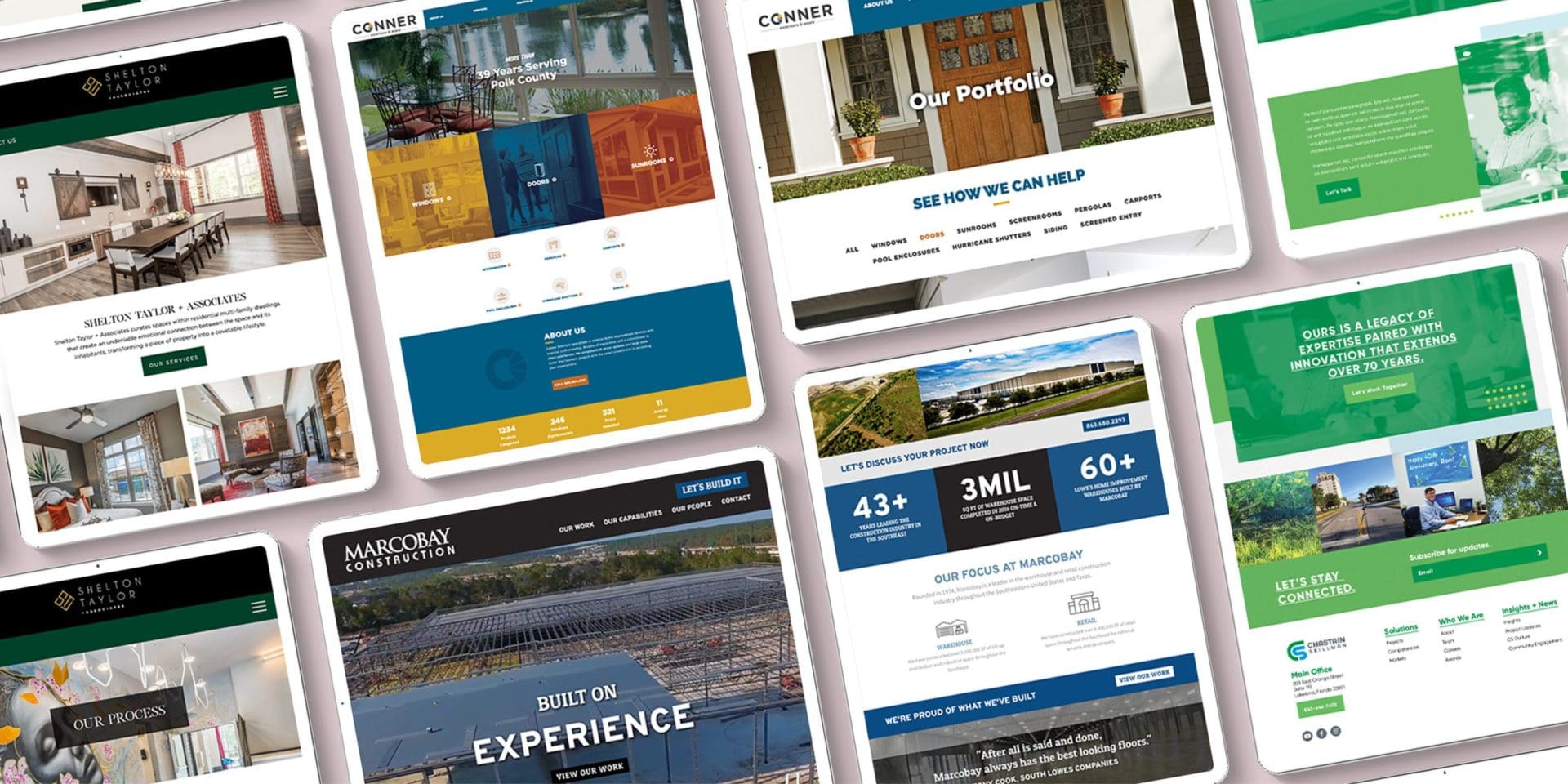
 Shelton Taylor + Associates first came to Nice Branding Agency for a new logo design and website redesign. The client’s main goal with the new brand was consistency.
We created a new logo for the company that was modern and sophisticated, and we wanted the new interior design website to share the same aesthetic.
The previous website was outdated and built on an old website platform with limited functionality and customization options. It featured static design elements that were limited to a single rectangular space. With few projects on display, small images, and very little movement, the website felt like a disservice to the widely imaginative group of designers that make up Shelton Taylor + Associates.
Shelton Taylor + Associates first came to Nice Branding Agency for a new logo design and website redesign. The client’s main goal with the new brand was consistency.
We created a new logo for the company that was modern and sophisticated, and we wanted the new interior design website to share the same aesthetic.
The previous website was outdated and built on an old website platform with limited functionality and customization options. It featured static design elements that were limited to a single rectangular space. With few projects on display, small images, and very little movement, the website felt like a disservice to the widely imaginative group of designers that make up Shelton Taylor + Associates.
 And so, we created a very client-friendly website design that prioritized large project photos to showcase the company’s beautiful work. We incorporated a lot of negative space, clean, simple fonts, and a script that elevated the overall look and feel of the website.


What Makes a Website Great in 2025? Before diving into our redesign examples, here are some essentials that elevate websites in today’s digital landscape:
- Mobile-first design – Responsive isn’t optional. It’s the default. Sites must be fully optimized for mobile devices.
- Accessibility – Following WCAG guidelines ensures your site is usable for all, including those with disabilities.
- Core Web Vitals – Load time. responsiveness, and visual stability are crucial for UX. as well as SEO.
- Interactive elements and micro-interactions – Tiny animations (e.g., hover effects or button press) create wonderful, engaging experiences.
- Visual storytelling – Think bold! minimalism, bespoke illustrations, video banners, and full-screen photography.
- Sustainable performance – Lean design, good (rather) great code, and green hosting are more and more valued.
CONNER WEBSITE REDESIGN
When you landed on Conner Exteriors’ old website, it was very difficult to figure out what services the company offered because of the two-line navigation at the top of the home page and the large callouts on the right side.
The website was not mobile-friendly and it lacked cohesiveness with the new brand we had built. We knew that the company’s decades of experience was one of its most important differentiators, and that information was lost in the text-heavy content.
For the new home renovation website, we laid out a site map that was easy to navigate. The company’s home improvement services and experience were brought to the forefront, and we used the brand colors to visually distinguish the service buckets.
The brand fonts and visual direction created a sense of cohesion across the new website, which also made the information easier to digest and scroll through on a mobile device. We pared down the text-heavy content to hone in on the key messaging and improve the readability on mobile.
The new website now spotlights the beautiful work that Conner Exteriors has produced over the years with large, bold images that spark inspiration, and make an impact on visitors.
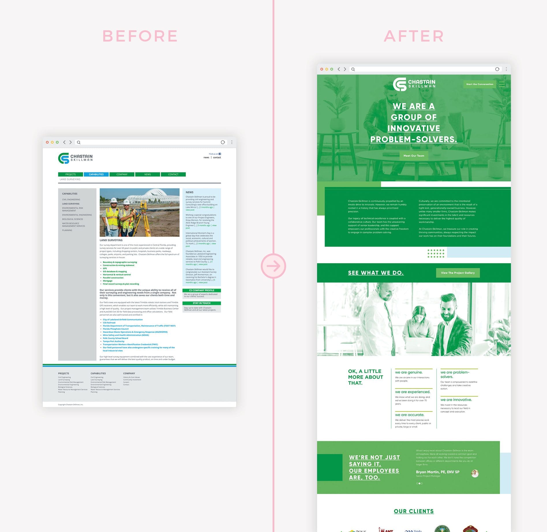
CHASTAIN-SKILLMAN WEBSITE REDESIGN
Prior to working with Nice Branding Agency, Chastain-Skillman, a Florida-based engineering firm, had all the pieces necessary for a successful website, but it wasn’t executed well.
Outdated and lacking cohesion with the brand, the old website did not offer a positive user experience. The company wanted its new website to showcase the company in the best light.
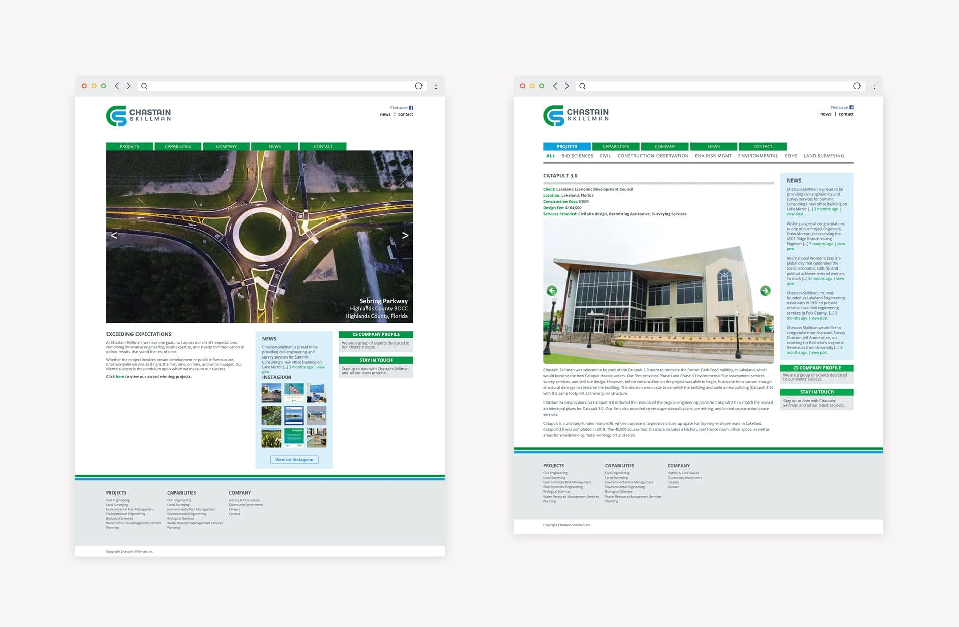
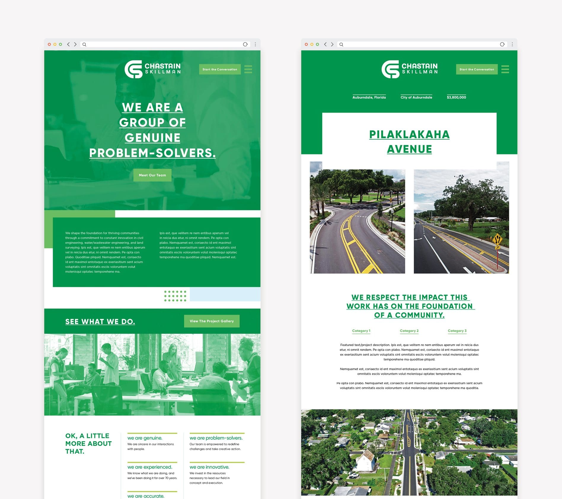
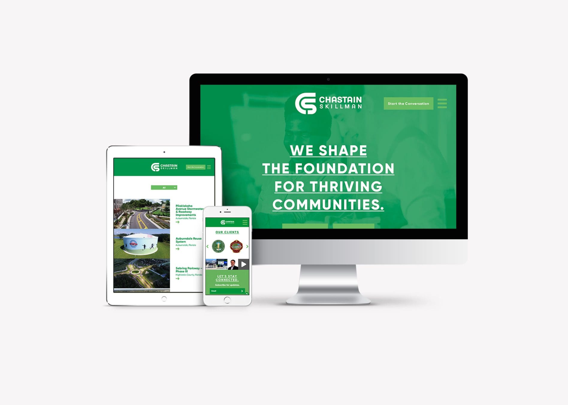
And so, our website design team got to work. We started by creating a site map that was easy to navigate and would create a natural flow for the user journey. At 25 pages, this Engineering Firm Website required a lot of strategy and planning.
We then pared down the content to focus on the key messaging and differentiators. We transformed the project pages from text-based to image-based, which would be easier content to consume on a mobile device, and overall, more user-friendly.
Our website redesign agency utilized the brand colors, fonts, and logo throughout the beautiful new website, which improved the cohesion, readability, and navigation.
The company’s services and impressive work are now prominently displayed in a way that will motivate website visitors to act quickly and easily.
MARCOBAY CONSTRUCTION
The construction industry is ever-changing, much like technology, but you’d never know it looking at Marcobay’s old construction website.
With a text-heavy homepage and small, outdated project photos, there was little motivating users to explore the website, let alone contact the company for construction services.
To change this trajectory, we designed a modern, responsive construction website for Marcobay that would bring the project photos to the forefront, along with larger statistics that were easy to read and emphasized Marcobay’s extensive experience.
To visually demonstrate the value of working with Marcobay, we brought a video that showcased a completed project to the homepage. We chose this strategy because video is statistically proven to increase time spent on websites, improve user understanding of products and services, and generate leads.
Additionally, we added several prominent calls-to-action throughout the construction website and incorporated testimonials from satisfied customers that would help motivate potential customers to connect with the company.
GLOBAL GRAB WEBSITE REDESIGN
Much like our other website redesign and development projects, Global GRAB’s website needed a total overhaul.
Text-heavy and outdated, the website lacked intentionality. Small images did not adequately tell the story of the company’s unique products and services, and the mobile experience was lacking.
In a nutshell, the old website was not an accurate representation of the worldwide authority on perimeter security.
After helping Global GRAB establish a new brand identity, including clearly defined key messaging and a bold visual direction, we had the tools necessary to design and develop a proper website.
The new perimeter security website brings the value proposition front and center. It clearly communicates who Global GRAB is, what they do, how customers benefit from their services, and what sets them apart from the competition. It features moving video on the home page, bold calls-to-action, icons to designate the different offerings, testimonials, blog articles, and more.
With the new brand colors weaved throughout the website, the user can easily flow through each page and find exactly what they are looking for.
SHELTON TAYLOR + ASSOCIATES
Shelton Taylor + Associates first came to Nice Branding Agency for a new logo design and website redesign. The client’s main goal with the new brand was consistency.
We created a new logo for the company that was modern and sophisticated, and we wanted the new interior design website to share the same aesthetic.
The previous website was outdated and built on an old website platform with limited functionality and customization options. It featured static design elements that were limited to a single rectangular space. With few projects on display, small images, and very little movement, the website felt like a disservice to the widely imaginative group of designers that make up Shelton Taylor + Associates.
And so, we created a very client-friendly website design that prioritized large project photos to showcase the company’s beautiful work. We incorporated a lot of negative space, clean, simple fonts, and a script that elevated the overall look and feel of the website.


