The New ZARA Logo
Fashion and logo design are two of my favorite things so when they collide in a new ZARA logo update, you better believe as a branding agency owner, I’ll be paying for a front row seat.
 So what's the heck is all the rage over the new ZARA logo? If it’s nothing more than an improvement from the old terrible GAP-style logo, at least it’s that, right?
 Additionally, I can’t drive my car between the letters anymore, so that helps me pronounce the name without losing my focus before I make it to the second letter.
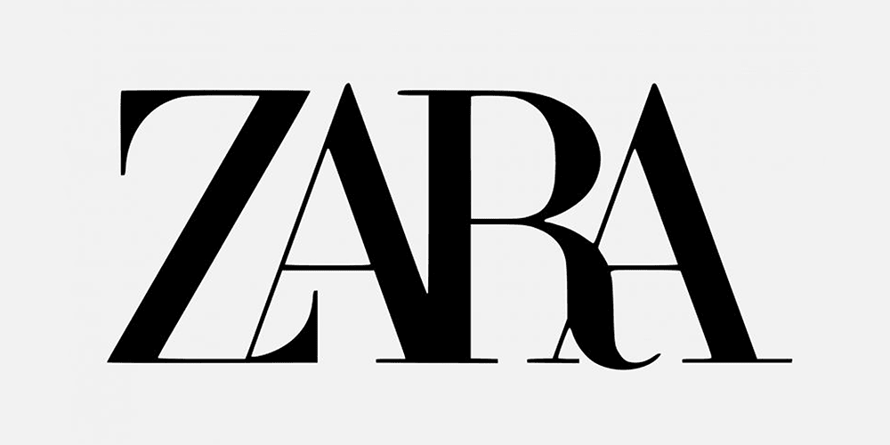
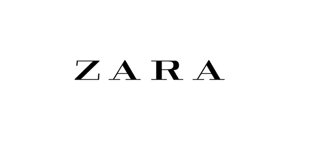 They picked the right font, it’s actually beautiful with the most classy serifs on the market and the thin to thick line contrast. The font alone aligns more to who they are than the previous typeface.
Is it a little squished? Well squished isn’t necessarily the right terminology. The letters have been moved closer to each other but the aesthetic it's balanced. Nothing is squished.
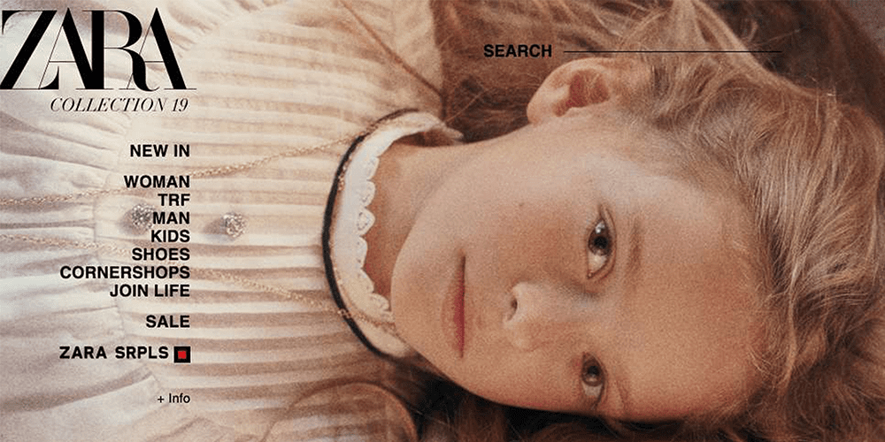
Have you been to ZARA’s website? Can we instead choose to harp on the fact that you can’t get a good look at their clothes because their models are jumping through the sky in the product photos? No, let’s definitely bash them for trying to move in the right direction with their logo as opposed to the fact that I can’t even get a good look at what I’m ordering when purchasing the latest high fashion work shirt.
They picked the right font, it’s actually beautiful with the most classy serifs on the market and the thin to thick line contrast. The font alone aligns more to who they are than the previous typeface.
Is it a little squished? Well squished isn’t necessarily the right terminology. The letters have been moved closer to each other but the aesthetic it's balanced. Nothing is squished.
Have you been to ZARA’s website? Can we instead choose to harp on the fact that you can’t get a good look at their clothes because their models are jumping through the sky in the product photos? No, let’s definitely bash them for trying to move in the right direction with their logo as opposed to the fact that I can’t even get a good look at what I’m ordering when purchasing the latest high fashion work shirt.
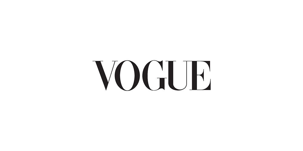
 Does anyone out there remember VOGUE? Yeah, that logo? It’s as classy as the workday is long. Basically ZARA, in my mind, is trying to be ‘vogue’ in their image and direction, according to many things they are conveying, so I think they just might be on the right track if they choose the same or a similar typeface as the magazine that made every woman from the age of 35-45 who they are today.
 I also find this pretty comical from Fast Company:
“It’s an obvious step away from the minimal logos favored by tech companies and startups–from Google to Uber to Everlane–in favor of the more complex logos common in heritage design houses like Cartier, Gucci, and Bulgari.”
I would hope it’s more in line with Gucci than Google. Can I get an amen?
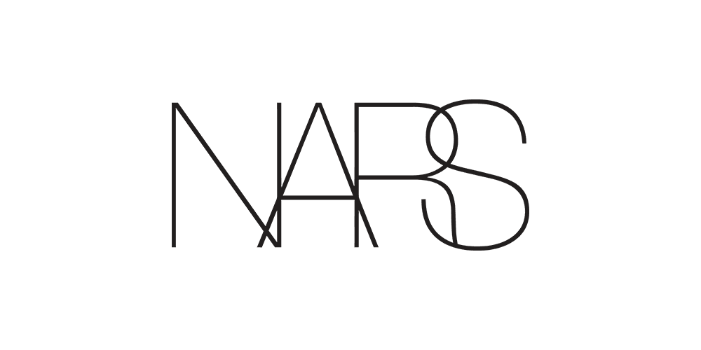
One last comparison I saw on the web was how it had similarities to the NARS Cosmetics logo. Did they also receive a public shaming when they launched? Their letters are overlapping as well, but I have to say they did go with a more simplistic, san serif font face that provides a clearer display.
I also find this pretty comical from Fast Company:
“It’s an obvious step away from the minimal logos favored by tech companies and startups–from Google to Uber to Everlane–in favor of the more complex logos common in heritage design houses like Cartier, Gucci, and Bulgari.”
I would hope it’s more in line with Gucci than Google. Can I get an amen?
One last comparison I saw on the web was how it had similarities to the NARS Cosmetics logo. Did they also receive a public shaming when they launched? Their letters are overlapping as well, but I have to say they did go with a more simplistic, san serif font face that provides a clearer display.
 Playing with the typography and intersection a bit probably would have gotten people off their back a little, but I think we can all agree, even if it’s not perfect, it definitely looks better than where they were before with their short, fatter, stuffy serif typeface.
 The two thicker lines intersecting between the A and the R are too heavy. The intersection between the R and the last A is much more balanced because, as you can see, but may not have necessarily noticed, there’s a thick and a thin line intersecting. This contrast sends my sophistication meter into overdrive.
Fortunately and unfortunately, the version with the blocked background helps the issue at hand, but overall makes my eyes tired and my head hurt if I look at it for too long.
The two thicker lines intersecting between the A and the R are too heavy. The intersection between the R and the last A is much more balanced because, as you can see, but may not have necessarily noticed, there’s a thick and a thin line intersecting. This contrast sends my sophistication meter into overdrive.
Fortunately and unfortunately, the version with the blocked background helps the issue at hand, but overall makes my eyes tired and my head hurt if I look at it for too long.
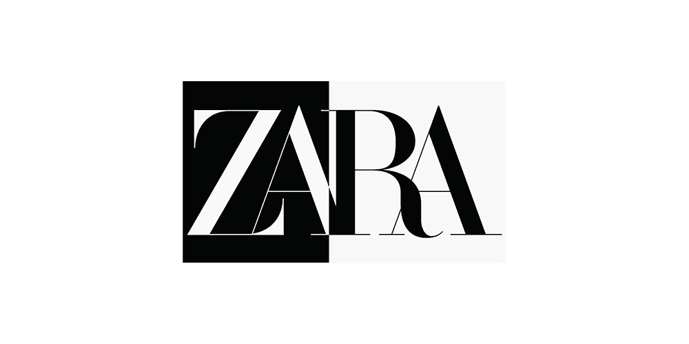 Additionally, it’s tragic that the Z and the A couldn’t have had a better point of intersection.
The style of the Didone font that was chosen has extremely thin lines. Personally I think the contrast of the thick to thin provides interest; however, a bit thickening up the thinnest areas by just a hair might provide assistance when the logo is utilized on various mediums.
I’m still shopping at ZARA, but my one request is to take some normal product photos so I can see what the hell I’m buying.
Thanks ZARA, and props for not being afraid to change or evolve your logo. Don’t listen to the haters — your logo looks better than it did yesterday.
Additionally, it’s tragic that the Z and the A couldn’t have had a better point of intersection.
The style of the Didone font that was chosen has extremely thin lines. Personally I think the contrast of the thick to thin provides interest; however, a bit thickening up the thinnest areas by just a hair might provide assistance when the logo is utilized on various mediums.
I’m still shopping at ZARA, but my one request is to take some normal product photos so I can see what the hell I’m buying.
Thanks ZARA, and props for not being afraid to change or evolve your logo. Don’t listen to the haters — your logo looks better than it did yesterday.
Does anyone out there remember VOGUE? Yeah, that logo? It’s as classy as the workday is long. Basically ZARA, in my mind, is trying to be ‘vogue’ in their image and direction, according to many things they are conveying, so I think they just might be on the right track if they choose the same or a similar typeface as the magazine that made every woman from the age of 35-45 who they are today.
The Agency Behind the New ZARA Logo
The agency behind this logo is Baron & Baron design firm. They also developed the Harper’s Bazaar logo, and it’s being speculated that the font is the same in both logos. The font used is apparently the same font used by Burberry, Balenciaga, and Yves Saint Laurent. ZARA’s new look conjures up the heritage and weightiness of these brands with its heavy, all-caps logo, which perhaps signals something about ZARA’s ambitions to carve out a place among these luxury fashion houses. Lastly, I’ll mention that the Baron & Baron logo itself uses a very similar typeface. These guys love this Didot-style font, and I side with them because it’s class, class, class. We’re left wondering about the meaning behind this logo, because ZARA didn’t exactly give a reason for the logo redesign, or any meaning behind the logo. Will the real ZARA please stand up? We’d love to hear from you on what the meaning or purpose behind this thing is. A teaser campaign would have worked wonders to create interest and excitement surrounding the new logo launch. Following that, it would be advisable to launch a campaign that explains the meaning behind the logo and the reason for the change. In all honesty, the logo in use in print looks incredible. There aren't any images floating around that show the logo being used as the store signage; however, when you see the logo in application, it’s a beaut.
What They’re Saying About the New ZARA Logo
According to the Today show, this is ZARA’s first logo change since 2010, and only the second in their 45-year history. With this little bit of change, a campaign teasing the logo redesign would have made sense, along with some information from ZARA about their decision to change. I find it outrageous to read all the articles from sources like Bustle or Fast Company, claiming that the “brand swapped out the familiar, neat, and evenly spaced letters for ones that bump into each other." Can we please once again address the distorted letters in the original ZARA logo — they were actually squished. The Z gives me anxiety each and every time I see it. The serifs are disproportional and not very sleek. It was not indicative of high fashion, or fashion at all in my opinion.Nice Branding Agency’s Thoughts on the New ZARA Logo
I’ll be 100% honest in the fact that without all the facts — the project brief, the client requests, or the client revisions — critiques and suggestions on any logo project should be taken with a grain of salt. With that, here’s a few things I would recommend focusing to improve on the new ZARA logo. If you’ll notice, the top of the A extends higher than the other letters, which is a very minor detail that was potentially overlooked.
The two thicker lines intersecting between the A and the R are too heavy. The intersection between the R and the last A is much more balanced because, as you can see, but may not have necessarily noticed, there’s a thick and a thin line intersecting. This contrast sends my sophistication meter into overdrive.
Fortunately and unfortunately, the version with the blocked background helps the issue at hand, but overall makes my eyes tired and my head hurt if I look at it for too long.
Additionally, it’s tragic that the Z and the A couldn’t have had a better point of intersection.
The style of the Didone font that was chosen has extremely thin lines. Personally I think the contrast of the thick to thin provides interest; however, a bit thickening up the thinnest areas by just a hair might provide assistance when the logo is utilized on various mediums.
I’m still shopping at ZARA, but my one request is to take some normal product photos so I can see what the hell I’m buying.
Thanks ZARA, and props for not being afraid to change or evolve your logo. Don’t listen to the haters — your logo looks better than it did yesterday.