Parallon Technology Solutions Project Showcase
We were approached by Parallon Technology Solutions with an RFP as they were searching for a healthcare branding agency. First of all, we were excited for the prospect of getting to revolutionize a brand associated with HCA. After reviewing the RFP, we also knew that every single aspect of the project fell squarely within our wheelhouse as a healthcare branding agency.
We started working with the team at PTS with the proposal negotiations. We were stoked about the project from the get-go. The passion the Parallon Tech team had for their purpose was contagious. We wanted to create a brand image that would accurately reflect their commitment to the cause.
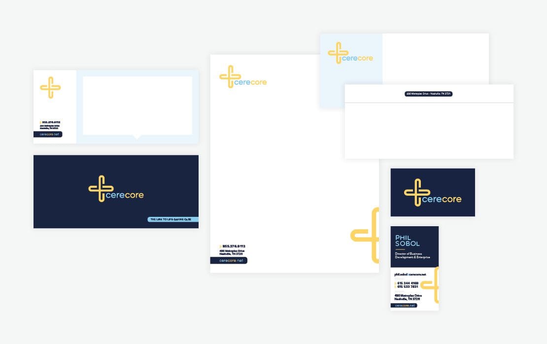
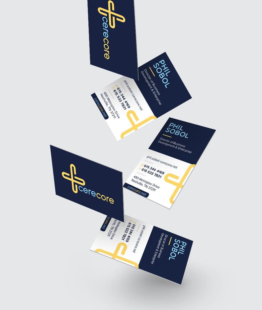 When a company invests in a rebrand, it’s absolutely imperative that they have the tools necessary to launch. Launches have to deploy the brand without compromising its integrity. This means that sales teams, admins, the marketing team, and anyone else who communicates on behalf of the marketing team must be equipped with newly branded collateral.
As CereCore's healthcare branding agency, we utilized floods of navy punctuated with pops of bright yellow. We employed simple, clear, sans serif fonts to convey the information in a manner that’s easily digestible. The overall vibe of all of the collateral is professional, yet compelling.
When a company invests in a rebrand, it’s absolutely imperative that they have the tools necessary to launch. Launches have to deploy the brand without compromising its integrity. This means that sales teams, admins, the marketing team, and anyone else who communicates on behalf of the marketing team must be equipped with newly branded collateral.
As CereCore's healthcare branding agency, we utilized floods of navy punctuated with pops of bright yellow. We employed simple, clear, sans serif fonts to convey the information in a manner that’s easily digestible. The overall vibe of all of the collateral is professional, yet compelling.
A Little About Them
Parallon Technology Solutions (PTS) provides EHR implementations, IT help desk, application support, IT managed services, hosting, technical staffing and strategic IT consulting services to hospitals, outpatient facilities, and large physician groups nationwide. They have a team of more than 450 clinical, financial and technical professionals. PTS has implemented EHR systems in more than 300 facilities. Additionally, PTS offers staffing and remote support services for all major EHR acute and ambulatory platforms as well as their ancillary applications. Say what? EHR systems are Electronic Health Records systems, which are basically digital versions of a patient’s paper chart. After digging in a little, we came to the conclusion that the impact that our client has on patient care is immense. The efficient implementation and support of the systems that they set up leads to better outcomes for patients, ease of use for physicians and caregivers, and a better bottom line for the healthcare organization as a whole. We realized that our clients were the link. They were the connection to the care.Healthcare Branding Agency Recommends Rebrand
Parallon Technology Solutions was established as a part of Parallon Business Solutions. The Parallon organization as a whole is owned by Nashville-based healthcare operator, Hospital Corporation of America (HCA). PTS (our client) and Parallon have since separated, however they share the word Parallon in their names. Additionally, their visual identities lack distinction from one another. The similarities between the look and feel of the two organizations cause confusion for both the consumer and internal-facing initiatives. The company clearly needed a healthcare branding agency to help sort things out. The purpose for the rebrand was to distinguish Parallon Technology Solutions from its former parent company and also to develop a brand for the organization that better aligns with the firm’s mission, values, and characteristics.Discovery
Nice Branding Agency, a healthcare branding agency, completed a rebrand for Parallon Technology Solutions from tip to toe. The project started with a strategy session designed to pull out the most minute details and address the broadest topics with key stakeholders. PTS held the rebrand discovery meeting at PTS headquarters in Brentwood, TN. Picture a conference room with the CEO, department heads, plus a couple of Nice girls. We asked open-ended questions that sparked conversations about the direction of the organization. We learned about its impact on the market, and how the leaders thought the company should be perceived. Finally, we talked about processes, teams, services, competition, and overall market trends. Then, we took our new knowledge back to our healthcare branding agency and got down to business.Naming
First of all, it was pretty apparent from the get-go that PTS needed a new name. Their existing name had no relevant meaning behind it. It was so close to Parallon Business Solutions that the organizations were often confused for one another. Let’s be upfront about this. Naming is no easy feat. There are both legal and brand-related implications of altering the moniker of an entrenched business. In this case, the rebrand was the perfect platform for renaming the company. Through the creative method of research and brainstorming, our team presented the client with five new name options, paired with narratives that would accompany the name and set the tone for the brand. We ran the names through our trademark attorney to ensure that they were viable options before presenting them. The company then took the options they liked to their legal team and came back with two usable names per their legal department. Finally, the name CereCore was selected, and the narrative became the foundation for the brand.Becoming CereCore | Logo
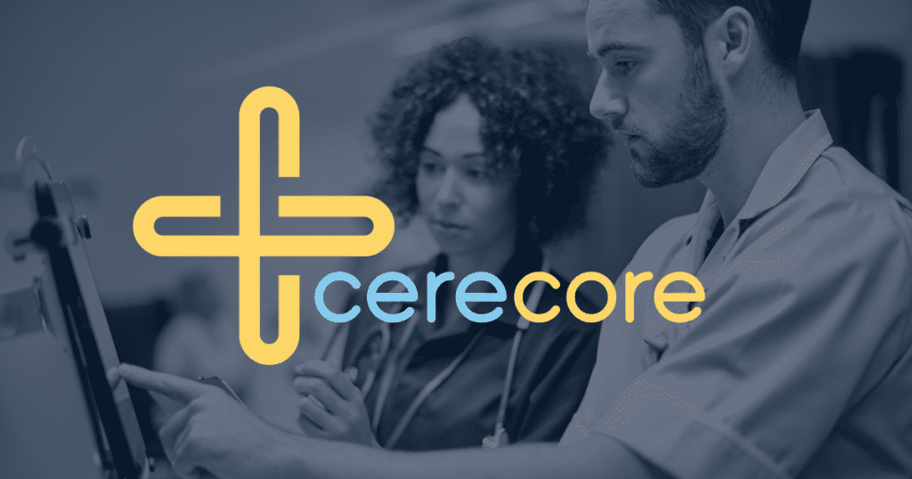
The meaning behind CereCore goes deep. The name implies that our client is the intelligence at the core of healthcare operations. We anchored the logo with an icon that featured two Cs inextricably intertwined with one another. The icon took on the shape of a + sign, further relating CereCore to the healthcare industry that they served. Additionally, the movement throughout the icon is loosely related to the movement of data throughout the organization. Next, we developed a brand story to help convey this message to anyone who encountered the brand. "At CereCore, our heart for healthcare is interconnected with our knowledge of technical solutions, creating a vital link that ultimately drives the delivery of high-quality care. The concept of connection through this link lives on throughout the patient care experience. CereCore connects caregivers with crucial information, and then those caregivers, in turn, connect with their patients. All interactions are intuitive and seamless, respecting the power of efficiency in delivering the kind of care that can alter the course of a life. CereCore is the link. We are the connection. Our team works tirelessly to affect the efficiency of healthcare organizations by providing end-to-end solutions for intuitive technology, user-centered support services, and staffing experienced professionals, always acting on our passion to empower others to provide lifesaving care. The most important applications for the logo would be their business systems and the website, of course, as well as an extensive inventory of promotional products and apparel."Brand Direction
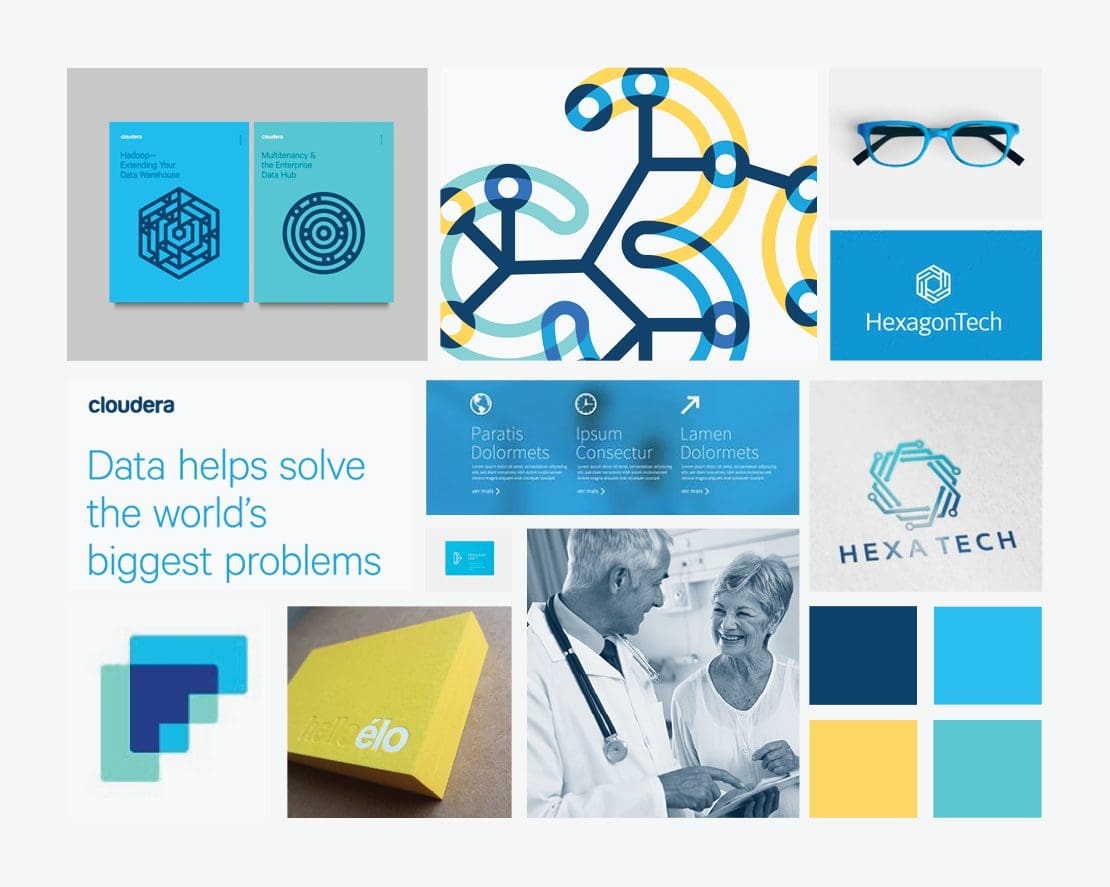
Along with the name, we presented various visual directions for the brand to take. Each aligned with the narrative and name options, and provided a unique approach to the visuals. We fill the brand boards with images, type, text, and colors. Together, they give a glimpse of the overall direction of the brand in terms of aesthetics. By presenting these boards along with the narrative and name, the client could grasp an overall feel or essence of the proposed direction as a whole.
Marketing Materials + Stationery
Next, the brand direction and logo were solidified and approved by our client and their legal team. Then, we launched into the development of marketing materials, stationery, and internal communication pieces. These included hubspot email and blog templates and CTAs, case study templates, slicks, business cards, letterhead and envelopes, and PowerPoint presentation templates.
When a company invests in a rebrand, it’s absolutely imperative that they have the tools necessary to launch. Launches have to deploy the brand without compromising its integrity. This means that sales teams, admins, the marketing team, and anyone else who communicates on behalf of the marketing team must be equipped with newly branded collateral.
As CereCore's healthcare branding agency, we utilized floods of navy punctuated with pops of bright yellow. We employed simple, clear, sans serif fonts to convey the information in a manner that’s easily digestible. The overall vibe of all of the collateral is professional, yet compelling.
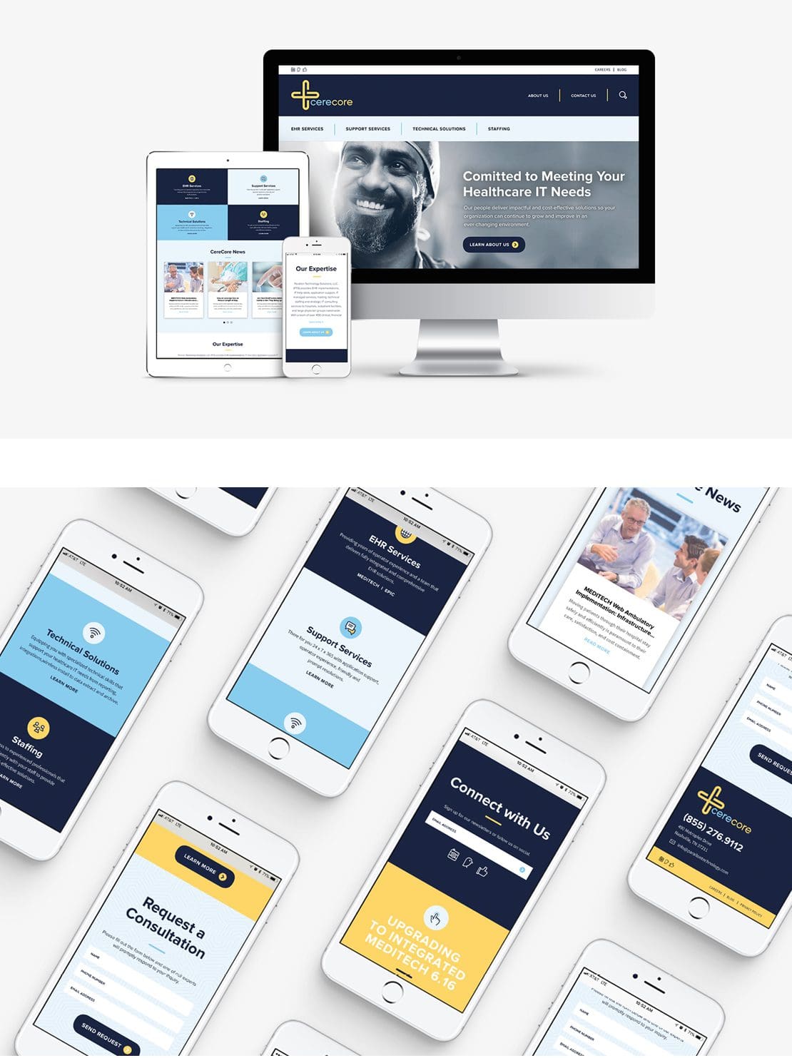
Website Design
As expressed in the RFP, our client would have their internal team build out their new website, however, we would have the opportunity to design the site. We created a wireframe that put the user first, simplifying the header navigation and ensuring that the site easily passes the “grunt test.” The design created aligns perfectly with the foundational branding elements, and the imagery involves a certain modern appeal, while remaining relevant for the industry.
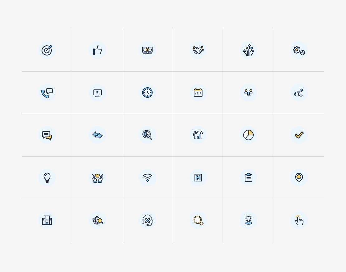
Icon System + Image Library
Next, to help CereCore maintain the integrity of the brand, we created both an image library and an icon system. The image library is a curation of stock images selected from the client’s available platform. We gathered imagery that would accurately reflect the passion and diversity of their team and clients. We sought images that would remain in line with their brand standards. Our design team custom-created a system of icons. The client could use these icons to create their marketing materials moving forward. Prior to a rebrand, one of the most difficult, but most necessary to-dos is to outline all outlets on which your brand could be deployed. We don't want you to need to create something and not have branded materials to do so properly. Lucky for you, as a healthcare branding agency, this isn’t our first rodeo. Aside from some company-specific needs that you might have, we have a large branding package that addresses all elements involved in a typical rebrand for a large firm.
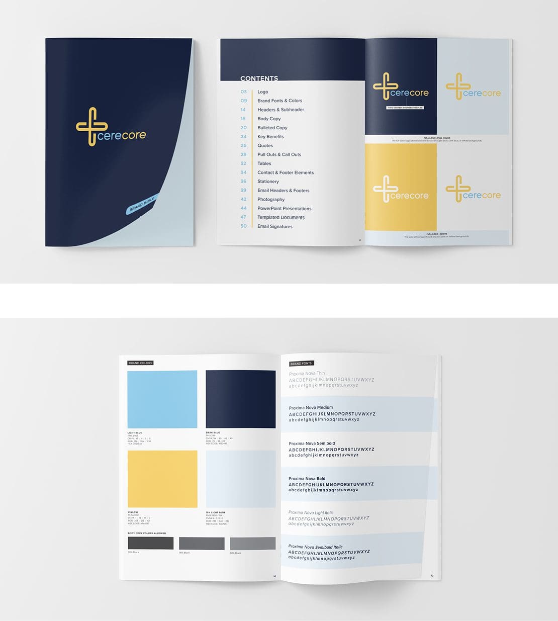
Brand Standards Guide
At the completion of the rebranding exercise, we provided CereCore with a brand standards guide. This document includes all colors, fonts, headers, subheads, body copy, pullouts and callouts, imagery, email headers and footers, and more. The outlining of these items and the usage of them provides an additional safeguard against the disassembling of the brand.


