Custom Logo Design: Before and After
We design a lot of business logos as part of our branding services. Needless to say, we've seen it all—the good, the bad, and the ugly.
The disconnect often lies in a common misunderstanding about the true purpose of a logo. A great logo is cohesive with your core purpose, offerings, and values, versatile in size, color, and layout, and simple while still being distinctive and memorable.
If you love a great logo design transformation as much as we do, prepare to be wowed by some of our favorite logo redesigns from over the years and learn a little about our process along the way.


ALLTRUST INSURANCE
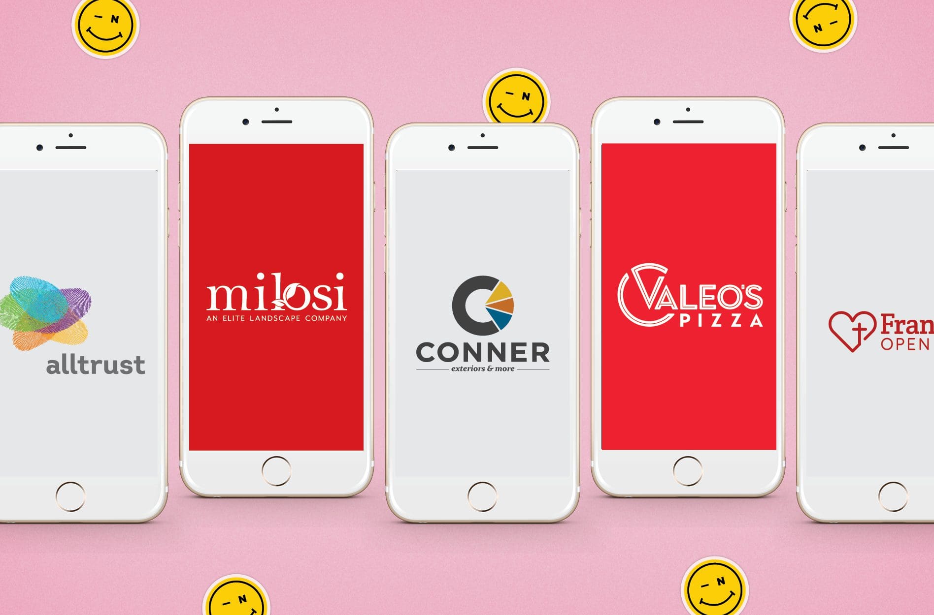
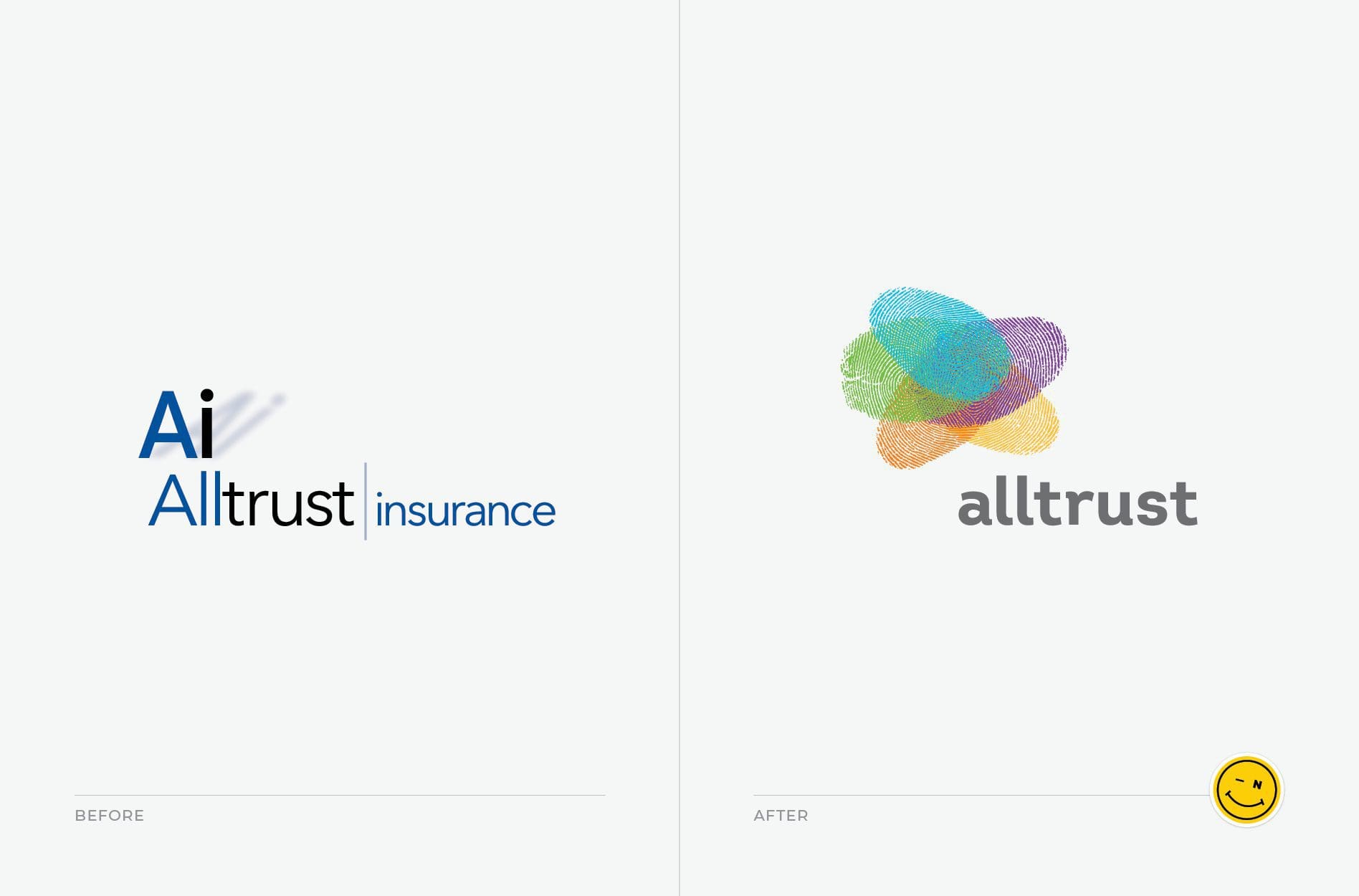
When Alltrust Insurance came to us, they were exhausted by the branding process. The Florida-based employee benefits firm had been through rebranding twice and were unhappy with the results. They had yet to find a branding agency that could bring their brand to life through graphic design elements. To say we were up for the challenge would be an understatement. In order to develop a brand that Alltrust would be proud of, we began our branding project with an in-depth discovery phase. We met with the CEO, stakeholders, key employees, clients, vendors, and partners in order to get to the heart of the brand and its differentiators. We used this information to overhaul the company’s logo. We ended up building an entire logo system so that they could highlight their different divisions: Compliance, Wellness, Human Resources, Technology, and All In. We gave each its own distinct brand color. Since Alltrust is in the business of people and celebrates their individuality, each division took the form of a fingerprint in the logo. Altogether, the layered fingerprints in the logo had the appearance of a treetop to represent the thought leaders that work at the company and the knowledge they provide to clients. We used a clean sans serif for the grey logotype so that the word Alltrust is simple, straightforward and yet still piques your interest. In the end, our client was very pleased that we listened, accurately captured their vision, and ultimately brought the brand to life through, yes, a single mark and a few words. The Alltrust logo was just part of the insurance company rebrand. Pop over to our portfolio to see how we put the new logo design to work for the firm.
CONNER EXTERIORS AND MORE CUSTOM LOGO DESIGN
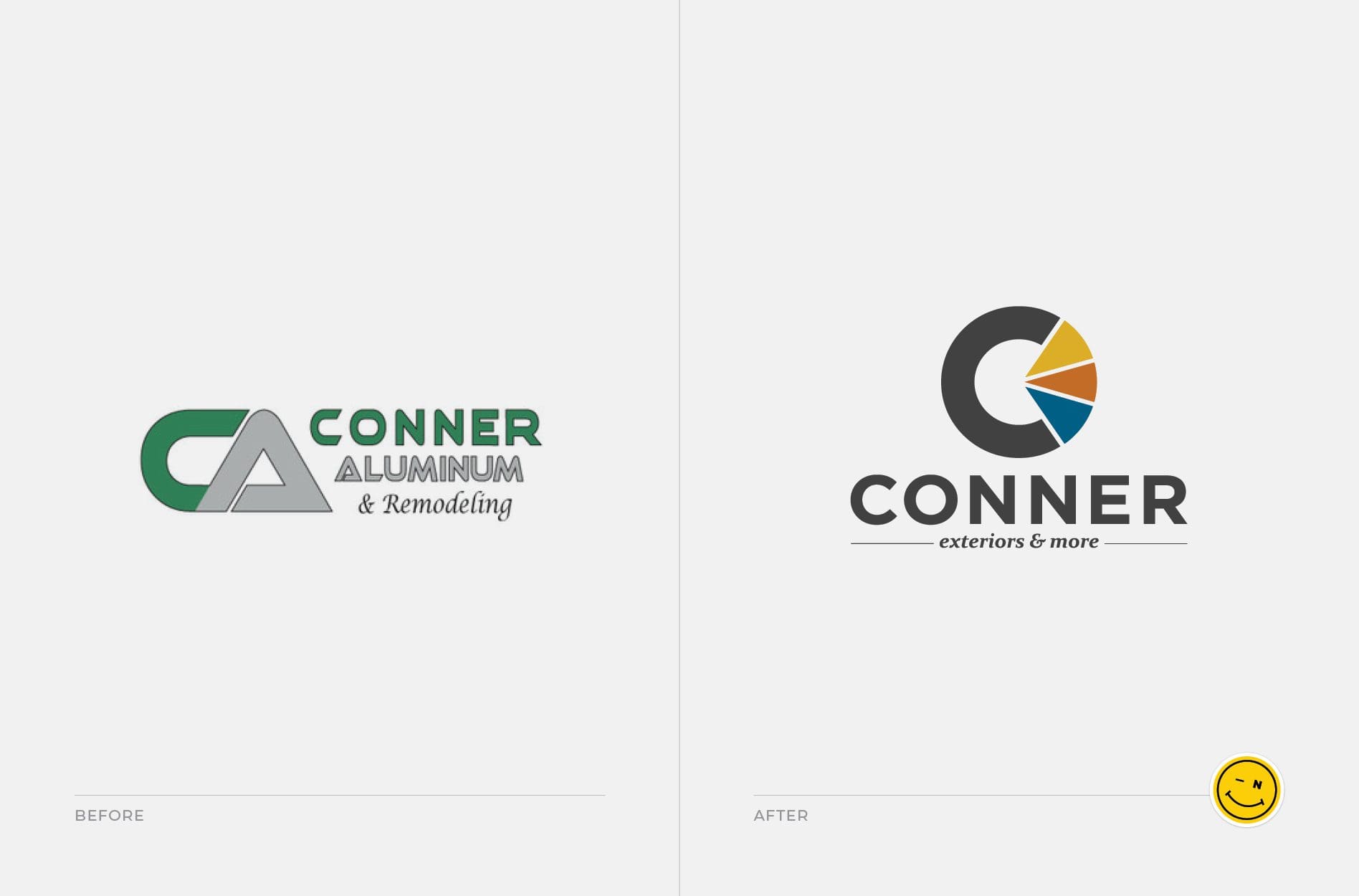
Conner Aluminum, a home improvement contractor in Lakeland, Florida, came to Nice Branding Agency because they wanted to diversify and clarify their services. The name of the company alone was limiting and did not fully capture the breadth of their offerings, which include a myriad of exterior renovations, like doors, siding, windows, sunrooms, and more. We suggested that the client use “Conner” as the main business name with “exteriors & more” underneath. We built a logo system around this idea. Within the name, we added a pie shape to the letter “O.” Each slice of the pie represented a different division of the business. Blue referred to windows and doors, orange was exterior, and yellow was enclosures. By itself, you could see the letter “C” within the pie shape, so it doubled as a standalone icon for the brand. Altogether, the symbol indicates that Conner can be your whole exterior home renovation contractor. The shape of the icon is also representative of the Florida sun. It reflects the location of the business and the way that Conner enables you to enjoy the sun while still being properly sheltered. We chose a very clean font for the logotype, so that it was easily readable when placed on trucks, uniforms, business cards, and beyond. Having been in business a long time, it was a fresh upgrade from the green and silver gradient motif that defined the brand for many years. A few years later, we equipped Conner with a brand new custom Wordpress website design. Head over to our blog post on transformative website designs, complete with before and afters, to see the refreshed Conner website.
FRANKTOWN OPEN HEARTS LOGO DESIGN
When Nice Branding Agency CEO Amy Dennis joined the board at FrankTown Open Hearts, she recognized that the local nonprofit could benefit from a rebrand. The organization provides developmental programs that teach practical life skills to inner-city youth in Franklin, Tennessee. A nonprofit that does such meaningful work deserves a brand that amplifies its message and impact. The previous logo was small and difficult to read. The letters FTOH appeared outdated and didn’t clearly communicate the organization’s mission. By cleaning up the logotype and spelling out the words, we brought clarity and much-needed space to the design. We also created an icon that featured a heart and an opening that led to a cross, in order to reflect the Christ-centered values and mentoring at the core of the nonprofit. We were glad to have the opportunity to create the first standalone icon that the organization has ever had.
