Century Storage: A Visual Brand Direction Project
BRAND DIRECTION PROJECT KICKOFF
Our client, Century Storage, reached out to the team at Nice Branding Agency for assistance honing in on their brand look and feel. They’d been operating under their existing colors and logo design for some time. However, there wasn’t a cohesive visual brand direction in place to support their continued growth. At the time of the project, Century Storage operated 14 self-storage facilities. They catered to a more affluent demographic. And they distinguished themselves from the competition by their attention to customer service. While they didn’t necessarily dislike their logo or brand color palette, our client did understand the necessity for a more comprehensive brand. From a practical standpoint, the company needed new signage and in-store design. So the team at Century Storage was eager to get a brand direction in place before installing signage or decor. Before strategizing on visual direction, we sent over a creative questionnaire for our client to complete. The answers to the questions posed within this form would provide our team with valuable information about the client’s expectations for the project, competition, existing brand, and more.DESIGN DIRECTION
Based on the information obtained from our client, our brand designers met to determine the direction for the project. Fun Fact: Our Visual Brand Direction package includes up to three distinct visual direction options. Upon presentation and selection, we finalize the chosen option. For this project, in particular, it’s important to reiterate that this was not a new business in need of a new brand. Additionally, the project was not a rebrand. Instead, it was the development of a consistent and cohesive visual brand direction. This identity would seamlessly integrate with, yet upgrade, the existing company look and feel. We decided that it would be important that all three visual brand directions maintain at least a minimal measure of semblance with the existing brand. The similarity could tie into what customers already knew and loved about Century Storage. We determined that the three visual brand direction options we would present would represent various levels of departure from the existing logo design and color palette.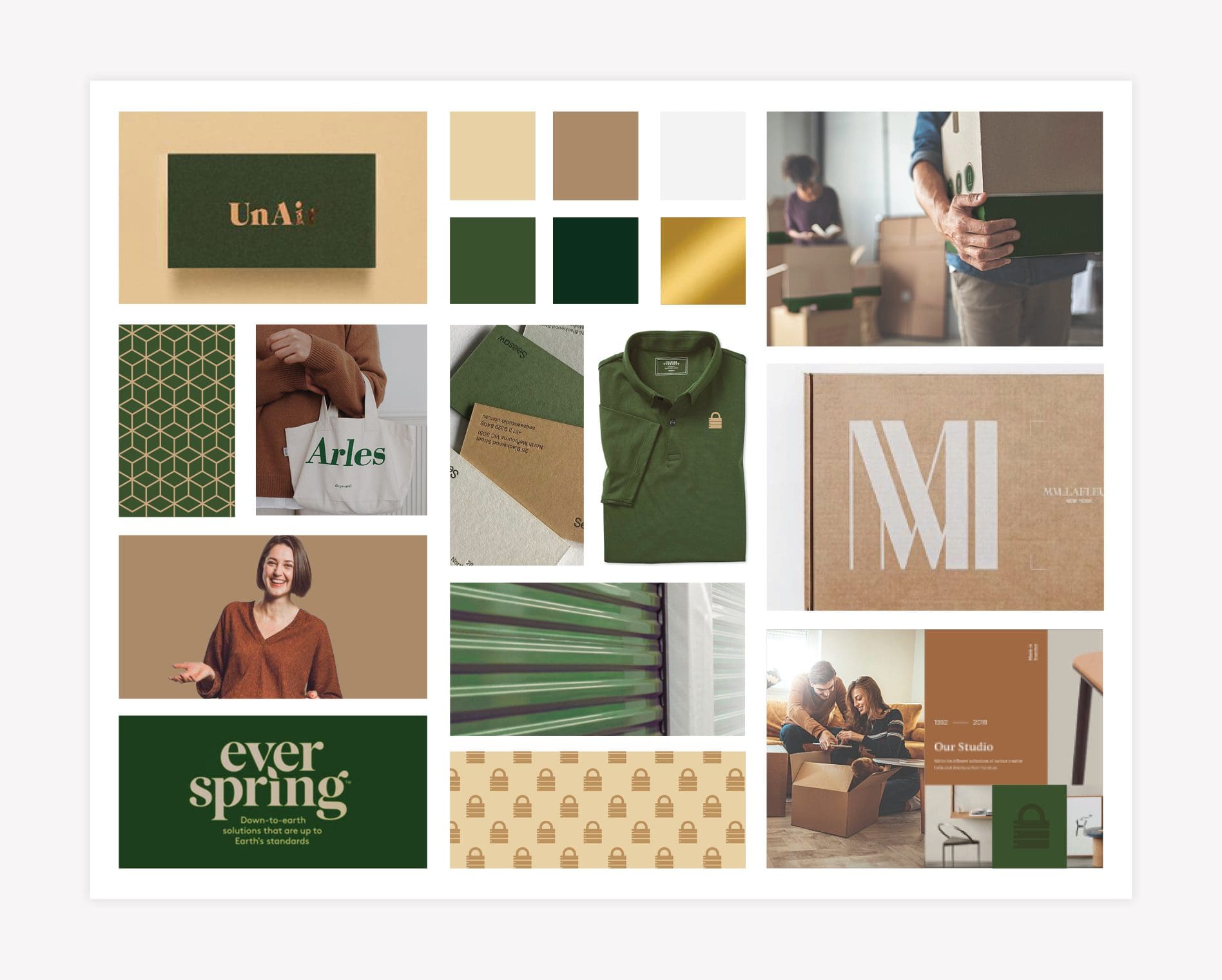
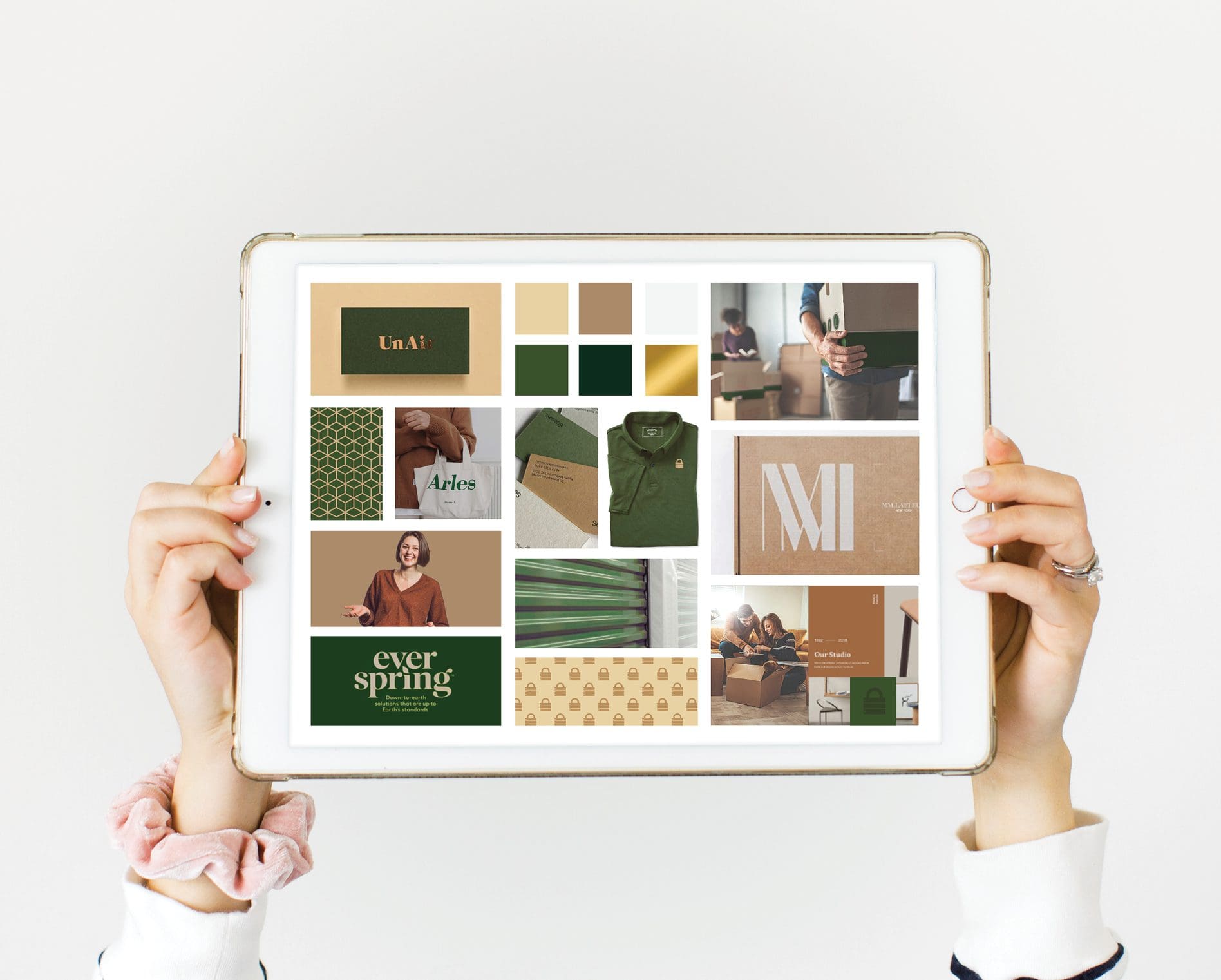
VISUAL BRAND DIRECTION: OPTION ONE
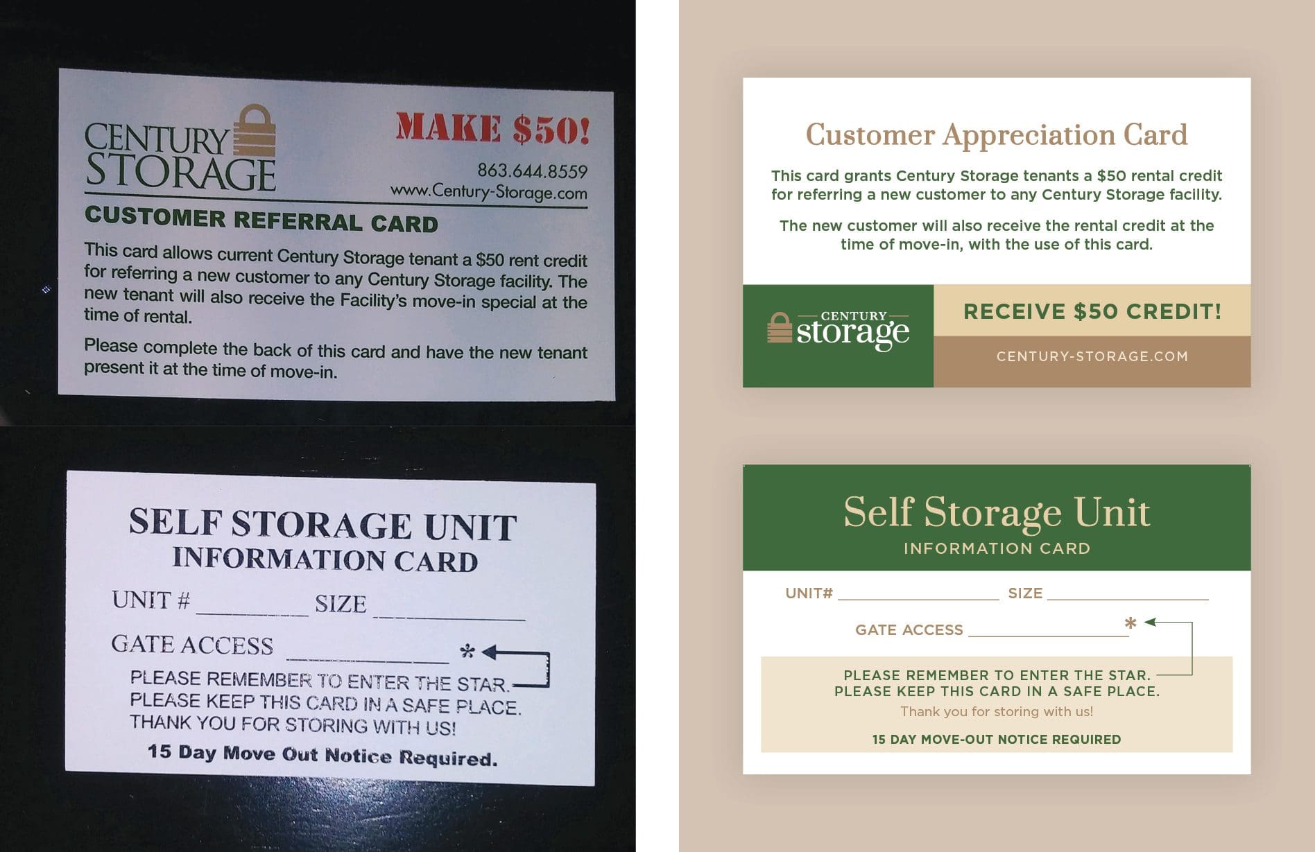
The first visual direction we created included a color palette that was closest to what was existing. Additionally, the style of the selected fonts closely resembled fonts in the existing Century Storage logo design. However, the refreshed visual direction created a markedly more professional image for the business. A deep hunter green was selected, punctuated by a professional and sleek gold. Green was chosen to align with their existing look. However, we altered the shade to provide a more solid, stable, professional appearance. The addition of the metallic gold conveys a sense of security. In an understated manner, it also connotes the implicit value of the items stored at our facilities. Plus, it indicates that our clients’ belongings are safe under lock and key. We referenced bespoke patterns created to include locks and keys, or boxes. The patterns would be an added detail of customization to the graphics and start building brand recognition. A gridded layout mimics the square and rectangular shapes of moving boxes and the units themselves. The imagery within this direction includes professional people who are happy to help clients understand their options for self-storage. Warm overlays keep the images from being overly modern.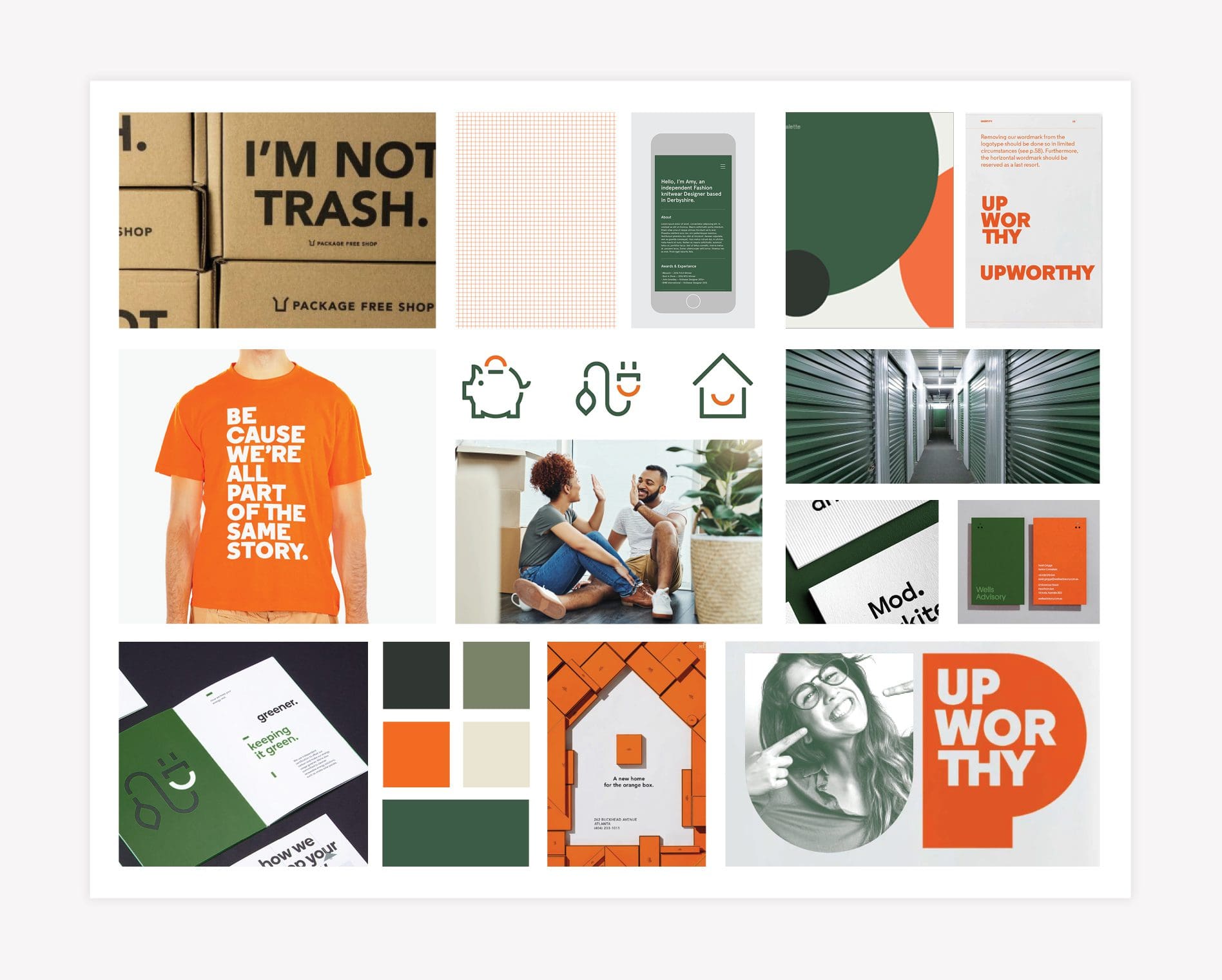
VISUAL BRAND DIRECTION: OPTION TWO
The second visual direction option conveys a shift into a more modern aesthetic. We used the Century Storage green tone. However, it is complemented by a richer green to introduce a sense of modern design. The brand color palette also includes an orange hue that brings a vibrancy to the brand and a depth to the visuals. To align with the modern aesthetic, an icon system and bold, geometric shapes showcase offerings and services. Under this visual direction, brand photography takes on a cool, subtle green tone. Additionally, imagery includes graphics in a grid pattern that visually aligns with the concept of organized space. Graphic design for brand support includes floods of color with large, bold black text in larger applications, such as moving boxes. Smaller applications feature classic fonts printed on textured paper to emulate the texture of a cardboard moving box. Where appropriate, icons and shapes convey key messages and mimic the act of movement and organization. Cheeky sayings connect people with the brand and make messages more memorable. Overall, this visual direction presents a modern take on the existing brand with added elements and layers of design that start to communicate a narrative.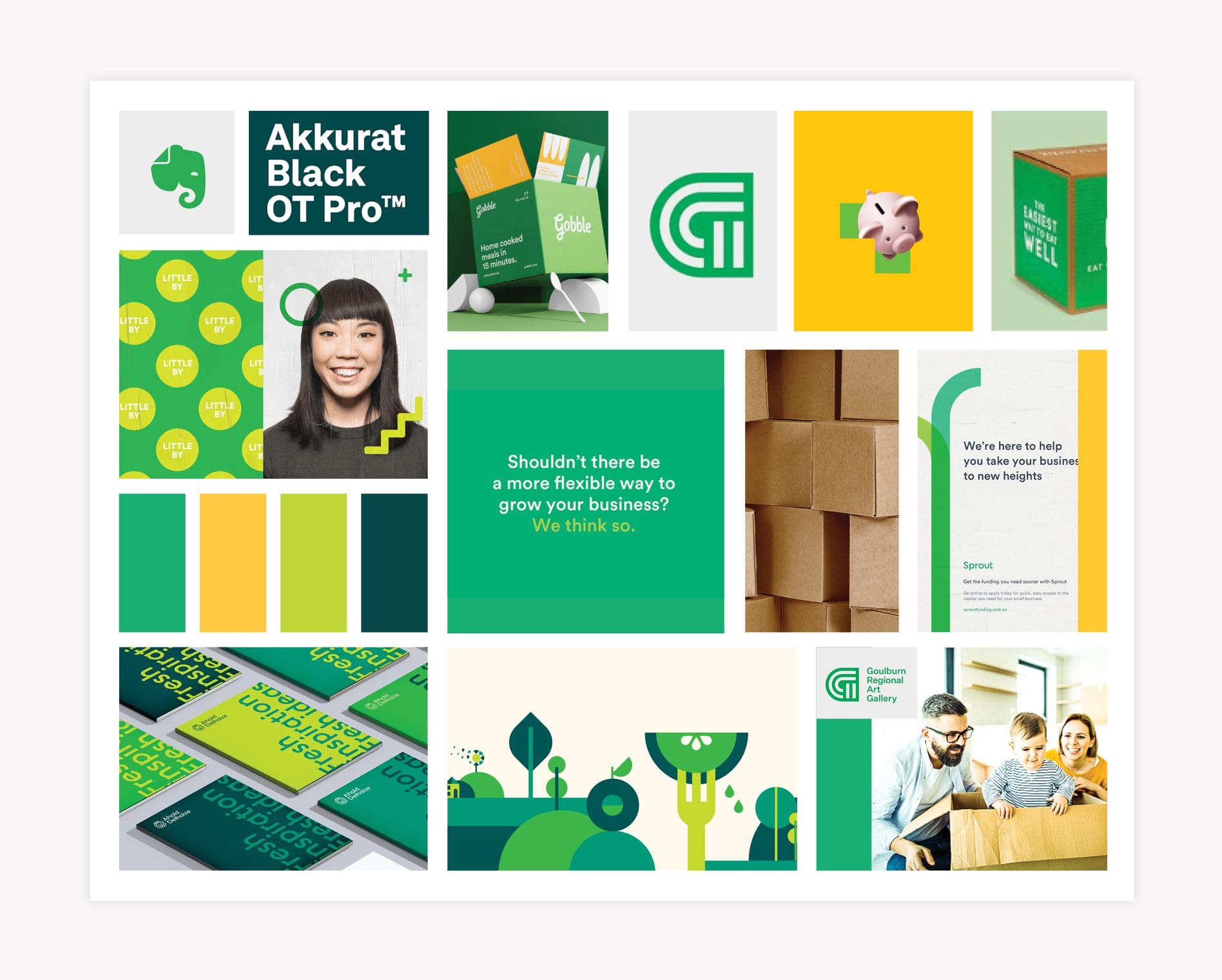
VISUAL BRAND DIRECTION: OPTION THREE
For the third option, we created an entirely new visual direction for the business. We understood that it would be a challenge to transition from the existing brand assets to a completely new look and feel. However, we wanted to ensure that our client was able to see what we could do with the brand when unfettered by constraints. Sidenote: We did obtain approval in advance for creating a new visual direction. The color scheme for the third visual direction option includes various shades of greens alongside an attention-grabbing yellow hue. This palette communicates an uber-clean energy. These colors resonate with the feeling of being organized and having more space. The fresh aspect also mirrors a new start, or the exciting change that comes with moving. For this visual direction, we would need to redesign the logo to take on a clean modern shape. Additionally, we’d create an icon style to emulate a modern illustrative approach. We could implement multiple icons together to create a scene or convey a message. Since the colors are so bold within this visual direction, we selected clean sans serif fonts balance the branding. Photography tones would be vibrant with a cool tone. And employees would be shown as happy and welcoming, with overlaid icons. Moving boxes or packaging would be a combination of the brand colors with white typography. This brand would take the Century Storage visuals in a new direction that would allow for a bold brand to be built. The visuals here would influence not only the aesthetic but also how the company communicates with the public. This brand would draw attention consistently in every application.PRESENTATION AND SELECTION
Upon presentation, our client deliberated over the options. They were (surprisingly!) super-compelled by the more modern options. However, after careful consideration, Century Storage selected visual direction option one. One of the primary considerations was that many of the locations would need to retain the darker green color. Switching to an entirely new look and feel would require immense investment in exterior signage, environmental branding, and more. Additionally, they appreciated the upscale, professional aesthetic of option one. They thought it would resonate well with their existing and potential clients. The brand board selected was finalized and provided to our client for safekeeping. The resulting visual direction could now serve as a roadmap to reference whenever creating collateral for the brand.BRAND SUPPORT
We were already retained to overhaul a set of existing brand assets, including interior signage, box design, graphic design, and more. This work we completed to establish a visual direction was paramount to the success of phase two. By having an approved, cohesive brand direction, we could design supporting assets with consistency and following an already-approved look and feel.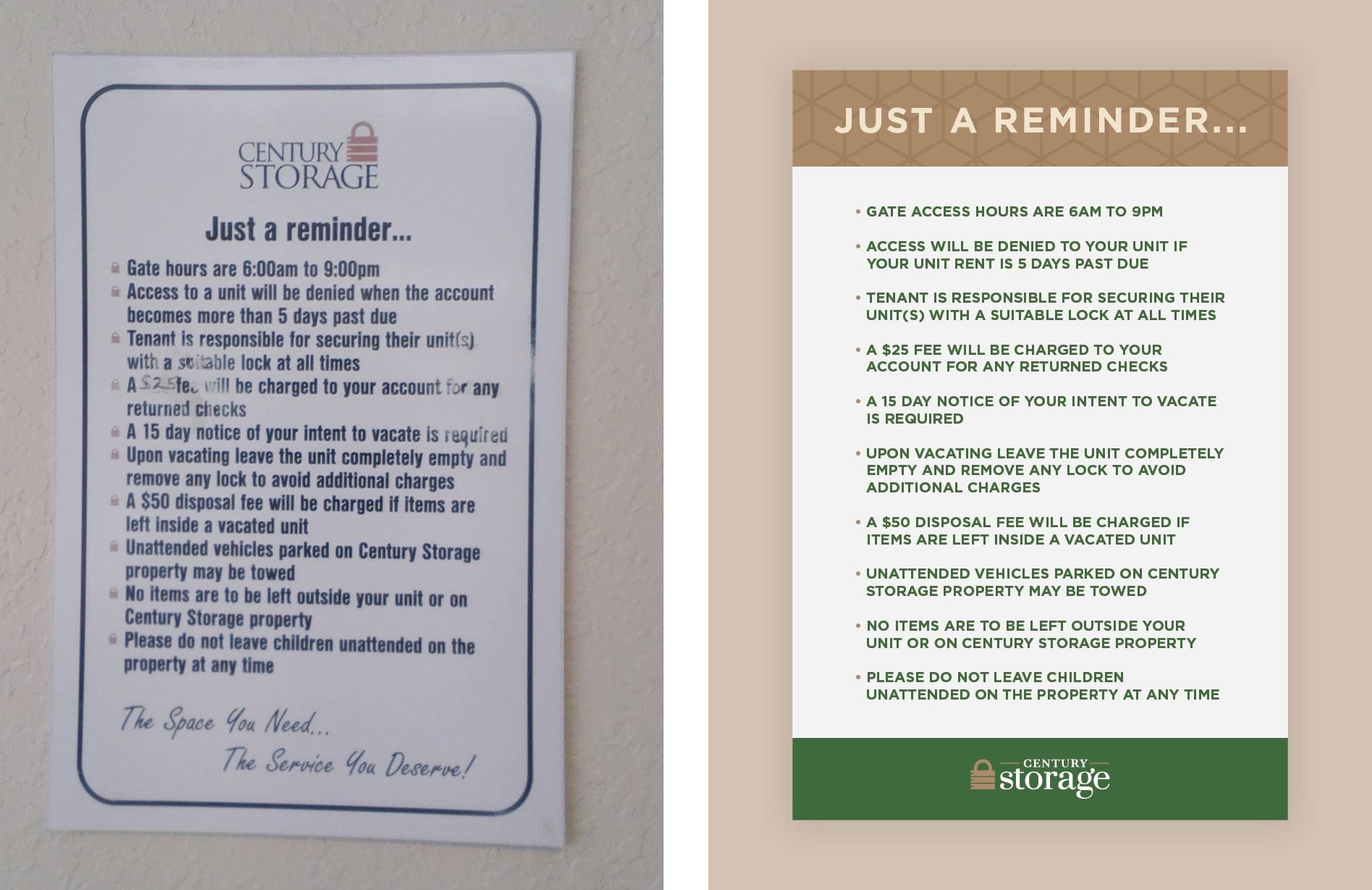
 If your business is lacking a clear visual brand direction, contact the team. You’ll be amazed at how pulling it together will set you up to grow in the right direction.


