Business Card Development: Our Start to Finish Process
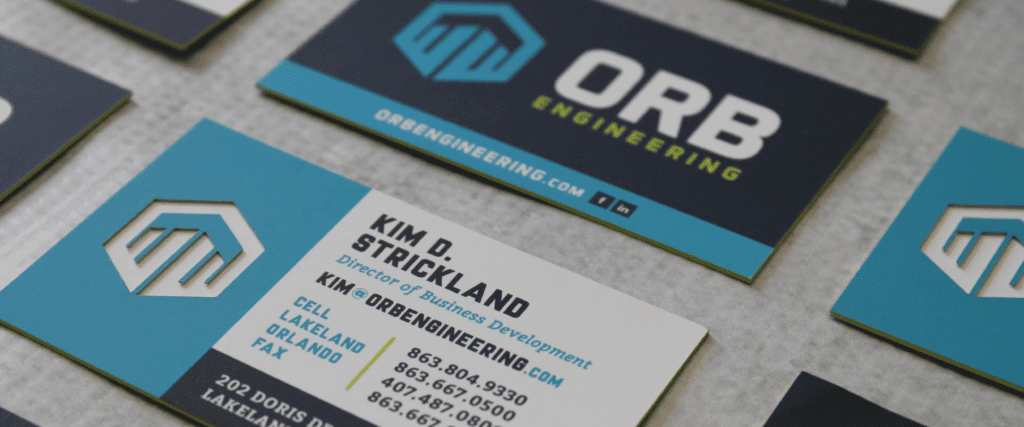
ORB Engineering is a full-service engineering firm in Lakeland, Florida. The firm handles all aspects of a project for their clients, including planning, analysis and design. While the principles of the company are polished, their existing brand identity was not. We started working with ORB to develop a custom logo that better represented the firm and then moved on to business card development. This is a natural progression for most of our clients.
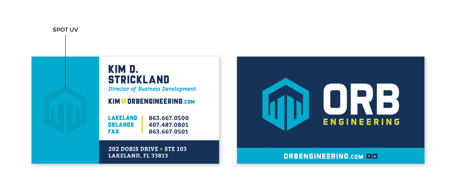
 Options 2 and 3 featured a Spot UV treatment applied to the icon. Spot UV is a print finish that, when applied correctly to a business card design, can attract interest and incorporate dimension. There are some tricks of the trade here. Spot UV works really well when applied strategically (learn more about UV coating here!). It falls flat on white, and it’s not so great on busy images. Here, we were also proposing for the card to be printed on suede to further the luxe look and feel.
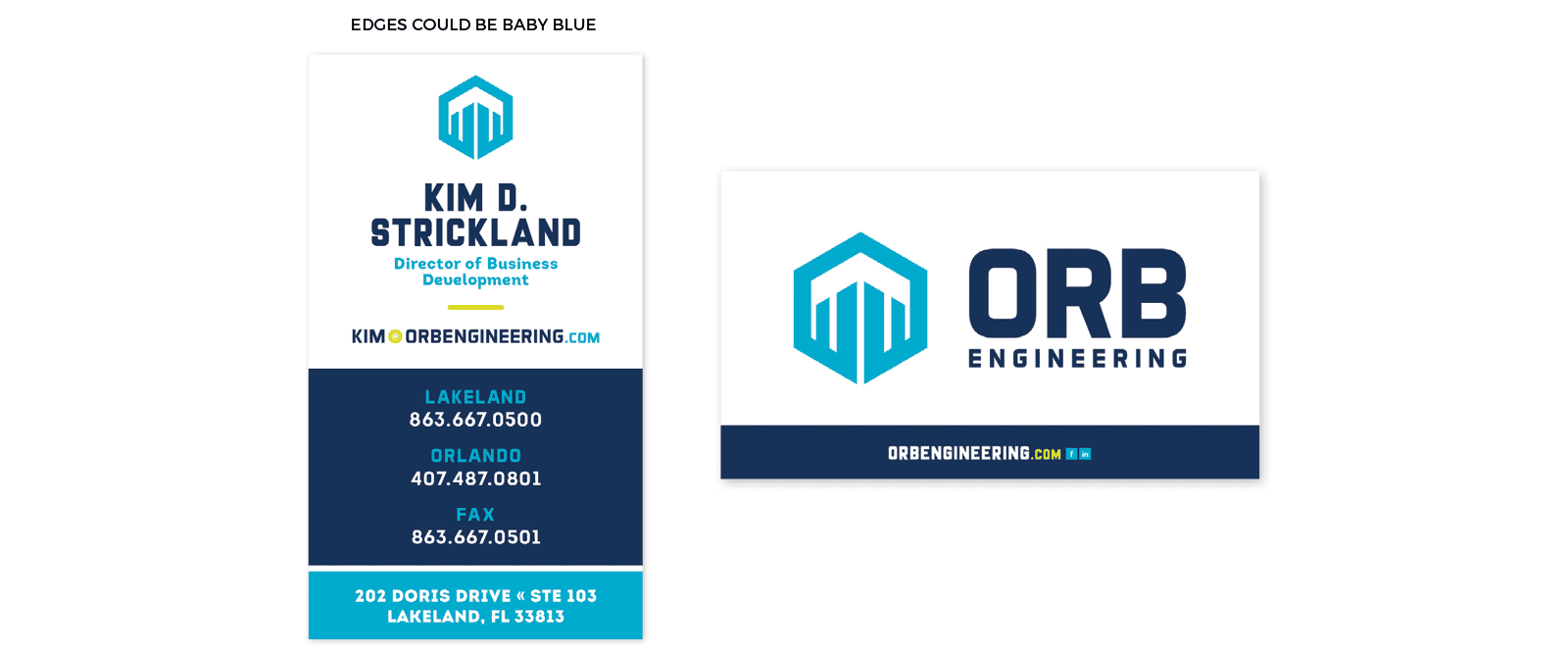
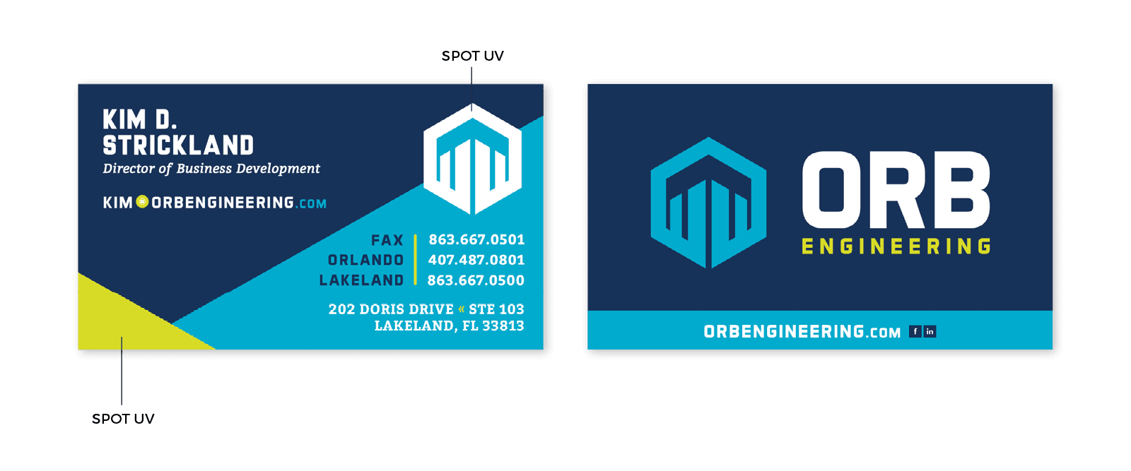 The final option included a heavy stock with a colored, or painted, edge. The edge color would match the PMS brand colors and would give the cards a completely custom look.
We know understanding color jargon can be complicated, so here's a quick guide to decode them all.
The final option included a heavy stock with a colored, or painted, edge. The edge color would match the PMS brand colors and would give the cards a completely custom look.
We know understanding color jargon can be complicated, so here's a quick guide to decode them all.
When presented to the client, Kim selected the business card design from option 2. However, she wanted to apply a die cut to the card, instead of Spot UV. YES, KIM! This option was going to look awesome. We love when a client wants to go all out. We love it even more when their “all out” is something that is actually feasible.
Instead of completely cutting out the icon, the client requested that we die cut the upper layer to reveal a layer of crisp white stock underneath. This was similar to a sample that Kim had seen in our office when she first visited.
Now it was time to take these puppies to print.
Getting these kinds of custom cards printed is not something that any old Joe Shmoe can coordinate. Our team works closely with both trade and local printers to execute the design that we have created at a price that will not break the piggy bank.
It’s not as simple as sending the files through and hoping for the best. There are press checks and proofs that must be approved before the card goes to print. And once it comes back, it’s not always up to snuff. Our designers’ hearts race as they open the boxes and painstakingly review proofs and printed materials, scouring them for errors from the printer before they even hit your hands.
Nothing but the best ends up on our clients’ desks. And this was no different. We actually encountered issues with this print job but worked with the printer to get the cards perfect *just* in time for Kim’s team’s industry event. Phew!
The ORB business card development project was such a fun one for our team. We were able to deliver something completely unique, and we are super proud of the way our collaboration with the client turned out.
If you are looking for a business card design that will get you noticed, just give us a jingle. The Nice Girls know a thing or two about business card development, and we’d love to work with you.
A Brief Briefing
Before we began the business card design process, our client Kim from ORB paid a visit to our Lakeland office to take a look at some of the business cards we had done in the past for our clients. Kim spoke with us about her desire for the cards to really pop. She wanted to pull out all the stops and create something truly unique. She offered up ideas about die-cut metal cards, transparent plastic cards, odd-shaped cards, and more. Her Pinterest boards were packed, y’all, and it was apparent that she had definitely Googled, “business card design ideas.”Keep What's In The Past In The Past
Here’s the thing about Kim. She had been burned in the past when she created a business card design with another print vendor and wasn’t 100% over-the-moon happy about the end result. She brought in her existing card and noted that there were some things she liked about the card and some things that weren’t ideal. For example, her existing card used a print finish called Spot UV. One point here. But the finish wasn’t used to its fullest potential. Boo. The card was also blank on one side. Say what?! That’s a waste of precious real estate right there. Also, a big ding to her existing cards and something that had to be addressed was that the cards showcased the old brand in all its glory. Psst... if you're thinking, "what the heck is a print finish?!" then head to our blog post on print finishes you wanna know. OK, after seeing the existing cards, we were feeling pretty good that we could knock this business card development out of the park.Design On A Dime | Business Card Development
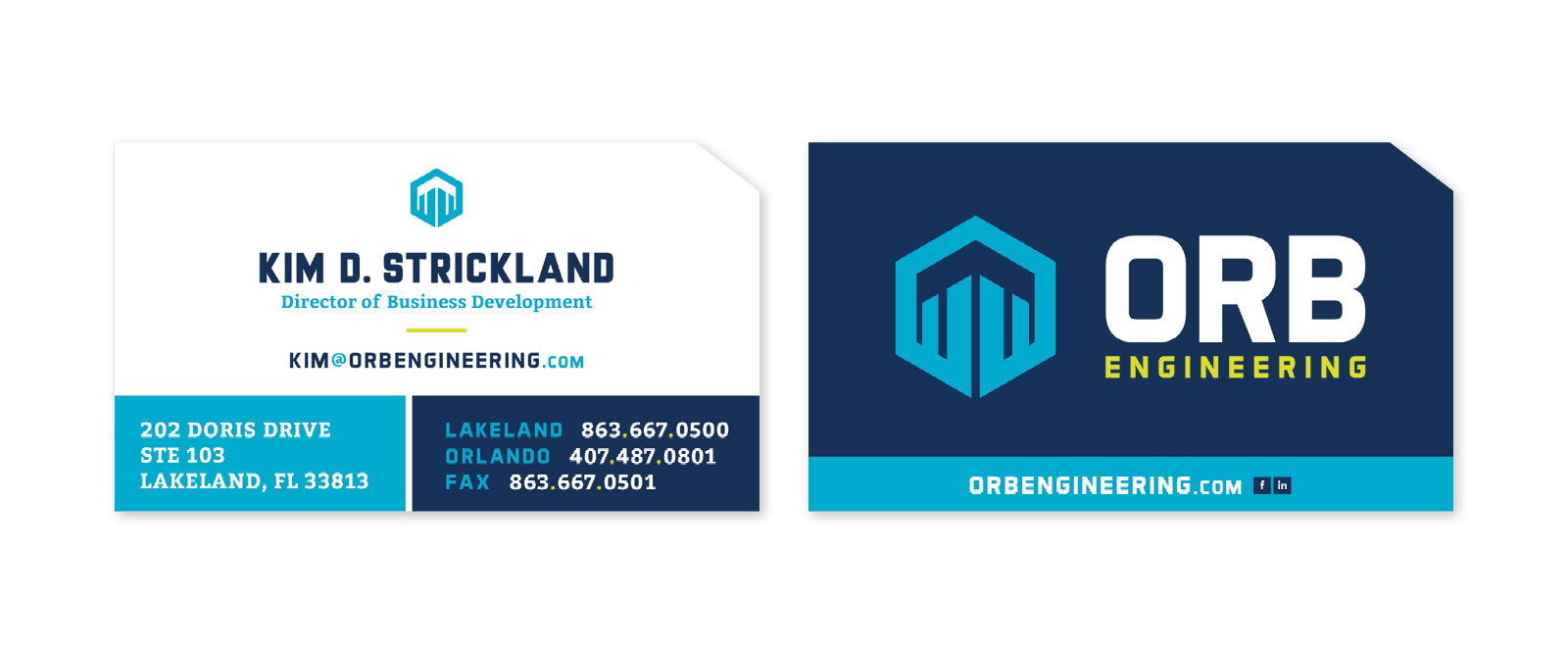
While Kim was committed to her idea of making the cards something special, we were really trying to work within our proposed budgets for the project. So, we set out to create three different card options that we presented, along with “special effects,” if you will (which I am sure you will). Our team set to work creating options that were both vertical and horizontal. We used a standard-sized business card, as this is what worked best given the information that needed to be on the card and the size and shape of the logo. Each design featured big floods of the bold blue hues that we included in the client’s brand color palette. The blues evoke a sense of capability and honesty. We also incorporated a secondary brand color — chartreuse. This bright yellow-green brought the spice of life to the brand and translated well to the business card development project. Along with the proofs, we indicated special print options and finishes for each selection. The first business card design that we presented included a dogeared cutout in one corner. The card would be printed on a hefty stock. This shape provides a modern edge that is unique to the card, which in turn makes the card memorable, which then makes the client memorable. See how we do that? It’s not just about creating all the pretty things all day long. It’s about creating functional, beautiful pieces that are useful and accomplish a predetermined purpose.Options 2 and 3 featured a Spot UV treatment applied to the icon. Spot UV is a print finish that, when applied correctly to a business card design, can attract interest and incorporate dimension. There are some tricks of the trade here. Spot UV works really well when applied strategically (learn more about UV coating here!). It falls flat on white, and it’s not so great on busy images. Here, we were also proposing for the card to be printed on suede to further the luxe look and feel.
The final option included a heavy stock with a colored, or painted, edge. The edge color would match the PMS brand colors and would give the cards a completely custom look.
We know understanding color jargon can be complicated, so here's a quick guide to decode them all.
 Proofing | Business Card Development
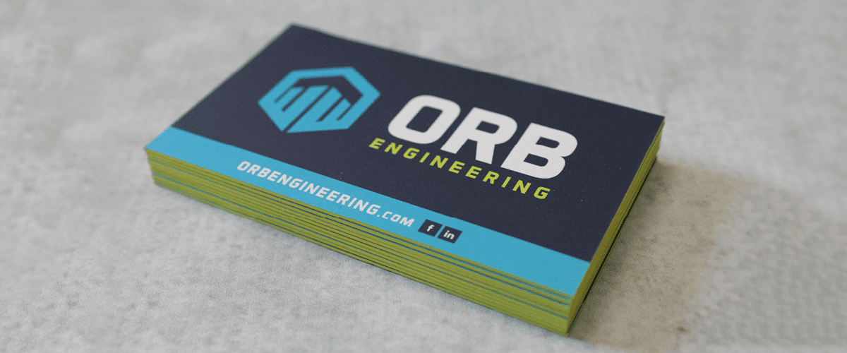 Printer Coordination | Business Card Development


