The Halal Guys Brand Review
The Halal Guys brand review by Amy Dennis who owns Nice Branding Agency, a branding agency with a focus in restaurant branding.
It would be a complete understatement to say that I'm impressed. It's remarkable that The Halal Guys have been able to build a following like they have without the necessary support that comes from a brand. I'm thrilled for their success, but also a little sad as I write The Halal Guys brand review because though they're one of the fastest-growing franchises around, they don't actually have an intentional brand.
This scenario is one that truly baffles me. I'm a firm believer that the way for restaurants to win is through mastering the trifecta of operations, food and branding. When a company can successfully have all three functioning at a high-level, the result is restaurant euphoria.
There is one stipulation to that train of thought, though. In certain situations, if a restaurant is able to master two of the three within the golden trifecta, these functions can carry the third and still bring success. Now, for what length of time? I'm unsure. But, for The Halal guys, I think this is the case.
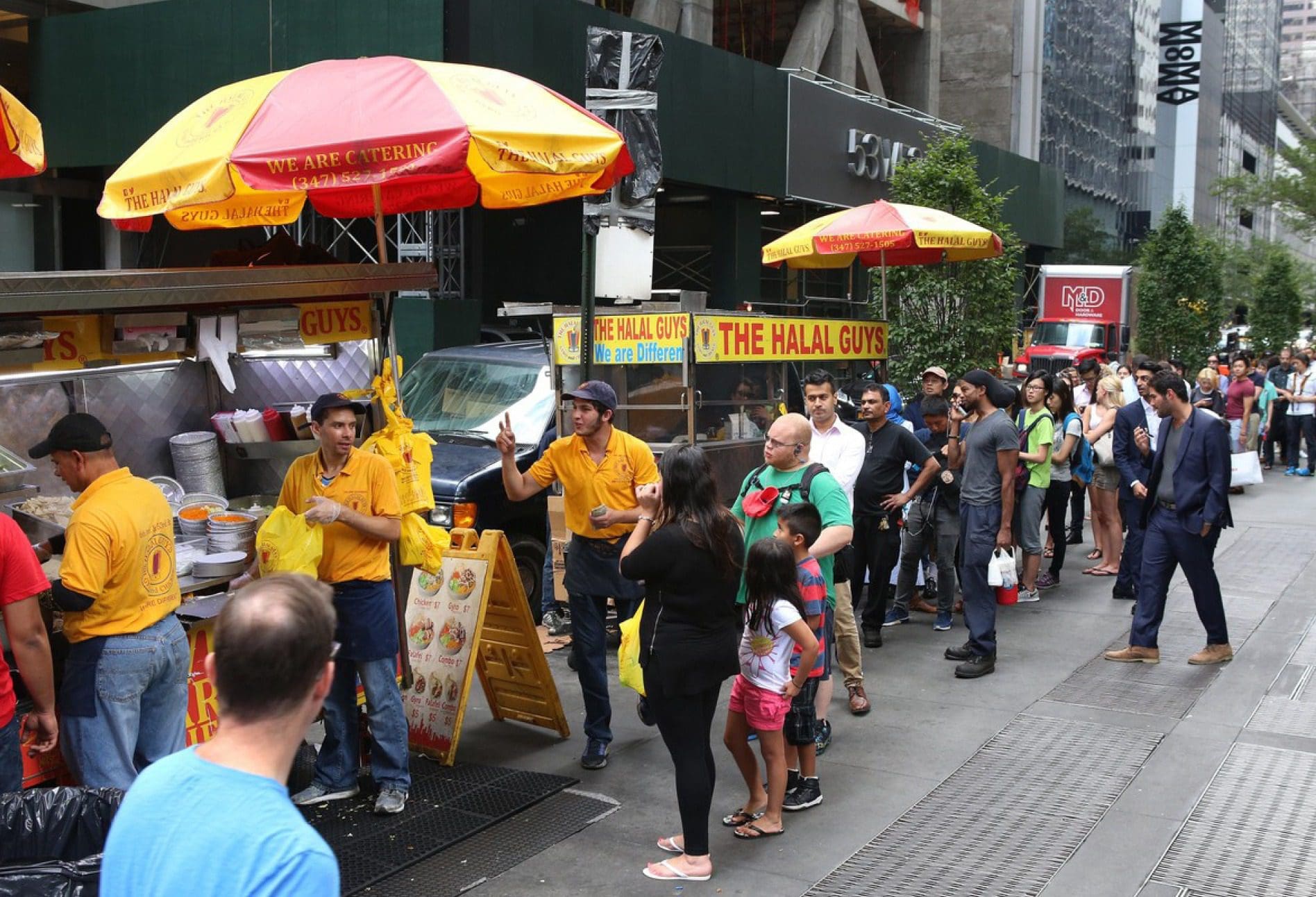 Their food and operations are currently carrying the brand, or rather what's lacking of one. The brand has been formed in a very unintentional way, which causes uncertainty and lack of connection to what the consumer experiences. It's clear that people have been able to connect with their food. The only problem is that if you have not tried their dishes, that relationship doesn't exist. This leaves a large amount of untapped potential for customers that could connect with their brand and become fans of The Halal Guys.
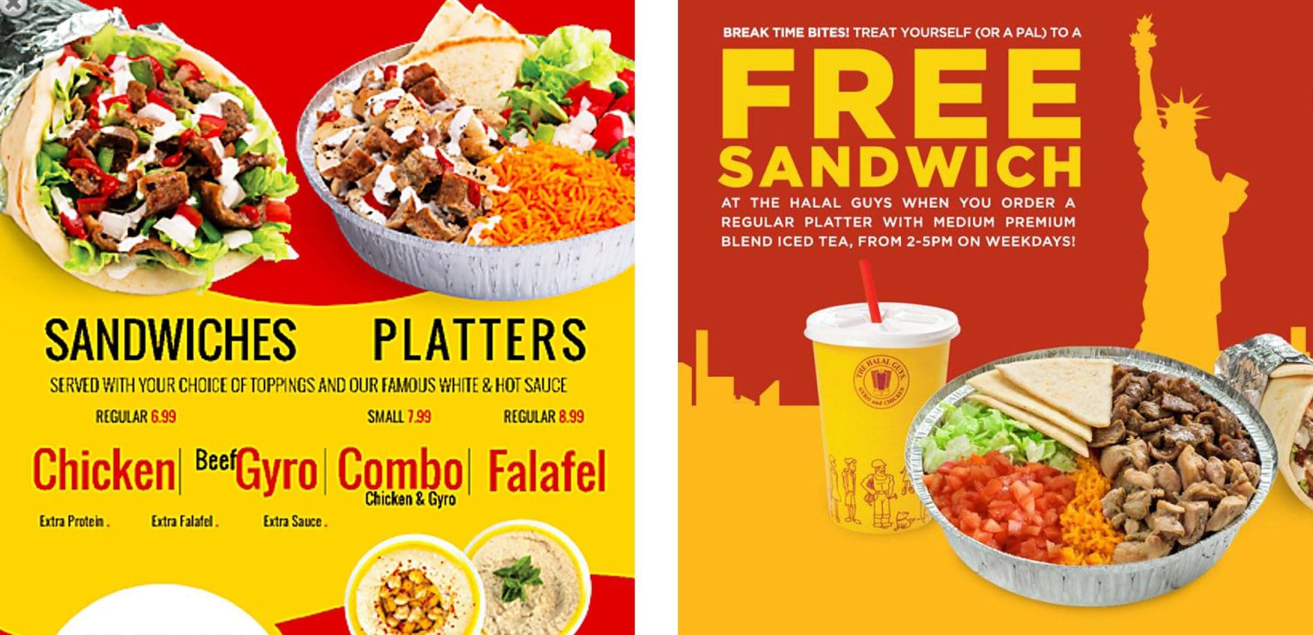
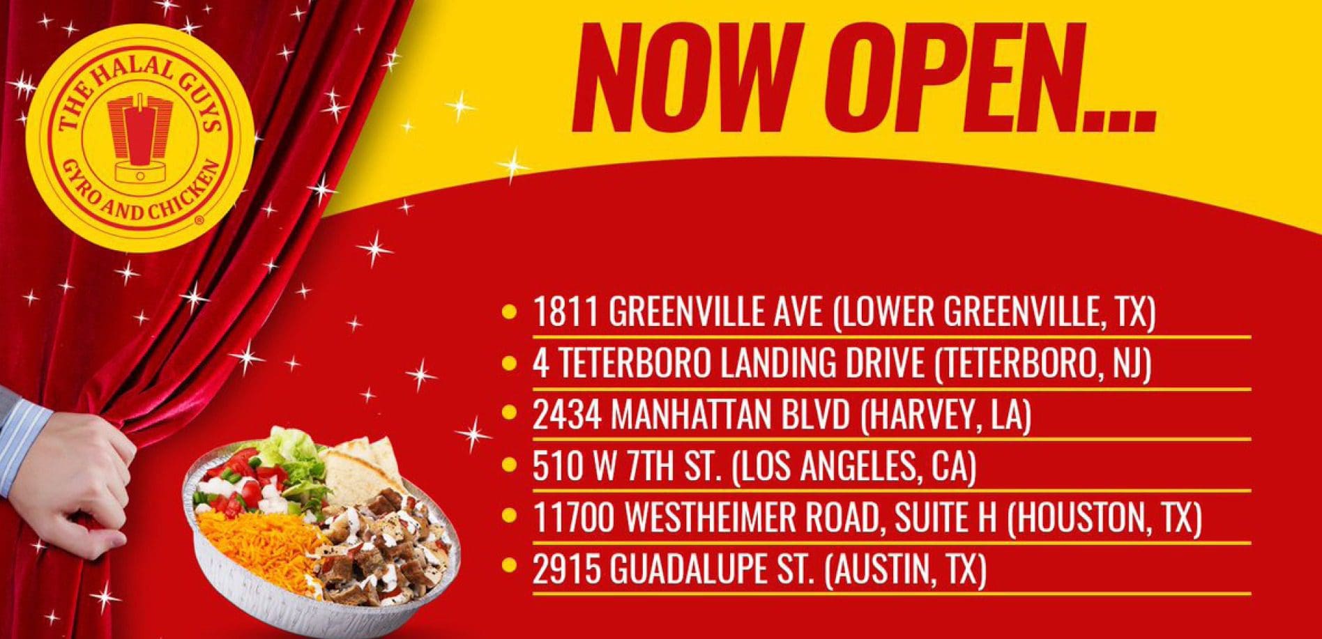
Alternatively, the customers who have yet to become acquainted with the food are left with many conflicting visuals and verbiage from the restaurant. Consistency is what builds connect in branding and currently, the visuals and verbiage are creating conflicting messages.
 Let's take a step back and discuss branding.
Branding is how people perceive a business based upon the total of everything they come in contact with in relation to the restaurant. Essentially, a brand is what people think of your restaurant based upon the things they've seen, heard or experienced. When it comes to The Halal Guys, they are neglecting the first two and rely entirely on the experience aspect. I believe they could have a stronger "brand" if they were to place some focus on what's "seen" and "heard".
If they were to focus on strengthening the third aspect of the trifecta, they could not only build a bigger and more powerful following of customers but they could also possibly connect themselves to more opportunities for franchising, which is one of their main sources of growth.
Let's take a peek at the current state of The Halal Guys' branding below.
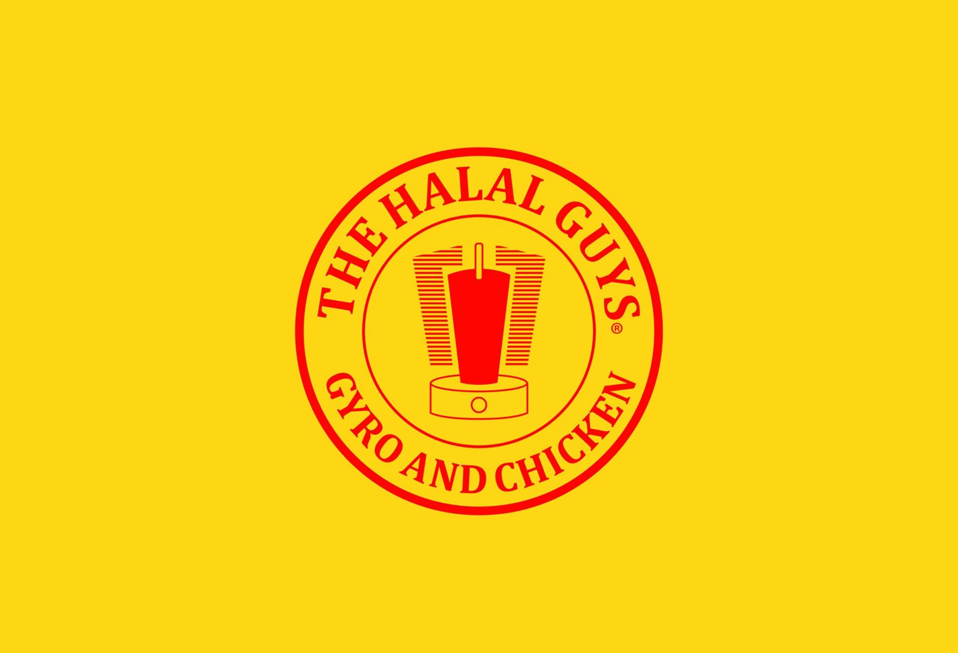 Their current logo shares many similarities to many other fast-casual restaurants that have brought ethnic dishes to the American food landscape.
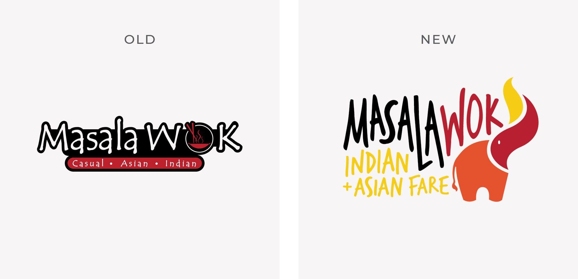
Quite a few years ago, we helped Masala Wok with rebranding. They're an Indian and Asian fast-casual restaurant that is based in Texas. Their original logo also had a round seal with an illustration in the center before we build the new logo you see below.
 One of the first successful ethnic food restaurants, Pei Wei, had a logo with a similar construct as well. Imitation is said to be the sincerest form of flattery, right?
 From both a basic design and creative perspective, The Halal Guys logo needed some major work.
The fonts utilized in the logo are generic and this is contradictory to their story as well as the flavors within their cuisine. The letter spacing is erratic, the weight of the strokes utilized within the font are inconsistent.
When looking through a creative lens, the illustration featured in the center is lacking in overall meaning and connection to their brand. It can be assumed that it somehow ties to New York City, where the company got its start, but there's no question that with branding techniques and brainstorming a more purposeful mark could be developed.
The logo and icon quality don't come close to holding a candle to the quality of food The Halal Guys produce. Just imagine how strong their branding could be if they had a logo that was as strong as their dining experience.
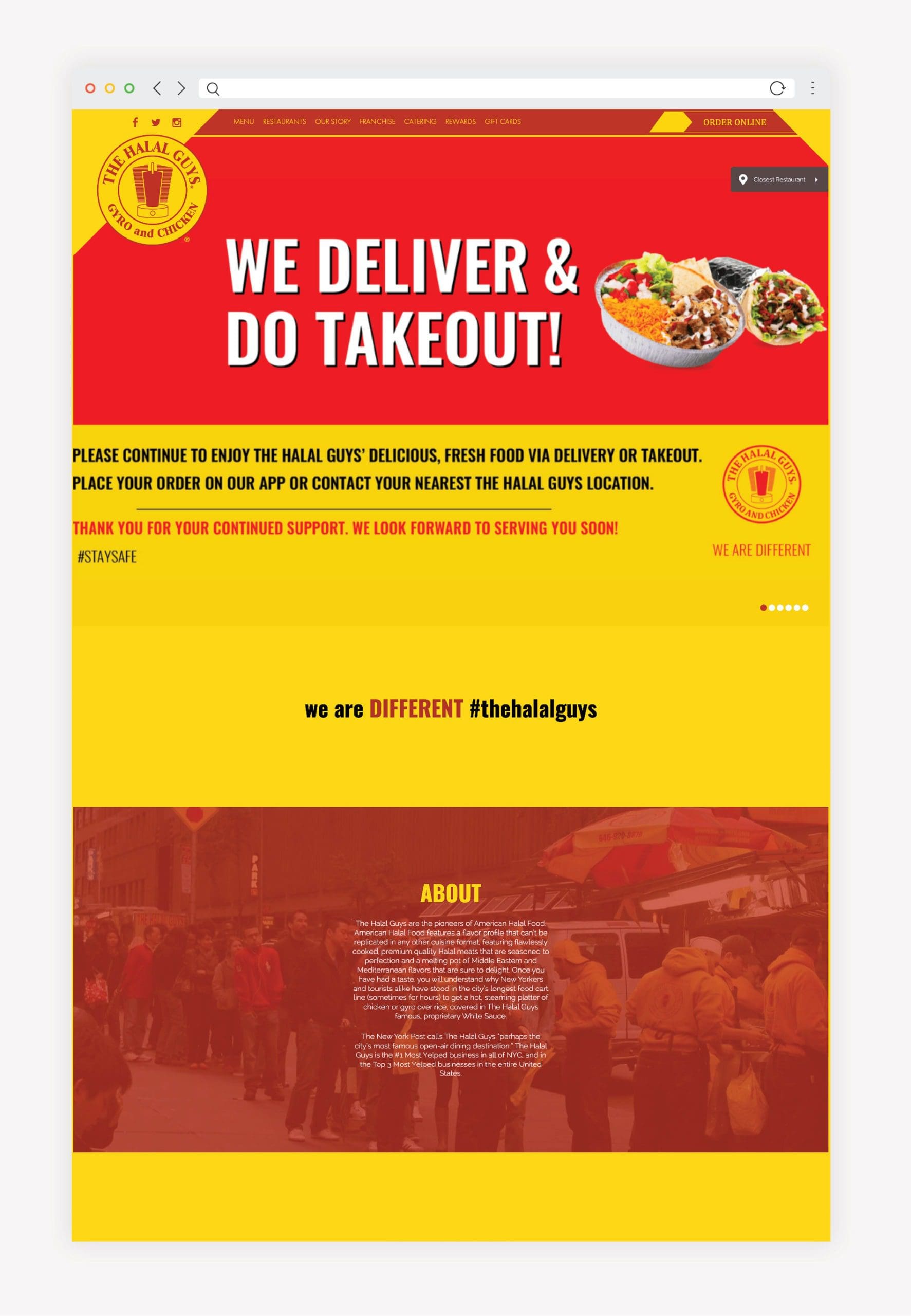 I'm not done talking about the colors, but first, I need to drive home the lack of connection between the website and viewer.
The Halal Guys brand story is one that could bring great excitement to people. It's always inspiring to hear about companies that have humble beginnings and grow to see substantial amounts of growth. It's impressive and engaging. And yet, this story cannot be found on their website.
Now yes, they do have a history page that's filled with the typical core values, mission and vision statements. But that's not enough, tell us the story of the brand, and tell it proudly. Show me the food and build my excitement to come and experience it!
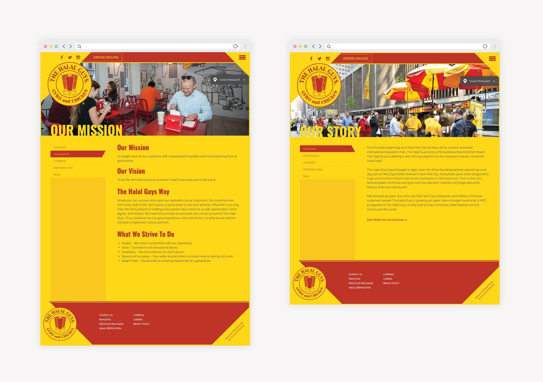 Okay, now back to the colors. Simply put, with the touch of a graphic designer with strong restaurant branding experience, their site could be brought into a more harmonious state. They need color harmony that is supportive of how simple the brand is instead of colors that are off-putting.
It almost seems as if The Halal Guys went into business thinking: McDonald's successful does fast food, let's use the colors they use. Pei Wei successful brought ethnic food to America so a logo similar to theirs will do.
Shameless Plug: Hey guys, your food at The Halal Guys is way better than both of those brands, combined. If only you'd allow a restaurant branding firm like Nice Branding Agency to breathe life into it. Your story needs to be told. We'd love to help.
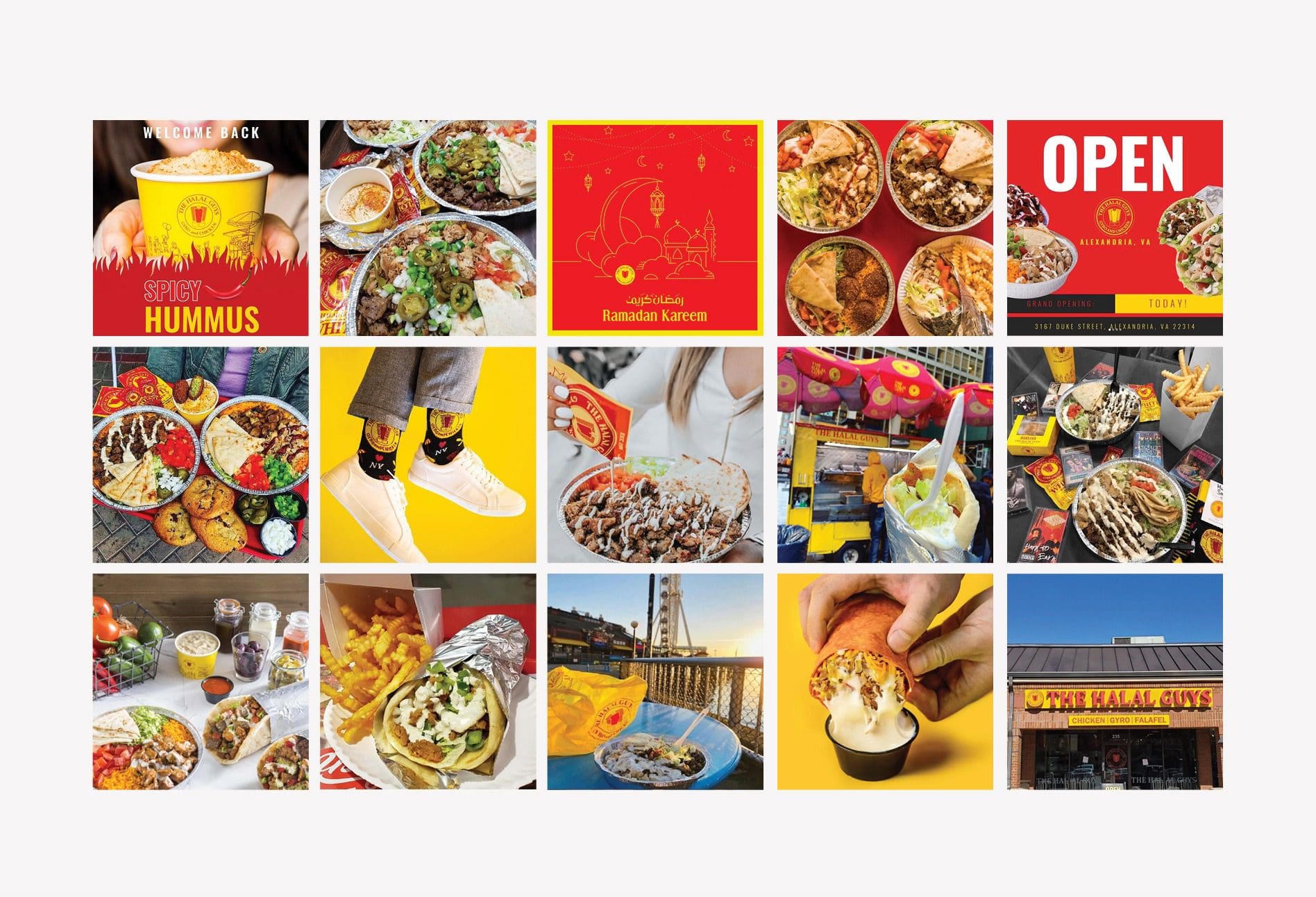 In an ideal situation, the feed would exhibit more overall purpose and consistency both visually and verbally, but, it's hard to expect such things when there has been no foundational branding bricks laid to help guide their branding direction.
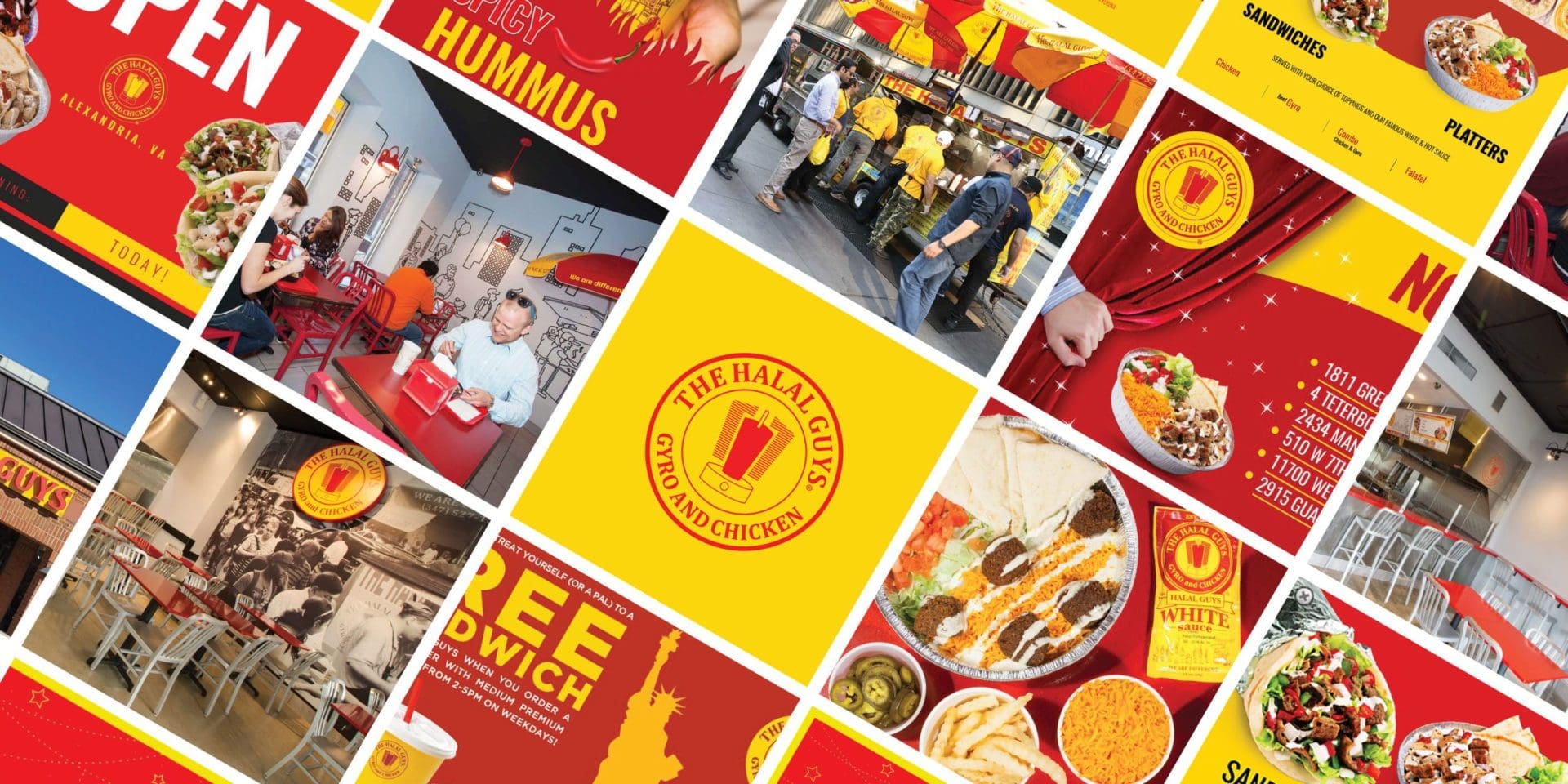
There are a plethora of bold designs, soft designs, font types, different filters and overall photo styles.
It's not the end of the world for a social feed to be untidy, but the more consistency to come from a feed, the better. Consistency builds connection, and that's what brings people back to restaurants again and again.
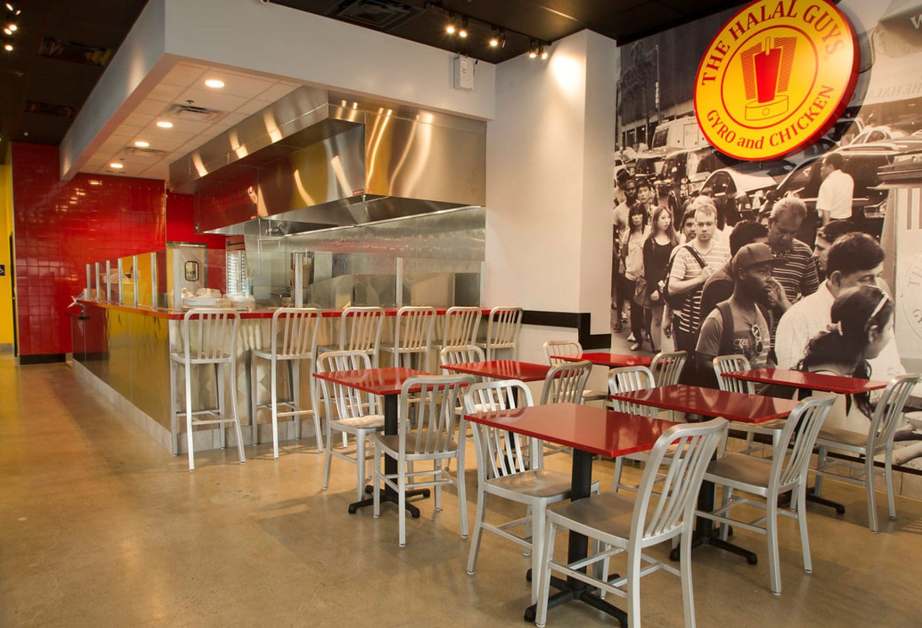
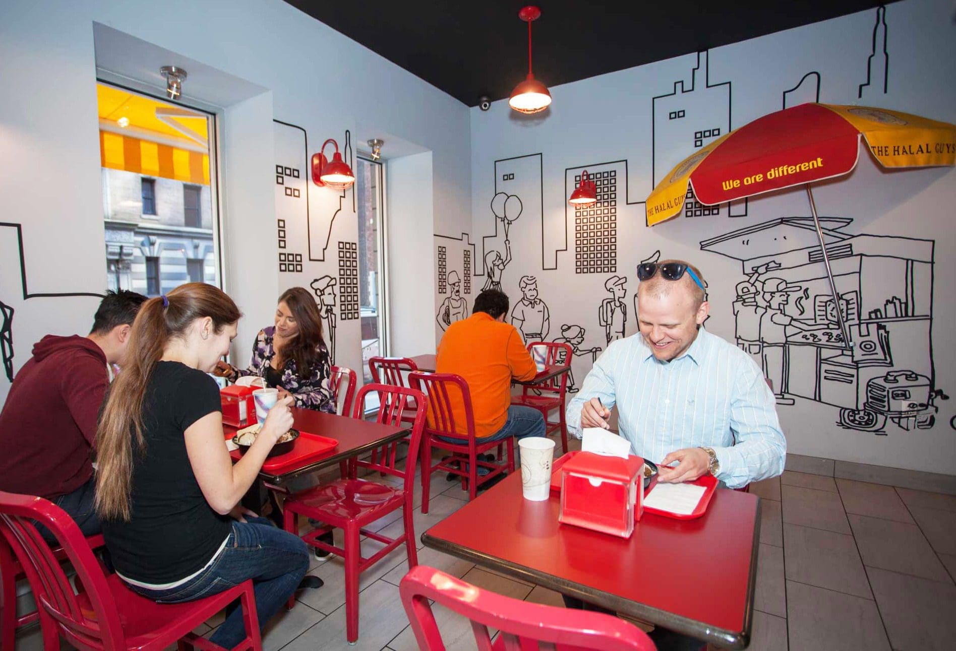 The mural and historical connection it provides helps me connect with the brand. The style isn't very original but it is nice to see that they brought their story to life on the walls of their space.
I connect with the mural and the historical reference that it provides to The Halal Guys’ story. The style again feels like something I’ve seen before; however, I’m glad to see them bringing their story to the walls of the physical space.
Also, they seemed to have held off on putting the red and yellow brand colors everywhere. But instead, there's a nice display of colors of red in harmony with pops of white and yellow which builds unity for their aesthetics.
 Their food and operations are currently carrying the brand, or rather what's lacking of one. The brand has been formed in a very unintentional way, which causes uncertainty and lack of connection to what the consumer experiences. It's clear that people have been able to connect with their food. The only problem is that if you have not tried their dishes, that relationship doesn't exist. This leaves a large amount of untapped potential for customers that could connect with their brand and become fans of The Halal Guys.
Alternatively, the customers who have yet to become acquainted with the food are left with many conflicting visuals and verbiage from the restaurant. Consistency is what builds connect in branding and currently, the visuals and verbiage are creating conflicting messages.

 Let's take a step back and discuss branding.
Branding is how people perceive a business based upon the total of everything they come in contact with in relation to the restaurant. Essentially, a brand is what people think of your restaurant based upon the things they've seen, heard or experienced. When it comes to The Halal Guys, they are neglecting the first two and rely entirely on the experience aspect. I believe they could have a stronger "brand" if they were to place some focus on what's "seen" and "heard".
If they were to focus on strengthening the third aspect of the trifecta, they could not only build a bigger and more powerful following of customers but they could also possibly connect themselves to more opportunities for franchising, which is one of their main sources of growth.
Let's take a peek at the current state of The Halal Guys' branding below.
The Logo
 Their current logo shares many similarities to many other fast-casual restaurants that have brought ethnic dishes to the American food landscape.
Quite a few years ago, we helped Masala Wok with rebranding. They're an Indian and Asian fast-casual restaurant that is based in Texas. Their original logo also had a round seal with an illustration in the center before we build the new logo you see below.
 One of the first successful ethnic food restaurants, Pei Wei, had a logo with a similar construct as well. Imitation is said to be the sincerest form of flattery, right?
 From both a basic design and creative perspective, The Halal Guys logo needed some major work.
The fonts utilized in the logo are generic and this is contradictory to their story as well as the flavors within their cuisine. The letter spacing is erratic, the weight of the strokes utilized within the font are inconsistent.
When looking through a creative lens, the illustration featured in the center is lacking in overall meaning and connection to their brand. It can be assumed that it somehow ties to New York City, where the company got its start, but there's no question that with branding techniques and brainstorming a more purposeful mark could be developed.
The logo and icon quality don't come close to holding a candle to the quality of food The Halal Guys produce. Just imagine how strong their branding could be if they had a logo that was as strong as their dining experience.
The Website
It's acceptable to make the assumption that the food is leading this concept. When I viewed their site, I found no connection to their food at all. Rather, I found myself wanting to close my eyes in response to the lack of color harmony within the restaurant site. I'm not done talking about the colors, but first, I need to drive home the lack of connection between the website and viewer.
The Halal Guys brand story is one that could bring great excitement to people. It's always inspiring to hear about companies that have humble beginnings and grow to see substantial amounts of growth. It's impressive and engaging. And yet, this story cannot be found on their website.
Now yes, they do have a history page that's filled with the typical core values, mission and vision statements. But that's not enough, tell us the story of the brand, and tell it proudly. Show me the food and build my excitement to come and experience it!
 Okay, now back to the colors. Simply put, with the touch of a graphic designer with strong restaurant branding experience, their site could be brought into a more harmonious state. They need color harmony that is supportive of how simple the brand is instead of colors that are off-putting.
It almost seems as if The Halal Guys went into business thinking: McDonald's successful does fast food, let's use the colors they use. Pei Wei successful brought ethnic food to America so a logo similar to theirs will do.
Shameless Plug: Hey guys, your food at The Halal Guys is way better than both of those brands, combined. If only you'd allow a restaurant branding firm like Nice Branding Agency to breathe life into it. Your story needs to be told. We'd love to help.
Social Feed | The Halal Guys Brand Review
Their Instagram feed is where the connection to their food experience starts to trickle in a bit. There are food photos all over the feed, which allows the viewer to do everything but taste and smell the food. But, definitely makes them wish they were! In an ideal situation, the feed would exhibit more overall purpose and consistency both visually and verbally, but, it's hard to expect such things when there has been no foundational branding bricks laid to help guide their branding direction.
There are a plethora of bold designs, soft designs, font types, different filters and overall photo styles.
It's not the end of the world for a social feed to be untidy, but the more consistency to come from a feed, the better. Consistency builds connection, and that's what brings people back to restaurants again and again.
The Interior
Since I have not been able to visit one of their locations in person yet, I don't have very many thoughts on their interior design. That being said, I will note that the direction seen in photos does seem to be on the right track in terms of building connection for customers through different touch points.
 The mural and historical connection it provides helps me connect with the brand. The style isn't very original but it is nice to see that they brought their story to life on the walls of their space.
I connect with the mural and the historical reference that it provides to The Halal Guys’ story. The style again feels like something I’ve seen before; however, I’m glad to see them bringing their story to the walls of the physical space.
Also, they seemed to have held off on putting the red and yellow brand colors everywhere. But instead, there's a nice display of colors of red in harmony with pops of white and yellow which builds unity for their aesthetics.
