King + Cat

construction logo design

King + Cat is a land clearing and excavation company owned by Ralph King. Referred by a former Nice Branding Agency corporate branding client, Ralph retained Nice Branding Agency to build him a bold brand. Business branding for King + Cat consisted of the creation of a business name, as well as the development of an eye-catching logo, a straight-forward website, and a business card for the company’s owner.

Construction Branding Kickoff

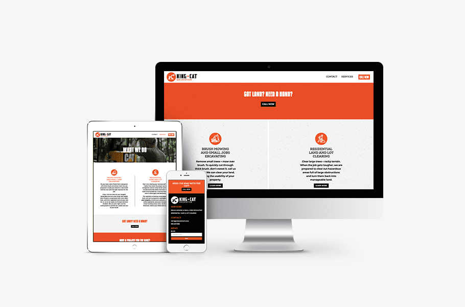
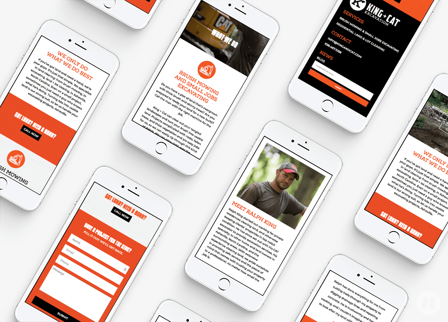
The excavation and land-clearing company located in Asheville, North Carolina, required construction branding. The project included a construction logo, a new business card, business stationery, and a new website. Along with his Caterpillar-branded excavating equipment, Ralph King would work to grade and clear land, cut trails through properties, and perform construction excavation work for residential clients. Additionally, he hoped to work with real estate brokers to help prep land for sale.

The construction branding project kickoff meeting with our team included a thorough review of the project details, including the client’s goals for the brand, the primary demographic for the services, and the initial information regarding the client’s desires for the visual direction.

Business Name Development

Some of our business branding package clients come to us with a business name in hand. And others need to add business name development to the package. For this project, our client had an idea of the services he would offer, however he had no idea what to name his business. He wanted his business name to evoke a second look, and to be catchy and memorable.

So, our team engaged in our business naming process to come up with several name options that we could present to our client. The process begins with research into the industry and an assessment of the target market. We take the time to do some competitor analysis and to speak with our client about their position in the market to learn why a client would choose them over their competitors. In this case, it was the business owner himself that differentiated the business from the competition. He was reliable, professional, and completely capable. You could trust him on your property and could depend on him to get the job done.

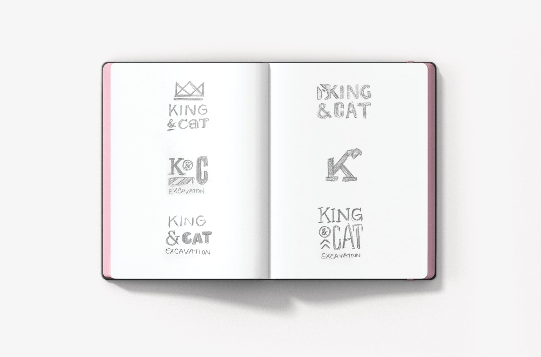
After reviewing the compiled market research, we then got to work brainstorming business name options. We put all of the names up on the wall (literally) and started looking into the availability of using the best options. We did a cursory look through the trademark search system, dug through available domains, and used search engines to determine whether the names we had in mind were too similar to those of competing, local businesses.

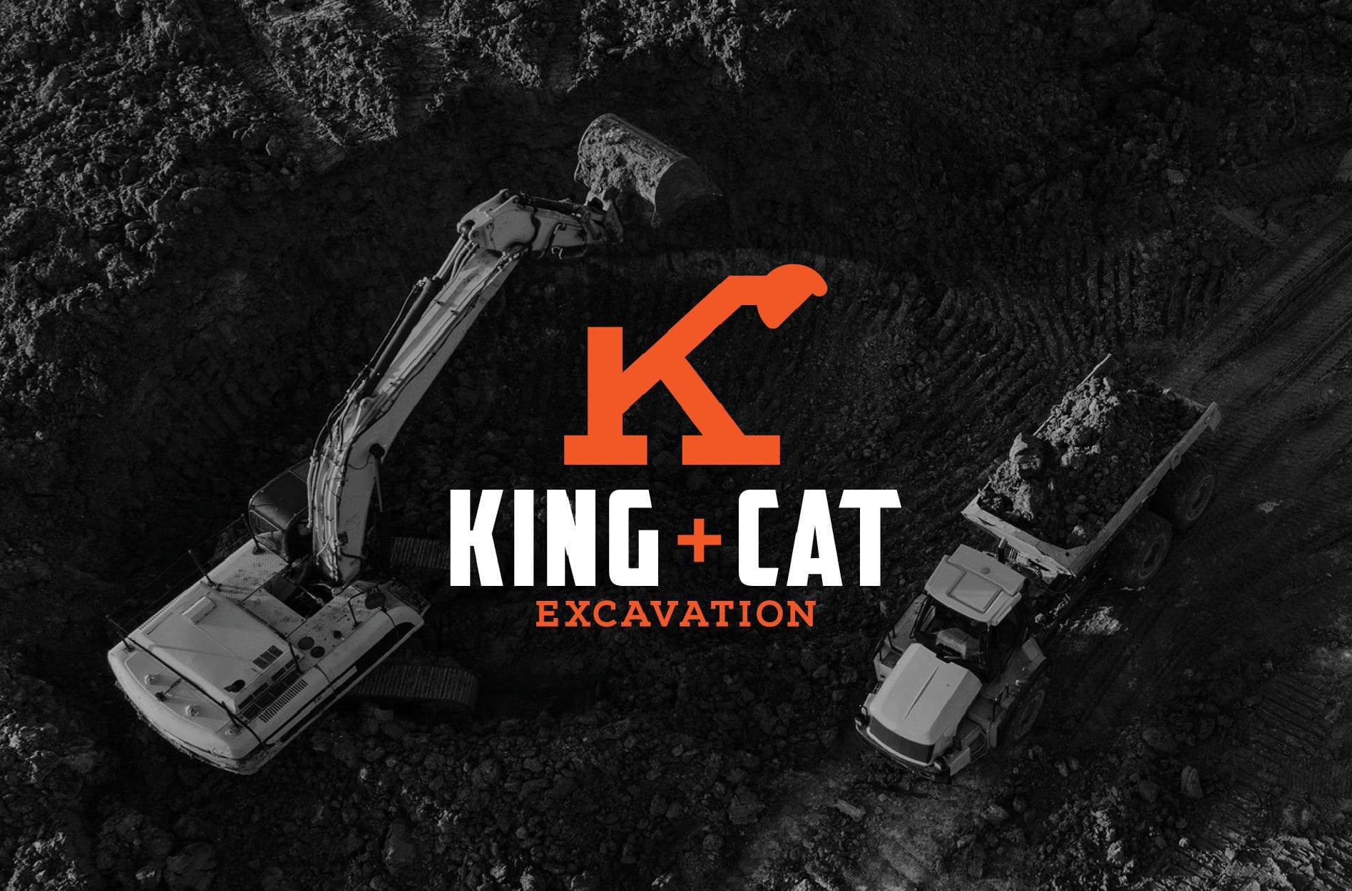
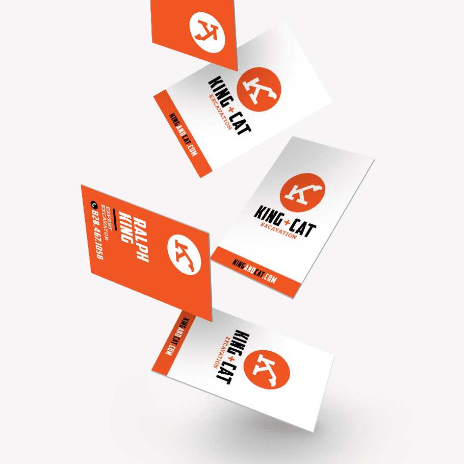
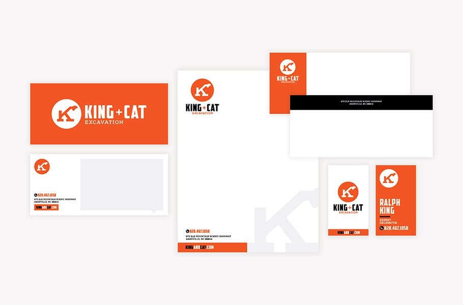
We then presented our best three options, paired with available domain names to our client for selection. Our client selected the name King + Cat from our short list, and we recommended that he consult with his attorney if he intended to trademark the name. In this business name, King refers to Ralph King, the business owner and the king of excavation and land clearing in Asheville, North Carolina. The term, Cat, refers to the Caterpillar Excavator that Ralph utilizes in his business to clear land.

With the name selected, we moved into bringing the name to life through logo design.

Construction Logo Design Direction Brainstorm

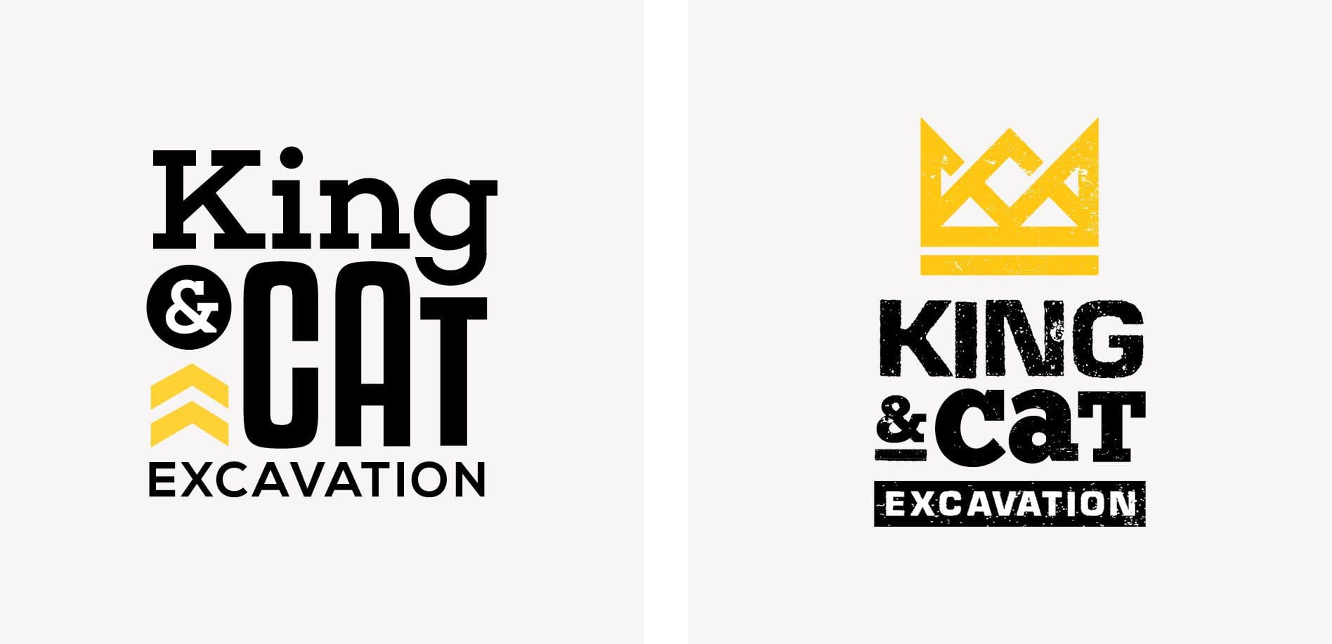
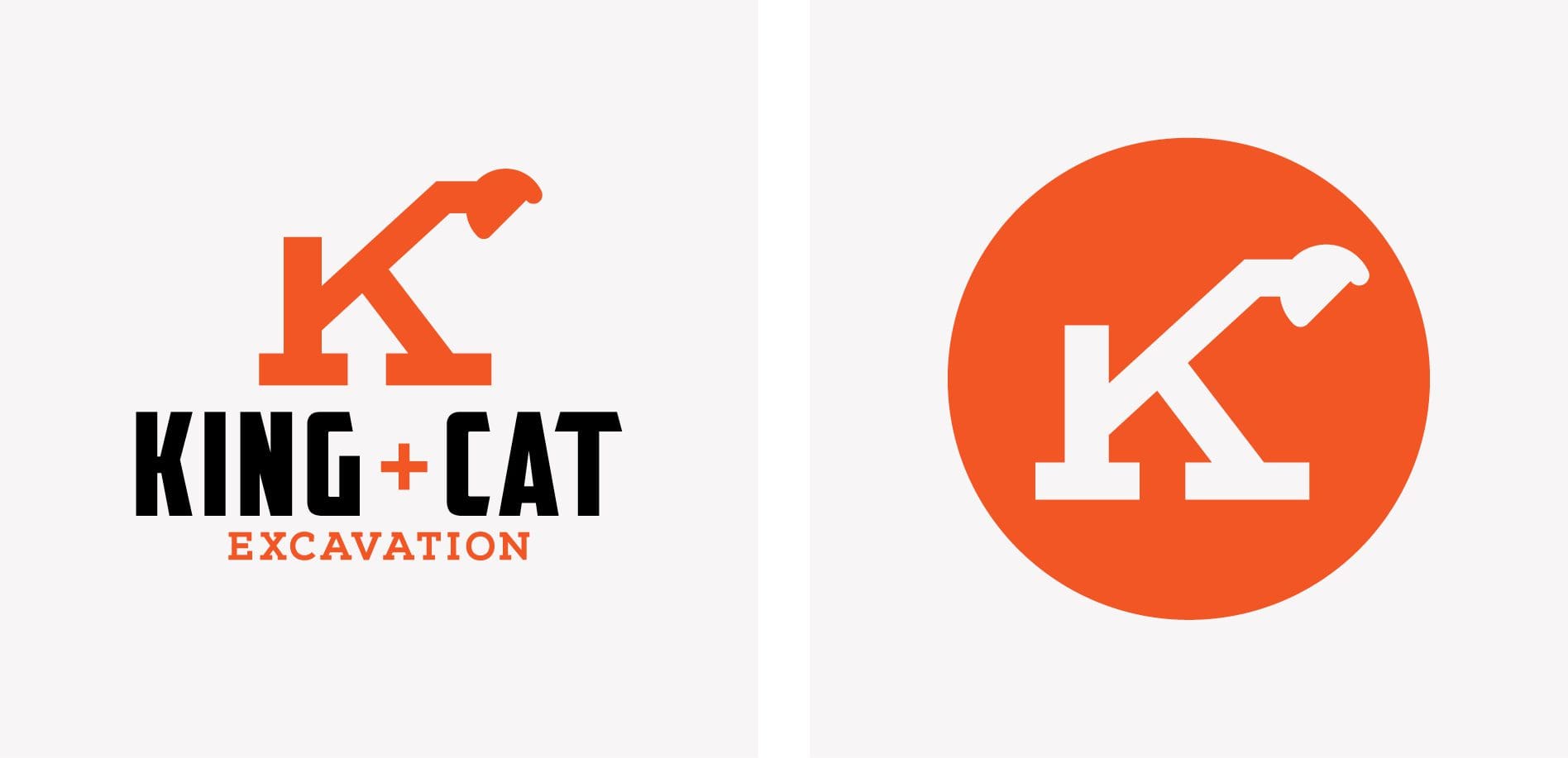
During our logo design direction brainstorm, each of our branding experts brings to the table concept ideas for the logo design portion of the project. For this project, we determined that we would utilize the type to convey the Ralph’s steady strength, while bringing some approachability in through the development of an icon that would communicate the nature of his business. We would play on the “King” name, as well as the construction element and the positive change that Ralph could bring to a piece of property.

construction logo design

Finalization of Logo Conceptualization

Our logo design team presented the ideas to our Creative Director and Director of Design who provided some initial feedback to guide the design process, and determined three concepts for digital development.

Construction Logo Design Options

Armed with the feedback and finalized logo direction, our logo design team set out to create three new logo options that would be presented to the client. The logo design process includes the pairing of fonts, selection of complementing brand colors, and the custom-design of new logo icons that can stand alone in application. As we work through the logo design process, we create several options that may not make the cut, and that’s alright. It’s all part of the creative process, and we are ruthless when determining which three logo options will best serve the client for the next 10 years or so. The final three are what we present to our client.

For King + Cat Excavation, the first option we created implemented a color palette that included a strong, bright orange, typically associated with the construction industry. The orange is balanced with a bold black, and woven throughout the icon and type. The logo icon for the first logo option was created from a capital letter K to correlate with the name of the construction company. The top ‘arm’ of the K forms the bucket of a Caterpillar construction machine, and the bottom of the letter is firmly grounded on supports.

The type for this first logo option is a clean, all-caps sans serif font that brings a modern, bold, and strong look to the new logo. Additionally, we paired the business name with the word, ‘excavation’ to ensure that all who encountered the construction logo would understand the nature of the business immediately. As brand awareness spreads, the client would have the option to utilize just the logo icon or to drop the tagline from the new logo if desired.

construction logo design

The second logo option was primarily typographic in nature, and the type would serve as the icon and the full logo. The logo design included a pairing of a classic serif font, with a more simple sans serif font and was balanced with an ampersand and decorative markings that indicated the tracks of the construction machine.

The final logo option implemented a yellow and black palette, also congruent with the construction industry. The logo icon for this option was comprised of a mountainous terrain woven together to create the symbol of a crown. This crown logo icon would provide a platform for conveying the ‘King’ name. Rough and more polished fonts were paired together to tell a story that was both strong and dirty, yet professional and trustworthy.

construction logo design

Presentation and Selection

Upon presentation, the client selected logo option one for its simple boldness and clean lines. This new construction logo would serve the business well both over images, on a white background, and as a stand alone brand icon.

construction business branding

Construction Logo Finalization

Once the construction logo was selected, our branding team finalized the new logo design by ensuring that all sizing and spacing was perfect. Additionally, our Director of Design selected exact color codes for the new logo, including PMS colors, CMYK colors, RGB colors, and hex codes.

Upon finalization, our design team created a complete set of logo files to pass off to the construction client. These included full color, black, and white files in PDF, EPS, JPEG, and PNG. We also prepared a logo guidelines sheet to help the client keep the new construction logo and brand intact.

construction business branding

Business Card

With a finalized logo in hand, we moved to implement the logo design on a new business card. Business cards and stationery design for construction company branding is an important part of the mix. Having a professionally designed business card, letterhead, and notecard allows a construction business to present itself as a professional and reliable resource. This can lead to the ability to attract better business and more of the company’s ideal customers or clients.

For King + Cat, we created business cards that implemented the bold orange brand color in a manner that’s extremely eye-catching and memorable. The logo icon took a prominent place in the design and the contact information was presented in a straightforward and easy to read format.

construction business card design

Stationery Package Development

Once the new business card was approved by our client, we shifted design powers to implement the new business card design into a custom letterhead, envelope, and notecard. The print-ready files for these pieces were provided to our client, and we coordinated print for the first order of the printed brand materials.

construction business stationery design

Website Sitemap Presentation

As we worked through the new construction logo design and stationery, we also began planning for the construction website project. For King + Cat, we presented the client with a simple website sitemap, outlining the website pages we would utilize to build the new construction website. In order to create this website sitemap, it’s important for us to have a firm understanding of the goals for the user of new website, and the journey the user must take to achieve those goals.

For King + Cat, we understood that as a one-man-band, Ralph King needed to ensure that his construction website could get his potential clients all the information they would need about his business. Since he would be in the field, he wouldn’t have time for lengthy sales calls or service explanations. So we created a simple, straightforward website that included a homepage that told the viewer what the construction company does and why it matters, a services page that breaks those construction services down in a bit more detail, and a contact page that makes it easy to get in touch with the King.

Website Hosting

Additionally, we sought to determine where the new construction website would be hosted. Typically, our clients keep the website hosting with us, as we host on the most robust platform for WordPress websites. We also handle monthly maintenance on the platform and plugins, as well as daily backups of the site in case a need for restoration arises.

For King + Cat, Ralph decided to have us host and maintain the website. One less thing for him to worry about as his time was primarily spent serving his clients.

The Website Wireframe

With the simple sitemap approved, our web design team moved into the wireframe phase of the website project. This is where the real magic happens. During this phase, we created a blueprint for the King + Cat website that would dictate where every element would live on the website. The wireframe is like the blueprint for a house. It shows us where things will be in relation to one another and gives us (and our clients) an opportunity to see the structure of the website before the design and development takes place.

For King + Cat, just like we do for our other website clients, we placed a priority on user-experience. It can be tempting to throw everything you know about your business into your website homepage. And no offense, but… who cares?! Seriously though, we took a user’s seat and thought through what a residential homeowner with lots of land would want upon encountering the King + Cat website.

With this knowledge, we created a one liner for the header and then consistently provided information upon scrolling through the website homepage. Calls to action to call the king or view the services were scattered throughout the construction website to nudge the viewer to action.

One thing to note is that through this process, we saw the business change a bit. When forced to decide what should be where on the website and to prioritize the user, the structure of the services themselves were honed in on by the business owner. This process is invaluable and really makes such a big impact on the business, outside of just the website project.

Once finalized internally, our web design team walks the client through the proposed website wireframes and after two rounds of revisions, if necessary, the construction branding project moves into the website design phase.

construction website development

Website Design

Based on the final approved wireframe, we then worked to implement the bold new brand into the website through web design techniques. Our website design team created the design for key pages, utilizing fonts, colors, and textures that aligned with the newly developed construction brand. Additionally, imagery of Ralph himself was used in the design to convey trustworthiness and approachability.

Finally, we allocated space on the website homepage for a drone video to instantly communicate to the viewer the exact service provided by King + Cat. This also provides an opportunity to tell the viewer about the scope of services — residential jobs handled by one man and one machine. The design of these key pages were presented to the client for approval, before making their way into web development.

construction website design

Website Development

If the website wireframes are where the magic happens, the website development phase is where we do the heavy lifting. Here, we work to bring the website design to life, pixel for pixel. The finished product is a new website that’s provided to the client on a staging link to review before we take it live on the domain. For King + Cat, we presented a fully responsive, custom WordPress website that aligned with the brand and told the story of Ralph King and his Caterpillar machine. But more importantly, the new construction website told potential clients what they could expect from working with Ralph and how his services would improve their lives (and land!).

construction website design

Website Launch

As the construction branding project came to completion, our internal team underwent extensive testing on the new construction website. We launched the approved website on the domain and did a thorough pre and post-launch closeout on the new website. This entailed reviewing every part of every page against the design, and testing each and every button, link, and form for functionality and aesthetic appeal.

Construction Branding Project Closeout

To closeout the construction branding project as a whole, we provided our client with his new logo files, print files for stationery, and a back up of his new website for safe-keeping. We also equipped the client with a simple video that showed him how to update key content on his website himself.

Ready for a Nice Brand?

Creating a new brand for a construction company is something we hold near and dear. We have proven the impact that a professional perception of your business can have on allowing you to make strides in attracting your ideal clients and growing your business.

If you’re interested in working with the queens of branding, contact us today. We’d love for your business to be our next brand.

are you ready to create something nice?