
Keith Williams approached us for new Nashville business branding. Keith Williams + Associates provides an invaluable resource to Critical Access Hospitals in the form of audits and strategies to minimize over and under payments on Medicare and Medicaid cost reports.
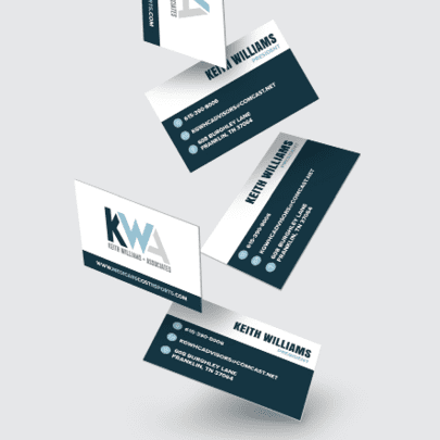
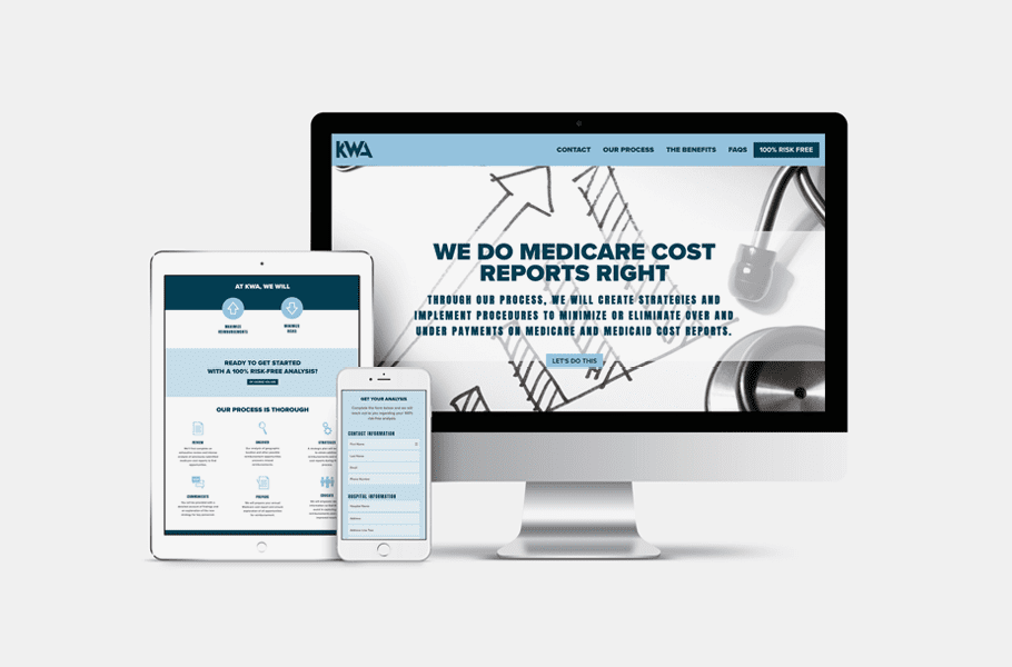
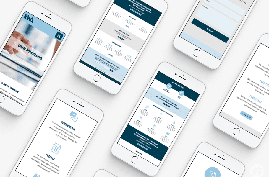
To build the Keith Williams + Associates brand, we bundled our services for a custom-designed logo, matching business card, and WordPress website.
Logo Development
To create the KWA logo, we started by talking through the ins and outs of the business with Keith. It was essential that we understood who his clients were and what he was offering them. We needed to know the unique value Keith would provide to determine how to position him through his branding.
We then had Keith fill out a logo questionnaire that detailed what he wanted to see in his logo, what he didn’t want to see in the logo, and where the logo would be most used in application, among other things.
Keith’s main goals were to communicate that he was experienced, affordable, and trustworthy to his core audience of C-Suite executives at hospitals. To convey this, we created five options that we presented to Keith. Most of the options included the initials, KWA.
Each of the logos created provided a bold, strong, smart approach which paralleled with the needs of Keith’s potential clients. This look also allowed for quick recognition of the logo and would create an easy association between the initials KWA and the brand.
The final version presented included an icon centered around a K with up and down arrows incorporated. This look provided an icon-style approach, rather than an ‘initial’ or acronym approach. The upward and downward facing arrows in the icon were indicative of the increased reimbursement and decreased risk that the brand would become synonymous with.
We honed in on the colors green, blue and gray on these options. The color green represents growth and prosperity. The blue represents loyalty, reliability, trust, and wisdom all of which are necessary elements of the KWA brand. The combination of these colors, along with the soft gray balancing neutral is a solid combination that will carry the brand through multiple mediums in the years to come.
The final logo selected is a memorable, recognizable design that shows his initials woven together. We used a blue and white color palette to convey honesty and professionalism, and a bold font to draw the viewer in and separate Keith from the competition.


