Gyro Republic

greek-restaurant-branding

Our team worked on a restaurant branding project to build a bold brand for a new Texas-based Gyro restaurant, later to be named Gyro Republic. The goal of the new restaurant brand was to create a fast-casual concept that could be quickly turned into franchises across the country.

greek restaurant brand design

Greek Restaurant Branding Kickoff

To start Gyro Republic’s restaurant branding project, we obtained the plans for the restaurant and goals for the project. We compiled what we learned from our conversations with the client and his responses to our Creative Questionnaire and shared them with our creative team during an internal kickoff meeting.

Our client had a name for the restaurant already picked out. But, after some consultation, he decided to engage in our restaurant naming process in order to ensure the brand’s success. So, naming was added on to the Elite Restaurant Branding Project, and our project management team started setting a schedule.

The name and visual direction would serve as the basis for the creation of all other brand elements.

Then, we would develop the logo design and environmental branding, menu design, business card and stationery design, take-out bag design, cup design, and T-shirt design.

While restaurant brand support was being created, we would work on website wireframing, website design, and website development.

The mission of the new restaurant was to bring street-food-inspired, halal, and Greek-style flavors made with fresh ingredients to customers.

The restaurant would be a build-your-own-meal concept, similar to Chipotle. Customers would be empowered to choose their base, protein, toppings, and sauce. All options complement one another, so customers could trust that the entire meal would be delicious.

Restaurant Naming

Our team then came together for a naming session.

Each individual took what they learned about the restaurant and independently researched fast-casual market trends, halal-inspired restaurant trends and available domain names.

Everyone then brought their findings to the table, and we began to eliminate options that wouldn’t be strong enough to be the first word in the brand’s story. The remaining names were strong options backed by reason and research that we would present to the client.

The names we presented were “Gyro Republic,” “Greek Street Grill,” and “The Lucky Lamb.”

Gyro Republic pairs the word ‘“gyro” with “republic,” a nod to the traditional name of the Greek region that the food comes from: the Hellenic Republic. On its own, the word “republic” means a government in which supreme power resides in a body of citizens. This aligns well with the build-your-own concept where people have the power to choose ingredients and customize their meal.

Greek Street Grill combines the alliteration of the words “Greek” and “grill” with the similar sounding words “Greek” and “street” to create a name that rolls off the tongue. We believed that the descriptive and memorable name would resonate with the target market.

The Lucky Lamb is a tongue-in-cheek reference to the most unlucky party in the creation of a gyro: the lamb. The name personifies the lamb in order to create a distinctive brand. The lamb would take on its own personality and would be brought to life throughout the brand.
greek restaurant naming agency

Following the presentation, our client selected the name Gyro Republic.

He liked that the word “Republic” highlighted the personal experience of choosing your meal, which would make the restaurant stand out.

Additionally, the word “Republic” conjures empowering feelings. It paints a picture of people. The picture is one of collaboration, political change, and choice. An apt description for this brand.

Brand Direction

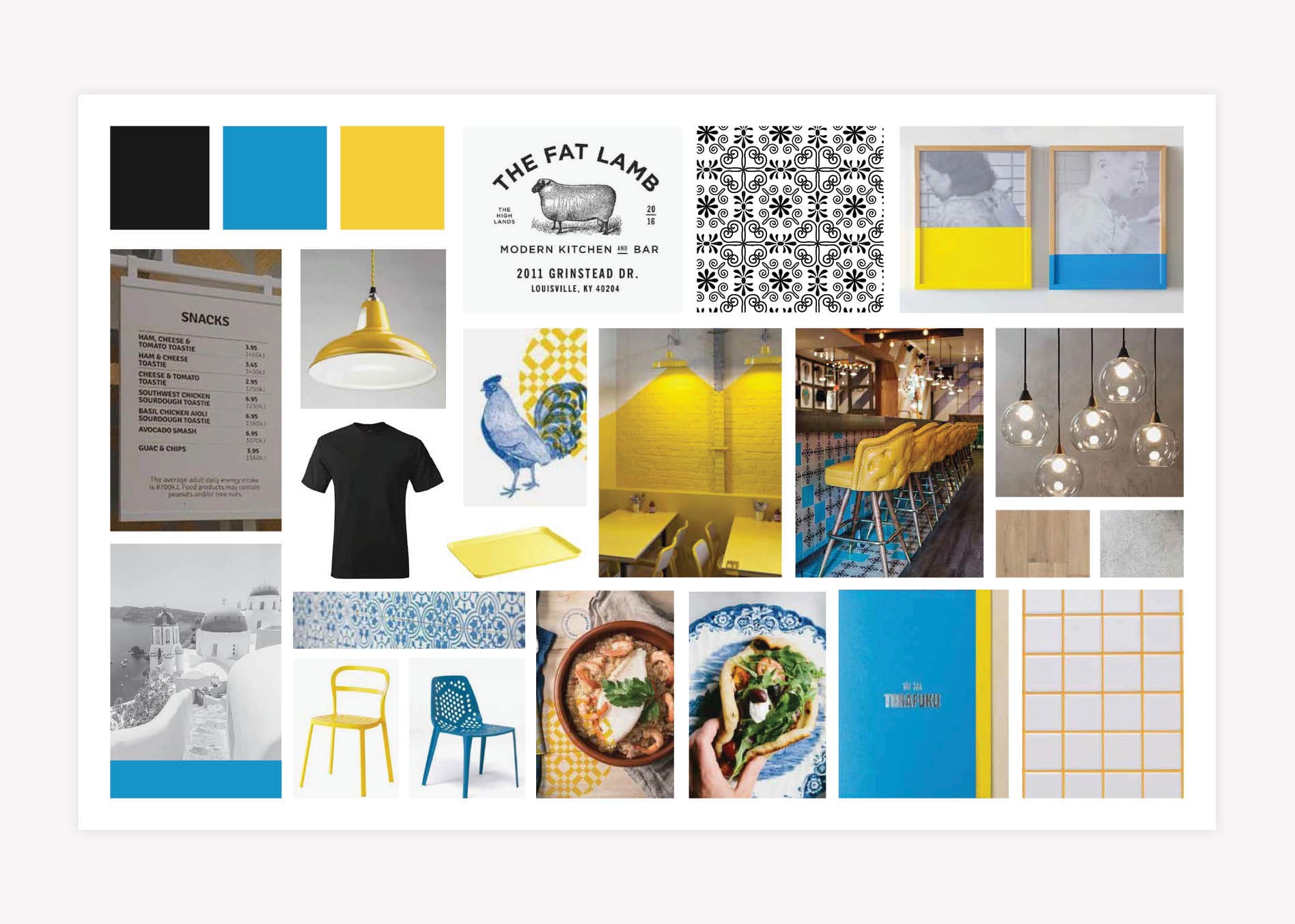
To develop the visual brand direction, our designers put together three unique brand boards that would represent the overall visual of the brand. Each brand board offered a fresh take on the brand’s meaning.

The first option had simple black and white patterns and graphics. It provided a modern twist on the traditional Greek colors of blue and yellow by altering their hues to communicate freshness and vibrancy. The pairing of the simplistic black and white graphics with pops of colors created compelling visual interest. Concrete and brick materials were used throughout the brand board to ground the colors used in the brand.
The second brand board evoked the history of Greece through the use of line drawings. It portrayed a modern, clean, and simple vibe with wood tones and floods of a soft, welcoming mint color. Under this brand direction, the brand would be supported by clean, geometric patterns and have hints of wood and craft paper to give a comforting, relaxed tone.

We took a more elegant approach with the third option. It put a modern spin on the classic Greek visuals. We pulled in a more traditional Greek blue with classic gold and marble accents, and then used modern fonts and finishes to update the aesthetic. The logo would be a seal-style mark like traditional bistro graphics.

Following the presentation, our client chose the first visual direction, and we got to work building the brand.

greek restaurant brand direction

Logo Design Brainstorm

Next, we moved into logo development. A restaurant’s logo will be featured on almost all materials. So, it needs to be a strong symbol that aligns with the restaurant’s narrative and position in the market.

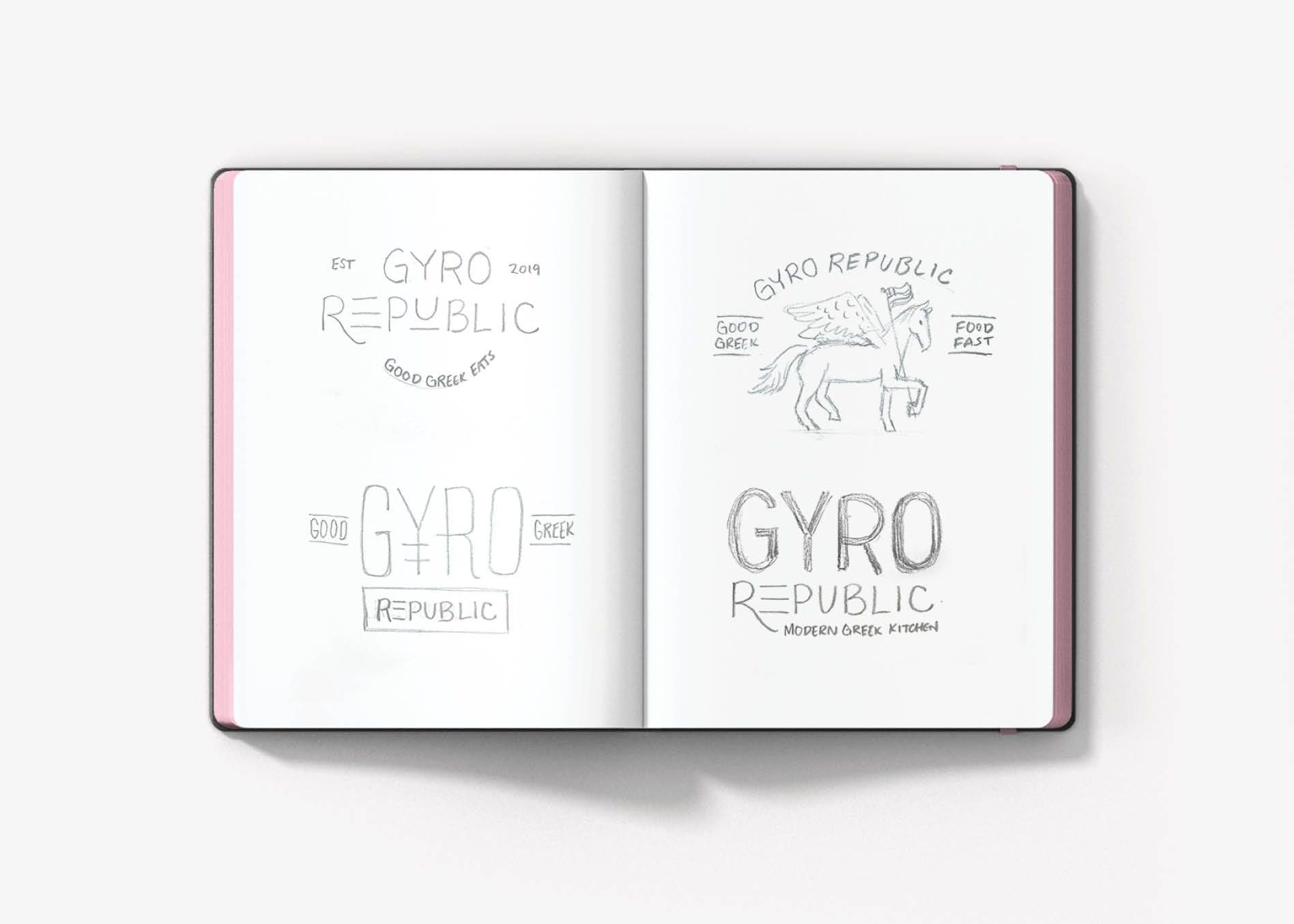
Our design team came together to sketch out ideas while we discussed the design strategy and brand story. After creating numerous sketches for the Gyro Republic logo, our brand designer presented them to our Creative Director and Director of Design.

greek restaurant branding

Finalization of Conceptualization

During this phase of our Greek restaurant branding project, our design leaders evaluate the sketches to determine which aligns closest with the overall brand direction. They ensure that the concepts are original, typographically sound, and compelling enough to help carry the brand.
After our design leaders selected the three strongest concepts, the logos were developed digitally to present to the client.

Greek Restaurant Branding Logo Design

The first logo design option featured a stylized “Y” and a tall, thin font. This typography created an elevated look that referenced the Greek alphabet. Additionally, the shape of the “Y” cleverly resembles the spit traditionally used to cook gyro meat.

The second logo was based on the concept of the Greek mythical winged horse, Pegasus. Pegasus ultimately is a symbolism of power, freedom, innate talent, abilities or gifts, the gift of voice, the gift of speech, and chance and opportunities. We thought this aligned perfectly with the meaning behind Gyro Republic. In this logo design, Pegasus carried the Greek flag to further convey the idea of freedom and power.

restaurant logo design

The third logo featured a modern, slightly rounded sans serif font that made the brand feel approachable. The customization of the logo typography resulted in a unique and eye-catching design.

In this logo, the letters have meaning. The stylized “R” was used to draw the eye throughout the logo, and provide a stylized approach to what could otherwise be a nondescript font face. The “E” mimics the lines in the Greek flag and creates a feeling of repetition from the E to the U that pulls the eye across the design. The “U” is underscored to emphasize the customer’s power of choice at the restaurant. The logo design includes a simple tagline that tells people exactly what to expect: Modern Greek Kitchen.

greek restaurant logo design

Presentation and Selection

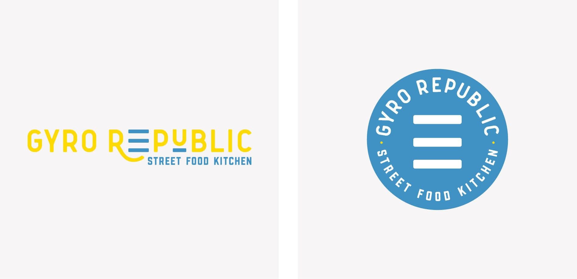
Following our presentation, our client chose the third option. He was drawn to the custom logotype and felt that the design would be a good representation of the brand. The new logo was presented in variations of color that could be implemented in an array of applications.
A seal-style icon was developed to complete the suite. It implemented the three lines from the “E” in the full logo. This logo icon was strategically created to stand out, primarily on labels and as a social media profile image.

greek restaurant logo design

Logo Revisions

Upon selection, our client requested that we adjust the tagline. He had determined that the final restaurant menu would consist of Greek street food and halal-style dishes. So, we replaced “Modern Greek Kitchen” with “Street Food Kitchen” in the logo design.

The adjusted design was presented to the client for approval before moving into finalization.

Logo Finalization

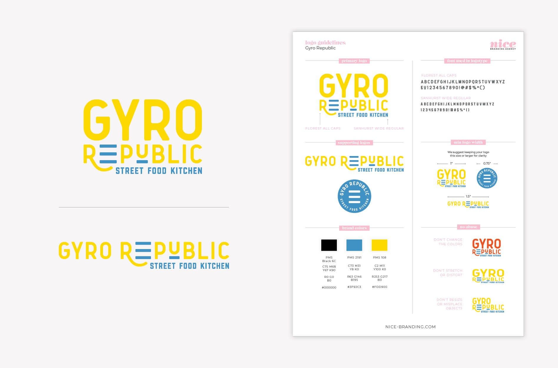
Our Director of Design carefully reviewed the design to perfect the logotype and spacing before our design team moved into creating final logo files. The final logo files were created in black, white, and full color, in all of the necessary file types.

Logo guidelines were created to note the brand colors and fonts, and to communicate key do’s and don’ts in terms of utilizing the logo design.

gyro republic logo design

Greek Restaurant Interior Branding

Next, we began working on environmental branding for the restaurant space.

Our goal is to utilize the physical space to create an experience. We seek to create an experience that tells a story, so everyone who walks through the door feels the brand through everything they see, hear, and touch.

Our client provided us with a floorplan to reference for the interior of Gyro Republic. Using it as a guide, we pinpointed the customer journey through the restaurant, from the front door to the ordering counter to seating and more. Based on the customer journey, we implemented interior design strategies to weave the brand through each and every touchpoint.

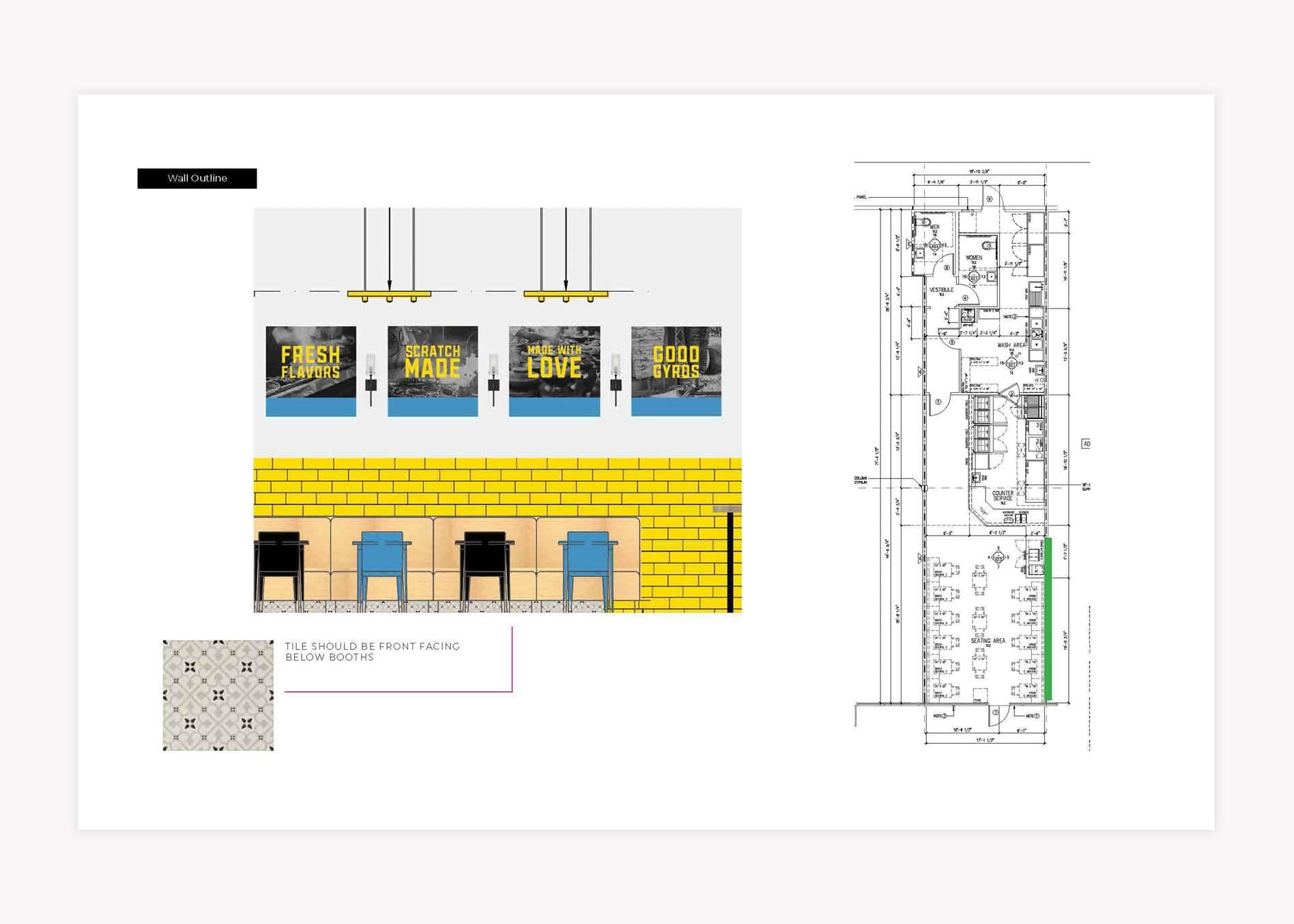
We determined that bench seating would run the length of the restaurant. The space was long and narrow, so while the bench seating was eye-catching, it was also a functional element of the environment. The final seating selections would include a combination of oak wood booths, wooden tables, and a front-of-house window bar top for additional seating.

The use of wood for the tabletops would bring in a natural feel and a casual vibe while keeping the restaurant looking fresh and polished.


restaurant interior design

We recommended that the chairs be a mix of the brand colors and styles to highlight the variety and eclectic nature of the brand.
This variety aligns with the overall visual direction for the restaurant and serves as a nod to the build-your-own-meal concept.

Yellow subway tile would be laid above the booths, along with oversized black and white street-style food photography on one wall. The other wall would feature a large, custom mural.

greek restaurant interior design

We recommended polished concrete for the flooring. Hand-painted yellow floor graphics on the concrete floor would direct customers up to the point-of-purchase and double as a photo op.

restaurant environmental brand design

We chose black and white Mediterranean-style tile for the riser at the point-of-purchase counter. The counter extended throughout the customer journey, starting with the ordering spot, moving through the topping selection station, and ending at the point-of-purchase. The focal tile would allow us to further direct the customer journey by drawing their eyes directly to the back of the restaurant where you order.

Blue subway tile was selected for the wall behind the counter. The blue would bring in another brand color to balance the use of yellow throughout and convey a sense of playful brightness that aligns with the overall visual direction for the brand. The inclusion of a large flood of color ensured that the black and white pattern of the tile remained an accent and not a primary brand element in the space.
Gyro Republic - branding interior design

In an effort to create a lasting connection with the customer, we make a point to not overlook any square foot of the restaurant environment.

Branding Package Add-On: Custom Mural Design

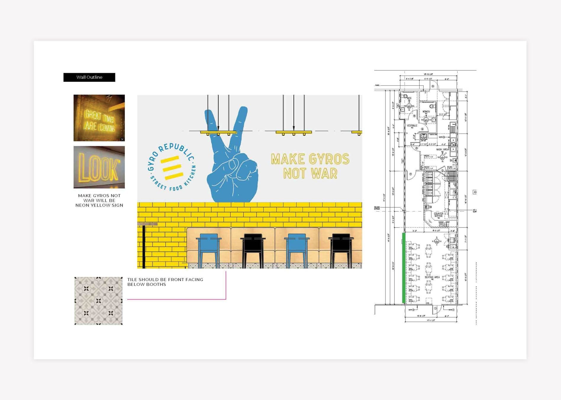
Our client purchased an Hour Pack for the design of two custom wall murals, as an add-on to this branding package. The murals would serve as focal points and provide an opportunity for customers to immerse themselves in the brand story. Restaurant mural design is also strategically implemented to inspire people to photograph key messaging and brand elements, and share the photos on social media.

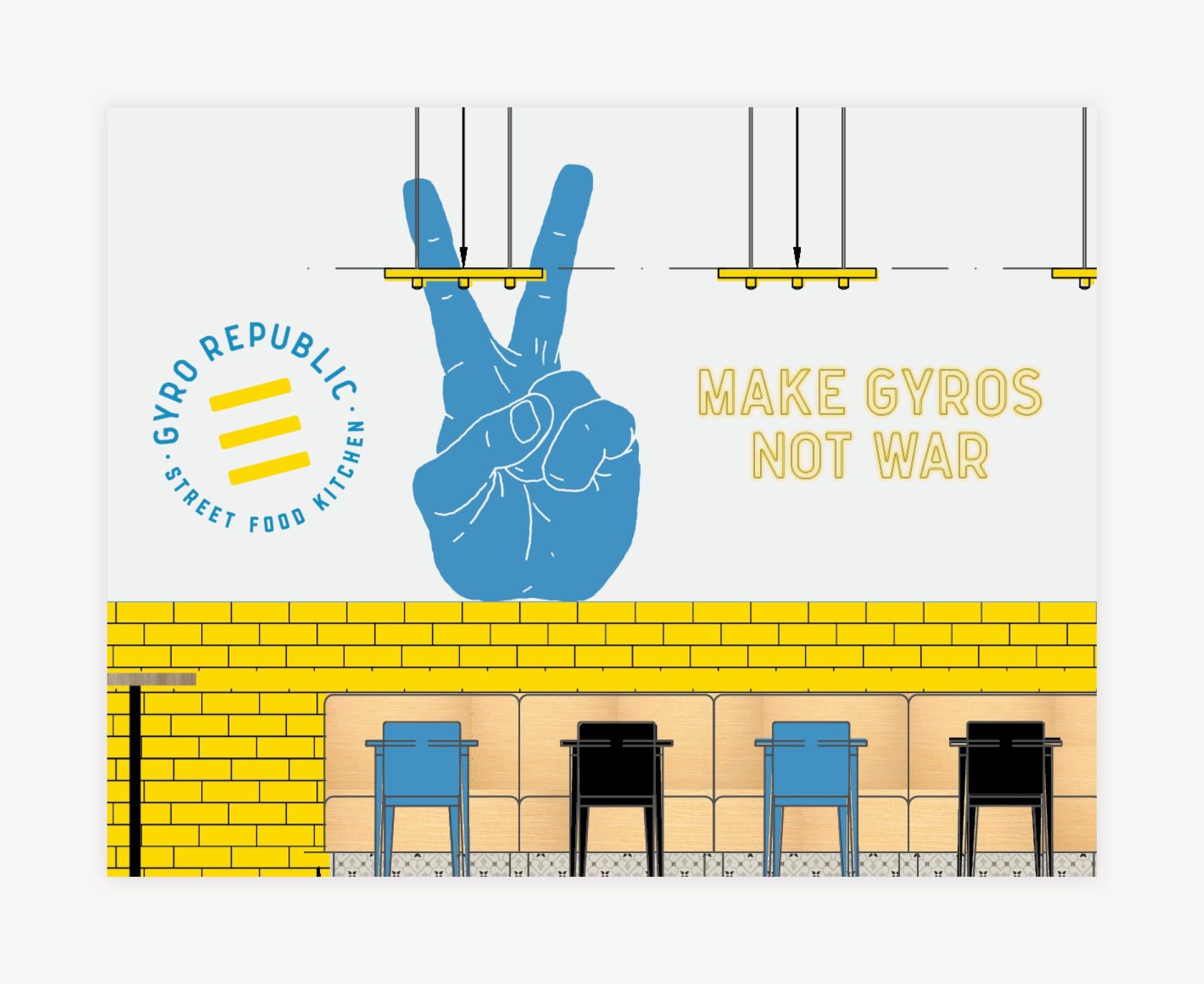
The main mural featured a mix of line art, solid oversized illustrations, and custom brand messaging that voiced the meaning behind Gyro Republic. The positioning of the mural near the order counter enabled customers to read about the brand’s differentiators and snap a picture while standing in line.

custom mural design

The second mural was located along the left side of the restaurant, over the booth seating for easy viewing.

restaurant mural design

The open-concept mural featured a neon sign that read “Make Gyros, Not War,” paired with an oversized, illustrated peace sign in the brand colors. The location of the mural and the placement of the custom neon sign made this piece visible from the exterior, drawing attention of passersby.

Menu + Menu Board Design

The menu sets the tone for all of the printed restaurant materials.

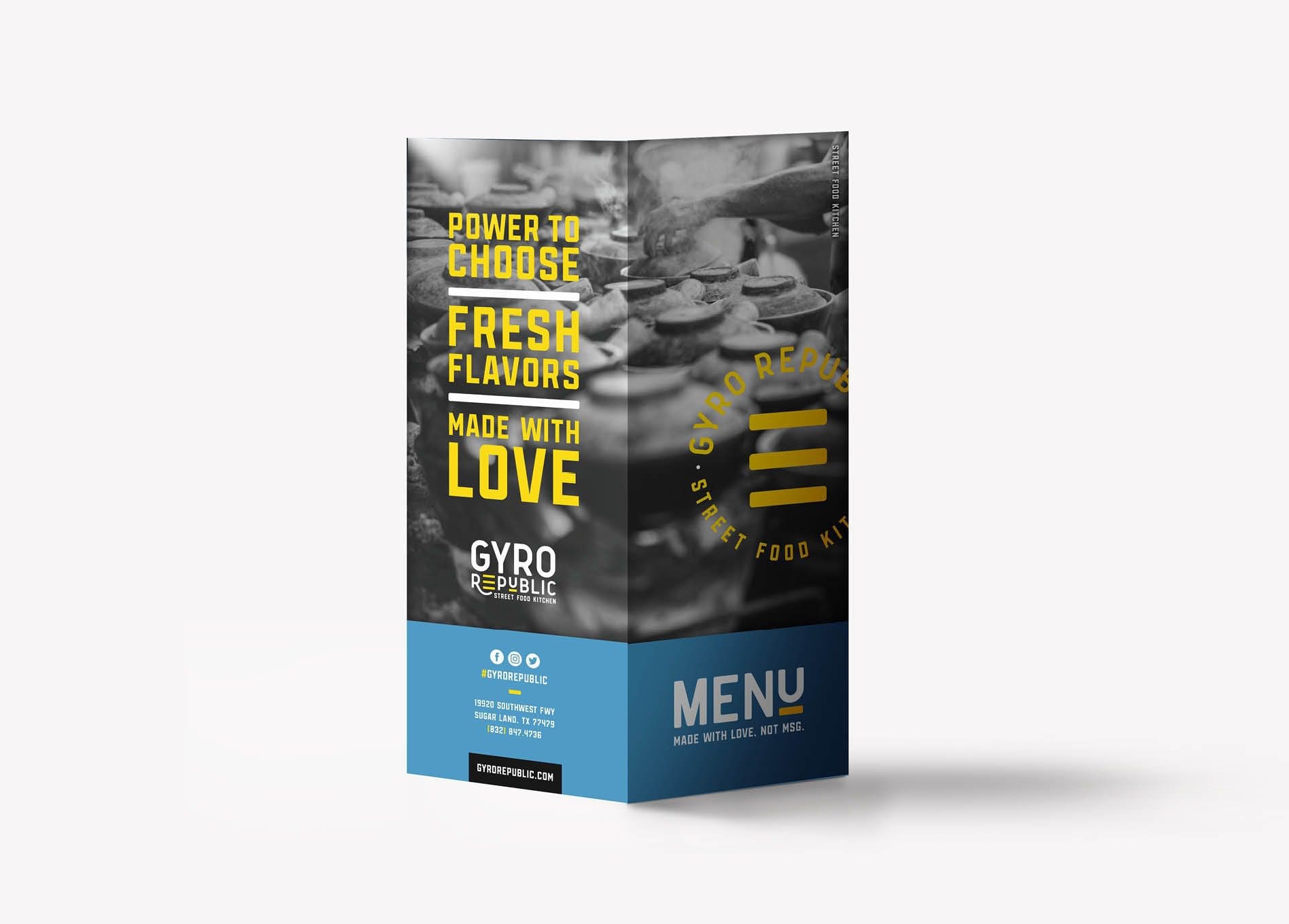
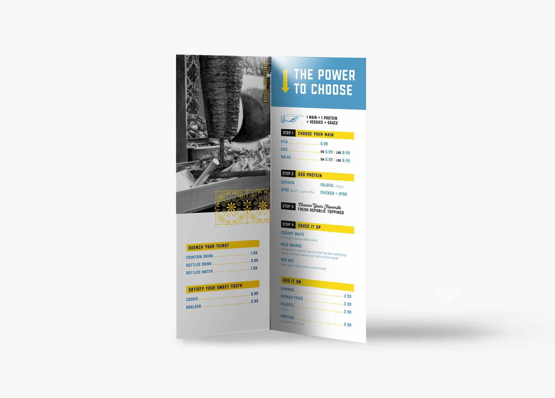
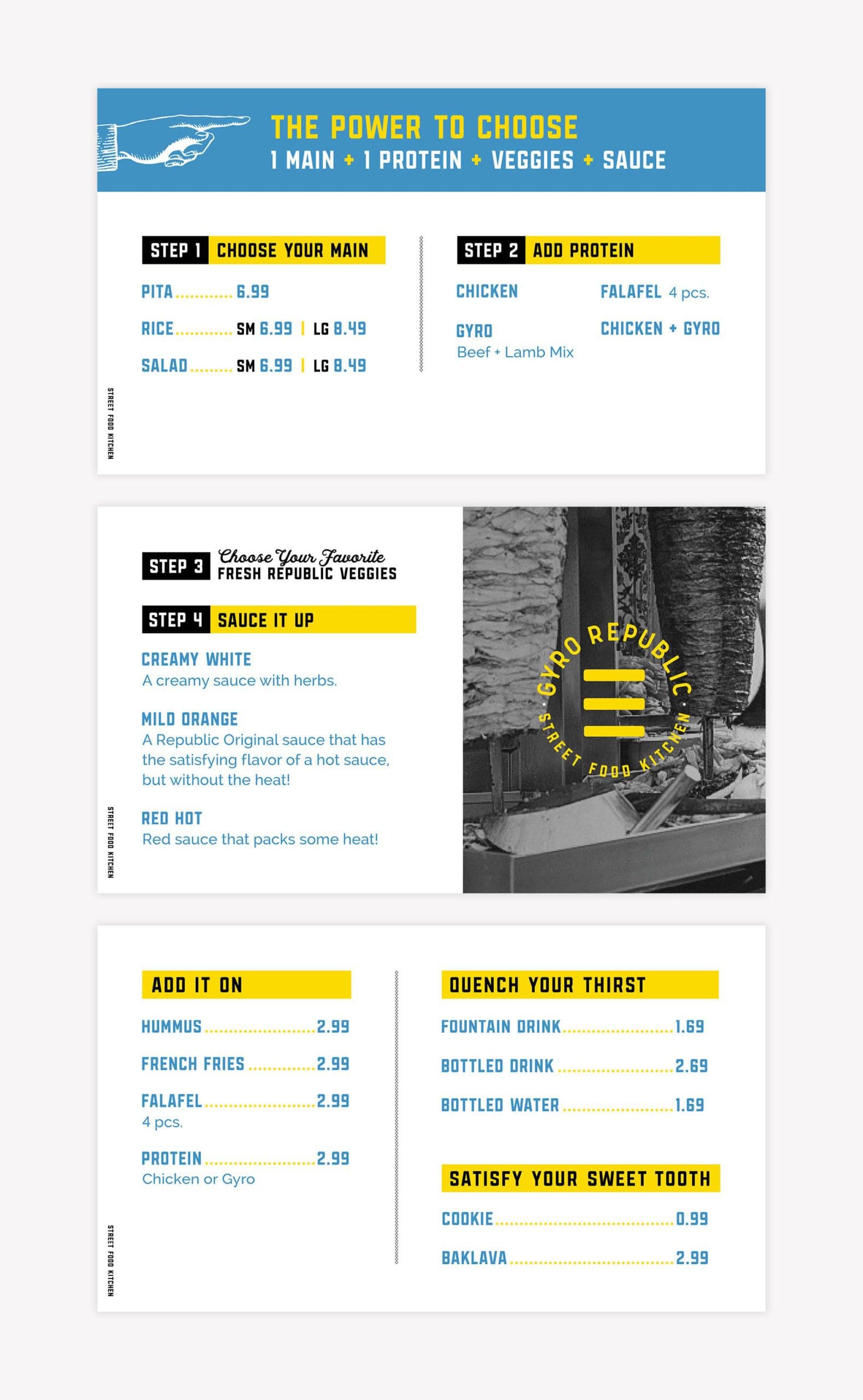
When it came time to design a menu for this Greek restaurant branding project, we took a strategic approach. Given Gyro Republic’s “build-your-own” style of ordering, we wanted to create a visually uncomplicated menu that would make ordering a no-brainer.

For a fast-casual restaurant, ordering has to be streamlined and efficient to avoid a backup at the point-of-purchase. The menu must be easy to navigate in order to keep things moving. We created easy-to-follow steps with verbiage emphasizing the customer’s power to choose, bringing in the brand voice and helping to explain the process.

greek restaurant menu design
restaurant menu graphic design

We consulted on the sizing, construction, and materials for the menu boards as well. Our client chose to use digital menu boards as a cost-effective option for easy updates. So, we created the graphics for the digital menu boards and sketched them within the space to provide our client with a reference point for installation.

restaurant menu board design
greek restaurant branding

Restaurant Branding: Business Card

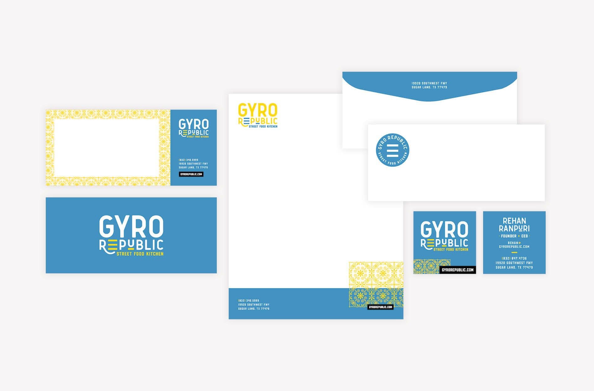
We developed the business cards next to equip managers and operators with professional, branded collateral for outreach. We designed and presented three business card options as part of our Greek restaurant branding project.

They feature the logo and brand fonts on a flood of blue, punctuated by a pattern that also serves as an accent throughout the restaurant brand support.

greek restaurant branding business card design

Stationery Package Development

Once we settled on the final business card design, we created a corresponding letterhead, envelope, and notecard design.

Our team is available to coordinate printing for all printed materials, including stationery, menus, and more for our clients. This service ensures that the final product aligns with our vision.

Gyro Republic - restaurant branding package design

Greek Restaurant Branding Materials

Designs for cups, to-go bags, window clings, and attire are included in our Elite Restaurant Branding Package to ensure that the restaurant brand permeates every available touchpoint.

To-go materials and delivery-experience branding are often overlooked elements of brand support. However, it is the delivery experience that immerses the customer in your brand, even when dining at home. Consider this: When a customer dines at home, they are not impacted by your environmental branding or your trained team. When take-out is ordered, your delivery experience bears almost all of the responsibility of communicating your brand and making you memorable—aside from the food, of course.

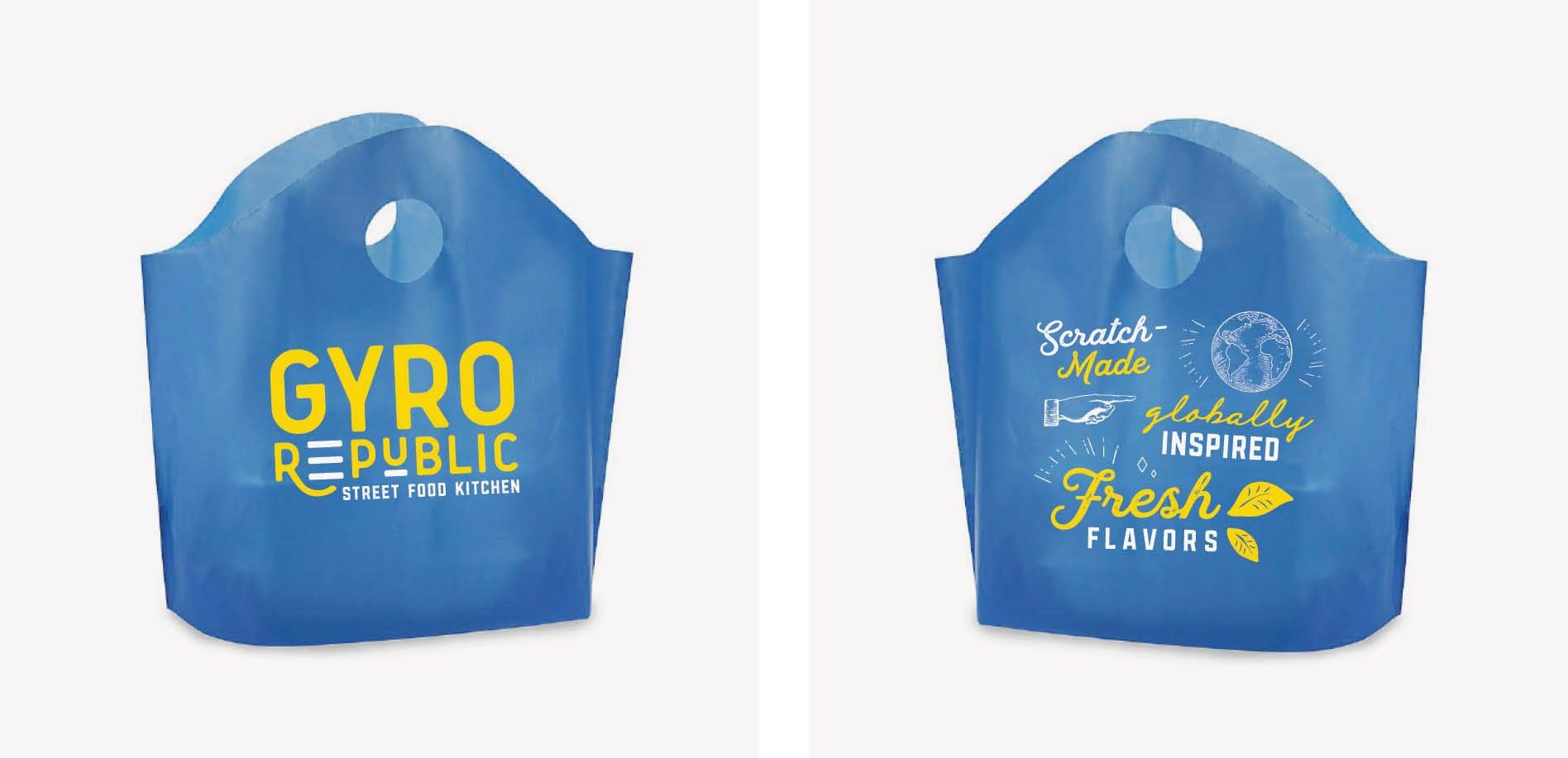
For Gyro Republic, we created to-go designs that would deliver the brand into the hands of every customer, every time. We custom-designed and custom-printed the take-out bags to include the logo on one side and elements from the in-store mural on the other. These elements would convey key messaging and differentiate the Greek restaurant from competitors.

greek restaurant branding

Restaurant cups are often photographed and posted on social media, so we make sure they are a key player in supporting marketing efforts. Gyro Republic’s cups featured a flood of blue, accented by yellow and punctuated by a brand pattern. The brand’s hashtag and social icons were placed on the cup to encourage engagement.

greek restaurant branding

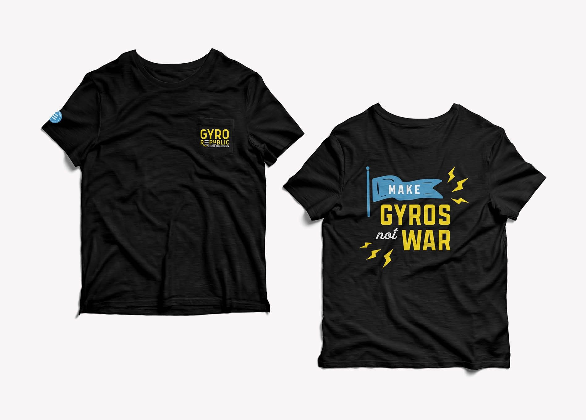
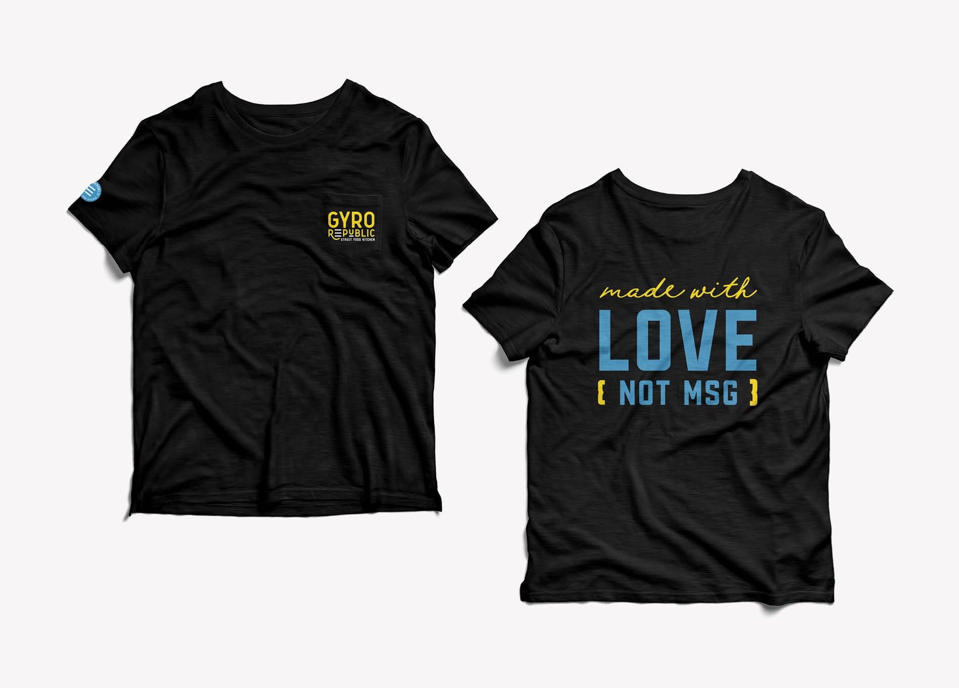
Employee attire is another often-missed restaurant branding opportunity. Your employees are living billboards for your brand. That’s why we include the design for a staff T-shirt in our Elite Restaurant Branding Package. For Gyro Republic, we designed shirts and hats that reflect the brand’s aesthetic and messaging.

Gyro Republic - restaurant branding
restaurant tshirt graphic design
restaurant hat design

Lastly, we designed custom window graphics to brand the exterior of the Greek restaurant space while under construction. Our goal was to create graphics that would generate a buzz about what’s coming, but that could also be left on the windows after the grand opening. We also designed door graphics to communicate contact info and hours of operation.

window graphics

Sitemap Presentation + Website Hosting

Our website designers created a strategy and design for the Gyro Republic website that would align with the brand messaging and visual direction.

First, we make a list of the required website pages for the sitemap. Gyro Republic needed a one-page website, so the outlined list focused on the information that was necessary to include.

At this juncture, we discussed hosting and website maintenance. We offer both and encourage our clients to use us to host the websites we design and develop for them. We partner with a robust WordPress hosting platform that ensures minimal website downtime, consistent updates, daily backups, and optimal page load speeds. As part of hosting with us, we also provide monthly maintenance on the site and the site plugins to ensure the site has proper functionality at all times.

Website Wireframe

After receiving approval for the sitemap, our website design team started working on the wireframe.

This is when we really focus on the user experience. We strategically map out how the user will find what they are looking for easily. Specifically, we organize the menus and map out the location of text, images, buttons, headers, and more.

For Gyro Republic’s website, we created a hierarchy to present the necessary information, starting with the most important things that users would be looking for, at the top of the page. As the user scrolls down the website page, they will continually be fed supporting information and led to their intended actions.

We developed headlines and call-to-action copy for the wireframe in order to demonstrate how the website would convey the brand’s story and motivate customers to take action.

Finally, our team presented the wireframe to the client. Once approved, we moved into the website design phase.


restaurant website design

Greek Restaurant Branding: Website Design

During the website design phase, we start to see the greek restaurant brand come to life outside the walls of the physical space.

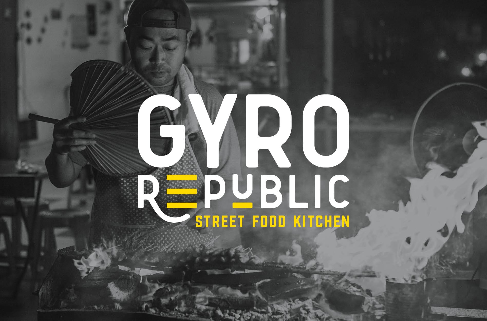
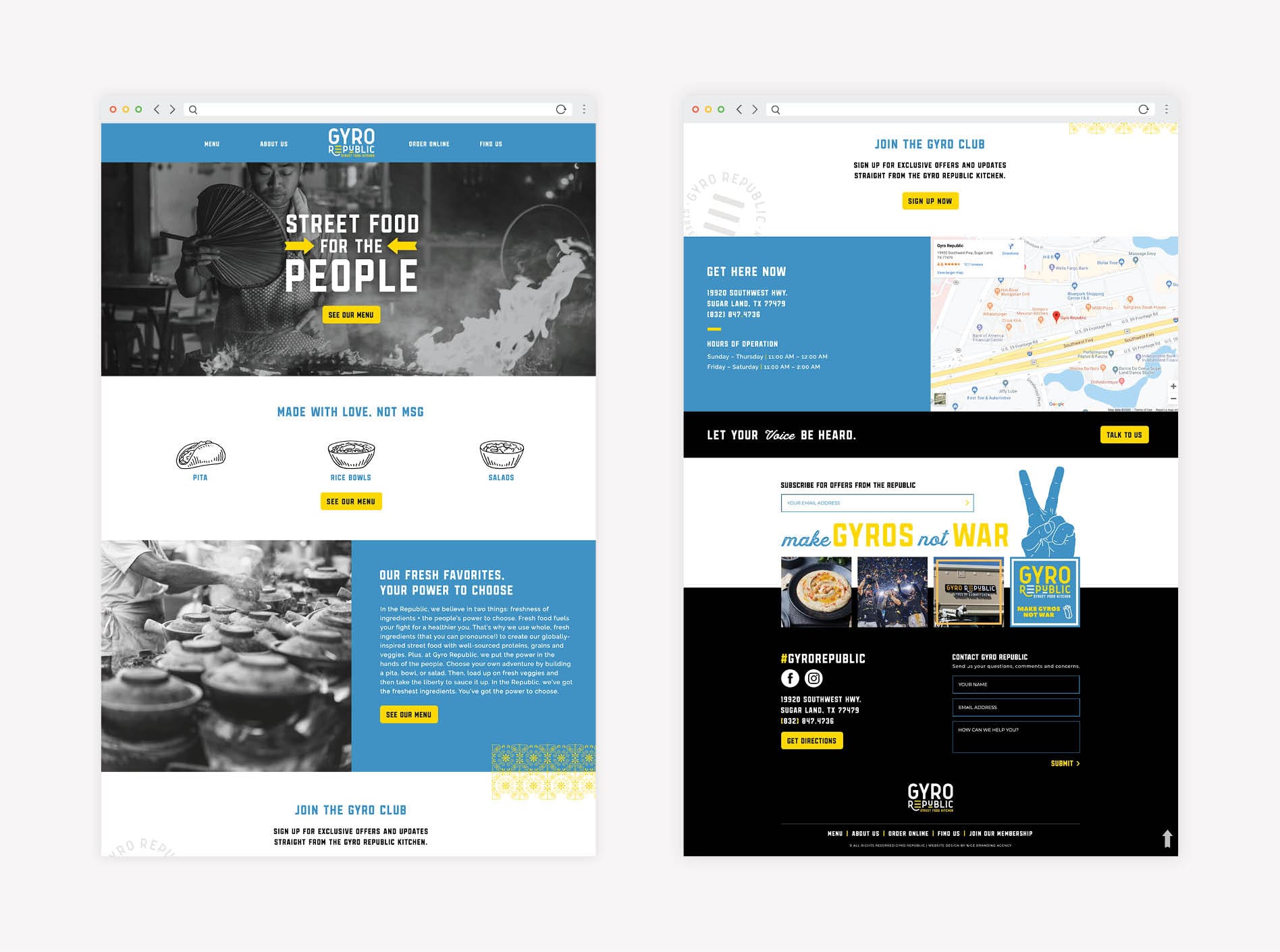
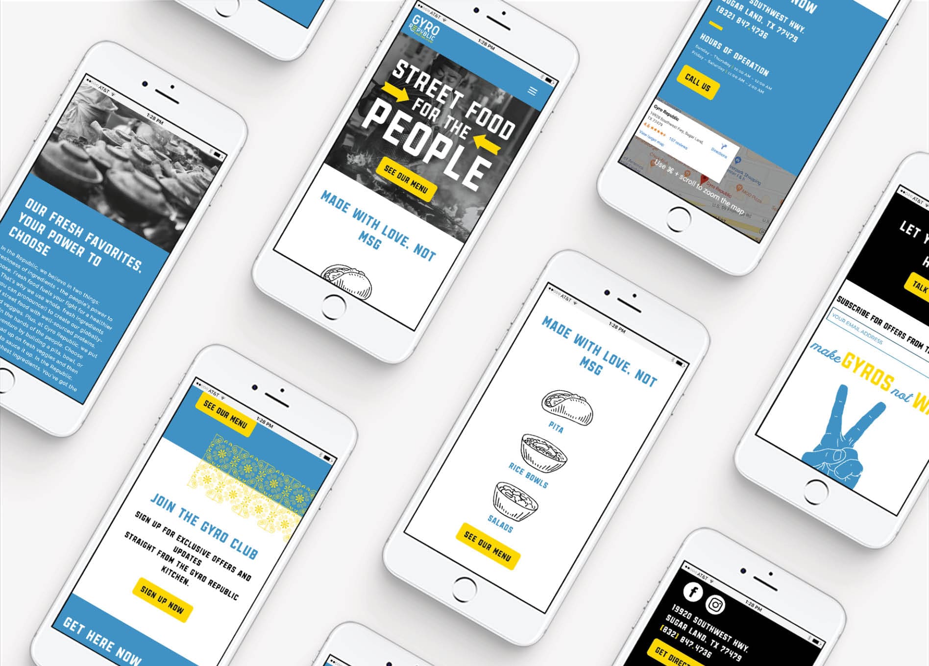
We match the design of the website to the overall brand direction and brand support. The “Street Food for the People” concept is front and center on the website via a large black and white header image.

Floods of blue with pops of yellow and brand patterns draw the eye to key messaging.

We pulled in imagery that reflects the visual direction of the brand and highlights the relation of street food to the concept. The design of the menu on the website mirrored the design of the printed restaurant menu.

With the target market in mind, we worked the Instagram feed into the website’s footer to encourage engagement and provide customers with a real-life glimpse into the restaurant’s interior and menu items. We implemented elements of the restaurant mural to highlight this section of the website and tie in the brand.

Once we received approval from the client, we moved into the website development phase of the branding project.


restaurant website design

Content Development

Our copywriters created content in the approved brand voice to fill the website pages and support the headlines and calls-to-action.

For Gyro Republic’s website, the messaging had to be approachable, memorable and playful. All content echoed the key pillars of the brand, including: fresh flavors, clean ingredients, globally inspired. By repeating these pillars throughout the brand assets, we create a lasting connection for the consumer.

Website Development

After the design was finalized, we developed the website to match.

Once development was complete, we deployed the website to a staged link and meticulously tested all buttons and forms. Our team also reviewed all pages against the design to confirm that all elements appeared as intended.

Nice Branding Agency utilizes the WordPress platform to build and host websites because it allows for custom functionality. WordPress provides the flexibility necessary to develop a versatile site that provides an optimal experience both on desktop and on mobile devices. It’s also easy to update, which allows our clients to make content updates as needed.

Website Launch

With final approval from the client, we launched Gyro Republic’s new website on the client’s domain.

As soon as the site goes live, we work through another comprehensive round of testing to ensure functionality and usability.


restaurant website development
restaurant-website-design

Greek Restaurant Branding Project Closeout

After all payments were taken care of, we provided our client with the final logo files and a supporting logo guidelines sheet. Additionally, he received final files for the stationery package and the restaurant materials. We sent over a backup of the new website, along with a training video for updating key content on the website.

The Greek restaurant branding project for Gyro Republic was a huge success. The community flocked to the restaurant and interacted with the newly created brand in a positive way. Social media channels are flooded with customer-generated photos that celebrate the brand.

If you need a new or refreshed brand, contact us today.

Follow us on Instagram for more branding project recaps and expert tips.

are you ready to create something nice?