ES Global

global logo rebrand

ES Global was operating under a brand that didn’t reflect the professionalism and scale of work that the company was known for. Nice Branding Agency was retained to elevate the perception of the ES Global brand by creating a fresh, new aesthetic, deployed via a logo, website, and stationery package. This rebranding project enhanced the reputation of the company and aligned ES Global’s visual identity, brand voice, and web presence into an effective, international brand.

Project Kickoff

Nice Branding Agency of Nashville, Tennessee was engaged to complete the ES Global rebrand project and charged with a goal to connect cultures and compel partners to take action.

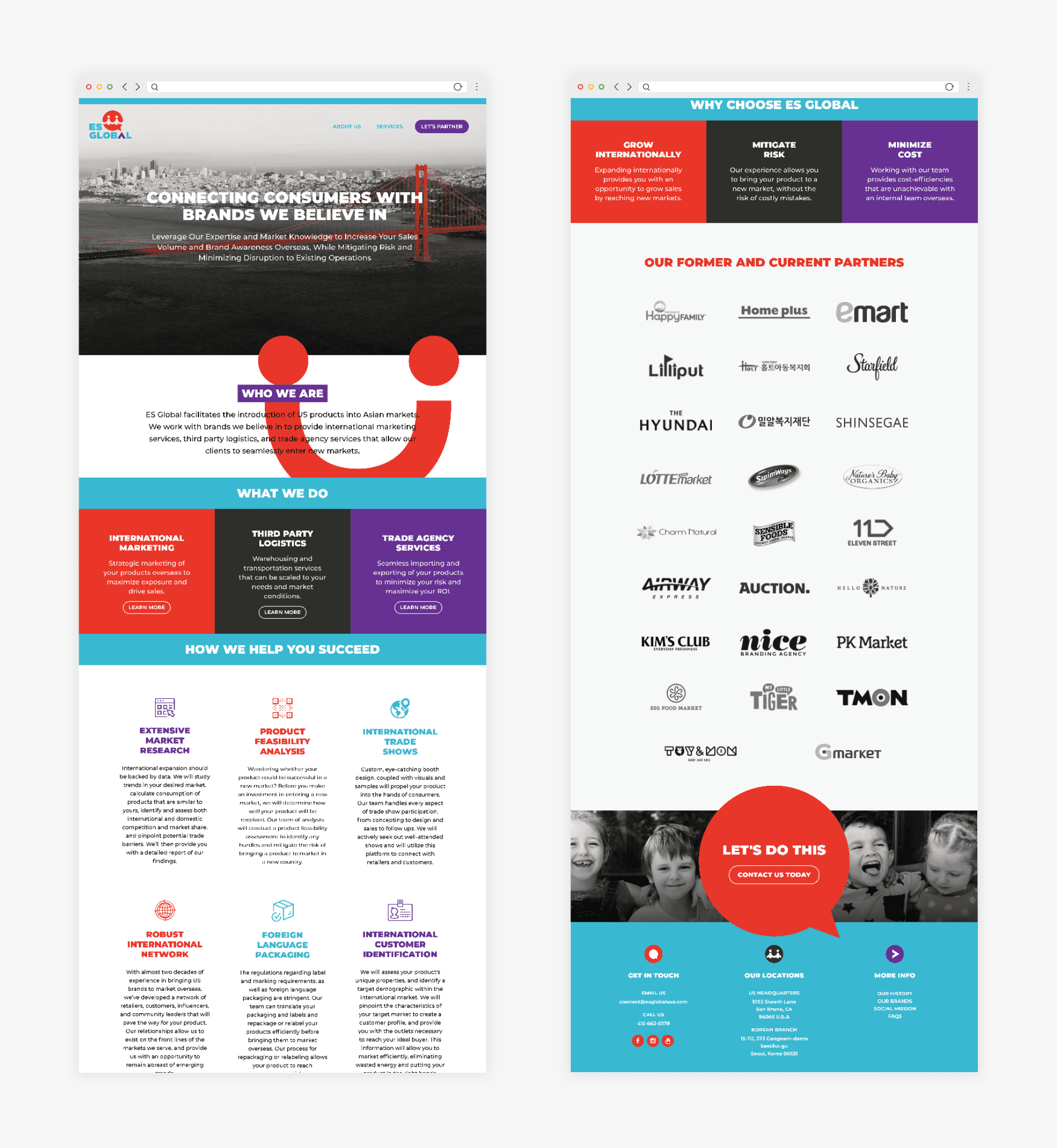
In 2004, ES Global founder Jinae Kang created a company that would bring happy, healthy products from the US into happy, healthy homes in Asia, specifically, into Korea. Basically, ES Global serves as the liaison between US brands and Korean vendors to get American products placed into Korean retail establishments. ES Global has a ton of connections and partners with dozens of big US brands, including Happy Family Organics, SwimWays, and UGG, bringing them into Asia, often as the exclusive distributor that connects the markets.

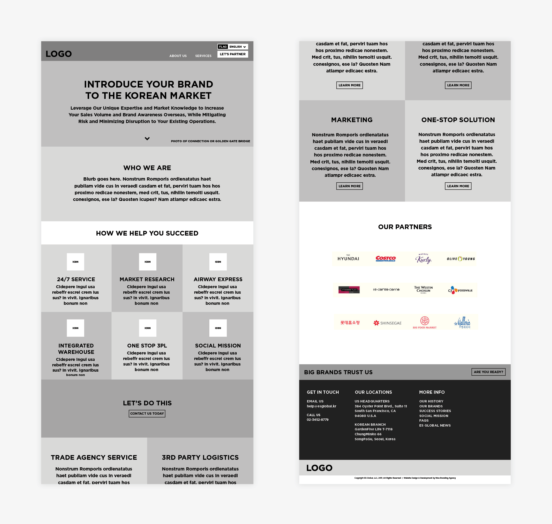
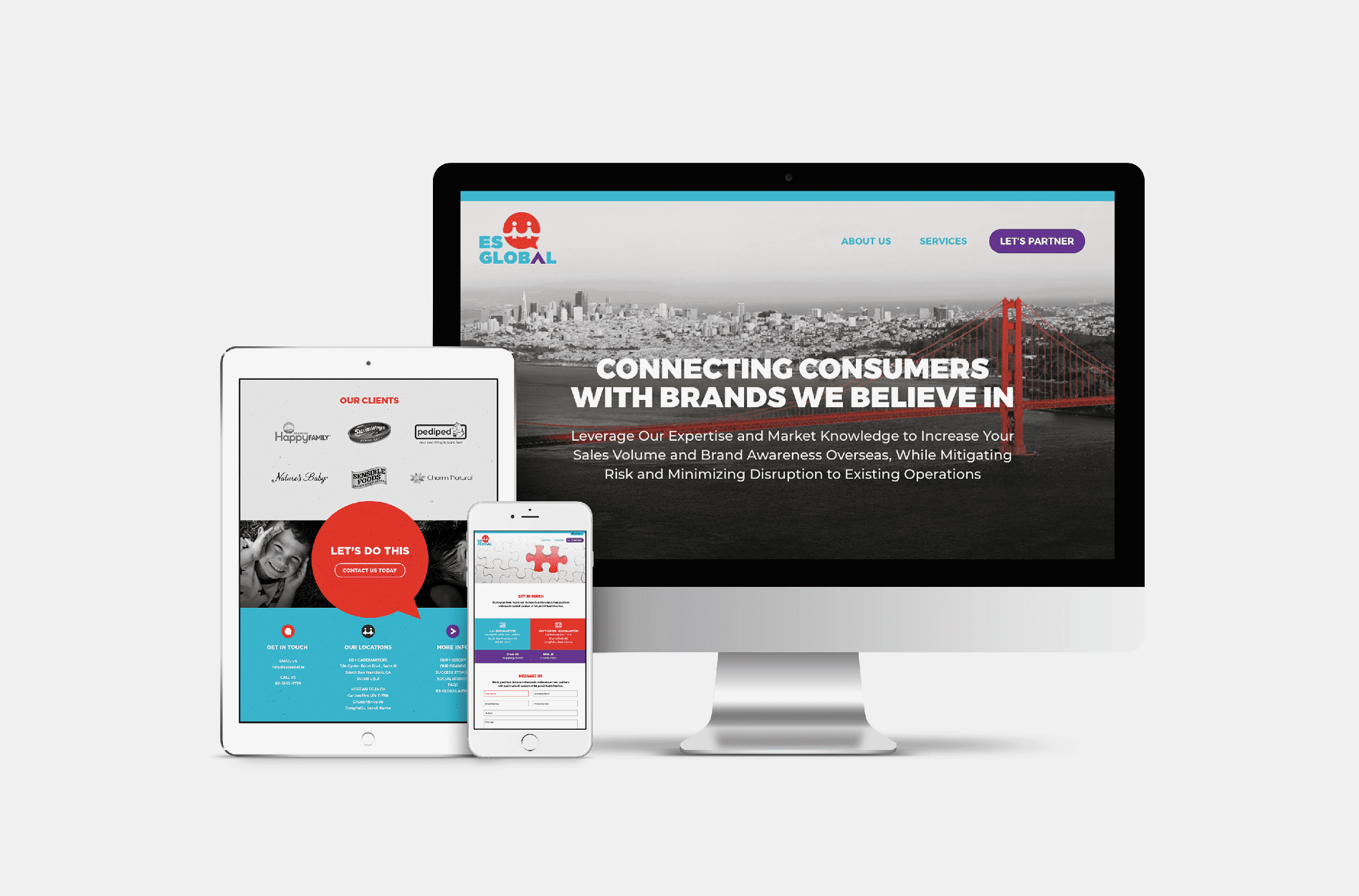
When ES Global approached Nice Branding Agency, their current brand identity wasn’t drawing the interest that the company deserved. Their website had many goals to achieve, but the user experience wasn’t effectively carrying the viewer through the content of the website, engaging them or compelling them to take action. The ES Global rebrand was a necessity.

After examining the existing brand collateral, and talking with our client about her goals for the business and the challenges she was facing, we determined that ES Global was in need of a new brand identity. Their brand would need to function both domestically and overseas, explaining the complex international business in a way that would resonate in both markets and grow with the company as it continued to expand.

Logo Design Direction Brainstorm

Following the ES Global rebranding project kickoff, our team reviewed the creative questionnaire to glean information about the business. Understanding the business from clicking through the existing website was a feat, and we really had to put on our thinking caps to have a firm grasp on what the company does and what value it provides.

We understood that ES Global coordinated the supply of family-friendly products from the US to retail stores in South Korea. After strategizing on the position, we determined that their biggest value was in their ability to communicate and manage the supply chain. This provided value both to the manufacturers who wanted their products in stores abroad, and the retail stores in South Korea who wanted their shelf space filled.

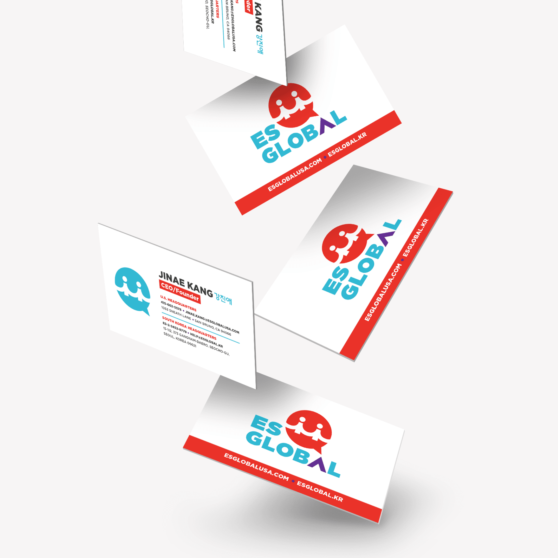
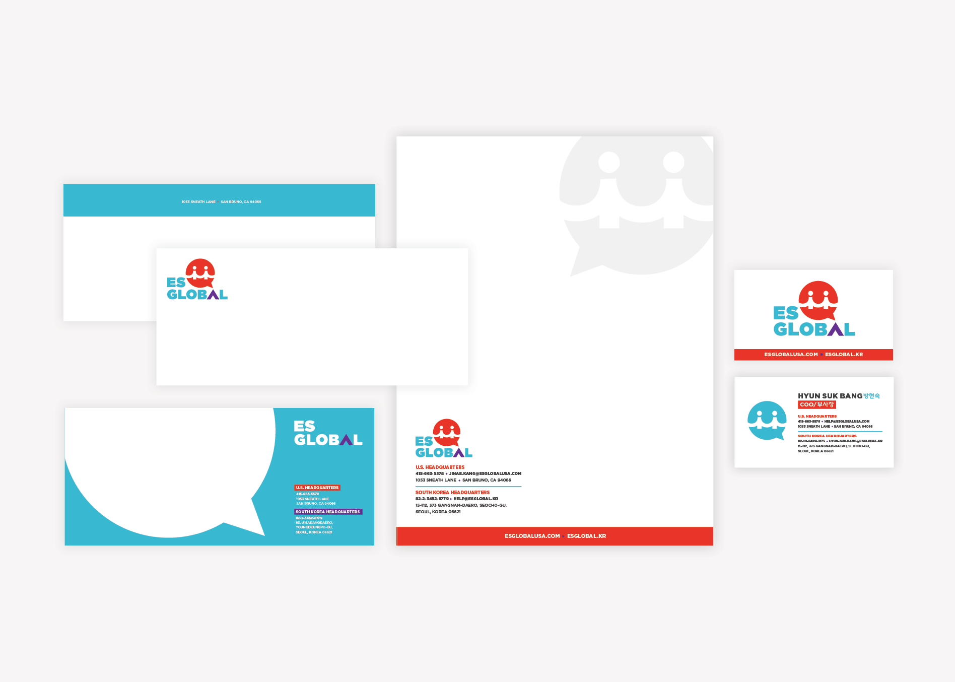
The design concepts that would inform the logo process and the global rebrand were centered on the value of communication, connecting markets, and dealing in international trade.

global logo sketches

Finalization of Logo Conceptualization

The options were presented to our Director of Design and Creative Director for consideration. The design leaders provided input that deepened the meaning of the concepts and identified three concepts for digital development for the ES Global rebrand.

Logo Design

With finalized logo direction in hand, our branding team got to work creating digital versions of the new logo concepts.

To create the first logo option, we developed an icon inspired by San Francisco’s Golden Gate Bridge, where the ES Global headquarters are located. We used the bridge illustration as a platform for some additional hidden symbols; a smiley face, representing positivity and happiness, and two people holding hands, representing the joining of the two markets. We seamlessly tied this into a speech bubble that denotes the importance of communication in the ES Global process. A carat symbol is used in place of the letter A to indicate both directional and upward movement, as well as growth.

By utilizing bright colors, we emphasized the happy, family-friendly feel of ES Global products.

international logo graphic design

The second logo option we created took on a sense of movement to convey the quickness with which ES Global was able to bring US products to market in Asian retail establishments. The icon was comprised of the acronym ESG formed into a circular shape that’s indicative of a power button.

The third and final logo option we developed is one that aligns well with the import/export industry. The logo icon takes the shape of a globe, while directional arrows indicate the movement of both imports and exports. A clean and bold font was incorporated here to maintain a friendly, but professional aesthetic. And the A in the word “global” took on the look of an upward-facing arrow to indicate the positive change an organization could expect when working with ES Global.

global logo design options

Presentation and Selection

We presented the new logo options to our client, and they selected the logo that included the option based on the Golden Gate Bridge and the concept of connection and communication. The brand mark had significant meaning, and would align well with their culture and values.

international logo icon development

Logo Finalization

The selected logo was sent back through our Director of Design for polishing. Here, the new logo was inspected to ensure that every element was perfectly spaced and aligned. Also, exact logo colors were selected in PMS, CMYK, RGB, and hex codes. Finally, we created brand guidelines to indicate proper usage of the new logo, fonts, and color codes for future reference.

global logo guidelines

Business Card

The next step in the ES Global rebrand project was to design a business card for ES Global that would stand out when company representatives attended networking events with future partners. At these events, hundreds of business cards would be exchanged, so ES Global needed a business card that would be able to make a statement.

To accomplish this, our graphic design team created a couple of different options that could attract both US brands to partner with them and also Korean vendors to give them shelf space overseas.

The business card we proposed featured a die cut of the new ES Global logo, with PMS colored edges and a thick, coated stock. This card incorporated both English and Korean contact information to be useful in both markets.

global business card design

Stationery Package Development

Based on the new business card design, we created a business stationery package that included a letterhead, notecard, and envelope. The notecard and letterhead would both fit in the no. 10 envelope, providing an operational efficiency and cost savings. Additionally, we provided our client with a digital version of the selected letterhead for use.

global stationery design

Website Sitemap Presentation

We started the website project with the creation of a sitemap for the new website. To determine what pages we would need on the website, we assessed the existing website and the client’s goals. The site map for the website noted the website pages we would include and the hierarchy of the website pages.

Website Hosting

Additionally, at this juncture, we reviewed our website hosting package with our client. We host our websites on the best platform for WordPress sites in the industry. We ensure fast page load speeds and daily backups. Additionally, our web design team completes monthly maintenance and monitoring on the platform and plugins.

The ES Global team decided to allow us to host the website. This would make for an efficient go-live day, and would allow us to keep the site secure and functioning well.

The Website Wireframe

We created website wireframes and a website strategy to improve the ES Global user experience online. The wireframe strategy was immensely valuable to ES Global as an organization. By mapping out the user experience on the website prior to web design or web development, we were able to bring clarity to the process of working with the company, better define what the company offered its clients, and firm up the company’s position in the market.

We also addressed calls to action, and developed a system for engaging the user over and over until they took the intended action.

Mapping out each page of the website through website wireframes allows us to identify the information necessary to present to the user. This is a strategic step in the process of building a website and one that should not be skipped.

After presentation and finalization of the wireframes, our team moved into the website design phase of the ES Global rebranding project.

global wireframe digital design

Website Design

Visually, the website was filled with bold brand colors and positive icons that reinforce the happy feeling provided by the company and the benefits of partnering with ES Global. Color-blocking visually aids the viewer through pertinent information on the website.

Through website design, our team was able to bring the visual image of the brand to life. Bold fonts, bright colors, and proper spacing techniques were all used to guide the website visitor around the site with ease.

The website design was presented to the client and finalized before moving the next phase of the ES Global rebranding project.

global responsive website design

Website Development

The website was custom-developed on WordPress to ensure that ES Global could easily update key content as needed. Nice Branding Agency approaches each website development project with a priority on user-experience and a mobile-first development. Executing the website strategy, website design, and website development under one unified team resulted in a stunning website with a powerhouse of information, displayed under the brand’s new visual direction.

After presenting the website development to the client and making any requested revisions, our web design team carried out intensive testing to assure all items on the new website were functioning as intended. Additionally, we created how-to videos for our clients with directives to update key content on their site through the user portal.

global website design agency
global mobile website design

Website Launch

The website was launched on the ES Global domain and the site files were provided to the client. In this case, our client had a South Korean developer translate the entire website to Korean and install it on a .kr domain for easily accessibility for their vendors, so the value of the website project was immense.

Project Closeout

To closeout the ES Global rebrand project, we provided our client with their new website files and new logo files, as well as the print-ready PDF files for all of the business stationery items.

Ready for a Nice Brand?

The ES Global rebrand project was a great example of how our business branding package can be useful for the creation of a refreshed brand identity. Even for an established, international business, this package is a great way to solidly restructure a brand so that it aligns with your position in the market and reaches your target customers. Contact us to learn more about rebranding your company.

are you ready to create something nice?