CereCore Foundational Branding

healthcare branding

Parallon Technology Solutions (PTS) approached us with an RFP as part of their search for a corporate healthcare branding agency. PTS, an HCA affiliate, was an exciting prospect for us. After we reviewed the RFP, we started working on proposal negotiations with the PTS team and were awarded the opportunity to rebrand the company. We started with Foundational Branding, which allowed us to identify brand attributes, positioning, and visual direction. Once the foundation was firmly in place, we moved into a full rebrand, including naming, logo development, corporate stationery design, web design, and the design of key marketing collateral.

project type

Research + Discovery

We kicked off the Foundational Branding project with our discovery meeting, prior to developing corporate brand positioning. During discovery, we get to sit down face to face with our client. Here, we are able to ascertain details about who they are and how they want to be perceived, what challenges they face, who their competitors are, what their goals are, and more.

Our client’s passion for their work was apparent even during our early conversations, and this inspired us to create a foundation for the brand that would better frame this passion.

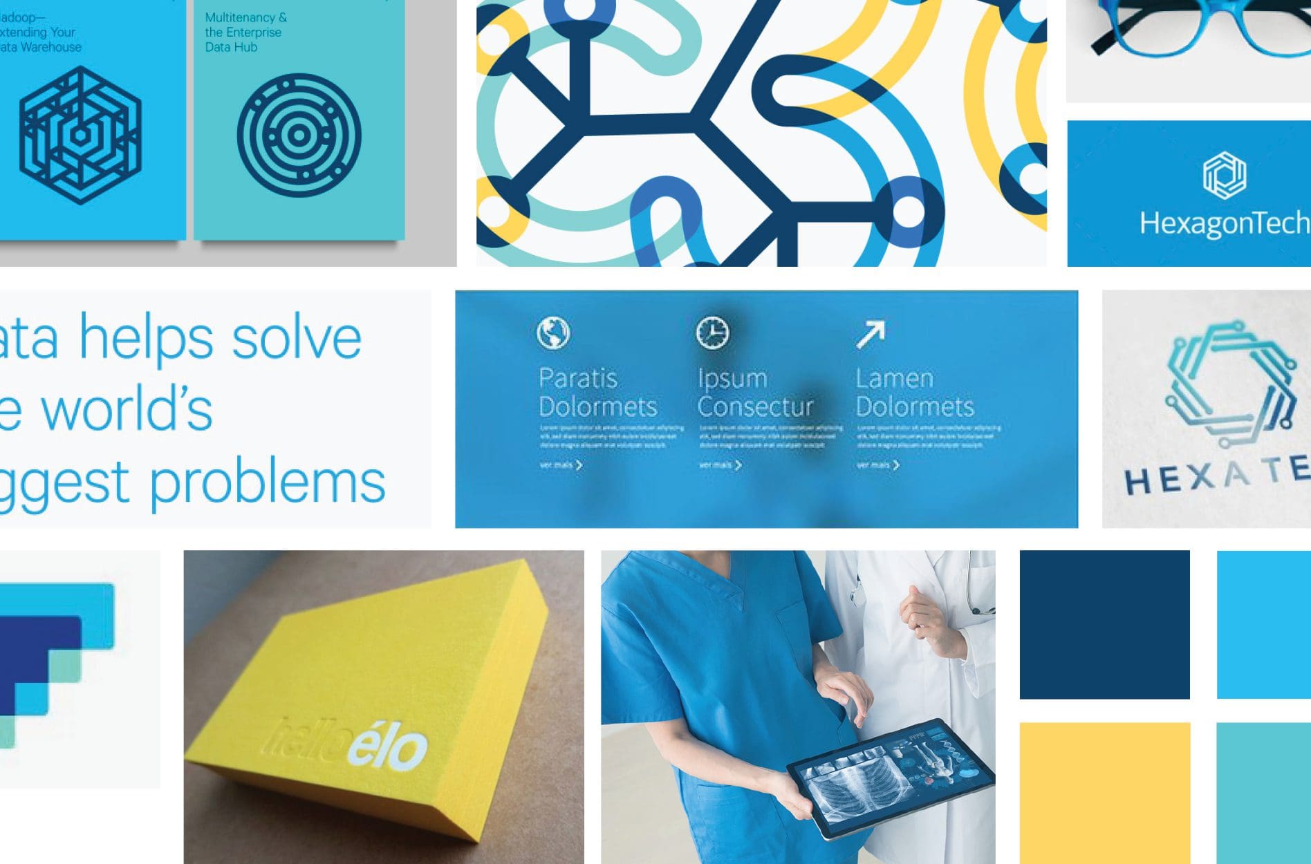
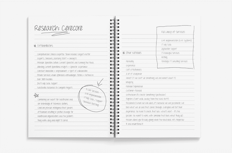
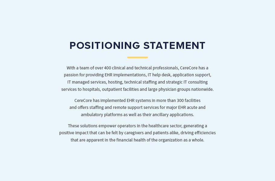
From our pre-session internal research, we were able to glean that Parallon Technology Solutions provides EHR implementations, application support, IT help desk, IT managed services, technical staffing, and strategic IT consulting services. They also provide system hosting to hospitals, outpatient facilities, and large physician groups nationwide.

Their team of more than 450 clinical, financial and technical professionals has implemented EHR systems for more than 300 facilities.

It all seemed pretty complex in nature, but standard in terms of how they stacked up to their competitors.

However, throughout our discovery session, we realized that PTS has a huge impact on patient care. Their efficiency in implementation and support for their systems leads to ease of use for physicians and caregivers, creating better outcomes for patients and a better bottom line for the organization as a whole.

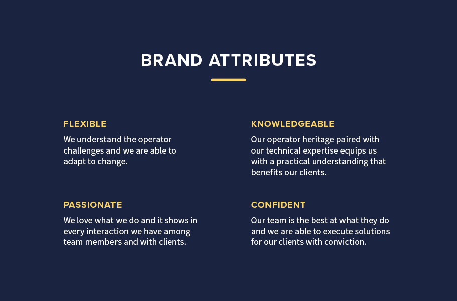
We learned that the company has an operator heritage, which means that they were founded by and are currently led by a team of people who have actually operated healthcare facilities. So, when their healthcare clients encounter issues with their EHR systems, the PTS team knows exactly what’s happening and how to solve the problems.

Additionally, we discovered that our clients have a true passion for healthcare. They do what they do because people benefit from their tech solutions in a way that’s actually life-saving.

Finally, we came to learn that they are super-resilient. They don’t ever give up, and once they give their word to a client, you can count on them coming through. Where other organizations may throw in the towel on a difficult project, the PTS team steps up.

business branding research

Corporate Brand Positioning Statement

With the research in hand, we moved into corporate brand positioning.

The positioning statement for an organization is one of the most important elements of the brand. This statement not only conveys to the public what your organization is about, it also equips your team with the words necessary to be able to speak knowledgeably about your firm.

For Parallon, one of the most important aspects of the Foundational Branding exercise was to position them in the market in a manner that set them apart from sister company, Parallon Business Solutions.

positioning statement

Business Attributes

Based on our discovery findings and positioning statement, we also created a list of attributes that would properly describe the company in a manner that differentiated them from their competition. While we started with a long list of potential descriptors, we then pared down the attributes to a set of adjectives that would be able to guide the development of verbiage related to the brand, as well as the company’s actions.

After we had the list finalized, we got to work defining each of the attributes. This doesn’t mean that we looked the words up and to jot down the Webster’s definition. Rather, we created definitions that explained what each word would mean to the organization specifically.

brand attributes

Visual Direction

With the positioning and brand attributes in place, we set about to create various visual direction options that would be able to convey the brand through imagery.

As part of our Foundational Branding package, we present up to three distinct brand direction options. This allows our clients to envision the various visual directions that the brand can take and to weigh in on which of the options will work best for them. Each of the brand boards we create are viable directions, so whichever is selected will start the brand off on the right foot.

For this particular project, we presented three brand boards with three accompanying brand stories.

The first brand board was graphic and bold.

Here, modern colors wash over imagery that inspires forward motion. Patterns are present to bring order to white space, and floods of blue reinforce the modern, tech feel with an underlying nod to honesty and trustworthiness. In this visual direction, interest would come in through gradients, and the blue hues would range from a deep navy to a bright teal.

The brand story focused on the operator heritage of the team, nodding to the fact that PTS operators are medical professionals first and foremost, who have been called to medical technology.

business branding

The second brand board took on a typographic approach.

In this direction there are big, bold, modern sans serif fonts in bright white on top of floods of green, purple, or black. Negative space comes in to indicate the thought and strategy that takes place between bursts of implementation and support. Patterns and icons are utilized to direct the user experience throughout the brand.

The brand story here focuses on the network of defense created by the team of providers and IT professionals. Here, we would envision this coming into the brand in a manner that relates the network with the network of defense within the body itself.


business branding

The third visual direction also encompassed the brand attributes.

This board is populated with bright blues to convey knowledge and reliability and yellows to communicate confidence, pride, and happiness.

Imagery and graphics nod to the flexible solutions provided by the organization, and modern clean lines denote the knowledge and technical aspect of the business. Intertwining and overlapping colors showcase the connection between PTS and their clients, followed by forward movement and life-saving innovation.

The brand story aligns with the visuals in creating a narrative based on the connection created between the healthcare systems and the company, and between the patients and their caregivers. Further, the story denotes that the connection of care is one that has the possibility to create measurable positive change within the organization.

business branding

Presentation

With the corporate brand positioning, attributes, and visual direction options solidified, we prepared to present our work to our client. We scheduled a presentation and met our clients at their offices to review the options for visual direction, and to present to them their attributes and positioning statement.

Getting buy in from key stakeholders is crucial, and we don’t leave the communication of our vision up to any one person in the client’s organization. Rather, we like for the CEO and Directors, along with the team that will implement the brand on the front lines to be able to hear it from us directly.

The three brand directions were distinctly different, but all conveyed the same position and attributes. Ultimately, our client selected the third brand direction.

With the corporate brand positioning in place, we were able to move forward in the branding project. This included naming, logo development, website design, stationery design, marketing materials design, and a strategy for brand launch communication. View the progression of the branding project, including the company’s new name in our portfolio entry for the project.

are you ready to create something nice?