The Kroger Rebrand of 2019
I have to admit that I have indeed cheated on Publix from time to time by shopping at Kroger. But, in all those times, I’ve never been enticed to the point of needing to get a lawyer involved.
I’ve stopped by the grocery chain giant simply out of location convenience, never because of a connection with the brand, brand support, product or offers.
During the time I’ve spent in research to prepare to write this rebranding review, I’ve come across multiple articles indicating that if I had indeed shopped at Kroger, which I’ve admitted I have, I undoubtedly would have remembered various marketing initiatives, such as “Right Store, Right Price” or “Kroger Means Meat."
Poor assumptions and poor branding. I don’t remember any of this.
What I can say I remember from my Kroger shopping experiences are the awkward logo, the less-than-helpful employees, the dollar-store-looking sale signage and the card you must always have to get the sale prices. Oh, and the flies. I feel like there are always flies.

Publix, don’t fret. You still have my heart.
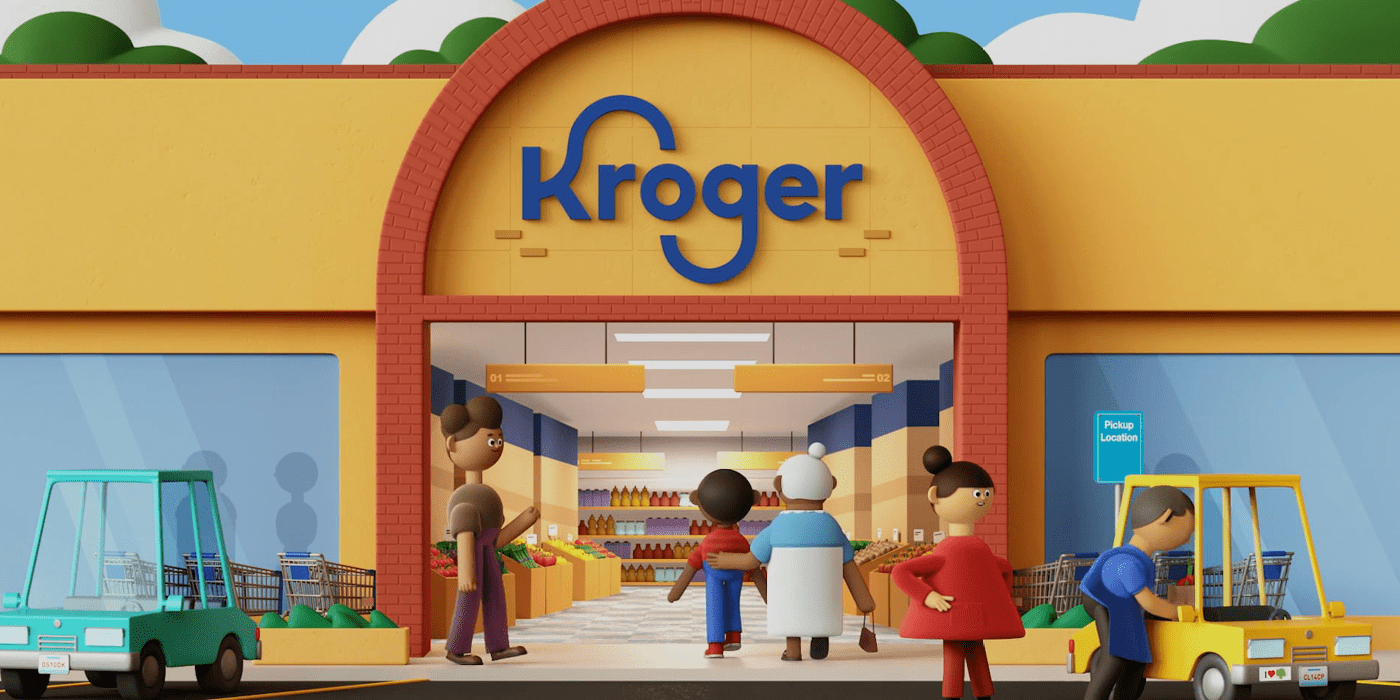
One positive side note, I do really enjoy The Little Clinic branding within Kroger stores. It always makes me feel like there’s some form of life and professionalism inside Kroger.
Kroger as a Grocery Retailer
Kroger was established in 1883 in Cincinnati, Ohio, and is still headquartered there today. Kroger has almost 2,800 stores in 35 states and annual sales of more than $121.1 billion. It’s not the largest grocery retailer in the United States, but it’s close and it is one of the largest in the world.
Employing nearly half a million associates, Kroger and its banner names serve 9 million-plus customers daily. They have 2,769 retail food stores. Many of its stores include fueling centers, health clinics, and pharmacies.
Kroger also does good. They donated $192 million in 2018 to support hunger causes in its local communities, it diverts tons of waste from landfills, rescues produce and reduces waste, and is constantly making electricity usage improvements.
Industry observers say growth in Kroger’s core food retail business has lagged and the company’s bottom line has been squeezed by intense competition from Amazon, Walmart, and other large grocery retailers.
Kroger Gets a New Brand
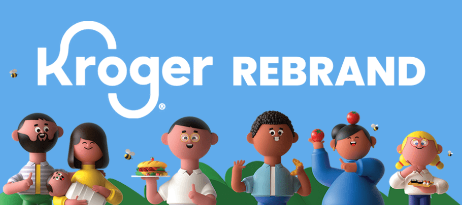
The new brand for Kroger was unveiled to the public in November of 2019. It appeared to be comprised of a refreshed logo, a brand color scheme, and a tagline; paired with a brand font set and the birth of the Kroji’s. The new identity for Kroger was designed by DDB.
Kroger states per their website, “The last two years have been a time of transformation as we work to redefine the grocery experience through Restock Kroger. And we just completed another important step on this journey – clearly defining our brand to celebrate our love of people and our love of food.”
Rebranding is a key step in innovation when reinventing an organization, and a valid reason for a rebrand, so I’m glad to see that Kroger has indeed undergone a rebrand.
Customer experience is a huge piece that impacts brands these days. I will note that it’s disappointing to see Kroger update a logo, unveil a new tagline, and release an advertising campaign, all while seemingly ignoring customer experience elements. More impact could have been made had they given more attention to these areas as part of the rebrand.
Kroger Rebrand: Initial Thoughts
There are a few key branding points that this rebrand nails, no matter the pluses and minuses surrounding the design and the details.
This brand delivers the ability to connect or engage with consumers. It has achieved a unique, never-before-seen look that piques interest and garners attention. Speaking from experience, the existing Kroger brand delivered zero engagement.
On the same note, the Kroger rebrand is definitely unique and recognizable in the sea of grocery competition. It’s huge to me that in all the reviews and all the research, no one has compared this rebrand to another rebrand.
According to Mandy Rassi, Kroger’s Vice President of Marketing, “Strip away the logos, and it is impossible to tell the difference between the [grocery] retailers."
The custom illustrations within the new Kroger rebrand squash the imitators.

The messaging about the new brand states that it provides brand consistency for Kroger. I think brand consistency can mean various things to various individuals, and there’s no way to judge if consistency is delivered when a brand is launched. I will say, however, that the creation of the unique illustration of the Krojis will undeniably provide consistency for the brand.
Lastly, I believe Kroger is doing something right in the decision to not rely on the rebrand alone to drive change. They have backed the Kroger rebrand with an aggressive multi-media marketing campaign that strives to bring to life their new position and approach, and the rebrand is a single step in a larger turnaround initiative known as Restock Kroger.
"We are on a transformation journey and we are making strong progress on redefining the customer experience," said Rodney McMullen, Kroger's chairman and CEO. "Everything we are doing today is creating a truly seamless shopping experience, so we can serve customers anything, anytime and anywhere."
The Kroger Logo
It’s most definitely better, I don’t think there’s any argument there. It’s cleaner, more balanced, has increased letter spacing, and demonstrates a stronger, more precise construction.
![]()
It’s still keeping with the large, continuous letterforms on the ‘K’ and the ‘G,' which seem to pose little purpose other than subtly depicting a smiley face. It’s still very playful and light-hearted, simply showing a more modern approach.
Other than the half circles, the font face looks fairly standard, but a good choice for standard. For a company with the breadth and depth of Kroger, I would have undoubtedly chosen to have a custom font set created with more unique qualities of visual interest, but as previously mentioned, the new Kroger logo is leaps and bounds ahead of the existing logo, and pairs nicely with the new custom Kroji illustrations.
The existing Kroger logo has been around for quite a long time, so completely scrapping it would be detrimental to the retailer, and a very difficult transition indeed.
I think the refreshed logo serves its purpose well enough.
![]()
Blue remains Kroger’s signature color and Kroger is stating that the blue brand color “represents the Kroger brand heritage of food savvy, and signals safety and trust to customers.”
But wait, you’ll see as you continue to read that “Fresh” is a key concept in this rebrand, so could they have moved to a more “Fresh” color? Or created a color concept system that would allow a “Fresh” key color to be introduced to the brand on a regularly recurring basis?
The Tagline (or Positioning)
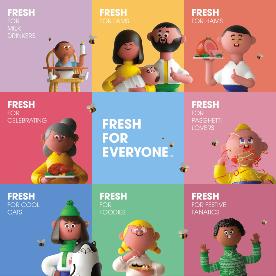
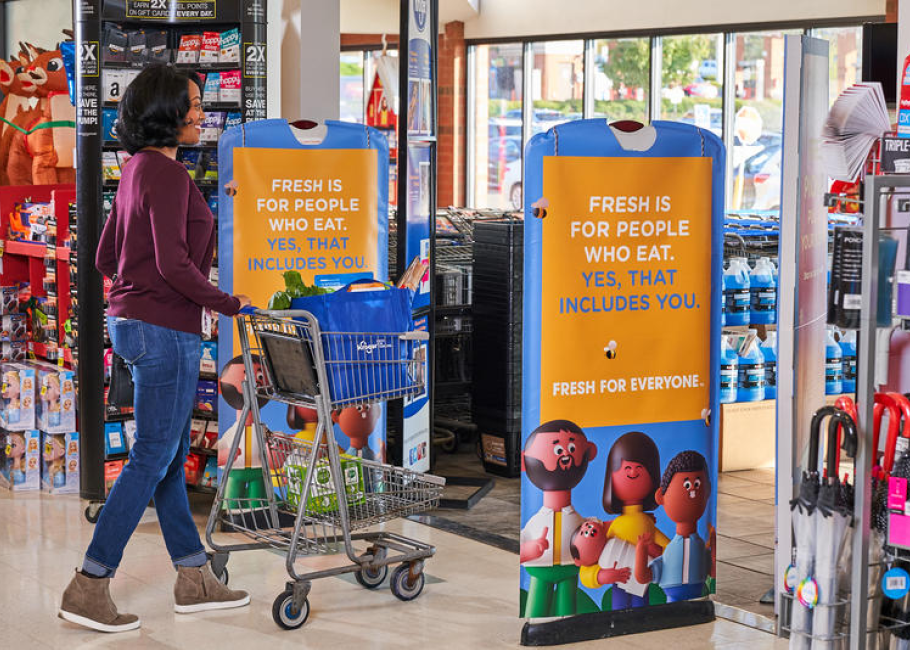
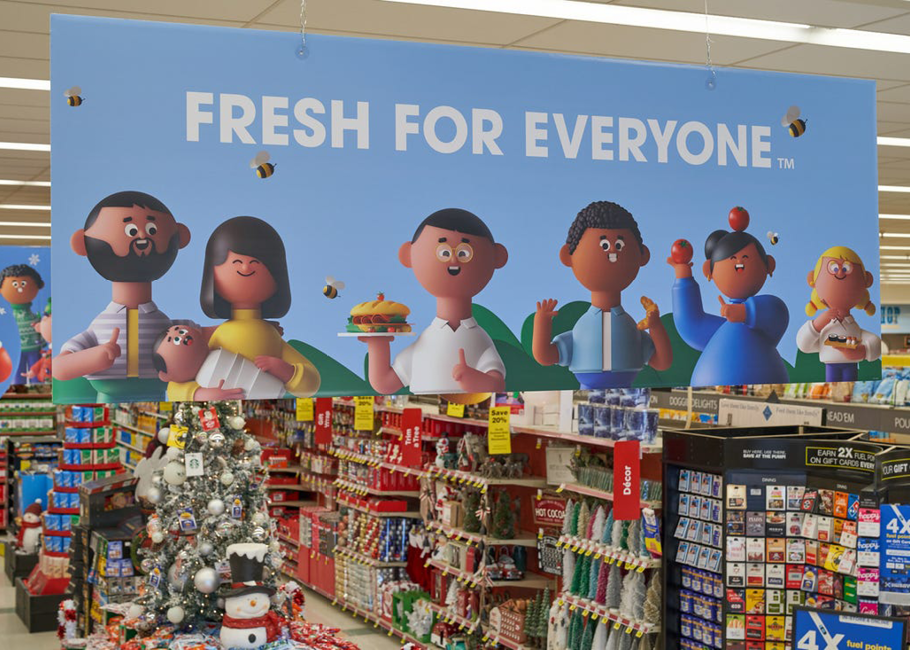
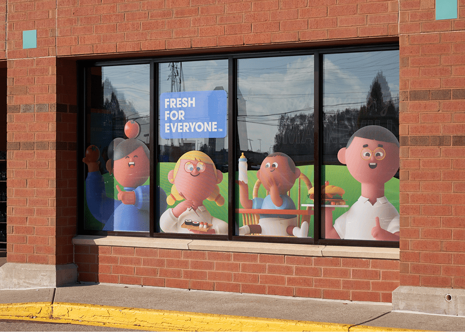
Kroger stated that the rebranding is shaped around a new slogan, “Fresh for Everyone,” to convey the supermarket giant’s commitment to providing customers access to “fresh, affordable and delicious food.”
![]()
The Cincinnati-based company said the “fresh” focus also portrays the Kroger name as a “uniquely egalitarian American brand.”
So let’s just stop right here for a quick second. First off, if we are going to say our stores and products are for everyone, we can’t use words like egalitarian, because not everyone knows what that means. Brand disconnect in verbiage.
The Kroger website uses the tagline “Fresh for Everyone” to sum up: ‘We believe no matter who or where you are, everyone deserves to have affordable, easy-to-enjoy, fresh food.' Please take away the need for a scan card to get affordable food. Brand disconnect in customer experience.
Furthermore, I think the details about ‘affordable,' ‘easy-to-enjoy,' or 'easy-to-access,' that Kroger summed up in “Fresh for Everyone” got lost. Those pieces seem really important to me.
According to McMullen, I think what Kroger is actually trying to get to here is that yes, indeed, their food is fresh, but the manner in which they connect people to their food is what makes them desirable. Let’s review his statement:
"We are on a transformation journey and we are making strong progress on redefining the customer experience," said Rodney McMullen, Kroger's chairman and CEO. "Everything we are doing today is creating a truly seamless shopping experience, so we can serve customers anything, anytime and anywhere."
They are positioning themselves to be the best in all the ways in which people ‘get’ their food, whether it be through an app, delivery, curbside pickup, or shopping in-store.
They seem to be focused on innovating in all of these areas, and that is plenty of reason for a rebrand, but the tagline misses this. There’s nothing in my research that indicated they were repositioning the quality of their food to fresh food, or that their fresh food is their differentiator.
The Brand Font Set
I won’t go into the font set too deeply other than to say I’ve seen two font families thus far as part of the new brand. Both are sans serif fonts, one with rounded edges and one without rounded edges.
The pairing of these two looks are not necessarily what I would categorize as a best practice, but I think in design and branding there’s always room for breaking a best practice when it has a purpose, so I’ll stay on the positive train here.
If I had to guess, the rounded sans serif was too playful and childlike to pair with the logo as a tagline, so Kroger most likely demanded to see other options. A generic sans serif unrounded was paired and picked and therefore needed to be a part of the Kroger rebrand font set.
Preaching here, a custom font set should have been crafted specifically for Kroger to meet both the branding and on-going marketing needs.
As I review the newly launched brand support, I don’t see any clear distinction as to when one font is used and when the other is used, or how they are paired, which makes my skin crawl a bit, but it’s probably too early to make a judgement call on fonts; and my lack of involvement doesn’t really allow for a judgement either.
I’ll just say that they’ve got to do something about the generic price signs, I beg of you.
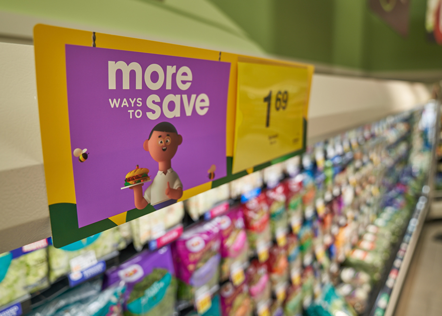
I’ll end here by stating that the fonts chosen, especially the rounded sans serif family, pairs nicely with the illustrative style of the Kroji’s. Other than that, the pairing of fonts seen in brand support thus far seem generic and elementary.
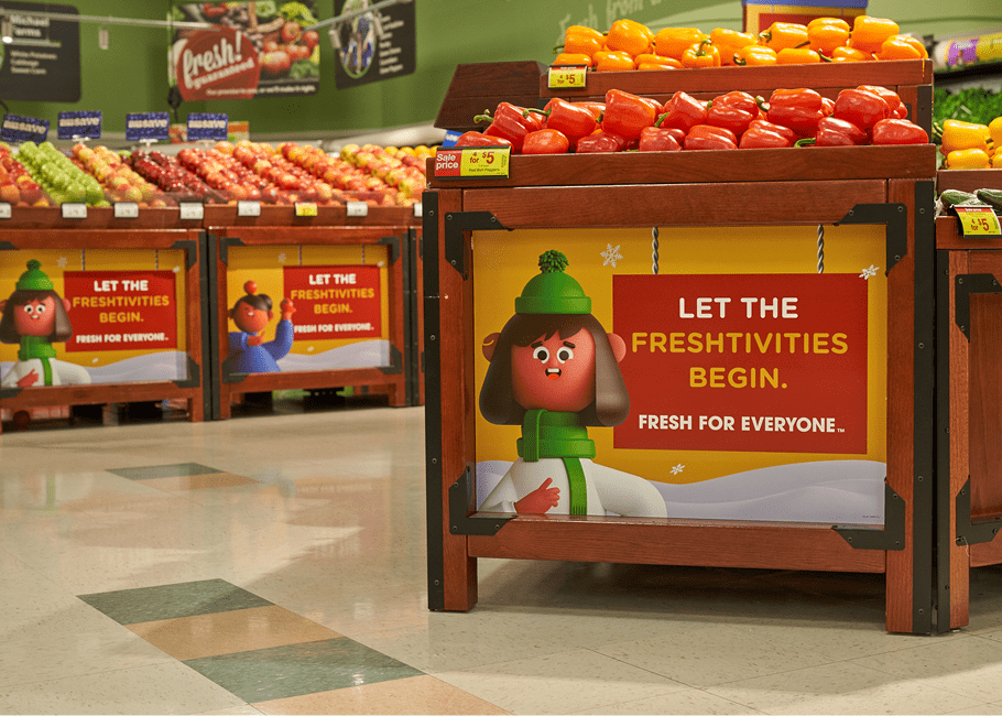
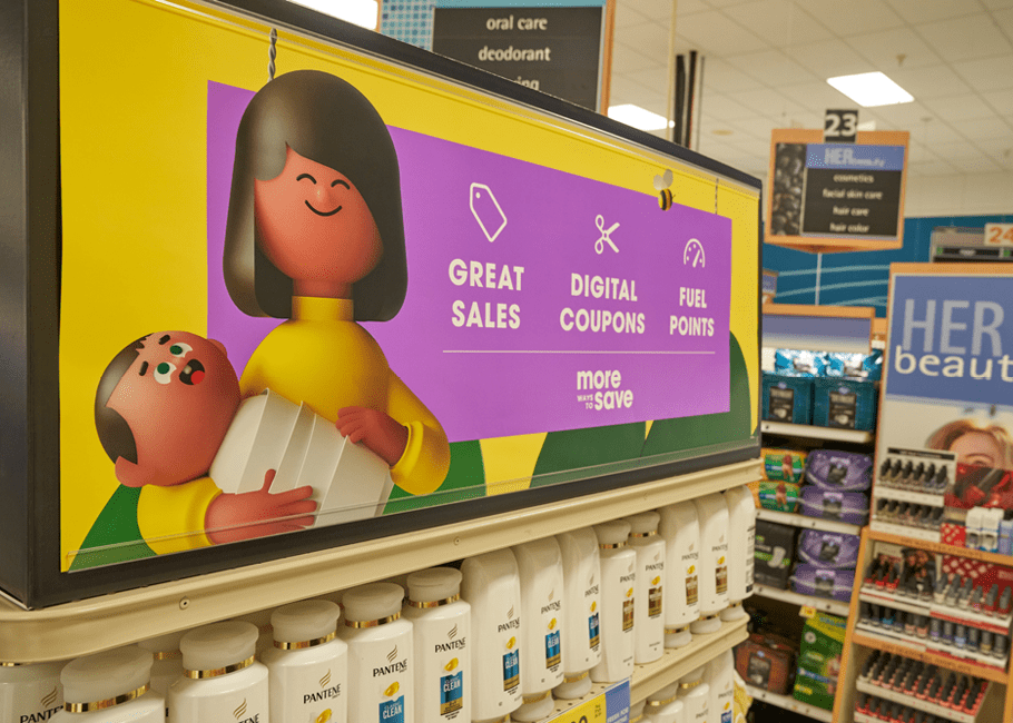
The Kroji’s
The Kroger rebrand also introduces the “Kroji,” a cast of animated characters that the company said brings differentiation to its brand and is designed to “represent Kroger customers, associates and communities in an inclusive, relatable, optimistic and fun way.”
Kroji combines “Kroger” and “emoji,” the digital icons popularized in social media. Does it count when you have to explain it?
Overall, the idea of the Kroji and the unique illustrative style is top-notch. I love the thinking behind the fact that these are characters that Kroger’s customers and employees can relate to.
The custom illustrations and animation of the Krojis actually allows the customers to see themselves in the stories, even more so than using real people. With the Krojis, you start to fill in the blanks between yourself and the character on the screen and can relate more, imagining yourself as a character.
I think the strategy behind the Kroji’s are brilliant. And gosh, just look at them. They are so cute and memorable, and super intriguing. Checks all the boxes.
I’m curious to see future iterations of the Kroji’s and what they develop into. Because we weren’t on the rebranding team, we don’t have the insight to know future plans, but from a branding and positioning perspective, there could have been a deeper connection to the brand positioning and differentiators harnessing the Kroji characters, upon the launch of the new brand.
I think there's a huge opportunity to knock future marketing out of the park with these Krojis, especially related to showcasing the different ways Kroger connects people with food and the value found at Kroger. It would have been my suggestion to do some deeper brand marketing at the launch of the rebrand introducing different Kroji characters that illustrated these differentiators.
This simply goes back to missing the brand positioning, and relating the entire Kroger rebrand to “Fresh for Everyone."
On a more lighthearted note, my team got hung up on the bees. Kroger, what are the bees for? Do they stand for anything? Maybe the flies?
Kroger Rebrand: Brand Support
All kidding aside, I have to say that I’m happy to see Kroger put any type of brand support that connects to the consumer in place because there has been a lack in the past. I also like that what they are doing is unique and intriguing.
Unfortunately, as I continued my analysis and research, I began to disconnect from the tagline with each piece of brand support I encountered related to the Kroger rebrand.
If everything Kroger has is fresh, it’s gonna be hard for other grocery retailers to compete because there’s only so much fresh to go around. No silly Kroji’s, everyone has fresh.
It’s telling me that if I eat, I deserve fresh and I can get that at Kroger, and that’s supposed to make me want to shop there?
No, my experience in how I get the food I want to eat is what is going to make me want to shop there. The value I get that food for is what is going to make me want to shop there. Fresh isn’t even part of the equation, it is expected for all grocers.
Right now, they are leading from a fresh position that’s not actually fresh at all.
The brand support used to launch the Kroger rebrand should have encompassed how I can get fresh easily, conveniently, and for a good value. That’s the differentiator. All groceries in their competitive landscape deliver up fresh.
Unless Kroger finds a way to communicate their innovation of connecting people to their fresh food through brand-driven marketing, they probably will not be able to rekindle a relationship to lost customers and obtain new customers.
Let’s not forget what Rodney says: "We are on a transformation journey and we are making strong progress on redefining the customer experience. Everything we are doing today is creating a truly seamless shopping experience, so we can serve customers anything, anytime and anywhere."

A key piece of brand support is customer experience and they left that out of this rebrand. “Whoops,” says the Kroji.
The Marketing Campaign
Kroger did take a correct step in following their rebrand with a mass media advertising campaign, which includes retail, television and radio broadcast, digital, print, social, podcast, cinema, outdoor, TV, and music-streaming channels.
This campaign has introduced the various elements of the Kroger rebrand, which is step one in consumer introductions. We say it all too often, if you build it, they won’t come, but you must build it so they will come. So props to Kroger for upholding a fundamental on following a rebrand with a marketing campaign.
We don’t want to beat a dead horse here, but the campaigns we have seen are animations of happy Kroji’s shopping at Kroger. Not the differentiator. Of course, Kroger wants you to know that when you shop at Kroger you’ll be happy, but it’s clear in our research that there’s a ton of innovation happening to reinvent Kroger and that’s not clear to the public through this campaign.
Kroger Rebrand: Final Thoughts
I’ll put forth one last assumption on the craft and technicalities behind this Kroger rebrand, or the lack thereof. The agency chosen to rebrand Kroger is a traditional, yet innovative, advertising agency. I’m dying to see the day when these large corporations who have a dire need to reposition and innovate understand the difference between a branding agency and a marketing or advertising agency.
Branding sets the foundational, the positioning, the technicalities. Marketing works within the branding set forth to spread the message. If you don’t have a strong brand and positioning, don’t bother marketing. I think that’s ultimately what went down here. They missed the brand positioning through a poor tagline and the marketing is off due to that. Unique, memorable, connective, and cute, but off.
If you’re curious about learning more about brand-driven marketing, check out our blog that differentiates it from sales-driven marketing.
At Kroger’s size, they really can’t afford to not have both specialties of branding and marketing continuously working hand in hand.
Overall, I think Kroger rebranded with the intention to showcase how they are innovating to meet the desires of how customers ‘aspire’ to eat or get their hands on the foods they want to eat. If that was indeed the purpose, although the rebrand was unique, intriguing, fresh, and creative; it ultimately could have done a much better job to say what part the ‘new’ Kroger will play in bringing these food aspirations to life.
I don’t think the positioning Kroger has is wrong, but I do think the execution of the verbiage chosen, both in the tagline and in brand support, paired with the lack of innovation in customer experience missed the mark. The translation from what Kroger is doing to how that’s being communicated to the consumers doesn’t match.
They definitely achieved a connection to the consumer and they are off to a great start. A little further strategy to connect this rebrand with their true positioning and differentiators, and I might just need to find myself a divorce attorney.


