Brand Development for a Tech Branding Company | Big Fish
Big Fish is a mobile application design and development studio based out of Tampa, Florida. They focus on creating custom application software solutions for the healthcare industry. It was started by our client, Sara McQueen.
When Sara first came to us, Big Fish had recently undergone a rebrand from a visual perspective with a new logo and brand colors. She was happy with this new direction. However, she wanted to further strengthen the Big Fish brand and better articulate who they were, what they did, and the value they brought to the table.
Sara knew she had an opportunity to create a stronger brand for Big Fish, but she didn’t know what that looked like.
It was clear to us immediately that Foundational Branding would serve her well to help communicate Big Fish’s value in a way that would resonate with both future clients and their employees.
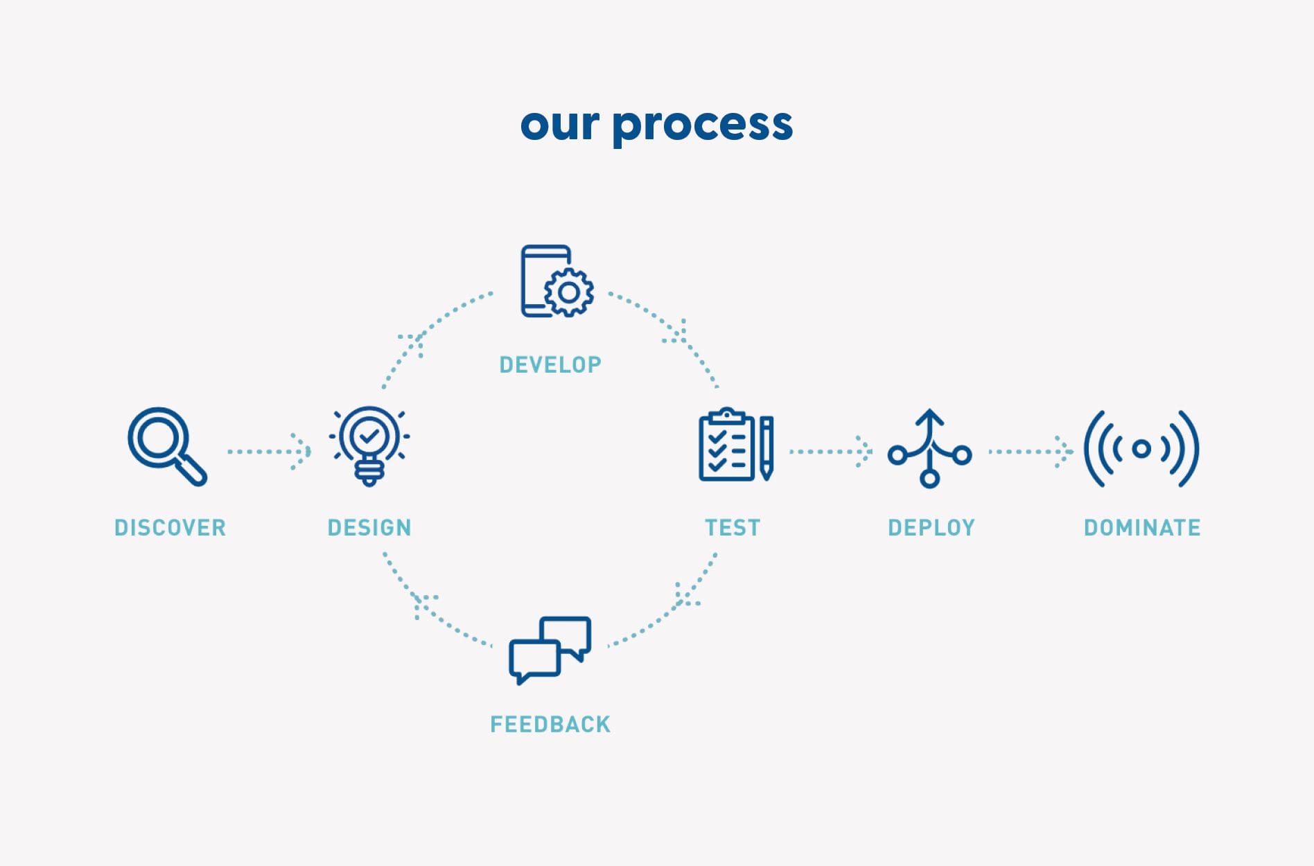
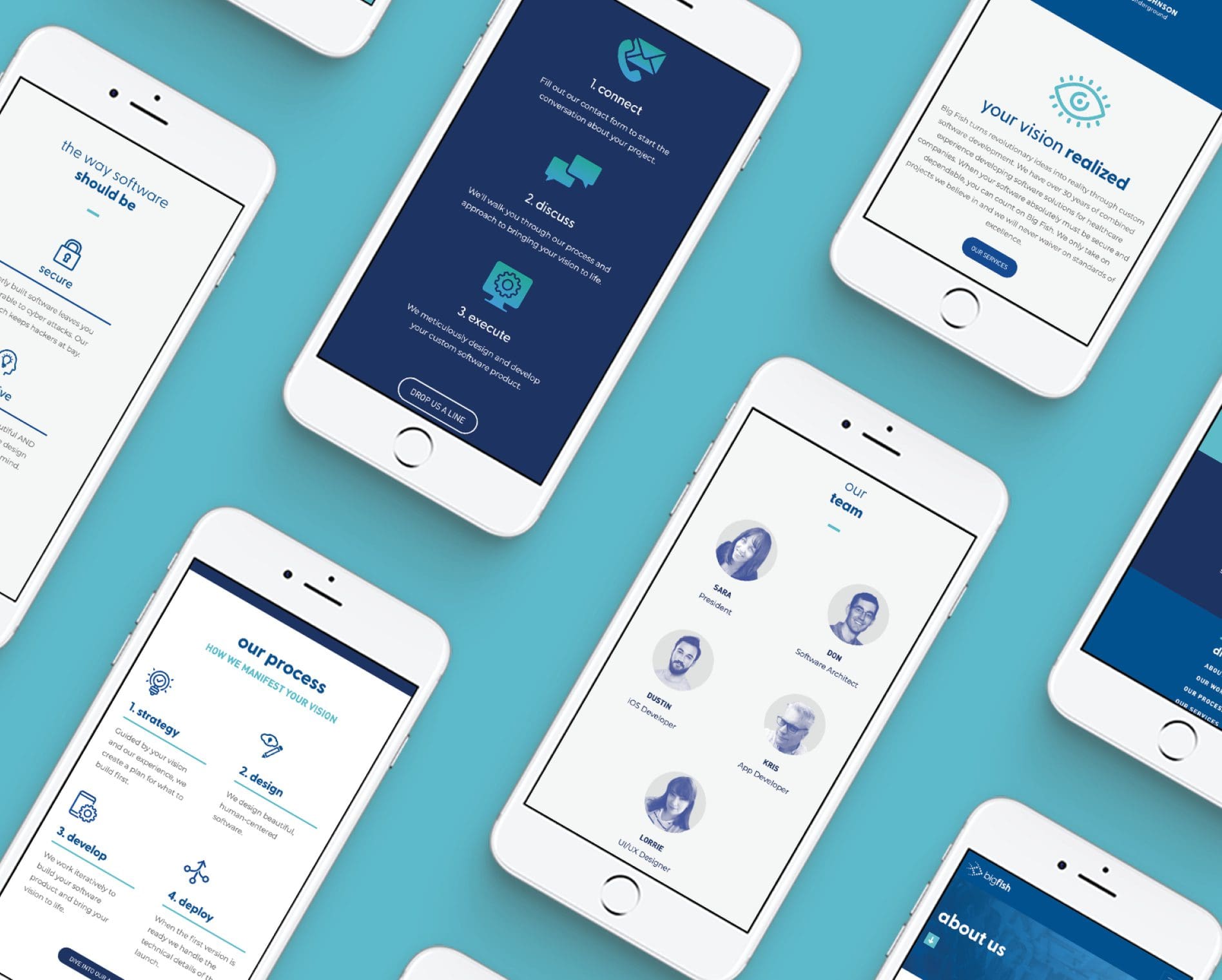
 An additional piece we helped create for Big Fish was an outlined process for their software development. We wanted to showcase how Big Fish takes a client from a discovery session to a successful software launch. The five steps we outlined for Big Fish’s process were: discovery, design, development, deployment, and diligence.
We displayed this process on the homepage of their website, so it would be easy for potential clients to find and quickly understand the scope of what Big Fish can do. This was also an important piece for Sara and her team to have while on a sales call with a potential client.
An additional piece we helped create for Big Fish was an outlined process for their software development. We wanted to showcase how Big Fish takes a client from a discovery session to a successful software launch. The five steps we outlined for Big Fish’s process were: discovery, design, development, deployment, and diligence.
We displayed this process on the homepage of their website, so it would be easy for potential clients to find and quickly understand the scope of what Big Fish can do. This was also an important piece for Sara and her team to have while on a sales call with a potential client.
 Another way we helped create consistent messaging for Big Fish was by writing a blurb about their software. Our team recognized that there were some unique qualities to the software they develop. This blurb gave the Big Fish team a way for our client to share this with consistency every time during the sales process.
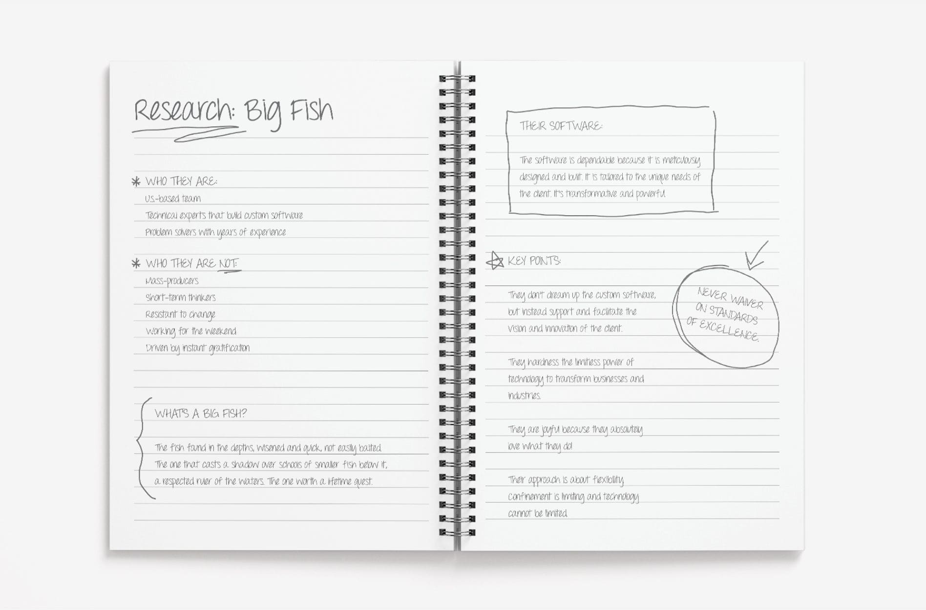
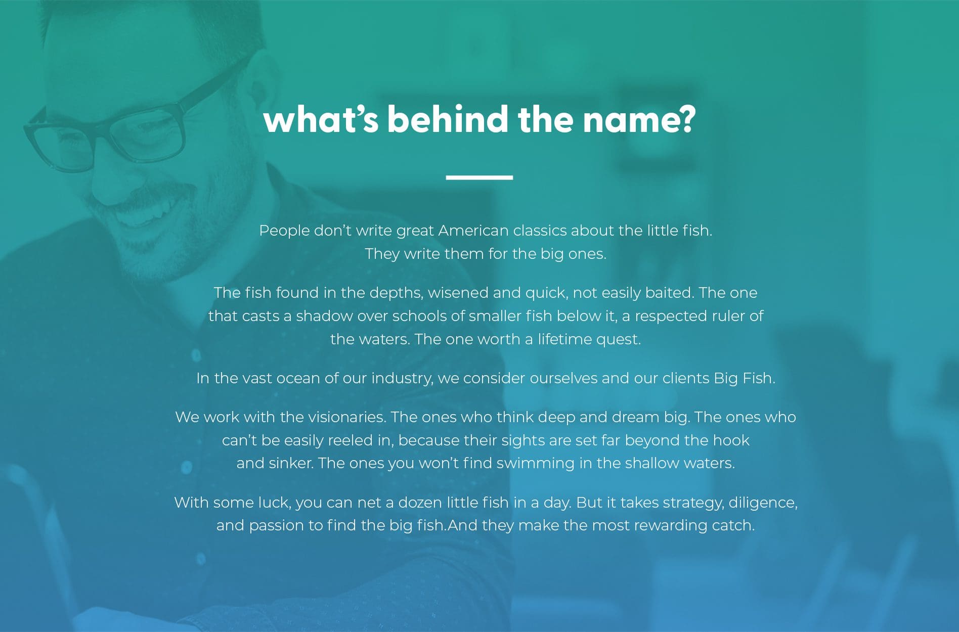
As our team worked on crafting consistent messaging that represented Big Fish, one major piece that was missing was a narrative behind their name. Sara is a deep thinker and very methodical and sensible in the way she makes decisions. However, when we asked her how she landed on the name Big Fish, she didn’t have an underlying story.
In the spirit of Sara’s personality, we wanted to give a deeper significance to their name. We took the insight we had gained during our discovery session and crafted a narrative that gave the Big Fish’s name meaning and clearly represented who they are.
The narrative highlighted the respected nature of the “big fish” and the depth of knowledge our client brings to every project they work on. It also shared how big dreams and ideas aren’t easily reeled in, but Big Fish was always ready to rise to the occasion for the reward of the catch.
In the end, our team was really proud of the story we crafted and our client was very fond of the narrative as well.
Another way we helped create consistent messaging for Big Fish was by writing a blurb about their software. Our team recognized that there were some unique qualities to the software they develop. This blurb gave the Big Fish team a way for our client to share this with consistency every time during the sales process.
As our team worked on crafting consistent messaging that represented Big Fish, one major piece that was missing was a narrative behind their name. Sara is a deep thinker and very methodical and sensible in the way she makes decisions. However, when we asked her how she landed on the name Big Fish, she didn’t have an underlying story.
In the spirit of Sara’s personality, we wanted to give a deeper significance to their name. We took the insight we had gained during our discovery session and crafted a narrative that gave the Big Fish’s name meaning and clearly represented who they are.
The narrative highlighted the respected nature of the “big fish” and the depth of knowledge our client brings to every project they work on. It also shared how big dreams and ideas aren’t easily reeled in, but Big Fish was always ready to rise to the occasion for the reward of the catch.
In the end, our team was really proud of the story we crafted and our client was very fond of the narrative as well.
 For the website design and content development, we used the Foundational presentation as our guiding light. We brought the websites’ pages to life with the imagery and colors of the updated visual design direction. Our team used the positioning statement and brand story to create messaging that clearly represented who Big Fish is.
RESEARCH + DISCOVERY
We started the tech company brand positioning process with a deep discovery session with Sara over Zoom. Our team learned about the history of the company, what it’s been through and where it is now. Big Fish started as a mobile and text marketing company in 2010. In 2013, they started developing iOS and Android mobile applications. Over the years, Big Fish has shifted to focus solely on app development. While they are a smaller, boutique-sized company, they bring a wealth of experience and passion to the projects they work on. They knew the value they provided their clients and needed a clear way of communicating it. Sara shared with us how she felt like she was reinventing the wheel every time she had a sales conversation. Big Fish needed clear messaging about the value they provided to help grow the company internally and externally.
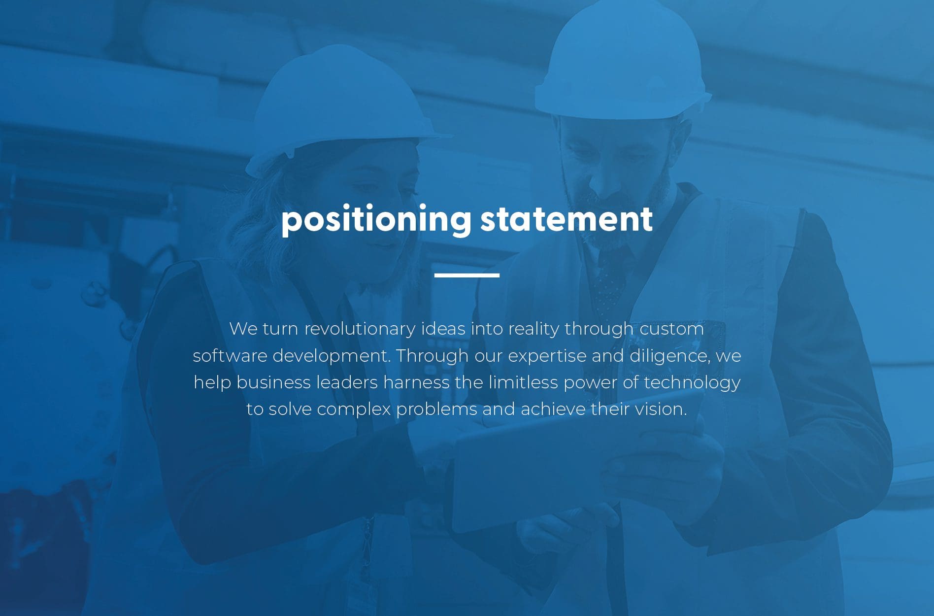
TECH COMPANY BRAND POSITIONING: POSITIONING STATEMENT
After digging into the core of who Big Fish is, we crafted a positioning statement. A positioning statement is an important piece of our Foundational Branding process. It clearly and succinctly defines a company or organization and serves as a guide for every step of our branding process. We created a long and short positioning statement that focuses on how Big Fish uses their experience and drive to bring their client’s vision to life. Having a clear and concise statement for Big Fish was a key piece in developing consistent messaging for their brand.
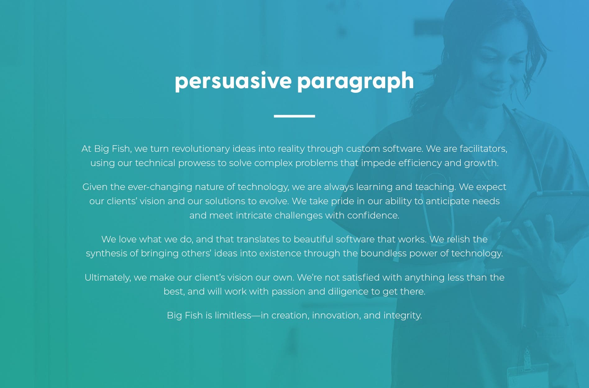
TECH COMPANY BRAND POSITIONING: PERSUASIVE PARAGRAPH
Next, we took the positioning statement and expanded that into a persuasive paragraph. For their persuasive paragraph, we wanted to communicate more about Big Fish’s process for developing software and the passion they bring to every project. We also wanted to highlight their commitment to excellence in what they do. Big Fish can take this persuasive paragraph and use it for their website or any of their marketing collateral to further explain who they are and what sets their team apart from the competition.
An additional piece we helped create for Big Fish was an outlined process for their software development. We wanted to showcase how Big Fish takes a client from a discovery session to a successful software launch. The five steps we outlined for Big Fish’s process were: discovery, design, development, deployment, and diligence.
We displayed this process on the homepage of their website, so it would be easy for potential clients to find and quickly understand the scope of what Big Fish can do. This was also an important piece for Sara and her team to have while on a sales call with a potential client.
Another way we helped create consistent messaging for Big Fish was by writing a blurb about their software. Our team recognized that there were some unique qualities to the software they develop. This blurb gave the Big Fish team a way for our client to share this with consistency every time during the sales process.
As our team worked on crafting consistent messaging that represented Big Fish, one major piece that was missing was a narrative behind their name. Sara is a deep thinker and very methodical and sensible in the way she makes decisions. However, when we asked her how she landed on the name Big Fish, she didn’t have an underlying story.
In the spirit of Sara’s personality, we wanted to give a deeper significance to their name. We took the insight we had gained during our discovery session and crafted a narrative that gave the Big Fish’s name meaning and clearly represented who they are.
The narrative highlighted the respected nature of the “big fish” and the depth of knowledge our client brings to every project they work on. It also shared how big dreams and ideas aren’t easily reeled in, but Big Fish was always ready to rise to the occasion for the reward of the catch.
In the end, our team was really proud of the story we crafted and our client was very fond of the narrative as well.
TECH COMPANY BRAND POSITIONING: BRAND ATTRIBUTES
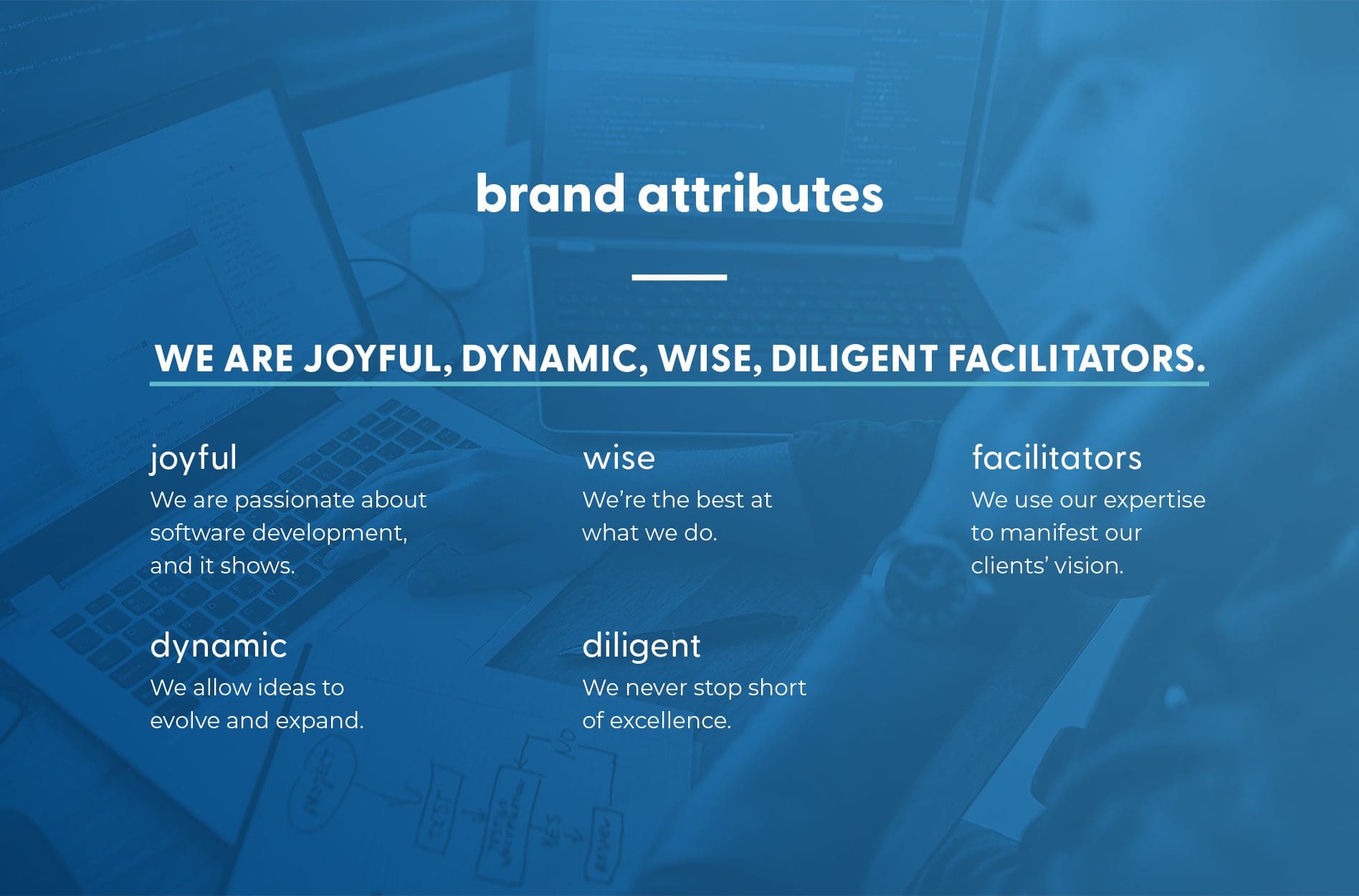
After we solidified the story behind the name Big Fish, it was a natural next step to identify their brand attributes. Brand attributes are a set of adjectives we use to describe a company and what differentiates them from the competition. They help guide every component of the branding process—from visual design to copywriting. The more we talked with Sara about what sets Big Fish apart, the more we appreciated the passion they brought to every project, their wealth of experience, and their ability to pivot quickly when needed. To represent these qualities, we chose the following words for their brand attributes: joyful, dynamic, wise, diligent, facilitators.
TECH COMPANY BRAND POSITIONING: VISUAL DIRECTION
We were then able to use the chosen brand attributes to strengthen our client’s visual direction. While they had recently updated their visual branding, we saw room to improve and build on what they had. Although we typically create three boards, we only created one for Big Fish since we were refining what they currently had. We wanted to give this aspect of their brand more consistency and congruency with standard colors and gradients. On their board, we incorporated different shades of blue to look like the depths of the ocean. This also represents the depth of Big Fish’s knowledge and the limitless potential their custom software provides. The pops of purple help move the brand forward while communicating the company’s creative and joyful nature. We used photographic images with gradient overlays and graphics to give a sense of uniformity and showcase Big Fish’s technical expertise. Overall, our goal was to communicate Big Fish’s limitless amount of creativity, integrity, and innovation.
PRESENTATION
We presented the tech company brand positioning project to Sara and walked her through the changes we had made and why. She was happy with the updates our team had made. The last thing we did for Sara during this stage was give her some potential next steps. We already had a great foundation of the brand and visuals and wanted to share what we recommended to help expand their brand’s impact. The suggestions that Sara decided to move forward with were a logo typeface update, Social Pack, and a new website.LOGO REFINEMENT
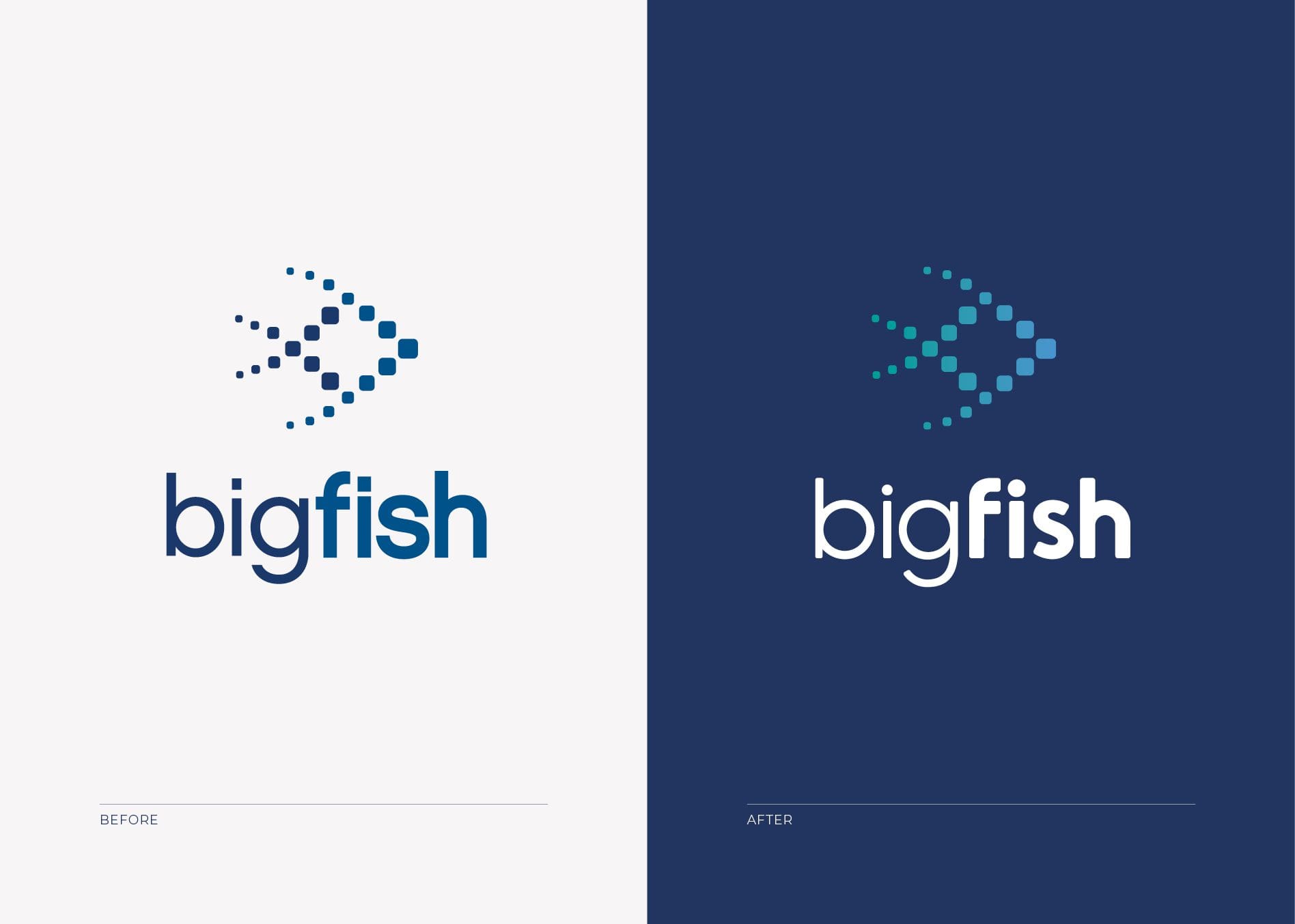
We recommended logo refinement for Sara to align with their new visual direction. Big Fish is a unique company, but their logo was slightly generic and had minor details that did not align. To create a more inviting feel, we focused on updating the logo font. Instead of the harsh edges of the original font, we rounded the edges to be consistent with the new brand look. These rounded edges also represented the smooth movement of a fish in the sea, as well as clients through their process. We used a combination of bold and light fonts to represent the distinct nature of the company and better align with the overall identity.WEBSITE DESIGN
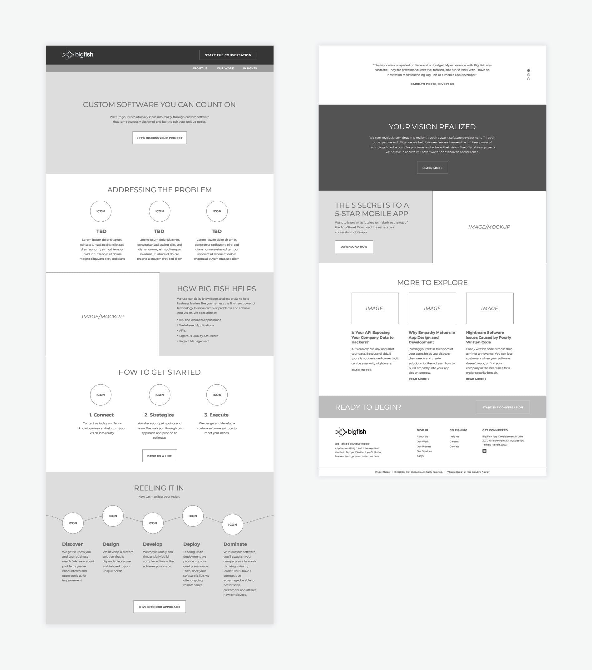
The next step in establishing Big Fish’s new brand direction was to create a website. Typically our website process is four steps: user experience and wireframing, design, development, and then testing and launch. Because Sara had developers on staff, she only wanted us to do the first two steps: wireframing and user experience and then design.WEBSITE WIREFRAME + USER EXPERIENCE
While creating the wireframes, we focused on inspiring the user and having them move through the website. Big Fish has a unique situation where they can’t showcase a lot of their work to the public. This is because the custom software they create for their clients disrupts industries and is what differentiates them from the competition. In addition, Sara has a small team, and she wanted to make sure that the website encouraged people to look around for information instead of always landing on a page and launching into a lengthy sales call. Ultimately we wanted to convey to the user why Big Fish was different, what they stood for, and inspire them through the visuals and verbiage. Taking this into consideration, we worked through the wireframing process, outlined each page, and then walked Sara through it. Once we finalized the wireframe with Sara and got her approval, our team got to work on the website design.
WEBSITE DESIGN
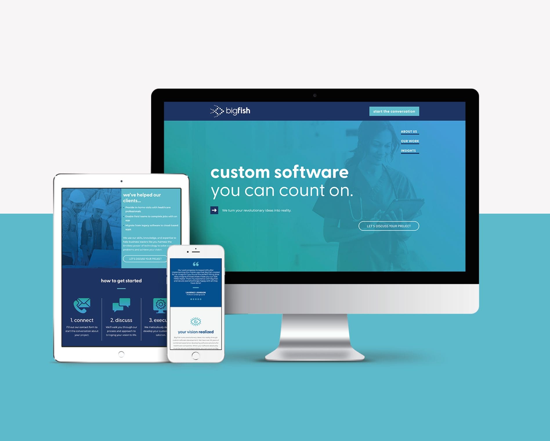
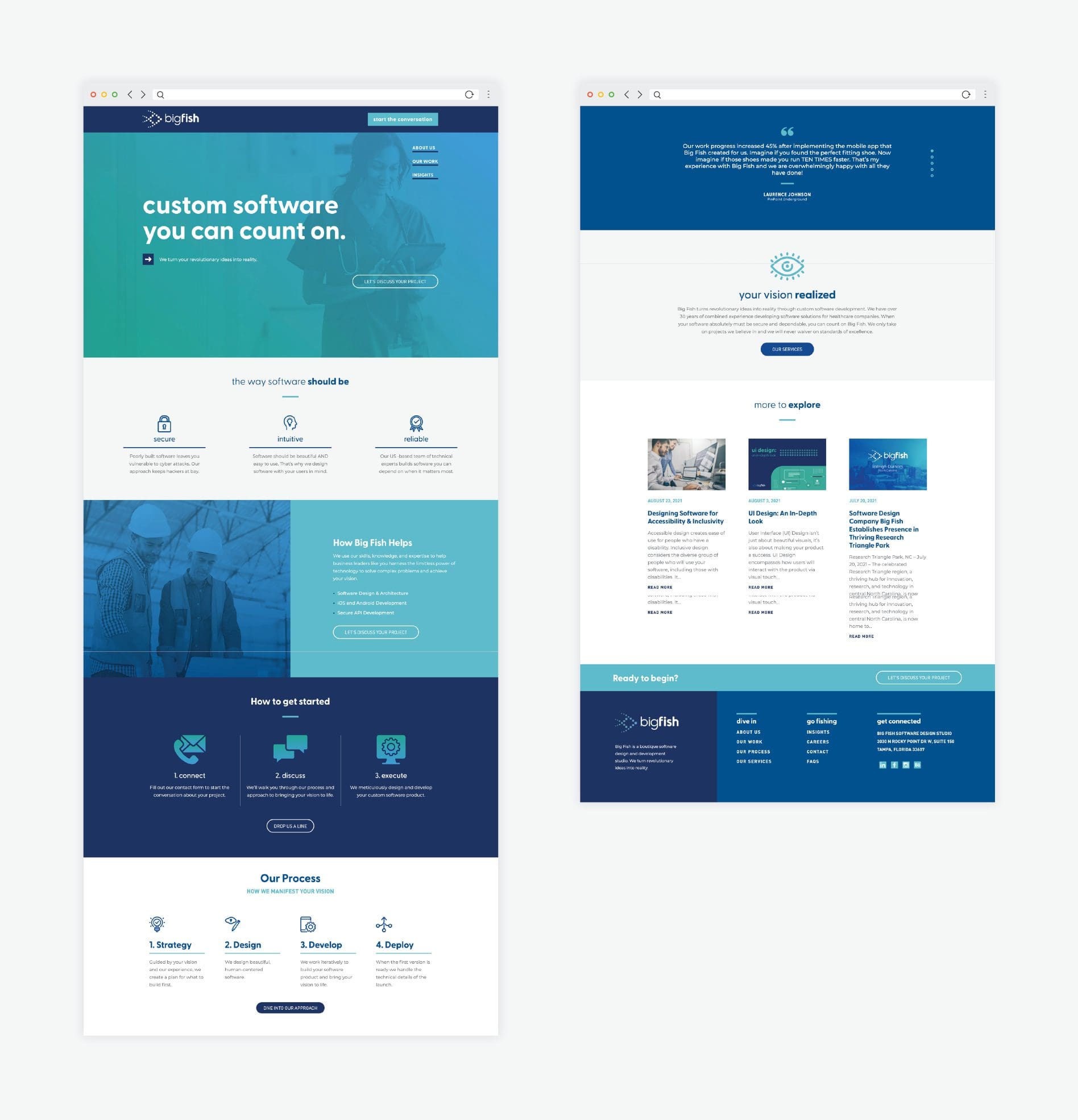
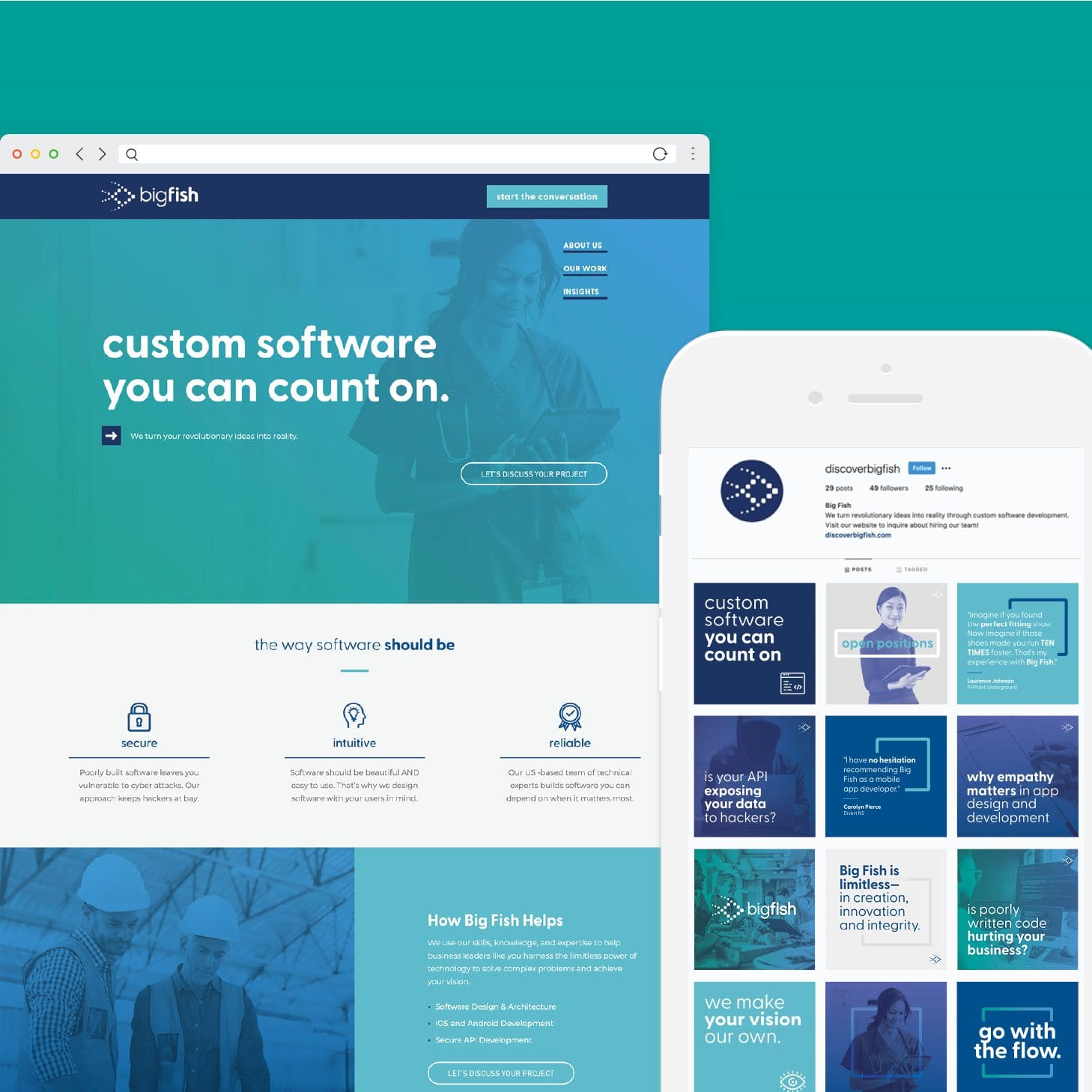
For the website design and content development, we used the Foundational presentation as our guiding light. We brought the websites’ pages to life with the imagery and colors of the updated visual design direction. Our team used the positioning statement and brand story to create messaging that clearly represented who Big Fish is.
WEBSITE ASSET PASS OFF
Once Sara approved the website design, we packaged everything up and gave the assets to the developer with developer directions. Their developer took the reins and have recently launched the site.SOCIAL PACK DEVELOPMENT
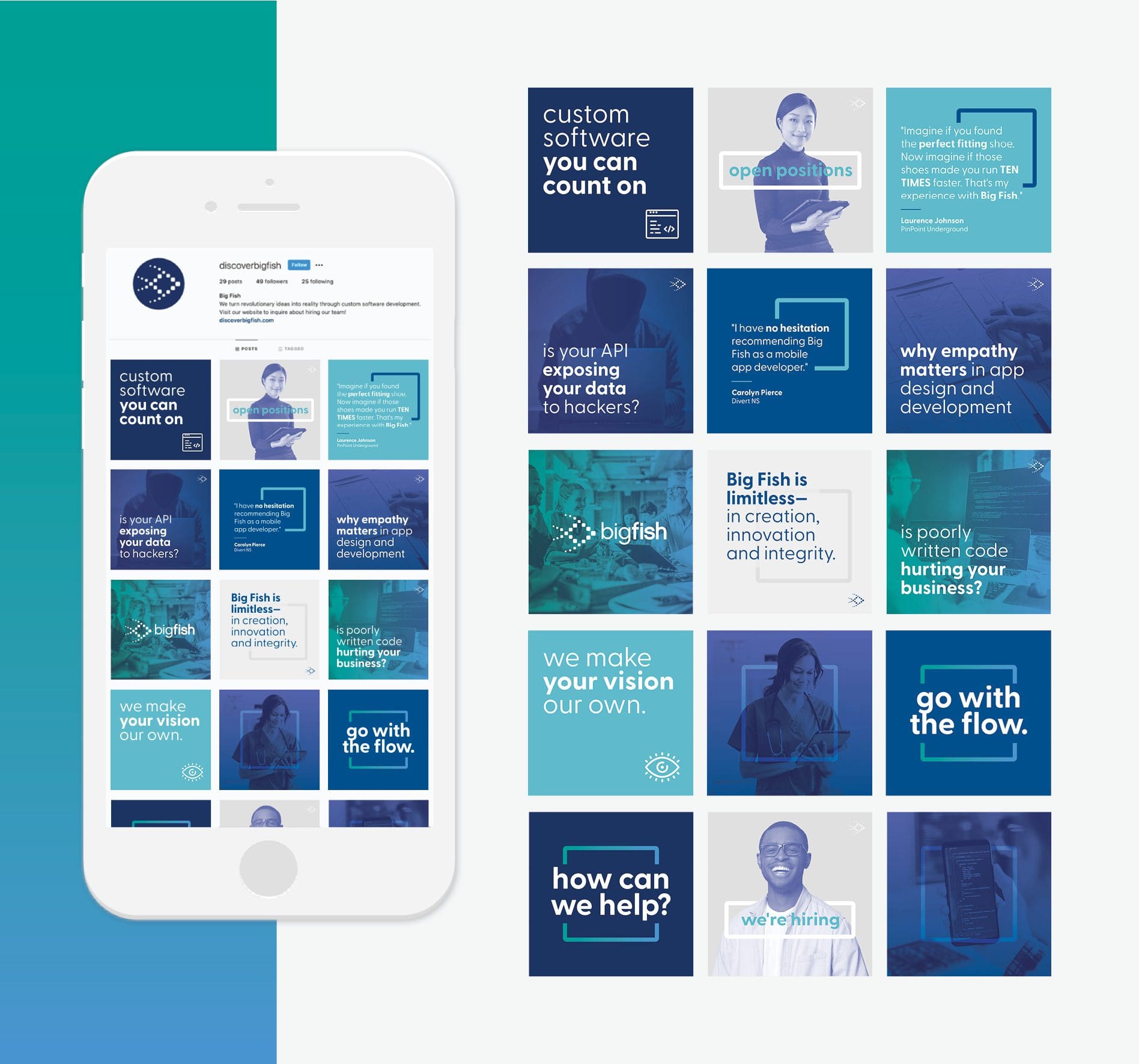
An additional piece we created for Big Fish was a Social Pack. Our Social Pack is a collection of branded, high-quality social media posts. Our clients can use these personalized posts to establish a consistent brand voice on their social media platforms. For Big Fish, we used their updated visual direction and messaging to create 15 custom social media posts. This included captions and hashtags that targeted Big Fish’s intended audience.


