Holler & Dash Restaurant Interior Design Review
Let’s just all agree that the restaurant branding and restaurant interior design at Holler & Dash, a biscuit house in Brentwood, Tennessee, is an exemplary case of effective brand positioning. From a restaurant branding perspective, they’ve nailed it. To the creatives who developed this brand and restaurant interior design: you're rockstars, and you deserve a whole sheet of gold stars.
Not one detail was overlooked — each piece is in place and executed to perfection. Every customer touchpoint was designed to connect with the customer and create an experience that alludes to good ol’ down-home Southern comfort. This is brand positioning done right.
Gather round, folks. Nice Branding Agency, a restaurant branding agency in Nashville, Tennessee, is about to break down this restaurant brand in one of our famous restaurant interior design reviews.
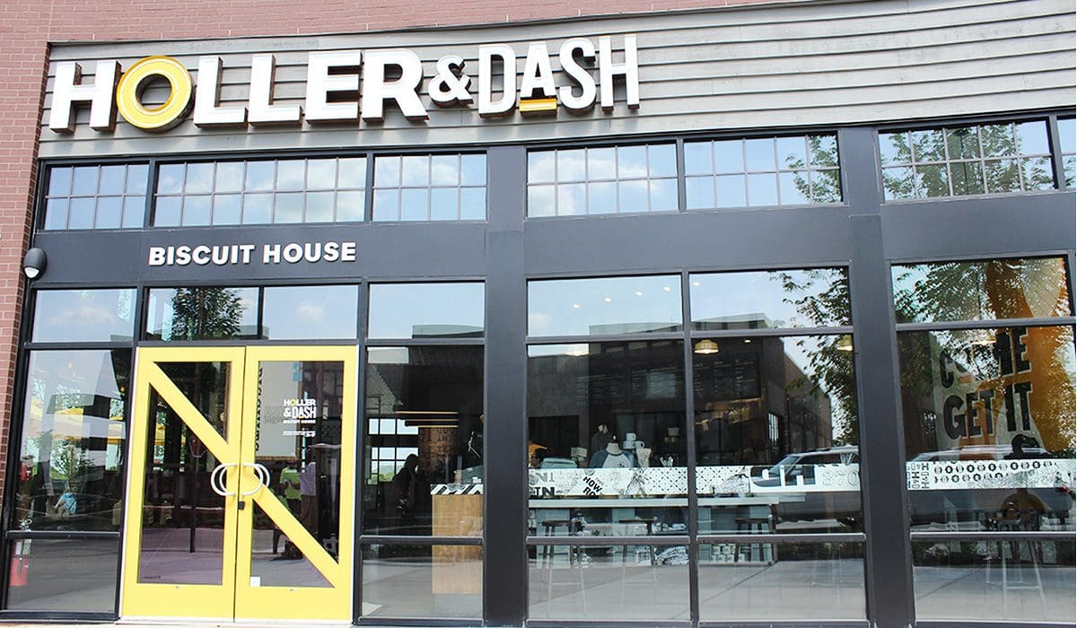 Holler & Dash is located within a live/work retail development. It’s a fairly new establishment to the Brentwood, Tennessee, scene, and I’m sure there were overwhelming rules and regulations to follow regarding landlord guidelines. The location probably didn’t leave too much flexibility for the exterior design of the space, but what was there was bright and modern, including the exterior sign and an inviting patio. I’m not a sign expert, but it looked like a mix of channel letters and neon lights. The one thing I am sure of is that it was NOT your standard retail space sign.
Right off the bat, I was struck by the yellow doors. It’s a little detail that made a huge difference. Think about all the retail doors you walk into on a daily basis. When’s the last time you saw one that was different than your standard black metal door? Someone had to actually outline that this be painted yellow. Yellow, as in one of the happiest colors on the planet. Yes, come on in. We are happy in here and happy to serve you. That’s what that yellow door said to me.
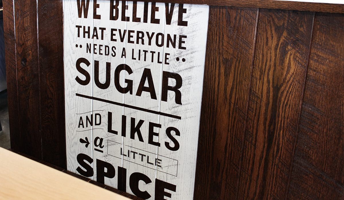
 As I began my glorious journey to the order counter, I passed several custom-made spacious wooden-slatted booths, a long wooden banquet, and multiple large wood-printed illustrations articulating the beliefs of the brand, along with other explanations of what made the product, service, and brand unique. It was clear what they were putting out there, and I didn’t have to question what I should think; they subtly told me.
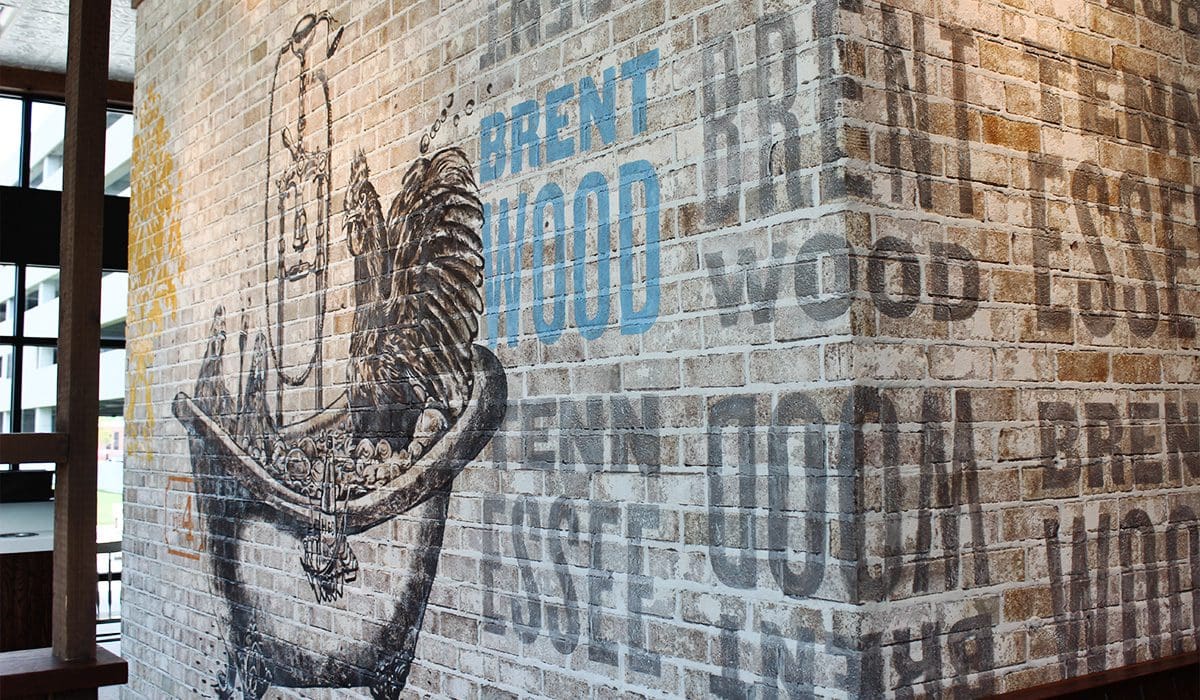
 There were multitudes of murals, artwork, textures, and finishes that engaged my senses. A large brick wall with a huge handpainted rooster and eggs brought together modern and rustic in an artistic dream, all while nodding to the freshness of their food. A geometric, vintage flower pattern was simply placed here and there to break up white walls and engage my eyes.
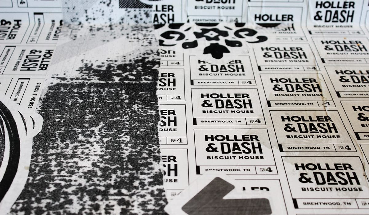 The way that this biscuit crew worked the local element into the restaurant interior design was very successful. They didn’t throw up a community cork board with posters pinned up, but instead they worked the city name and store number into various art elements. It was subtle and not forced, and it worked really, really well for the brand.
The four theme was seen in other places throughout the store as well, but never directly showcasing it as store number 4. It was subtle and cool, and once you figured it out, you felt a little more on the inside of the brand.
 Once again, I saw that a high-top bar seating area looking out over a large window can quickly become the most coveted seat in a restaurant these days.
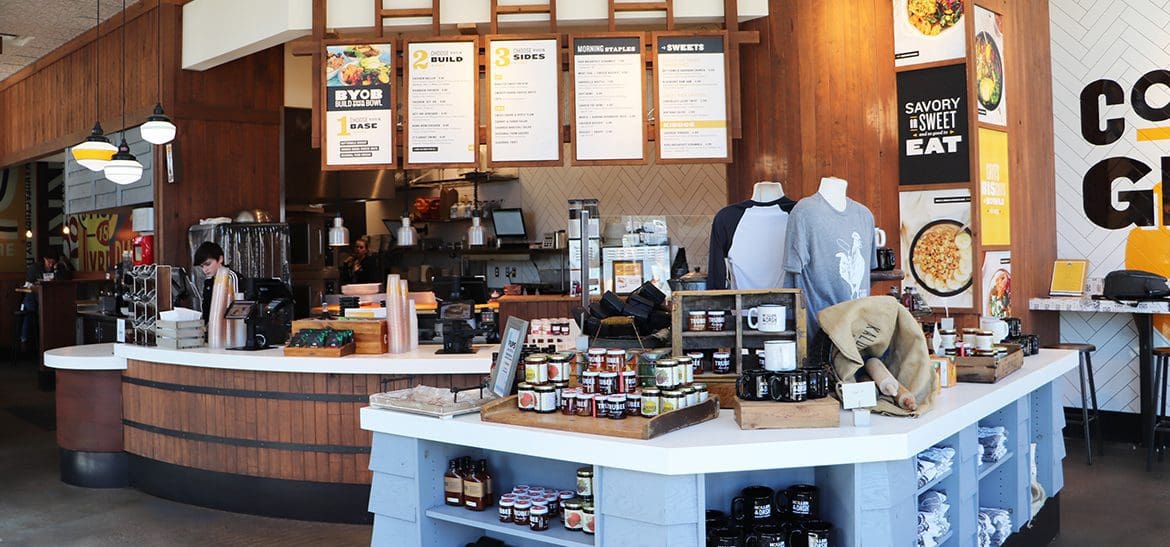
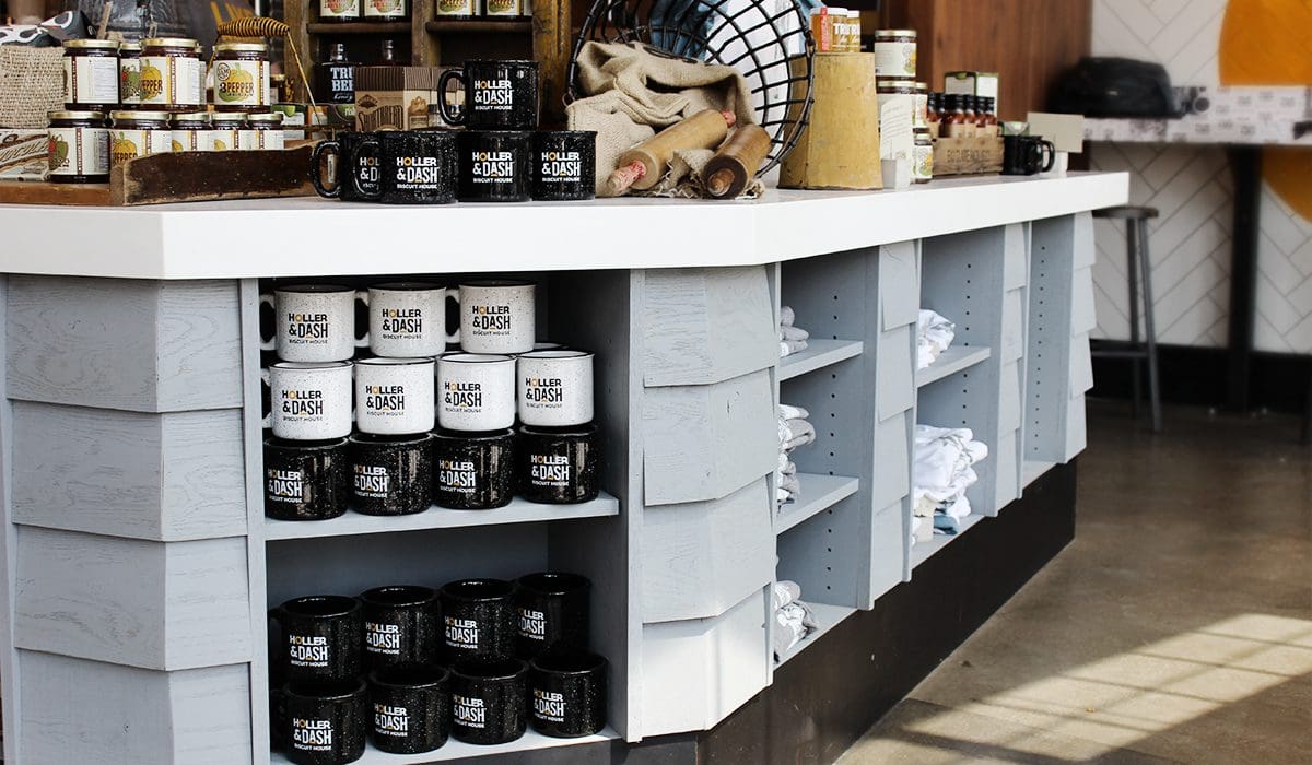
Directly interrupting my path to the register, as well as creating a natural flow for the line to form, was a retail merchandise display that housed sauces, tees, mugs, books, and many other goodies that all tipped their hats to the rustic, down-home, farm-fresh feeling that the brand was throwing at you. Oh, and yes, this brand is owned by Cracker Barrel, so you know they know a thing or two about retail.
 The attire that the team sported boasted cheeky sayings and fun vibes, once again connecting the customer to the brand’s beliefs. The fonts, colors, and the soft look of the cotton remain cohesive and connected to the brand.
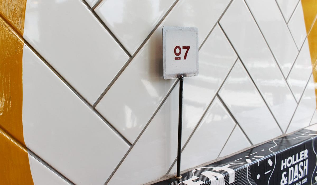
The table numbers weren’t just ordered from the www. They were metal and hand painted, distressed, and done up with one of the established brand fonts. Each place you had the opportunity to sit had a hole that propped the sign up, which added to the functionality and experience details of the restaurant interior design.
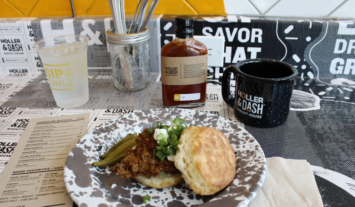
 One thing I was really drawn to was the serviceware. The plates were a mix of enamelware and old camp-style plates. The silverware was housed in wide-mouth Ball jars. I loved the detail that was put into the selection of the serviceware. Like I said, guys … no stone was left unturned here.
 The menu boards were digital. Sad-face emoji. I’m always grateful for the functionality of digital, but I’ll always hold a good, old-fashioned, handmade menu board close to my heart. I was a little thrown that they didn’t have something handmade in this area, but they did a great job of housing the screens, almost to the point where you couldn’t tell they were screens.
The countertop where orders were placed was organized and served as a landing spot of larger, homemade wood bins housing cold drinks, and point-of-sale displays used to hold additional menu options and marketing signage. My OCD self truly loved that everything in this area had a home or a holder, and nothing was just thrown on the counter.
The finishes in the space were impeccable. The vintage tile design serving as the welcome mat by the front door saluted this location being the 4th store in the company and has been a magnet for smartphone cameras.
The ceiling tiles were decorative antique-style tiles. The lighting in the space was a variety of farmhouse-inspired, vintage styles that were warm and welcoming. Vintage yellow barn pendants; white gooseneck barn lights; and some old-school, new-school pendants were scattered around and placed in just the right spots.
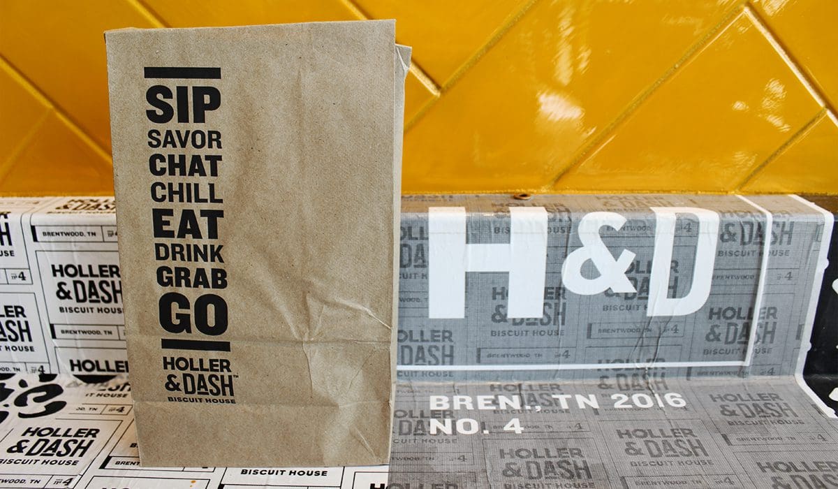 This brand got it right with their restaurant interior design. Really, they got all of it right, and my hands clap for them because it’s not an easy feat these days.
After writing this review and visiting the location a few times, I decided to take a peek at the brand’s website. I read the story, and they stand for community and a made-by-hand approach. That approach is not only directly related to their product, but to their entire brand. And now folks, it all makes sense — handcrafted biscuits served up warm in a handcrafted environment.
Get there if you’re around one. I’m certain you’ll love their restaurant interior design.
If you're looking to create a consistent restaurant brand that covers all customer touchpoints and makes an impact that can't be ignored, give Nice Branding Agency a call. We will make the magic happen!
Restaurant Interior Design: Eye Catching Exterior
 Holler & Dash is located within a live/work retail development. It’s a fairly new establishment to the Brentwood, Tennessee, scene, and I’m sure there were overwhelming rules and regulations to follow regarding landlord guidelines. The location probably didn’t leave too much flexibility for the exterior design of the space, but what was there was bright and modern, including the exterior sign and an inviting patio. I’m not a sign expert, but it looked like a mix of channel letters and neon lights. The one thing I am sure of is that it was NOT your standard retail space sign.
Right off the bat, I was struck by the yellow doors. It’s a little detail that made a huge difference. Think about all the retail doors you walk into on a daily basis. When’s the last time you saw one that was different than your standard black metal door? Someone had to actually outline that this be painted yellow. Yellow, as in one of the happiest colors on the planet. Yes, come on in. We are happy in here and happy to serve you. That’s what that yellow door said to me.
Restaurant Interior Design: Back Entrance
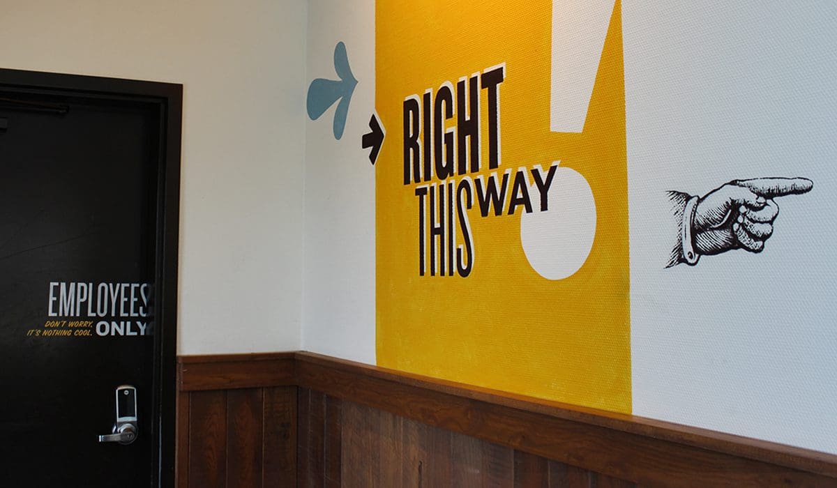
So, we’re going to take this from the back to the front because that’s where I entered from. And, as a side note, I was still blown away even though I didn’t come through the front door. As I entered, I was in the back of the store, near the staff door and the restrooms. The doors were full black metal, but the messaging on the doors connected with me. One was for staff only. Instead of just plopping “Staff Only” on the door, they added a cheeky message below it saying, “Don’t Worry. Nothing Cool is Happening in Here.” I mean come on, people … that’s good stuff. Connecting with the customer in the smallest areas makes the biggest difference.
Restaurant Interior Design: Oh The Details
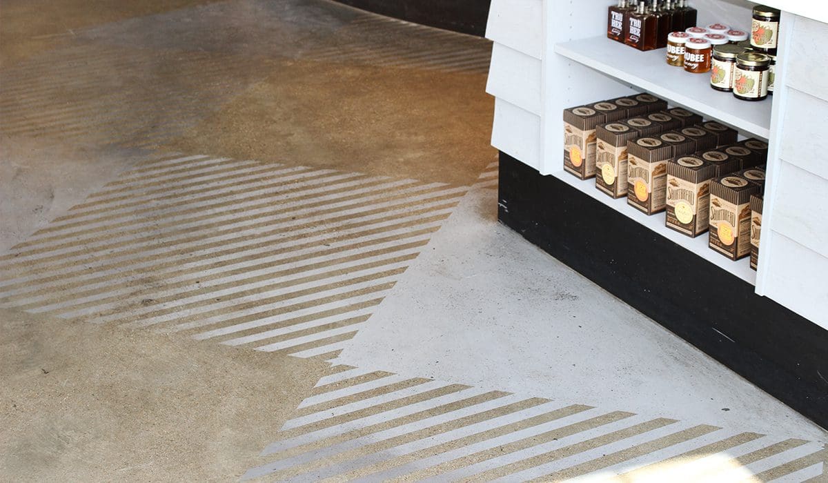
The floor where I entered was your standard, super-hip concrete floor, but they took it a step further by stamping a few different designs in the concrete. There was a subtle geometric pattern that added a fun element to the floor and was also seen scattered throughout the restaurant in different areas. As I began my glorious journey to the order counter, I passed several custom-made spacious wooden-slatted booths, a long wooden banquet, and multiple large wood-printed illustrations articulating the beliefs of the brand, along with other explanations of what made the product, service, and brand unique. It was clear what they were putting out there, and I didn’t have to question what I should think; they subtly told me.
 There were multitudes of murals, artwork, textures, and finishes that engaged my senses. A large brick wall with a huge handpainted rooster and eggs brought together modern and rustic in an artistic dream, all while nodding to the freshness of their food. A geometric, vintage flower pattern was simply placed here and there to break up white walls and engage my eyes.

Restaurant Interior Design: Hidden Number Four
Many of the booths and tables had little touches of the brand painted directly onto them. You’re right — it didn’t come from the factory that way. They had to have that custom painted, and guess what — I think they are on their sixth store now. These guys are living proof that it is possible to put unique touches in multi-location restaurant brands. There were logos, icons, art elements, and the number 4 shown in large, unexpected places which excited me as I explored the restaurant. The way that this biscuit crew worked the local element into the restaurant interior design was very successful. They didn’t throw up a community cork board with posters pinned up, but instead they worked the city name and store number into various art elements. It was subtle and not forced, and it worked really, really well for the brand.
The four theme was seen in other places throughout the store as well, but never directly showcasing it as store number 4. It was subtle and cool, and once you figured it out, you felt a little more on the inside of the brand.
Restaurant Interior Design: Being Trendy
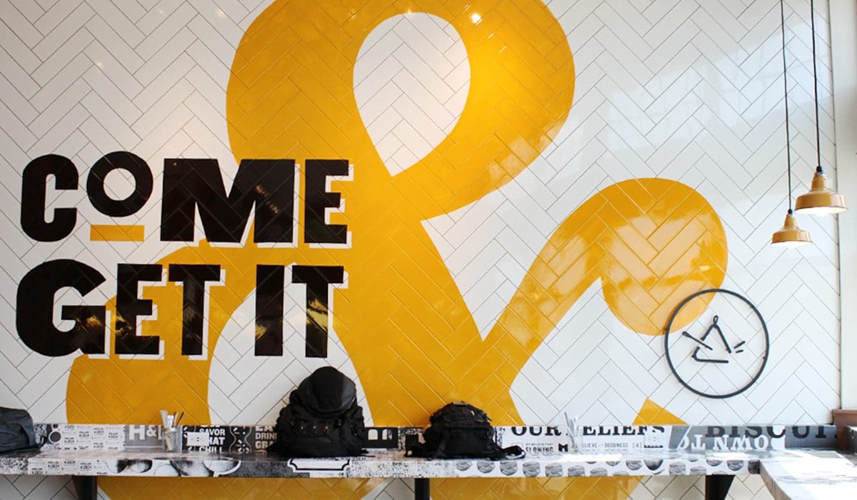
Loads of wood and natural elements were accented by pops of yellow and semi-eclectic, bold, black-and-white typographic elements. Think Subway in the ’90s, but cool. Nothing was too perfect, allowing the rustic nature of the brand to modernize itself through trendy artwork and beautiful typography. As I made it to the front of the store, there was a large focal wall that housed the logo in a big, huge, overdone way. It was just great. This display was done on a white subway tile wall, but the tile was laid in a herringbone pattern. Once again, I saw that a high-top bar seating area looking out over a large window can quickly become the most coveted seat in a restaurant these days.
Directly interrupting my path to the register, as well as creating a natural flow for the line to form, was a retail merchandise display that housed sauces, tees, mugs, books, and many other goodies that all tipped their hats to the rustic, down-home, farm-fresh feeling that the brand was throwing at you. Oh, and yes, this brand is owned by Cracker Barrel, so you know they know a thing or two about retail.
 The attire that the team sported boasted cheeky sayings and fun vibes, once again connecting the customer to the brand’s beliefs. The fonts, colors, and the soft look of the cotton remain cohesive and connected to the brand.
The table numbers weren’t just ordered from the www. They were metal and hand painted, distressed, and done up with one of the established brand fonts. Each place you had the opportunity to sit had a hole that propped the sign up, which added to the functionality and experience details of the restaurant interior design.
 One thing I was really drawn to was the serviceware. The plates were a mix of enamelware and old camp-style plates. The silverware was housed in wide-mouth Ball jars. I loved the detail that was put into the selection of the serviceware. Like I said, guys … no stone was left unturned here.
 The menu boards were digital. Sad-face emoji. I’m always grateful for the functionality of digital, but I’ll always hold a good, old-fashioned, handmade menu board close to my heart. I was a little thrown that they didn’t have something handmade in this area, but they did a great job of housing the screens, almost to the point where you couldn’t tell they were screens.
The countertop where orders were placed was organized and served as a landing spot of larger, homemade wood bins housing cold drinks, and point-of-sale displays used to hold additional menu options and marketing signage. My OCD self truly loved that everything in this area had a home or a holder, and nothing was just thrown on the counter.
The finishes in the space were impeccable. The vintage tile design serving as the welcome mat by the front door saluted this location being the 4th store in the company and has been a magnet for smartphone cameras.
The ceiling tiles were decorative antique-style tiles. The lighting in the space was a variety of farmhouse-inspired, vintage styles that were warm and welcoming. Vintage yellow barn pendants; white gooseneck barn lights; and some old-school, new-school pendants were scattered around and placed in just the right spots.
Restaurant Interior Design: Typography Done Right
All printed materials were done up right with stellar typography and graphic design, printed on craft paper that made my fingertips smile when I picked them up. This brand got it right with their restaurant interior design. Really, they got all of it right, and my hands clap for them because it’s not an easy feat these days.
After writing this review and visiting the location a few times, I decided to take a peek at the brand’s website. I read the story, and they stand for community and a made-by-hand approach. That approach is not only directly related to their product, but to their entire brand. And now folks, it all makes sense — handcrafted biscuits served up warm in a handcrafted environment.
Get there if you’re around one. I’m certain you’ll love their restaurant interior design.
If you're looking to create a consistent restaurant brand that covers all customer touchpoints and makes an impact that can't be ignored, give Nice Branding Agency a call. We will make the magic happen!
