Project Showcase for Holler & Dash
If you remember our 2017 Holler & Dash interior design review, you know we’ve been crushing on this brand for years. Recently, they reached out to our team to assist them with a restaurant branding and graphic design project to accompany a menu change they were implementing, and we jumped at the chance to work with the best biscuit makers in the ‘biz.
To give you some background, Holler & Dash is a Tennessee-based, Cracker-Barrel owned biscuit spot, founded on a love for biscuits and a commitment to good, old-fashioned southern hospitality. Just like parent company Cracker Barrel, Holler & Dash is committed to creating incredible, elevated comfort food flavors from scratch.
This aspect of their brand reaches everything they do, from the food to the dining environment. Their commitment to their branding and determination to do it right gives us all the heart eyes.
Our client reached out to us to refresh some of the Holler & Dash restaurant materials; they were making some modifications to their menu items, and with that, there came a need to reinvent the customer journey, update hand-held menus and menu boards, and shoot some new food photography. That's where Nice Branding Agency's restaurant branding skills came onto the scene.
The Customer Journey
A big part of this project was a review and assessment of the current space. With the new menu items came a need for an updated front counter and service platform. In addition, the client felt that there was wasted space in the front of the restaurant, which kicked off the customer journey.
After fully understanding how the new menu items would impact guest service and the current customer journey, our team reviewed the space from a customer perspective, and offered up a modified plan to kick off the customer journey.
We pinpointed the need for an updated entry sign, the removal of a high-top seating counter, the installation of permanent signage holders, and floor graphics to direct traffic. Additionally, we reviewed the digital menu display, but we'll come back to that piece of the pie.
Our team worked with the architectural firm, Design and Engineering, Inc., to design and fabricate the new installations. A great architectural firm is key to carrying out any interior branding project.
Pulling from an existing brand element, pattern arrows were placed on the floor to direct the customer through the order line, and past custom sign holders that introduced and highlighted the new menu items. Furthermore, these permanent sign holders would allow for another connection point with the customer, which we are always in favor of.
Let's walk through the updated menu and then we'll journey through the space and show you the updates.
Updated Restaurant Materials: Menu Design
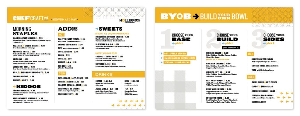
The updated Holler & Dash restaurant menu stuck with their classic morning staples and sides, and added a new bowl menu that could be customized. They also were adding on some biscuit-inspired ice cream desserts that needed new names and a new home on the menu.
To get started, we first reorganized the chef-crafted items to fit on one side of the print menu. Organizing all this goodness into an easy-to-read one-sheeter was a tricky puzzle, but we did it, and the final result flows perfectly from mains to sides, desserts and drinks.
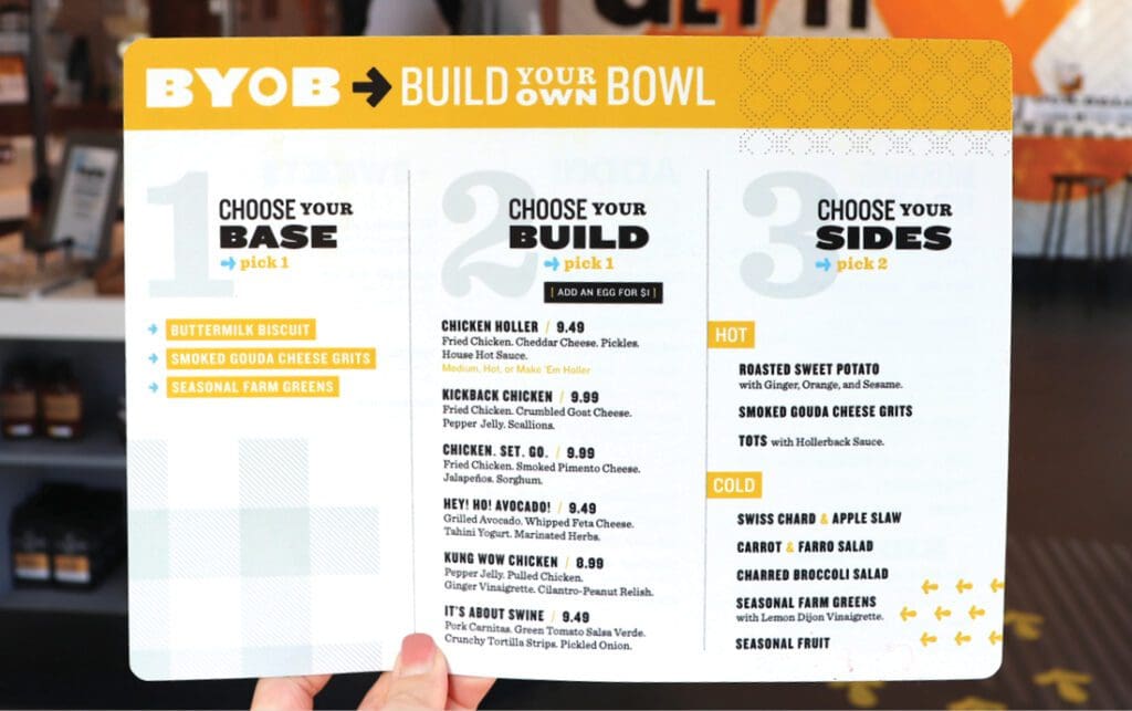
On the flip side of the menu, it’s as easy as 1, 2, 3. The “build your own bowl” side of the menu showcases the classic chef-inspired bowl creations and an easy three-step process to create your own.
We worked with existing brand elements such as custom-pattern textures on both sides of the menu to bring in a hint of the southern vibe that's inherent in the brand: we especially love the soft grey plaid print. Sophisticated southern indeed!
Updated Restaurant Materials: Food Photography
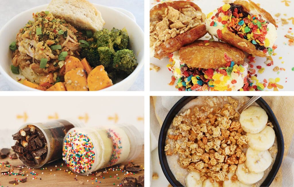
The next piece of the Holler & Dash project was food photos — really good ones. Through proper planning, our team was able to capture on-brand food photography of the new bowl and dessert menu items.
Our food photography process includes a curated set of props, backdrops and accessories to make every shot align with the brand. We spent a full day photographing all of the Holler & Dash dishes so we could fill their menu boards and new signage with food pictures of the good stuff.
Updated Restaurant Materials: New Menu Boards
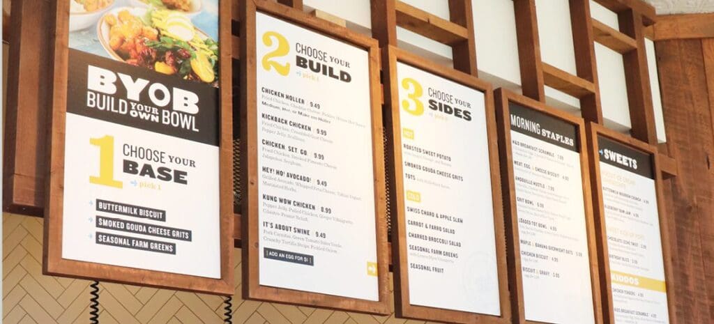
Once the print menus were updated, we got to work creating five menu boards to display the new offerings on the wall behind the register. These broke up the newly designed print into five pieces: three for build your own bowl and then two more for morning staples, desserts, and kids’ menu items.
We were also asked to review the existing digital menu boards and determine whether or not the menu boards should remain digital, or if they should be reinvented to another material.
Understanding who Holler & Dash is as a brand lead us to the decision to implement a new menu board system that better aligned with their down-to-earth vibe. We worked with Design and Engineering, Inc. out of Franklin, Tennessee to rework the menu board system.
The new menu boards were printed on foam core, housed in a wood frame, and they look pretty good up on the wall if we do say so ourselves!
Restaurant Graphic Design Entry Sign
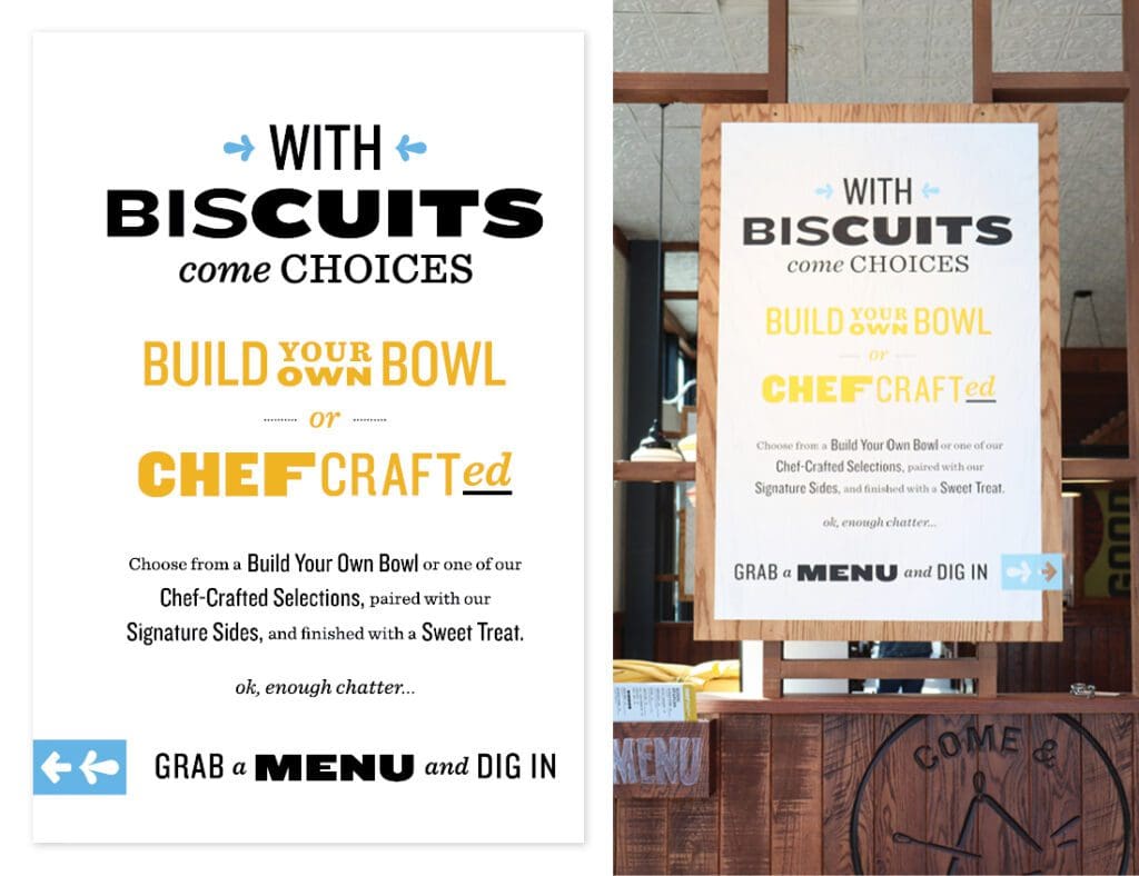
The Holler & Dash entryway has a divider wall that holds a sign. When the new bowl menus were released, we strategized and designed a new entry sign to encourage visitors to grab a menu and read up on the new additions. It easily explains the build-your-own concept in an eye-catching design that snatches attention right at the front door and kicks off their customer journey with a clear direction of how to order.
Restaurant Graphic Design Window Signs
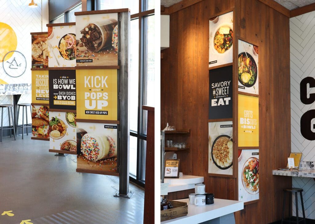
The new permanent sign displays were where we really got to let the food photography do its thing. After the design and fabrication of the new displays, we filled them with custom signage to promote and introduce the new menu items through on-brand messaging and food photography.
These stand tall and proud in the storefront window, catching the eyes of those passing the restaurant, and informing customers of great things they need to know about Holler & Dash.
Restaurant Graphic Design Wall Signs
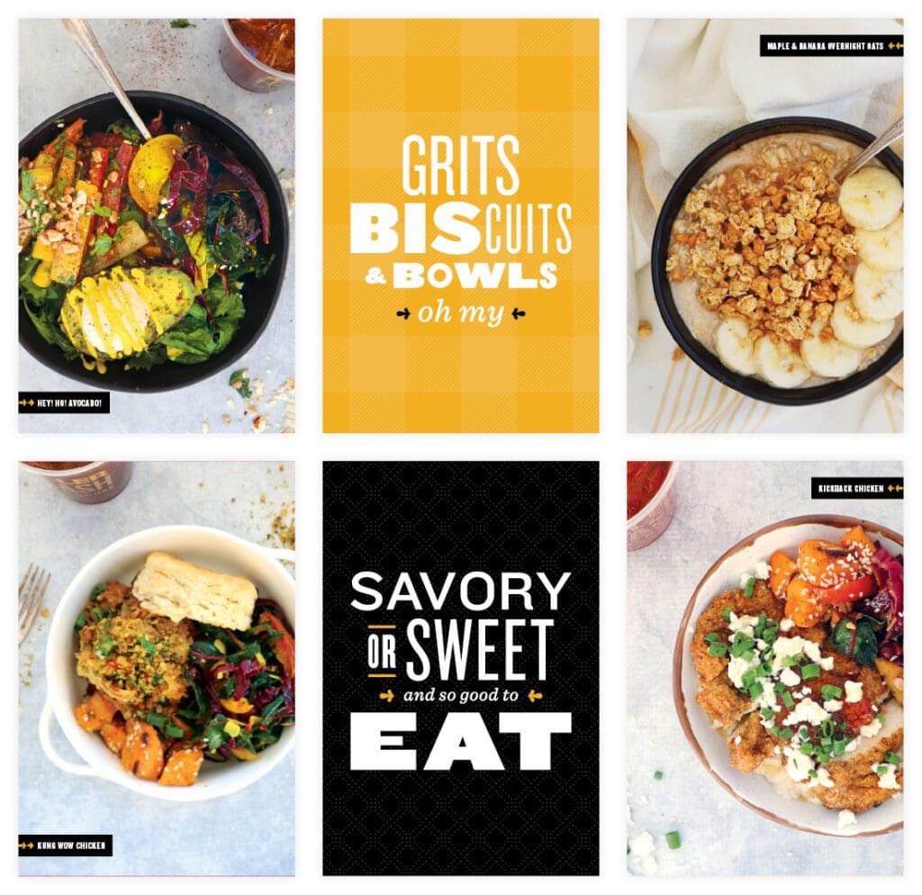
In addition to the permanent window sign displays, we worked with Design and Engineering, Inc. to design and fabricate another permanent wall sign holder. This would offer another touchpoint in the customer journey and provide Holler & Dash an additional outlet to speak to the customer.
After the fabrication of the sign display was completed, we created signs to fill the display that focused on the goodness in the food. We selected our most enticing food photography shots and paired them with messaging that utilized some clever wordplay to showcase the sassy southern brand voice. Not only do these make for a great Instagram shot, but they drive home the vibe of the brand and bring the menu to life.
Being part of the launch of the new Holler & Dash menu was fun for our team and our taste buds. Updating restaurant materials for an established brand is a careful balancing act of old and new, and we’re super proud of how this project turned out.
If you’re ready to update some of your restaurant materials with on-brand graphic design, give Nice Branding Agency a call. We can help you out every step of the way: 615-905-9936.

