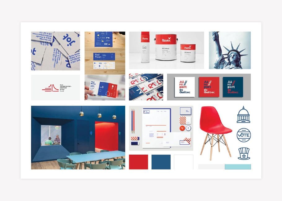
Our Favorite Before and After Logo Redesign Examples
Some clients come to us with existing logos, and as a branding agency, it’s our job to assess the design and see whether or not the logo will serve them well. Scroll for some of our favorite logo redesign examples from over the years.
Just as a well-designed logo can help a business to appear professional and polished to potential customers, a poorly-designed logo can damage the perception of your business. So, while your business logo definitely doesn’t carry the weight of your entire brand (that’s what brand support is for!) it’s an important brand asset for your business.
For many businesses, the first logo design is created without that deep dive into the purpose and personality of the company, and the result is a logo design that doesn’t represent the company well. When that happens, it’s time for a little job we like to call a logo revamp.
Want to see how impactful a logo refresh or logo redesign can be for a business? Check out some of our favorite logo transformations from the past.
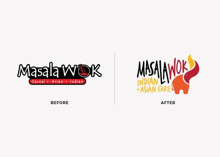 The original Masala Wok logo included intricate details that wouldn’t resize well; both the icon and the supporting font had tiny lines that are hard to see at most sizes. Additionally, the black background was too dark; it did not communicate the feeling of the bright, powerful flavors of the Masala Wok food. Overall, the original logo just doesn’t represent the cool, trendy cuisine Masala Wok offers, and it wasn't unique within the authentic fast-casual market.
As our logo design agency got started on the logo design project, we met with the restaurant’s founder to discuss all things Masala Wok and determine what was and was not working in their brand. After that, we got to work creating a brand direction that highlighted their best assets and would attract the new, mainstream customers they were after. The final visual direction featured warm, vibrant colors reminiscent of the streets of India, paired with modern lines indicative of Asian cultures.
The original Masala Wok logo included intricate details that wouldn’t resize well; both the icon and the supporting font had tiny lines that are hard to see at most sizes. Additionally, the black background was too dark; it did not communicate the feeling of the bright, powerful flavors of the Masala Wok food. Overall, the original logo just doesn’t represent the cool, trendy cuisine Masala Wok offers, and it wasn't unique within the authentic fast-casual market.
As our logo design agency got started on the logo design project, we met with the restaurant’s founder to discuss all things Masala Wok and determine what was and was not working in their brand. After that, we got to work creating a brand direction that highlighted their best assets and would attract the new, mainstream customers they were after. The final visual direction featured warm, vibrant colors reminiscent of the streets of India, paired with modern lines indicative of Asian cultures.
 With the visual brand direction in place, we moved on to the new logo design. Our logo design experts took the visual direction from the brand board and designed an elephant icon with a flame-shaped trunk. Just like the Masala Wok food, the elephant combines a traditional Indian icon, an elephant, with the flame indicative of the wok used in many kinds of Asian cooking.
Just like the cultures, the colors intertwine in the flame to represent both regions that make up the basis for the menu. We paired the elephant with an approachable font that conveys the fast-casual aspect of the restaurant. The final logo is much more appropriate for a fast-casual restaurant than the original logo, highlighting the culture of Masala Wok in a way that the mainstream public can feel and relate to. Most of all, the logo is bold and impactful. See the full project in our restaurant branding portfolio.
With the visual brand direction in place, we moved on to the new logo design. Our logo design experts took the visual direction from the brand board and designed an elephant icon with a flame-shaped trunk. Just like the Masala Wok food, the elephant combines a traditional Indian icon, an elephant, with the flame indicative of the wok used in many kinds of Asian cooking.
Just like the cultures, the colors intertwine in the flame to represent both regions that make up the basis for the menu. We paired the elephant with an approachable font that conveys the fast-casual aspect of the restaurant. The final logo is much more appropriate for a fast-casual restaurant than the original logo, highlighting the culture of Masala Wok in a way that the mainstream public can feel and relate to. Most of all, the logo is bold and impactful. See the full project in our restaurant branding portfolio.
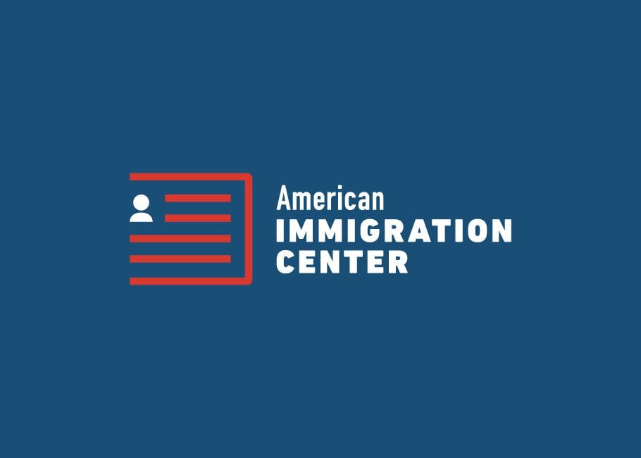
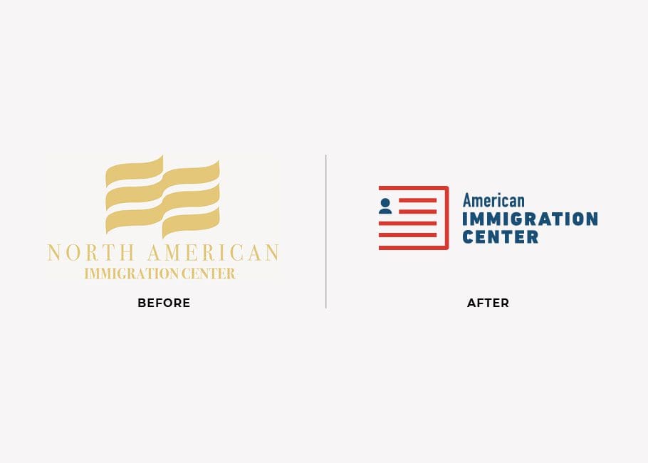 The original American Immigration Center logo was flat; it was a one-color design with a dated serif font that was hard to read at small sizes. So, our logo project was focused on creating a refreshed design that would reflect the welcoming, knowledgeable personality of the American Immigration Center.
Our work on their brand pulled in colors indicative of the United States and modern, approachable touches to make the brand accessible and inviting to new customers. Check out the final brand board:
The original American Immigration Center logo was flat; it was a one-color design with a dated serif font that was hard to read at small sizes. So, our logo project was focused on creating a refreshed design that would reflect the welcoming, knowledgeable personality of the American Immigration Center.
Our work on their brand pulled in colors indicative of the United States and modern, approachable touches to make the brand accessible and inviting to new customers. Check out the final brand board:
 To bring the new logo into alignment with the brand board, we created an icon that was both an American flag and a passport, with a human icon to incorporate the personal feel of the brand. The updated logo is much more modern and inviting than the initial design. The new logo is professional, legitimizing their company as the one you would trust with your immigration needs.
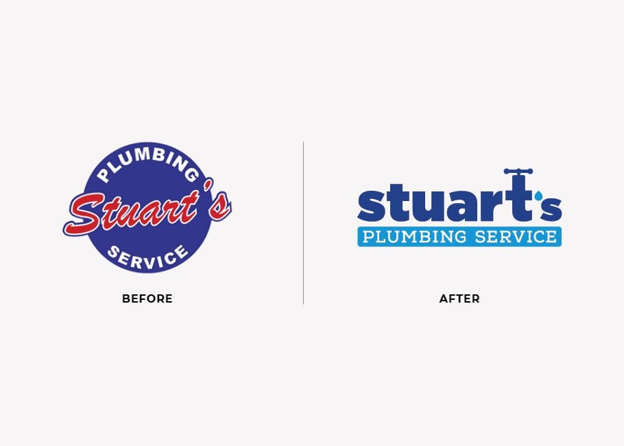 We knew the updated logo needed a strong icon and elements recognizable to the plumbing industry in a bold, but not overly-literal way.
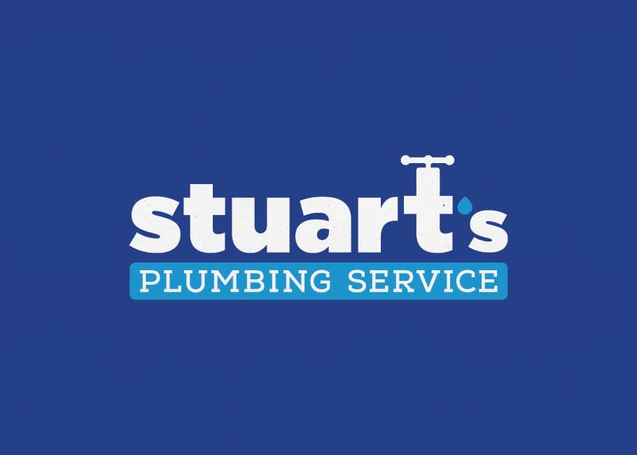
The final product, seen in this group of logo redesign examples, turns the letter “T” into a faucet with a water droplet near the mouth of the faucet that forms an apostrophe. The lowercase letters and bold font make the design approachable, indicative of the friendly family-owned experience customers have with Stuart’s Plumbing. The blue colors work well together and visually associate the logo with water, honesty, and professionalism.
Read further about their project in our business branding portfolio.
We knew the updated logo needed a strong icon and elements recognizable to the plumbing industry in a bold, but not overly-literal way.
The final product, seen in this group of logo redesign examples, turns the letter “T” into a faucet with a water droplet near the mouth of the faucet that forms an apostrophe. The lowercase letters and bold font make the design approachable, indicative of the friendly family-owned experience customers have with Stuart’s Plumbing. The blue colors work well together and visually associate the logo with water, honesty, and professionalism.
Read further about their project in our business branding portfolio.
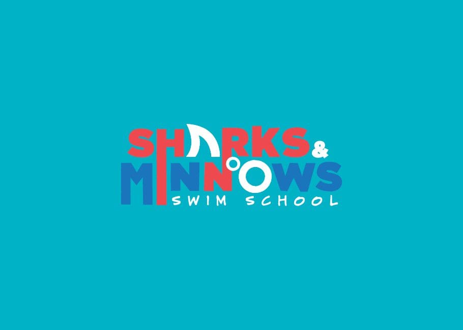
 To adapt the picture into a viable brand mark, we simplified the ideas of the original design into a cohesive logo. The final design, featured in this logo redesign examples showcase, has a shark fin “A” and a bubble “O”. The primary colors are kid-friendly and fun, and the fonts are happy and approachable. There final design is professional and cohesive.
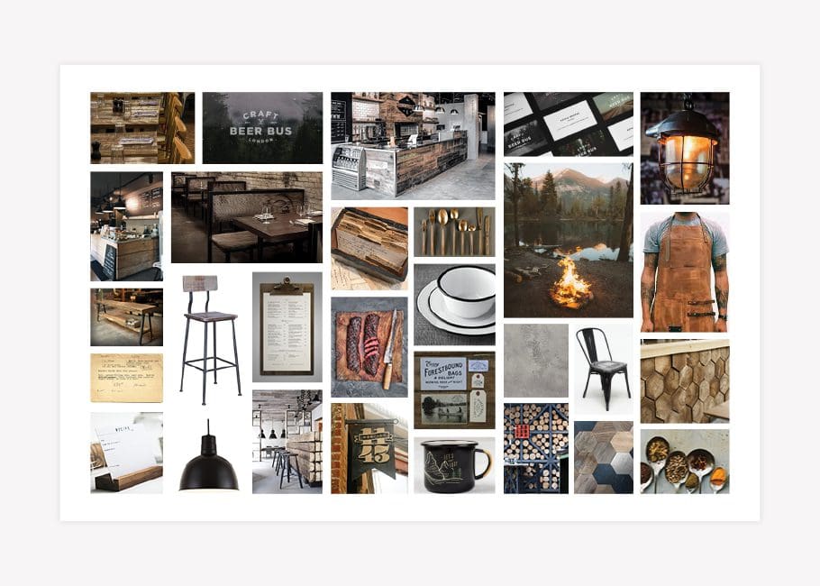
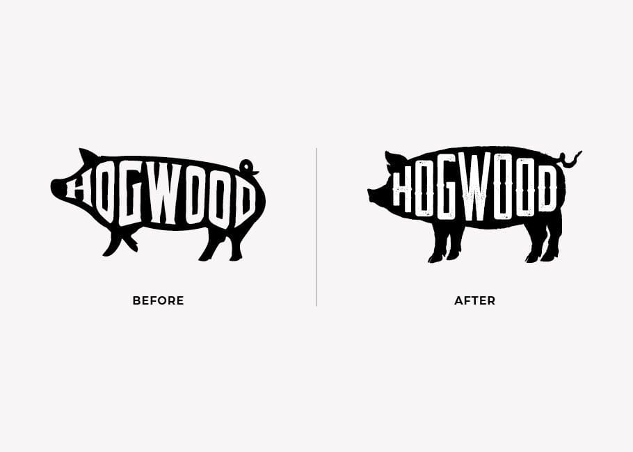 Hogwood is a BBQ restaurant based off of a successful Colorado catering business with a focus on the fire. Their brand board features dark, wood hues, warm lighting, and highlights the fire. With that in mind, we thought the design of the initial brand mark aligned well enough to keep and update.
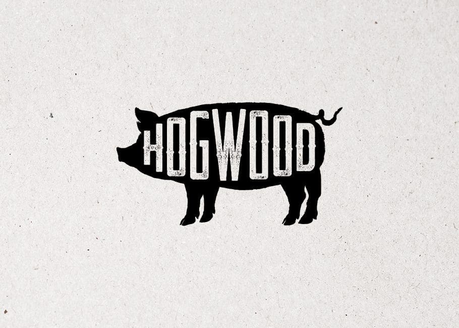
 To clean up the logo, we updated the font and the outline of the pig, making him stationary and a little more detailed. The final mark is versatile and scalable so it can be put on everything from the sign outside to the labels of their signature BBQ sauce. Additionally, the logotype can be pulled out of the pig and used on its own, making, for one, embroidered attire achievable.
 For 16 Handles, we ended up following a similar process to update their iconic mark. It fit with the fun feeling of the brand and had the added value of customer recognition but just felt a little bit outdated.
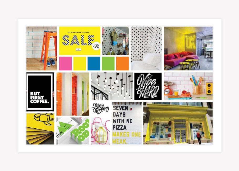
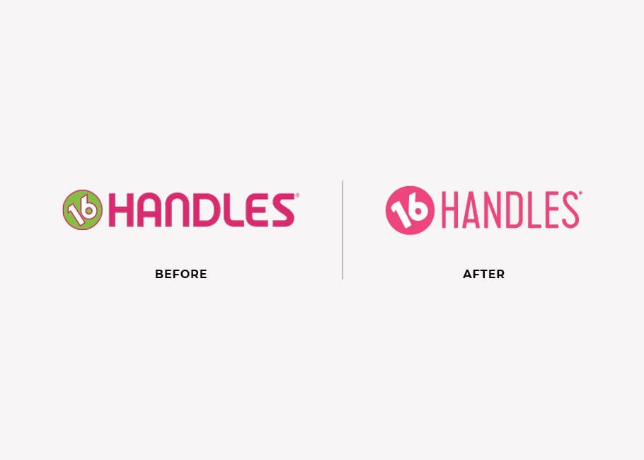 As you can see, the 16 Handles brand board is full of neon colors, bold typography, and modern graphic patterns. It’s simple, bold, and colorful.
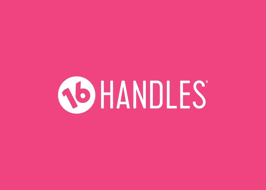
 To make the logo align better with the brand visual direction, we first removed the outlines from around the logotype. Then, we updated the font to a more rounded, trendy typography choice. Finally, we pulled out any unnecessary elements so that the logo would look great on everything from small cups to big signs.
 Inspired by our logo redesign examples? If your logo needs a re-do or a do-over, we’re the team for you. Hit us up or call to get started: 615-905-9936.
For more inspo and examples of our branding work, head over to our portfolio.
Inspired by our logo redesign examples? If your logo needs a re-do or a do-over, we’re the team for you. Hit us up or call to get started: 615-905-9936.
For more inspo and examples of our branding work, head over to our portfolio.
MASALA WOK
Masala Wok was an expanding fast-casual restaurant when they reached out to our logo design company to help them solidify their brand identity. At the time, they were working on opening two new locations, but they were having problems connecting to the mainstream public with their existing brand.
With the visual brand direction in place, we moved on to the new logo design. Our logo design experts took the visual direction from the brand board and designed an elephant icon with a flame-shaped trunk. Just like the Masala Wok food, the elephant combines a traditional Indian icon, an elephant, with the flame indicative of the wok used in many kinds of Asian cooking.
Just like the cultures, the colors intertwine in the flame to represent both regions that make up the basis for the menu. We paired the elephant with an approachable font that conveys the fast-casual aspect of the restaurant. The final logo is much more appropriate for a fast-casual restaurant than the original logo, highlighting the culture of Masala Wok in a way that the mainstream public can feel and relate to. Most of all, the logo is bold and impactful. See the full project in our restaurant branding portfolio.
AMERICAN IMMIGRATION CENTER
American Immigration Center came to our logo design company wanting a cohesive brand that represented what they do. They also wanted their logo to set them apart from their competitors. Our branding project included an updated logo, stationery, and interior branding so they could open offices in new cities and become the go-to company for immigration services in the United States.
To bring the new logo into alignment with the brand board, we created an icon that was both an American flag and a passport, with a human icon to incorporate the personal feel of the brand. The updated logo is much more modern and inviting than the initial design. The new logo is professional, legitimizing their company as the one you would trust with your immigration needs.
LOGO REDESIGN EXAMPLES: STUART'S PLUMBING
Stuart’s Plumbing reached out to our logo design company for a rebrand in order to start attracting their ideal clients and heighten the level of professionalism their company brand support conveyed. They also wanted to bring the updated branding to vehicle graphics for their transit fleet, so we got to work updating their logo design to something that would look great on big vehicles, tiny business cards, and everything in between. The existing Stuart’s Plumbing logo was more indicative of a baseball team than a professional plumbing company. The logo colors did not work well together, and the logo design did not communicate the plumbing industry or the professionalism of the business.LOGO REDESIGN EXAMPLES: SHARKS + MINNOWS
Sharks & Minnows is a swim school with locations throughout the state of Florida. We’d been working with the company for over 10 years on a seasonal basis to create flyers and other graphic elements as needed. However, until we worked on the logo redesign project, we’d never been able to create a solid brand for the business. Every graphic design project simply took on its own look and feel based on the theme for the season. Our branding agency realized that this wasn’t ideal and we talked to our client about updating the logo to create the basis for the brand. The original Sharks + Minnows logo was more of a picture than a logo; it is way too complicated to be a recognizable mark for their brand. The details and half dozen colors make it impossible to replicate on small brand elements and unusable when a black and white or transparent version is needed.LOGO UPDATES: HOGWOOD AND 16 HANDLES
Sometimes, a company’s first logo design works. A great design can grow with your company and only need minor tweaks over the years to stay relevant in your market. Take Coca-Cola and Starbucks, for example. They update regularly while maintaining brand loyalty and customer recognition. Sometimes, we get our hands on one of these little gems that simply need a bit of polishing. The Hogwood BBQ logo and 16 Handles logo both were refreshed by our logo design company and will serve each company for a few more years. The original Hogwood BBQ logo was a logo and logotype in one. That complicated its use on various items. The logotype could not be used without the shape of the pig, which was complicated and tricky for the company at times. This, in itself is enough to do some logo design work; however, the original logo was not professionally designed and needed a bit of a professional detail job.
To clean up the logo, we updated the font and the outline of the pig, making him stationary and a little more detailed. The final mark is versatile and scalable so it can be put on everything from the sign outside to the labels of their signature BBQ sauce. Additionally, the logotype can be pulled out of the pig and used on its own, making, for one, embroidered attire achievable.
To make the logo align better with the brand visual direction, we first removed the outlines from around the logotype. Then, we updated the font to a more rounded, trendy typography choice. Finally, we pulled out any unnecessary elements so that the logo would look great on everything from small cups to big signs.
Inspired by our logo redesign examples? If your logo needs a re-do or a do-over, we’re the team for you. Hit us up or call to get started: 615-905-9936.
For more inspo and examples of our branding work, head over to our portfolio.


