Three Restaurant Interior Design Projects
A businesses' physical space has the ability to create a life-changing experience and tie customers to the brand for life. Our branding team at Nice Branding Agency uses business interior design to create experiences that fully immerse the customer in the brand through compelling visuals and messaging.
 The practice of bringing a brand to life within the walls of a physical space is called environmental branding. This can also be referred to as business interior design. This is inclusive of both the inside and outside of a space, including the choosing of the light fixtures, flooring, wall finishes, wall installations, furnishing, fixtures and hardware. Business interior design makes a brand not only tangible but also allows for the creation of a strategic consumer experience.
Today, we'll be focusing on a few of our favorite business interior projects that we've completed. Within this review, we'll be drawing the connection of how interior design contributes to a customer's experience.
The practice of bringing a brand to life within the walls of a physical space is called environmental branding. This can also be referred to as business interior design. This is inclusive of both the inside and outside of a space, including the choosing of the light fixtures, flooring, wall finishes, wall installations, furnishing, fixtures and hardware. Business interior design makes a brand not only tangible but also allows for the creation of a strategic consumer experience.
Today, we'll be focusing on a few of our favorite business interior projects that we've completed. Within this review, we'll be drawing the connection of how interior design contributes to a customer's experience.
 The Nice team developed a brand for a Gyro restaurant that focuses on street-food-inspired, halal-style food in Texas. We were tasked with naming the restaurant, creating visual direction, logo design, website design, and menu design. We also created marketing materials, including a take-out bag design and cup design, as well as design staff t-shirts and other merchandise.
 Despite all of those wonderful pieces we created, the business interior branding was the most impactful. An interior branding plan was constructed to ensure that the overall look and feel of the brand was fully in alignment with the brand's overall visual direction.
The restaurant floor plan and seating layout was where we chose to start. These were provided by the architect. With these, we were able to create a plan that designated choices for lighting, flooring, seating, tables, wall art, wall color and texture, tile, floor graphics, etc. Our job was to choose or create all the elements that a customer will encounter as they journey through the space.
Our goal was to create an environment that would convey Gyro Republic's brand narrative, which is focused around the concept of street food for the people and the power to choose (It's a republic, get it?). This design had an emphasis on millennial customers, but it was still tailored to appeal to the a wider demographic.
We selected concrete floors to serve as a base for the design. This would allow us to use hand-painted graphics to guide the customer journey. It seems that all too often quick-service restaurants don't acknowledge the customer journey and underwhelm and confuse people when they enter the building.
Despite all of those wonderful pieces we created, the business interior branding was the most impactful. An interior branding plan was constructed to ensure that the overall look and feel of the brand was fully in alignment with the brand's overall visual direction.
The restaurant floor plan and seating layout was where we chose to start. These were provided by the architect. With these, we were able to create a plan that designated choices for lighting, flooring, seating, tables, wall art, wall color and texture, tile, floor graphics, etc. Our job was to choose or create all the elements that a customer will encounter as they journey through the space.
Our goal was to create an environment that would convey Gyro Republic's brand narrative, which is focused around the concept of street food for the people and the power to choose (It's a republic, get it?). This design had an emphasis on millennial customers, but it was still tailored to appeal to the a wider demographic.
We selected concrete floors to serve as a base for the design. This would allow us to use hand-painted graphics to guide the customer journey. It seems that all too often quick-service restaurants don't acknowledge the customer journey and underwhelm and confuse people when they enter the building.
 The next step we took was choosing the seating and tables for the restaurant. The seating choices played a large role in quietly communicating the brand message. We varied the chairs in the color and style. The seating was in alignment with the brand aesthetic and color. The variety of seating signified a customer's power to pick a seat of their choosing. Beyond that, the varying styles and colors told the story of the differences between the people themselves that exist within the republic.
To build consistency amongst the plethora of different chairs, we choose wooden tables to fill the space. On one wall, we added in custom booth seating to make the most of the space within the limited footprint. We also determined that the riser at the foot of the booth seating should be adorned with a focal tile that would mimic the tile at the register.
We utilized the blank walls as a canvas to convey the brand message in an indisputable and unmistakable way. We then chose apply custom art on both side of the restaurant. For the left wall, near the entry, we designed a substantial mural with the statement "Make Gyros Not War." This phrase was in alignment with the overall brand approach and offered a pretty impressive statement to anyone whom entered the space.
The next step we took was choosing the seating and tables for the restaurant. The seating choices played a large role in quietly communicating the brand message. We varied the chairs in the color and style. The seating was in alignment with the brand aesthetic and color. The variety of seating signified a customer's power to pick a seat of their choosing. Beyond that, the varying styles and colors told the story of the differences between the people themselves that exist within the republic.
To build consistency amongst the plethora of different chairs, we choose wooden tables to fill the space. On one wall, we added in custom booth seating to make the most of the space within the limited footprint. We also determined that the riser at the foot of the booth seating should be adorned with a focal tile that would mimic the tile at the register.
We utilized the blank walls as a canvas to convey the brand message in an indisputable and unmistakable way. We then chose apply custom art on both side of the restaurant. For the left wall, near the entry, we designed a substantial mural with the statement "Make Gyros Not War." This phrase was in alignment with the overall brand approach and offered a pretty impressive statement to anyone whom entered the space.
 For this mural, we utilized neon lights for the phrase. An illustrated hand holding up a peace sign was prominently placed, and the logo icon was very visible within the design too. We strategically placed this mural to grab the attention of customers, even from outside. It was also created as a "selfie-wall" of sorts that would allow diners to take a photo from anywhere they may be sitting in the dining room.
 Right across the dining room, we created a typographic poster that featured other key phrases. We placed these words on top of black-and-white imagery that illustrated traditional street food. The brand colors were laid on top of the images to unite the art to fit the overall visual direction.
 Another custom mural greeted the customers as they came up to the point of purchase. This mural was created to add to the space where diners would wait while placing their orders. The hand-drawn piece displayed drawings and brand messaging such as "fight for clean ingredients;" "made with love, not MSG;" "globally-inspired;" and more. This mural was placed intentionally, we thought it was important to publicize the brand's differentiators in a place where people would have time to take them in.
 To further define the customer journey, industrial, powder-coated piping was implemented to divide the line and create a path for customers to follow. Additionally, the point-of-purchase counter was made into a focal point with the use of custom tile on the riser. From the front door, any customer could easily make out the journey, and where it would end at the point of purchase.
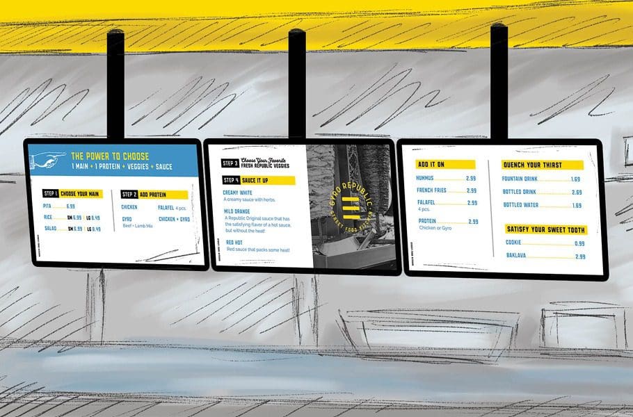 We designed digital menu boards to hang in the ordering area because we felt that this was in alignment with customer expectations for the target marketing and the overall modern feel of the space. Also, operationally, this makes changing out information so much simpler!
We chose white subway tile for the wall behind the point of purchase and paired it with a blue grout. This wall transitioned to a yellow subway tile with a gray grout on the right wall by the dining room. This simple difference created a distinction between the dining room and the prep and purchase area.
For the bathrooms, we chose to utilize the brand colors for the walls and doors while keeping the fixtures and finishes in alignment with the overall brand direction.
Lastly, we created a lighting plan. When investing in business interior branding, no customer touchpoint should be neglected. Lighting is one of the touchpoints that's commonly overlooked. We exploited the power of lighting to develop distinct areas within the space. We lined the ordering area with starburst flush mount lighting and lit the dining room with modern linear pendant lights.
Overall, the restaurant interior design we completed for Gyro Republic is extremely fascinating. The attentive design and rational, united application of the brand within the space make for an extremely "Instagrammable" space. The brand story is told throughout the space in a manner that communicates the restaurant's position within the market, their ethics, and differentiators to anyone that comes in.
We designed digital menu boards to hang in the ordering area because we felt that this was in alignment with customer expectations for the target marketing and the overall modern feel of the space. Also, operationally, this makes changing out information so much simpler!
We chose white subway tile for the wall behind the point of purchase and paired it with a blue grout. This wall transitioned to a yellow subway tile with a gray grout on the right wall by the dining room. This simple difference created a distinction between the dining room and the prep and purchase area.
For the bathrooms, we chose to utilize the brand colors for the walls and doors while keeping the fixtures and finishes in alignment with the overall brand direction.
Lastly, we created a lighting plan. When investing in business interior branding, no customer touchpoint should be neglected. Lighting is one of the touchpoints that's commonly overlooked. We exploited the power of lighting to develop distinct areas within the space. We lined the ordering area with starburst flush mount lighting and lit the dining room with modern linear pendant lights.
Overall, the restaurant interior design we completed for Gyro Republic is extremely fascinating. The attentive design and rational, united application of the brand within the space make for an extremely "Instagrammable" space. The brand story is told throughout the space in a manner that communicates the restaurant's position within the market, their ethics, and differentiators to anyone that comes in.
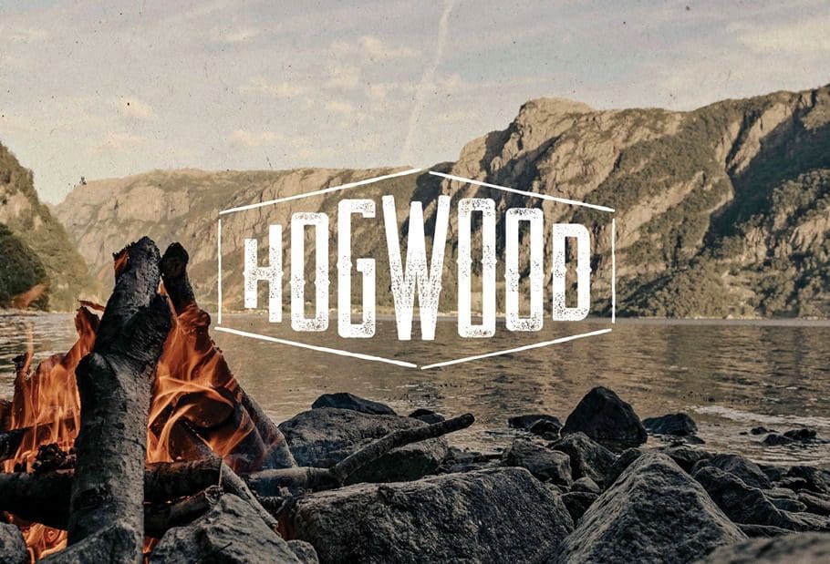 Similar to Gyro Republic, our team built the Hogwood brand from the ground up. The big difference with this project was that they came to us with a name as they had already been operating as a catering company in Crested Butte, CO but this was the first time that they'd be moving into a brick-and-mortar space.
This space would be in the Franklin, TN area which resides just outside of Nashville. The Nice Branding Agency office is located in Franklin so this project holds a special place in our hearts and also happens to be right around the corner from our office.
Similar to Gyro Republic, our team built the Hogwood brand from the ground up. The big difference with this project was that they came to us with a name as they had already been operating as a catering company in Crested Butte, CO but this was the first time that they'd be moving into a brick-and-mortar space.
This space would be in the Franklin, TN area which resides just outside of Nashville. The Nice Branding Agency office is located in Franklin so this project holds a special place in our hearts and also happens to be right around the corner from our office.
 We began this project by developing a visual direction for the brand. We knew we had to pay homage to the rustic mountain vibes that Hogwood's was rooted in when creating their overall aesthetic. We introduced an industrial touch to the design for differentiation and a pop of modern marigold was used sparingly to offer contrast and light.
We also designed a revised logo for the brand, as well their menu and website design. With that, we also created custom take-out bags, cup designs, spice packaging, gift cards and chose the staff attire.
We began this project by developing a visual direction for the brand. We knew we had to pay homage to the rustic mountain vibes that Hogwood's was rooted in when creating their overall aesthetic. We introduced an industrial touch to the design for differentiation and a pop of modern marigold was used sparingly to offer contrast and light.
We also designed a revised logo for the brand, as well their menu and website design. With that, we also created custom take-out bags, cup designs, spice packaging, gift cards and chose the staff attire.
 Creating the business interior design for Hogwood was undeniably one of the portions of the project that was most meaningful. We made sure that the brand we created for them conveyed their brand every where the eye could see. In the discovery phase of this project, we found out that the restaurant has origins in Crested Butte so the concept was globally inspired.
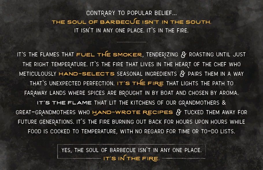
The founder (and chef) was extremely well-traveled and sourced spices from countless far away places. He had tasted food from countries near and far and started this barbecue restaurant to bring those flavors to the people in his hometown. His recipes were established upon generations of expertise and then heightened by the chef's personal procedures, local ingredients, global flavors. This resulted in food that was exceptional and not in alignment with any one region of barbecue. They also smoke their award-winning meat over a flame to temperature, not time. This practices makes the meat supple and tender and they never rush the process in the name of making profits.
With the full picture, we picked out that Hogwood is fueled by fire: a fire that brightened the kitchens of grandmothers, a fire that lit the way for spice ships in days long ago and it just so happens to tenderize their meat to perfection.
We came to the realization that the soul of BBQ isn't in the South, it's not in any single location. The soul of barbecue is in the fire! This then became the key brand messaging for Hogwood and was interwoven throughout this business interior design project.
Creating the business interior design for Hogwood was undeniably one of the portions of the project that was most meaningful. We made sure that the brand we created for them conveyed their brand every where the eye could see. In the discovery phase of this project, we found out that the restaurant has origins in Crested Butte so the concept was globally inspired.
The founder (and chef) was extremely well-traveled and sourced spices from countless far away places. He had tasted food from countries near and far and started this barbecue restaurant to bring those flavors to the people in his hometown. His recipes were established upon generations of expertise and then heightened by the chef's personal procedures, local ingredients, global flavors. This resulted in food that was exceptional and not in alignment with any one region of barbecue. They also smoke their award-winning meat over a flame to temperature, not time. This practices makes the meat supple and tender and they never rush the process in the name of making profits.
With the full picture, we picked out that Hogwood is fueled by fire: a fire that brightened the kitchens of grandmothers, a fire that lit the way for spice ships in days long ago and it just so happens to tenderize their meat to perfection.
We came to the realization that the soul of BBQ isn't in the South, it's not in any single location. The soul of barbecue is in the fire! This then became the key brand messaging for Hogwood and was interwoven throughout this business interior design project.
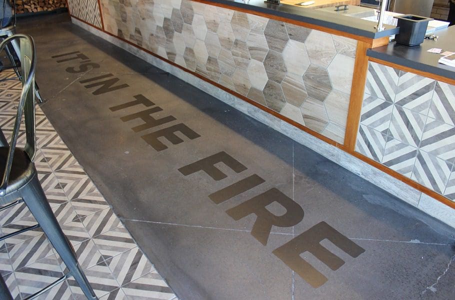
 For this project, we started with their flooring choices. We went with a mix of concrete flooring and focal tile to direct the customer journey. The focal tile inlay was installed at the counter so that customers could watch as their food was being made. We had the inlay custom-made to display, "It's in the fire". We put this there to create the connection between hand-pulled meats and internationally inspired, locally sourced side dishes, and the fire that is the soul of BBQ.
 The walls also fortified this messaging. Before the customer arrived at the point-of-purchase and food-prep stations, they were confronted by a large wall installation that displayed the brand story. Within this story, we spelled out the brand's differentiators by focusing on the impact of fire on the food. Below this installation laid a custom-made and fabricated wood storage arrangement. The placement of these components ties together the power of the fire.
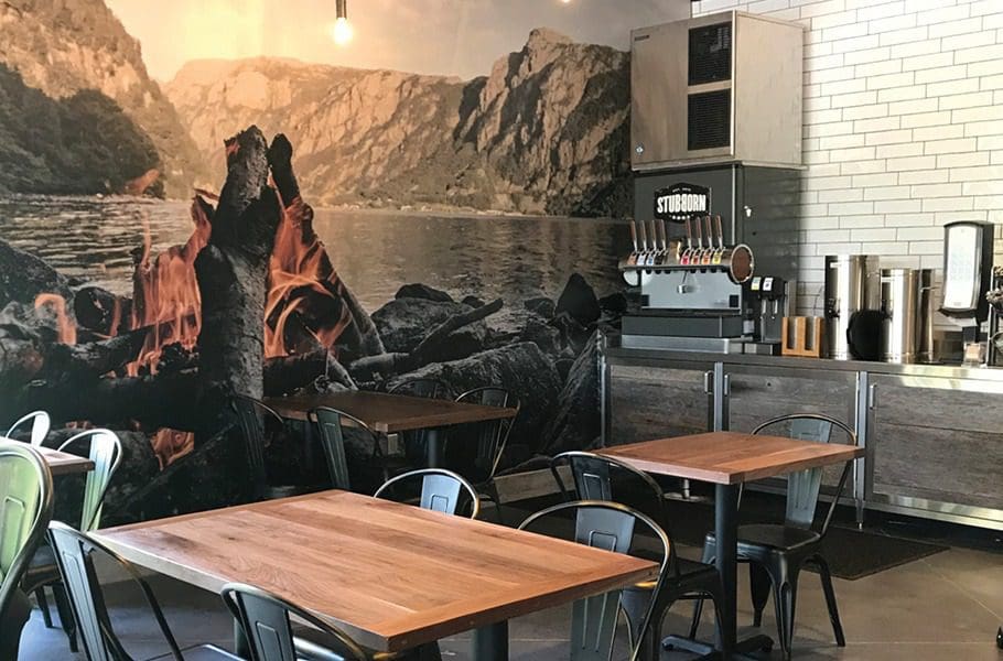
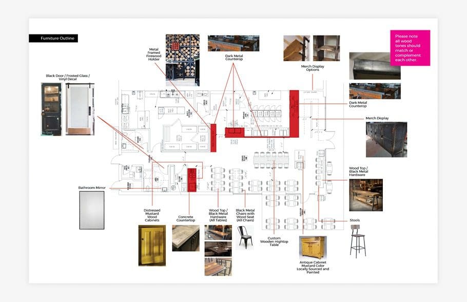 The tables within the space were made of rough wood upon industrial-style metal legs. We utilized metal chairs to tie in the industrial style even further. Using rough, industrial-style metal was entirely done on purpose. This style embodies the look and feel of a smoker, which can be seen in the food-prep area. In addition, the rough-wood tabletops align with the stacks of wood from an apple orchard that are sitting ready to be put into the smoker.
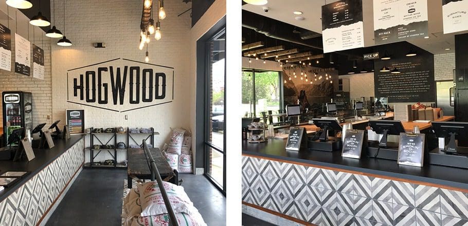
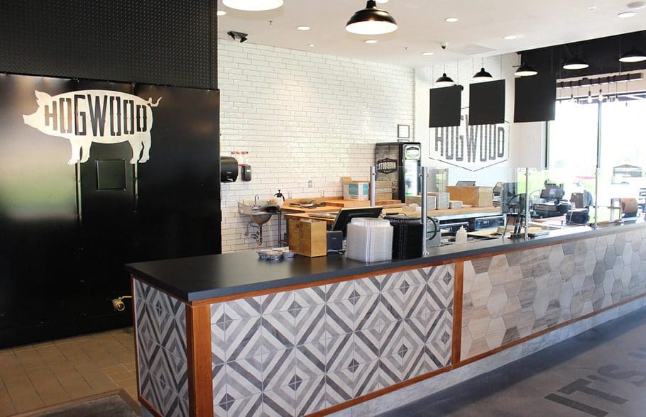 The restaurant walls we used to display the overall message and immerse the customer in a meticulously crafted dining experience. The walls consisted of either brick painted white or drywall painted black to afford blank space for interior branding. Immediately upon entering, customers were greeted with a large-scale application of their logo before they got to the point-of-purchase. Once at the point-of-purchase, they would see menu boards that are hung from industrial chains.
 As the customer journey continues, they would see a full-length wall mural that depicts a mountain region on the left. Around the corner, the mural continued on to the drink area. Here the image displayed tall flames which paid homage to their brand's origin and provided images that allow the viewer to transport to a different place. The imagery was also reflected on the website and other brand pieces to continue drawing a connection for the consumer.
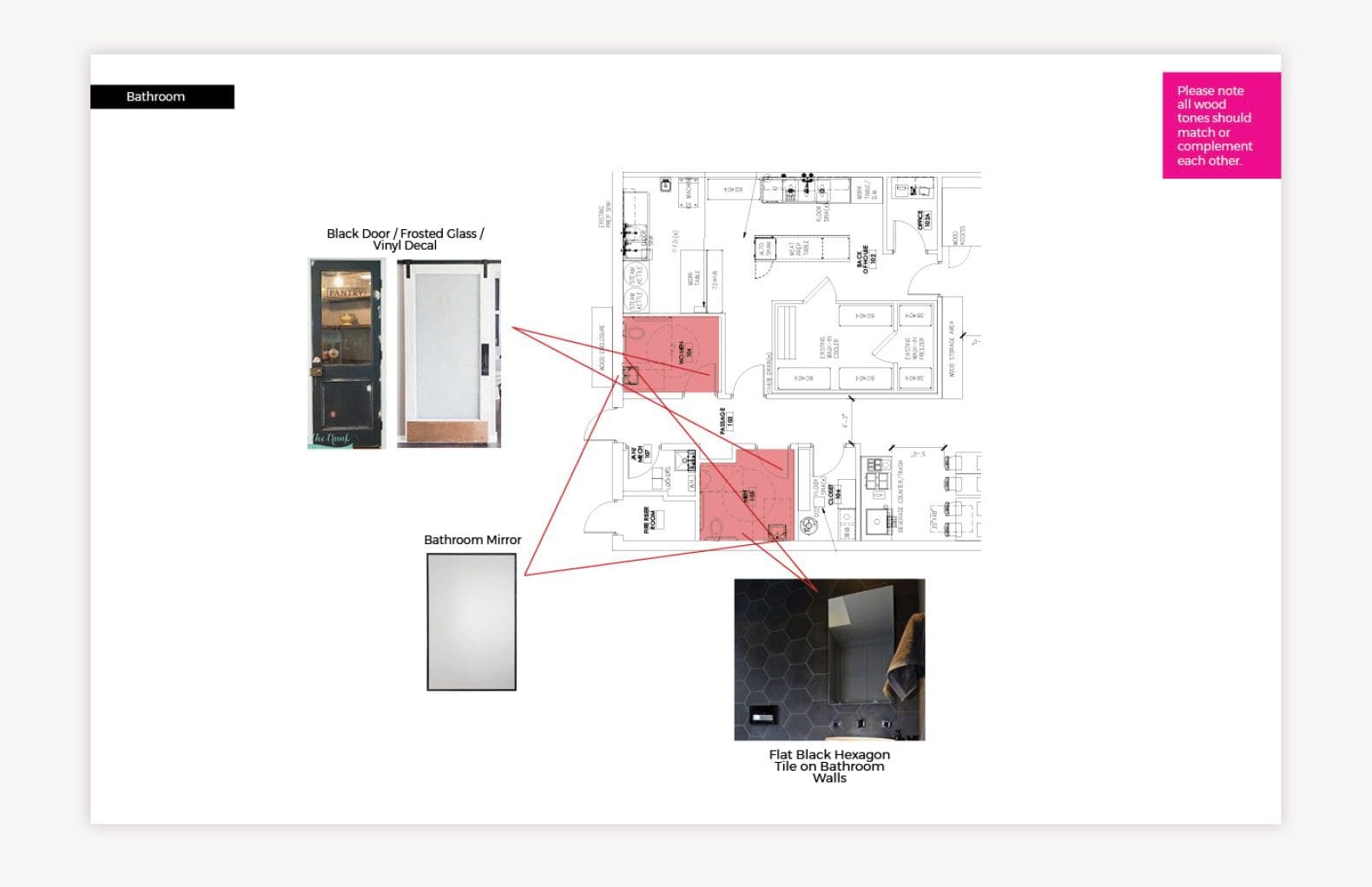 The restrooms and the journey to and from them, are a crucial element of business interior branding. We chose black paint for the hallways leading to the restrooms and added a custom galley wall for the area. We created and curated square images that were in alignment with the brand messaging and felt tied to the origin story. These pictures were mounted on handmade wooden clipboards. Once guests enter the restrooms, they would be meeting with black-and-white buffalo check wallpaper, industrial fixtures, accents of marigold, and clean subway tile.
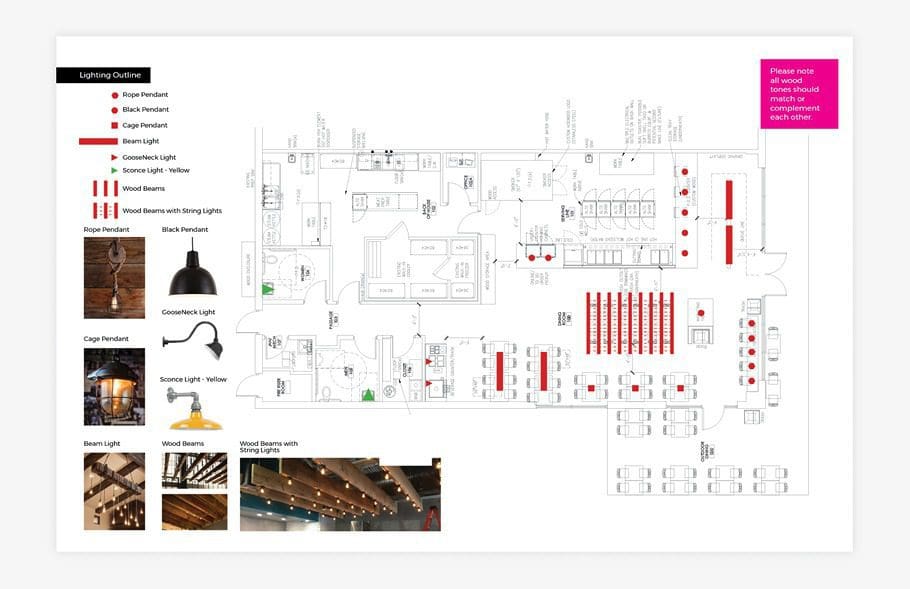 Lastly, we created the restaurant's lighting plan. We utilized the architect's advice in terms of where to place the lights and proposed custom lighting that was rustic in nature. These lights were made from rough wooden beams and bare-bulbed lights hanging from wrapped black cords. These fixtures provided plentiful light while also adding to the look and feel of the space. Other light fixtures within the space included: matte-black gooseneck lighting, marigold-yellow sconces, and caged-light pendants. This mix of fixtures brought dimension to the space and helped divide the room into sections.
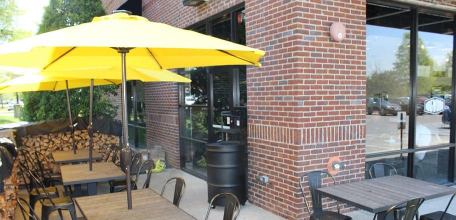 We chose the patio to place additional storage for the wood, black metal tables and chairs, and yellow patio umbrellas.
This overall branding drew in locals and local celebrities. Hogwood is frequented by nationally acclaimed musicians, such as Mike Weaver of Big Daddy Weave and country-music artist Chase Rice. The Nice girls also make frequent visits for their amazing pulled pork and hand-poured mac and cheese.
We chose the patio to place additional storage for the wood, black metal tables and chairs, and yellow patio umbrellas.
This overall branding drew in locals and local celebrities. Hogwood is frequented by nationally acclaimed musicians, such as Mike Weaver of Big Daddy Weave and country-music artist Chase Rice. The Nice girls also make frequent visits for their amazing pulled pork and hand-poured mac and cheese.
 The Nice team helped Mr. Wong's Chicken and Rice in their restaurant rebrand from their original brand Original Chicken 'N Rice. We helped with renaming the restaurant, providing updated logo design, menu design, web design and more.
We chose the name Mr. Wong's Chicken and Rice to feature the hard work put in by the founder, Mr. Wong. The restaurant's target market consists of families, and we wanted to draw great attention to that specific thing!
The Nice team helped Mr. Wong's Chicken and Rice in their restaurant rebrand from their original brand Original Chicken 'N Rice. We helped with renaming the restaurant, providing updated logo design, menu design, web design and more.
We chose the name Mr. Wong's Chicken and Rice to feature the hard work put in by the founder, Mr. Wong. The restaurant's target market consists of families, and we wanted to draw great attention to that specific thing!
 We started with visual direction. Here, we proposed a brand that would primarily consist of a warm red, bright yellow, and pure black. White accents would be used as needed throughout the brand. Additionally, wood and metal would be introduced through the interior. The overall look and feel was one that was casual and approachable, and not too trendy. The idea was to create a concept that was modern but not one that was full of cheeky phrases or symbols that might be misinterpreted by the customers. Industrial elements would come into play against bold, rough typography.
This restaurant occupied a small footprint, and we would need to maximize seating for both individuals who might be grabbing a quick bite and families who wanted to dine together.
We started with visual direction. Here, we proposed a brand that would primarily consist of a warm red, bright yellow, and pure black. White accents would be used as needed throughout the brand. Additionally, wood and metal would be introduced through the interior. The overall look and feel was one that was casual and approachable, and not too trendy. The idea was to create a concept that was modern but not one that was full of cheeky phrases or symbols that might be misinterpreted by the customers. Industrial elements would come into play against bold, rough typography.
This restaurant occupied a small footprint, and we would need to maximize seating for both individuals who might be grabbing a quick bite and families who wanted to dine together.
 In this restaurant, like the two above, a concrete floor was proposed. Custom floor graphics would bring the brand design elements to life and help guide the customer up to the counter to order.
Our restaurant interior design team proposed a mix of seating to accommodate the various customer needs. On one wall, we selected a set of custom-designed wooden booths. At the window, we proposed counter seating with industrial-style yellow stools. And, on the other side of the restaurant, we proposed wooden high-top tables and stools. This would provide a modular component that would allow guests to sit alone or combine tables for larger parties.
On the walls, white subway tile would be installed from the floor to about halfway up the wall. The subway tile would be easy to clean, and aligned with the overall look and feel of the brand.
In this restaurant, like the two above, a concrete floor was proposed. Custom floor graphics would bring the brand design elements to life and help guide the customer up to the counter to order.
Our restaurant interior design team proposed a mix of seating to accommodate the various customer needs. On one wall, we selected a set of custom-designed wooden booths. At the window, we proposed counter seating with industrial-style yellow stools. And, on the other side of the restaurant, we proposed wooden high-top tables and stools. This would provide a modular component that would allow guests to sit alone or combine tables for larger parties.
On the walls, white subway tile would be installed from the floor to about halfway up the wall. The subway tile would be easy to clean, and aligned with the overall look and feel of the brand.
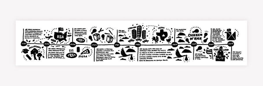 On one wall, a hand-drawn illustrated timeline would run from the front of the store to the point-of-purchase. The timeline told the story of Mr. Wong and his journey as he immigrated to the United States and opened his first restaurant. The timeline followed this journey all the way up to present day, ending with the rebrand of the restaurant to Mr. Wong’s Chicken and Rice.
 Across the dining room, the other wall featured food imagery and brand messaging. Menu boards were printed on PVC and framed to hang above the point-of-purchase. Lighting throughout the space would consist of caged-light pendants; flush-mount bulbs; and sleek, industrial ceiling fans.
 There was one bathroom within the space and it was small. But, since the door would open directly to the dining room, it was key to have a clean design within the rest of the space. Our design team selected subway tile and modern fixtures for the bathroom to align with the overall look and feel of the restaurant.
 The new restaurant interior design has been implemented to replace an existing location. It looks great and provides the restaurant with an outlet to not only serve their food, but also to tell their story.
What is Environmental Branding, Exactly?
The practice of bringing a brand to life within the walls of a physical space is called environmental branding. This can also be referred to as business interior design. This is inclusive of both the inside and outside of a space, including the choosing of the light fixtures, flooring, wall finishes, wall installations, furnishing, fixtures and hardware. Business interior design makes a brand not only tangible but also allows for the creation of a strategic consumer experience.
Today, we'll be focusing on a few of our favorite business interior projects that we've completed. Within this review, we'll be drawing the connection of how interior design contributes to a customer's experience.
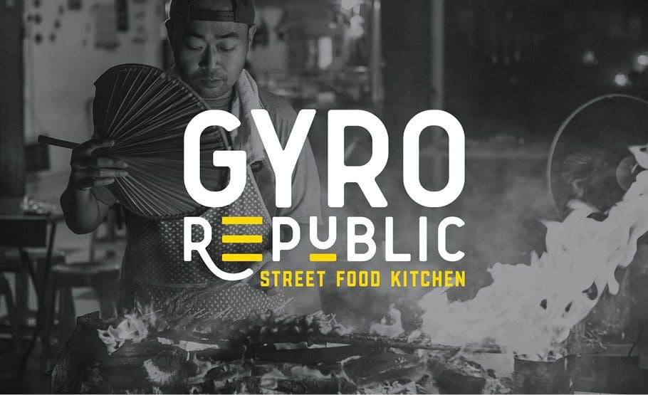
Business Interior Design Project: Gyro Republic
The Nice team developed a brand for a Gyro restaurant that focuses on street-food-inspired, halal-style food in Texas. We were tasked with naming the restaurant, creating visual direction, logo design, website design, and menu design. We also created marketing materials, including a take-out bag design and cup design, as well as design staff t-shirts and other merchandise.
Despite all of those wonderful pieces we created, the business interior branding was the most impactful. An interior branding plan was constructed to ensure that the overall look and feel of the brand was fully in alignment with the brand's overall visual direction.
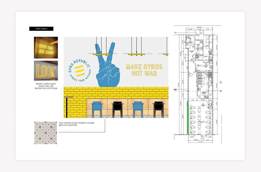
The restaurant floor plan and seating layout was where we chose to start. These were provided by the architect. With these, we were able to create a plan that designated choices for lighting, flooring, seating, tables, wall art, wall color and texture, tile, floor graphics, etc. Our job was to choose or create all the elements that a customer will encounter as they journey through the space.
Our goal was to create an environment that would convey Gyro Republic's brand narrative, which is focused around the concept of street food for the people and the power to choose (It's a republic, get it?). This design had an emphasis on millennial customers, but it was still tailored to appeal to the a wider demographic.
We selected concrete floors to serve as a base for the design. This would allow us to use hand-painted graphics to guide the customer journey. It seems that all too often quick-service restaurants don't acknowledge the customer journey and underwhelm and confuse people when they enter the building.
The next step we took was choosing the seating and tables for the restaurant. The seating choices played a large role in quietly communicating the brand message. We varied the chairs in the color and style. The seating was in alignment with the brand aesthetic and color. The variety of seating signified a customer's power to pick a seat of their choosing. Beyond that, the varying styles and colors told the story of the differences between the people themselves that exist within the republic.
To build consistency amongst the plethora of different chairs, we choose wooden tables to fill the space. On one wall, we added in custom booth seating to make the most of the space within the limited footprint. We also determined that the riser at the foot of the booth seating should be adorned with a focal tile that would mimic the tile at the register.
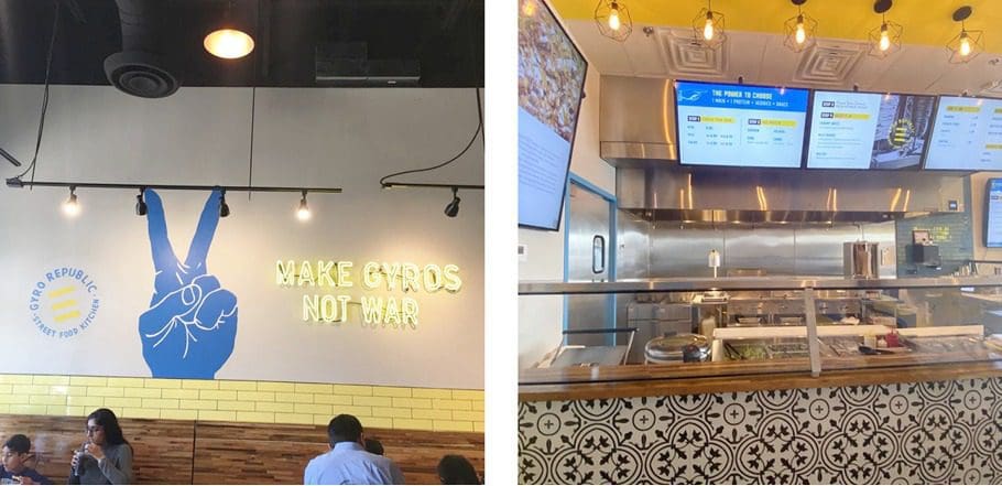
We utilized the blank walls as a canvas to convey the brand message in an indisputable and unmistakable way. We then chose apply custom art on both side of the restaurant. For the left wall, near the entry, we designed a substantial mural with the statement "Make Gyros Not War." This phrase was in alignment with the overall brand approach and offered a pretty impressive statement to anyone whom entered the space.
For this mural, we utilized neon lights for the phrase. An illustrated hand holding up a peace sign was prominently placed, and the logo icon was very visible within the design too. We strategically placed this mural to grab the attention of customers, even from outside. It was also created as a "selfie-wall" of sorts that would allow diners to take a photo from anywhere they may be sitting in the dining room.
Right across the dining room, we created a typographic poster that featured other key phrases. We placed these words on top of black-and-white imagery that illustrated traditional street food. The brand colors were laid on top of the images to unite the art to fit the overall visual direction.
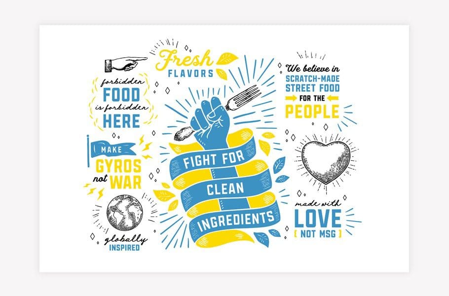
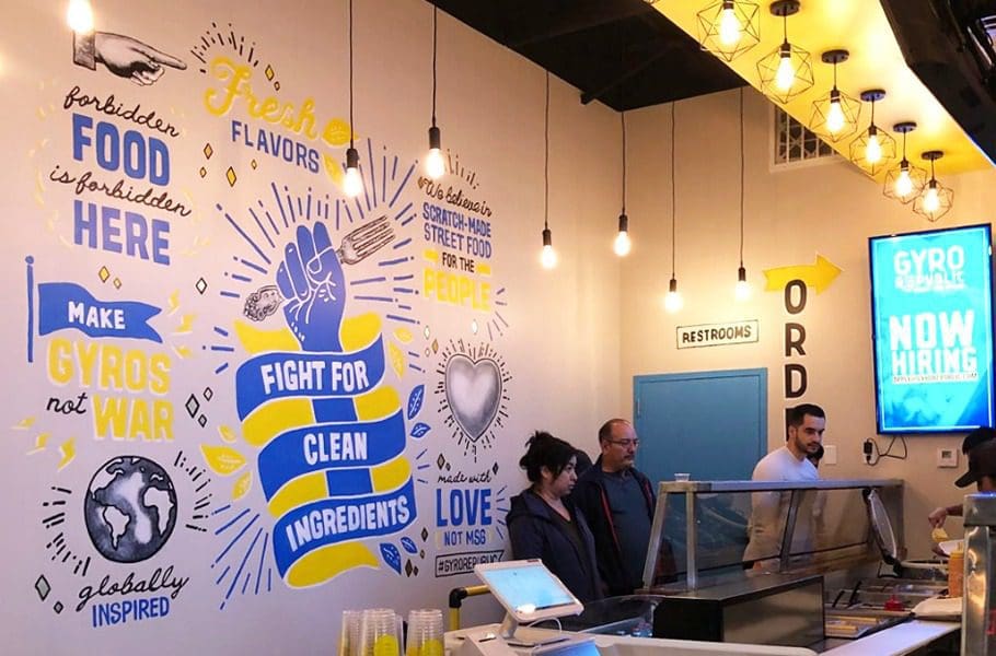
Another custom mural greeted the customers as they came up to the point of purchase. This mural was created to add to the space where diners would wait while placing their orders. The hand-drawn piece displayed drawings and brand messaging such as "fight for clean ingredients;" "made with love, not MSG;" "globally-inspired;" and more. This mural was placed intentionally, we thought it was important to publicize the brand's differentiators in a place where people would have time to take them in.
To further define the customer journey, industrial, powder-coated piping was implemented to divide the line and create a path for customers to follow. Additionally, the point-of-purchase counter was made into a focal point with the use of custom tile on the riser. From the front door, any customer could easily make out the journey, and where it would end at the point of purchase.
We designed digital menu boards to hang in the ordering area because we felt that this was in alignment with customer expectations for the target marketing and the overall modern feel of the space. Also, operationally, this makes changing out information so much simpler!
We chose white subway tile for the wall behind the point of purchase and paired it with a blue grout. This wall transitioned to a yellow subway tile with a gray grout on the right wall by the dining room. This simple difference created a distinction between the dining room and the prep and purchase area.
For the bathrooms, we chose to utilize the brand colors for the walls and doors while keeping the fixtures and finishes in alignment with the overall brand direction.
Lastly, we created a lighting plan. When investing in business interior branding, no customer touchpoint should be neglected. Lighting is one of the touchpoints that's commonly overlooked. We exploited the power of lighting to develop distinct areas within the space. We lined the ordering area with starburst flush mount lighting and lit the dining room with modern linear pendant lights.
Overall, the restaurant interior design we completed for Gyro Republic is extremely fascinating. The attentive design and rational, united application of the brand within the space make for an extremely "Instagrammable" space. The brand story is told throughout the space in a manner that communicates the restaurant's position within the market, their ethics, and differentiators to anyone that comes in.
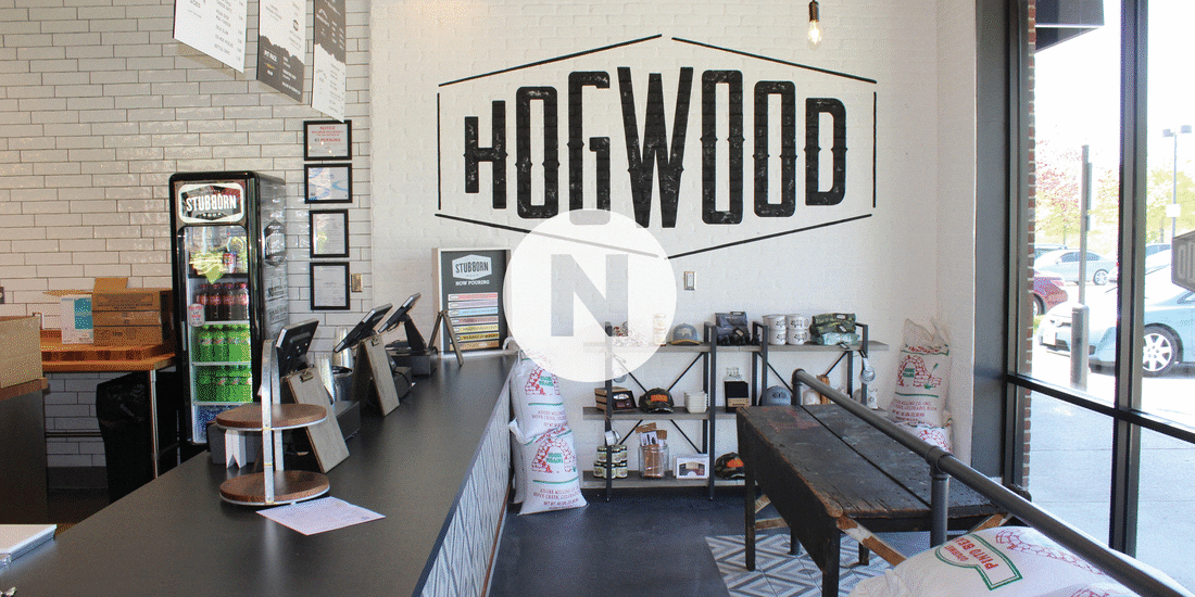
Business Interior Design Project: Hogwood
Similar to Gyro Republic, our team built the Hogwood brand from the ground up. The big difference with this project was that they came to us with a name as they had already been operating as a catering company in Crested Butte, CO but this was the first time that they'd be moving into a brick-and-mortar space.
This space would be in the Franklin, TN area which resides just outside of Nashville. The Nice Branding Agency office is located in Franklin so this project holds a special place in our hearts and also happens to be right around the corner from our office.
We began this project by developing a visual direction for the brand. We knew we had to pay homage to the rustic mountain vibes that Hogwood's was rooted in when creating their overall aesthetic. We introduced an industrial touch to the design for differentiation and a pop of modern marigold was used sparingly to offer contrast and light.
We also designed a revised logo for the brand, as well their menu and website design. With that, we also created custom take-out bags, cup designs, spice packaging, gift cards and chose the staff attire.
Creating the business interior design for Hogwood was undeniably one of the portions of the project that was most meaningful. We made sure that the brand we created for them conveyed their brand every where the eye could see. In the discovery phase of this project, we found out that the restaurant has origins in Crested Butte so the concept was globally inspired.
The founder (and chef) was extremely well-traveled and sourced spices from countless far away places. He had tasted food from countries near and far and started this barbecue restaurant to bring those flavors to the people in his hometown. His recipes were established upon generations of expertise and then heightened by the chef's personal procedures, local ingredients, global flavors. This resulted in food that was exceptional and not in alignment with any one region of barbecue. They also smoke their award-winning meat over a flame to temperature, not time. This practices makes the meat supple and tender and they never rush the process in the name of making profits.
With the full picture, we picked out that Hogwood is fueled by fire: a fire that brightened the kitchens of grandmothers, a fire that lit the way for spice ships in days long ago and it just so happens to tenderize their meat to perfection.
We came to the realization that the soul of BBQ isn't in the South, it's not in any single location. The soul of barbecue is in the fire! This then became the key brand messaging for Hogwood and was interwoven throughout this business interior design project.
For this project, we started with their flooring choices. We went with a mix of concrete flooring and focal tile to direct the customer journey. The focal tile inlay was installed at the counter so that customers could watch as their food was being made. We had the inlay custom-made to display, "It's in the fire". We put this there to create the connection between hand-pulled meats and internationally inspired, locally sourced side dishes, and the fire that is the soul of BBQ.
The walls also fortified this messaging. Before the customer arrived at the point-of-purchase and food-prep stations, they were confronted by a large wall installation that displayed the brand story. Within this story, we spelled out the brand's differentiators by focusing on the impact of fire on the food. Below this installation laid a custom-made and fabricated wood storage arrangement. The placement of these components ties together the power of the fire.
The tables within the space were made of rough wood upon industrial-style metal legs. We utilized metal chairs to tie in the industrial style even further. Using rough, industrial-style metal was entirely done on purpose. This style embodies the look and feel of a smoker, which can be seen in the food-prep area. In addition, the rough-wood tabletops align with the stacks of wood from an apple orchard that are sitting ready to be put into the smoker.
The restaurant walls we used to display the overall message and immerse the customer in a meticulously crafted dining experience. The walls consisted of either brick painted white or drywall painted black to afford blank space for interior branding. Immediately upon entering, customers were greeted with a large-scale application of their logo before they got to the point-of-purchase. Once at the point-of-purchase, they would see menu boards that are hung from industrial chains.
As the customer journey continues, they would see a full-length wall mural that depicts a mountain region on the left. Around the corner, the mural continued on to the drink area. Here the image displayed tall flames which paid homage to their brand's origin and provided images that allow the viewer to transport to a different place. The imagery was also reflected on the website and other brand pieces to continue drawing a connection for the consumer.
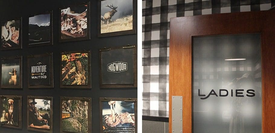
The restrooms and the journey to and from them, are a crucial element of business interior branding. We chose black paint for the hallways leading to the restrooms and added a custom galley wall for the area. We created and curated square images that were in alignment with the brand messaging and felt tied to the origin story. These pictures were mounted on handmade wooden clipboards. Once guests enter the restrooms, they would be meeting with black-and-white buffalo check wallpaper, industrial fixtures, accents of marigold, and clean subway tile.
Lastly, we created the restaurant's lighting plan. We utilized the architect's advice in terms of where to place the lights and proposed custom lighting that was rustic in nature. These lights were made from rough wooden beams and bare-bulbed lights hanging from wrapped black cords. These fixtures provided plentiful light while also adding to the look and feel of the space. Other light fixtures within the space included: matte-black gooseneck lighting, marigold-yellow sconces, and caged-light pendants. This mix of fixtures brought dimension to the space and helped divide the room into sections.
We chose the patio to place additional storage for the wood, black metal tables and chairs, and yellow patio umbrellas.
This overall branding drew in locals and local celebrities. Hogwood is frequented by nationally acclaimed musicians, such as Mike Weaver of Big Daddy Weave and country-music artist Chase Rice. The Nice girls also make frequent visits for their amazing pulled pork and hand-poured mac and cheese.
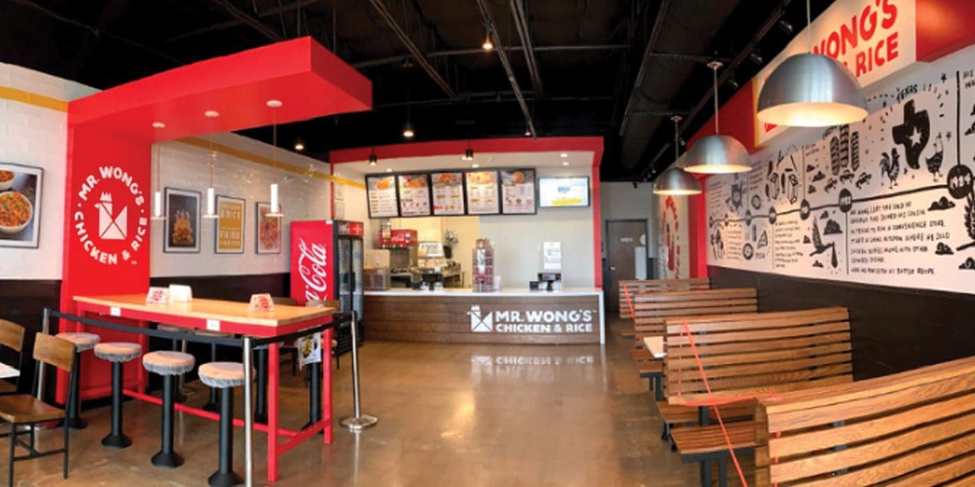
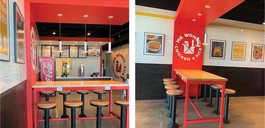
Restaurant Interior Design Project: Mr. Wong's Chicken and Rice
The Nice team helped Mr. Wong's Chicken and Rice in their restaurant rebrand from their original brand Original Chicken 'N Rice. We helped with renaming the restaurant, providing updated logo design, menu design, web design and more.
We chose the name Mr. Wong's Chicken and Rice to feature the hard work put in by the founder, Mr. Wong. The restaurant's target market consists of families, and we wanted to draw great attention to that specific thing!
We started with visual direction. Here, we proposed a brand that would primarily consist of a warm red, bright yellow, and pure black. White accents would be used as needed throughout the brand. Additionally, wood and metal would be introduced through the interior. The overall look and feel was one that was casual and approachable, and not too trendy. The idea was to create a concept that was modern but not one that was full of cheeky phrases or symbols that might be misinterpreted by the customers. Industrial elements would come into play against bold, rough typography.
This restaurant occupied a small footprint, and we would need to maximize seating for both individuals who might be grabbing a quick bite and families who wanted to dine together.
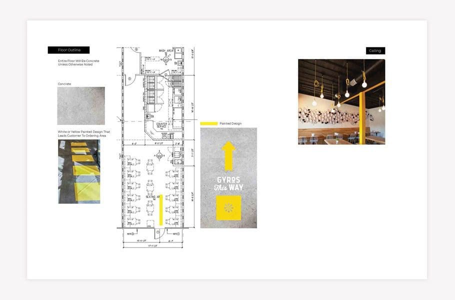
In this restaurant, like the two above, a concrete floor was proposed. Custom floor graphics would bring the brand design elements to life and help guide the customer up to the counter to order.
Our restaurant interior design team proposed a mix of seating to accommodate the various customer needs. On one wall, we selected a set of custom-designed wooden booths. At the window, we proposed counter seating with industrial-style yellow stools. And, on the other side of the restaurant, we proposed wooden high-top tables and stools. This would provide a modular component that would allow guests to sit alone or combine tables for larger parties.
On the walls, white subway tile would be installed from the floor to about halfway up the wall. The subway tile would be easy to clean, and aligned with the overall look and feel of the brand.
On one wall, a hand-drawn illustrated timeline would run from the front of the store to the point-of-purchase. The timeline told the story of Mr. Wong and his journey as he immigrated to the United States and opened his first restaurant. The timeline followed this journey all the way up to present day, ending with the rebrand of the restaurant to Mr. Wong’s Chicken and Rice.
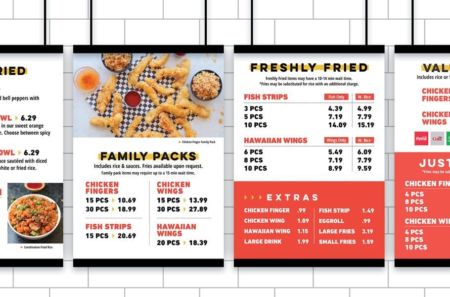
Across the dining room, the other wall featured food imagery and brand messaging. Menu boards were printed on PVC and framed to hang above the point-of-purchase. Lighting throughout the space would consist of caged-light pendants; flush-mount bulbs; and sleek, industrial ceiling fans.
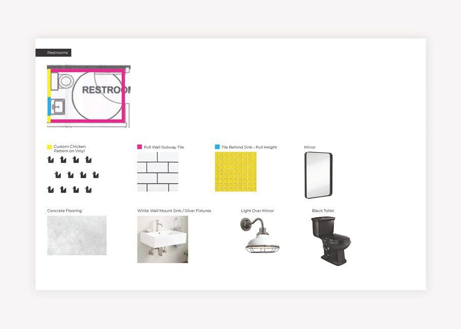
There was one bathroom within the space and it was small. But, since the door would open directly to the dining room, it was key to have a clean design within the rest of the space. Our design team selected subway tile and modern fixtures for the bathroom to align with the overall look and feel of the restaurant.
The new restaurant interior design has been implemented to replace an existing location. It looks great and provides the restaurant with an outlet to not only serve their food, but also to tell their story.


