Little Words Project Showcase
The brand audit we worked on for Little Words Project evolved into a full-on brand refresh. The end result was an elevated perception of the LWP brand by leaps and bounds.
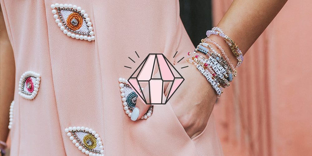
Founder of Little Words Project and nice girl gang leader, Adriana, started sharing bracelets as a sophomore in college to encourage her sorority sisters. Little did she know, her idea would turn into a national retail campaign that has been featured in InStyle and Martha Stewart Weddings, and also on the wrists of thousands of girls worldwide.
Adriana experienced bullying as a kid and wanted to find an outlet to share positive reminders to other girls. In her sorority, she made the first batch of Little Words bracelets. She shared them, and encouraged the wearers to keep their word for as long as they needed it. Then, the girls would pass it on to a sister who needed some encouragement, too.
The bracelets quickly became an iconic symbol of their friendship on campus. After graduating, Adriana launched a movement to share her bracelets with women around the world. Thus, Little Words Project was born.
The movement-turned-business quickly garnered national attention, and Adriana reached out to the girls at Nice Branding Agency for a brand audit in hopes of aligning the organization’s image and messaging with the overall mission.


 This brand audit was a project where we got to see most of our suggestions come to life. Adriana took our suggestions from the brand audit and ran with them, and Little Words Project ended up with a really strong brand because she trusted the branding company she hired.
If you’re interested in undergoing our brand audit process or would like more information around brand audits, reach out to the girls at Nice Branding Agency. We have proved our process in the brands we’ve revamped. Let us help you fall in love with your brand, too.
This brand audit was a project where we got to see most of our suggestions come to life. Adriana took our suggestions from the brand audit and ran with them, and Little Words Project ended up with a really strong brand because she trusted the branding company she hired.
If you’re interested in undergoing our brand audit process or would like more information around brand audits, reach out to the girls at Nice Branding Agency. We have proved our process in the brands we’ve revamped. Let us help you fall in love with your brand, too.
Brand Audit
Our client approached us initially to do a comprehensive brand audit. She had a feeling that she needed to make a change, but she couldn’t put her finger on exactly what part of her brand needed to change. Little Words Project’s existing brand had served the company well, but the hunch was that it lacked the cohesion and the dimension it deserved. Sidenote: Sometimes a client comes to us with the knowledge or desire to build a new website or undergo a brand refresh. Other times, our client wants to take a more calculated approach to their next steps. If someone is unsure about what they need and how to proceed, a brand audit is a great first step. It allows us to immerse ourselves in their brand and engage in overarching strategy work before we even open the design programs. To start exploring where the LWP branding might be falling short, we launched a brand audit. We dug deep into the jewelry industry, specifically investigating competitors, and confirmed that Little Words was on the right track regarding its target market.Reviewing Existing Collateral
The next step of the brand audit was to dive into the company’s existing collateral. We reviewed every single piece of material that was customer-facing, including the logo and icon for LWP, the retailer package, the delivery experience and packaging, the website, photography, social presence, and more. As we continued the brand audit, we assessed the LWP goal of having users download the app, register their bracelet, and then share the bracelet with a fellow nice girl when they had ultimately conquered or overcome the issue at hand. Practically speaking, here’s how the brand audit went down. We started with internal research. Our team compiled anything and everything we could find from our client’s archives and from the world wide web about Little Words Project. We pored over the pieces of the brand and began to form a perception of the company (hint: this perception is what branding really is). We put all of the evidence into a PowerPoint and presented it to our team at an internal strategy meeting within our agency. Each of the members of our team cemented their first impressions about LWP at that meeting.Brand Audit Strategy
Next, our strategists sat down with the details and dove in. NOTE: While brand strategists may look deeper than first impressions, the average customer likely will not. This is why you need the Nice girls. We can see things that your customers (and sometimes even you yourself) cannot. We can bring the good to the forefront and kick the rest to the curb, so you’re left with a shiny, new brand that conveys to customers exactly what you want it to convey—nothing more and nothing less. For Little Words, our strategy team examined each piece of collateral to determine its purpose or goal. Then, we noted improvements that could be made to each of the assets to better align all branded materials with the overall mission of the company. We literally dissected everything during the brand audit.Here's What We Found
We identified the good, the bad, and the ugly. As we typically find, the good included everything that LWP was about. The heart of the organization and the impact they had made worldwide was truly impressive. Also, in the “good” column was the @littlewordsproject social media presence. Adriana had taken on LWP social as her personal project and had built quite a following of college girls, influencers, and brand ambassadors. Areas with room for improvement included the brand colors shown in the logo, the user experience on the website, and the shopping experience. While the heart was in the right place, the branding needed a boost to match the love that our client had poured into her business. We packaged our findings into a nice, neat, detailed presentation and hopped on a conference call to present it to our client. After walking through the presentation, we summed up the contents into a handy-dandy checklist of action items that LWP could work on to better align the brand. Upon conclusion of the audit, our client entrusted us with completing each of the items on the checklist, and we launched into a brand refresh for Little Words Project.
Logo
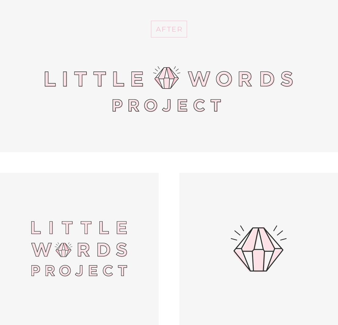
While we were definitely on-board with the focal point of the logo being the iconic gem or bead, we felt that the existing color scheme wasn’t as indicative of the emotion we wanted to convey for this particular brand, nor did we feel that it aligned with the current trends of the target market. The existing logo was magenta and a textured gold color. While we are all for a nice gold finish, the colors needed to be tweaked to more instantaneously connect with the target. Also, we wanted to evoke feelings of happy friendliness and bold femininity. We proposed a refresh. Our creative team utilized the same overall structure; however, we refreshed the fonts and incorporated a fresh, new color palette of pinks. Additionally, we worked with the bead icon to shore up the design and create something that would truly pop off the page. We added dimension to the icon using a system of alternating shades, and we incorporated modern lines to bring in movement.Delivery Experience
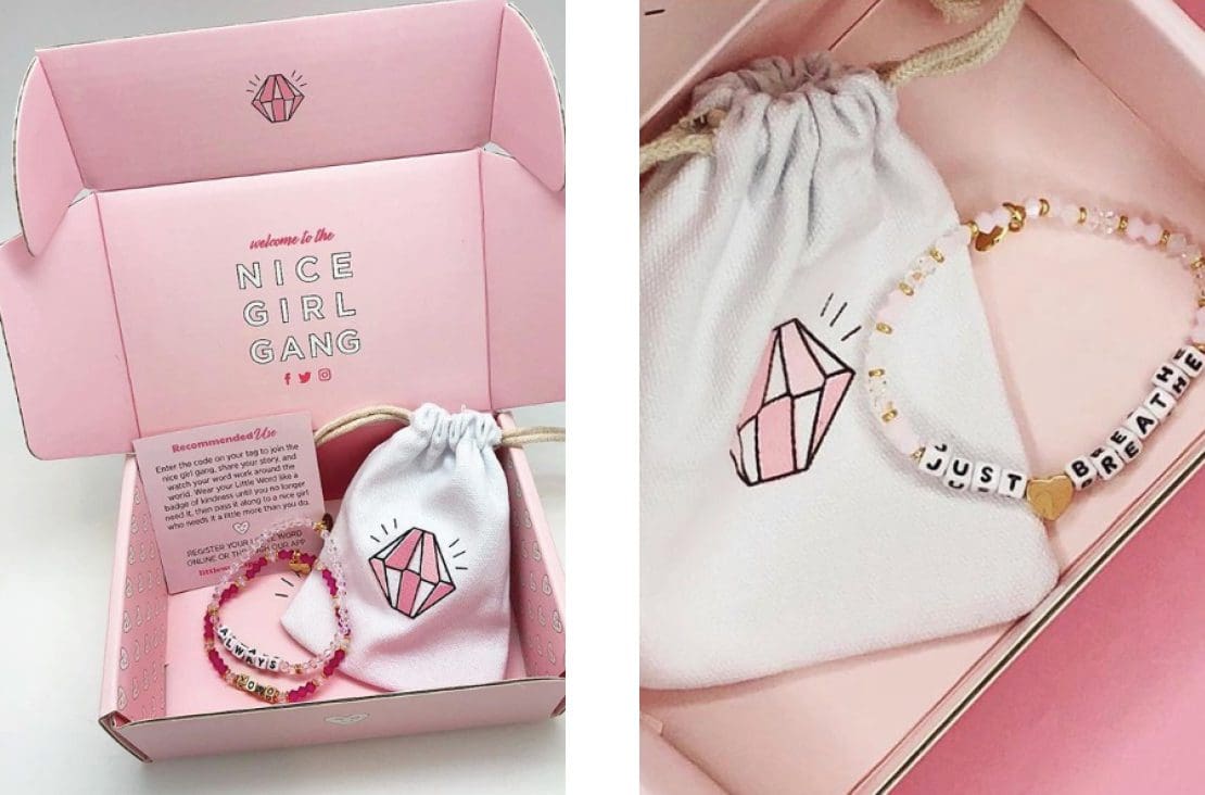
Taking a consumer-first approach, we ultimately stepped into the Little Words Project customer journey. We walked through the ordering process, just as a customer would. We were immediately taken with the bracelets when we received them. The bracelets were dainty, yet bold, and the words that were chosen for each of us were spot on. That said, the packaging and the overall experience of receiving the bracelets were a little underwhelming. The product came to the door in a nondescript, standard yellow bubble mailer. Upon opening the package, there was a small, canvas bag that held the bracelet and a handwritten note of encouragement from LWP. We loved the idea of including a handwritten note; however, we thought that the packaging could be more impactful and serve as a true extension of the brand. We set out to create something compelling, cohesive, and 100% worthy of an Instagram share.Custom Delivery Packaging Design
We developed a custom-printed box design that would do more than just house the product. The box incorporated various elements of the brand, including the full logo and the logo icon, and it ultimately conveyed the mission of LWP by welcoming the recipient to the Nice Girl Gang. We incorporated social icons and a call to action to register your little word right there on the box. When opened, the customer would receive a canvas bag in the box. This was similar to the previous delivery experience. However, the new bag had the bright bead icon to reinforce the connection of the logo icon with the brand. The handwritten note component also remained intact; however, the card now does double duty. In addition to leaving a space for a note, the card communicates the mission and encourages the customer to “register, wear, conquer, share”—steps in the customer journey that were previously left unenforced. Let’s face it. Sending out a custom printed box with each and every order might not be the most cost-effective method, so we also provided LWP with a strategy that included a pink bubble mailer and custom printed label with a canvas bag and note card for smaller orders. This modular approach allows the company the flexibility it needs in terms of packaging while still ensuring that everything is 100% on-brand and connecting with the customer.
Registering Bracelets
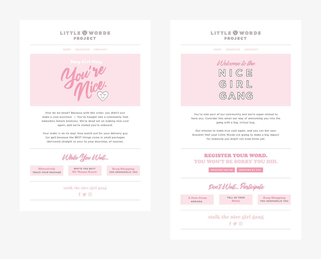
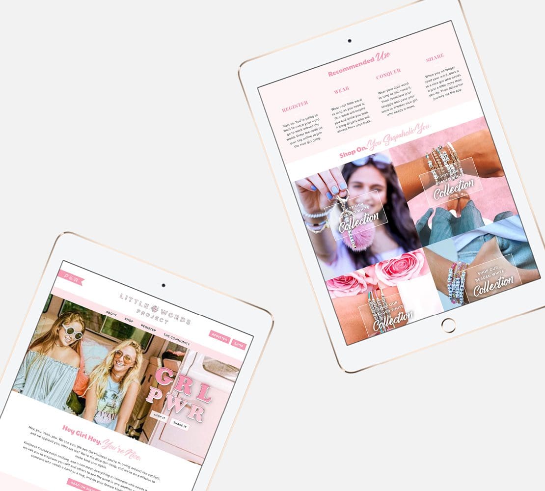
Little Words Project is a unique jewelry brand not only because of its message, but also for its registration process. When you order a bracelet, you get an opportunity to register it on their website. This registration keeps track of the bracelet through a unique number, so you can take inspiration from the word on your bracelet, and then pass it on when you are ready to share the inspiration with someone else. The registration process means that each new owner of the bracelet can keep track of where the bracelet has been. This process really enriches the power behind the words and the bond between the girls that share them. This, though, is a complex process to convey. To help customers understand where, how, and why to register their bracelets, we implemented the tagline: REGISTER, WEAR, CONQUER, SHARE. We deployed this messaging all across the brand, on the cards that would go out with the orders, the new website, and elsewhere.Email Drip Campaign
We created a drip campaign designed to deepen the connection with the customer. This was key to the project. One of the main goals was to create a community of Little Words wearers. The idea behind the movement is to unite women in the power of being nice. The drip email campaign that we developed would also provide bracelet-wearers multiple opportunities to register their bracelets. See, when a girl receives a Little Words bracelet, she might not be ready to share it yet. It takes time to accomplish the word on your wrist. We wanted to give girls a reminder farther down the road to register their bracelets and share their experiences. The drip campaign started with a delivery email. This email lets customers know that their order has been received and their little word is on its way! Further emails in the campaign encouraged her to register her word. The next reminded her how to share and keep track of her bracelet through the Little Words Project website when she was ready to inspire someone else. We built cross-promotion techniques into each email within the drip campaign. If you’re seeking a set-it-and-forget-it way to stay connected with your customers, reach out to the Nice girls for a custom designed and implemented email drip campaign. We will set you up!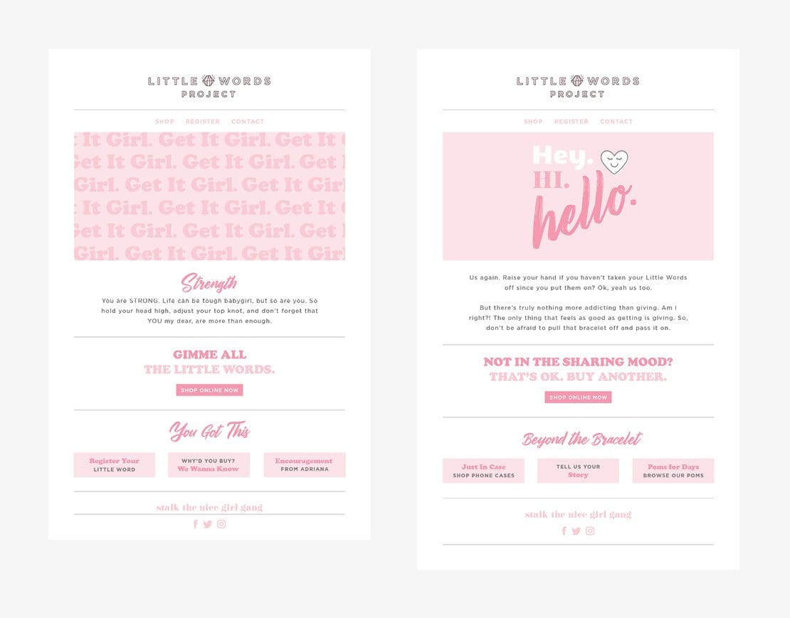
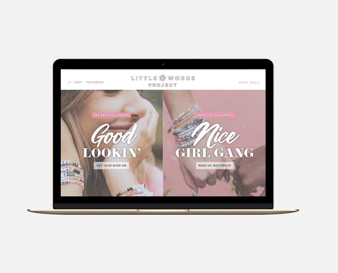
Website
To share the Little Words Project with the world, we designed and developed a custom Shopify website. Previously, LWP was working from a template-based site. We really wanted to elevate both the brand and the user experience through a custom build. We found that on the existing website, the user experience wasn’t ideal. In order to find the perfect word and bead color, the user would have to scroll through a big menu. Then, they had to click into the product to see color variations and options. We introduced the use of a custom mega menu to simplify the shopping experience. In the mega menu, we worked on a strategy that allowed the user to shop by collection OR shop by word. We worked hand in hand with the client to bring this element of the UX to life. Additionally, we used calls to action throughout the website to refer the user back to the overall mission. Here, we encouraged each user to register her word. This brought the mission to the forefront without distracting the user from shopping.Branding Within a Website Build
Aside from user experience, we also addressed branding in the build of the new site. We utilized the palette of pinks and new photography to craft an enticing story. We paired bold brand fonts with handwritten script fonts to create the strong femininity and fun vibes of LWP. Ultimately, the mission and the products took center stage on the site. We created ample opportunities to educate the viewer about the why behind the brand, as well as to show off the multiple product offerings that LWP carries. You see, they do more than just bracelets. Our agency typically works with the WordPress platform, so building a Shopify site from the ground up was challenging for our team. The final site is beautiful and we are super proud to have created it.
Retailer Package
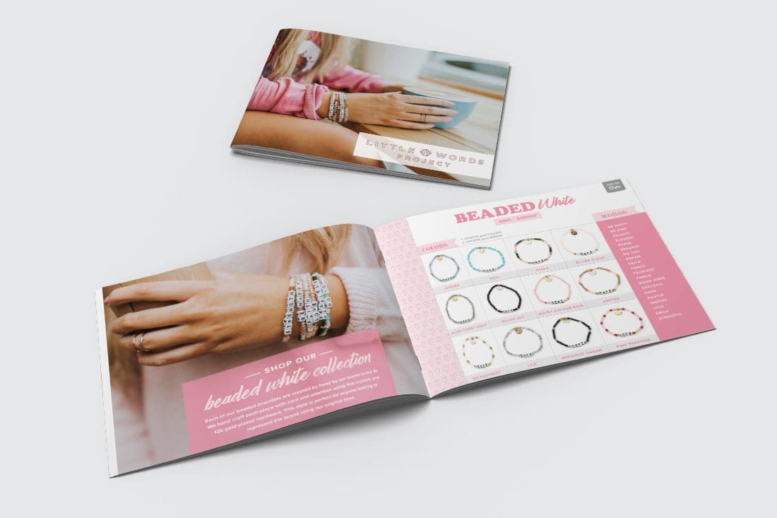
Part of the success of the LWP brand was the retail component. In addition to selling products online, LWP partners with retailers nationwide to place their products in boutiques. LWP fans flock to these stores to get a glimpse of the latest product lines from Little Words. We started by addressing the Line Sheet that LWP provides to their wholesalers. In addition to improving the aesthetics of the “catalog," we paid special attention to user experience. We wanted it to be easy for retailers to place an order. We made a structure that highlighted high-margin items and showcased their packages in a manner that was easy to understand. The brand was used throughout the document, using the color scheme and font suite that we’d developed.Retailer Display
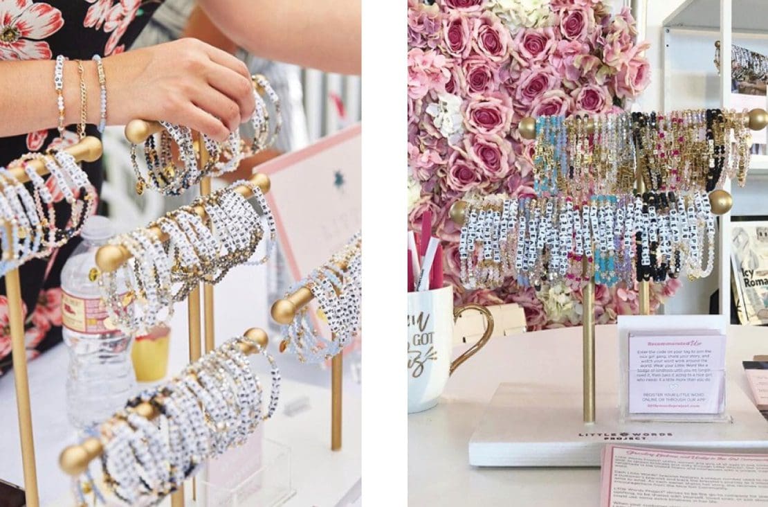
The next component we did for Little Words Project was a retailer display. Here, we designed a stand for the bracelets. The stand had a modular system that would display the bracelets well in retail locations. Adriana works with hundreds of retailers across the country, and each of these displays needed to accurately convey her brand. Each retailer needed to be able to sell the products in alignment with the LWP brand. We needed a foolproof setup. Retailers and boutiques shouldn't need to figure out how to keep your setup on-brand. We created displays that had white bases and gold T stands that could be added on to. This meant that retailers could sell just a few bracelets or a ton of them. Everyone could use the setup. The gold worked well with the modern brand look and provided a perfect background for the sparkly bracelets. We provided a space within the stand to hold a custom designed card. Customers could take these cards with them. Each card explained the movement and the process behind registering, wearing, and sharing their bracelet.
Extra Goodies
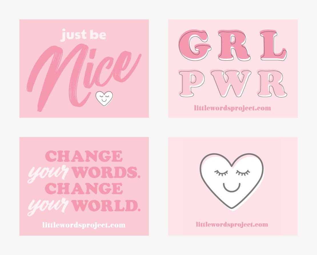
In addition to the previous brand audit suggestions, we created stickers that LWP could send to their clients. The stickers made statements such as GRL PWR and Change Your Word, Change Your World.
This brand audit was a project where we got to see most of our suggestions come to life. Adriana took our suggestions from the brand audit and ran with them, and Little Words Project ended up with a really strong brand because she trusted the branding company she hired.
If you’re interested in undergoing our brand audit process or would like more information around brand audits, reach out to the girls at Nice Branding Agency. We have proved our process in the brands we’ve revamped. Let us help you fall in love with your brand, too.


