Project Kickoff
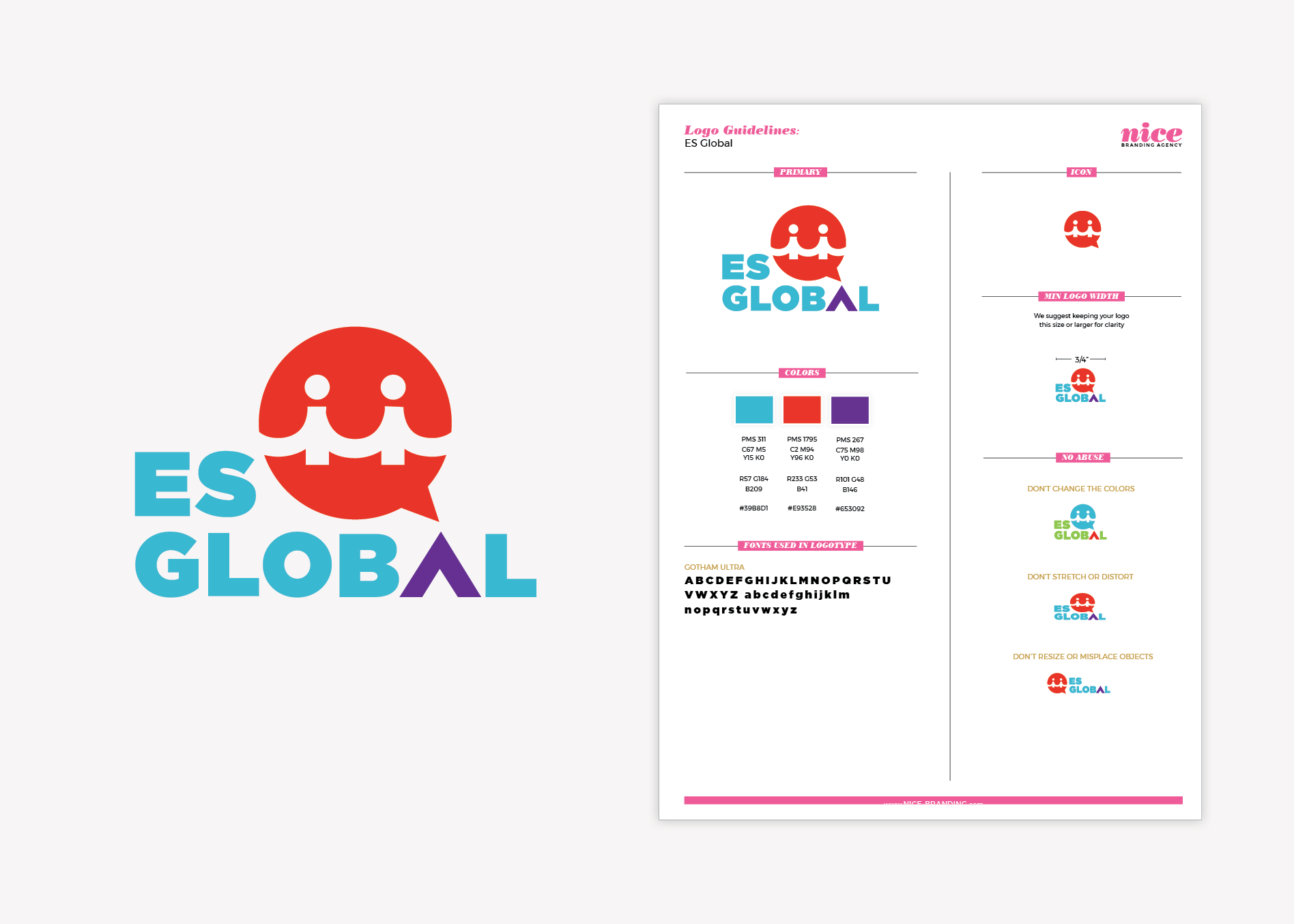
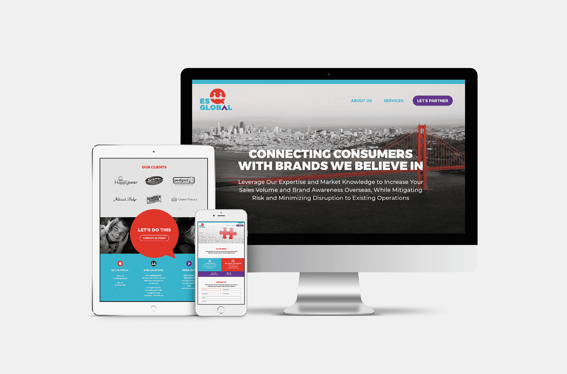
Nice Branding Agency of Nashville, Tennessee was engaged to complete the ES Global rebrand project and charged with a goal to connect cultures and compel partners to take action.
In 2004, ES Global founder Jinae Kang created a company that would bring happy, healthy products from the US into happy, healthy homes in Asia, specifically, into Korea. Basically, ES Global serves as the liaison between US brands and Korean vendors to get American products placed into Korean retail establishments. ES Global has a ton of connections and partners with dozens of big US brands, including Happy Family Organics, SwimWays, and UGG, bringing them into Asia, often as the exclusive distributor that connects the markets.
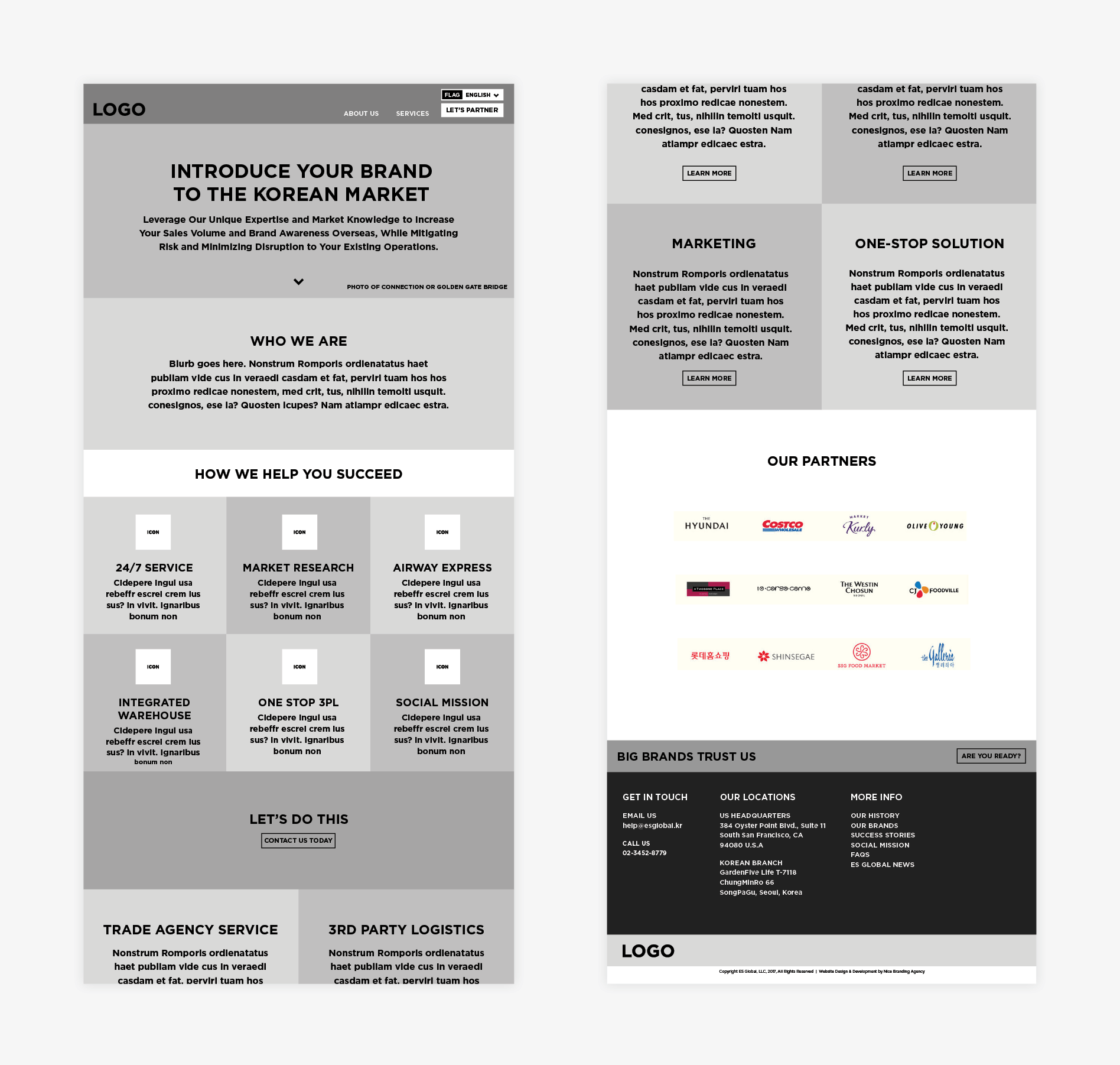
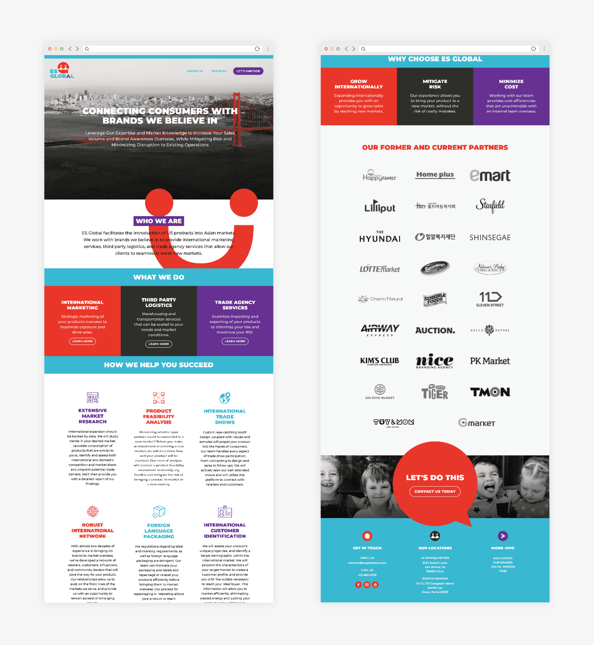
When ES Global approached Nice Branding Agency, their current brand identity wasn’t drawing the interest that the company deserved. Their website had many goals to achieve, but the user experience wasn’t effectively carrying the viewer through the content of the website, engaging them or compelling them to take action. The ES Global rebrand was a necessity.
After examining the existing brand collateral, and talking with our client about her goals for the business and the challenges she was facing, we determined that ES Global was in need of a new brand identity. Their brand would need to function both domestically and overseas, explaining the complex international business in a way that would resonate in both markets and grow with the company as it continued to expand.
Logo Design Direction Brainstorm
Following the ES Global rebranding project kickoff, our team reviewed the creative questionnaire to glean information about the business. Understanding the business from clicking through the existing website was a feat, and we really had to put on our thinking caps to have a firm grasp on what the company does and what value it provides.
We understood that ES Global coordinated the supply of family-friendly products from the US to retail stores in South Korea. After strategizing on the position, we determined that their biggest value was in their ability to communicate and manage the supply chain. This provided value both to the manufacturers who wanted their products in stores abroad, and the retail stores in South Korea who wanted their shelf space filled.
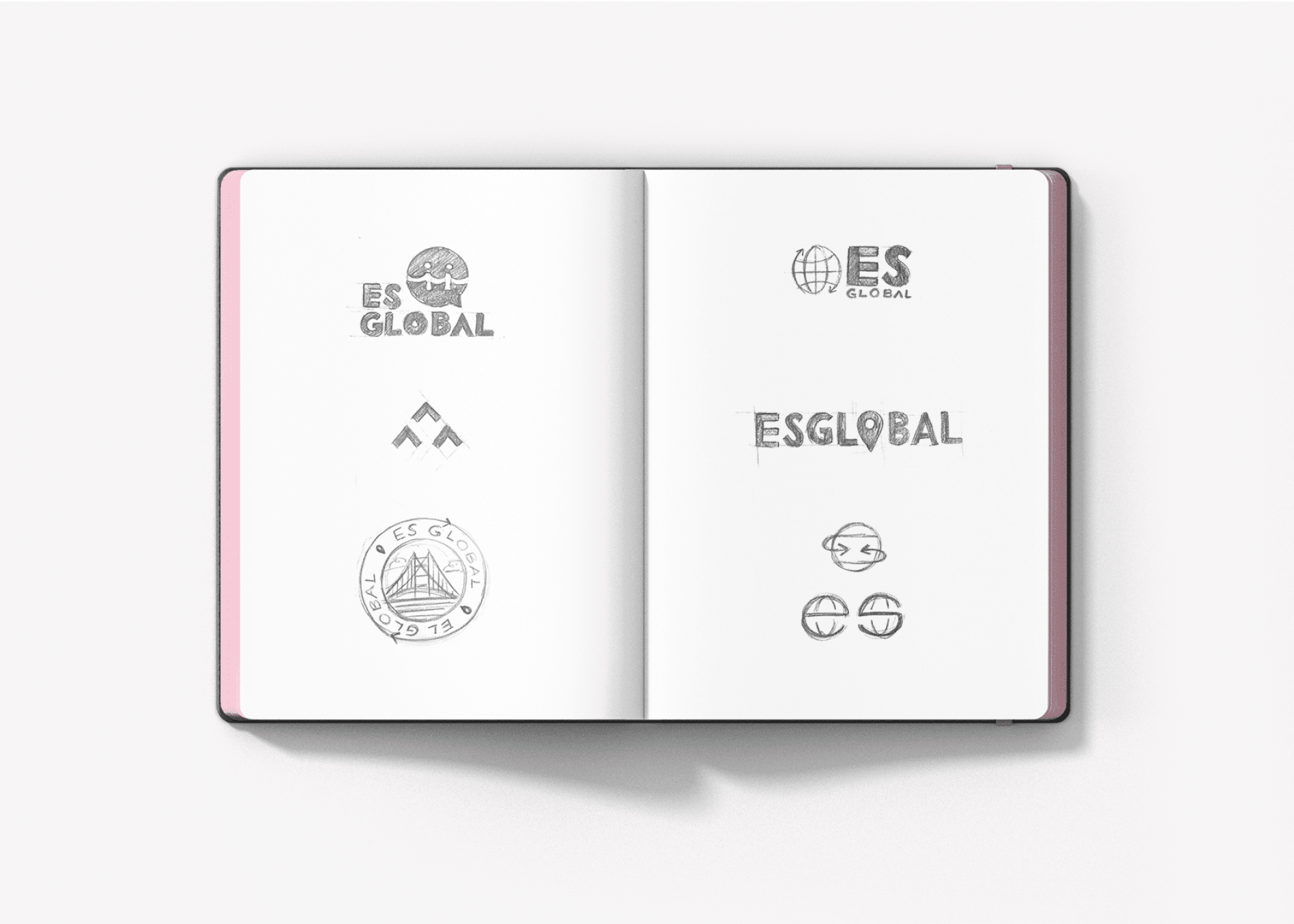
The design concepts that would inform the logo process and the global rebrand were centered on the value of communication, connecting markets, and dealing in international trade.
