Pollock Printing is a national, regional and local printer that does commercial printing and binding in Nashville, Tennessee. As a branding and graphic design company, working with printers is symbiotic because they are able to print everything we can dream up for them in-house. We were excited to put our minds together and equip them with some killer graphic design that would really showcase their printing abilities.
The Sales Booklet
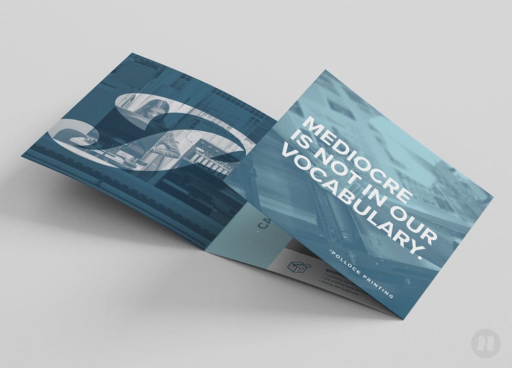
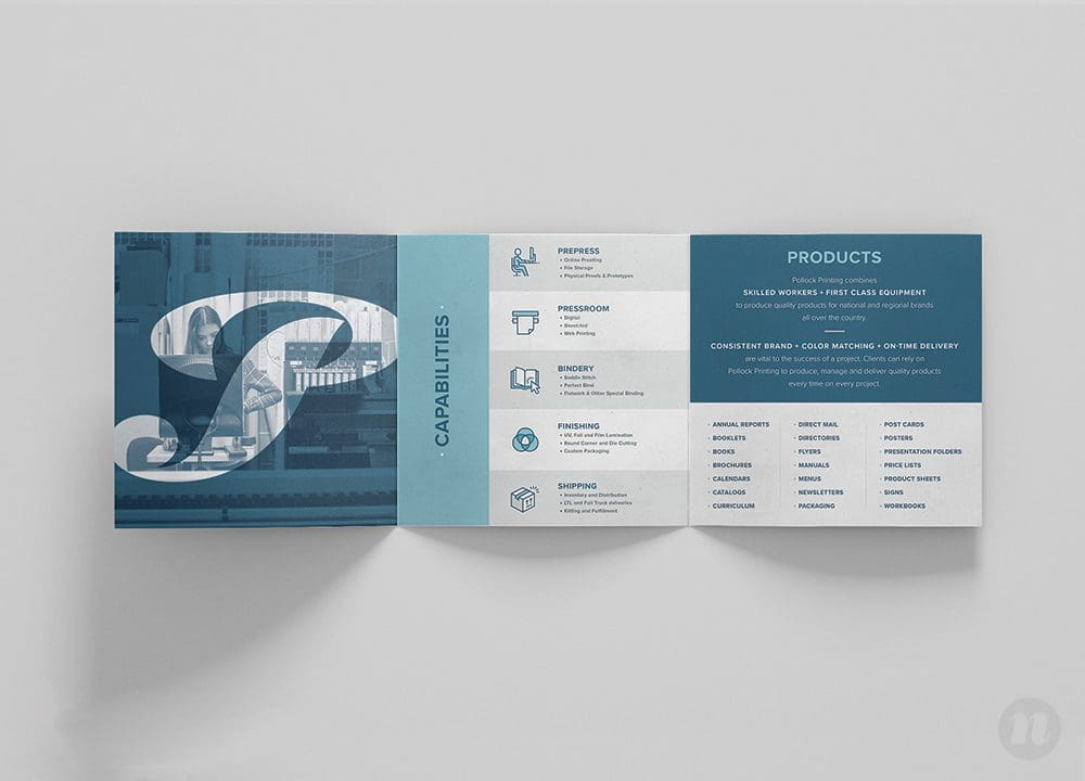
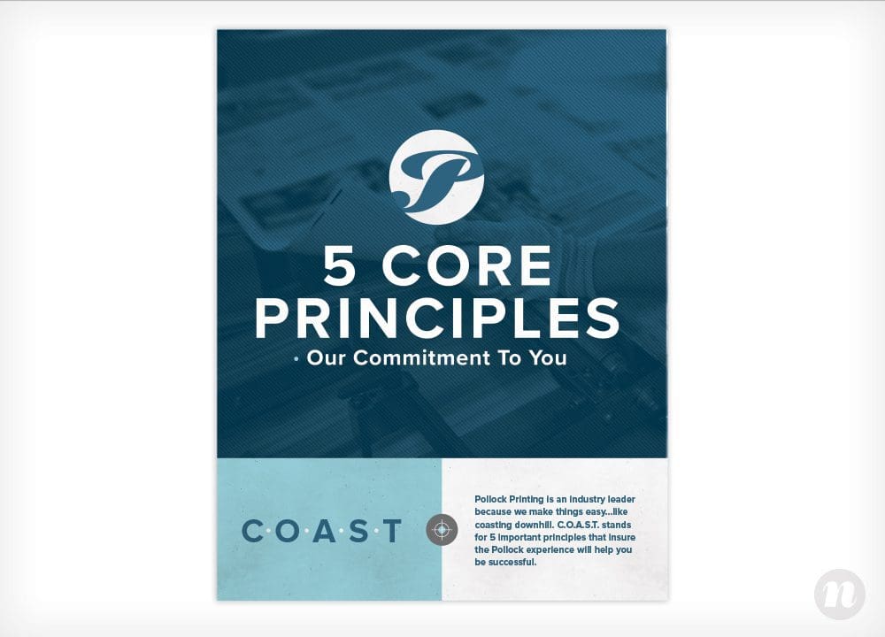
To start, we got working on redesigning their sales booklet through strategy and compelling graphic design. For the main elements of the overall design, we used clean and modern fonts, paired with images of their work and images of people working on big printers overlaid with blues that were consistent with their brand colors.
The sales booklet we created was a rectangular trifold that clearly communicated Pollock’s capabilities through a series of icons and concise wording. We featured their commitment to quality through copy that emphasized their consistency, on-time delivery and the skilled nature of their work.
Additionally, we included the story of Pollock to showcase their credibility as tenured experts in their field.
Through the final design, we used blocks of color and a strategic layout to convey a number of different facets about the business without getting too wordy or losing the reader in too much information. The successful merriment of graphic design and strategy provided Pollock with a final product that we were proud of.
One-Sheeter
Once the sales booklet design was finalized, we translated the trifold design into a double-sided one-sheeter.
At the client’s request, the document included a perforated section at the bottom that could be removed and left behind with the potential client to more easily share contact information. This section included space for a personal, handwritten note as well as a graphic design that emulated a business card.
Business Card
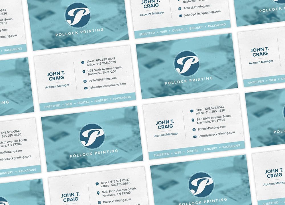
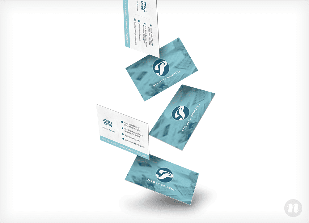
Speaking of business cards, we utilized our graphic design skills to produce several proposed business card options that took on the blue texture and overlays from the previously designed pieces.
Again, we used blocks of color to separate the information into a cohesive message about Pollock’s abilities.
We proposed a card design with a custom die cut on the logo icon, as well as an option that used spot UV to highlight the icon.
In the end, the client ended up selecting a standard print that would feature the “P” logo icon on the front and incorporate their key services on the information side, along with coordinating contact information.
Pocket Folder
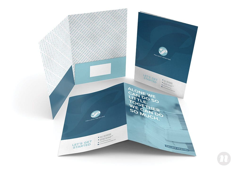
Finally, we designed a pocket folder that took on the same branding and graphic design elements as the other collateral. The front reads, “Alone we can do so little, together we can do so much,” with a “Let’s get started” call to action along with contact information for Pollock. This pocket folder would catalyze clients to further engage and become partners with Pollock.
On the interior, we included a Pollock Printing pattern to provide a custom feel to the folder. The inside flaps include icons for each of their key services, and a perforated place to hold a business card.
We at Nice Branding Agency, a Nashville Graphic Design Company, loved working with Pollock Printing. Their extensive work with agencies and our familiarity working with printers made it a really fun project for everyone involved. Getting to collaborate with them on their experience with print made for smooth sailing and a great final product.
If you’re interested in working with our Nashville Graphic Design Company, please contact us today.
