Stay’d

restaurant brand design

Meal delivery service is nothing new. You place an order, get fresh ingredients delivered to your doorstep, and then you take on the role of chef. But, just imagine if all of the work was done for you and all you had to do was sit back and relish restaurant-quality food from the comfort of your home with your loved ones.

Enter Stay’d.

Maadaadizi Investments created an innovative meal delivery service concept that brings thoughtfully curated meals to your front door and frees customers from the nuisance of meal preparation and hosting. To help take their concept to the next level, they came to Nice Branding Agency, the restaurant branding experts.

Meal Delivery Branding Project Kickoff

Our meal delivery branding creative process begins with a discovery session.

We have the client complete a Creative Questionnaire to assist with educating our team on the project. We then use those answers and our jottings from previous conversations to brief our branding team prior to them starting work on the project.

Naming

Our first challenge? Naming the service.

Every single one of our team members took time to dig deep into the goals, history, positioning, and the “why” of the business independently. From that research, they brainstormed a variety of potential names.

After this, we came together to share our name ideas. After discussing the pros and cons of each name, we eliminated options that weren’t strong enough to serve as the first word in the brand’s story.

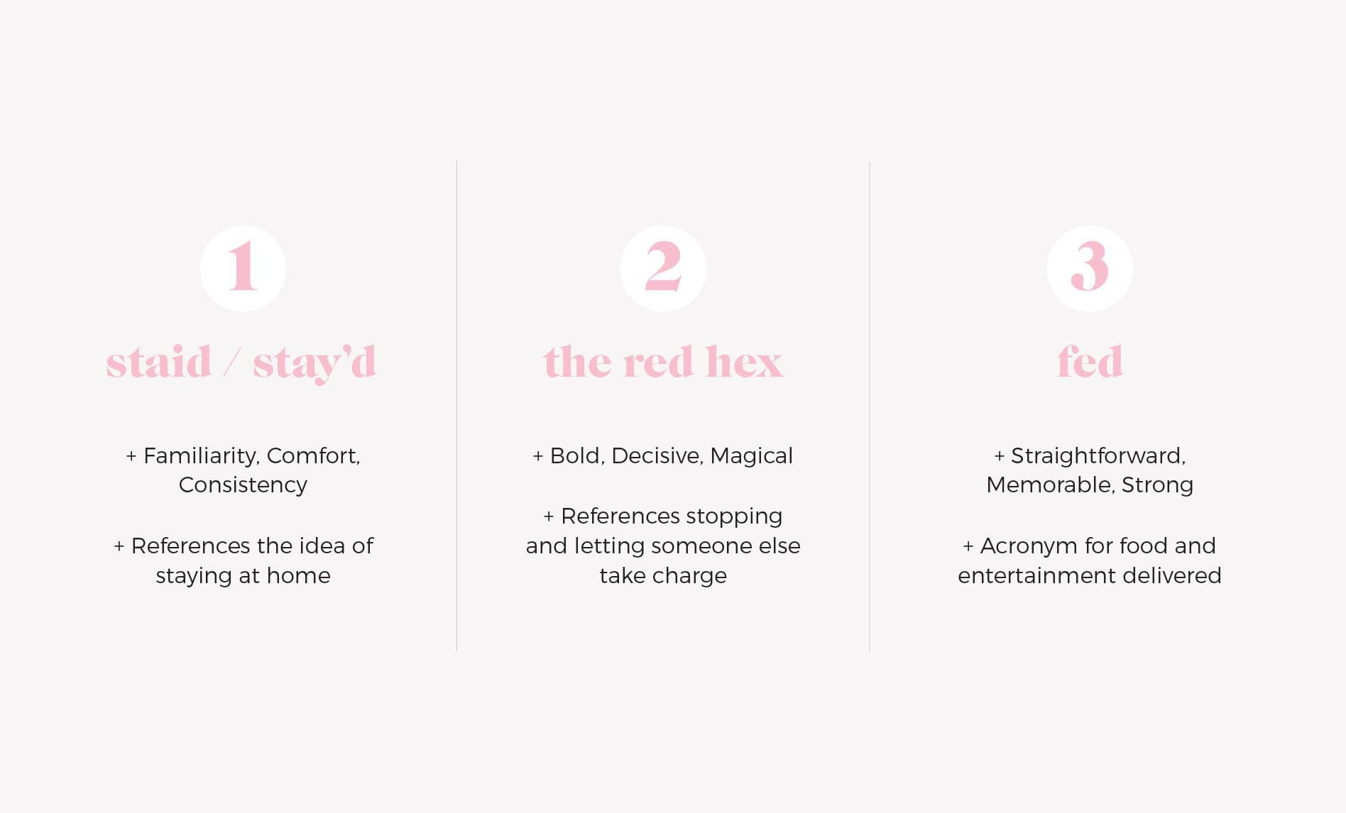
These names that remained were backed by stealth reason and research. The names left were: “staid / stay’d,” “the red hex,”and “fed”.

The first option, “Staid” or “Stay’d”, referred to the idea of staying home. It can draw up thoughts of date night in or an intimate meal shared with friends and family. “Staid” suggests steadiness, a sense of dignified respect, and elevates the brand. Whereas, “Stay’d” has a modern yet, youthful mood. For either choice, there was an undertone of familiarity, convenience, and consistency.

The second option, “The Red Hex”, spoke to a collective state through a symbol we all recognize: A stop sign. We’re all constantly immersed in the hustle and bustle of life and there’s no guilt in stopping and letting someone else take the wheel for a while. Also, the color red is bold and decisive. The word “hex” has an air of magic within it. There’s a certain attraction to the name which is fitting of the act of ordering in.

For the last option, we presented the name “fed”. Food and entertainment delivered. This acronym evokes certainty. We are explicitly who we say we are. The name is memorable, the past tense of a word we’ve grown up with. It’s strong: the word itself has only positive associations. Design-wise, it works well in a logomark and also fits seamlessly into brand messaging.
meal delivery branding attributes

After presenting these options, our client chose “Stay’d” due to the positive feelings it conjured and how it echoed their vision for the brand.

The Starter Pack | Meal Delivery Branding

After we completed the Naming process, The Starter Pack was up next.

To start that process, we create two options for the brand which include a mood board, logo design, brand color palette, brand fonts, and supporting brand icons. From here, the client picks one option and this then becomes the foundation for their brand.

Design Direction Brainstorm

Upon having a good understanding of their business goals, location, target marketing, offerings, and competitive differentiators, we flushed out two brand concepts, each with its own exclusive look and feel.

The first brand had a retro, vintage feel and put emphasis on the comfort of being at home with your loved ones. The second brand featured more vibrant colors and fun, flavorful energy.

We’ll delve into the details below. Keep reading to find out which option came out on top.

First Brand Concept Development

Brand one has the more vintage vibe of the two.

Overall, the aesthetic centers around the warmth of being at home. The pleasure of Sunday supper with friends and family. You can almost hear the laughter paired with the sound of clinking glassware.

It’s reminiscent of the good ol’ days prior to cell phones when you would enjoy every bite, read the paper, and be fully present in the conversation. With this ideal, Stay’d bring friends, fellowship, and good food to the table.

Mood Board

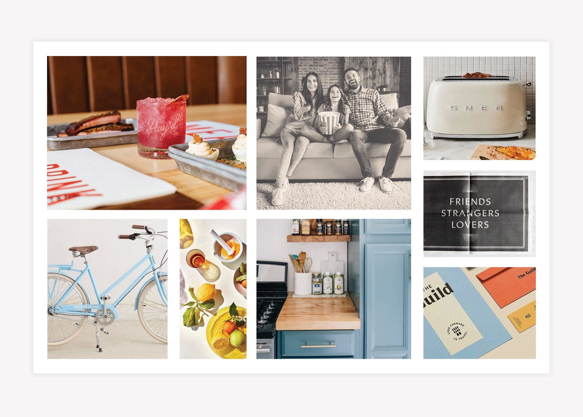
The Start Pack package starts with the formation of a six-image mood board that communicates the overall aesthetic of the brand.

For the first concept, we chose photography that displays modern-day experiences but in a retro-inspired space to align with the brand.

meal delivery branding mood board

Meal Delivery Branding Logo Concept #1

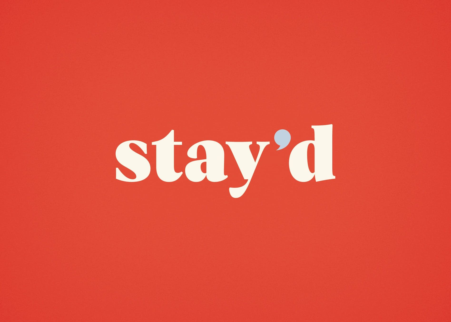
For this logo, we landed on a friendly serif face that’s easy to read and comfortable to digest. We designed the apostrophe to double as a speech bubble as well.

We wanted this speech bubble to represent the companionship and conversation that take place over good food. This icon can also be carried throughout the branding to drive home this conversation piece of the brand.

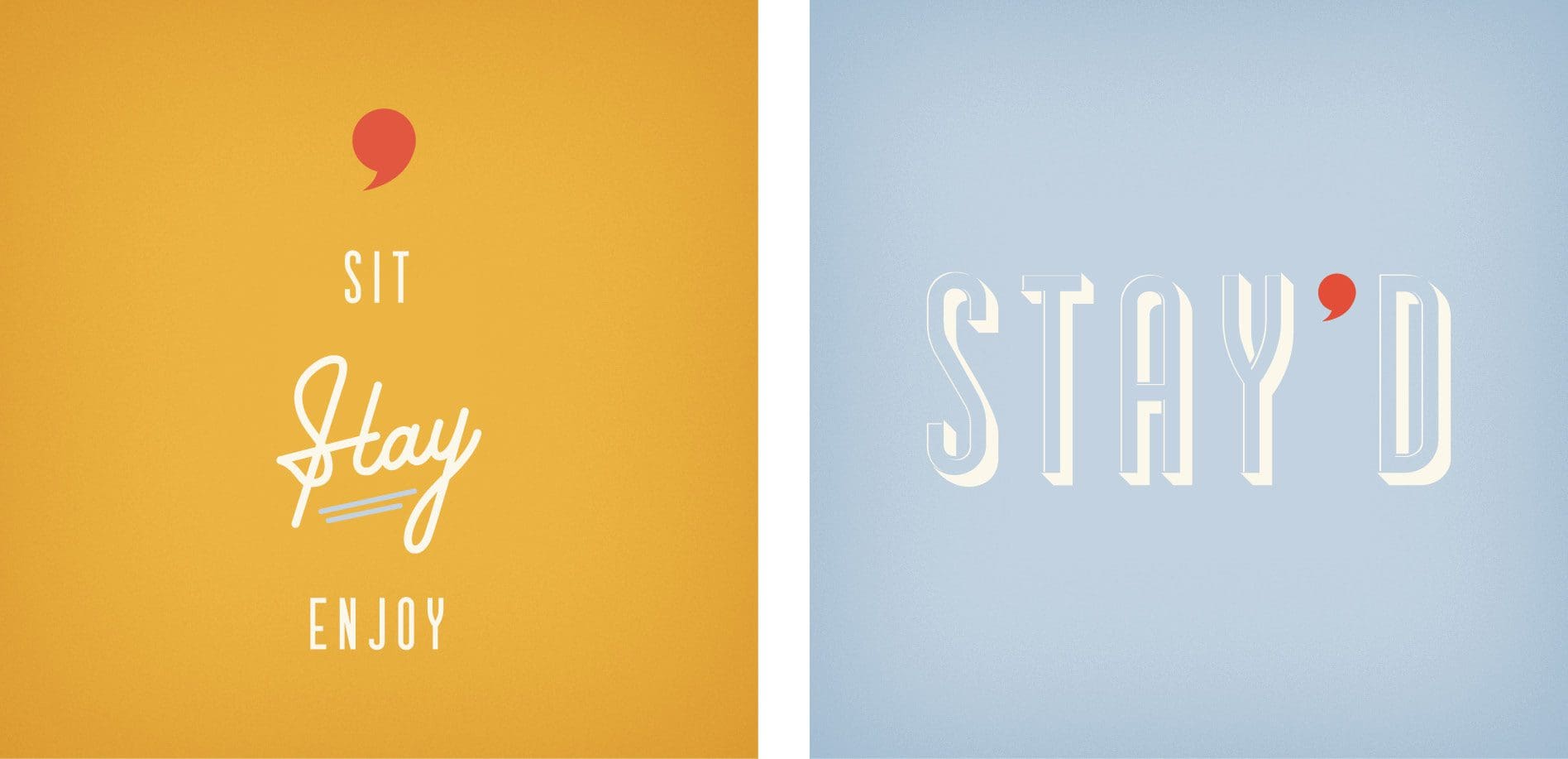
The speech bubble can also double as a comma if flipped which indicates a pause.

design logo branding restaurant

Brand Colors

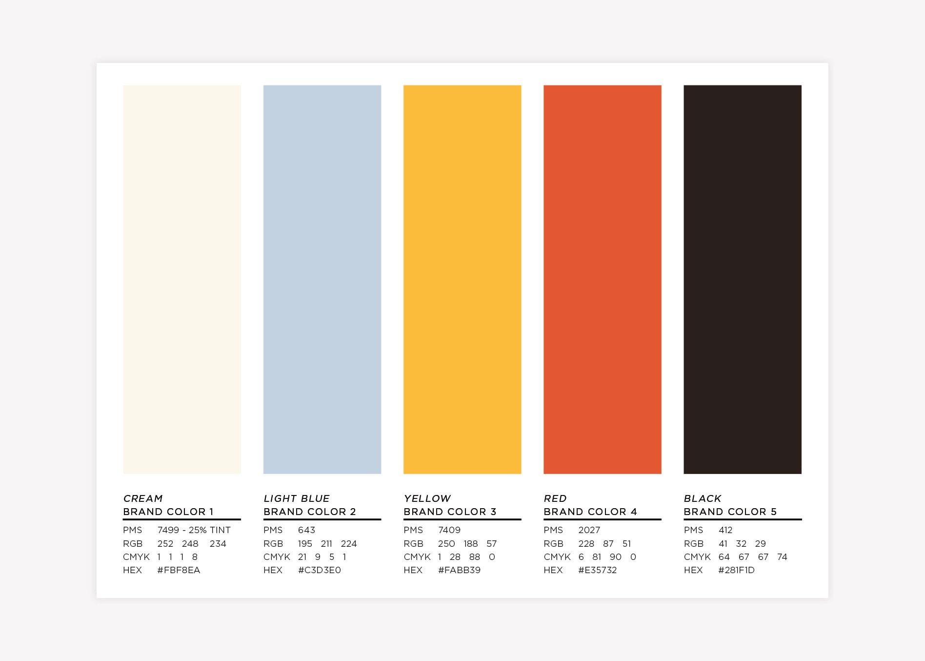
This brand direction features colors that are classic, comfortable, and reminiscent of some that you may have seen in a vintage kitchen.

restaurant industry brand colors

Brand Fonts

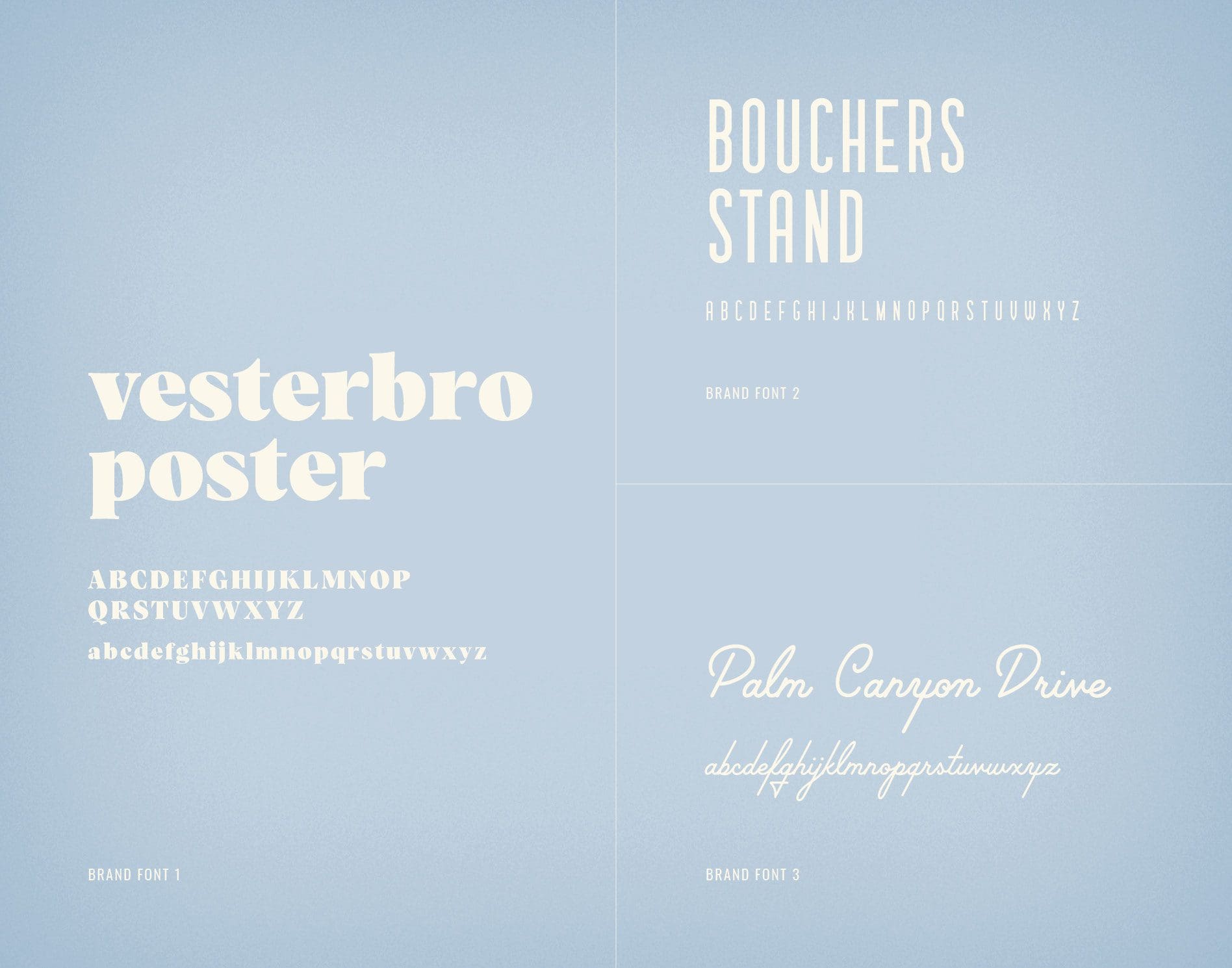
As previously mentioned, we landed on a friendly serif face for the logo that was easy to read and comfortable to digest.

food industry brand fonts

Supporting Icons

To pair with the classic retro feel of the brand, we developed complementary supporting logos. You will notice that we brought the speech bubble apostrophe into these supporting logos as well. With a variety of supporting logos, they can each represent separate markets while still maintaining the recognizability of Stay’d as a brand.

This speech bubble apostrophe could also stand on its own as an icon.

food logos meal delivery branding

Second Brand Concept Development | Meal Delivery Branding

For brand two, the overall aesthetic is fun, creative, and flavorful. We wanted this concept to acquire the energy and sounds of laughter between family and friends as they’re coming together around the dinner table.

Mood Board

We included several patterns, from polka dots to stripes, in this brand as well as bright colors that vibrate off of one another while working seamlessly together. Custom patterns will be made from elements of the chosen logo.


brand board meal delivery branding

Meal Delivery Branding Logo Concept #2

For this logo, we chose a carefully crafted display typeface that accurately characterizes the curated meals from Stay’d. This logo serves as a mix of circles and diagonal shapes that play off of one another.

The featured circles represent people while the diagonal rectangular shapes represent dinner tables we sit around. For this brand, we utilize the apostrophe as a location marker that represents staying home.

logo design nashville branding agency

Brand Colors

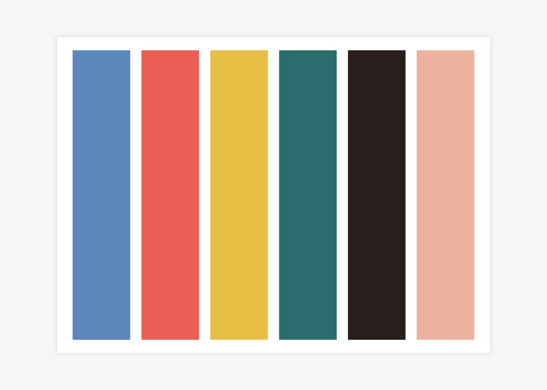
For this brand direction, we wanted the color to bring a fun, energetic feel. The teal and yellow bring in warm tones that evoke the feeling of home, which are then paired with a lighter blue, peach, and red, to bring energy and fun to the brand.

restaurant brand colors tennessee

Brand Fonts

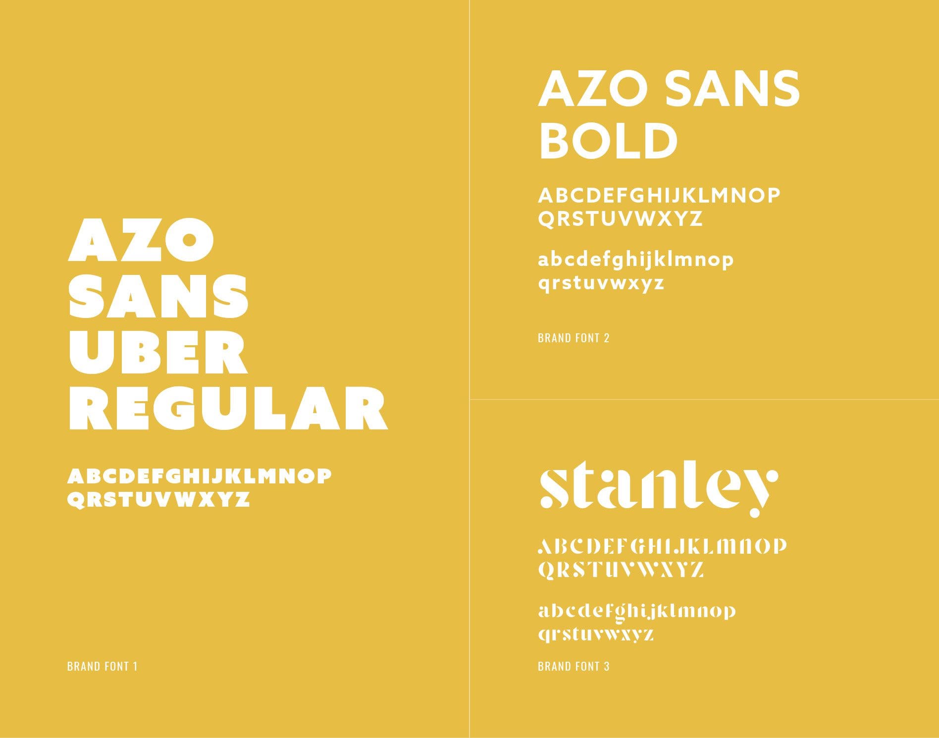
The brand fonts used for this direction are the uber-bold sans serif and a slightly less invasive bold version of the Azo Sans font family. We would also utilize the logo font for support.

food business brand fonts

Supporting Icons

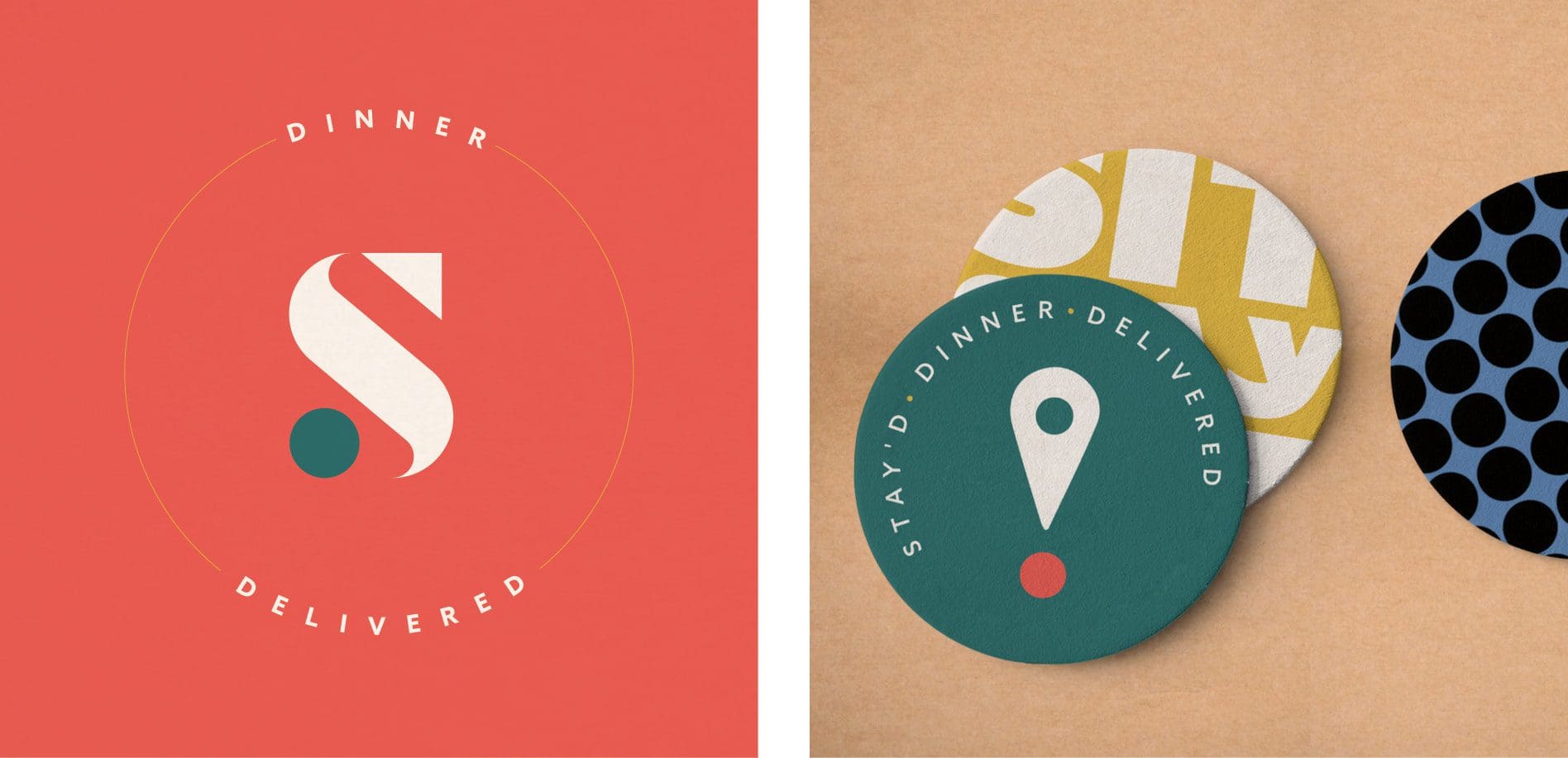
For the icon, we moved the circle from the main logo that lives under the location marker apostrophe, to form an exclamation point. This visually brings an air of excitement to the brand and ties the emotion of excitement to staying home, having dinner delivered, and spending time with loved ones.

We also built out a supporting icon of the S from the main logo with support text around it.

secondary logos food company

Presentation and Selection

We took both brand options and presented them to Maadaadizi Investments. In this presentation, the Nice team took the client through the concepts, detailing our thought process behind the designs.

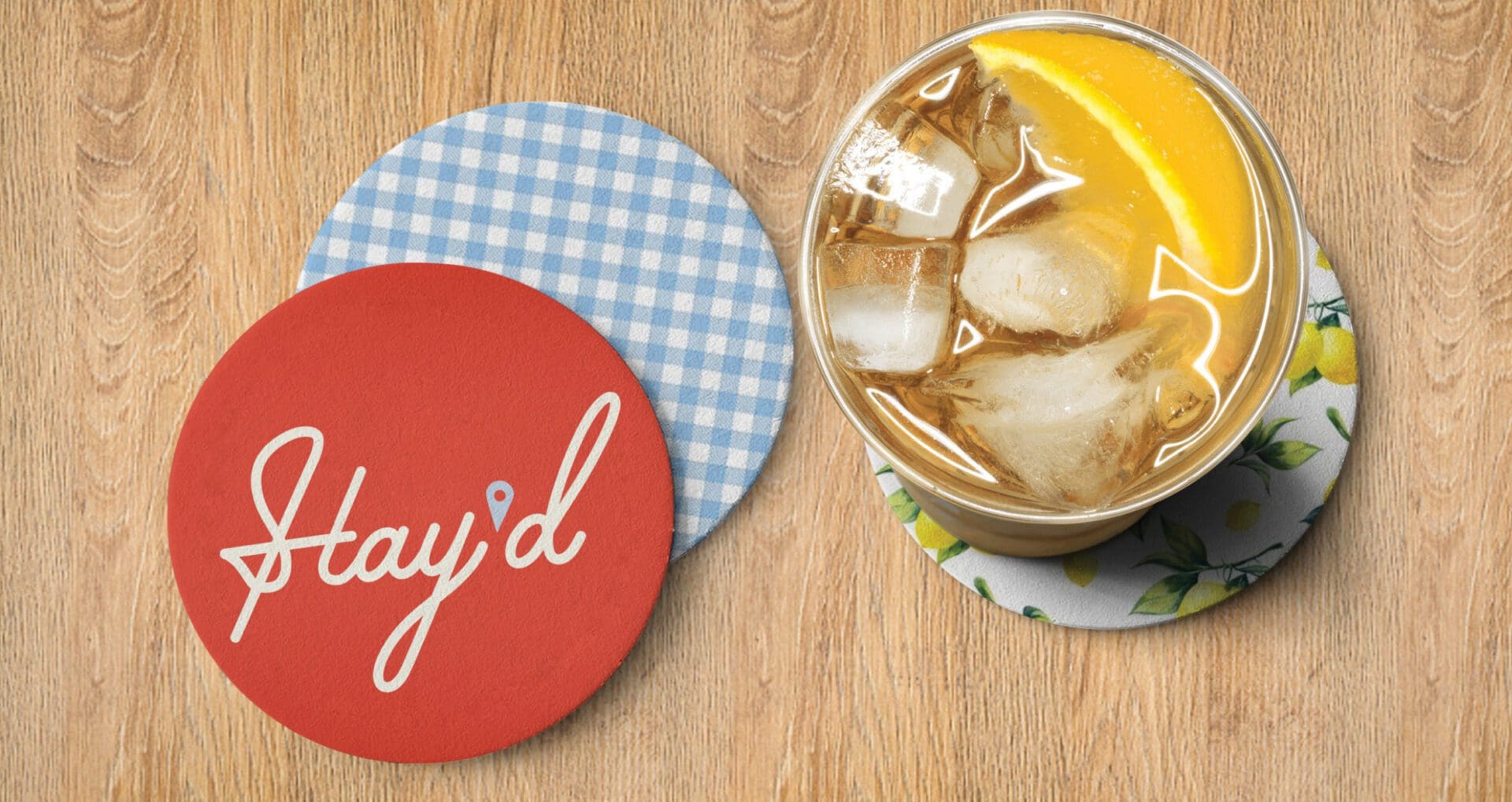
The client chose the first brand concept, but really enjoyed the location marker used as the apostrophe from the second concept. So, we revised brand one to include the location marker as the apostrophe in the main logo.

Picking and choosing elements from different brand directions and combining them isn’t always a winning choice. But, in this scenario, the graphic style of the location marker was complementary to the overall aesthetic, so we were happy to make this update!

final logo meal delivery branding
final secondary logo designs branding

Logo Finalization

Once the selection and approval process was complete, we moved into finalizing the logo. We made certain that the elements of the logo were perfectly and precisely spaced out. In addition, we selected the exact logo colors in PMS, CMYK, and RGB codes.

We were then able to create the final logo files in JPEG, PNG, EPS, AND PDF. We provided our client with these logo files, along with logo guidelines, in full color in tandem with black and white.

Brand Guidebook

The brand guidebook that we provide serves as a bible to keep the brand intact. We supplied Maadaadizi Investments with a booklet, including the six-image mood board, the logo, supporting logos, brand colors, and brand fonts.

Meal Delivery Branding Project Closeout

Our client was very pleased with our services and we have become a trusted partner of the company. We look forward to supporting them in any future branding and marketing efforts.

Looking for a Nice Restaurant Brand? Contact us today.

Follow along with us on Linkedin and Instagram to learn more about our services and see examples of our work.

are you ready to create something nice?