Bar Logo Project Kickoff
We started the bar logo project by having our client complete a creative questionnaire. The questionnaire allows us to glean important information about the project. Here, we clarify expectations, competition, target market, and more, before we start working on the logo design. In the brief, we learned that our client wanted us to create a brand mark that would marry modern design with the vintage nature of the location, and one that would tie in the meaning behind the name.
For The Trails Bar + Bites in Helena, Montana, we wanted to create a bar logo design that would align well with the “old school” vibe of both the town and the hotel itself. As we mentioned, it was important for us to examine the history and allure of the surrounding area and the story behind the hotel bar’s name in order to develop a logo mark that would have meaning. Helena is known for its extensive system of bike trails, thus the name of the hotel restaurant. We wanted to incorporate this into the new logo icon; however, we wanted to take an approach that wouldn’t simply include a bike or an overt reference to a bike trail.
Design Direction Brainstorm
After obtaining pertinent information from the client about expectations and about the restaurant and bar itself, our logo design team gathers to create concept directions.
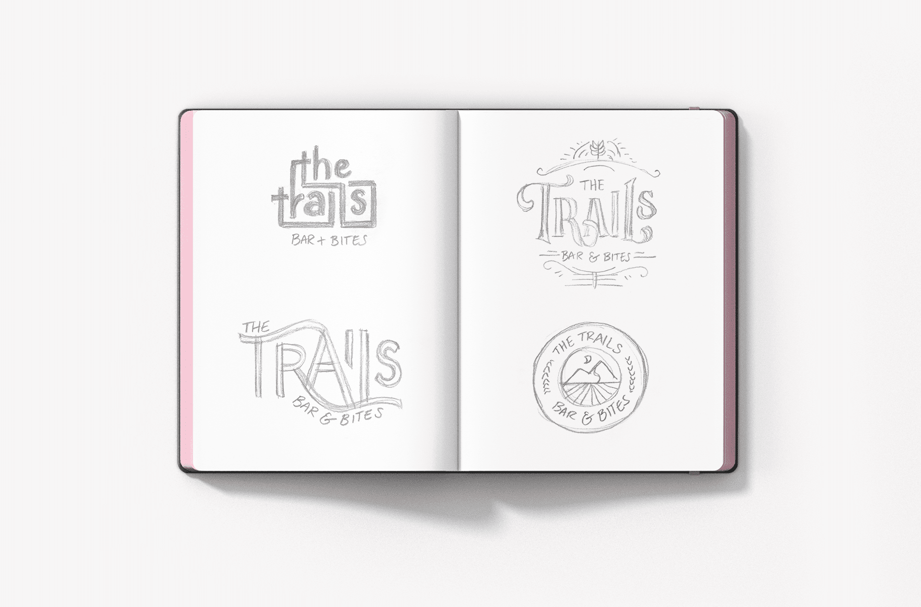
We decided that we would utilize the concept of the trail in several of our new bar logo design options, and that we would develop a couple of options that wove the trail through the logo type and a couple of options that would feature the trail in the logo icon or styling.
Finalization of Conceptualization
When the logo concepts were solid, they were presented to our Director of Design and Creative Director. For this new logo project, our directors agreed with three of the logo concepts presented and provided approval for our team to move forward developing out the logo concepts digitally.
Bar Logo Design Options
With approval, our logo design team began the process of designing the new logo options. They created digital versions of each of the sketches. Additionally, they selected color palettes for each version that aligned with the overall visual direction that dictated an old school look and feel. The idea was to create something that would be indicative of the name and story, but also legible when scaled down or up, and memorable for both locals and travelers.
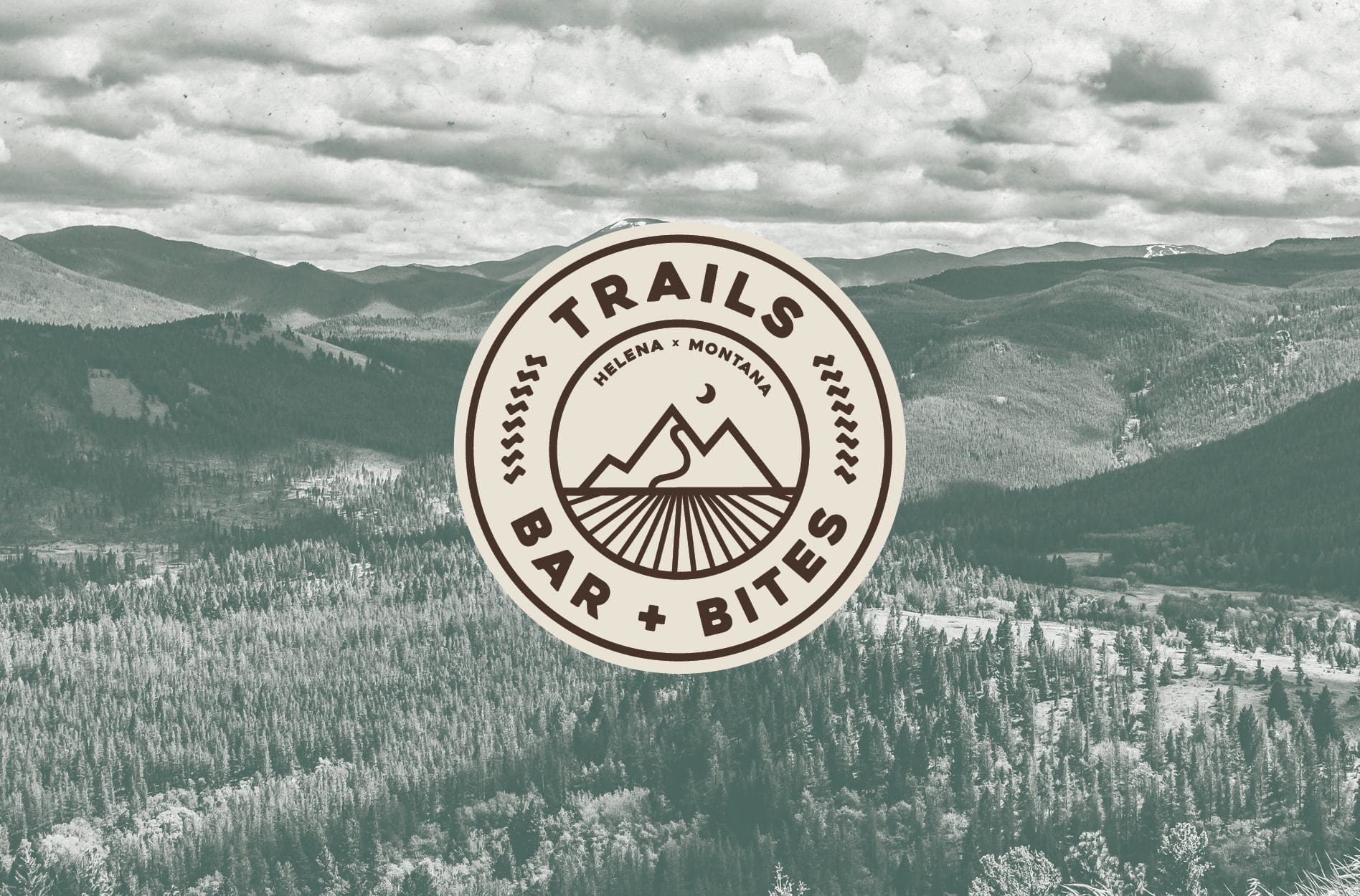
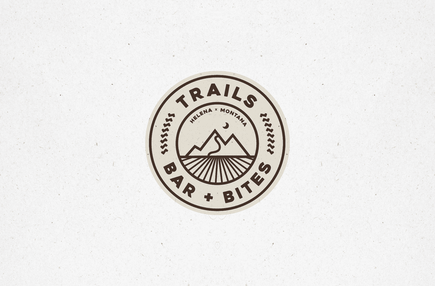
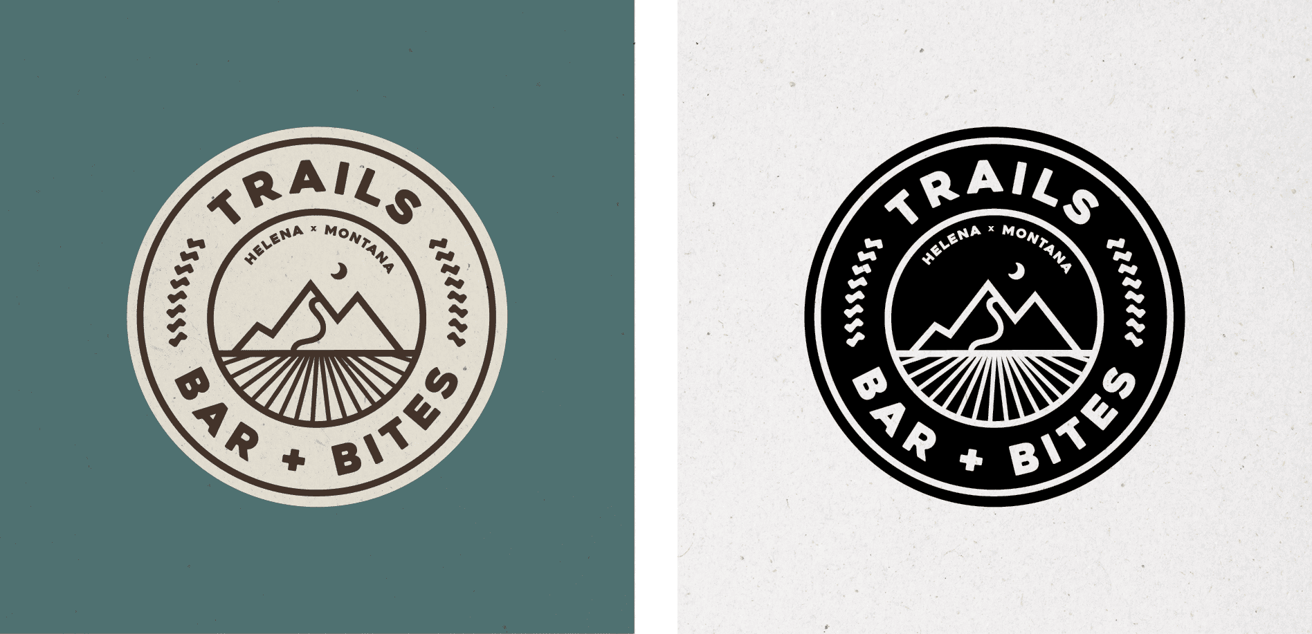
The first logo option developed was a round logo that would exist as both the primary logo and as a stand-alone brand icon. This mark included a clean, but classic font for the business name as well as a smaller call out to the location of the restaurant.
Within the center of the circle, we developed an illustration indicative of Montana’s mountainous landscape, with an upward moving trail leading to the mountain’s peak.
In order to further encompass the meaning behind the name, we created grooves along the circumference of the circle. While at first glance these seem to be purely decorative, upon further inspection you’ll notice that the grooves are tire treads, representative of the extensive bike trail system within the region. Additionally, under the mountain icon, you’ll notice a nod to wheel spokes from a bike.
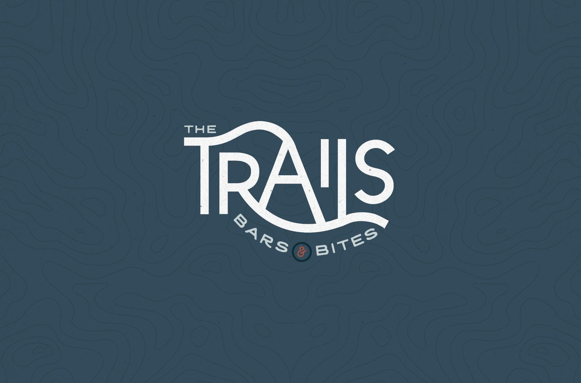
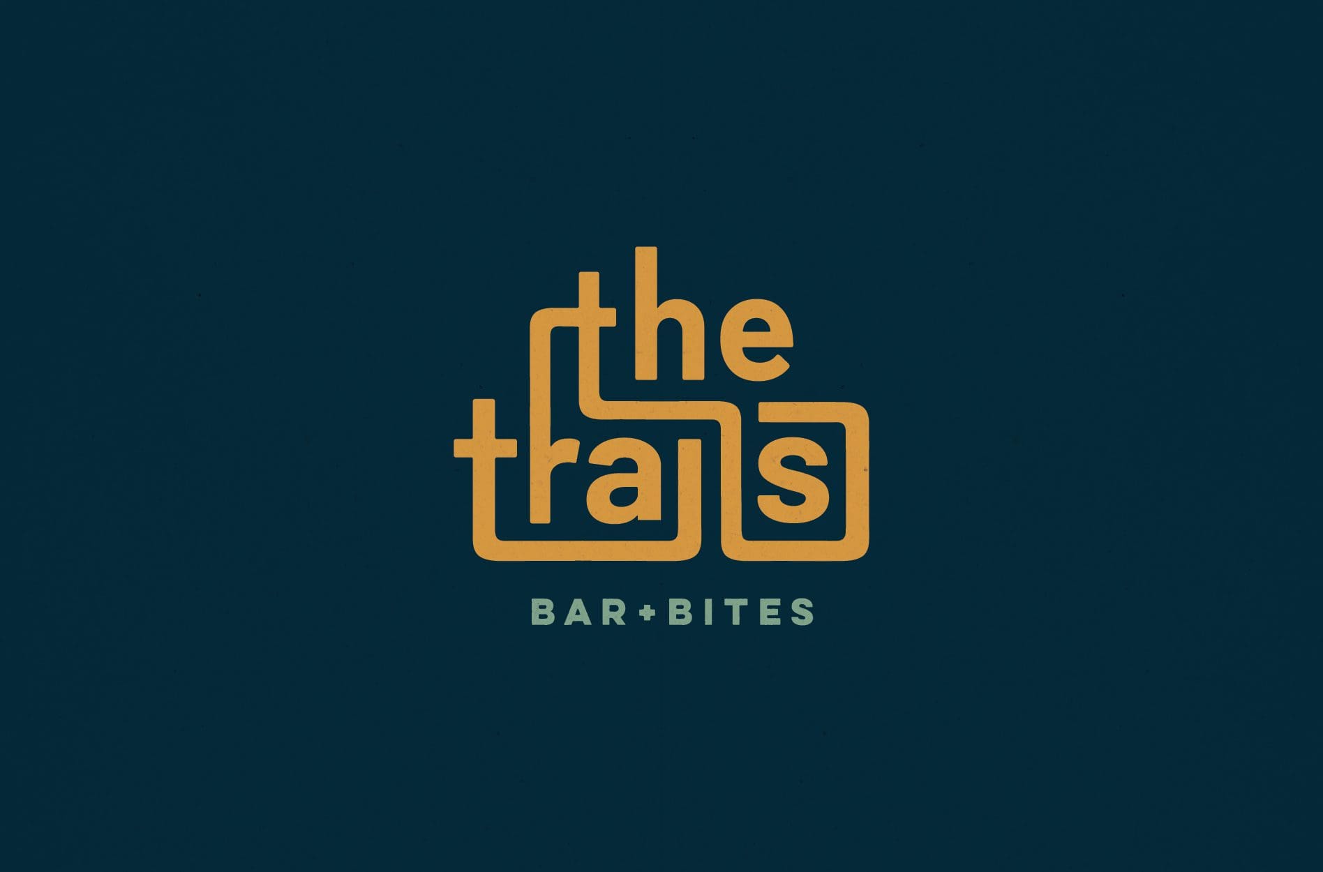
The second bar logo option that was developed included a modern typeface, woven together to form the name of the restaurant and bar. The connection between the letters nods to the intricate system of trails present in the area, and also the connections that people will make as they dine and drink within the space. Bar + Bites is set below the name of the restaurant in a cool green to pay homage to the prevalent nature within the region.
The third and final bar logo option took on a similar approach to including the trails within the logo type. However, this option also introduced a rounded feel that draws inspiration from the wheel of a bike. We used a simple color palette consisting of blue, warm yellow tones, and a bit of a warm teal in this new logo version.
Presentation and Selection
Upon logo presentation, our client selected the first logo option we presented. The iconic aspect of this logo mark really portrayed the meaning behind the brand name, and equipped the restaurant with a new logo that could stand on its own on menus, apparel, to-go cups, and more. The natural color palette of creams and browns worked well in the existing hotel property, and could be applied to backgrounds that aligned with the overall brand look and feel.
There we no changes requested to this new logo design, and we moved forward into finalization.
Bar Logo Finalization, Files, and Guidelines
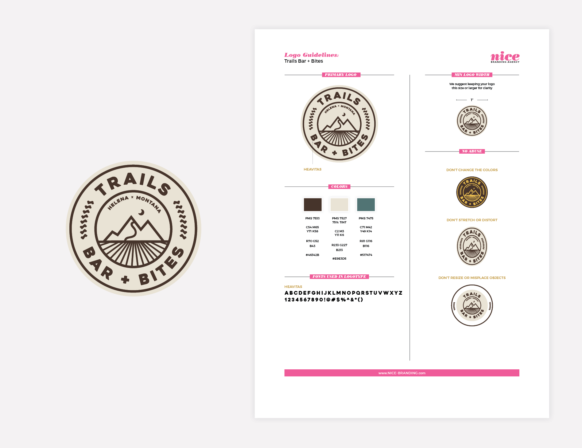
When our client had selected a new bar logo option, our Director of Design moved on to finalize the logo. For The Trails Bar + Bites, we examined the logo carefully to ensure that every element was in place. We looked at colors and spacing, and then selected final colors for the new bar logo. This included the identification of PMS colors, CMYK colors, RGB colors, and hex codes.
Project Closeout
With the logo final, we created logo files for the new bar logo. Here, our graphic design team develops logo files in PDF, EPS, JPEG, and PNG. We also created a logo guidelines sheet, which we shared with our client so that they can keep the logo intact as they implement it across the restaurant.
Ready for a Nice Logo?
We love blazing a trail through restaurant branding projects, and a new logo is definitely one place to start. If you’re looking to start climbing the mountain to branding success, give us a whistle and we’ll be right there.
