Big Fish

tech company logo

Big Fish is a mobile application design and development studio based out of Tampa, Florida. They create custom application software solutions for businesses in a wide range of industries, from healthcare to logistics. It was started by our client, Sara McQueen.

When Sara first came to us with a request to improve her tech company branding, Big Fish had recently undergone a rebrand from a visual perspective with a new logo and brand colors. She was happy with this new direction. However, she wanted to further strengthen the tech company branding and better articulate who they were, what they did, and the value they brought to the table.

Sara knew she had an opportunity to create a stronger brand for Big Fish, but she didn’t know what that looked like.

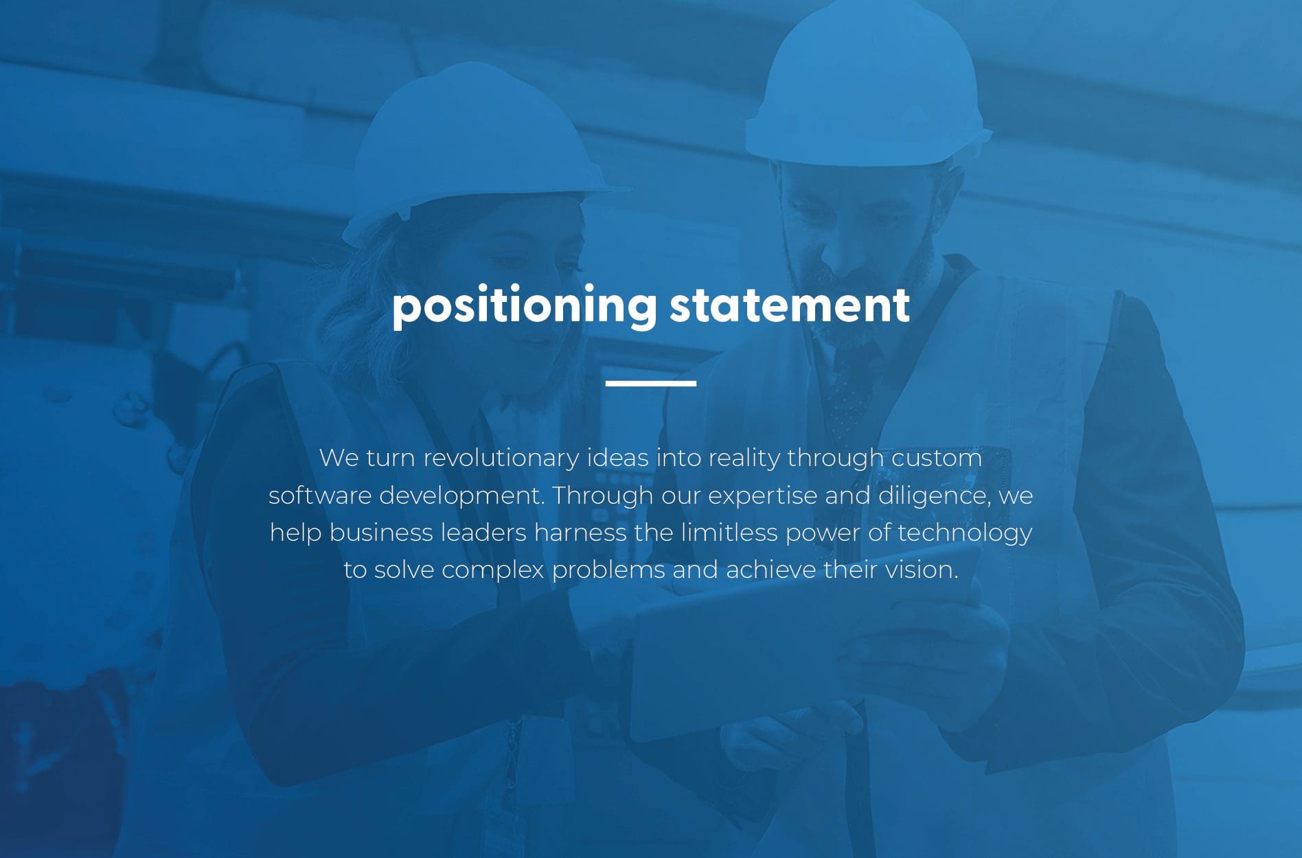
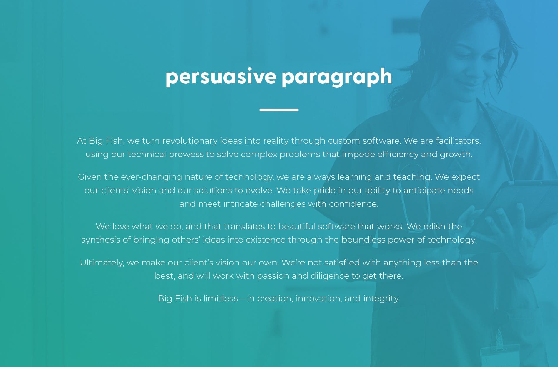
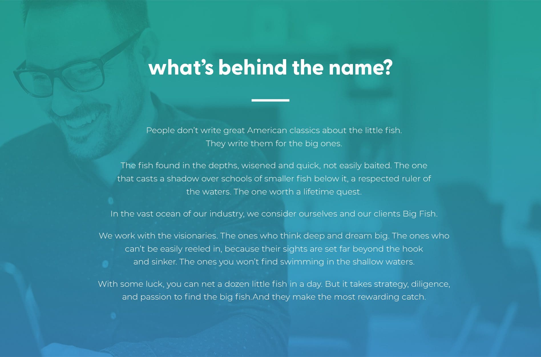
It was clear to us immediately that Foundational Branding would serve her well to help communicate Big Fish’s value in a way that would resonate with both future clients and their employees.

Research + Discovery

We started the Foundational Branding process, or Brand Positioning process with a deep discovery session with Sara over Zoom. Our team learned about the history of the company, what it’s been through, and where it is now.

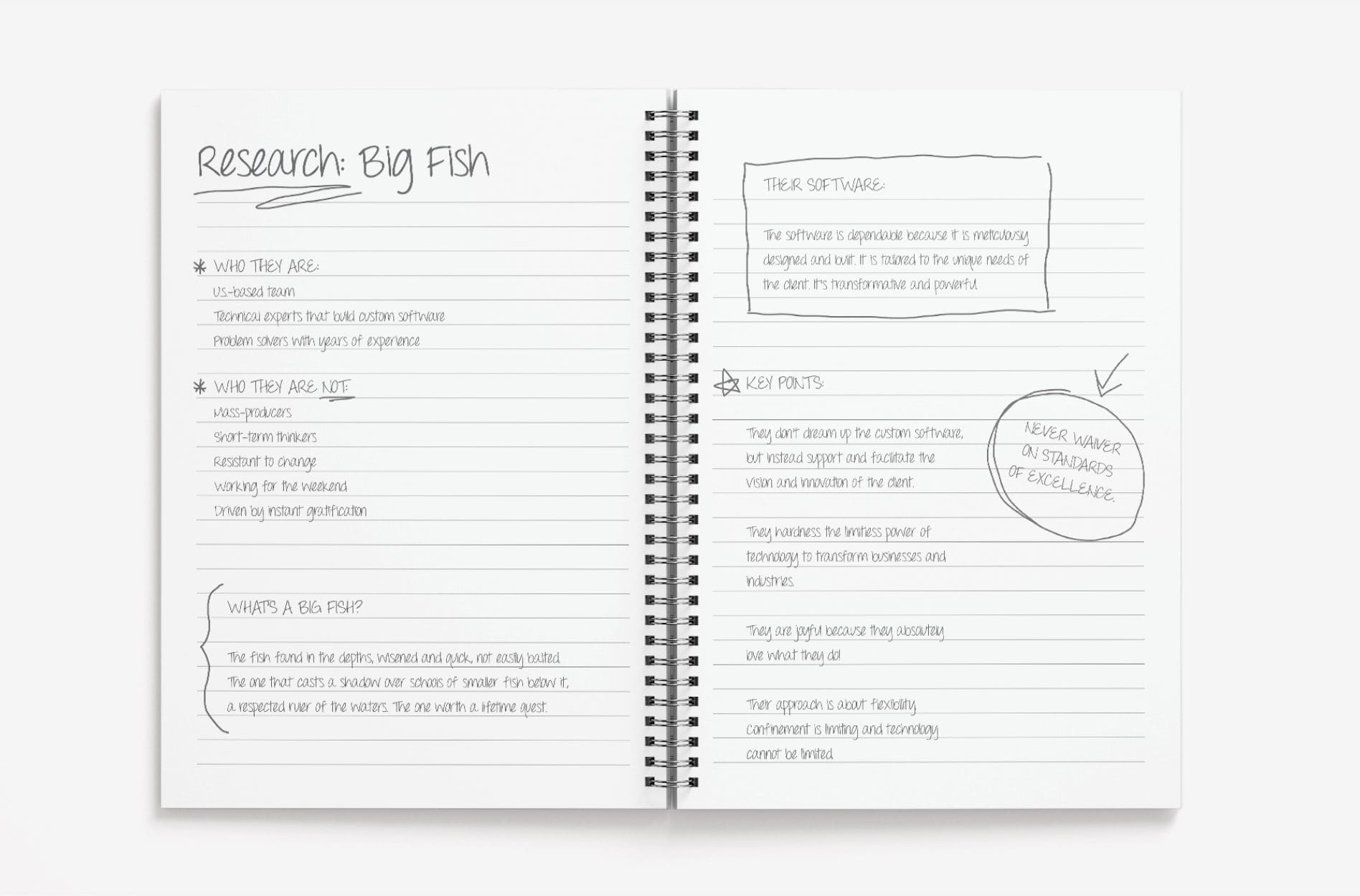
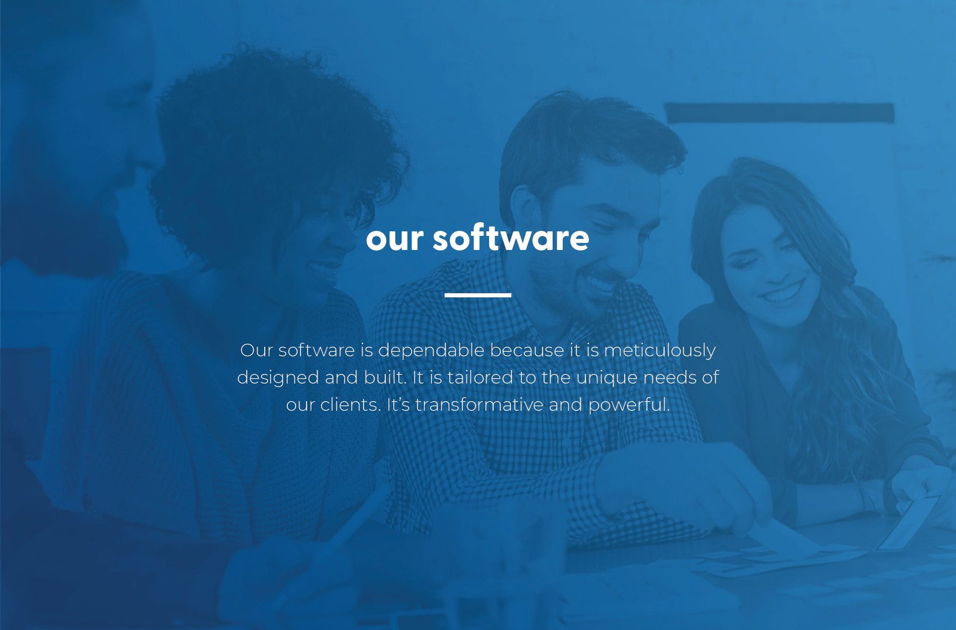
Big Fish started as a mobile and text marketing company in 2010. In 2013, they started developing iOS and Android mobile applications. Over the years, Big Fish has shifted to focus solely on app development.

While they are a smaller, boutique-sized tech company, they bring a wealth of experience and passion to the projects they work on. They knew the value they provided their clients and needed a clear way of communicating it.

Sara shared with us how she felt like she was reinventing the wheel every time she had a sales conversation. Big Fish needed clear messaging about the value they provided to help grow the company internally and externally.

All of the information we received helped us succeed in the tech company branding project.


tech company branding

Positioning Statement

After digging into the core of who Big Fish is, we crafted a positioning statement. A positioning statement is an important piece of our brand positioning process. It clearly and succinctly defines a company or organization and gets to the core of what the company truly does.

We created a long and short positioning statement that focuses on how Big Fish uses their experience and drive to bring their client’s vision to life. Having a clear and concise statement for Big Fish was a key piece in developing consistent messaging for their brand.

tech company brand position

Persuasive Paragraph

Next, we took the positioning statement and expanded that into a persuasive paragraph. For their persuasive paragraph, we wanted to communicate more about Big Fish’s process for developing software and the passion they bring to every project. We also wanted to highlight their commitment to excellence in what they do.

Big Fish can take this persuasive paragraph and use it in whole, or in part, for their website or any of their marketing collateral to further explain who they are and what sets their team apart from the competition.

tech company brand position

An additional piece we helped create for Big Fish was an outlined process for their software development. We wanted to showcase how Big Fish takes a client from a discovery session to a successful software launch. The five steps we outlined for Big Fish’s process were: discovery, design, development, deployment, and diligence.

We displayed this process on the homepage of their website, so it would be easy for potential clients to understand what working with Big Fish would look like. This was also an important piece for Sara and her team to have while on a sales call with a potential client.

tech company positioning

Another way we helped create consistent messaging for Big Fish was by writing a block of content about their software. Our team recognized that there were some unique qualities to the software they develop.

tech company brand messaging

As our team worked on crafting consistent messaging that represented Big Fish, one major piece that was missing was a narrative behind their name. Sara is a deep thinker and very methodical and sensible in the way she makes decisions. However, when we asked her how she landed on the name Big Fish, she didn’t have an underlying story.

In the spirit of Sara’s personality, we wanted to give a deeper significance to their name. We took the insight we had gained during our discovery session and crafted a narrative that gave the Big Fish’s name meaning and clearly aligned with who they are.

The narrative highlighted the respected nature of the “big fish” and the depth of knowledge our client brings to every project they work on. It also shared how big dreams and ideas aren’t easily reeled in, but Big Fish was always ready to rise to the occasion for the reward of the catch.

In the end, our team was really proud of the story we crafted and our client was very fond of the narrative as well.

tech company brand story

Brand Attributes

After we solidified the story behind the name Big Fish, it was a natural next step to identify their brand attributes. Brand attributes are a set of adjectives we use to describe a company and what differentiates them from the competition. They help guide every component of the branding process—from visual design to copywriting. Internally, they help to direct the operations of the company and the actions of the staff.

The more we talked with Sara about what sets Big Fish apart, the more we appreciated the passion they brought to every project, their wealth of experience, and their ability to pivot quickly when needed. To represent these qualities, we chose the following words for their brand attributes: joyful, dynamic, wise, diligent, facilitators.


tech company brand pillars

Visual Direction

We were then able to use the chosen brand attributes to strengthen our client’s visual direction. While they had recently updated their logo, we saw room to improve and build a true visual direction for the brand.

Although we typically create three boards, we only created one for Big Fish since we were refining what they currently had. We wanted to give this aspect of their brand more consistency and congruence with standard colors and gradients.

On their board, we incorporated different shades of blue to look like the depths of the ocean. This also represents the depth of Big Fish’s knowledge and the limitless potential their custom software provides. The pops of purple help move the brand forward while communicating the company’s creative and joyful nature.

We used photographic images with gradient overlays and graphics to give a sense of uniformity and showcase Big Fish’s technical expertise. Overall, our goal was to communicate Big Fish’s limitless amount of creativity, integrity, and innovation.

tech company branding

Presentation

We presented the visual and verbal direction to Sara and walked her through the thought process behind the work we did. She was happy with the direction our team had taken to update her tech company branding.

Ready for a Nice Brand?

At Nice Branding Agency, our team is passionate about creating impactful, bold, connective brands that set you up for long-term success. If you are interested in our branding services, let’s chat! Call 615-905-9936 or contact us today.

To stay up-to-date on everything we’re up to at Nice Branding Agency, be sure to follow us on Instagram and LinkedIn.

are you ready to create something nice?