Soulemi

fitness studio brand graphic design

One of our favorite projects was the creation of a bold brand for a fitness-tech product that was sure to shock the market. For this fitness branding project, our client reached out to us with a great idea for a new venture. As we started the project, we dug into what had already been determined. At this point, nothing had been developed aside from the name: SoulEmi, pronounced “soley me,” and the idea for a wellness membership that would combine all of the aspects of personal “me time,” from fitness to wellness and beauty, and make them accessible via technology.

Business Branding Project Kickoff

We started the fitness branding project by working to gain an understanding of the business. Our conversations with the client were focused on getting clarity around the platform she would develop, the target market, her plans for launch, and the competitive landscape.

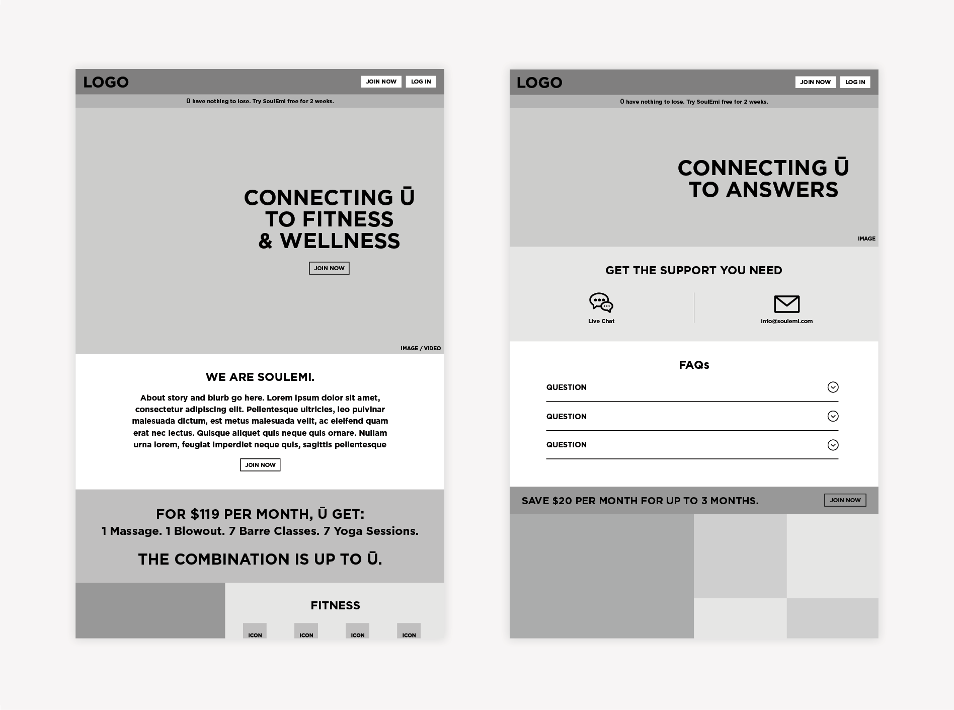
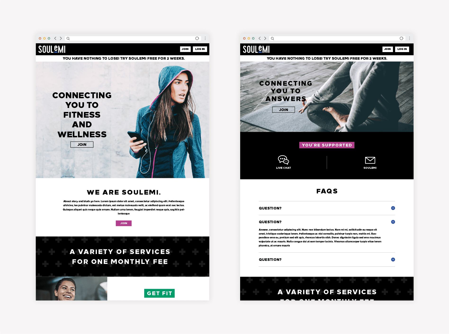
The platform was still in development, so there was no product for us to experience as we embarked on the gym branding project.

We followed the discovery session by doing some heavy-lifting in the research department. Our team members immersed themselves in the market. Here, we worked to understand what made some subscription-based brands stand out, and others fall flat.

Visual Direction

Once we had a good grasp of what was going down, we moved into the development of the visual direction for the fitness brand.

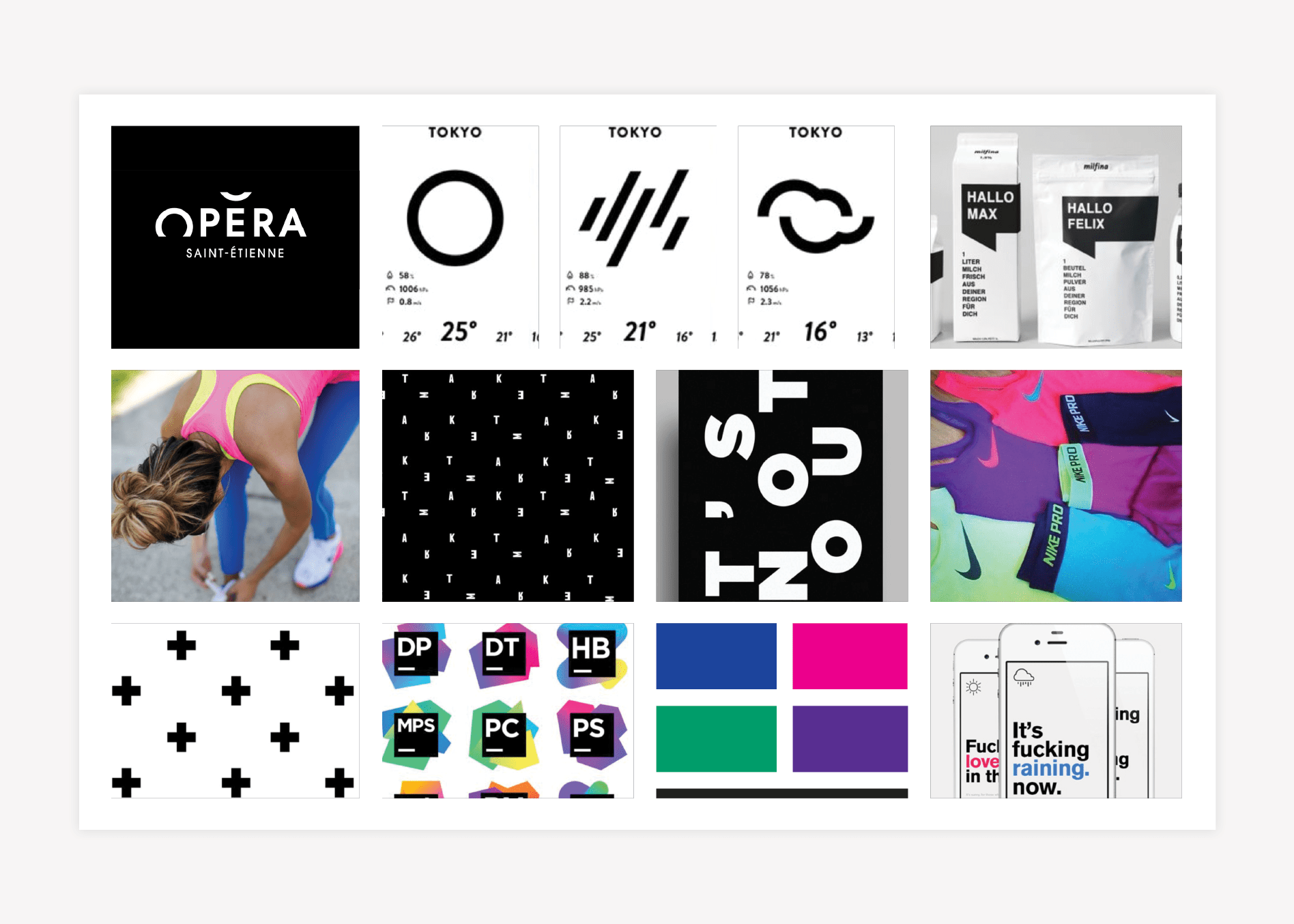
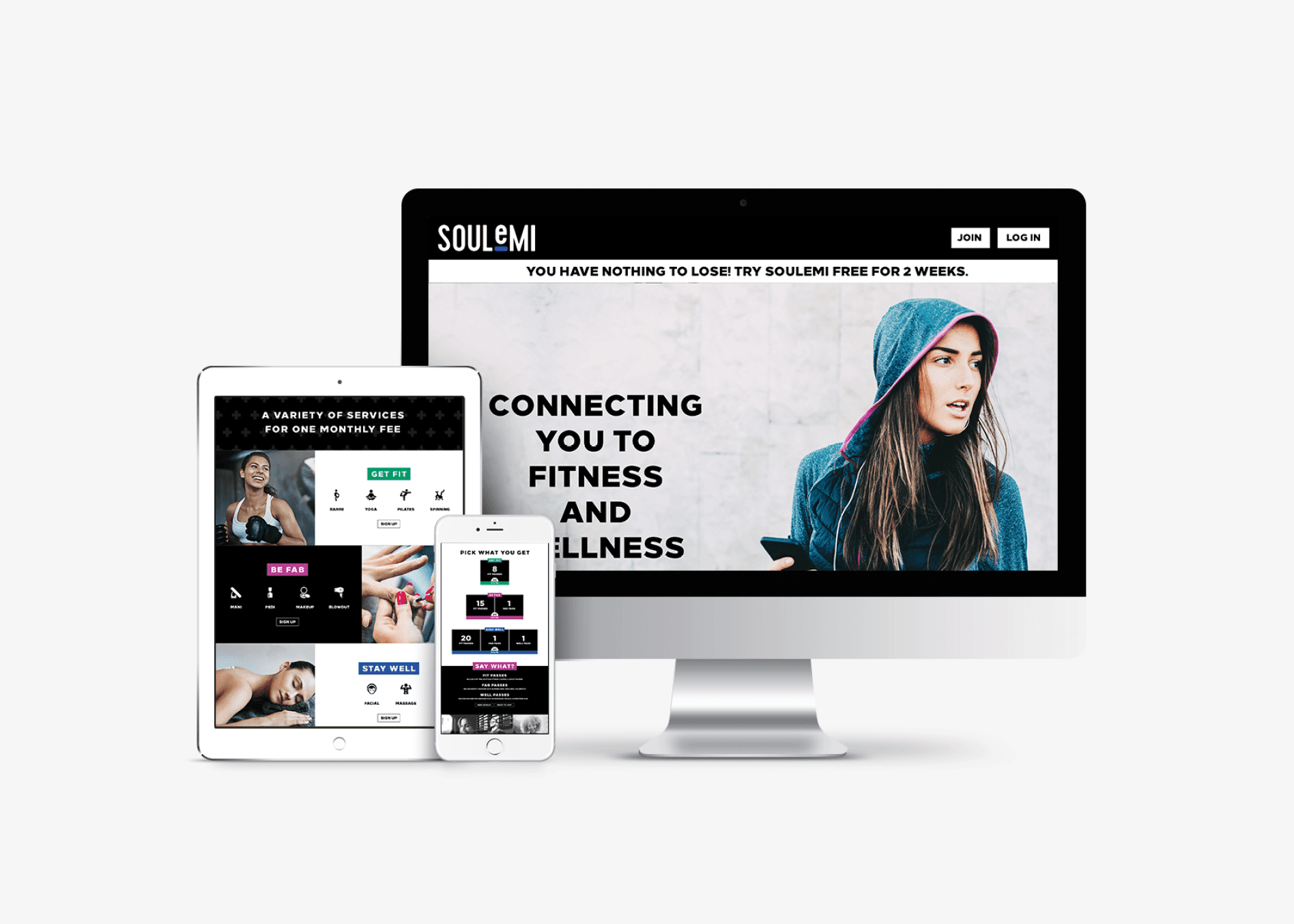
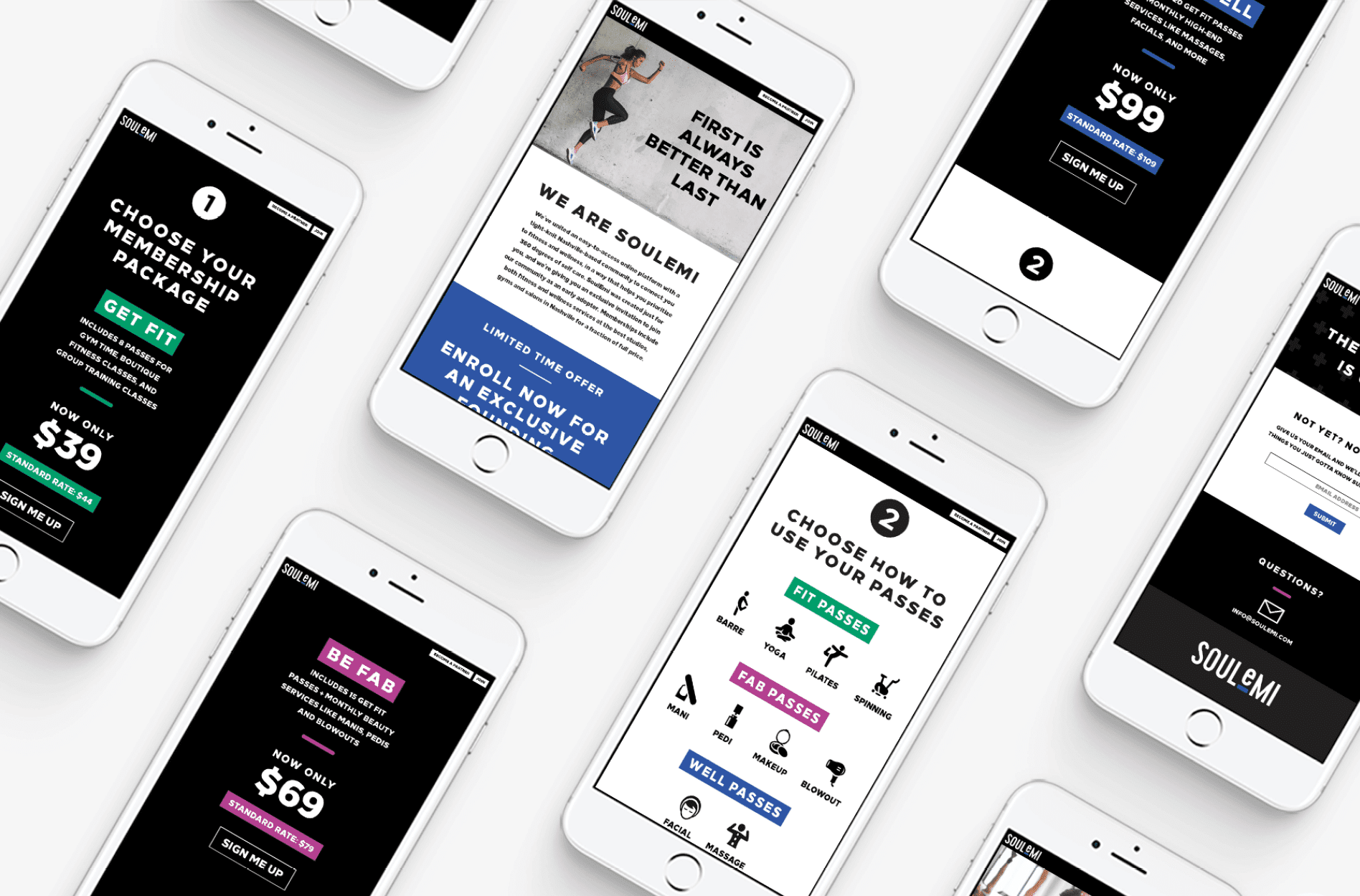
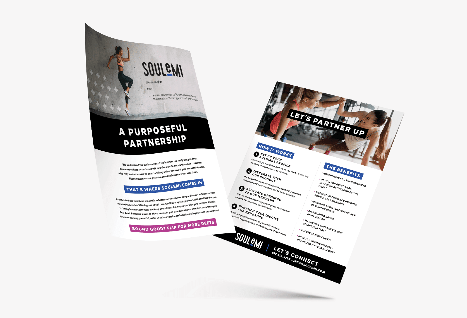
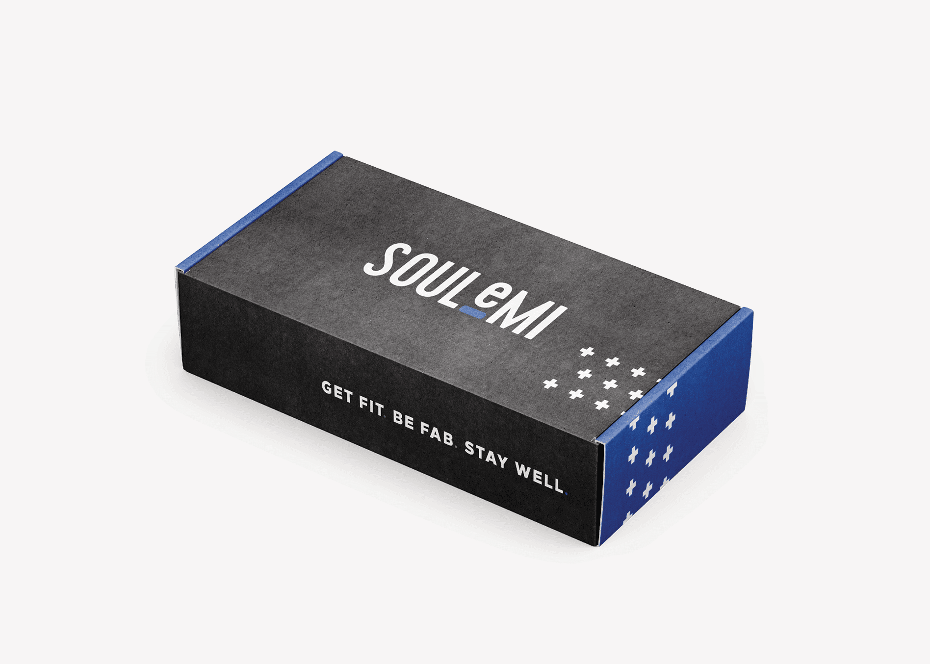
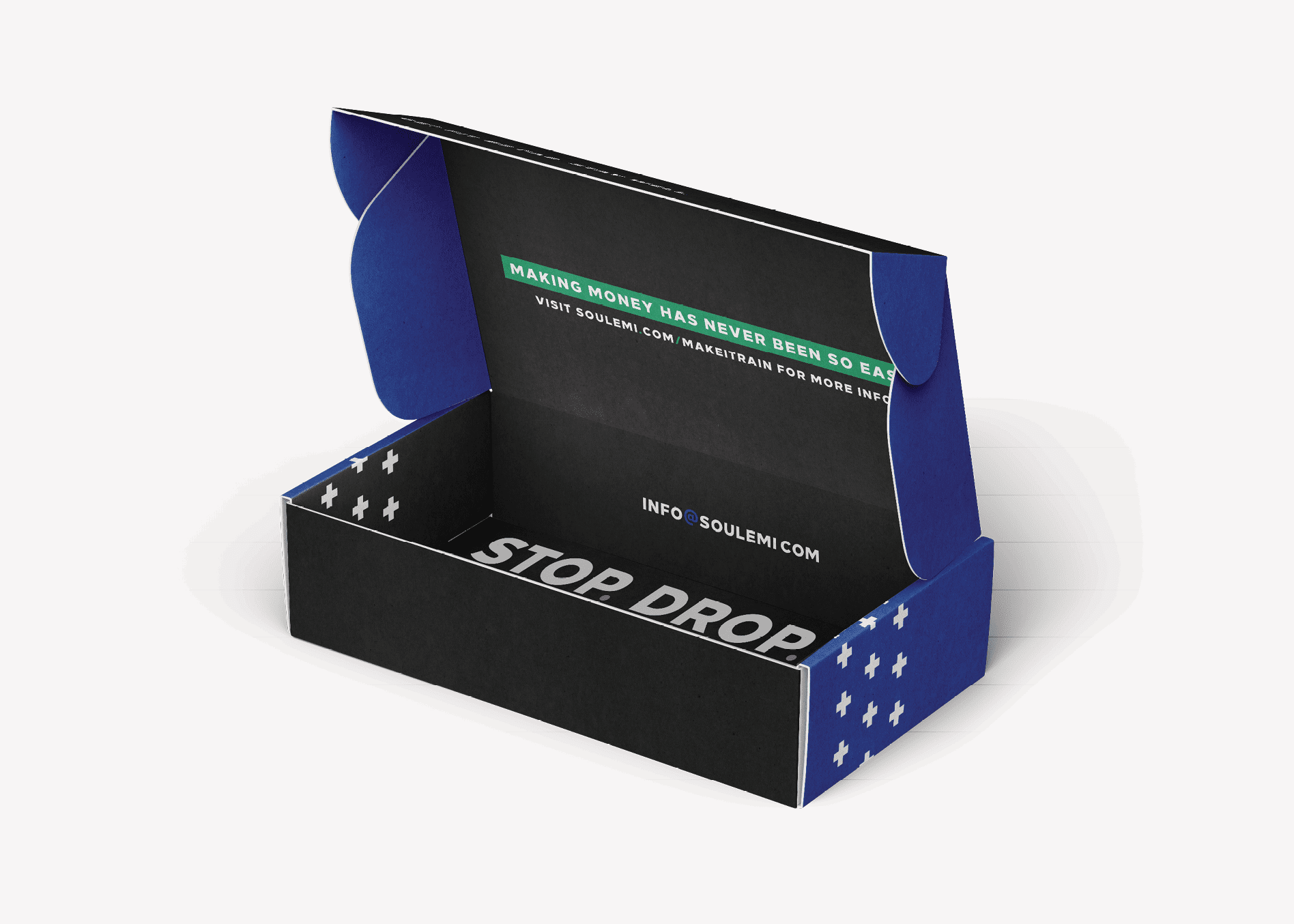
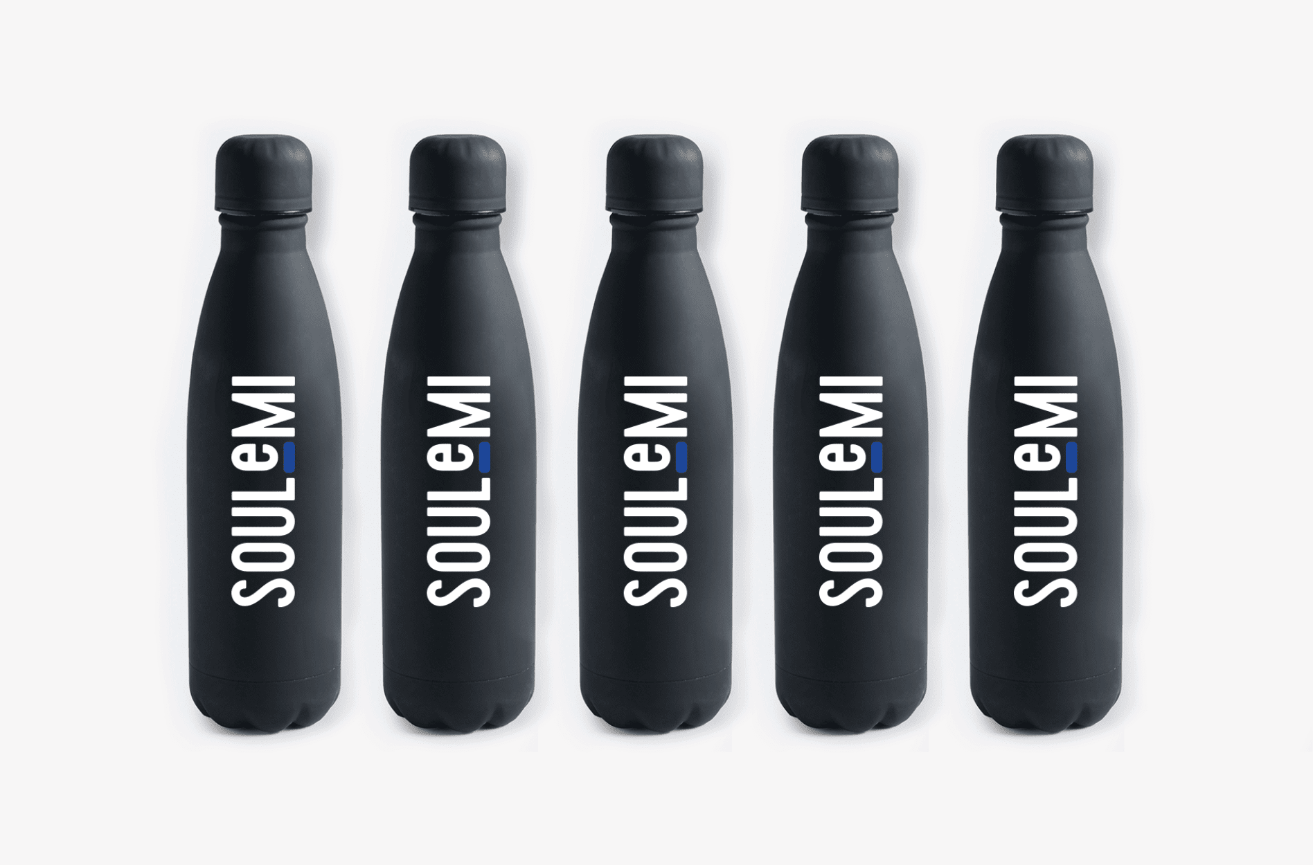
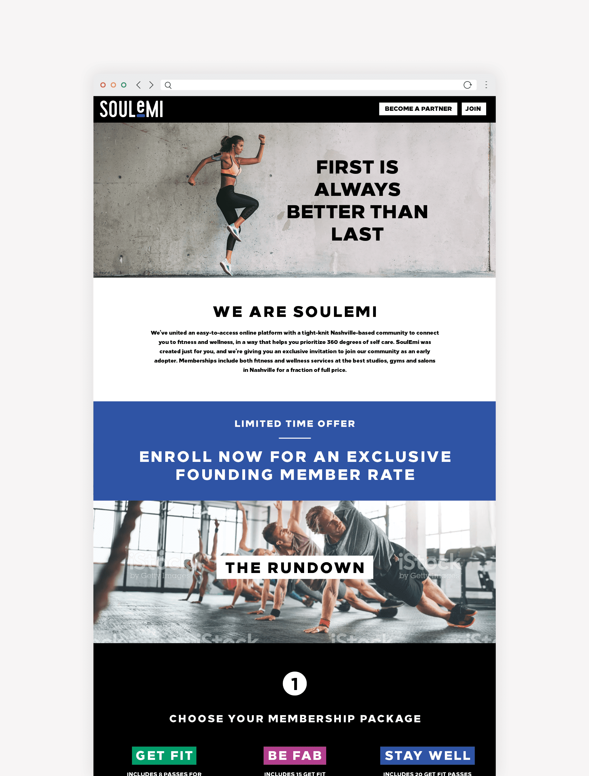
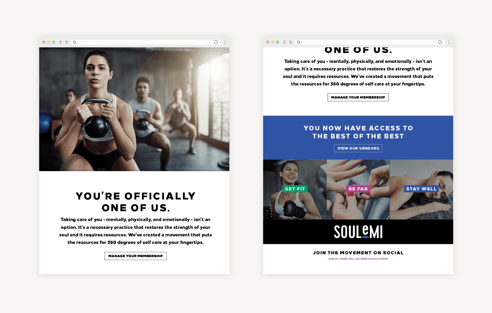
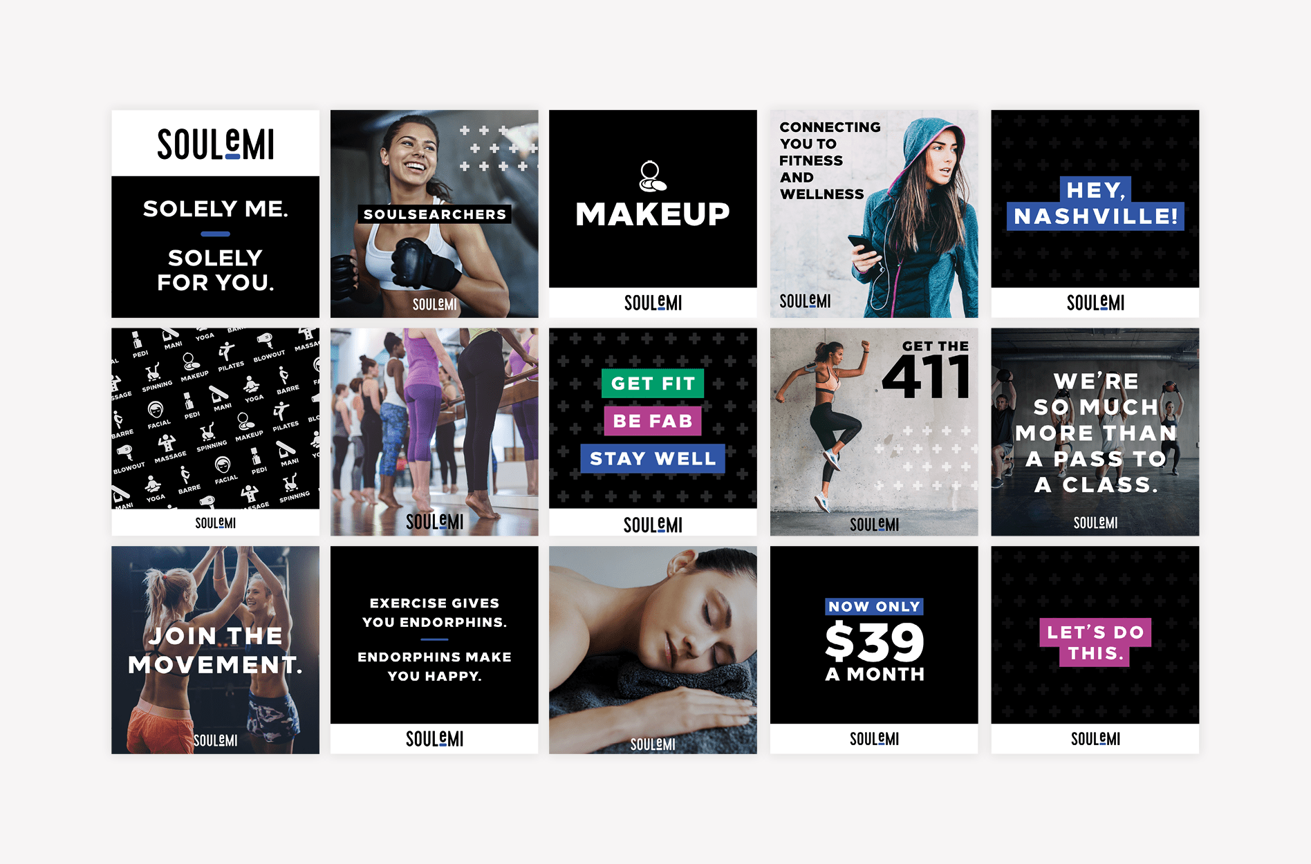
Our business branding process includes the creation of three brand boards to convey the positioning and attributes of the business visually. Upon presentation of the three options for visual direction, our client selected a board with bright pops of color grounded by clean black and white graphics and type.

The selected brand board had an edgy aesthetic but was still accessible and energetic. Our goal here was to resonate with the primary target market (women), but not discourage men from enrolling.

The bold, yet simple nature of the icons would appeal to both men and women, and the use of color would bring in an energy that would break up the stark nature of the graphics.

fitness brand board graphic design

Fitness Branding: Logo Design Options

Based on the selected brand board, we moved on to create a fitness logo that would serve as the first element encountered by the public related to the fitness brand.

We designed several logo options that utilized the clean and modern black font and bright brand colors.

fitness logo design sketches

The first logo design option presented included a typographic, stacked logo that showcased the business name in a bold all-caps sans serif font. This logo put the emphasis on the “soul” aspect of the brand.

In the full-color version, the u within the business name was shown in a brand color, to highlight the importance of self-care that this brand would provide, and a corresponding color block was placed at the end of the name to balance the logo design. The colors would create a system that aligned with the key offerings.

The second fitness logo design we presented was similar but showcased the business name in a bold, lowercase font. The simplicity of the logo design aligned with the simplicity that one could expect when engaging with the brand.

In the full-color version of this logo, the u took on a brand color once again, but this time instead of including the color block, we incorporated the brand color into the square dot above the letter i.

fitness logo graphic design

The final logo was a typographic design that incorporated a subtle nod to the pronunciation of the brand name. The line underscoring the letter e would abstractly direct viewers to pronounce the name with a hard e sound, effectively saying “soley me.”

yoga-fitness-logo-graphic-design

Presentation and Selection

Our client selected the third and final option. They loved how color would play a role in the brand, and the manner in which the branding would help eliminate pronunciation confusion.

As noted, our branding team established a color system that would help viewers identify the different service designations within the SoulEmi brand: fitness, beauty, and wellness. The colors would visually differentiate between the features offered by Soulemi, providing an element of user experience through color.

These colors were brought into the final fitness logo and interchanged seamlessly throughout the brand to convey services.

Logo Finalization

Upon selection, we finalized the logo and selected exact color codes. We also prepared a complete set of logo files and guidelines. The logo files were provided in PDF, EPS, JPG, and PNG. And the guidelines included the color codes in PMS, CMYK, RGB, and hex codes.

Business Card Development

The business cards for the brand were especially important for our client. A large portion of her business included networking with vendors to create new partnerships.

Our branding team designed business cards for SoulEmi that incorporated the bold, clean look of the brand. To further convey the aesthetic, we printed the business cards on super-thick 32pt uncoated stock. The thickness of the card indicated a higher-end service, and the uncoated stock communicated a sense of casual approachability.

The thick edges of the cards were painted with PMS brand colors in random assortments so that each team member’s business card would have a different colored edge. The resulting business cards were truly a beautiful extension of the brand, and definitely captured the attention of whoever could get their hands on them.

fitness brand stationery graphic design

Sitemap Presentation

With the product still in development, we set out to design a website that would serve as the portal to the platform. The website would need to quickly convey what the product was and how to enroll.

We started with a website sitemap to outline the pages needed for the new website. We determined where we would need external links to the membership platform, and what pages would need to exist on the WordPress website.

Website Hosting

Before moving into the website wireframe and website design phases, we talked with our client about website hosting. Since she had a team of developers working on her product, she decided to have her internal team sort out hosting for the website.

The Website Wireframe

With the sitemap finalized, we moved into the website wireframe phase. This is where we do most of our user-experience work.

We worked to create a wireframe for the fitness website that would prioritize the key goals for users who landed on the website. For this website, the goals were for people to join or to request more information. A secondary goal was for partners to inquire about a partnership. These calls-to-action were placed at the top right corner for easy access.

Directly below the menu, we included a large header image with text that would convey the brand’s position within three seconds to a user who landed on the website. The image selected would convey both the fitness and wellness industries and also the bold brand feel.

Then, throughout the scroll, users would be provided with information about the brand, starting with an overview paragraph of copy, and a one-liner. Upon scrolling further, custom icons depicting the key services available on the platform and related imagery would tell the user exactly what they would have access to upon enrolling.

Finally, we supported all of this information with testimonials and key differentiators. Logos of participating partners would scroll above the Instagram feed to show people where they could use their membership after enrolling.

fitness website wireframe digital design

Fitness Branding: Website Design

During the website design phase, we brought the wireframe to life with bold, on-brand imagery and brand colors and fonts. We utilized the color system previously developed to make it simple to distinguish service offerings and key differentiators.

Our client would shoot custom photos, so the images shown in the website design were indicative of what we would be looking for from the photoshoot.

fitness studio web design

Fitness Branding Website Development

Typically, we also develop the websites we design. This allows us to ensure pixel for pixel alignment between our website design and the resulting staged website. However, in this instance, our client decided to work with her internal team to develop the fitness website. We included an audit and one round of revisions upon our review of the staged website.

health fitness website graphic design
mobile friendly fitness web design

Website Launch

Upon review of the fitness website, we provided revisions for her team of developers to get the staged site closer to a side by side comparison with the website design. From there, her team handled the website launch and all post-launch checks.

Marketing Materials

Finally, we supplied our client with marketing materials to support the fitness brand.

The first marketing material design we created included several versions of a one-sheeter to provide to potential partners. Since SoulEmi was a new concept and somewhat hard to grasp for potential vendors, the collateral gave our client a simple graphic way to get her message across. We used clever copywriting and bold graphic design to convey the information in a manner that was easy to understand and visually compelling.

fitness flyer print design

We also developed a sales strategy that SoulEmi could implement in conjunction with the one-sheet documents. The goal was to drive home the fact that partners could benefit financially from working with SoulEmi.

To execute this strategy, we suggested that SoulEmi drop ten-dollar bills off to potential partners without a word. The bills would be encased in a custom-designed, printed box. The box garnered attention and compelled the recipient to inquire for further information. The final box we designed had the bold SoulEmi fitness branding on the outside. Inside the box, the typographic design stated the catchy phrase “stop, drop and bankroll.”

fitness package graphic design agency
package design branded box

Finally, to complete the partner package, we designed a high-end promotional product. The product was to align with the new brand and be useful to anyone who would receive it. To this end, we created custom-designed metal, Swell-style water bottles in a black matte finish to promote the fitness brand to potential partners.

The one-sheet, money box, and water bottle made a compelling package that would entice potential partners to give our client a few minutes of their time.

bottle product design

Fitness Branding Project Closeout

To closeout the business branding project, we provided our client with a complete set of logo files, print files for the business cards and marketing materials, and the files for the website.

We then continued to work on a launch marketing plan and deliverables related to the launch of the platform.

Launch Marketing

With the branding complete, we moved into the development of brand support that would propel the launch marketing strategy.

Website Landing Page

As we prepared to provide strategic and design support for the launch of the platform, we created a landing page.

The goal of the landing page was to serve as an extension of the brand and allow users to obtain pertinent information before the launch of the app. Additionally, we used the website as a place to drive traffic. Our goal was to get people to the landing page to learn about the coming platform, and to enter their email address for updates.

As the launch marketing got underway, we would use the email addresses to extend a founding member offer.

landing page graphic design

Email Drip Campaign

We also created a system of email drip campaigns to educate new members and potential members about the platform and encourage them to enroll or to start utilizing their membership.

The new member drip campaign welcomed recent registrants in the first message, then reinforced the platform’s offerings, and prompted members to refer a friend.

A second drip campaign addressed potential members who had previously entered an email address on the landing page but had not yet joined. This string of automated emails talked about differentiators and benefits to joining.

Throughout this email automation, we also directed potential members to a limited time founding member offer that would afford access to the platform at a reduced rate.

email marketing digital design

Organic Social Posts

Organic social posts were created to populate the brand’s social profiles and to help build the brand on social. We gave the content we’d already created legs by translating it into organic social content.

These posts supported the fitness branding, while also informing the public about the impending launch and the benefits of membership.

health fitness social media design

Final Thoughts

Overall, this fitness branding project was so much more than brand design. We were charged with creating a strategy for communication, both visual and verbal, that would allow our client to launch a new platform into a saturated market.

Additionally, there were some nuances to the platform’s offerings that needed to be communicated in a manner that was comprehensive, yet concise. The added layer of targeting both users and partners was another hurdle that we hopped over.

We loved working on this fitness branding project, as we were able to put our brand concept, logo design, copywriting, strategic marketing, and web design skills to use.

If you have a new idea and need a strategic approach to branding and launch, give us a call. We’re ready to work it out.

are you ready to create something nice?