Pizza Restaurant Website Project Discovery
At the start of the pizza restaurant website project, we asked our client to complete a creative questionnaire to transfer important information about the project to us. This included detailing the goal for the user, the key menu items to be featured, the scope of the menu, the functionality for the locations pages, and the external links necessary to facilitate online ordering and rewards.
With this information in hand, our team then sits down to brainstorm and sketch out the general layout of the website in order to visually assess the needs for the project.
Sitemap Presentation
To ensure that all bases were covered, we created a simple sitemap or list of pages and presented that to our client. It’s imperative that we have the scope securely nailed down at the start of a website design and development project. You see, building a website is somewhat like building a house. If you decide to add on another room late in the game, it can be done, but it will cost you.
Website Hosting
Additionally, we discuss website hosting at this juncture. Our hosting platform is the most robust solution for WordPress websites, and allows us to take daily backups of the sites we host. Page load times are fast (which is imperative for both user experience and SEO) and we do ongoing maintenance of the platform and plugins. In this case, our client decided to host the site with us, so that we could ensure optimal performance.
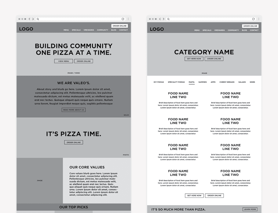
Pizza Restaurant Website Wireframe
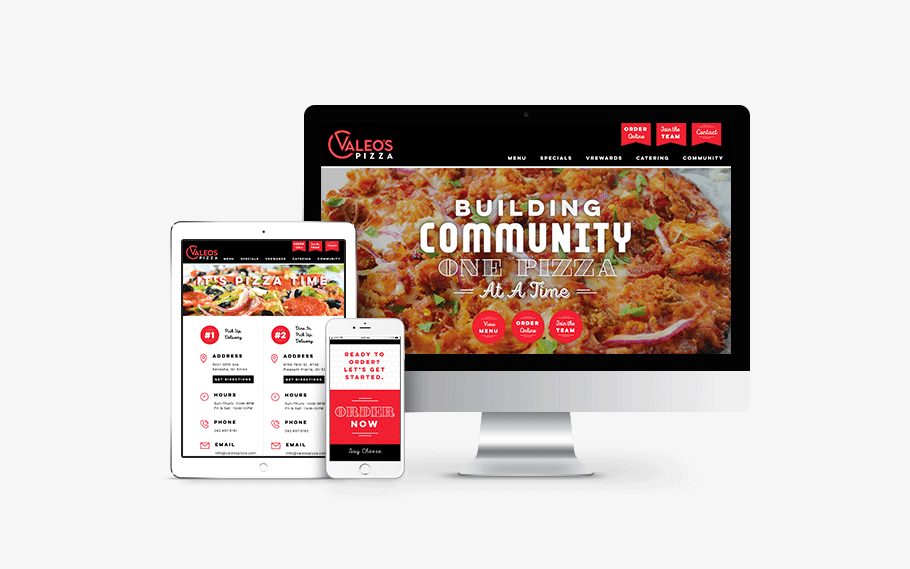
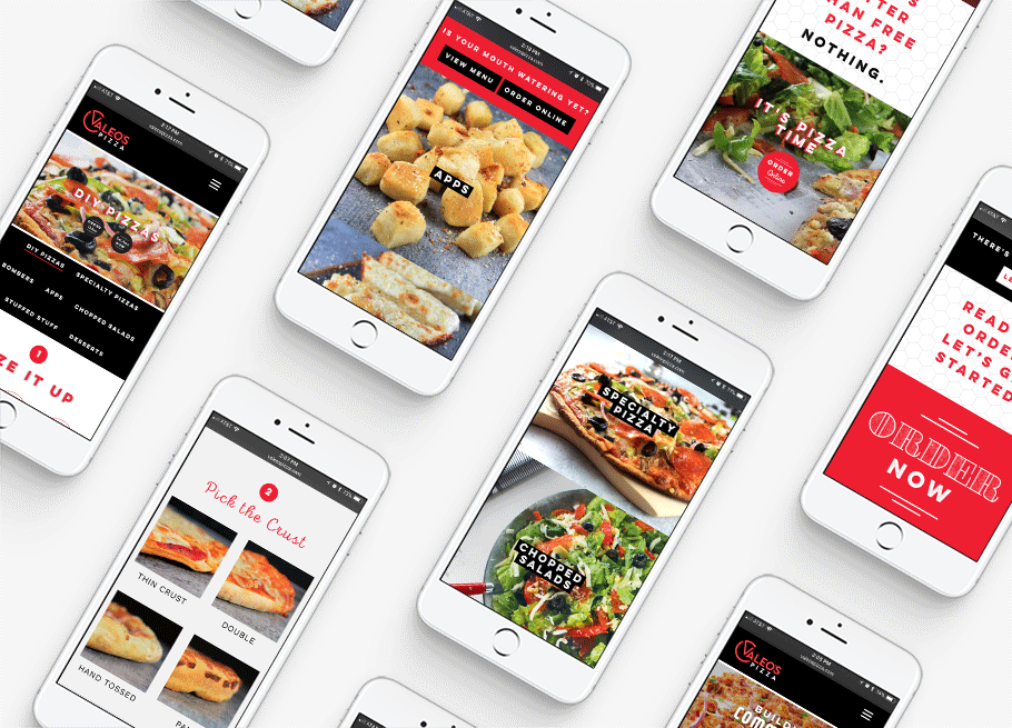
Creating the website wireframe for Valeo’s Pizza required some strategy. On this website, there were many goals for the user that would potentially compete for attention or cause confusion. So we mapped the site carefully, tailoring the main calls to action toward guiding users to view the menu, order online, or contact the restaurant. Upon landing on the website, the user would see the top left corner, top right corner and then back down and across the page in a z formation.
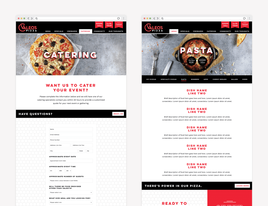
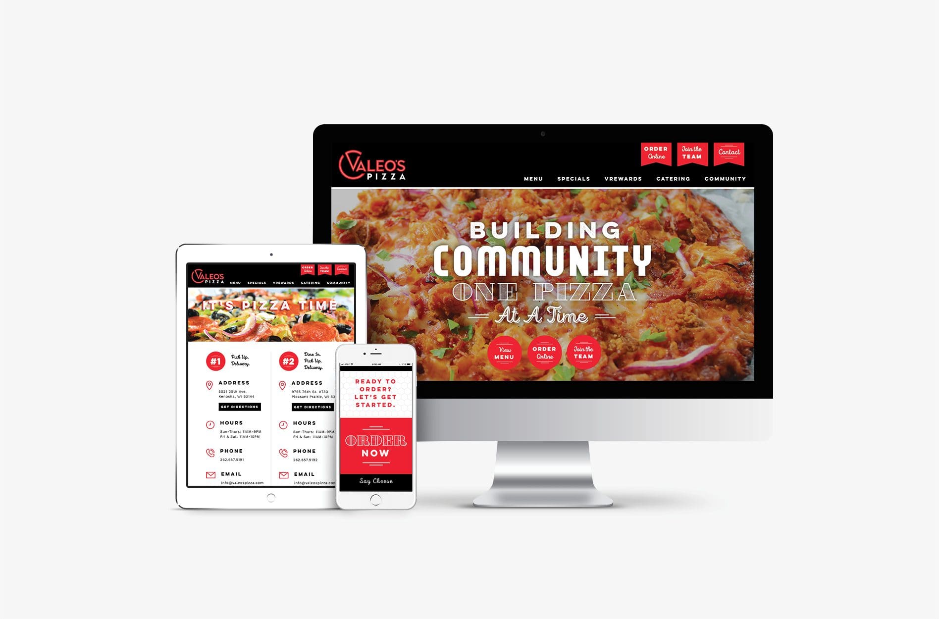
So, above the standard header, we included three top tier buttons to the primary calls to action. We included food photography as the header image and a one liner that wrapped up what makes Valeo’s Pizza different from all the rest. As secondary calls to action, we placed buttons directly below the header text to allow for another nudge. We also wanted to ensure that the specials and catering would receive proper attention in the user journey, so these pages were placed in the header navigation.
Additionally, the restaurant had a passion for people and the community, and it was important to them that this was evident within the website. We worked this in throughout the site, where it made sense, among enticing food photos and verbiage about specials.
