Petsense Foundational Branding

corporate retail branding

We worked with our client at PetSense to firm up the foundation upon which their brand was built. PetSense is an existing business that had come to be known by customers as a local, convenient pet store with helpful and friendly team members. However, their brand support was rather nondescript and it didn’t do a good job of conveying their core messaging. We were brought on by parent company, Tractor Supply Company, to give the foundation the overhaul it needed to better support the brand.

PetSense approached us for corporate retail branding, and based on their needs, we recommended starting with our Foundational Branding package. Typically, our process for Foundational Branding starts with a deep dive discovery with the client. We usually lead a conversation that identifies the target market, business objectives and goals, current customers, and current marketing. However, in this instance, PetSense had already completed the research phase with their owners and key employees.

Research + Discovery

So, at the start of the Foundational Branding project with us, PetSense provided us with a deck that summarized the findings from their internal research. Our team reviewed and digested the information, sorting out how the findings pertained to the foundation of the brand.

We talked through a few follow up questions with our client, and created our own summary of the findings that documented key points noted in the research. Some of the most notable information indicated a target market of mostly female customers, ages 45-65. The findings also revealed that dog food and supplies were top sellers, and that words that came to mind when people thought about the company were care, love, pets, friendly, knowledgeable, local, and convenient, among others.

Overall, the research contributed to solidifying the brand slogan originally drafted by the PetSense team, “The Place You Trust for the Pets You Love.”


corporate retail branding

Positioning Statement

Upon discovering the details about the target demographic, product offerings, differentiators, and opportunities for growth, we set out to create the positioning statement. Positioning is one of the most important aspects of corporate retail branding. With details about the organization under a microscope, we then begin to think about how they can differentiate the company from the competition. We want to create one statement that can succinctly and successfully convey what the company does, who it serves, and why anyone should care.

In our post on positioning, our Creative Director and CEO stated, “A business has no chance of being properly perceived by outsiders unless it is first clear on how it wants to be perceived. Only then can properly-aligned brand support be unleashed into the wild for assumption and classification.”

To create your positioning statement, you can ask yourself what you provide, to whom, and how you provide value. Then write it down and revise, revise, revise until it’s clear, compelling, and concise.

corporate retail branding

Brand Attributes

With the positioning statement in place, we moved into assigning attributes to the brand. Often, these are different than company values, but should closely align. Other times, the brand attributes and the company values may mirror one another. In this instance, we identified a set of brand attributes that would dictate the way the brand would look, feel, act, and talk.

Then, we worked to define these attributes. The meaning behind an adjective can sometimes be subjective, so it’s imperative to define what each attribute means to your brand specifically. We’ve done this for PetSense and the defined attributes can be seen in the image below.

Each attribute on its own indicates a certain element of the brand and the company that we want everything we create to personify. Taken together, the attributes paint a portrait of the company as a whole. Just as a person’s attributes taken together differentiate that person from anyone else.

corporate retail branding

Visual Direction

Finally, the brand board provides a visual direction for everything that is to be created on behalf of the brand. Practically speaking, the brand board should be referenced regularly to ensure that the support designed to communicate for the brand is in line with the overall direction.

In this case, we worked on the brand attributes, positioning statement, and visual direction in conjunction to ensure that the values, visuals, and verbiage correlated. Visuals and verbiage that align with values are what create a firm foundation upon which to build a brand.

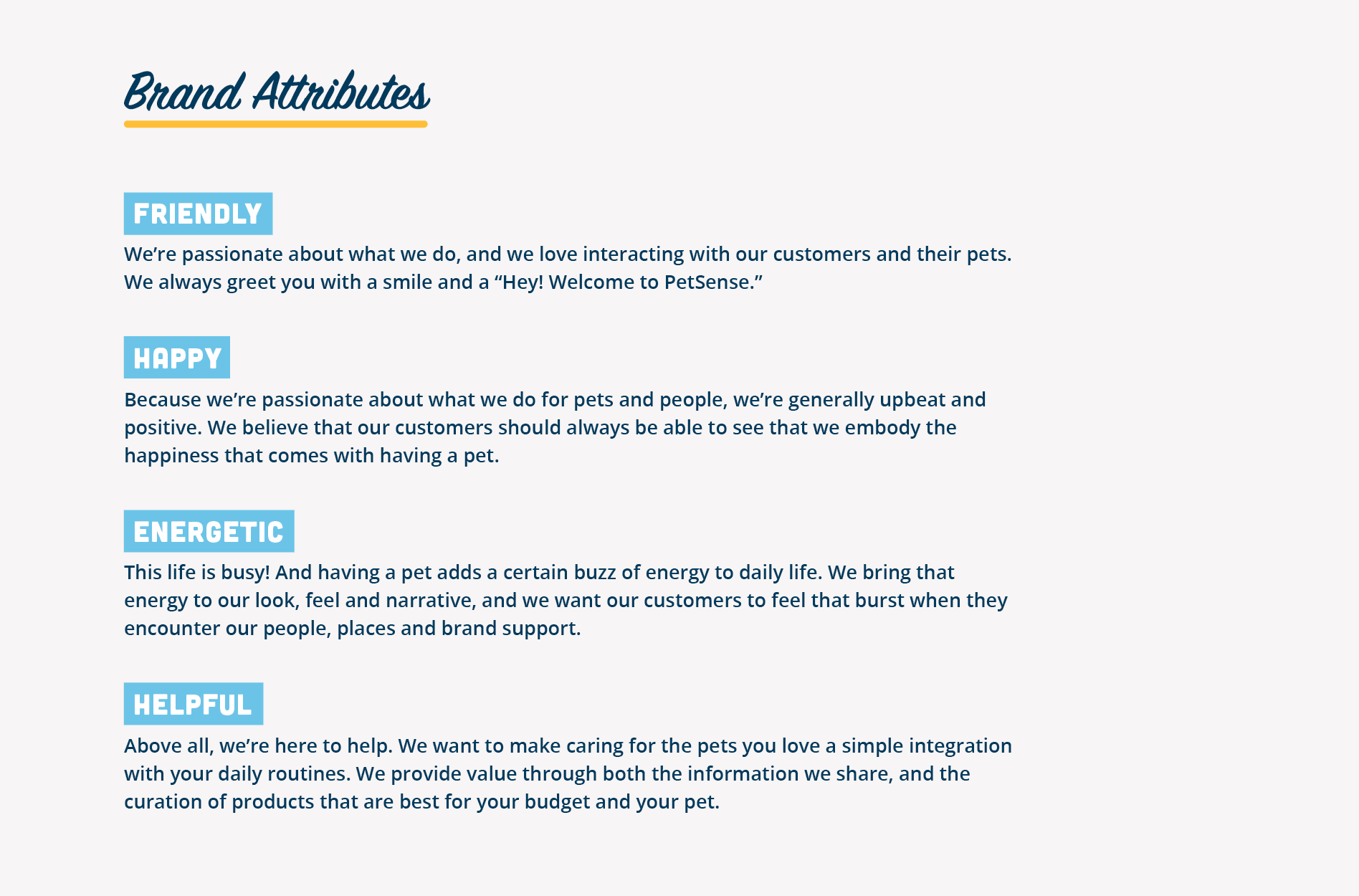
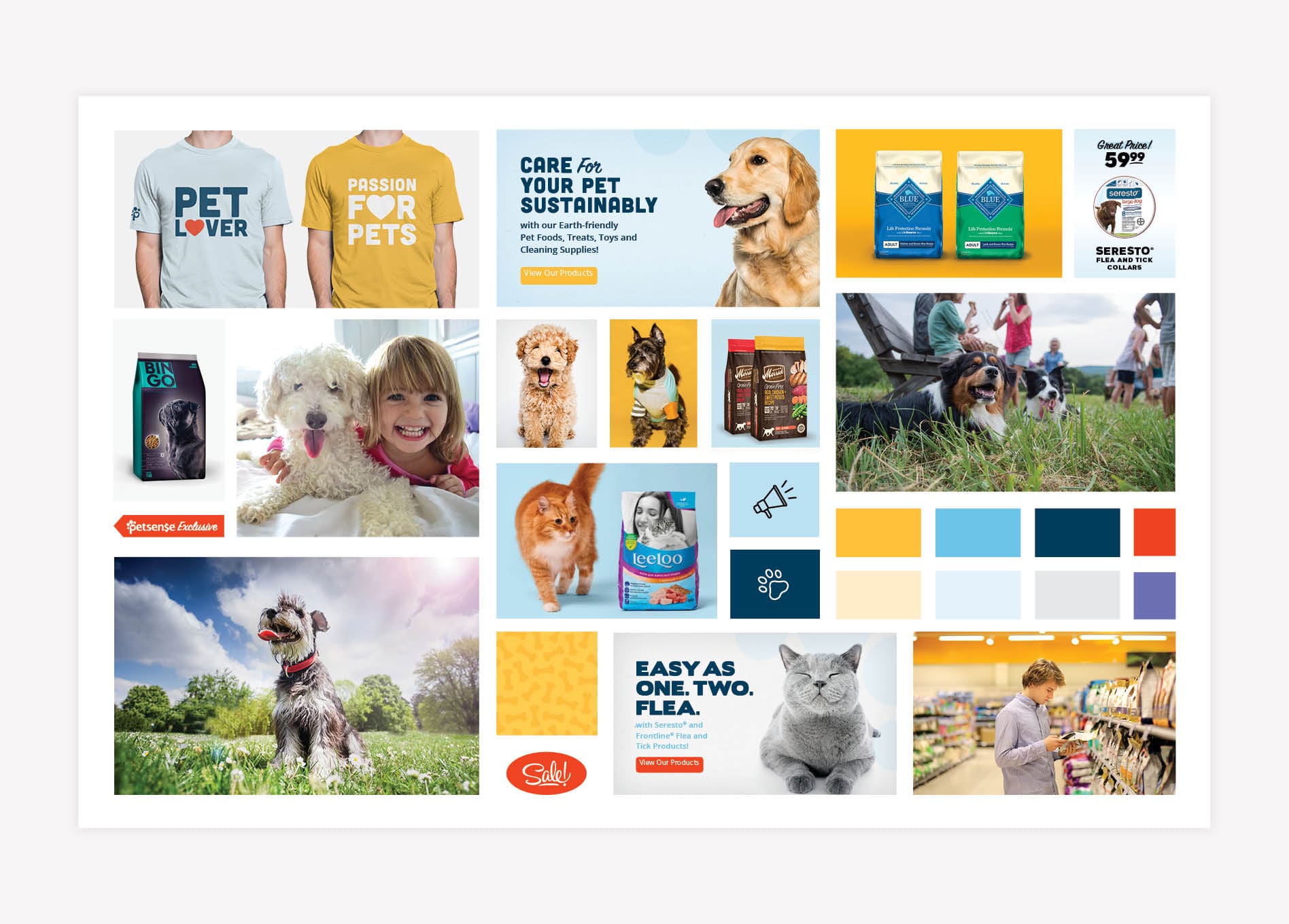
The visual direction for the PetSense brand has been curated to embody the brand attributes — Friendly, Happy, Energetic, and Helpful. Throughout each of the images and colors we used, we’ve brought in certain energy that is indicative of the energy that’s brought to a person or family by having a pet. Additionally, we’ve shown the pet as the hero, the connector between people, and the provider of happiness. Finally, through the product features, we’ve incorporated a style that’s helpful to the consumer as we showcase products in a manner that’s easy to digest, while also keeping the pet at the forefront. The visual direction created addressed brand colors, photography, graphic style, iconography, and direction for brand support.

Brand Colors

The brand colors include a yellow, red, darker blue, and minimal pops of purple. The yellow is brought in to reflect happiness, while the red evokes an emotion that relates to the love we have for our pets. Blue indicates loyalty, and the lighter shade nods to the happiness factor of this brand. Finally, the pops of purple bring energy to the visuals and an unexpected modern nature that keeps the brand fresh.

Photography for Corporate Retail Branding

In each of the photos we selected shown in the brand board below, you’ll see that the brand attributes shine through the composition.

In the bottom left corner, the image really shows the pet as the star of the show, he’s the hero and this composition conveys the emotion that pet owners feel as they often place the pet at the center of their lives. In the same manner, even though the pet appears in the photo alone, the image really draws the viewer in and connects the viewer to the pet — almost generating a sense of pride in the pet.

The photo above this shows real life and the buzz of energy that the pet brings to your daily life. You can feel the happiness and energy in this photo. The photo conjures up images of a family getting ready for school in the morning and jumping onto the bed with the pet — indicating the connection the pet has with the family and just how intertwined our pets are with our everyday life. This isn’t posed, it’s real. And that’s the energy we want to introduce.

Moving over to the right photo, this image again places the importance on the pet. He’s in the foreground of the photo to indicate his importance, but life is happening around him, and he’s happy to be a part of it.

We determined a direction for product images as well. According to the visual direction, products should be shown in photos that depict real life. However, when custom photos aren’t possible, we recommended showing the products on blue, yellow, or light gray to allow the products to pop and look realistic. The pet should be in the shot when possible, as shown with the cat strolling around the bag of food. This will allow the viewer to quickly identify the product category and zero in on what they’re looking for.

Graphic Style

For sliders and circulars, we recommended incorporating a photo style that has more negative space and one pet focus, which allows the offer and message to come to the forefront while still embodying the brand attributes.

Iconography

We identified that icons will be used throughout the brand to guide the customer journey, specifically aiding in the identification of key product categories. We will also identified additional graphic elements, such as patterns, to convey movement and energy and draw attention to key messaging.


corporate retail branding

When the positioning, attributes, and visual direction were complete, we did a full examination of each and every element to ensure that all pieces of the foundation were aligned. Any disconnect between visuals, narrative, and company values causes confusion. And any confusion encountered by the customer results in loss of connection with the consumer and ultimately, loss of business.

Corporate Retail Branding Presentation

Finally, we created a presentation that laid out the Foundational Branding for PetSense. The presentation was given to key stakeholders within the company at their offices in Nashville. Our meticulous attention to detail did not go unnoticed by the PetSense team, and they actually interrupted us during the presentation to let us know how on-point the work was and how impactful it would be for their business. The exact words of key stakeholders during the meeting were, “This is exactly what we have needed.”

are you ready to create something nice?