Milosi

landscaping company branding design

Milosi, an elite landscaping company in Nashville, approached us for a graphic design project. However, we noticed a disconnect between the company’s brand support and their core values and offerings. Thus, the project evolved into a complete brand overhaul. This is not our typical process for a rebrand; however, the value that was provided to our client was immense, and the rebrand led to an ongoing marketing relationship between Milosi and Nice Branding Agency.

Business Branding Project Kickoff

The owner of the landscape company initially approached our landscape branding company with the need for a horticulture calendar and brochure.

However, as our creative team worked through the originally requested graphic design projects, we quickly uncovered a lack of authenticity and originality in their brand, which was contradictory to what was apparent in their values, people, and operations. We knew from our conversations with our client that Milosi was locally recognized for the way that they care about their team, their clients, and the service they provide. However, we weren’t feeling that coming through in their collateral.

In an effort to convey their true personality, our landscape branding company suggested a rebrand to elevate their brand support, and align the visuals and narrative with what the company truly valued.

The need for the rebrand wasn’t simply visual. The existing service offerings, and the manner in which they were presented, were not aligned with Milosi’s goals for growth. While it was their intent to position themselves as a provider of luxury outdoor living services, their lineup of offerings was more in line with a traditional landscaping company (lawn maintenance, landscape lighting, irrigation, etc). Our team saw an immense need to restructure the presentation of services and to elevate the manner in which the services were presented to potential clients.

We presented the power of positioning to our client, and they agreed that a rebranding project would be in their best interest. As a specialized landscape branding company, our goal with the project was not to simply improve aesthetics. Rather, as mentioned, we sought to clarify their offerings and the manner in which they presented those offerings to current and potential clients.

This isn’t our typical process for onboarding a client for a corporate rebrand. This project started with a business that was seeking to solve a larger problem through one graphic design project. Through our expertise and experience, our strategic branding team was able to guide the landscape business in a manner that revolutionized the way that they are able to attract and retain clients. The rebrand was necessary. It was the proper method for repositioning the firm, as opposed to relying on one single graphic project to achieve the goal they were truly striving for.

Logo Design

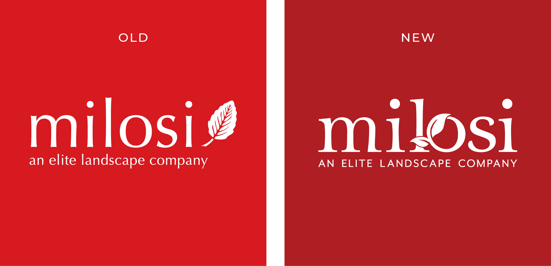
One of the primary brand elements is the logo design. For Milosi, the existing logo wasn’t a proper representation of the brand. It was a disjointed design and it didn’t lend itself to a good reflection of the company’s services. The logo font was outdated and the logo icon wasn’t unique.

Overall, the existing logo wasn’t indicative of a luxury service provider. Both the font and the icon were non-descript and certainly not custom. Additionally, the disjointed nature of the design didn’t lend itself to telling a story of a provider with a cohesive process for caring for your outdoor space.

During this logo design project, we redesigned the logo while retaining key elements of the concept. For example, the existing color palette was adjusted to create a custom, “Milosi red” that would convey a rich depth and a more luxurious feel. Also, while we did incorporate a leaf design into the new logo, we custom-created the refreshed icon and worked it seamlessly into the type. This incorporation of the leaf into the solidness of the font was indicative of the manner in which Milosi incorporates landscaping and hardscaping to create a completely custom outdoor space for their clients.

While the changes to the logo were seemingly simple, they were significant in positioning the brand properly and this can be seen in a before-and-after comparison of the logo.
landscaping logo rebrand

Presentation

We presented the new logo for the landscaping company, along with our case for why the refresh was required and how Milosi would benefit from a new logo. As mentioned, the improved design incorporated the leaf icon from the original logo, as this element was extremely important to the owner and recognized by customers. The new logo was updated, clean, cohesive, and conveyed high-end luxury outdoor living.

Logo Finalization

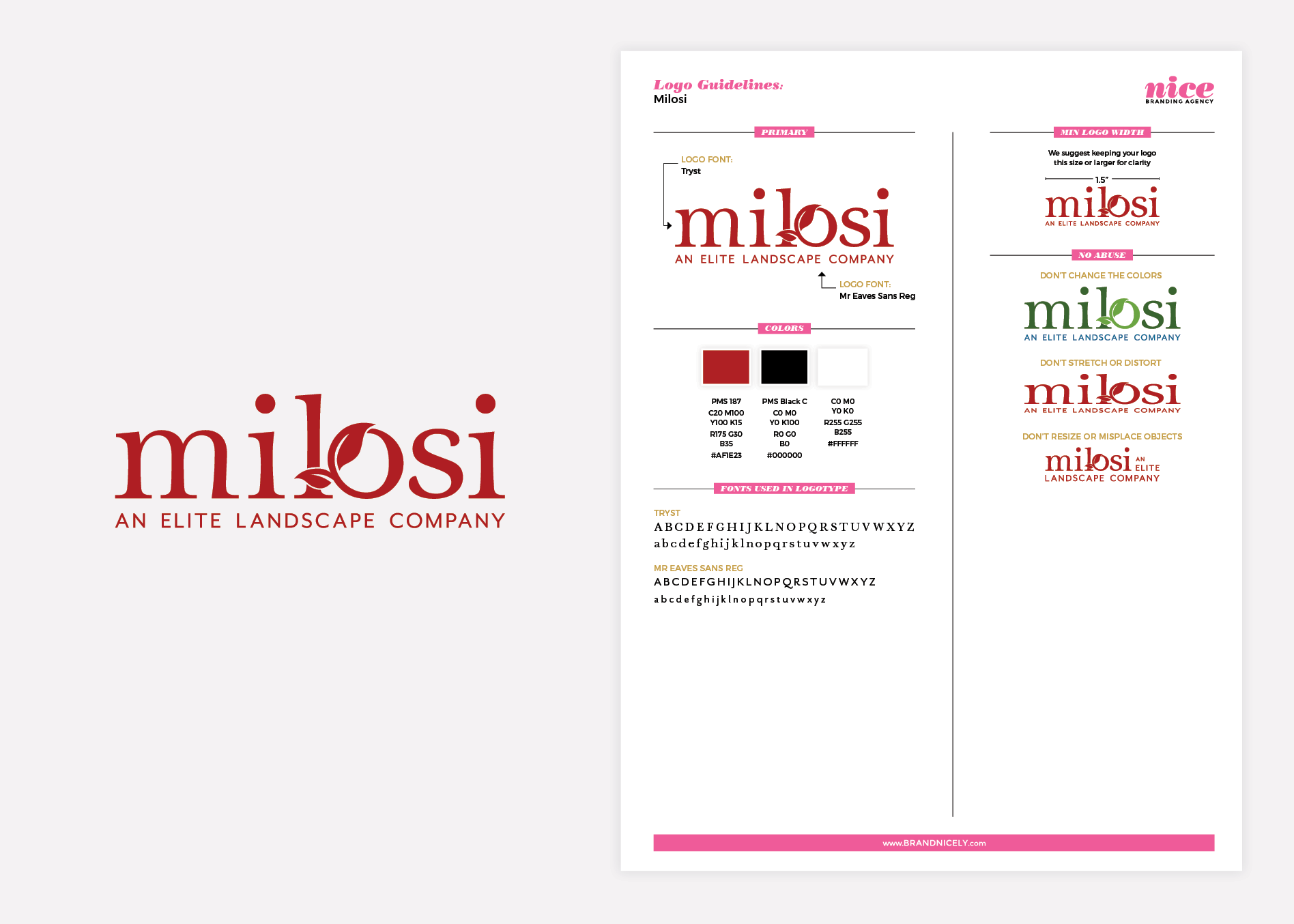
With our client’s approval, the new landscaping logo went back to our Director of Design for finalization. Here, the logo was perfected. Spacing was meticulously adjusted and the icon was assessed to ensure that it was ready for use. Additionally, exact colors were selected in CMYK, PMS, RGB, and hex codes.

Logo files were created and saved for the client as PDF, EPS, JPG, and PNG, and guidelines were provided to ensure proper logo usage. The guidelines also note the logo fonts and brand colors.

landscaping logo brand guidelines

Business Card

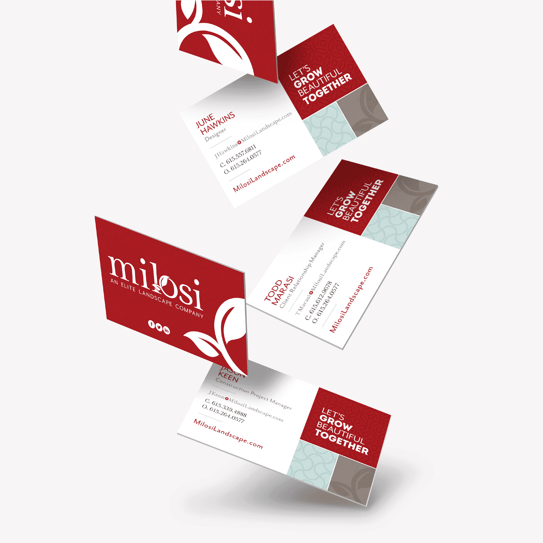
Based on the updated landscaping logo, we created a new business card for Milosi. They took on a look aligned with the new logo design and incorporated patterns that were developed through the rebranding process (more on that below).

As an elite landscaping company, it was imperative that the sales team was equipped with a business card design that was professional. The cards would be handed out to clients and potential clients, and they needed to convey a level of quality that would align with a high-end service provider like Milosi.

The design implemented the new logo with social icons on one side, and the contact information, tagline, and brand patters on the other.

They were printed on a luxurious silk stock that added to the upscale presentation.

Stationery Package

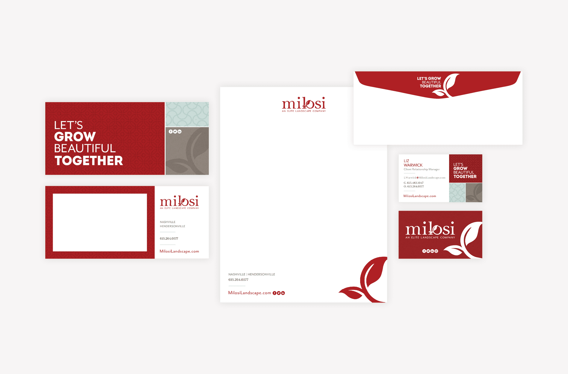
In addition to the cards, we provided an accompanying design for a letterhead and notecard, along with a no. 10 envelope that would fit both business correspondence and the new notecard.

corporate stationery package design

Sitemap Presentation

At this point in the rebranding process, we started planning for the website design and development portion of the project. This began with the creation of a sitemap to confirm the scope of work and to ensure all pages would be accounted for in the new build. We created a list of pages needed by assessing the existing site and determining what to keep and what could go. Decisions were based on user-experience and the ultimate goal was to provide value to the viewer upon each click and scroll.

It was here that we became aware that the website was misaligned with the desired brand position. We knew that Milosi wanted to be seen as a provider of elite outdoor living services. However, we noticed that the existing website prioritized both elite services and regular lawn care services equally. By showcasing lawn mowing in the header navigation, the website was conveying to viewers that they could hire Milosi just to mow their grass, which really wasn’t in line with the business that Milosi wanted to attain.

Website Hosting

We also determined where the new website would be hosted. We host with the best platform for WordPress website hosting in the industry. Our host provides the fastest page load speeds, daily backups, and monthly maintenance and monitoring. By working with Milosi to determine their hosting preferences, we’re able to ensure that we’re all set up to go live as soon as the new website is ready for launch. The Milosi team decided to host the website with us, which would make the launch process efficient and seamless.

The Website Wireframe

Once the sitemap was approved, we moved into the development of a website wireframe. Here, we created a structure for the website, or a “blueprint,” that would allow us to map out where everything would exist on the website and set the tone for how the business would position their core offerings. It was through the creation of the wireframe that we addressed the issue we had with Milosi promoting small supporting services with the same weight that they promoted their elite outdoor living services.

We improved the user experience and properly positioned the services by reconfiguring the website menus. We identified what would exist in the header navigation and what would be moved into the footer. While this may seem like a simple task, it’s actually super-impactful. Determining what will live in your header navigation forces you to make some tough calls about what’s most important to your business.

Overall, Milosi wanted to present all their offerings to all the visitors which overwhelmed and confused the user. Through the website wireframe process, we were able to strategically categorize offerings into core services and sub-services. This organization would guide the user to the services that Milosi actually wanted to be performing, as opposed to smaller services that do not provide ideal profit margins and don’t necessarily position them as a luxury outdoor living company.

The division of their main services into a core service lineup also helped them focus from an organization perspective. The additional services they provide are still valuable, but they were transitioned into supporting services as opposed to main services. This has helped them provide clarity in service from both an internal and external perspective. This also provided us with a roadmap that would direct future marketing efforts.

Another big win for the website wireframe was the incorporation of a professional portfolio. The portfolio was mapped to include images from projects that aligned with the core service lineup, and filter functionality that would allow the user to easily see the projects they were most interested in viewing. Content about each project could be developed to further convey project details, and provide an opportunity for SEO optimization surrounding key terms.

The website wireframe was presented to our client, and together, we walked through the user journey to ensure that all elements aligned with the internal sales process. Since our goal was to drive customers to call Milosi for a quote, it was imperative that the internal sales team could pick up where the website left off, leveraging the information provided to the customer through the website to close the sale.

Additionally, we presented the concept of restructuring of the services into core offerings and sub-services. We explained to our client how the website could be better structured to garner leads for the work they wanted to be doing, instead of simply listing out everything they could do.

Website Design

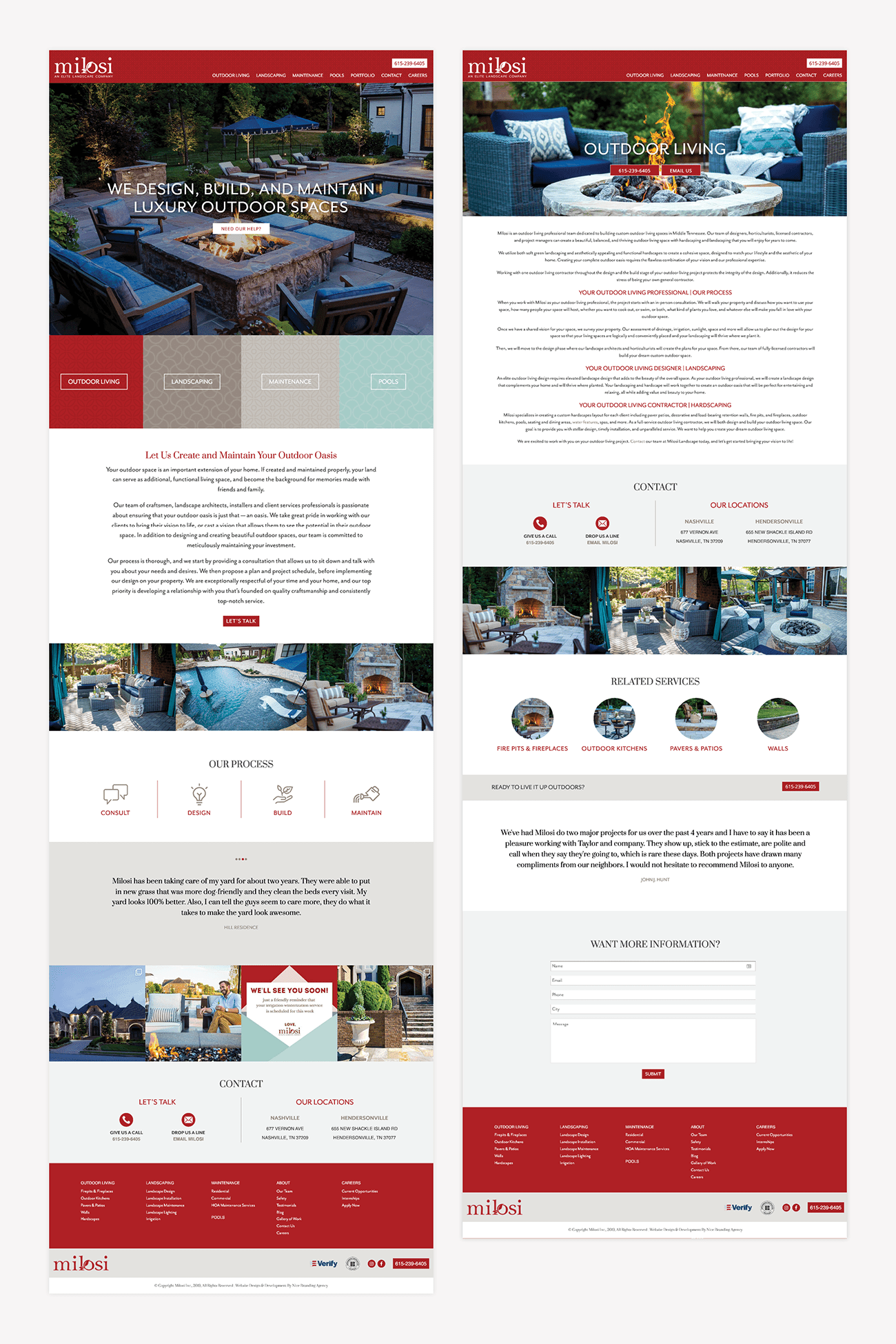
With the wireframe approved, we moved into website design. Here, we incorporated stunning project imagery, paired with on-brand, descriptive copy to entice the viewer to engage with the website. Clearly placed calls-to-action were sprinkled strategically to capture the client as soon as they were wowed.

Images of Milosi’s work took center stage, and compelling copy about their process and services reinforced the visual connection the viewer would make upon pageview. Throughout the website, content was developed to convey the pillars of the Milosi brand, which included their commitment to customer care, which is a major differentiator for the business.

We prepared the landscape website design and presented it to the client for approval.

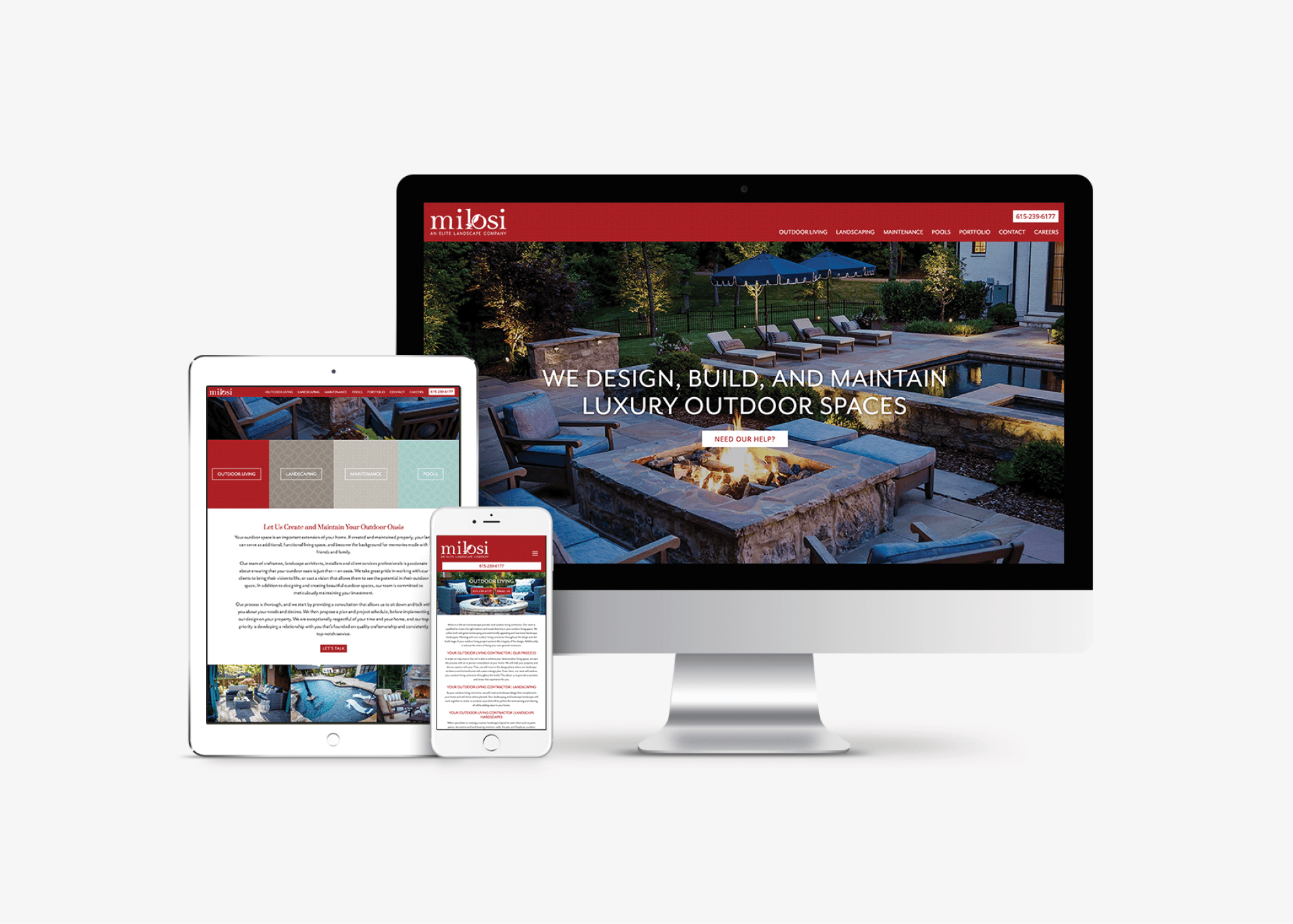
corporate website design development

Website Development

Once the wireframe and design were approved, we moved into the website development portion of the project. We developed the website on a WordPress platform, which would provide the benefits of customization, while not sacrificing the ability for the client to be able to continually update key content on their website.

The website was a custom build, which means that we didn’t start from a templated theme. This allows us the flexibility to truly design the user experience and to create something that’s one of a kind for our client.

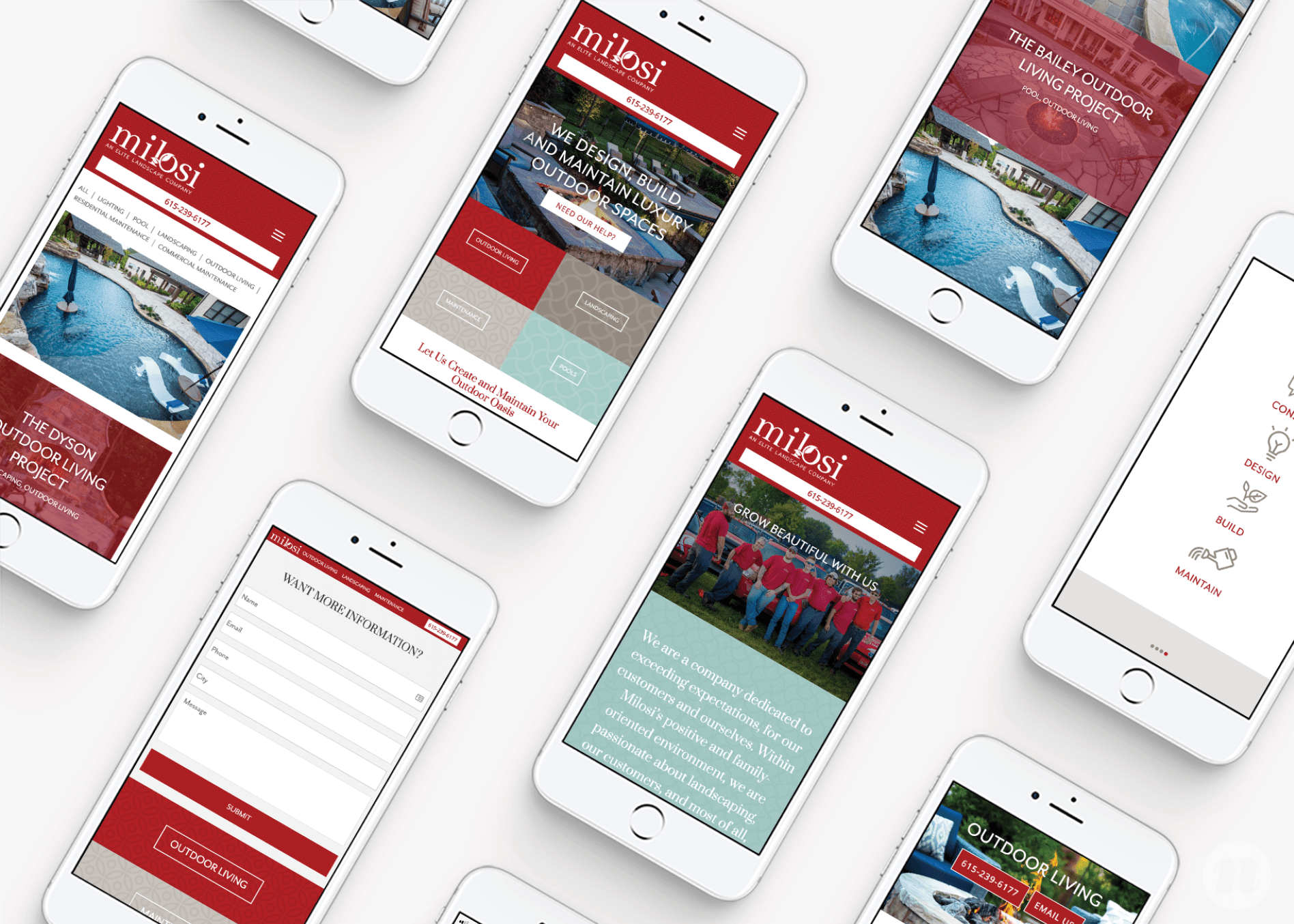
The website was designed and developed from a user-first, mobile-first perspective. It is fully responsive on various screen sizes and provides just the information the user desires upon each scroll.

The impact of this landscape website design and development project was far-reaching. As mentioned, aside from just improving the aesthetics of the Milosi website, we were able to really influence the structure of their organization and offerings. The restructure has helped them focus on what their ideal offerings are and has influenced their sales force dramatically.

landscaping responsive web design
corporate mobile friendly website design

Website Launch

We launched the website on the existing domain at milosilandscape.com. The website launch process included rigorous testing of all pages, forms, buttons, and links to ensure that all was functioning as intended.

Brand Standards Guide

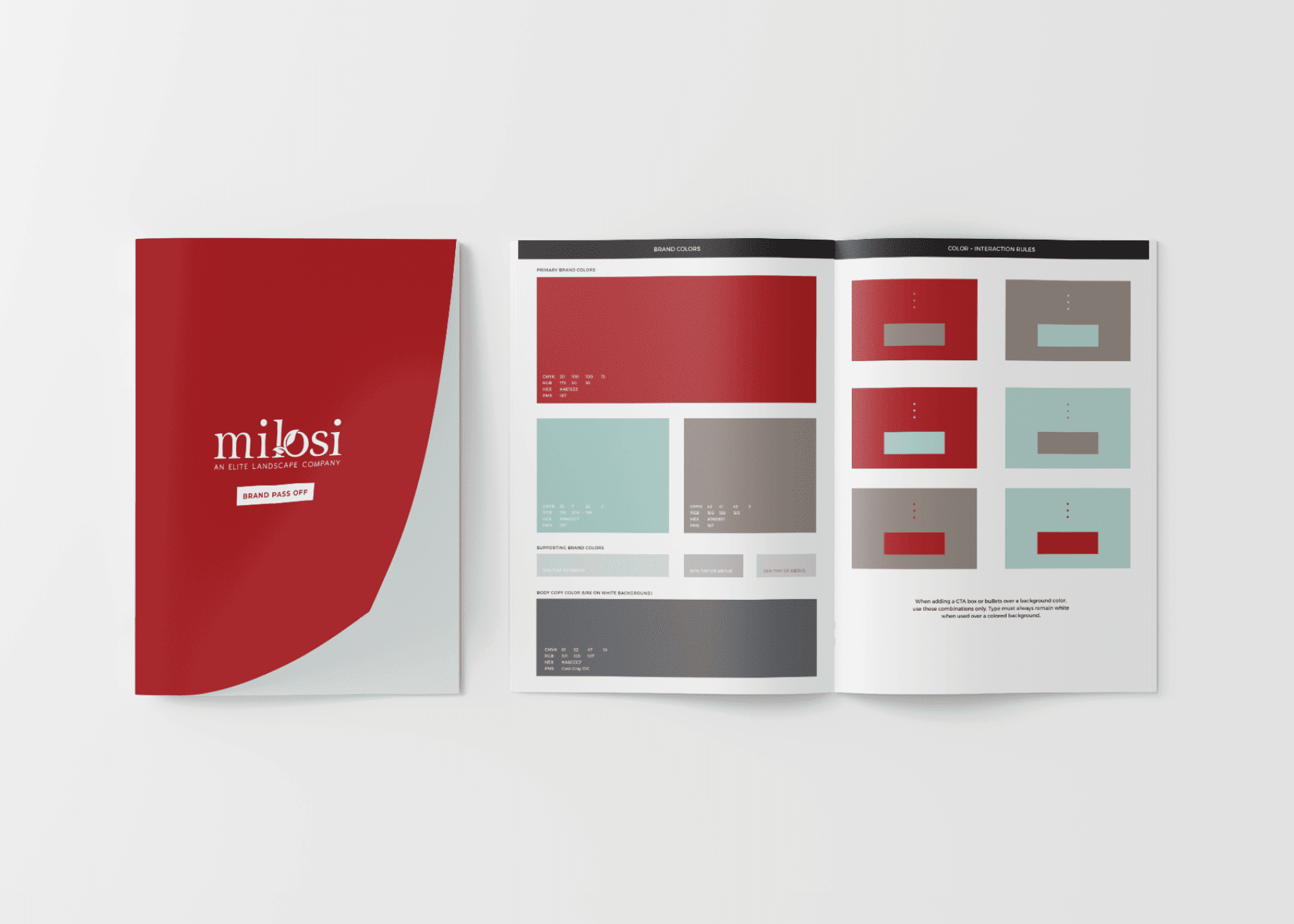
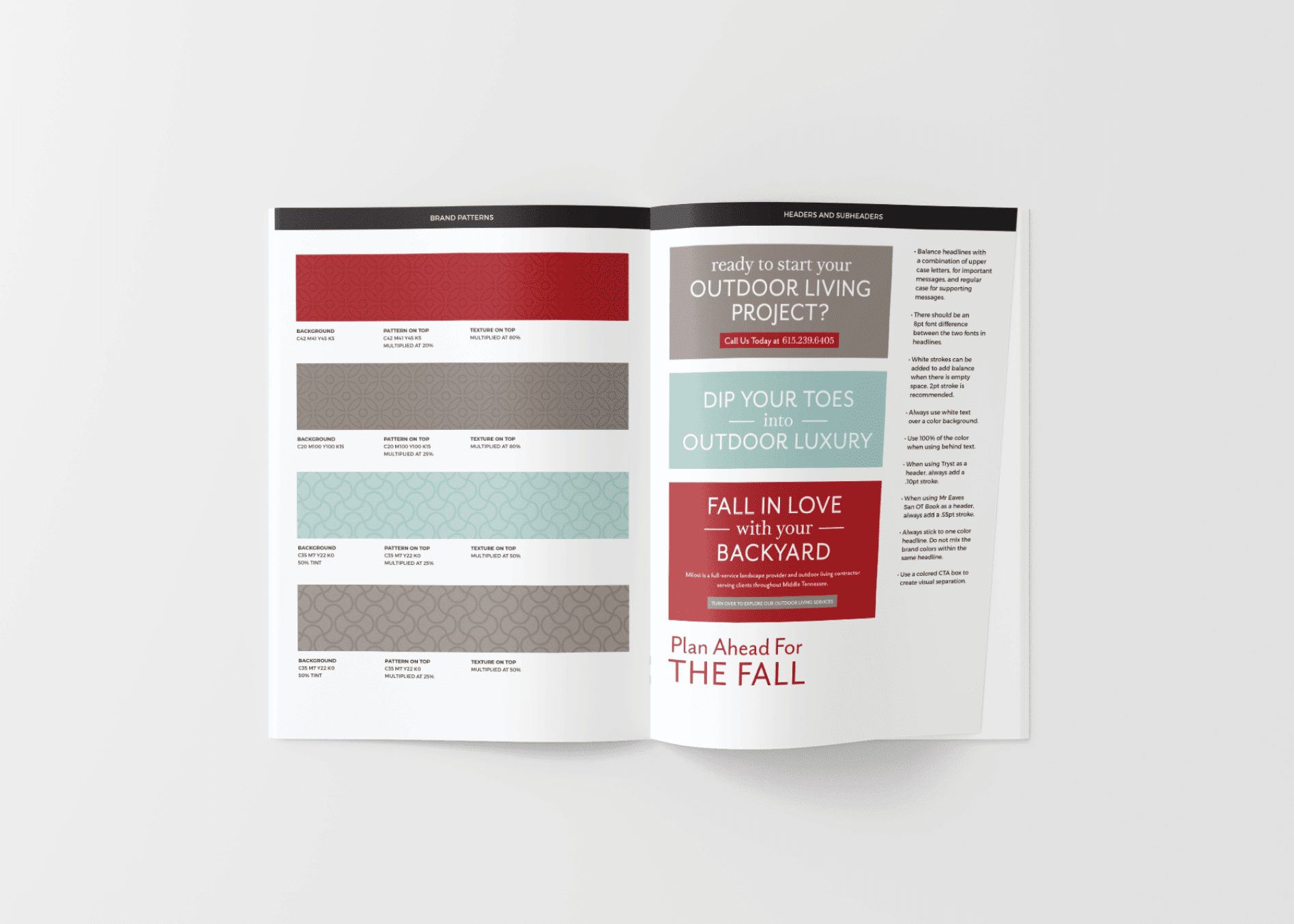
The rebranding project for Milosi encompassed a logo design, business card design, stationery package, and a custom WordPress website. When the rebrand was complete, but before we moved into the development of brand support, we created a brand standards guide. This brand book would ensure that the refreshed brand would remain intact as it passed through the hands of team members both at our agency and in-house at Milosi. The guide outlined font usage, logo standards, brand colors, photography guidelines, and more.

landscaping style guide design
corporate branding style guide

Brand Support

With a rebrand comes the need to align all brand support with the newly established look and feel.

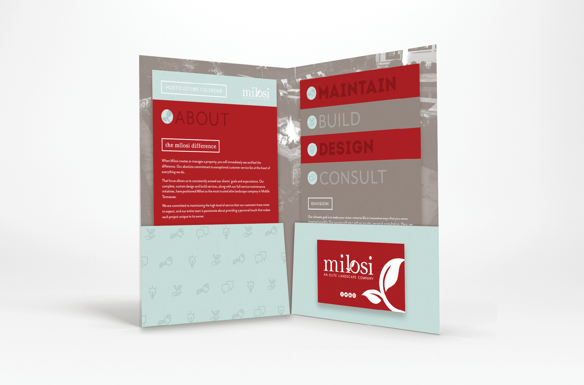
Our landscape branding agency started by creating a brochure for Milosi that would convey their growth process. This project was more than graphic design. Similar to the way in which we worked to create a strategy surrounding service offerings, we worked through the process to create a structure that would make sense to customers and give Milosi an edge on the competition.

This process was then communicated through a unique approach to brochure design. We created a pocket folder design and filled the folder with stacked inserts. Each of the inserts corresponded with a part of the Milosi process. The strategy for the stacked inserts was that it would make it extremely efficient to make changes to the process. Instead of reprinting the entire brochure, one card could be easily swapped for another. Additionally, it would make it simple to explain the process to clients.

landscaping print collateral graphic design

Within the design of the brochure, we worked on the development of patterns and icons to represent both the process and the key services of Milosi. Icons were developed that would make their process instantly recognizable to clients, and provide Milosi with a method for visually communicating the various steps in the process. When a viewer encounters the icons, they are able to quickly recognize the brand while also coming to an understanding regarding what they could expect from Milosi.

Our design team also developed custom patterns and textures for the landscape brand. The patterns were developed strategically to provide the brand with a design element that would allow them to consistently convey their area of expertise. The patterns were indicative of the ground, water, and landscape. The use of custom patterns not only improves the aesthetic, but it also provides a luxury and custom feel that aligns with the position of the brand.

landscaping icon pattern design
corporate modern pattern design
landscaping icon graphic design
corporate icon system design

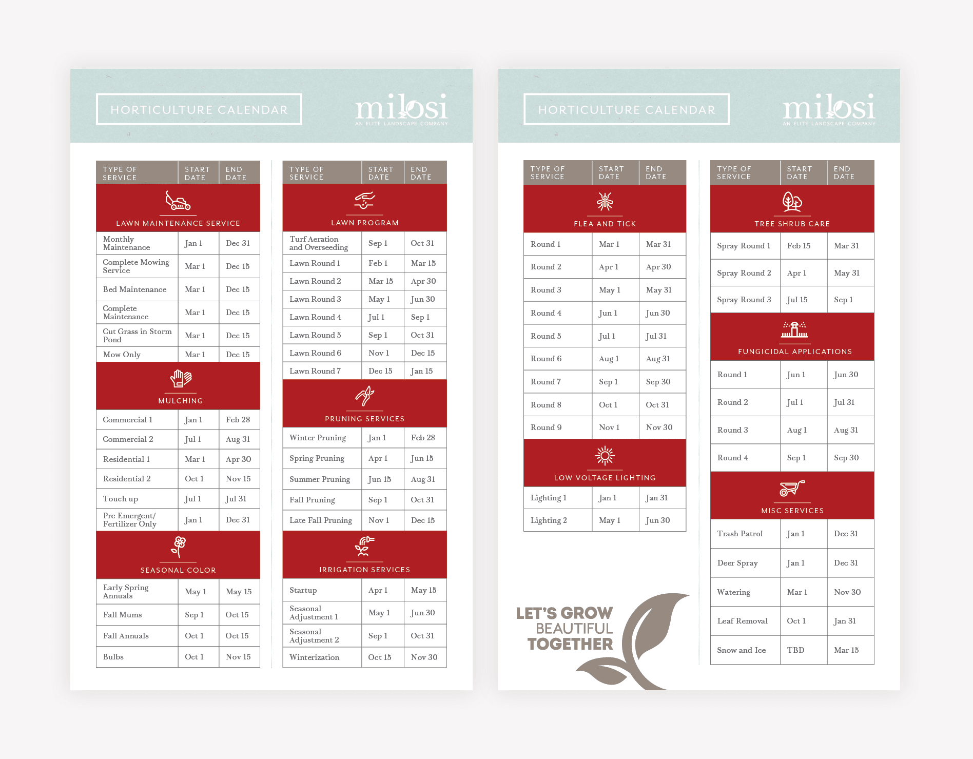
In addition to the brochure, we developed a horticulture calendar that would allow customers to understand when certain Milosi services should be performed throughout the year, which ultimately serves as a sales piece for existing customers. As we created this piece, we were able to implement strategy and copywriting to streamline the information about both the services and the core values of the company.

print calendar design

Promo Products and Apparel Design

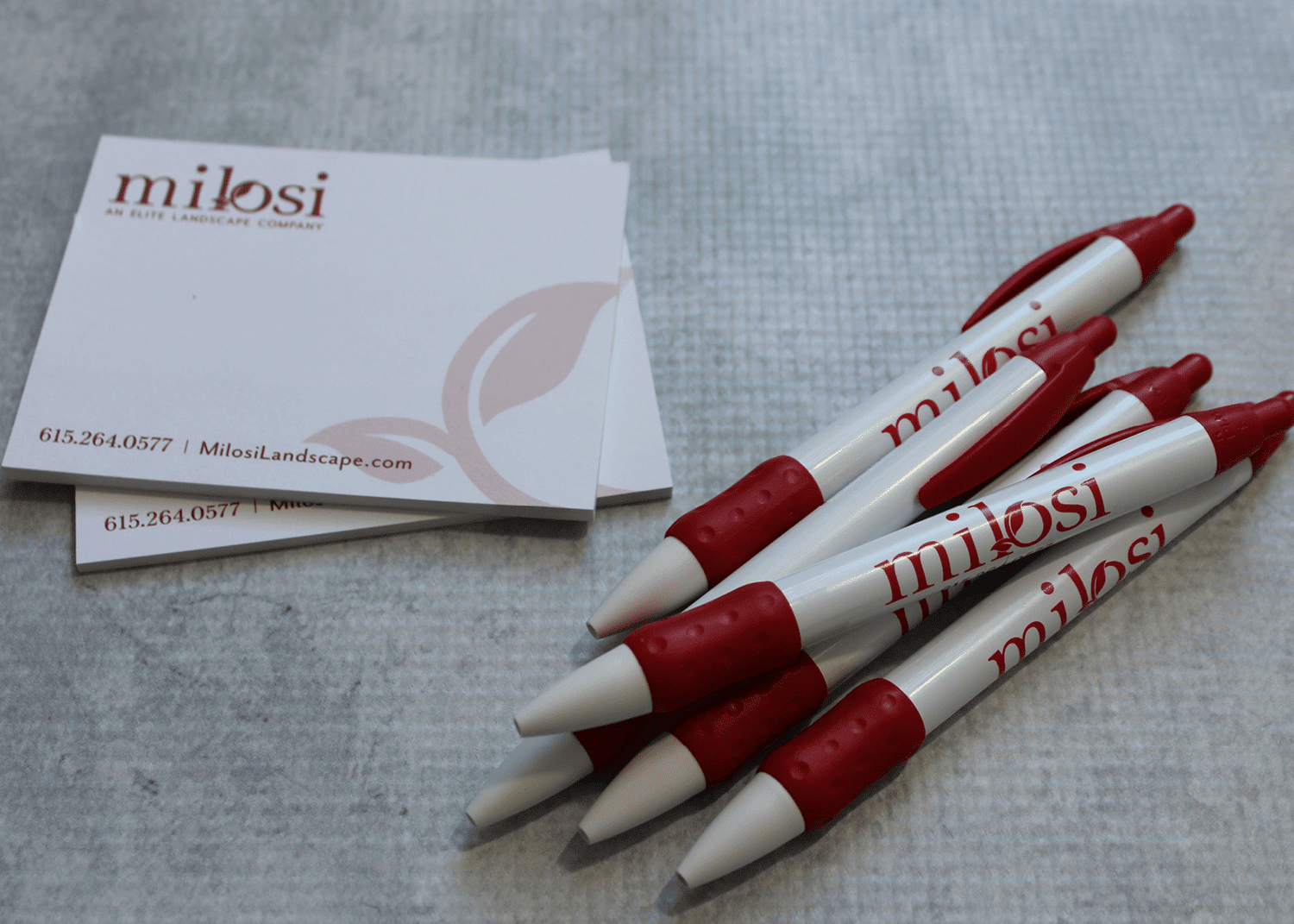
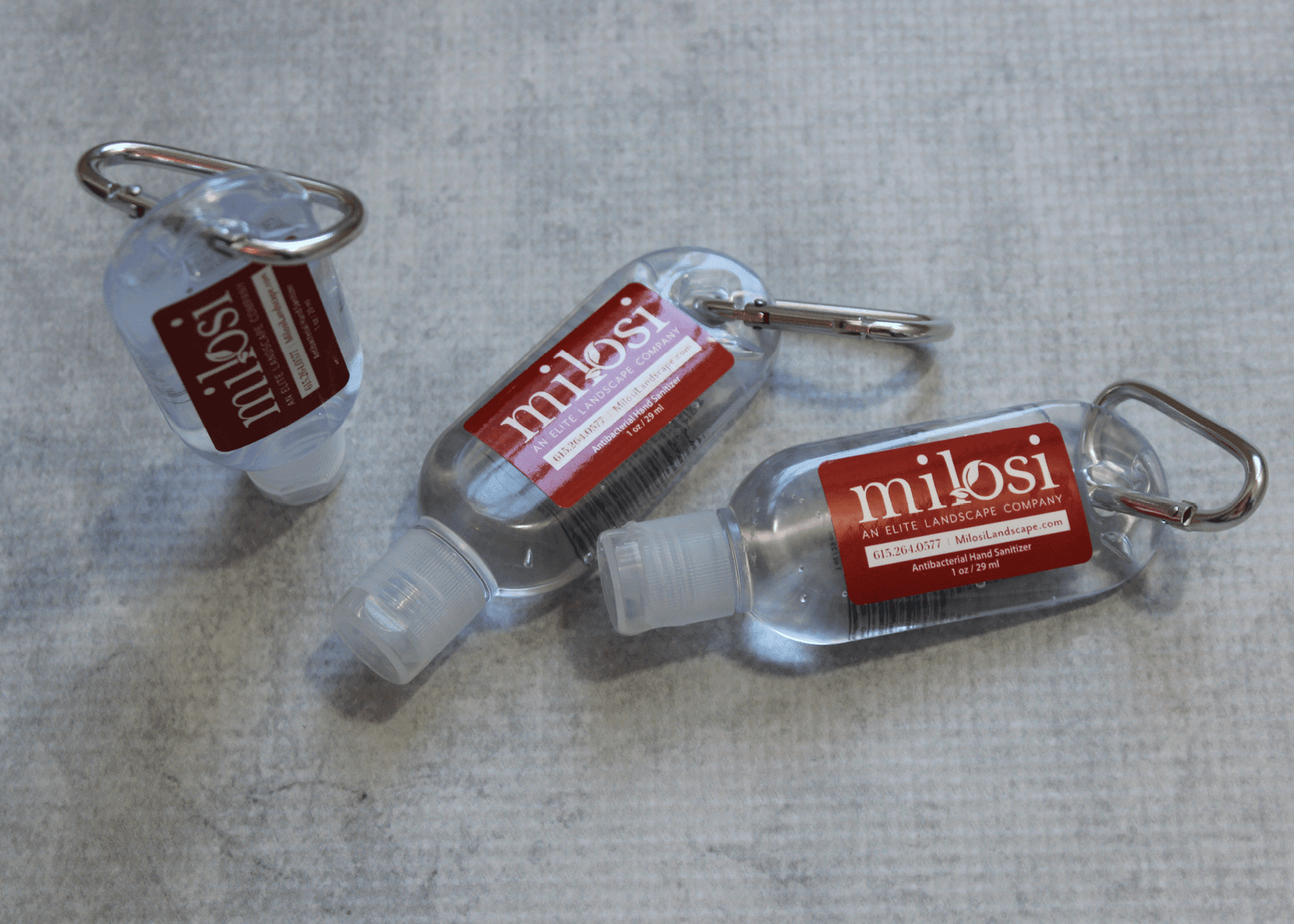
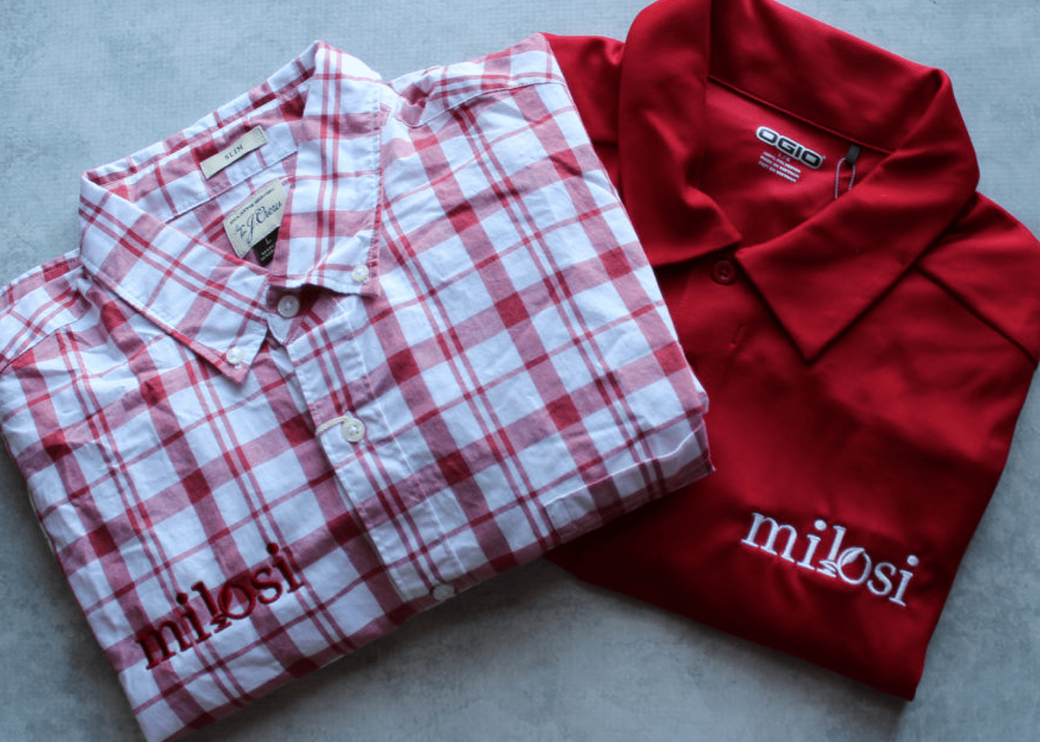
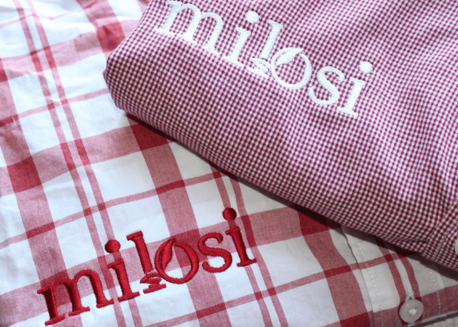
In order to create brand awareness and establish recognition within the community, it’s imperative that every element released on behalf of the company is aligned with the overall visual direction. So, we developed branded promo products including pens, notepads, drawstring bags, and hand sanitizers. Additionally, the team’s entire wardrobe was revamped to provide a level of professionalism that supported the new brand. The suite of branded attire consisted of tee shirts, dry fit shirts, visors, sun hats, safety vests, polos, and button-downs.

notepad pens merch design
landscape company promo products
corporate shirt embroidery design
corporate apparel graphic design

Vehicle Design

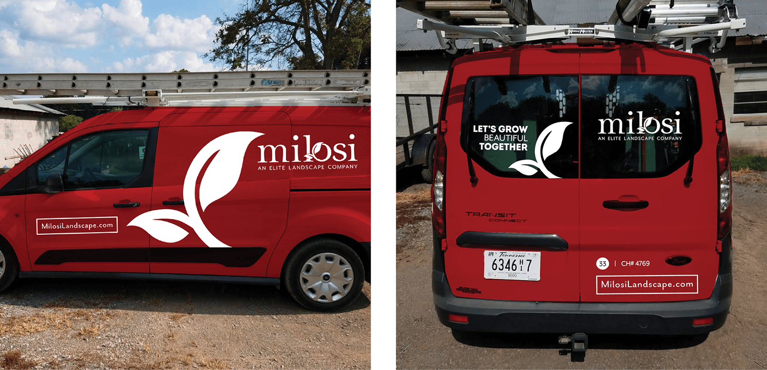
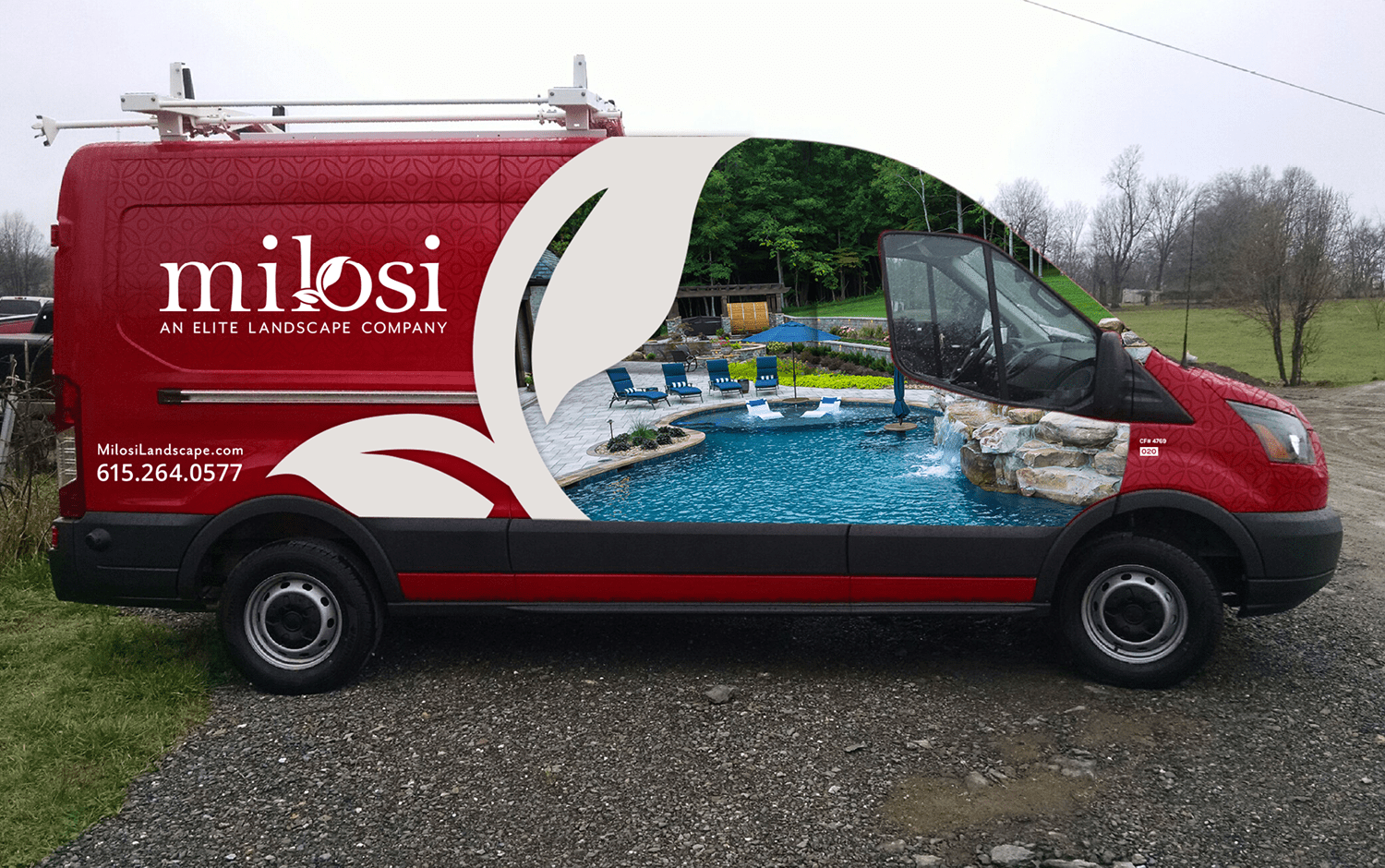
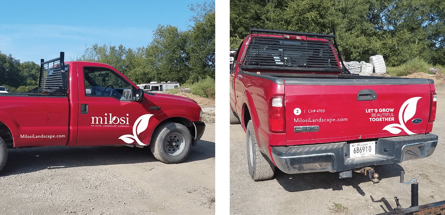
Finally, the entire fleet of vehicles was redesigned to include the new brand elements as well as the new logo. A transit van design was developed to showcase bold, eye-catching photography and graphics that would serve as a mobile advertisement for the company on a daily basis. The vehicles are a primary application for the landscape brand, and are a major player in creating awareness. The vehicle design process for this project was extensive, and included custom designs for the transit vans, prius cars, work trucks, and more. We worked with the installers to select the exact tone of red for the vehicles that would align with the brand, while consulting on the install to ensure perfect placement of the graphics.

landscaping van wrap graphic design
corporate van wrap graphic
landscaping truck wrap graphic design

Ready for a Bold Brand?

Overall, this our landscape branding client was not looking for a brand refresh when they initially approached our firm; however, they have been extremely pleased with the result. The refreshed landscape brand provided them with a level of professionalism that gave them a leg up on their competition and aligned their customer-facing collateral with the quality of their services. More importantly, the landscape company rebrand positioned the company for growth by aligning its brand and brand support with its goal for becoming the most sought-after purveyor of luxury outdoor living services.

At the completion of the rebrand, Milosi engaged in an ongoing marketing relationship with Nice Branding Agency. Our team assembled an annual marketing plan and currently carries out all marketing initiatives, with associated monitoring, reporting, and adjusting.

If you’re looking to grow something beautiful, let us be your guide. Give us a call to discuss.

are you ready to create something nice?