Box Design Kickoff
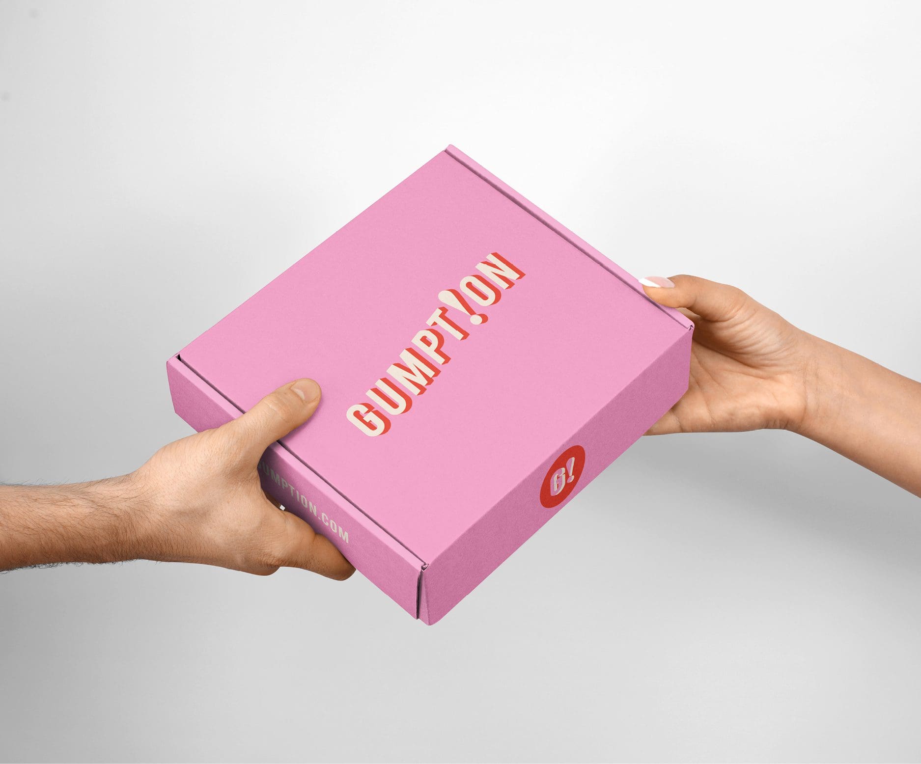
We started the project off by understanding the meaning behind the brand. We wanted to know why our client had started her online boutique and what the name Gumption! meant to the store. We found that the store would be a Kate Spade inspired spunky, yet classic compilation of curated goods for sale. There would be no brick and mortar, so the branding would be especially crucial in communicating the positioning. We started by designing a logo for the business that simply stated the name of the brand in a 3D-inspired type with the letter i replaced by an exclamation point. The logo itself conveys the idea of gumption, and we were excited to put this to work throughout the design of the delivery experience.
Box Design Content Development
The concept for the delivery experience was to infuse as much of the brand messaging into the box as possible, while maintaining user experience. Before designing the box itself, we strategized on brand-related messaging and determined that we wanted the box to be empowering, fun, and to encourage social sharing. We wanted users to be excited enough about the box itself that they would share their purchase on social media, effectively extending the reach of the brand.
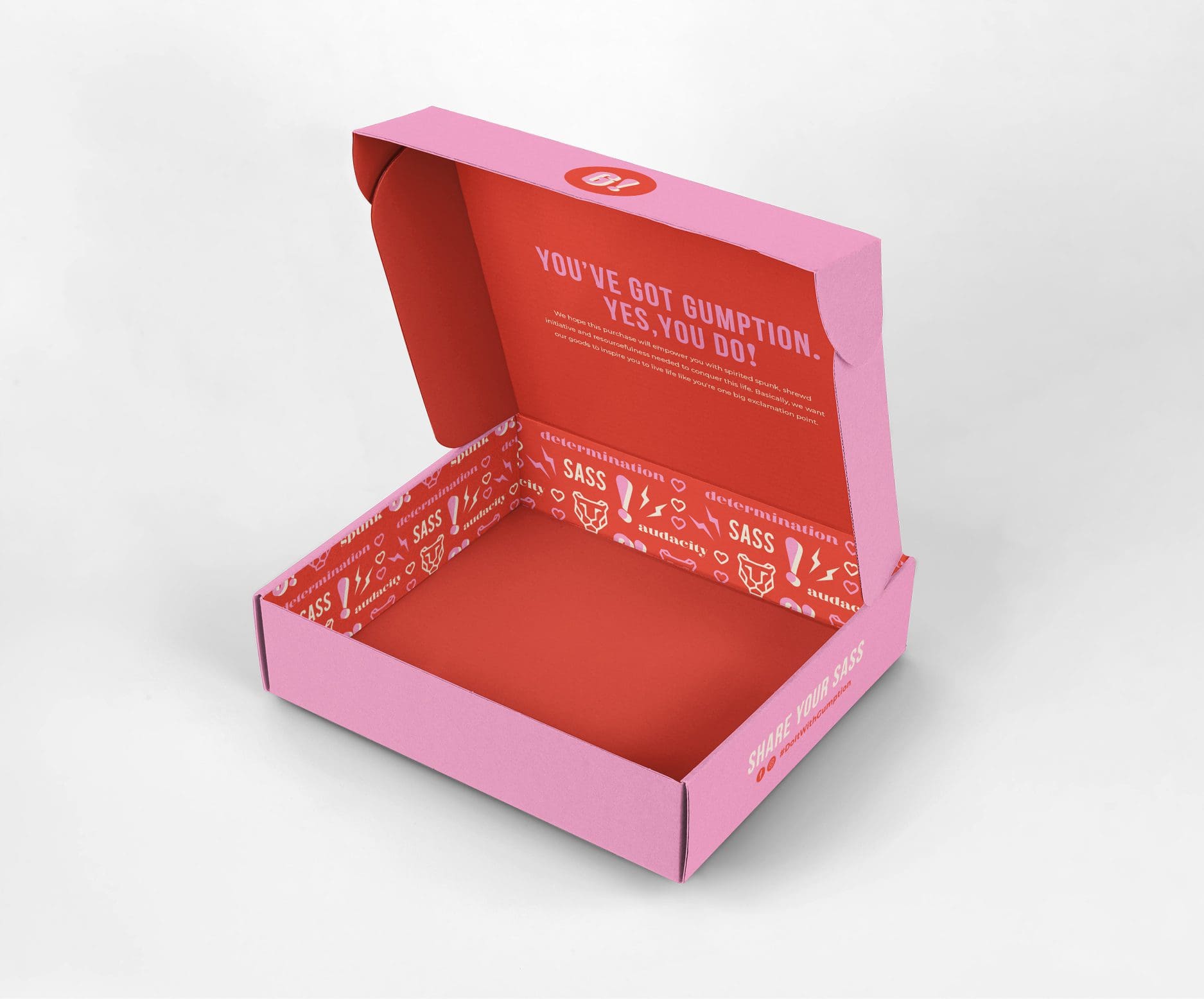
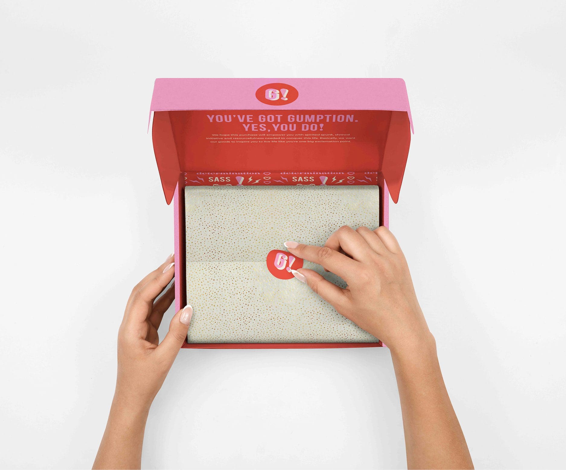
With this in mind, we set to work creating content that would be placed throughout the box design. We determined that the statement, “You’ve got Gumption. Yes, you do!” communicated to the buyer that yes, they had purchased something from Gumption! But, the following body copy conveyed that the store was hoping that the purchase would be empower the buyer with the gumption necessary to live life like one big exclamation point.
This messaging would be on the inside flap of the box and would be the first thing someone saw upon opening the box.
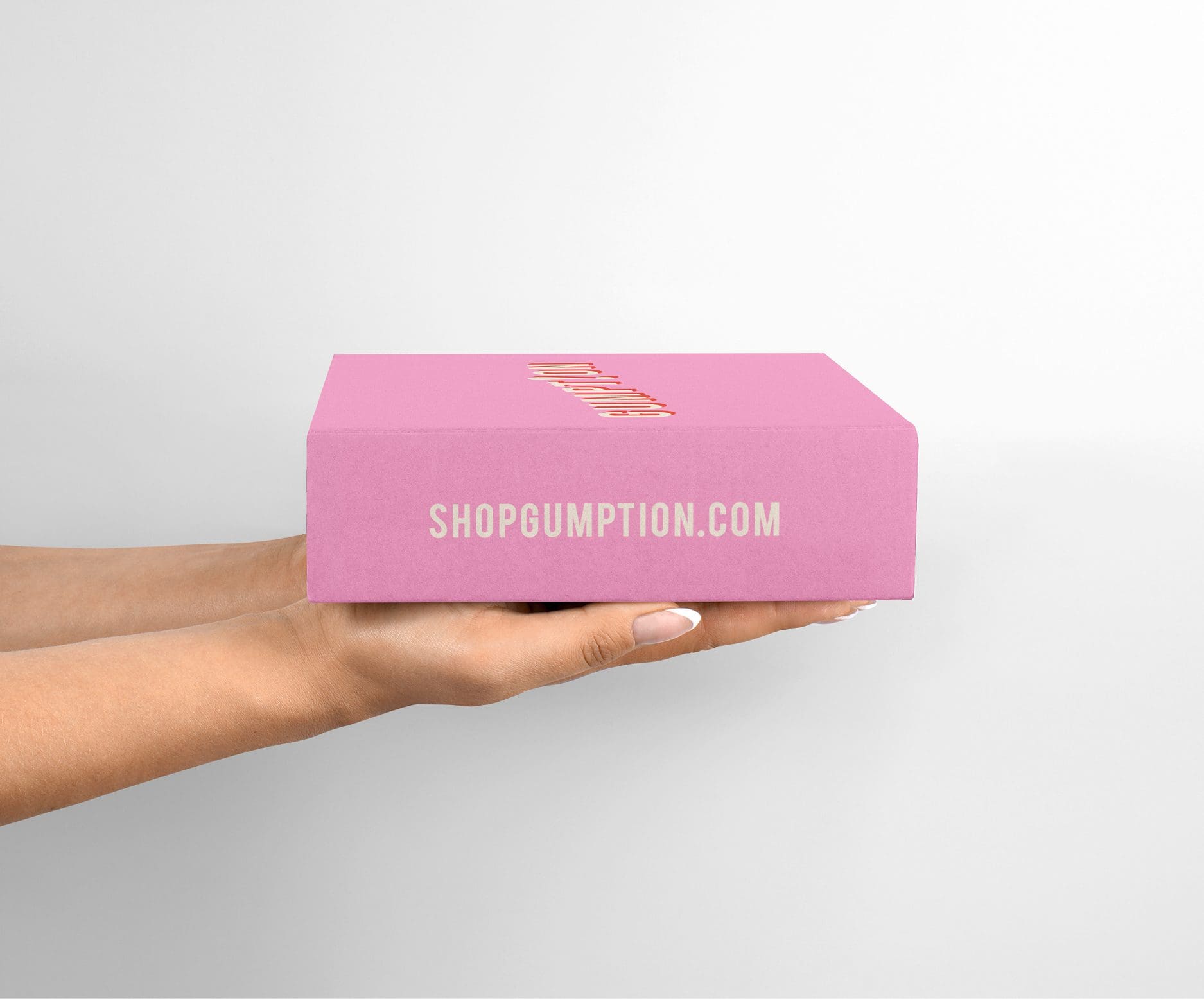
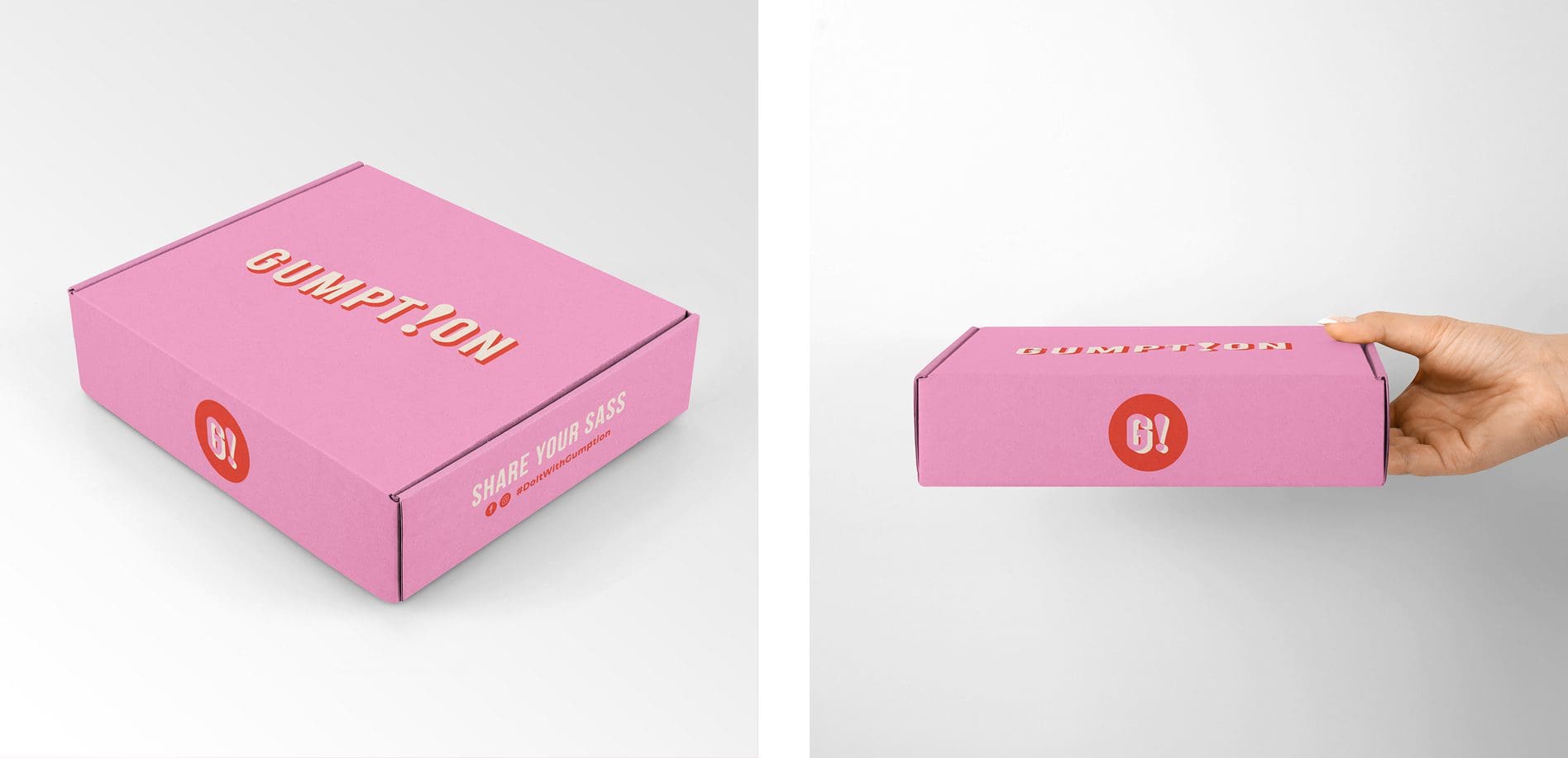
On the exterior sides of the box, which would be visible even before opening we would implement the URL and social handles in an attempt to convey the location of the store and encourage people to visit the pages to see what this Gumption! thing was all about.
Graphic Design
As we moved the content into design, the box came to life as a major element of the brand. We flooded the sides with pinks and reds, and implemented the copy developed to make a connection with the customer. Additionally, we created a custom pattern that consisted of the G! icon, interspersed with words that mean gumption, and a wildcat icon we developed specifically for the brand.
Additionally, we created an icon label that could be used to seal holographic or foil-flecked tissue to complete the experience. When a package is all you have to convey your brand in the hands of the consumer, it’s important the no touchpoint goes untouched.
Project Closeout
We closed this project out by providing our client with the print-ready PDF files for the box design so that she could order in bulk from her vendor. We also moved into subsequent branding projects for Gumption! that would allow our client to consistently maintain the brand as she began to launch in the digital space.
If you’ve got the gumption to start a business, and you’re looking for the branding queens, give us a holla. We’re ready when you are!
