Packaging Design Strategy
We kicked the project off by seeking to understand the product and its benefits to customers. We wanted to know just what made this product different, and how that would make an impact in the lives of users. As design-thinkers, we are always putting ourselves in the seat of the user. We’re looking to identify value propositions and differentiators that will allow us to speak to the end user through design.
Additionally, as shoppers ourselves, we wanted to know just why we should be interested in obtaining this product, how it would change our lives, and what would make us take a second look as the bottle sat on the shelves within stores.
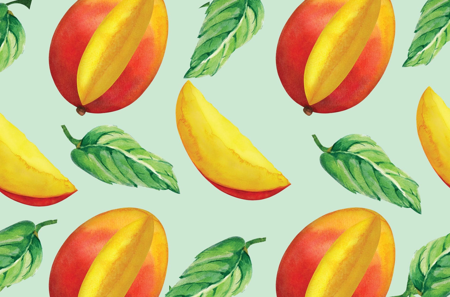
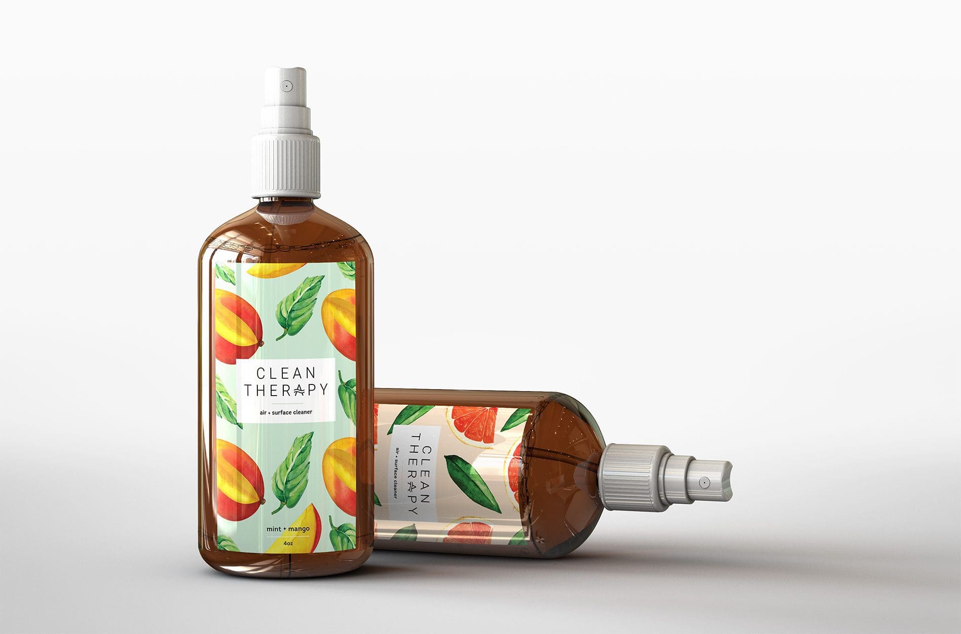
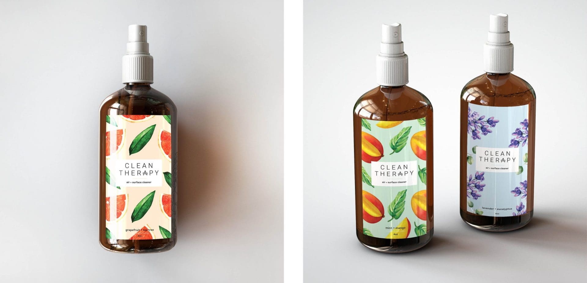
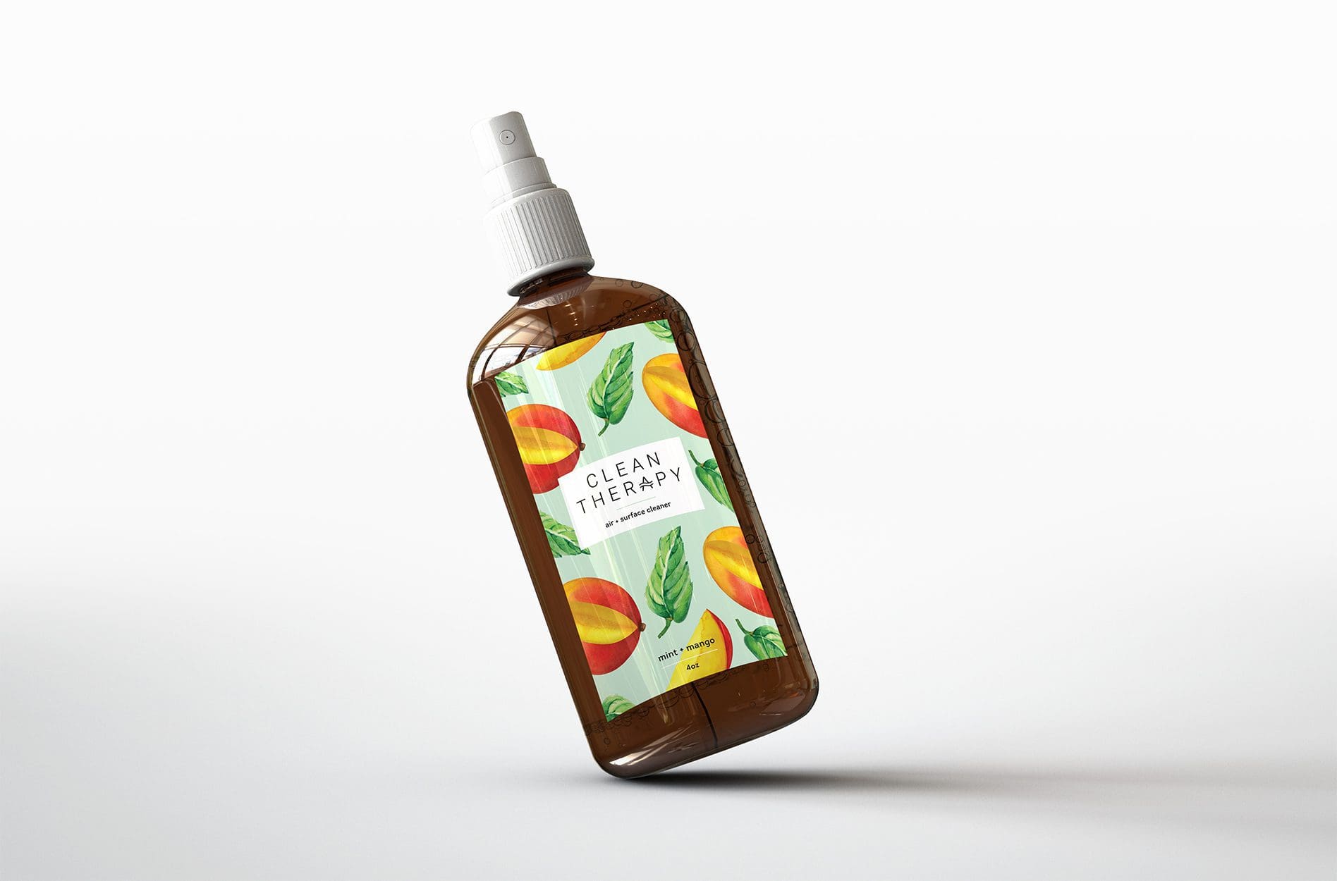
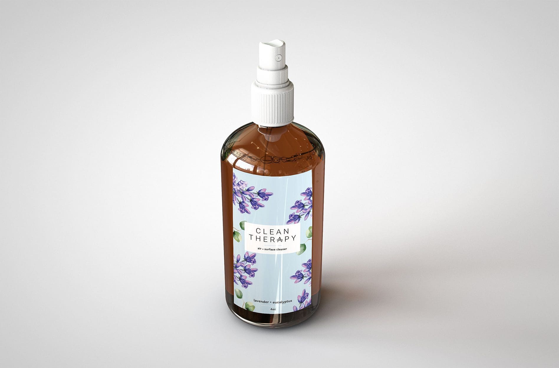
We determined that the key differentiator of the product was its base of essential oils and its promise to be 100% food-grade safe on surfaces. In fact, you could spray the product into your mouth safely. Our strategy would be to implement the design of hand-drawn illustrative patterns to convey the freshness of each scent combination.
Packaging Design
We started by creating labels that included graphics of the fresh ingredients utilized to create each scent. The labels took on a clean and modern feel, while bringing in the fruit and herbs surrounding a logo that was placed prominently in the center of the label.
The concept meant that a customer could identify the scent quickly upon glancing at the bottle. Additionally, upon viewing the label, you could almost smell the scent emanating.
The name of each of the scents was implemented in the lower region of the label, so that the space was mostly taken up with the illustration, as opposed to being filled with text.


