CereCore

corporate healthcare branding

Parallon Technology Solutions (PTS), a company owned by HCA Healthcare (HCA), approached Nice Branding Agency with an RFP for a corporate healthcare branding project. The firm needed to distinguish themselves from sister company, Parallon Business Solutions, and create a brand and narrative that better aligned with their core values. The PTS team selected Nice Branding Agency to handle the rebranding project, and our team dove in deep to uncover the true core of the company.

Corporate Healthcare Branding Project Kickoff

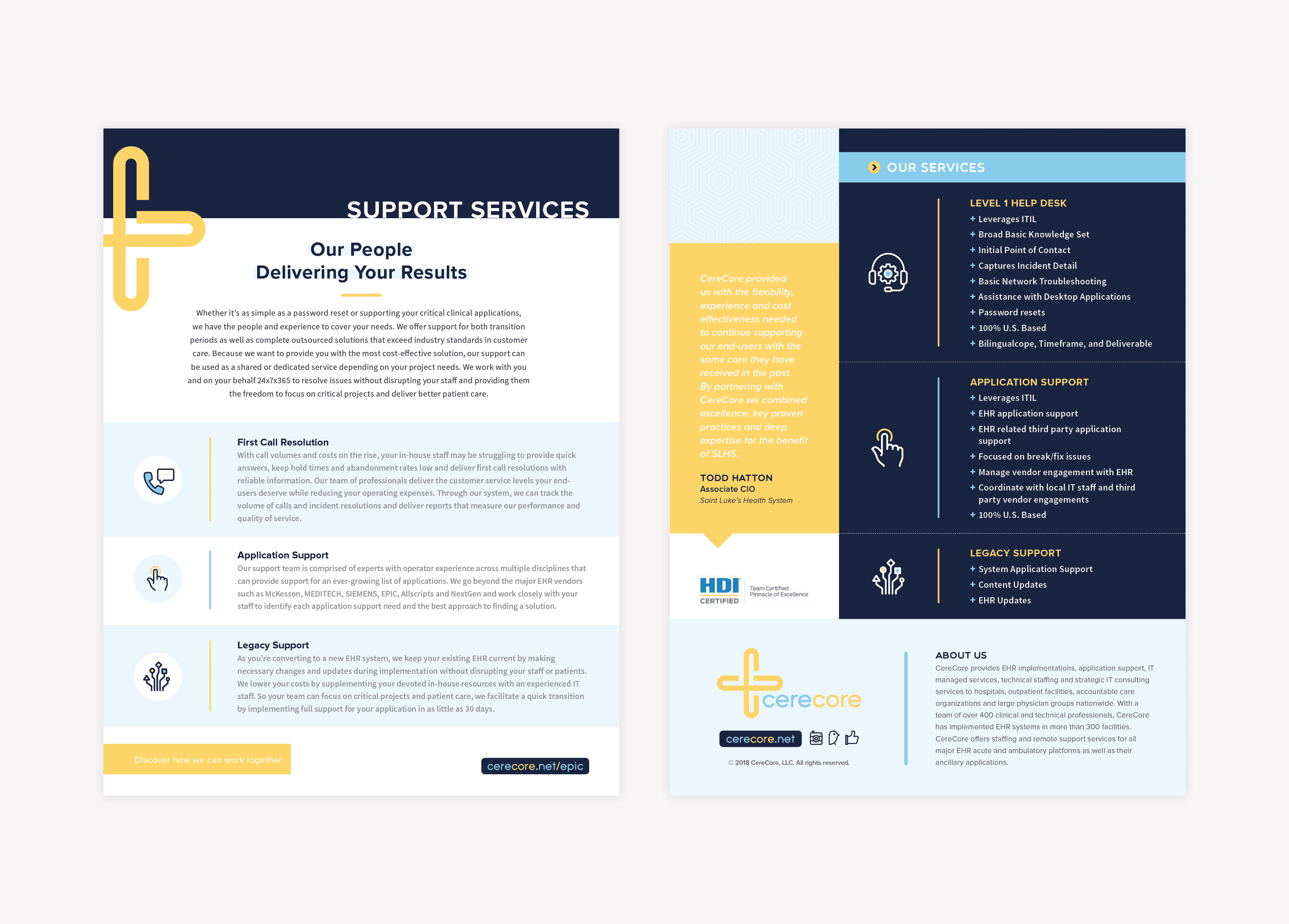
PTS provides EHR implementations, IT help desk, application support, IT managed services, hosting, technical staffing and strategic IT consulting services to hospitals, outpatient facilities, and large physician groups nationwide.

With a team of over 450 clinical, financial and technical professionals, PTS has implemented EHR systems in more than 300 facilities. Additionally, PTS offers staffing and remote support services for all major EHR acute and ambulatory platforms as well as their ancillary applications.

The company was established as a part of Parallon Business Solutions (PBS), and both organizations were wholly owned by HCA.

PTS (our client) and PBS have since separated, however they continued to share the word Parallon in their names, and their visual identities lacked distinction from one another. The similarities between the look and feel of the two organizations caused confusion for both the consumer and throughout internal-facing initiatives.

The company clearly needed a corporate healthcare branding agency to help sort things out. Overall, the primary purpose for the rebrand was to distinguish Parallon Technology Solutions from its former parent company and also to develop a brand for the organization that better aligned with the firm’s mission, values, and characteristics.

The project started with a strategy session designed to pull out the most minute details and address the broadest topics with key stakeholders.

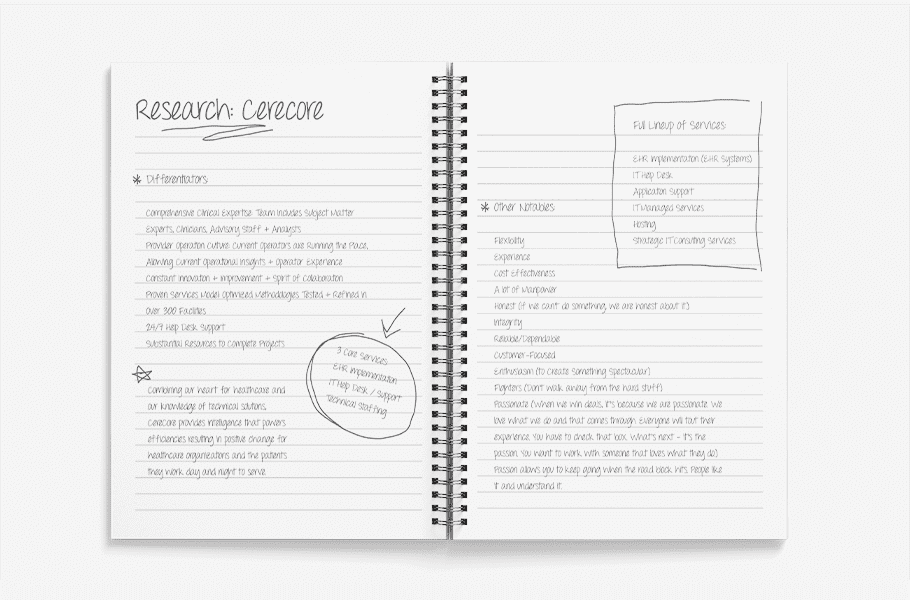
The rebrand discovery meeting was held at PTS headquarters in Brentwood, TN, in a conference room with the CEO, department heads, plus a couple of Nice girls. We asked open-ended questions that sparked conversation about the direction of the organization, its impact on the market, and how the leaders thought the company should be perceived. We also talked about processes, teams, services, competition, and overall market trends.

After digging in a little, we came to the conclusion that the impact that PTS has on patient care is immense. The efficient implementation and support of the systems that they provide leads to better outcomes for patients, ease of use for physicians and caregivers, and a better bottom line for the healthcare organization as a whole.

The more that was uncovered during discovery, the more we began to realize that PTS was the link. They were the connection to the care. However, we also came to see that the company’s existing story and brand support didn’t reflect this connection. It was sterile and flat, and had no nod to the compassion and operator heritage we learned about during our introductory meeting with the team.

We took our new knowledge back to our team and got down to business. The project scope included a complete rebrand, starting with a new name.

corporate healthcare branding

Logo

Upon completion of the mood board, our team then moved into the creation of a logo design that would fit the brand.

We determined that a priority for the final logo design was versatility. So, we created standalone logo icons (not all logos have or need separate icons!) that would allow the brand to exist in various applications. This was crucial, since the logo would need to represent the personal brand, as well as the clothing line.

To focus on the feel-good positivity, we used firefly and rainbow icons to represent hope, illumination, and positivity. The rainbow and firefly became the supporting icons for the brand.

corporate healthcare branding

Our client selected the third option, and we got to work implementing the brand direction across all brand support, starting with the logo.

Logo Design Direction Brainstorm

Based on the selected brand board and the new name and narrative, our team set to work to conceptualize options for the logo.

Prior to putting pen to paper or laying a finger on the mouse, we met to form some thoughts about how the logo could be created to be meaningful to the brand, effective in application, and both modern and timeless at the same time.

Our team determined that we would bring to life the concept of CereCore being the link to care and the catalyst to positive change. This would be done through the creation of iconography and type that conveyed the intertwining of CereCore with the healthcare organization and the movement of data and people through the process.

Finalization of Conceptualization

The concepts were presented to our Creative Director and Design Director. Upon presentation, the design leadership team provided additional layers to the concepts that could be carried out in design to deepen the meaning behind the marks.

Logo Design Options

With concepts in hand, our logo design team set to work digitally creating the concepts. Our designers worked to select and pair fonts and custom-create icons that would be able to stand alongside the type and exist on their own. These logo options would be reviewed and revised by our design leadership before being prepped for presentation to the client.

Presentation and Selection

The logo that was selected included an icon comprised of two C’s, pulled from the new name CereCore, that were intertwined to indicate the link that CereCore would play in the connection of care.

The icon took on a + sign, which implied their connection to the healthcare industry, as well as the positive impact the company has on individuals. Additionally, the + sign indicated the positivity of the CereCore team, and their enthusiasm for the work they do.

We also created visual movement through the logo to represent the movement of data throughout the company’s operations and the movement that is apparent daily in healthcare atmospheres.

Our client was floored by the meaning behind the mark. The brand story, now paired with the logo, gives the public a true look into heart of CereCore.

Logo Finalization

The selected logo then went back to our Director of Design for finalization. This process includes perfecting the icon and type and ensuring that every element is in its proper place.

Additionally, exact colors were selected for the logo in CMYK, PMS, RGB, and hex codes.

corporate healthcare branding

Sitemap Presentation

As we were finalizing the logo, we began to look ahead to the website design project. Since the design and build of a website is the most time-intensive aspect of a corporate healthcare branding project, we start with mapping as soon as we’re able.

For the CereCore website, we would essentially keep the existing sitemap, however, we would improve the user experience through our wireframe and design phases.

Website Hosting

Additionally, we usually discuss hosting at this point in the project, so that we can successfully implement the website hosting setup, prior to the website completion date.

We host our clients’ websites on the most reliable WordPress host in the industry, and provide our clients with monthly maintenance and monitoring and daily backups. Additionally, our hosting provides the fastest page load speeds and the least amount of downtime, compared to other online hosting services.

Business Card

With the logo finalized, we moved into the creative development of the business cards for CereCore. As much of the CereCore outreach is done through tradeshows and networking, the business card design was an important aspect of the project.

The business card design implemented the rich navy of the brand, while highlighting key information with bright blue and yellow tones and setting apart the new URL in a tag at the base of the card.

Corporate Stationery Package Development

Our corporate healthcare branding package also includes the design of a custom stationery suite that equips personnel to communicate professionally. For CereCore, we created a simple, but impactful letterhead and matching notecard, which would both fit inside the same no.10 envelope.

On all pieces, the plus-sign icon took center stage, providing our clients a platform for talking about their unique contribution to their industry.

corporate healthcare branding

Marketing Materials + Strategy

We then implemented the newly designed image into the organization’s key marketing materials to provide them with a strong foundation for transitioning to the new brand.

In all of the pieces, we utilized a consistent color palette that brought the visual direction to life in a tangible manner. Not only did we put our graphic design skills to use, but we brought a strategic consulting element to the table, analyzing the goal of each piece and adjusting the information presented to assure the goal was met.

We used navy with pops of bright yellow and clear, simple sans serif fonts to create compelling and professional support. In our design of the marketing collateral, our goal was to create pieces that could be updated easily by the internal marketing director. This impacted the design of the materials, as we worked systematically and strategically through the development of the collateral to ensure that all of the work would be easily editable.

Casey Study Template

We started with the design of a Case Study template. A keen understanding of our client’s needs from a marketing perspective uniquely equips us to develop pieces that are not only pretty, but also accomplish the goal at hand.

For the Case Study template, it was important for us to lay the information out in a manner that would allow CereCore to impress potential clients. This meant that the info had to be thorough, but easy to digest.

We used color blocking to pull out key text, and a system of font hierarchy to allow the reader to easily maneuver through the piece. Further, icons were implemented to bring the user to pertinent information quickly, and to allow the reader to simply understand what information was being conveyed.

corporate healthcare branding

Services One-Sheet

Similarly, in the two-sided services one-sheeter, we created a template that could be utilized by CereCore to convey to clients their services. We implemented the same strategy here, using color blocking and iconography to improve the user experience, allowing the customer to scan the piece and dig into details that were relevant to their needs.

While the front side explains the key support services, the user can flip the sheet for a bulleted list of services, reinforced by a testimonial from a key client. Just as we’d done in the Case Study template, we included the “About Us” information in the footer, along with contact information. This allowed our client to reiterate who they are as a company, and why their clients should choose them.

corporate healthcare branding

Proposal Design

Another key piece of marketing collateral that CereCore relies on is their proposal templates. We worked to design a beautiful multi-page booklet that the company could use to woo potential clients. The book included the new brand colors and fonts, as well as the overall visual direction and narrative. This piece is a pretty important element in conveying the company’s unique value, so we made sure that all information was presented in a manner that wouldn’t be overlooked by the reader.

corporate healthcare branding

Tradeshow Banner Design

Finally, we create a suite of banners to be used in tradeshow settings. The banner design was intended to convey CereCore’s key services in a manner that would catch the eye of people passing by, and introduce the world to the new brand.

We developed three banners. The outer two designs succinctly described the company’s four main services, while the center banner depicted imagery in line with the new brand. Additionally, a section of the positioning statement was utilized here to demonstrate the company’s core values. Icons were employed here to allow passers to get a quick glimpse and draw them in to learn more if desired.

corporate healthcare branding

Icon System and Image Library

We provided an image library and icon system that would allow CereCore to continue to create on-brand designs from within their office. The image library is a collection of on-brand stock images that can support their brand. The images we collected reflect the determination and diversity of their employees and remain within brand standards visually.

Next, we created a custom system of icons that could be used to brand marketing materials in the future.

corporate healthcare branding

For CereCore, hosting with us was unnecessary, as they possess their own servers and developers. This was something that we discussed during the RFP process, so we were prepared to hand over the website assets to our client’s team.

The Website Wireframe

We would usually start a website project with our wireframe process, which allows us to strategically map out the user experience. However, at the request of the client, we started with an audit of the existing website. Here, we assessed what was working well, what type of content needed to remain, and what the most important calls to action were for the website. We then mapped out the new structure of the site to take advantage of any opportunities for improvement.


corporate healthcare branding

Corporate Healthcare Branding Website Design

Upon approval of the structure, we then moved right into design, implementing a revised structure and completely updated user interface that put the new brand on display.

Part of the revised structure included simplified header navigation. A stacked menu in the header put key calls to action in the valuable top-right real estate, but then allowed users to easily access information about the four main service lines just below the primary header. Career and blog links were placed in a bar above the header to allow for visibility without distracting the user from the main calls to action.

We then aligned the design with the rest of the brand elements. We used modern imagery that was appealing and relevant to their industry, and copy that was simple and straightforward. Additionally, the website was designed from a mobile-first perspective, and we dictated that the design should be developed to be fully responsive on various screen sizes.

A compelling headline over a large image that has some emotional impact tells the user within 2 seconds flat what the company is committed to, and key services set apart by color blocking and iconography quickly convey what you can expect from the firm. As the user scrolls past the services, the company’s expertise is highlighted by case studies that are positioned to reinforce CereCore’s standing as a thought-leader, while providing additional information to those who seek details.

Testimonials and links to key content were strategically placed throughout the site, and opportunities for the user to connect with CereCore abound. Overall, the website is an important sales tool, and should be treated as such. The CereCore site is now a lead generating machine, and our clients were able to implement the design on their URL with our guidance.

corporate healthcare branding

Website Development

Typically, as part of our corporate rebranding package, our team designs and develops a custom WordPress website as part of the project. However, in this case, the RFP stated that the client would have their internal team build the new website. We would do the design, and pass it off to the CereCore team to develop.

corporate healthcare branding

Website Launch

At launch, our team carefully reviewed the live website to ensure that it matched the design we’d laid out. One round of revisions were provided to our client’s developer as part of this process.

Corporate Healthcare Branding Standards Guide

Finally, we provided our client with a guide of brand standards as a document that included all colors, fonts, headers, subheads, body copy, paragraphs, pullouts, callouts, imagery, headers, footers and more to be used as a guide to protect the integrity of the CereCore brand throughout all of their marketing materials.

corporate healthcare branding

Corporate Healthcare Branding Project Closeout

To closeout the project, we provided our client with their new logo files and guidelines, all final files for brand support, and the final files for their website design.

Ready for a Bold Brand?

Are you considering a corporate branding project? Give us a call and let us walk you through the process: 615-905-9936.

are you ready to create something nice?